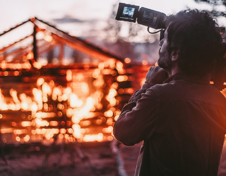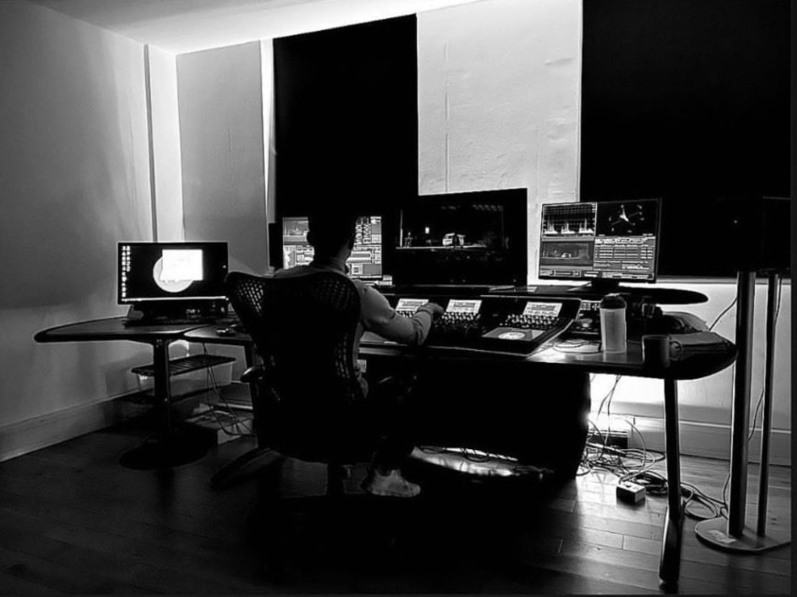
Colour assistant Mackenzie Taylor, whose passions began in the fields of graphic design and football, explores the films that led to his shift toward a role as a colour assistant, with his work now appearing on ITV, Amazon and Netflix.
Apocalypse Now (1979)
Taylor took advantage of the solitude of lockdown and furlough to learn new crafts, choosing to put his studies in graphic design to one side, and instead hone his skills in colour grading. As part of this, he studied the 1979 Vietnam War classic Apocalypse Now, directed by Francis Ford Coppola – a film which he now describes as one of his favourites to reference for grades.
“The jungle and river scenes seemed so natural and moody, this film is a perfect example of making an exaggerated grade feel natural and fitting,” he muses. “Being set in the hot jungles of Vietnam – and eventually Cambodia – the warm, saturated hues of green and yellow really make you feel like you’re there, standing shoulder to shoulder with the suffocating soldiers.”
Taylor recalls in the film what he refers to as “the most incredible colours” he’s ever seen, and Apocalypse Now is still referenced by colourists – almost 50 years after its initial release – when deciding to push contrast in scenes that have earthy tones. One of the most impressive aspects of the film’s colouring, as Taylor states, is that it manages to look as good as it does – despite predating current digital methods – through the process of directly manipulating the film’s negative, via the process of colour timing.
Blade Runner (1982)
Another timeless classic, directed by Ridley Scott and starring Harrison Ford (who would later reprise his role as Rick Deckard in the 2017 sequel, Blade Runner 2049), Taylor cites the dystopian 1982 science fiction epic as a direct inspiration for one of his own pieces of work, Coyote. In this 2022 feature film – set in a similarly bleak future setting – teleportation is used as a means to conduct human sex trafficking.
As Taylor recalls, “the teleportation scenes shot by Coyote’s DP, Josh Birch, are low in exposure and contain saturated, neon blues to emulate the machines used. This reminds me of the scenes when the first replicant is being interrogated in Blade Runner – a scene which uses very saturated teals and royal blues.”
Blade Runner’s own DP, Jordan Cronenweth ASC, translates Blade Runner’s dark, brooding narrative into dark and brooding visuals, marking it as an expertly-crafted piece of cinematic history.
Whiplash (2014)
Beginning life as a short film released in 2013, Whiplash stars J. K. Simmons as the intense and abusive Terence Fletcher. The film explores the tumultuous relationship between Fletcher and a young, passionate jazz drummer, Andrew Neiman, played by Miles Teller.
“It was incredible to see the difference in colour and exposure they used to enhance the effectiveness of the scenes,” comments Taylor, comparing the original short with the later feature-length production. Whiplash, he explains, is the film that taught him how to push an image to its limits to invoke a strong reaction.
Just as emotive acting and powerful music can bring a scene to blossom, so too can colours enhance the mood and impact. “The choice of colours in Whiplash really support those aggressive scenes, where Fletcher is bearing down on Nieman, furiously shouting at him and making him exhaust himself to his last breath.”
“From my memory I can only picture the film to be saturated oranges and yellows,” continues Taylor. “Most films will have a mixture of scenes, graded a certain way to break away from one to the next and change the environment. For example, night scenes tend to be darker and less saturated, while sunny days can contain bright whites and higher exposures. However, Whiplash virtually lives in a dark and moody tone of fire. It’s astonishingly striking, and I would recommend this film to anyone – even those not in the creative arts. It’s a phenomenally gripping piece of storytelling.”
Fury (2014)
World War II is an oft-travelled era for cinema, but while many films focus on the action and heroics of the frontline soldiers, Fury deviates from this path and focuses on an American tank crew – comprised of Brad Pitt (as Don “Wardaddy” Collier) and Shia LaBeouf (as Boyd “Bible” Swan).
This is not the only way Fury differs from other films centred around war. “Some of the battle scenes in Fury leaned more into teals and blues,” recalls Taylor. “Most other WW1 or WW2 films like 1917, Saving Private Ryan and the HBO series Band Of Brothers, you’re more likely to find muddy browns and darker greens.”
“There’s a really intense scene where the tanks are pushing towards the Germans in an open field,” recounts Taylor. “There are soldiers lining up behind the tanks, bullets flying from machine gun fire. The blues in this scene offer a great contrast of colour against the red tracer bullets and the rapid neon reds against the deep saturated blues almost look like something out of Star Wars. It was an interesting choice, and it personally made that scene all the more gripping and intense.”
Taylor recalls the advice he was given by senior colourists Duncan Russell and Katherine Jamieson that colour – and colour grading – as a matter of opinion. “You’re never going to get it right,” he muses in conclusion, “but if it works well with the story and isn’t distracting you from what’s trying to be told, then you have done a good job.”
Taylor’s work as a colour assistant can be seen in Netflix TV documentary World At War, feature film Coyote and the ITV series The Lovers.