
Words: Paul Fremes
Filmmakers such as Kurosawa and Fellini created some of movie history’s most memorable images without the benefit of software, modern cameras, or complex lighting. What was the method of these masters? How can cinematographers today see the same way?
Audiences think it’s delightful magic, but it’s deliberate, precise, and repeatable. In every shot, beautiful structure can be created by making two parts different but equal through balance. What!?
If you think of objects in the frame in terms of:
- how much they grab your attention or
- how much importance they have or
- how much ‘psychological weight’
they seem to have; you can balance a shot to make it more compelling.
How did Kurosawa compose the shot below for the movie, Yojimbo?
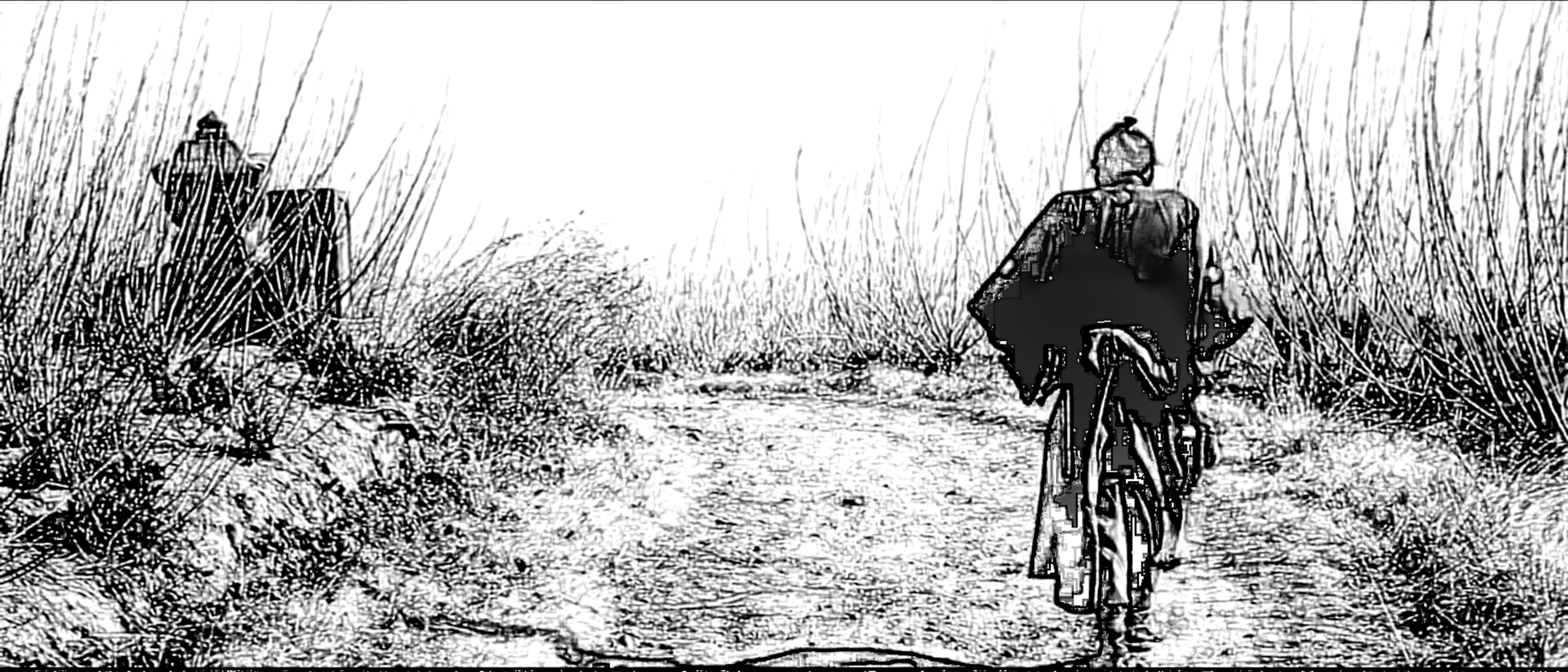
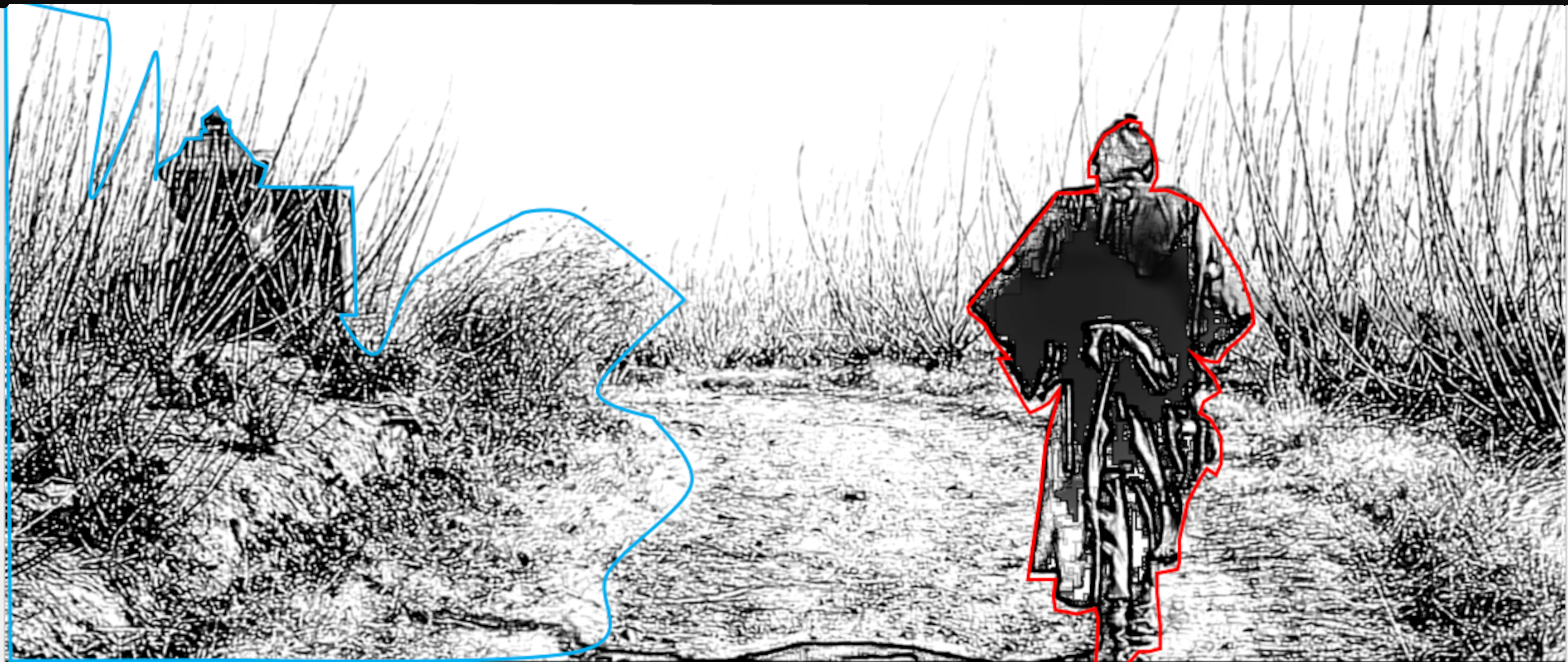
Reproduced image from Yojimbo (movie), Akira Kurosawa, 1961
The smaller human figure on the right (outlined in red) – that grabs our attention more
balances
the larger stone structure and grassy area on the left (outlined in blue) – that grabs our attention less.
Although the human figure grabs our attention more, the stone structure and grassy area occupies a larger portion of the frame compared to the human figure – creating a pleasing effect for audiences – a balanced composition.
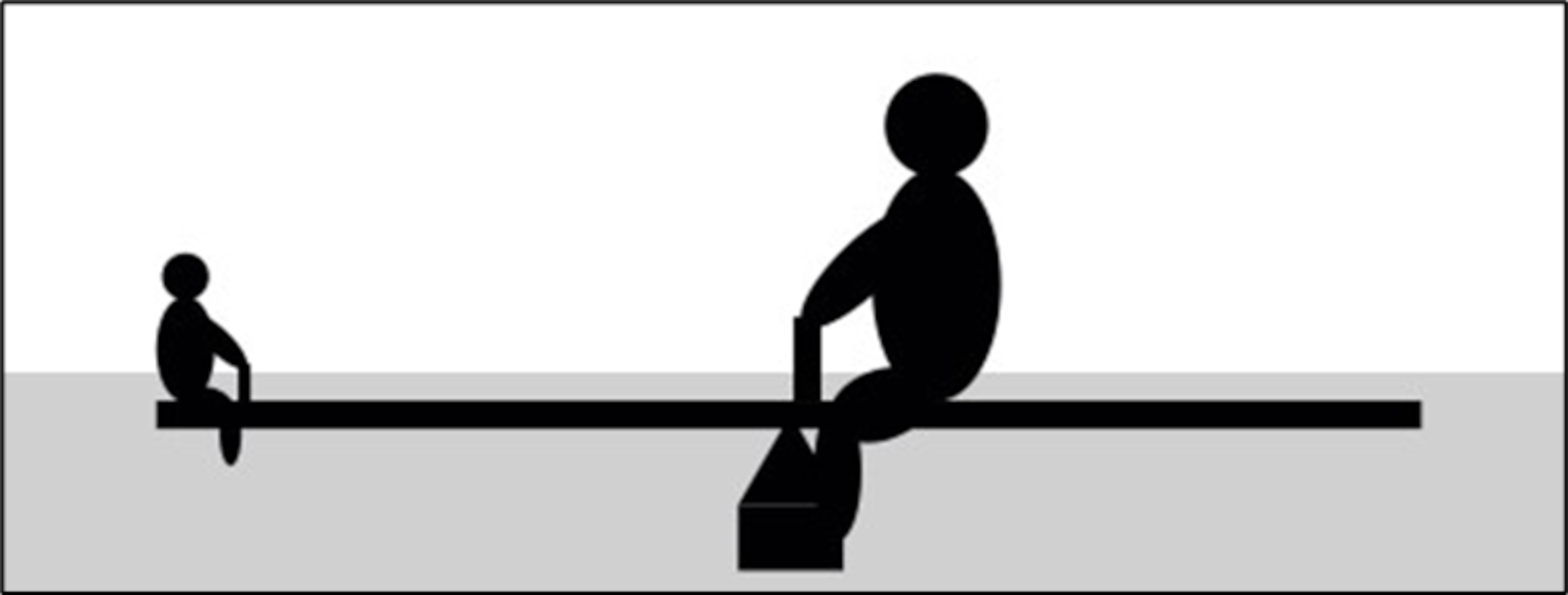
It is a see-saw principle. In the graphic below, the heavier person on the see-saw is sitting closer to the centre balancing a lighter person sitting farther from centre – similar to the Kurosawa image above.
In the Kurosawa shot above, the human figure is closer to centre and the stone structure is farther from centre – so that the stone structure can act sufficiently as a counterweight (because the stone structure does not have as much ‘psychological weight’).
The two parts are different but made equal through composing.
In the beautiful shot below, from Fellini’s movie 8 1/2:
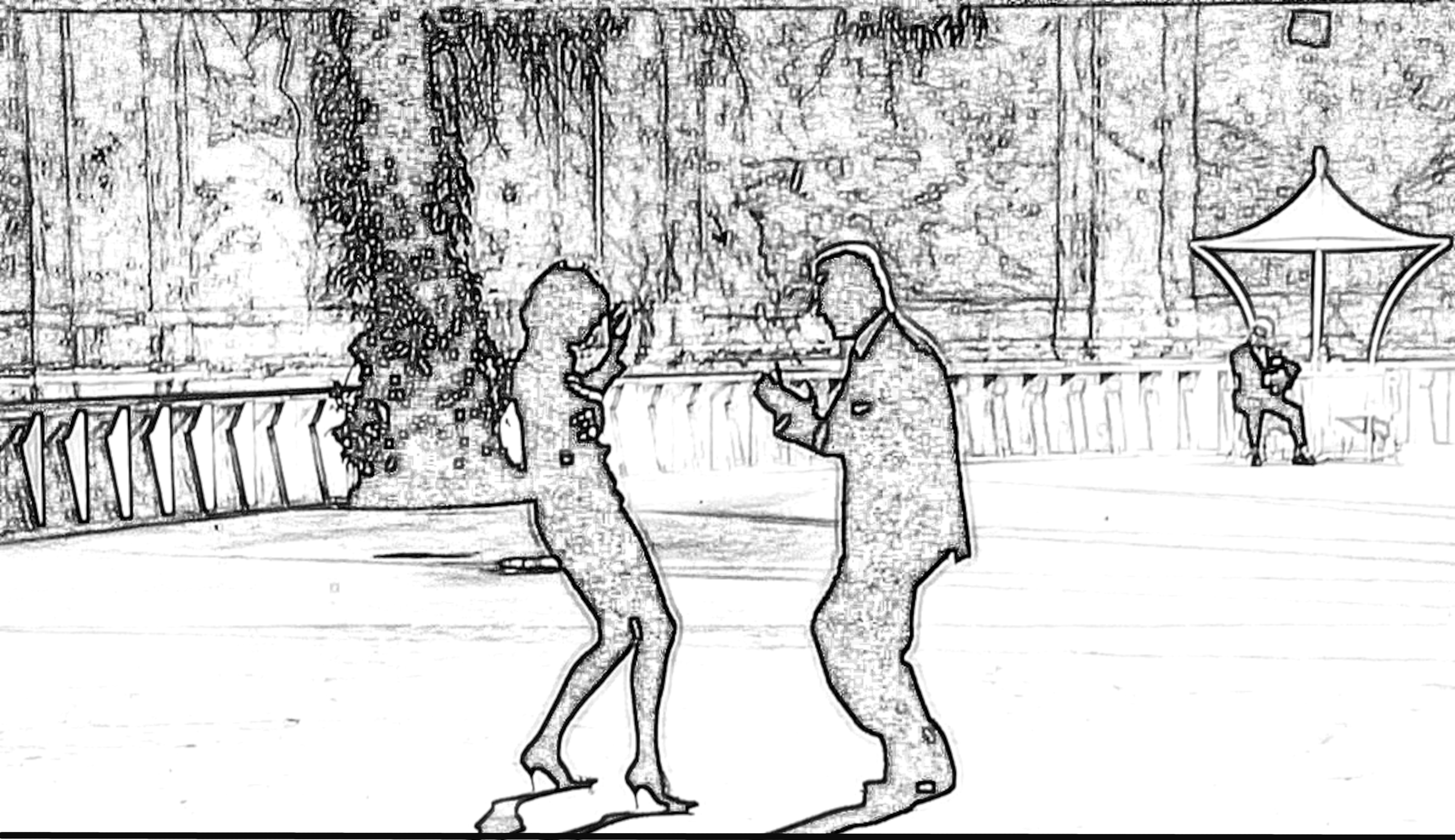
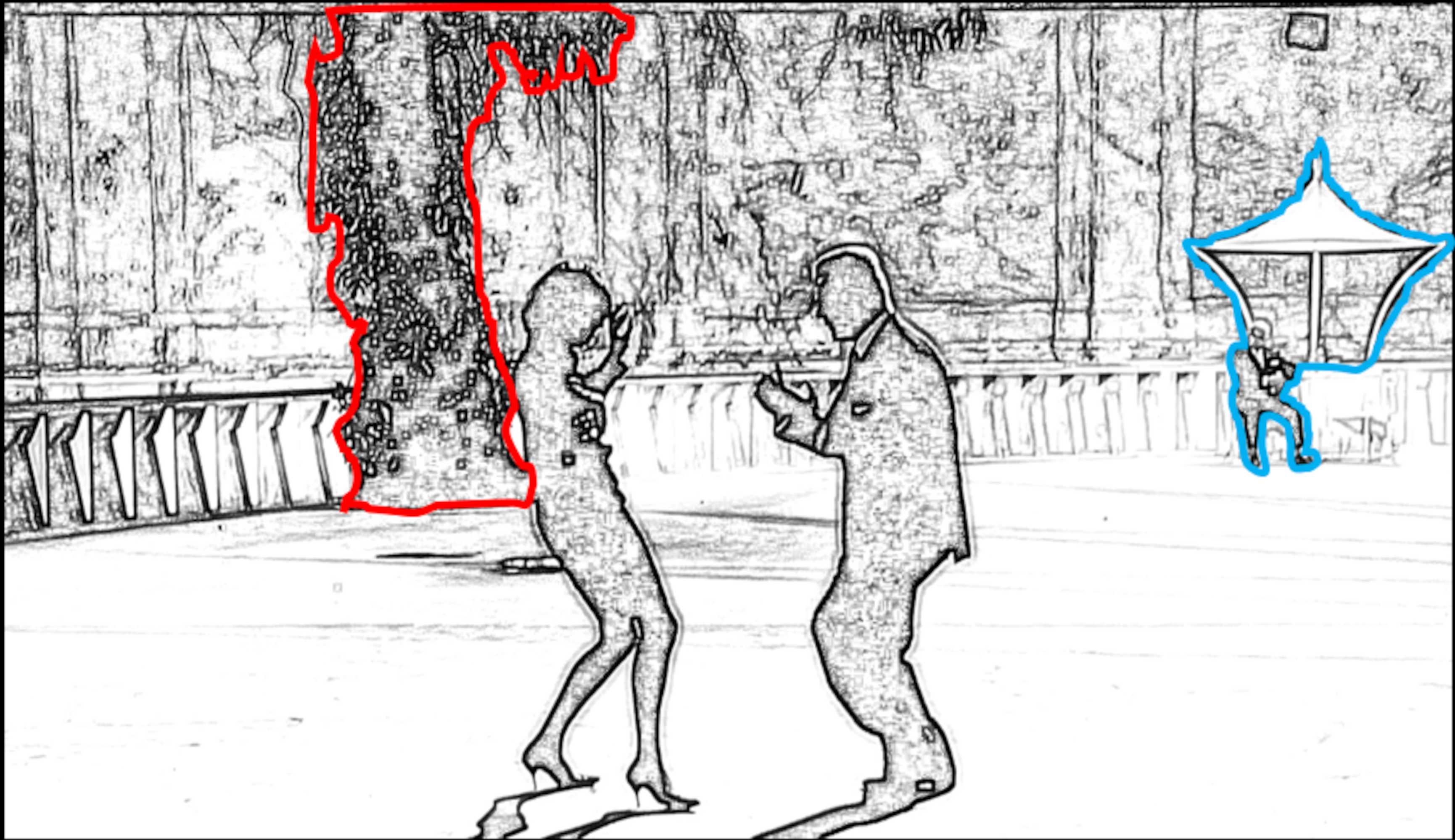
Reproduced image from 8 1/2 (movie), Federico Fellini, 1963
The dark tree trunk on the left (outlined in red) – that grabs our attention less
balances
The human figure and a patio umbrella, right (outlined in blue) – that grabs our attention more.
But, what about the human figures dancing in the foreground? Aren’t they the most important parts of the shot? Yes, however, the human figures dancing are nearly equal in ‘psychological weight’ on either side of the frame – because the male figure is larger and, the female figure is smaller but has more visually compelling ‘V’ shapes within her legs and shoes.
Since the foreground subjects have equal ‘weight’ the background objects do most of the work asymmetrically balancing this shot.
The dark tree trunk (dark objects often have more ‘psychological weight’ than bright objects) on the left, closer to centre, balances the small, sitting human figure and deck umbrella, farther from center. The seated human figure is so small and, the deck umbrella being white (commanding less ‘psychological weight’), must be farther from centre to adequately counterbalance the dark tree trunk.
Is this concept used in modern cinema? Yes, this essential technique is seen in the work of master cinematographers like Sir Roger Deakins CBE BSC ASC. It’s one of the essential elements of Deakins’ work that defines him as one of the best cinematographers of our time.
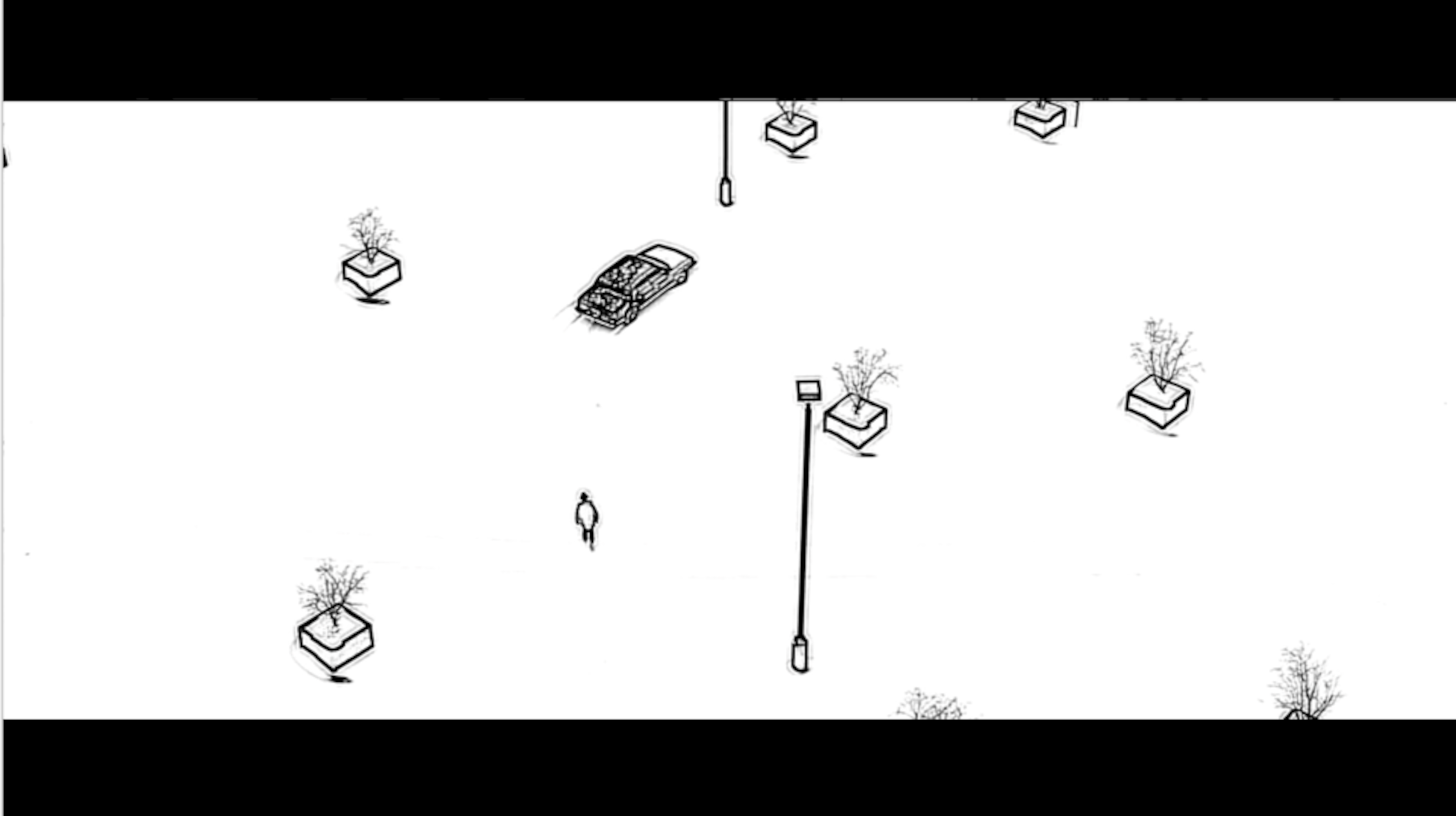
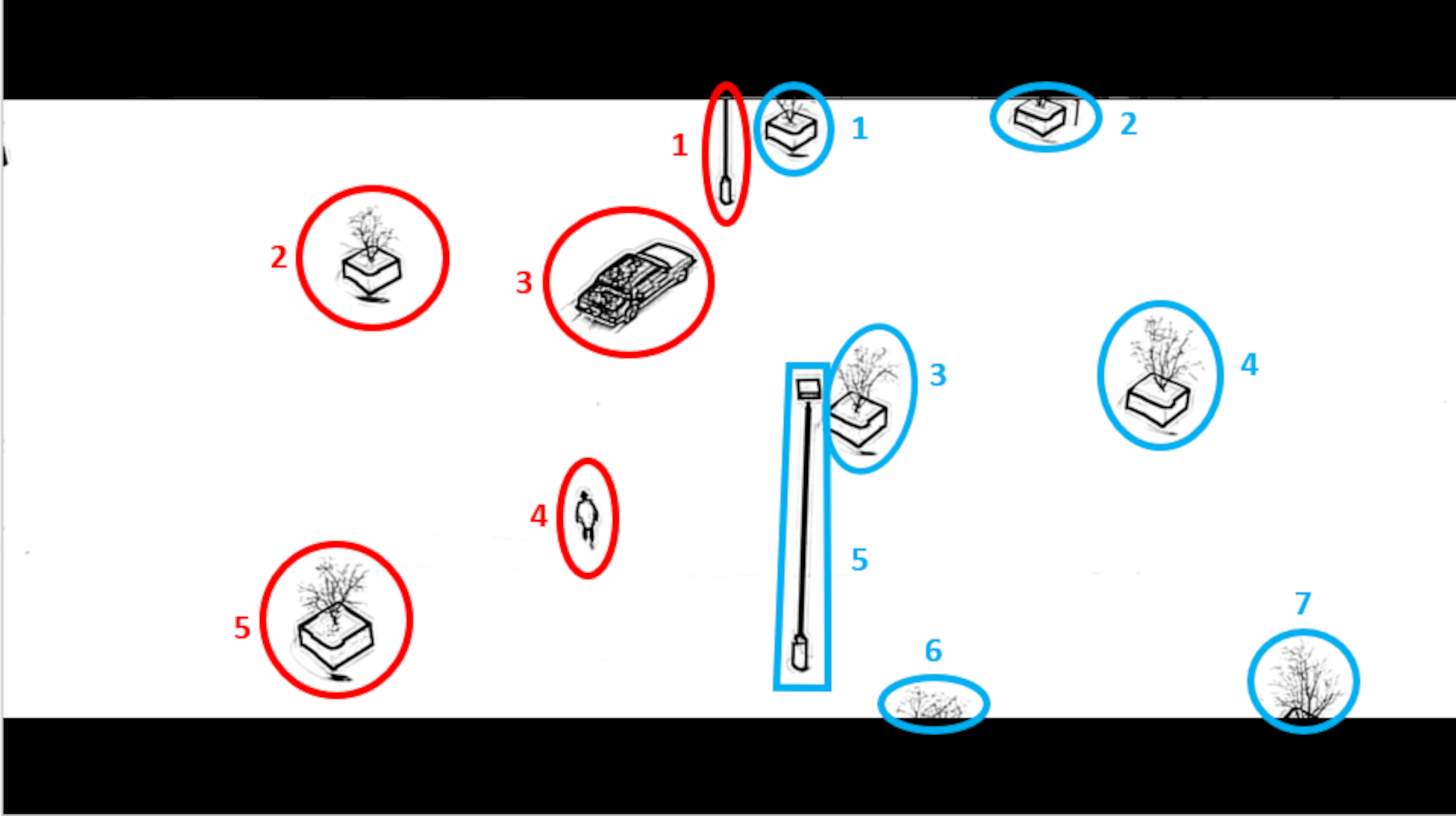
In Deakin’s composition below from the movie, Fargo, there are:
- Five objects are on the left side of the frame
and
- Seven objects are on the right side of the frame.
Since five doesn’t equal seven, where’s the balance?
The human figure and car on the left carry more ‘psychological weight’ than the planters on the right. Because of this, five on the left = seven on the right.
Reproduced image from Fargo (movie), The Coen Brothers, 1996
But that’s not all. Notice:
more space between the left frame edge and objects
vs
less space between the right frame edge and objects.
Because the car and human figure command much more of our attention (have more ‘psychological weight’) than the planters on the right, Deakins panned the camera slightly to the left moving the human figure and car closer to centre – like the heavier figure on the see-saw in the graphic above. The two sides of this image are different but made equal through composing.
It takes vision and practice to properly coordinate all parts of a shot – like learning to run a business, cook a fine meal, or play a musical instrument. Once you have this proven method, it is yours forever, and you’ll never see the world the same way again.
Like riding a bicycle, with practice, you see balance subconsciously – and that’s a superpower – that happens automatically when you look through the viewfinder.
Where did filmmakers such as Kurosawa, Fellini, and others like Antonioni, get this idea?
They were painters.


(Left-right: Kurosawa, Fellini, Antonioni)
They learned pattern recognition and balance from looking at the work of Van Gogh and his buddies. Every world-class painter is first a high-wire balance expert. In style, subject matter, and colour.
Kurosawa was known to be influenced by Van Gogh’s work. You can see the style, themes, and colour palette (somewhat) in the Kurosawa storyboard above, are similar to the Van Gogh painting, below:
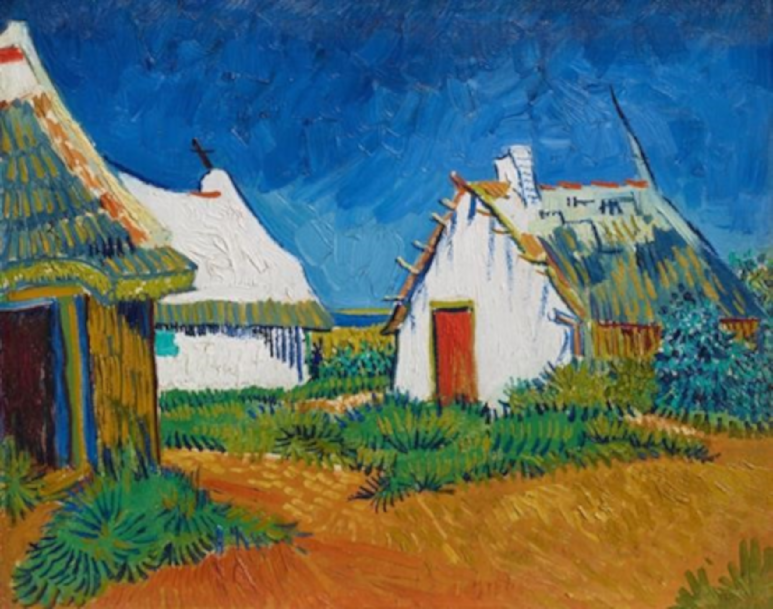
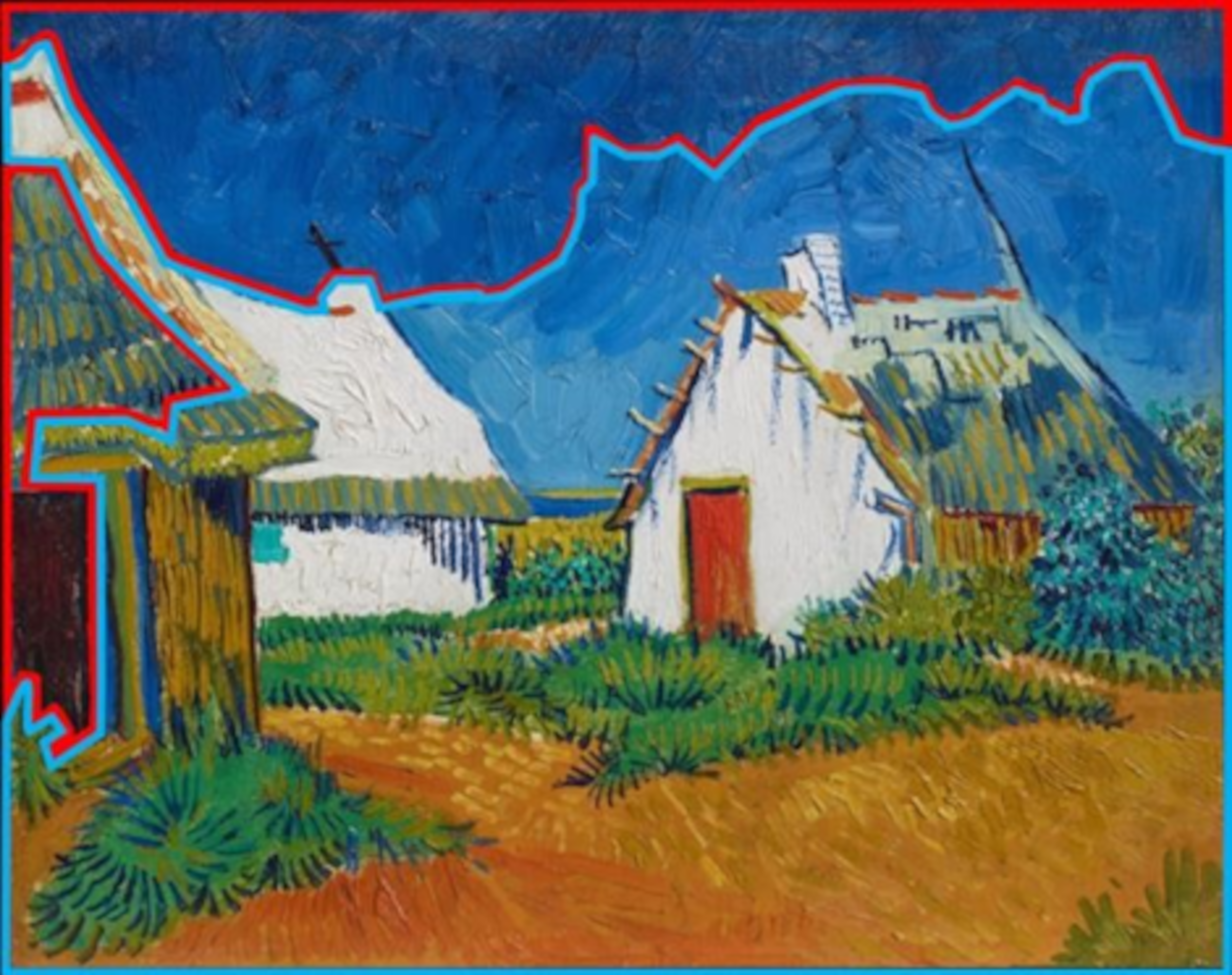
Vincent van Gogh, White Cottages at Saintes-Maries, 1888
In the painting above, the small, dark doorway, dark roof above the doorway and, the dark sky on the left (outlined in red)
balance
the large, bright sky, cottages, and ground on the right (outlined in blue).
(Note: It appears Van Gogh took artistic license painting the left side of the sky darker than the right side of the sky to make the image balance – transforming his visual experience into a beautifully structured image. This is structure and form in practice.)
It’s tempting to think that when Van Gogh decided to create this image, he just plunked his easel down and started recording reality. However, reality rarely (if ever) presents itself in a manner that can be directly transformed into an image that exhibits structure or form. Using these ideas, you can achieve the goal of composing shots on a whole new, exciting level.
To achieve a balanced composition:
- Van Gogh painted the left side of the sky darker
- Deakins (in the shot above) panned the camera slightly to the left
This process can transform the shots in your film into coordinated orchestras – a visual symphony where all parts of your imagery work together in relationship. Using this method in your cinematography can create an immensely pleasurable, magical, audience experience – increasing viewership.
You may be asking yourself, ‘what about the rule of thirds, doesn’t that concept simplify this whole process?’ Yes, it does – too much so. The rule of thirds was an oversimplified attempt to articulate geometrical structure in imagery, coined in 1797 by John Thomas Smith. The limitation of this idea is that it doesn’t account for the infinite sensitivity of the human eye to detect subtle changes. It doesn’t consider the ‘relationships’ of image components working together like instruments in a symphony.
The rule of thirds reduces the myriad of subtle possibilities to a clunky ratio. And, even if putting an object of interest on an intersection of thirds actually helps a composition – this method offers no guidance on how to coordinate relationships between all the other objects in the frame. One can get lucky and have everything work out and/or use beautiful subjects and lighting to carry the image. But, balance affords the precise ability to account for every millimetre of the frame ensuring that all the parts are working together. This precise methodology helps to ensure what you were trying to say when you created the shot, ends up on the screen exactly as planned.
Although the rule of thirds is seductive in its simplicity and, how a super-imposed grid over an image ‘appears’ to be logical – this idea creates new problems and has the great potential of being destructive when composers attempt to align objects with grid intersections – for its own sake. Imagine how homogeneous all of art would look if this rule were used? Many of humanity’s greatest artistic achievements would not have been possible – including the images illustrating this article.
Image balance allows for infinite combinations and flexibility in creating. Every shot can be original and unique. Audiences can be more engaged anticipating what wonderful creative, novel idea you used to compose the next shot. The delight your compositions create becomes one of the reasons audiences choose to watch your movies. Every shot is an opportunity to engross the audience simply using form, structure, and composition – that musicians, architects, photographers, and painters have used. With these methods a movie like, ‘No Country for Old Men’ with relatively few special effects is highly visually compelling.
Watch a two-minute video illustrating how famous fine art painter, Willem de Kooning used balance to create brilliant masterpieces. These concepts have generally been lost since WWII – even in the world of fine art painting (even though de Kooning painted [and Deakins composes] in the post-war era).
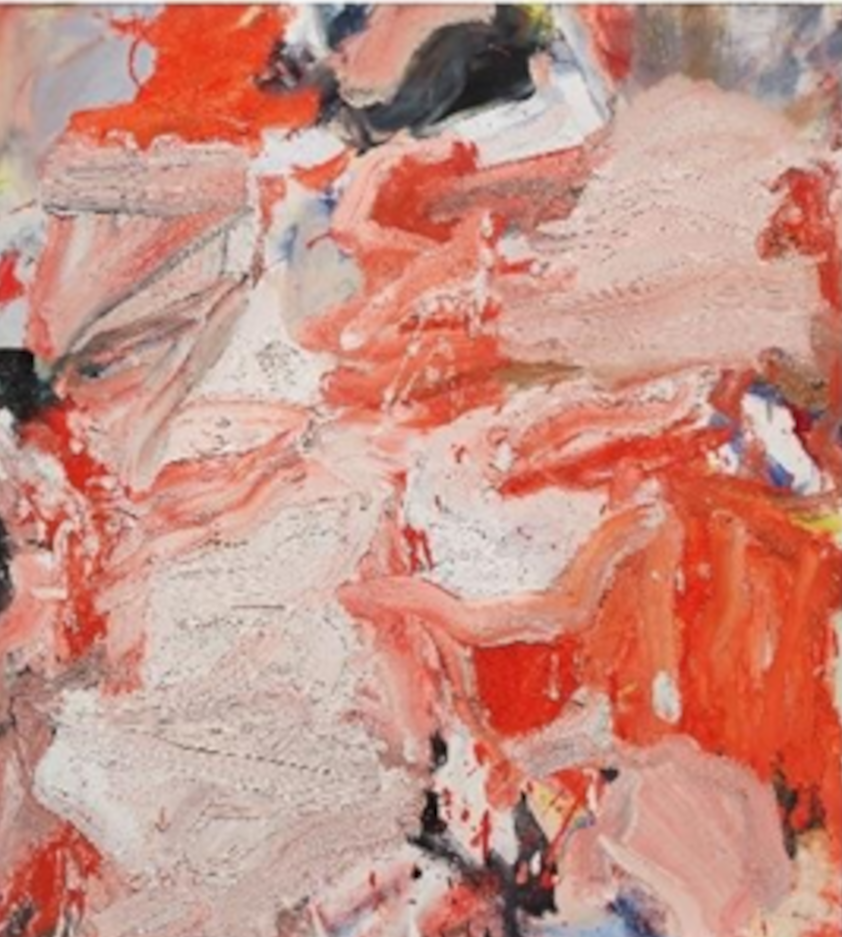
Untitled XXXIII, Willem de Kooning, 1977
Through this article, Mr. Fremes seeks to create a renaissance of these ideas.
What you have seen in this article is the theory of the combined concepts of asymmetrical balance and the brightness/weight illusion in imagery. This article represents one of the first times in history that information about these combined concepts has been made widely available in print (for this I believe the publishers should be lauded for their courage).
Largely, these concepts have only been shared verbally between master painters and apprentices. Having facilitated a workshop on this subject for hundreds of participants,
Mr. Fremes has observed that due to the simple logic of the presentation some participants convinced themselves that they already knew these ideas (although preliminary testing proved they did not).
If you are interested in information about learning how to put these powerful concepts into practice, there is a Zoom based cinematography workshop currently available that Fremes facilitates. ASC (American Society of Cinematography) members who have taken this workshop said it gave them a new articulable language to compose better imagery and collaborate precisely with other crew members about how shots could be improved. For workshop information, contact Paul at: pfremes@gmail.com.
About Paul Fremes: Mr. Fremes is a photographer who sought answers to the secrets of image structure. Although he learned that image balance is a key concept, exhaustive research proved that there is little information about how to use image balance. Fremes spent a decade developing a method that articulates how image balance works and how to put these ideas into practice. Now he’s sharing these ideas to inspire and help cinematographers utilise a methodology that helped classic filmmakers and painters create enduring imagery.