The power of the pen
Class divides and family dynamics are tested in Alice Troughton’s psychological thriller, as a young author becomes a tutor for a writing maestro’s son. Anna Patarakina FSF tells us how she translated Troughton’s vision into The Lesson’s noirish visuals.
How did you get involved with your project and what appealed to you about the story being told?
I was first introduced to director Alice Troughton on the set of the Sky TV series, The Midwich Cuckoos. Alice was the EP and 1st block director, and I was shooting the final block. Though our time together was brief, we connected over our shared interest in visual metaphors and subtext, so I was delighted when Alice contacted me a few weeks later inviting me to read the script for The Lesson. The story immediately captured my attention with its intricate yet measured drama, rich and nuanced characters, and complex themes. Alice and I discussed the potential tonality of the film, and we agreed it needed to be both harrowing and sophisticated.
What was it about lensing The Lesson that appealed to you as a DP?
Alex MacKeith’s brilliant and intelligent script was brimming with references to classical literature, art, and music. It was a joy to read, and I could immediately envision how Alice’s sensitivity and wit would enhance this already intriguing script; it made me want to be part of it. She is a very clever director, and it was an honour to be asked to shoot her debut feature.
As a cinematographer, I’ve had the privilege of working on a wide range of projects, yet I’ve always most enjoyed working on contained, ensemble dramas, as a confined physical space can work to highlight the psychological and emotional experiences of the characters. The script’s incorporation of film noir elements was very appealing as well. I saw it as an invitation to play with the atmosphere, adding to the intrigue and suspense, where shadows and visual motifs can be used to embrace it.
Tell us about your initial conversations with Alice about the look and mood for the film. What was her vision and what new perspectives did you bring? Furthermore, what references did you exchange?
During our initial conversations, Alice and I dove right into the look and mood, taking inspiration from the traditional format of a book consisting of a prologue, three parts, and an epilogue. Our goal was to create an almost tactile experience, evoking the sensation of opening an old book and feeling the texture of its pages.
One prominent theme in the script was the exploration of originality, and the absence of new ideas. The line, “Good writers borrow. Great writers steal,” served as an invitation to fully embrace references to great masters’ work, which provided a sense of creative liberation.
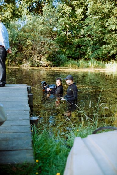
Our creative references spanned a wide range of films. We drew inspiration from classics such as Ingmar Bergman’s Cries and Whispers, Ivan Dykhovichny’s Black Monk and Andrey Tarkovsky’s Mirror. We even paid homage to Black Monk by recreating a dolly-zoom shot by the pond.
In addition, we found inspiration in more modern works like Andrew Haigh’s 45 Years, Sean Durkin’s The Nest, Zvyagintsev’s Elena, and Paul Thomas Anderson’s Phantom Thread. All these films examine the complexity of human relationships and the hidden aspects of our true selves, often exploring the darker side of human nature. We were inspired to highlight the complexities of our characters in The Lesson, hopefully revealing their hidden depths and the underlying tensions that influence their actions. Our goal was to peel back the layers of the human psyche, exploring the profound darkness and vulnerability that exist within all of us.
In addition to film references, we explored the fine art world as well. Alice and I spent a few days of our prep visiting various art and photography exhibitions in London, and later again in Hamburg. I was fascinated by the idea of bringing together different artistic influences to create a visual atmosphere for the film. In my research, I was drawn to the subdued interiors depicted in the works of Vilhelm Hammershøi, with their quiet, almost haunting quality. I felt that these spaces captured the introspective mood of the film and could serve as a source of inspiration for the set
design and lighting.
I was also intrigued by the surreal and dreamlike spaces created by Dorothea Tanning, with their strange and unexpected juxtapositions. I thought that incorporating elements of her work could add a layer of complexity to the film’s visual language, creating a sense of unease and disorientation that would reflect the psychological themes of the story.
During our prep period in Hamburg, I came across the extensive body of work by Herbert List and found it truly inspiring. His elegance when it came to capturing male bodies, in a tender yet dramatic manner, deeply resonated with me.
When was prep and what did it entail?
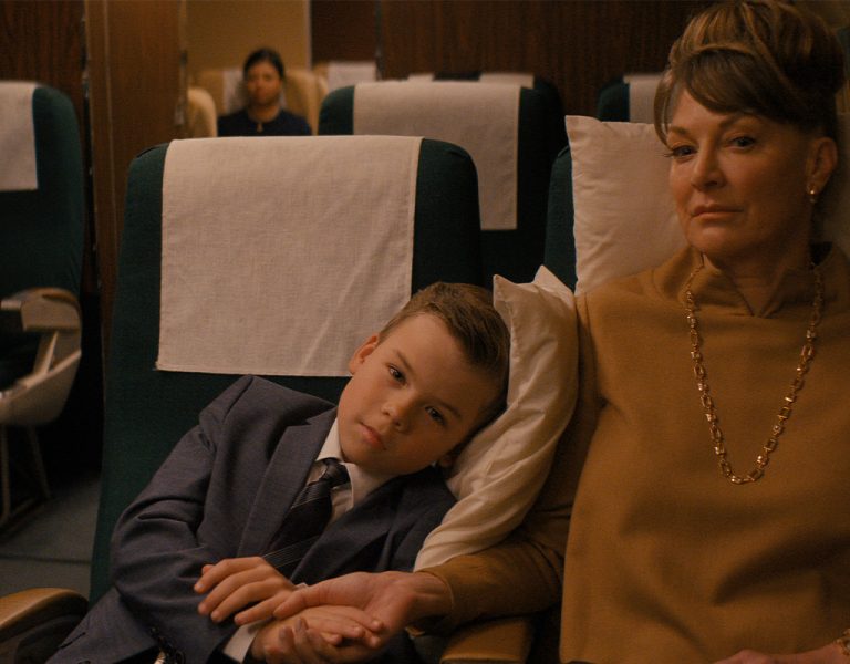
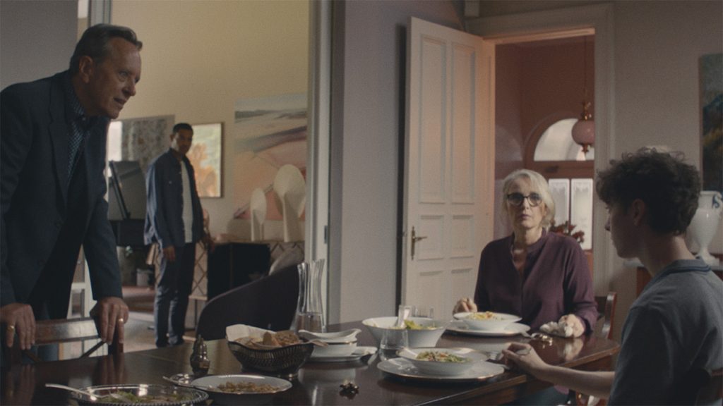
The project took place in Hamburg in May/June 2022. We spent four weeks prepping on location, followed by 22 shooting days. Prior to that, we had a few location scout trips to find the hero house. Since almost the entire film takes place in one space, finding the right house was crucial. First and foremost, the house needed to be believably English as the story was set in the UK. We came across various amazing spaces, ranging from very modern to traditional estates, each with its unique characteristics. There were discussions about shooting interiors and exterior scenes in separate locations, it made sense to keep everything together. I felt it was crucial for the story to be able to shoot characters entering the scene, capturing shots from and to the windows, and connecting all the spaces into one cohesive world.
Along the way, we also developed a goal of combining modern and old-school elements. Sinclair’s character represented tradition and patriarchy, while Hélène embodied a forward-thinking modern art curator. We wanted to incorporate design elements that would reflect each character. We ultimately chose the “Monet house” (named after the look-alike bridge over the house’s pond) as our location. It had an indoor pool, which our talented production designer Seth Turner transformed into Hélène’s studio. Once the idea was proposed, everything clicked for me. We were debating between two spaces, but I had a strong gut feeling about this house that came suddenly and was powerful enough to convince the whole crew. I loved that it had a triangular layout with Hélène’s studio, Sinclair’s office, and Liam’s guest house. This arrangement allowed for constant observation and tension between the characters, as they could be watching each other from different vantage points at any given time.
Production design always plays an incredibly important role in cinematography, and I always strive for a close collaboration with the art department team throughout the process. I cannot imagine a better fit for this project than Seth. He took an empty and somewhat soulless space and transformed it into something truly unique. Since Hélène, played by Julie Delpy, is an art curator in this story, her house is filled with modern art. It’s common in the industry to create fake art for projects, but Seth managed to arrange real pieces from various working artists to be displayed in the film. From paintings to led light installations, photography, and sculptures. My favourite piece of them all was an art installation in Helene’s studio “Machine to Extract Blood from Stone”, the author is none other than Seth himself! It was truly impressive to witness Seth’s multifaceted skills as both a production designer and an artist.
Another special mention is the sculpture of Apollo and Daphne, which was specifically created for the movie. Reading the script I imagined a classic Bernini’s piece, but when I saw the sketches on the art department wall, I became very excited. It became a multi-layered, multicoloured
construction made of acrylic sheets and glass. It was a very exciting process to see the idea growing and turning into reality.
Initially, I had concerns about the eclectic approach to art pieces and the mixture of modern and traditional furniture. I thought it might be challenging to bring everything together cohesively. However, it came together beautifully, far surpassing my expectations, and it was a joy to shoot. The three of us – Seth, Alice, and I – had so much fun studying Cy Twombly’s album and visiting local art collections. It was almost surreal to consider that these experiences were part of our work process. It felt more like a summer art residency. Engaging with the art world in this way added an extra layer of creativity and enriched our understanding of the visual language we wanted to bring to the film.
It was incredibly rewarding to work so closely with Alice during the pre-production phase. She is someone who has a profound commitment to authenticity and is receptive when presented with ideas, so the time we dedicated to watching films and exploring various art pieces were critical to our discussions about the characters and their story arcs. For me, it is crucial to grasp the director’s interpretation and vision for each scene, as we all bring our unique perspectives and experiences when reading scripts. By understanding Alice’s perspective and aligning it with my own, we were able to establish a solid foundation for our creative collaboration. It’s extremely helpful during the shooting period when things tend to change and a quick shared understanding of the priorities is paramount. It allowed us to adapt quickly and make informed decisions, ensuring a smooth workflow on set. Every project is unique, and the pre-production phase is rarely linear. Despite meticulous planning, sometimes the most influential part of our preparation was simply sitting by the pond of the house, immersing ourselves in nature. These moments allowed us to tune in with each other and find inspiration beyond the confines of traditional planning.
Tell us about your camera package. Which camera(s) and lenses did you use and why? Which rental house did they come from?
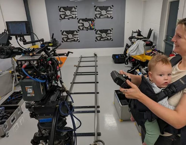
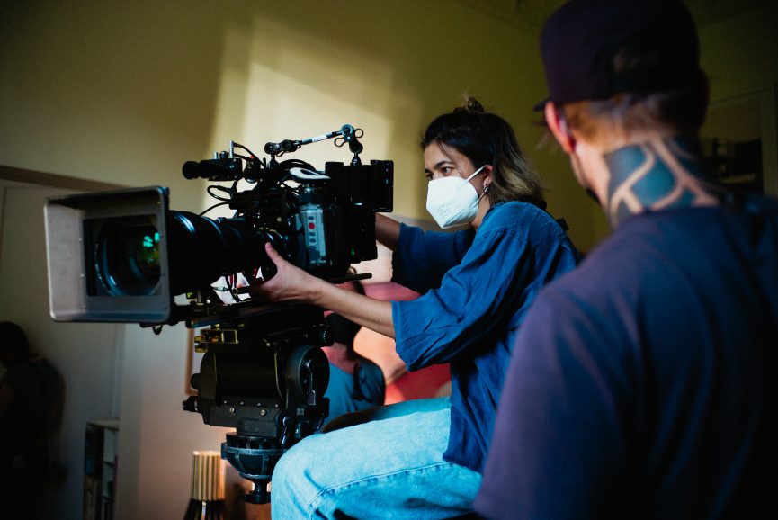
Originally, we planned to shoot on 16mm film, but due to various circumstances, we had to opt for a digital approach. We decided to use the ARRI Alexa Mini in S16 mode along with Zeiss Super Speed S16 lenses and two Angénieux zoom lenses, the 25-250 Optimo Style T3.5 and the 17-102mm Angenieux HR T2.9. Camera equipment has been provided by Cinegate Hamburg.
Although I initially had concerns about limiting sensor choice, I believed this was the right choice for the film. I am a fan of the halation effect and wanted to maximise it using the available tools. These lens choices provided a soft and timeless look right from the source, and we further enhanced it during post-production with the expertise of colourist Vlad Barin.
I managed to do two camera tests during the prep, both on the set. I knew that Alice is wary of specific green tones and with many scenes in the summer garden, it was important to find the right balance. For the first test, my long-time collaborator, colourist Anton Meleshkovich, made a LUT based on my references, that addressed troubled greens, setting the direction for the movie colour palette. Equipped with the footage, I came to Toby Tomkins, who created a bespoke shooting LUT. It was very responsive to the colour temperature shifts, which made it fun to work with natural light and get nuanced with the colour contrast of artificial sources.
The second camera test was mainly for the costumes. It’s a real luxury to get cast members in the costumes at the shooting location before the actual shoot. I find it invaluable. It’s almost like a bonus shooting day, where you can quickly test what works, and what doesn’t and get inspired for the following days. It also helps secure a more intimate relationship with the cast.
In post-production, Vlad took over and crafted the film’s definitive look. Having worked with Vlad before, I had complete trust in his sensitivity and knew that he would handle the footage with great care and attention to detail.
Vlad explains: “The intention was to achieve a timeless look that sat in line with the design and that worked well with the emotion of the story. As Anna shot digitally in the 16mm cropped sensor more there was no debate about doing some film emulation. I achieved this by building under a P3 print LUT and doing quite a bit of texturing work – as the image was already quite soft it was mostly through sharpening faces and adding a bit more grain to increase the perceived sharpness. We also paid close attention to the green shades of the foliage and dropped and also dipped the black quite low to accentuate the tension between the characters.”
What was your approach to camera movement in your series/film, especially to create tension and atmosphere? What was your approach to framing and composition? Were there any new tricks or techniques you used in lensing this series?
In approaching camera movement for our film, our primary goal was to create tension and a sense of unsettlement. During the shooting process, we experimented and refined our approach, discovering that slow, pensive zooms allowed us to gradually reveal or emphasise certain elements within the frame. I’m pretty sure I’ve started to dream in slow zooms during this job. Additionally, we found that dolly push-ins were effective in intensifying dramatic moments. The gradual, controlled movement added a layer of dynamism to the visuals, enhancing the overall atmosphere of the film. As with any creative process, our approach to camera language evolved as we explored different techniques and discovered what worked best for each scene.
Alice and I both shared a mutual desire to be bold with camera blocking whenever possible. Could we leave the entire scene playing on one long lens on a long track? Absolutely. Could we let the camera linger on the closed door for a good 10 seconds? Yes. These decisions may not sound particularly adventurous, but they truly were on the day.
In our vision, the camera did not function as a character per se, but rather as a reader of the book. Its role was to observe and interpret the events, much like a reader trying to decode the intentions of an unreliable narrator. This perspective became the main motivator for the camera movement. Plus, the original book structure dictated some of the decisions. We knew we wanted to incorporate repetition of the bookends – a similar scene of arriving and leaving the house. However, in the final scene, we positioned the camera lower in relation to Liam, intentionally giving him more weight and gravity on screen. This adjustment emphasised his newfound importance in the story.
I’m a big fan of frames within a frame and any sort of reflections. The beautiful house we filmed in provided the perfect opportunity to explore and appreciate these elements fully.
As for my preferred tools, I typically gravitate towards a more dynamic camera style and incorporate a lot of handheld work. Therefore, working on The Lesson presented a challenge with its emphasis on controlled movement and ensuring that each scene remained visually compelling and engaging. Watching a scene on a static shot makes you notice a million little flaws in your composition and lighting, which can be a painful experience. My local crew was teaching me a German word a day, but I think day one was the most prophetic one: “Verschlimmbesserung” is an attempted improvement that actually makes things a lot worse. It’s important to strive for perfection but it’s an impossible goal. Finding peace with stillness and accepting imperfections was a growing experience for me.
We used Cinefade in a slightly unorthodox way for the flashback scene. By rapidly triggering the control, a slight flicker of delay, which combined with the pulsating depth of field resulted in an unusual pulsing effect. I originally discovered this technique during the shoot of Midwich Cuckoos, where it served as a magical element. Alice liked it, so we were keen to utilise this tool again, as it felt suitable for capturing a childhood memory glimpse, almost like an old family tape.
Take us through your approach to lighting The Lesson. What were the biggest lighting challenges and was there a scene that was especially tricky to light?
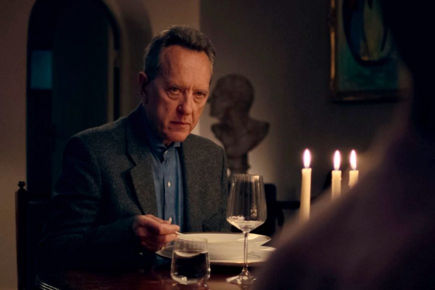
It’s hard to recall if we had any rules and approaches to the light, as it always felt like an exploration. I loved working with my gaffer Stefan “Fahle” Meese. We both are playful when it comes to using tools, so almost every day we tried something new. Night scenes inside the house were mostly lit with LED sources pre-rigged in the top corners with additional help from the floor. Since we saw out into the garden, we placed a 4k helium balloon deep in the background acting as a moon. Due to the very short nights in June, we played the dinner scene as “evening” that we shot during the day. We heavily gelled the windows and avoid seeing the sky when possible.
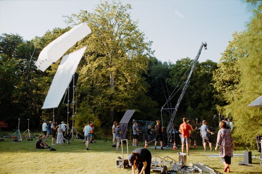
The main problem and challenge of the shoot was shooting scenes towards the sunlit garden. Naturally, the weather was very inconsistent, so we needed a strong and controllable source to balance the light levels indoors. Unfortunately, our schedule meant we needed to shoot inside and outside most days, so it had to be a mobile construction. We ended up building a rig that can be removed relatively quickly, letting us play with different ways to push in hard light. Some days we went for Dinos with CTB correction; some days we chose 4k HMI sources to recreate a hard sun effect. Sometimes I worried the light was too clean, so use textile or dingles – tree brunches or glass – to break it off. However, for the post-fight conversation between Julie Delpy and Daryl McCormack, I found myself staring at the wall, which was evenly lit, and trying to figure out how to add anything interesting to it. “Apollo and Daphne” became an inspiration. I realised it can be a motivation for the colour snippets on the wall, so we cut out random pieces of gel and placed them on the window.
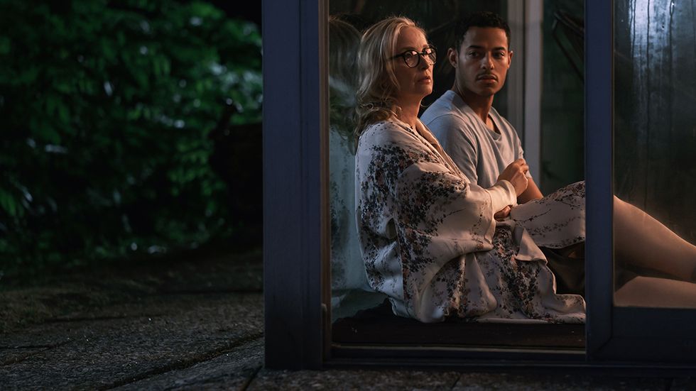
Another playful moment was when Liam was writing through the night. We wanted to create a special effect and decided to take things a step further. We placed a 10k light on a crane outside the window, effectively simulating sunrise in motion. Occasionally, we drew from our film noir toolbox and embraced a more dramatic lighting approach. For example, in the night terrace conversation, we wanted to create a contrast between Helene stepping in from the darkness into a small pool of light, resembling a glow from a house window, while Liam remained in the soft, bounced light of the night.
Collaborating with Fahle, with his creativity and engineering mindset, was an absolute joy. We encountered a particular challenge one day when we needed to shoot a small pickup scene by the bridge, which was intended to have an overcast or rainy atmosphere. Unfortunately, luck wasn’t on our side, and we were met with the brightest sun instead. Given the narrow space of the bridge and the need to diffuse the harsh sunlight, Fahle and his team came up with a beautiful solution. They built a sail system that stretched across the pond, using a diffusion textile to effectively soften and control the light. It was a truly elegant and effective way to address the task at hand.
What are you most proud of from your work on the film?
This project will forever hold a special place in my heart. First and foremost, I’m happy that the set was filled with joy and that we had a fantastic crew to collaborate with. I’d like to mention my great camera team: 1at AC Boye Klüver, 2nd AC Rouven Wendland, grip Christopher “Krabbe” Saß, grip assistant Jonas Neugebauer, DIT Konrad Kelch, and video op Luca Uchtmann. The positive energy and teamwork contributed greatly to the overall experience.
I’m particularly proud that Alice’s original visuals and vision were effectively translated onto the screen. We worked diligently to ensure that the intended look and feel of the film were maintained throughout. It’s rewarding to see our efforts in a final product that captures the essence of Alice’s creative vision. I believe we’ve managed to capture some amazing performances and I hope that visual storytelling only enriches and elevates them. Some jobs are hard and stressful, and this one really wasn’t that for me and I only hope it shows on the screen.