A MUSICAL ODYSSEY
Innovative techniques from Paul Guilhaume AFC shaped the visual storytelling of Emilia Pérez, enhancing the film’s emotional depth and impact.
Just as notorious Mexican drug lord Manitas Del Monte (Karla Sofía Gascón) undergoes gender confirmation to become Emilia Pérez, filmmaker Jacques Audiard explored various iterations of the project over four years of preproduction. Cinematographer Paul Guilhaume AFC witnessed Audiard decide to blend two contrasting visual approaches to create a gritty operatic crime drama. “They discovered when writing the script for Emilia Pérez that the music had to be occasions where the people realise something and express it through a song,” explains Guilhaume. “This is why Jacques wanted to film those songs as moments in the story. For example, in the first big piece, he wanted to throw the camera inside the market and create a lively world with people buying fruit or selling items, integrating Rita Moro Castro [Zoe Saldaña] singing and dancing. The camera itself would almost be like a documentary.”
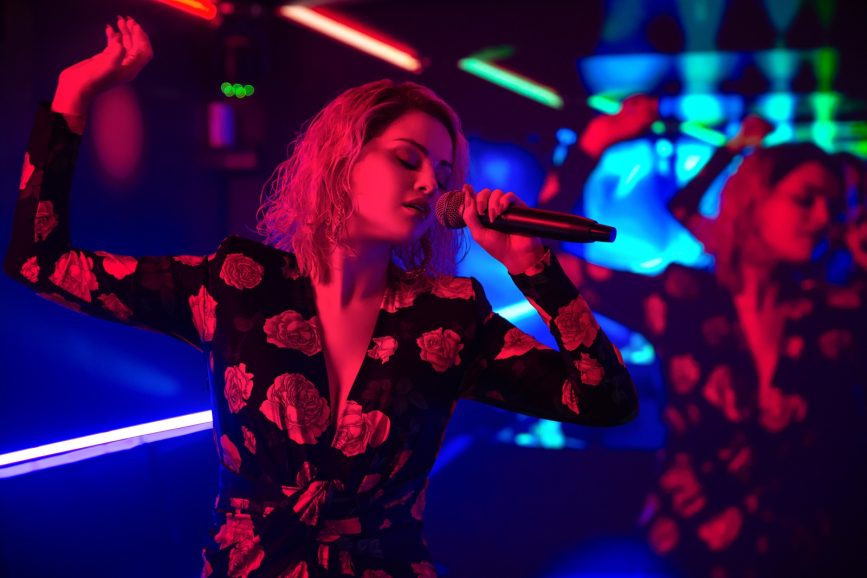
A year before principal photography, which spanned 55 days in a studio outside Paris and 10 days in Mexico, the music was close to the final version. “We were in a big room with 50 dancers, trying to cut the musical moments into pieces,” states Guilhaume, who used an iPhone and DJI stabiliser to help time the shots. “The first take goes from here to here. The second one goes from there to there. On the shoot day, the only difference was 150 more extras, but the whole thing was already edited.” The first act occurs entirely at night to set up the daylight that reveals the reemergence of Manitas Del Monte as Emilia Pérez. “I aimed to create an image with substantial pitch black, dividing it into three parts, each with absolute white, enhancing the black’s intensity. The daylight scenes reflect the arc of love in Emilia’s story. Jacques wanted something joyful, so I introduced light without jeopardising the film’s overall look. The last act fades to a much more matte night, exploring the lower limits of the signal.”
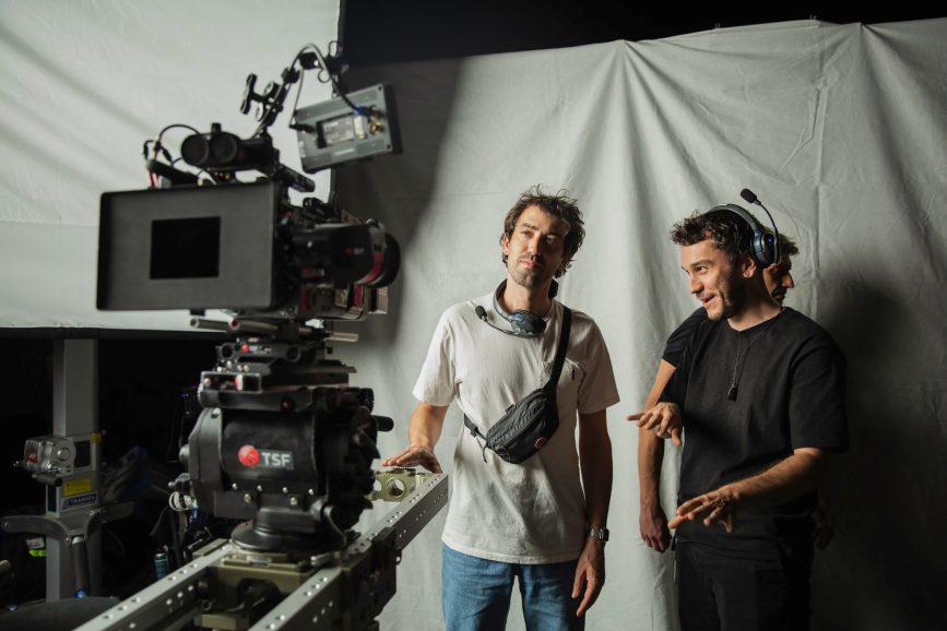
Almost 400 shots were captured with a bluescreen element, while others were shot against a black background or in the streets of Mexico using a compact RED Komodo for rig shots on a bicycle and car scenes. “We aimed to unify everything through consistent camerawork and colour grading,” remarks Guilhaume, who used two Sony Venice 2 cameras on set with Tribe7 lenses. “The camera is handheld and close to the characters. When there’s a wide shot, it must happen at the right moment to have an impact. In post, we maintained a constant colour palette with a strong LUT, darkening reds and avoiding pastels. When Zoe Saldaña is in the clinic and at the fundraiser gala, the camera must elevate the movie. It often involved a 20mm or 27mm on a Steadicam with dynamic movements executed by my camera operator Sacha Naceri.”
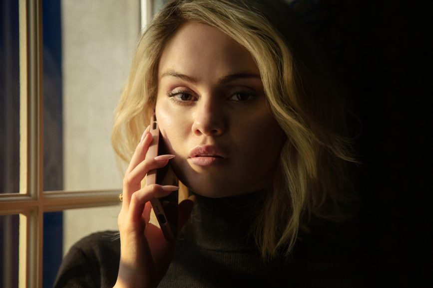
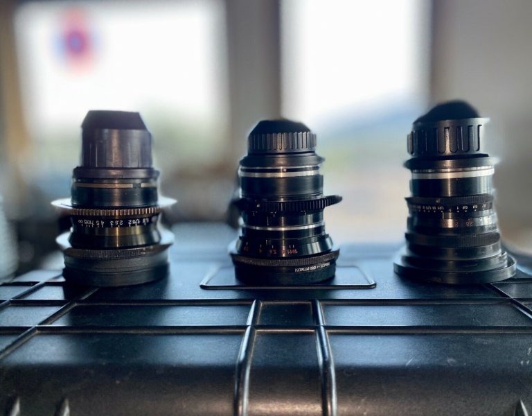
Studio and location shooting present opposite challenges. “In life, you remove elements to create an image that holds together. In a studio, everything you envision may not be present, so you have to bring life to each shot,” states Guilhaume. “We used focal lengths from 12mm Signature Prime and the Blackwing7 T-Tuned 20.7mm to 137mm, including long lenses like 800mm. The 27mm was for scenes, and 47mm for portraits.” The aim was to achieve a shiny image, necessitating that the two cameras remain close to each other. “The two cameras were always near one another. We’d shoot two sizes and then reverse in the same manner.” The amount of camera movement contrasted with the action in the frame. “When scenes felt too stiff, Jacques would request handheld camera work.”
All lights needed to adjust during shots, necessitating the extensive use of the MA lighting grandMA lighting console. LEDs served as the favoured light source, with Maxi Brutes and some 10K Fresnels providing sunlight within the studio. “Jacques realised that there was a person capable of changing and moving the lights in time with certain spoken words, which he used extensively in his blockings, facilitated by the LEDs.”
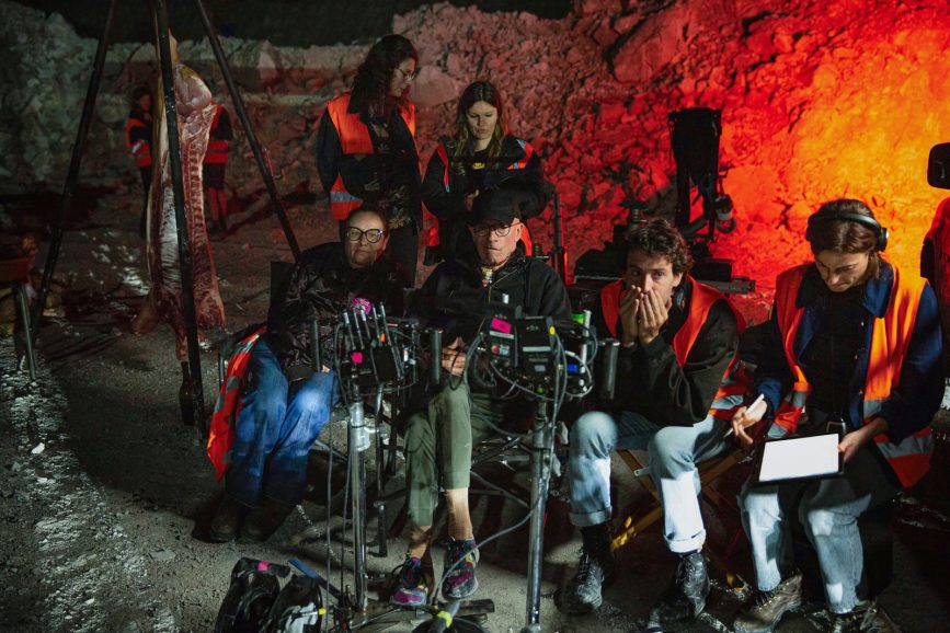
Each scene features a key image. “This image could be a face in the dark lit by a flashlight or a hand without fingers,” notes Guilhaume. “We worked from a collection of images that would flow one after another, allowing freedom in shooting, such as handheld shots without over-composing each frame.” Fifty percent of the colour grading focused on breaking the image’s definition. “The main reason I sought Arthur Paux as my colour grader was his ability to manage texture effectively. We layered the image to eliminate any sense of crispness, as I wanted to avoid that. The less definition, the more contrast can be added while still looking natural. We aimed to reduce microdetails and enhance micro-contrast using various tools at Arthur’s disposal.”
For the gunfight scenes, foreground and background elements were captured separately. “We recorded music and singing in the foreground while background shooting occurred. One take had a bluescreen separating the room, and in another take, we removed the actors and filmed background action. Sometimes, the background was slow-motion while the foreground was at normal speed. These effects are almost invisible but enrich the scene on a subconscious level.”
