
Out of Darkness, Cometh Light
Across The Pond / Mark London Williams

Out of Darkness, Cometh Light
Across The Pond / Mark London Williams
Lead image: energaCAMERIMAGE winner The Favourite
The calendar change from December to January is always redolent with contradiction - the wistfulness and yearnings of fall, giving way to finality, the endings, of winter. And then of course, a “new year” comes.
“Hollywood” - in its broadest metaphorical sense (thus including the BAFTAs) - runs on a similar cycle, waiting to see which films “make it through winter,” storing accolades like nuts and berries, toward award season’s climax in early spring.
But of course, there are also endings and loss, and the film world experienced two significant ones recently, with the passings of directors Nicolas Roeg and Bernardo Bertolucci. The Guardian recently wrote a compelling piece on both directors, and the ‘70s-era “transgressiveness” they brought to their films.
Bertolucci, the article acknowledged, may have his various accomplishments permanently tainted by what happened on the set of Last Tango in Paris. But that’s beyond the purview of this column, nor does space allow a thorough review of Roeg’s work as director, which includes two films hailed as among the best to ever come out of the UK: Performance and Don’t Look Now.


What is in our purview - even from “across the pond” - is how Roeg got his start: Specifically, as a cinematographer. He did second unit camera on no less than Lawrence of Arabia, and shot films like Fahrenheit 451 and and the great Vincent Price-starring Masque of the Red Death. He wielded the camera on a couple of his own projects, too: the aforementioned (and co-directed, with Donald Cammell) Performance, and the notable outback-set coming-of-age tale, Walkabout.
And if it’s not quite an irony, what’s notable is that Roeg became more notable, once in the director’s chair, for his editing. As with his contemporary Sam Peckinpah, albeit in different genres, he played with time, and its manipulations - and how we make sense of what is “before” and “after” in the emotional fabric (and sometimes literal sequence) of a life.
Yet one can tell he didn’t entirely leave his DP’s sensibilities behind him: Compare those saturated colors - especially the reds - in Masque of the Red Death, and that later horror masterpiece, Don’t Look Now.
Color was also very much on the mind of storied costume designer Sandy Powell, who talked about putting a certain legendary nanny in red for Mary Poppins Returns. We caught up with her and production designer John Myhre during a press event for the film. Cinematographer Dion Beebe was back in Australia, filming a biography of singer Helen Reddy, but he was still very much in everyone’s thoughts as they described their various collaborations.
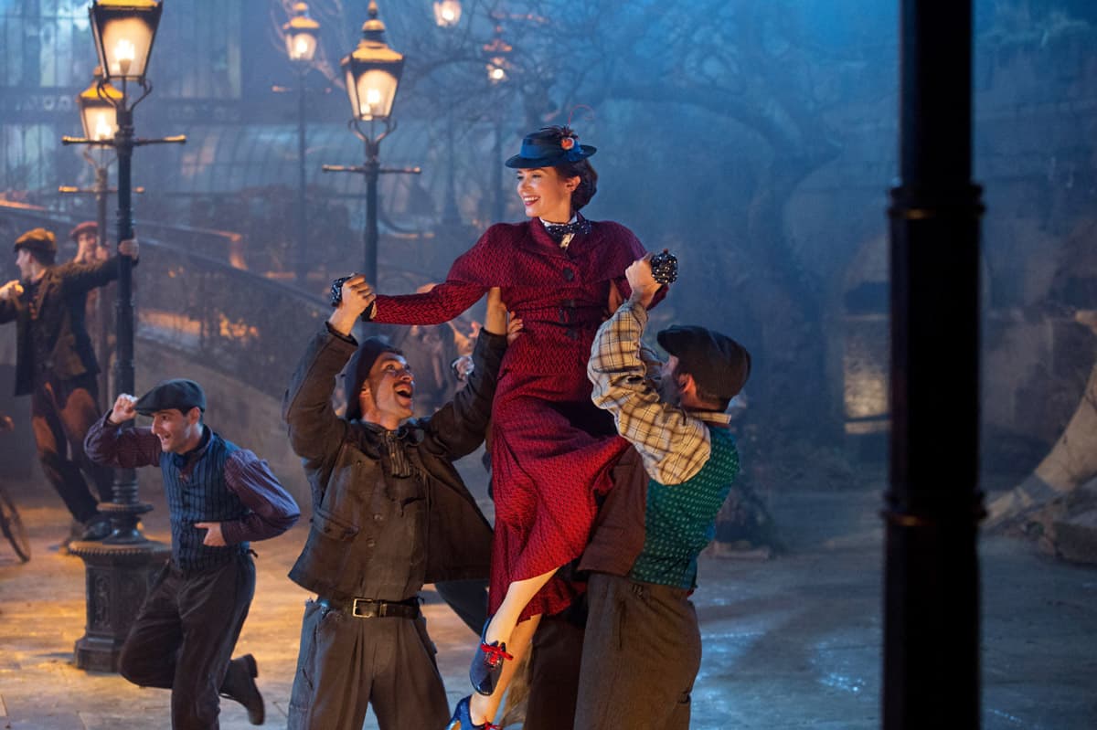


Powell talked about “thinking the whole time of textures and colors, things that would show up in low lighting, as well as how things are going to look brightly lit.” As for the red, she’d swapped out the blue that Emily Blunt, as the iconic Mary, had been wearing, for the more fiery color better seen in a culminating dance number staged at night. Fire was also on Myhre’s mind, as he talked about the need to redesign the movie’s 30’s-era gaslights.
“We worked very closely with the City of London, and with Dion,” he recounted. London currently has around “2500 working gaslights - but they’re all modern gaslights.” So they created their own “correct to the period.“ And then lit them up “so proudly,” only to have Dion say: “John - it’s not bright enough.”
The solution was to develop new lamp heads “with Dion and his lighting team… a hybrid of a gas flame, where it would be - then up in the hood of the lamp, electric lighting, which would give up enough light to give Dion what he needed.”
But working with period light - and with Sandy Powell - wasn’t unique to the latest Poppins. Production designer Fiona Crombie, of the highly touted period piece The Favourite (though a much earlier period - the 18th century England of Queen Anne), confirmed that Powell “is so experienced - she knows what’s going to work” when it comes to light.


Powell and Crombie also collaborated with director Yorgos Lanthimos, and DP Robbie Ryan, with Crombie noting that the ideas behind the cinematography were “what really informed what I was doing as a production designer.”
That included sequences that used a fish eye lens to capture nearly 360 degrees of a space, dictating how she was “creating rooms, how many objects I was putting in it,” all while leaving “capacity for Robbie to be ‘swinging around.’”
And not only swinging around, but one-upping Barry Lyndon, given that the entire movie “only used candle light, fire light. (That was) another big part of the collaboration - I insisted there was no artificial light.”
That meant “we had to build in to our production design how to justify candelabra after candelabra,” since in reality, there weren’t that many in a given room, even a Queen’s, circa the early 1700s. Certainly not enough to light the 35mm film Ryan was shooting on - even with the 6mm Primo lenses he was working with to take in the full scope of Crombie’s designs, along with the “designs” all the characters at court have on each other.
The surprising use of film in low-light contexts was also found in what has remained another year-end “favourite,” the deftly-made horror thriller A Quiet Place, starring Emily Blunt in a decidedly non-Poppinsy role, and co-starring, and directed by, her husband, John Krasinski. It was shot, of course, by Charlotte Bruus Christensen, who has been not only a roll on both sides of the pond, but was interviewed at greater length earlier in the year on the magazine side here at BC.


We caught up with her recently, however, to ask how her journey has been since then, with the film starting as a project that her friend Blunt suggested she do. They’d met while filming The Girl on the Train, with Blunt saying “‘let’s bring our families to upstate New York and make this movie.’ It was supposed to be a small project.”
Christensen thinks this “small project” - essentially a chamber piece with four actors holed up in a farmhouse - has resonated because it’s “also about fear,” as well as how families cope with that - sending your child to school, or a concert, and not being entirely sure if they’ll come back.
In the case of Quiet Place, it’s a world invaded by Lovecraftian creatures who hunt by sound - so to stay alive, you can’t make any.
Meanwhile, as with her counterpart Ryan, there was a frequently fire-lit third act, set “all (at) night, in the middle of nowhere, so it’s an obvious digital movie,” she notes, while adding that of course she wanted to shoot instead on film.
“We managed to convince the producers,” she notes wryly, who told them “‘you’re taking on a lot of responsibility.” She also noted the color red was an important visual thru-line for the film’s denouement, which was filmed - like the rest of the story preceding it - on Panavision Millennium XLs, with Anamorphic C series lenses. And yet, being the intimate movie it was, she “needed to get close” to the actors.
She credits Dan Sasaki, Panavision’s Woodland Hills-based VP of Optical Engineering, with changing the close focus on a couple of the lenses she used. “We just had the freedom to dig into this, to make room for the poetic moments and the scary moments.” And the audience and critics continue to respond to the “fearful symmetry,” as William Blake might have said, of such compelling, frightening verse.


Of course the calendar’s end also brings films seeking to find audiences in ensuing years. That feeling is perhaps no more palpable than at the American Film Market, a fall event that originally, in its pre-internet origins, served as a way for a lot of non-studio films to get seen and pick up “foreign distribution,” as folks needing “content,” as it wasn’t-quite-called-then, would fly over and see what rights for exhibition - and later videocassette! - could be snapped up. This writer first saw Blood Simple, by an unknown team called “The Coen brothers,” at one such market.
This year, we had a brief but amiable chat with writer/director Brian Cunningham, and his producer Nic Brown, hailing from Louisville, with their lost-in-the-woods tale Wretch (images below), with a fairly haunting trailer, shifting from found-footage to “third person” perspectives. But their strategy and toolbox matches many of the larger indie films we’ve written about here.


“The found-footage was shot with a prosumer JVC with a servo-zoom—the most ‘consumer-ey’ camera I could find that would still shoot in prores 4:2:2,” Cunningham told us. “For the cinematic parts I shot with the Sony FS7. The first shots with this camera are color corrected to match the JVC so that the shift in perspectives is subtle and maintains that ‘docu-drama’ feel. As the movie progresses, and we use the JVC less and less, the color/treatment on the FS7 becomes more cinematic.”
They also went from blending in “found” iPhone 7 footage to using Ronin stabilizers as the movie becomes more overtly “cinematic” - the latter being “shot in 4k and the found footage stuff at 1080. We settled on the 2048x858 resolution which meant we needed to slightly uprez the 1080p footage and downrez the 4k footage. It also allowed us to do some interesting slow zooms that let me play long scenes in a single shot and create a “70s” vibe.”
“70s vibe” being where we came in this month, with our remembrances of Mr. Roeg, for whom shooting on film was the only option you had, and cameras and telephones were still distinct devices.
Next month, a rondele of open houses, more digits, and a look at another signal cinematographic achievement, as the ‘70s edged into the ‘80s.
But you can find us in the meantime: [email protected], or @TricksterInk
