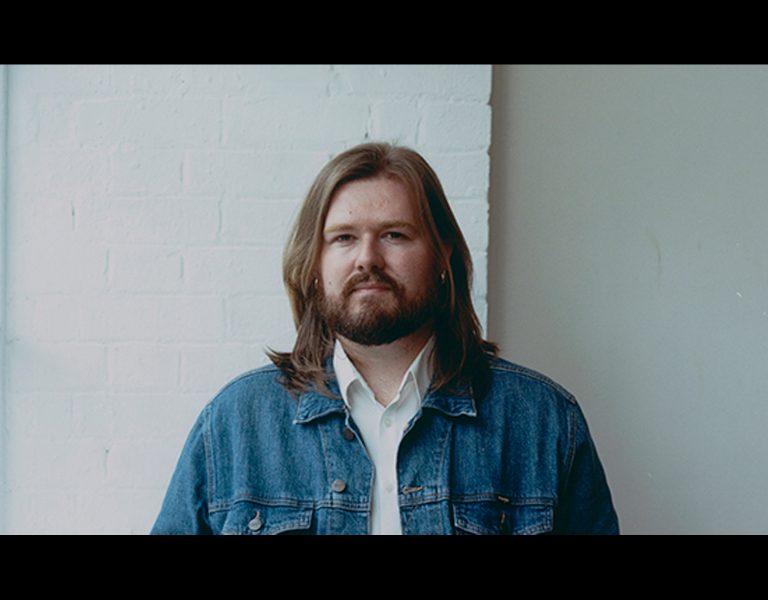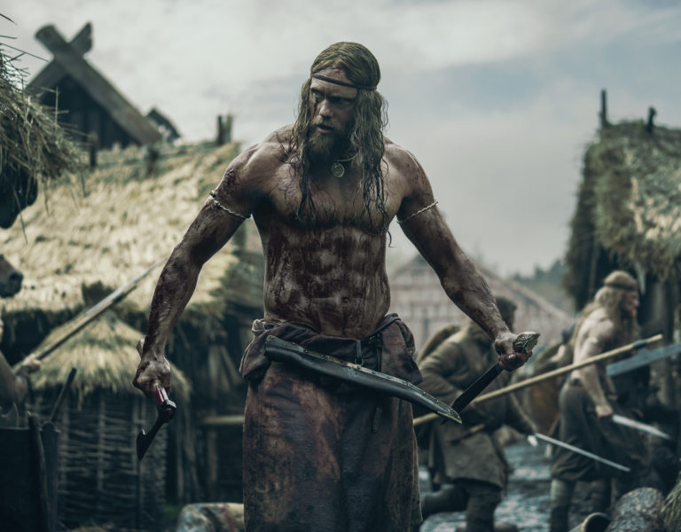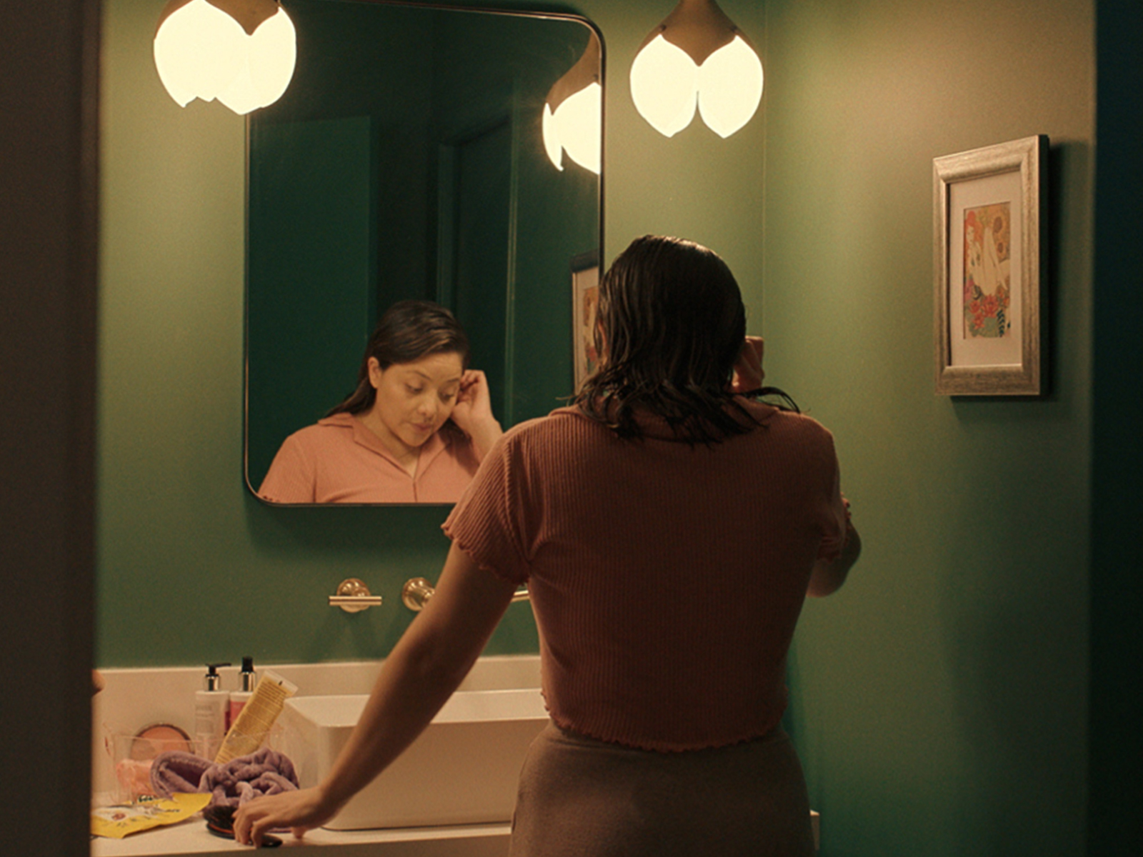
Now streaming on Netflix, Mo comedy series was directed by Slick Naim and DP’d by Timothy A. Burton. Colour grading and finishing was done at LightBender Post in Santa Monica by Juan Cabrera and Fran Lorite deploying SGO’s full-finishing and colour grading solutions Mistika Ultima and Boutique.
For LightBender’s founder and senior colourist Juan Cabrera, the series Mo is already the eighth project where he collaborated with cinematographer Timothy A. Burton. “It feels like coming back home. I am very comfortable with his style of filming and our communication is always excellent, so it was a very exciting thing from the get go. Because of schedules and Covid situation, all the work had to happen remotely. But even with that, we barely had any colour notes throughout the process. Working with the director (Slick) and the creator of the show (Mo) was an absolute pleasure.”
Unconventional cinematic look inspired by Syriana and Texas
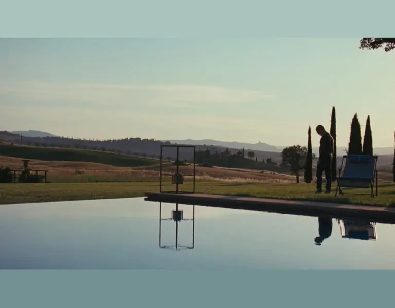
‘Mo’ is a semi-autobiographical series inspired by Mo Amer’s life as a Muslim refugee growing up in Houston, Texas. Despite the fact that the series is a comedy, Juan and Timothy wanted to stir away from the typical “all bright and colourful” look to develop a much more cinematic feel. “We approached this project more like a thriller, with density, and smart colour separation. We wanted the story to feel grounded, but without losing completely that veil of fantasy. For this, Tim used some creative LUTs on set, that we used as base to create our master look for the show. From there, we worked each sequence like its own little world, but with the primordial look in mind. Finally we added a layer of film-grain to complete the look.”
In the series, there are two main aesthetics – one illustrating the present where the main story unfolds combined with Mo’s childhood memories. For the first one, Juan and the team wanted to feel the heat of Texas, so warm tones were a constant, usually compensated by greens and a few sparks of blue. “The contrast had to be a common element too. Not to the point of losing shadow information, but enough to bring up textures and create expressive images.”
For the flashback sequences, feature film Syriana was one of Juan’s mental references. “Funny enough, it was more my memory of it. When I went back to watch it, the movie is way warmer than I remembered,” described Juan and added that they did not aim for the conventional nostalgic flashback feel, but they wanted it to be stark and gritty, even dangerous. “The atmosphere of the sequence where the family is at their house preparing to flee the country was almost completely created on the camera – only little tweaks such as blooming in highlights and heavy grain was added later,” said Juan, adding that the real challenge was achieving that same effect of the extreme look on other sequences that were captured in a more traditional way. “At the end I think we managed to keep that consistency, even though some shots have fifteen layers with five different selections.”
Mistika’s Bands to control lower lights
The comprehensive and wide selection of different colour tools offered in Mistika proved very useful for Juan and Fran. “I honestly think we used every single colour tool available. We are big fans of the Bands to control middle contrast and lower lights, and make sure the information is not lost. The same goes for highlights and the fourth HDR ball in the Primaries. The Proportional Hue Selection tool was also used extensively. Either to bring back spikes of colour, create separation, or bring colour into the Outside of the selection. The show was delivered following the full Netflix IMF workflow in 4K HDR so we did quite a lot of HDR-Specific colour too!”
Towards the end of the process, the team ended up doing the title design for the entire show and creatively experimenting, so the Comp3D, Text, and Animation tools also turned out to be a perfect complement to the colour grading toolset.
Totally non-destructive colour pipeline
For this series, creatives worked from the camera native colour space, Alexa Log-C Wide Gamut. “For Mo we had a Master HDR delivery, so we designed the colour pipeline to be completely non-destructive, even while using LUTs, to ensure we were keeping the full latitude of the image at all times and throughout all processes.” For the HDR general peak brightness was 600 nits, with sporadic 1,000 nits sparks; Most of the show sits around 150-250 nits and was mastered on the Sony BVM-X300/2 monitor.
Flexibility as a key workflow ingredient
LightBender Post team deployed their internally-developed workflow to be able to provide editorial with as much time as possible to do the best possible cut. “In this project we had the additional challenge of certain things being changed almost until delivery day, so being able to constantly chase the cut in a reliable way was fundamental. In fact, towards the end, there were three episodes that had major edit changes (to the point of changing sequences from one to another) and we were able to follow through with ease. Including SDR Colour Grading, HDR Colour Grading, and Dolby Vision metadata trims!”

