Timeless Tales
Haris Zambarloukos BSC / Cinderella
Timeless Tales
Haris Zambarloukos BSC / Cinderella
BY: Ron Prince
The $90m production of Cinderella is Disney’s 2015 live-action remake of its own classic 1950 animated cartoon. Directed by Kenneth Branagh, from a screenplay written by Chris Weitz, is was produced by David Barron, Simon Kinberg and Allison Shearmur for Walt Disney Pictures, and was lensed by cinematographer Haris Zambarloukos BSC.
The story is inspired by the original Charles Perrault fairy tale of Cinderella, and borrows many elements from Walt Disney's original animated musical film of the same name. It is understood that the box office success of Tim Burton's Alice In Wonderland, the second-highest grossing film of 2010, earning over $1 billion at the box office worldwide, inspired Walt Disney Pictures to develop a live-action adaptation of Cinderella. But the new production is not the revisionist fare that many other modern reworked fairy tales have served up. Classic, timeless and authentic are the by-words for this production.
Shot on 35mm celluloid, the film stars Cate Blanchett as Lady Tremaine (The Wicked Stepmother) with Lily James in the title role as Ella ("Cinderella"), Richard Madden as Prince Charming, Sophie McShera as Drizella, Holliday Grainger as Anastasia and Helena Bonham Carter as The Fairy Godmother.
Principal photography began on September 23, 2013, with production occupying several stages at Pinewood Studios, including the mighty 007 Stage which housed the ballroom, kitchen and attic sets, and encompassed shoots at treasured English locations such as Blenheim Palace, Windsor Castle, the Old Royal Naval College in Greenwich and Black Park.
Ron Prince caught up with Zambarloukos over Skype, and a cup of tea, to discover more about his work on bringing the movie to the big screen.
Is this new movie a revisionist reworking of Cinderella?
HZ: No quite the opposite. This new version is a classic retelling of the Cinderella story. Within that, it was a very serious proposition. Shooting Disney’s live action Cinderella came with a great responsibility that we took very seriously, especially as this property has remained as a much-loved animated movie for over 60 years. When I had my first meeting with Ken and David, we all knew the tale, but the challenge was how best to tell it.
What was the attraction for you?
HZ: From my own childhood, I recollect that the Disney stories, and Cinderella in particular, are inspiring. Often they are tales about the triumphs of the underdog in the face of terrible adversities, and how, with perseverance and kindness, success can come out of wretchedness and despair. In this sense, it’s not simply a children’s film, and the more-universal appeal was an attraction to me. Also, Walt Disney was a genius, and I loved the art of the animation in his films too. This new production was Disney’s first venture into taking one of its all-time classic animations into live action. But it wasn’t an experiment. We had one shot at it and, obviously, there won’t be a sequel.
So how did you go about the task of bringing a live-action version to the big screen?
HZ: Whilst Cinderella is a wonderful fairy tale, it’s also a fantastic moral story of how a young orphan girl never once loses her kindness or courage, and in that sense it’s very Dickensian. So we stepped back, considered our options, and set ourselves the task of making it in an old-fashioned kind of way. Naturally, Disney’s standards are high, so David and Ken set their standards even higher in what they wanted to create. At that first meeting we were all petrified, in the way that good filmmakers galvanise together, and don’t take anything for granted.
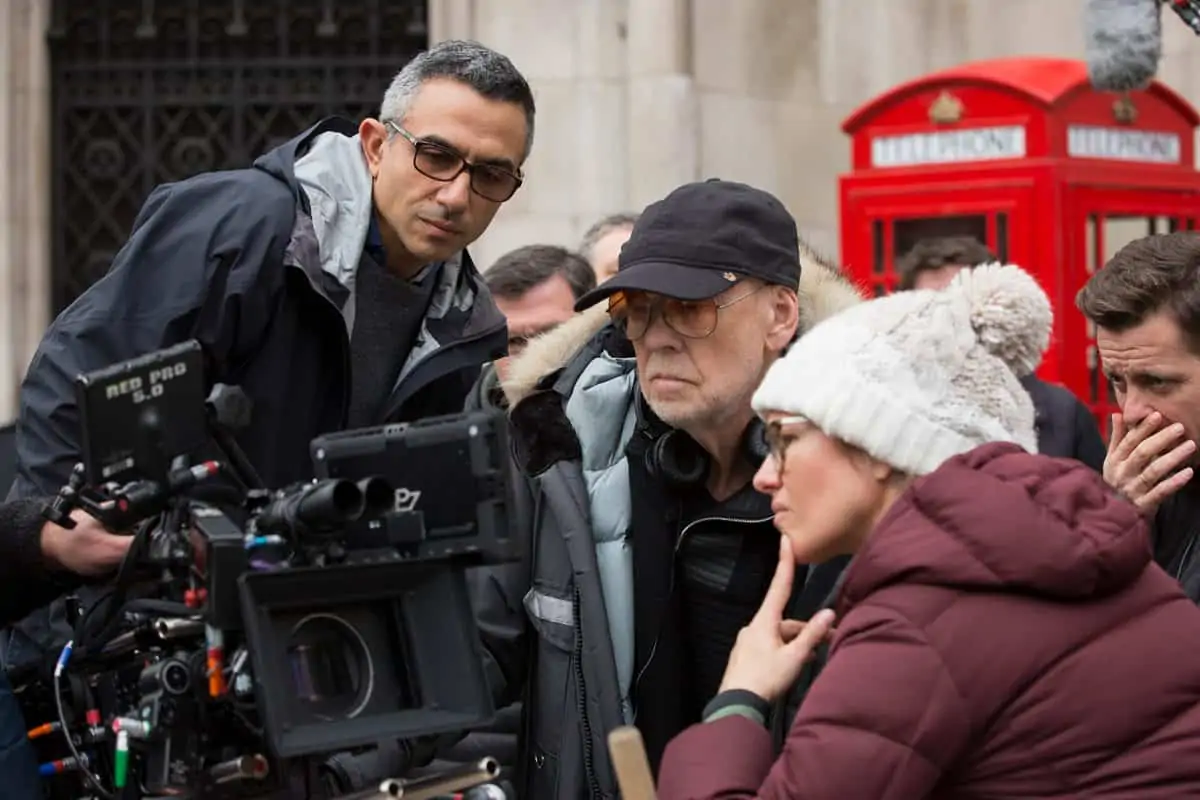
For Ken, performance is the most important thing, and he’s a master at getting great performances from the actors. Also, we have worked together on several films now, and I have come to understand that the staging of the movie is another important aspect of Ken’s directorial work.
We had great, established actors in key roles – such as Cate, Stellan and Helena – but the story pivots around two 23-year olds – Lily and Richard – and Ken worked closely with them. Whilst Lily is a very beautiful, Ken wanted to reveal in this production, that beauty also comes from the inside. So rather than seeing a delightful, angelic face from the start, we see a gradual transformation – through costume, make-up and hair, and lighting – throughout the movie, as Cinderella’s fortunes change.
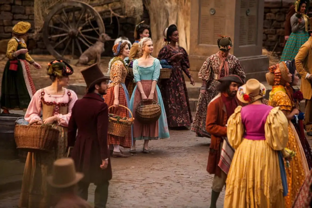
By the time I was attached to Cinderella, Ken had already started work with production designer Dante Ferretti and costume designer Sandy Powell, who are absolutely amazing. The authenticity was such that there was not one single hired costume – they were all made especially for the movie. We shot on large stages with wonderful props and painted scenics. I knew that planting a camera there to capture it all came with a great responsibility, and that the thinking behind the cinematography would need to come from a particular place.
What research did you do, and how did you find the looks for the movie?
HZ: We looked initially at David Lean’s B&W classics, such as Great Expectations (1946) and Oliver Twist (1948), both shot by the amazing Guy Greene. They’re timeless, the cinematography is stunning, and they set very high bar to reach in they way they evoke emotions.
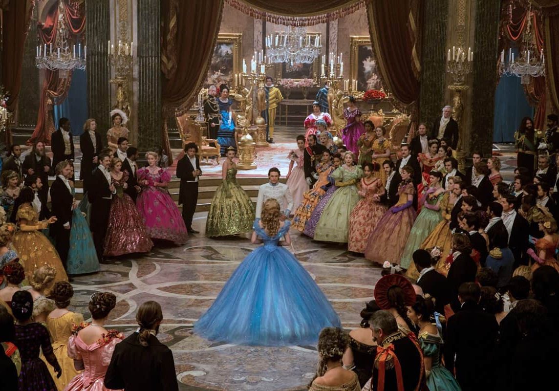
However, B&W movies are not the perfect visual references to show to studio executives wanting to make a big budget production in colour. So we also talked about certain painters that Ken and Dante had in mind. The usual references for candle-lit period dramas are Flemish painters, such as Rembrandt and Vermeer. But these have been done many times over, and were not playful enough for Disney. That was the trick. For the more joyful moments in the movie, they asked me to consider the paintings of Fragonard, an often-overlooked artist. Fortunately, the UK has many of his works at The Wallace Collection in London. The Fragonards are colourful and playful, and I could see how they could open-up new cinematographic opportunities. The “The Swing” in particular, is slightly naughty and flirtatious, and there’s a direct reference to it in the movie.
For the darker, more wretched moments in the movie, we again avoided the typical references, and looked at the works of the French Baroque painter Georges De La Tour. They are unusual, dark, but with bold lighting and strong compositions. I’ve loved his work since being a student at Central St Martin’s and “Joseph The Carpenter” is a masterpiece.
Whilst these painterly references gave us two strong starting points to counterpoint the joy and drudgery within the story, we also wanted a way to treat the seemingly benign but evil step-mother – for her to appear more like a film noir femme fatale. So I suggested that we also consider the portraiture work of Joseph Walker, cinematographer on many of Frank Capra’s best-loved movies, inventor of the zoom lens, and a forerunner of the Hollywood glamour look, and also the large format portrait photography of George Hurrell, upon whom Walker had great influence.
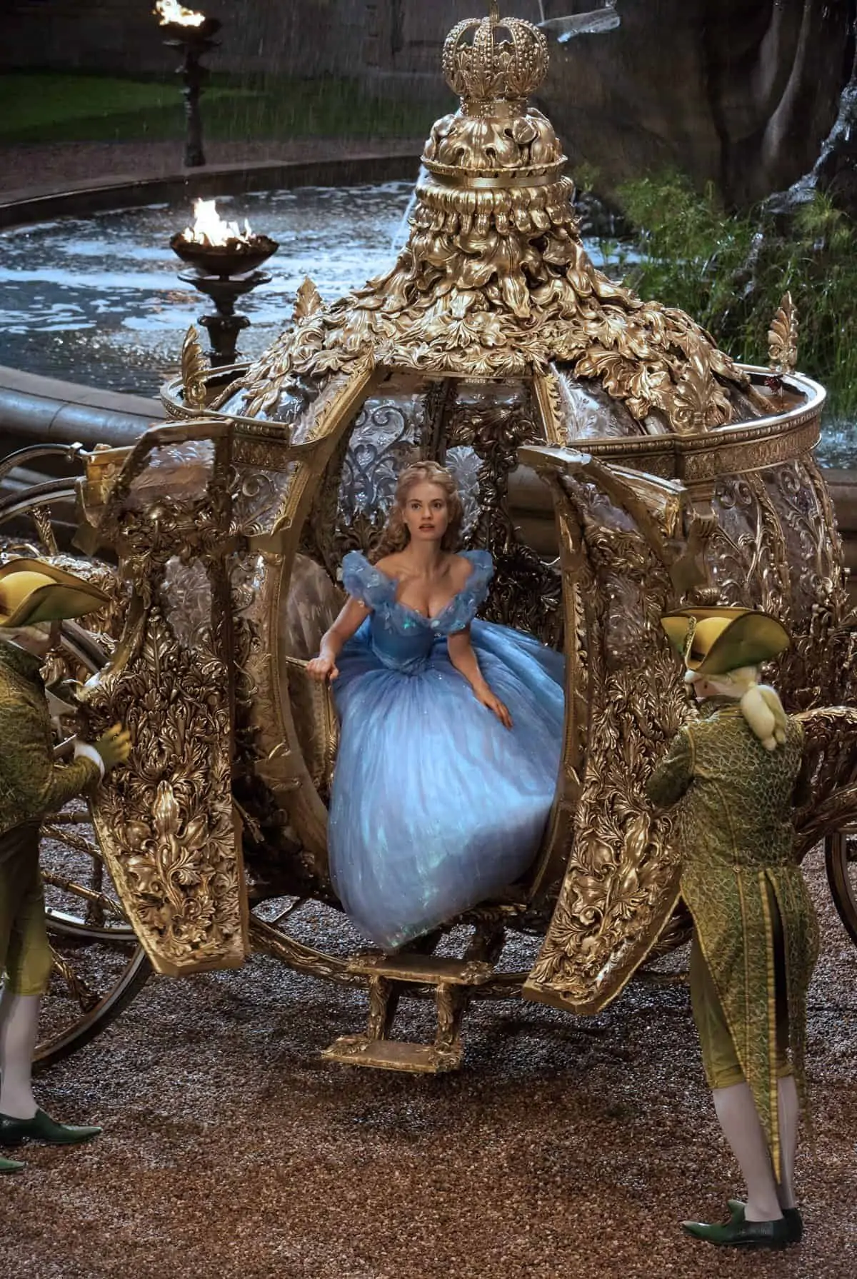
Tell us your reasoning for shooting celluloid and your kit choices?
HZ: There was absolutely no way we were going to shoot digital, for the simple reason that I think it dates very quickly in terms of look. We would have loved to have shot in 65mm, in keeping with the classical thinking behind the movie, but that would have been both impractical and prohibitively expensive, as the only lab capable of processing 65mm is in LA.
However, we shot tests on 65mm to help us hone-in on the techniques that would give us that sort of result on 35mm. The outcome was that I selected low ASA 35mm Tungsten filmstock – Kodak Vision 3 50ASA for day exteriors, plus Vision 3 200ASA for the day and night exteriors and interiors – and chose Millennium XL2 cameras and Panavision Primo Anamorphics. I also had a small set of C-series Anamorphics for the Steadicam scenes in the ballroom, and for when we wanted something slightly softer – for a particular mood, or a close-up on a face.
The effect of combining all of these beautiful ingredients is that when you shoot at T4 or T5.6, the images fall off in a classic way. There’s no need to degrade the picture either, or try to hide anything in the image with diffusion, as you do with digital. You can light a little lower, with more sidelight, and there’s no need for excessive fill to bring out a cheekbone or look into deep-set eyes. On close-ups you really can’t see the difference between 65mm and 35mm, and you get to that Jospeh Walker-level of portraiture. The technique spoke for itself. During production, we had to wait for the film to come back from the lab, and project the results to know it was right. It was a classic, old-school approach.
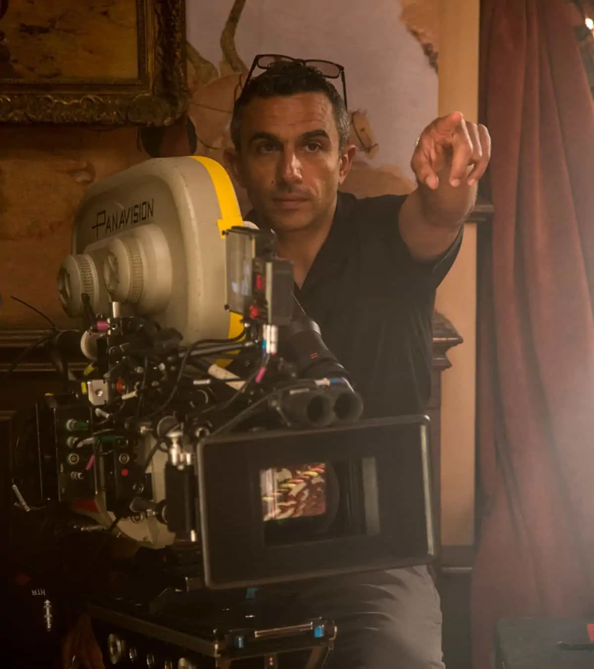
"For the darker, more wretched moments in the movie, we again avoided the typical references, and looked at the works of the French Baroque painter Georges De La Tour."
- Haris Zambarlouskos BSC
What was your strategy for moving the camera?
HZ: Again, we decided to be classical, to stay back, observe the staging, let the master shots evolve into mid-shots or end up as close-ups. We wanted to let the shots breathe, and for the moments to develop. But we didn’t go to crazy levels on doing long takes. Although we used Steadicam for the ballroom scenes, operated by Alf Tramontin, we used 30ft and 50ft Technocranes a lot, and even a 100ft Technocrane, which is a very big beast, for one of the end shots. Roger Pearce was the A-camera operator, with Luke Redgrave was on B-camera, and they made a great team together. Malcolm Hughes was key grip. There are not that many close-ups in the movie, although Roger came up with a great suggestion to have Cinderella, the Prince and the camera on a revolving platform, to film their upper body movements, which worked very well.
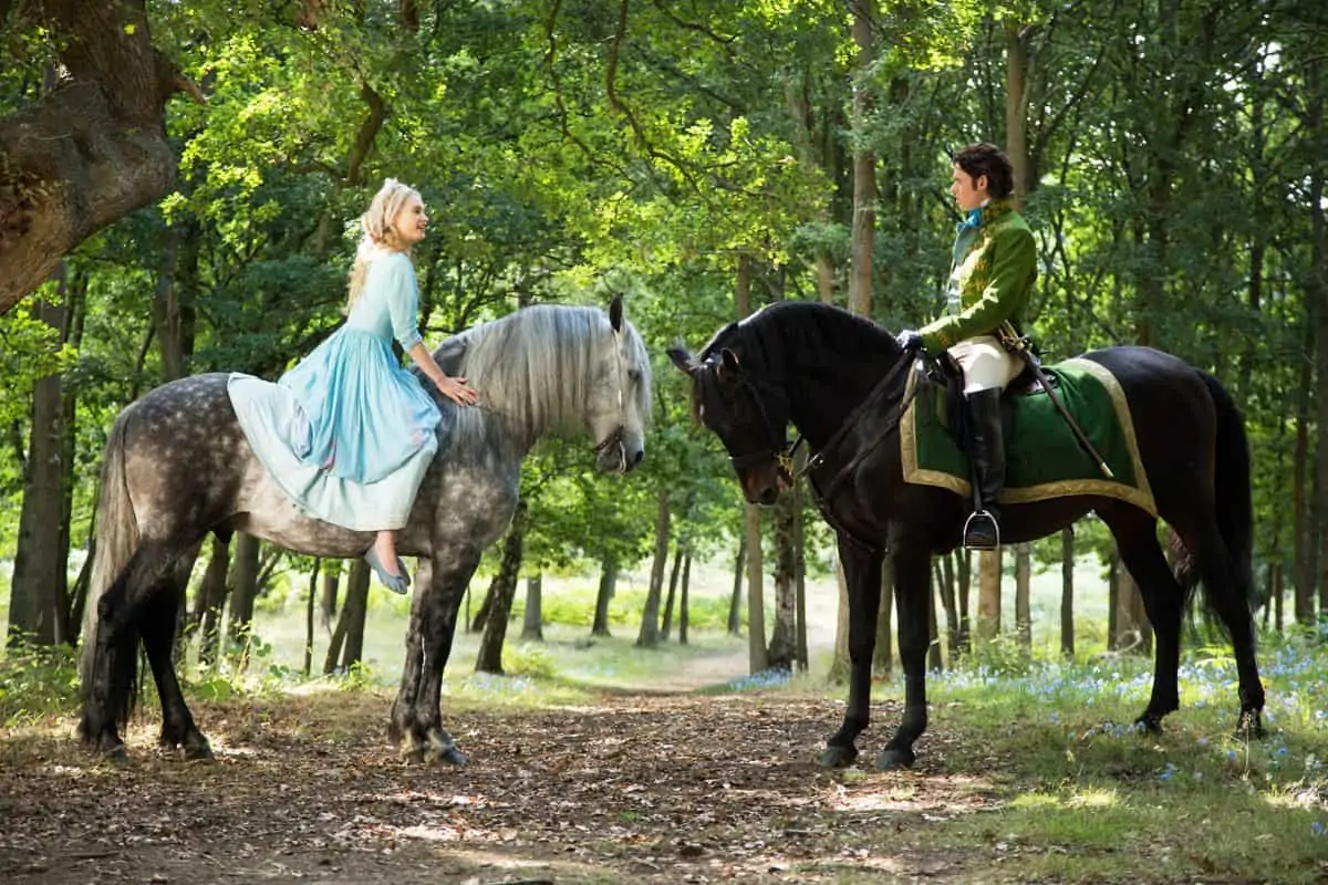
Another scene, which shows how Ken brings the staging of action and drama together really well, is when Cinderella and The Prince first meet on horseback. This involved the choreography of two cranes to match the choreography of the horses, which had to be in time with the actors’ dialogue – all of it on a sunny day outdoors. It was hard, old-fashioned, classic staging, but the payoff is an absolutely wonderful scene.
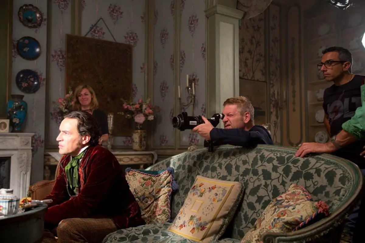
How did you go about lighting the movie?
HZ: Again, in keeping with our classic movie-making thought processes, I asked my long time gaffer, Julian White, to look into sourcing old lamps. With the help of the lighting team at Warner Bros. Studios Leavesden, he got a range of old Big Eye fresnels, that have a large lens but a very small lamp inside, and which look fantastic. Warners also shipped us other old-school tools such Zaps, plus Decasources and Decapods from Mole Richardson.
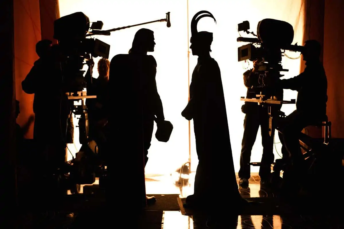
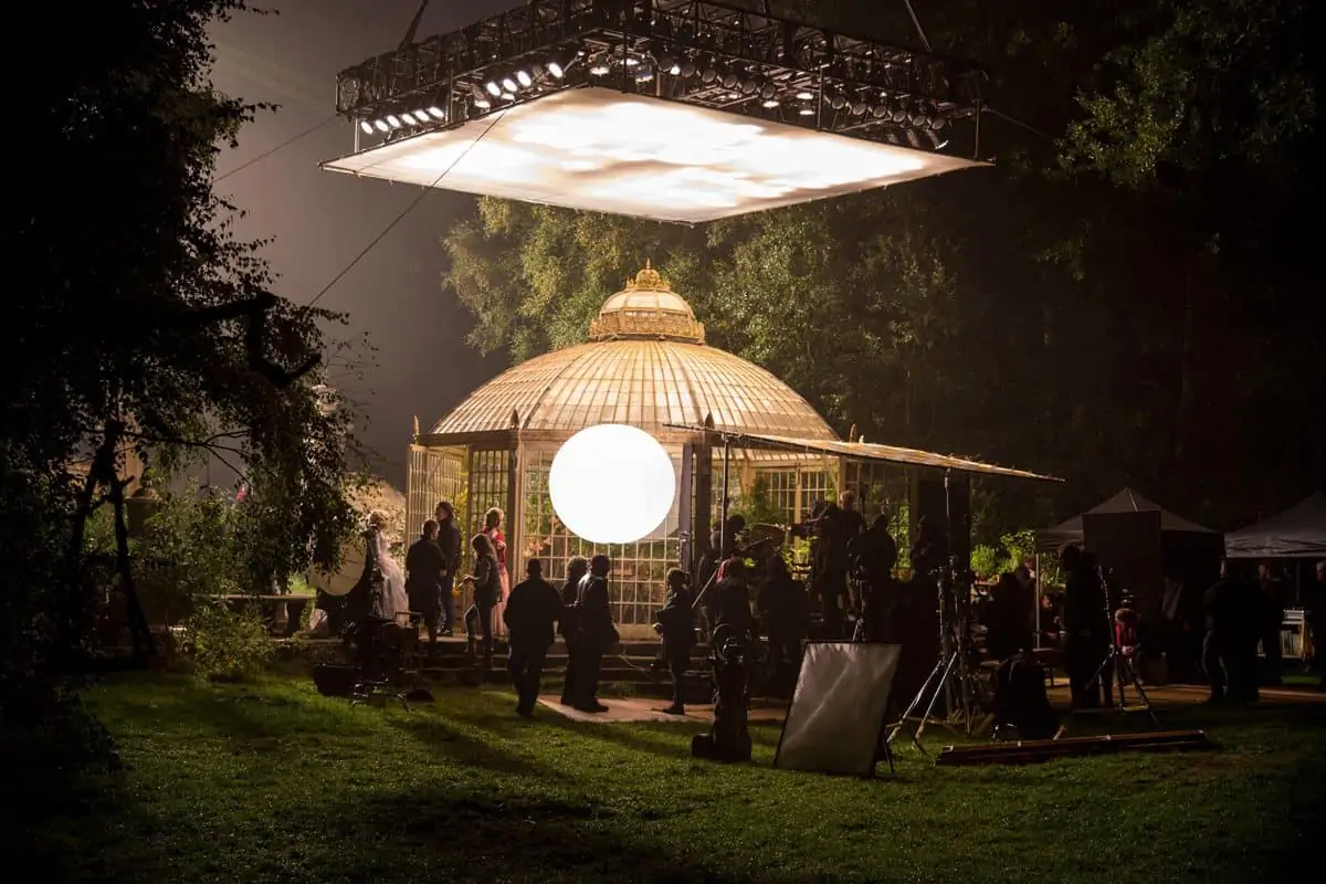
I also secured the talents of Chris Craig as our dimmer operator. He has huge experience of working in theatre and the music touring world, with bands like U2. He knows how to programme massive lighting set-ups that give you flexibility. With Chris’ help I was able to evolve a lighting technique that I used on Thor and Jack Ryan: Shadow Recruit, of using giant Tungsten softboxes, connected to dimmers, suspended on electric winches above the sets on the 007 Stage, which were set-up by Julian and our rigging gaffer Dan Lowe. This meant that I could easily control the intensity, quality and direction of the light. And because of the electric hoists this could be done without disturbing the crew or the actors during rehearsals on the different sets there. We could have full-on lighting around the perimeter of the set, or create candle-style flickers with dimming patterns on the smaller sources. David Balfour, our amazing prop master, sourced magnificent chandeliers from a company in Prague, and around 8,000 plastic candles with wicks, filled with paraffin, that looked like wax candles, but burnt safely without dripping for 8 hours – and these helped enormously in bringing visual splendour to the ballroom scenes.
What about the dailies and the final DI?
HZ: This was a family affair. I brought together a close-knit group of people who worked together to ensure colour consistency across the film and HD dailies and into the DI. The processing was done by iDailies, and the film dailies were supervised by Clive Noakes, who was at Deluxe at the time. Although not many cinematographers do film dailies any more, it’s a routine that I still insist on, and we projected short clips everyday with the crew in Theatre 7 at Pinewood. To make sure the film dailies matched the HD dailies, that Ken and the production team watched, I worked in pre-production with the team at Company 3 – colourist Trevor Brown, chief technology director Laurent Treherne, and DI colourist Rob Pizzey. They created and applied a series of LUTs that would preserve the look of the film after it had been variously scanned. This meant that everyone – the editors, VFX team, Ken – all had the same consistent images – with no surprises along the way – right from the dailies to the final DI. The final look is very pleasing, rich and saturated, deep and dark. Kodak on steroids.
What do you think of the final result?
HZ: I come from a dark background in independent filmmaking, but any reservations I might have before about taking on this project have been forever crushed. What we achieved was not done by accident. It’s the result of a lot of dedicated collaborative work and meticulous execution. It’s not a stereotypical reimagining, neither is it a twist on the tale. It’s more of a real, 21st century take, made in a classic style, of which I am very proud.
