Home » Features » Opinion » Across The Pond »
With the Academy weighing in with Oscar nominations, this year’s set of contenders in the feature film category would appear to be set. They are Greig Fraser ASC ACS, for his work on Dune, Ari Wegner ACS for The Power of the Dog, Bruno Delbonnel ASC AFC for The Tragedy of Macbeth, and Dan Laustsen ASC DFF for Nightmare Alley.
And interestingly, one-and-a-half of these films are in black-and-white. Or three of them, depending how you do the math.
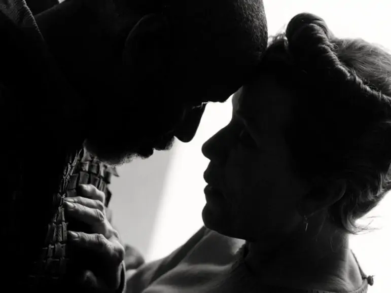
We refer of course, both to Delbonnel’s work on Joel Coen’s adaptation of The Scottish Play, one of the Bard’s darkest works, done again in shades of gray as was the Orson Welles version, and also to Laustsen’s for Guillermo del Toro’s carnival-set noir adaptation. The latter, of course, was originally released in a muted colour palette, and then followed by a more limited B&W release a few weeks later.
It brings up the interesting question then about which version will be most influential to not only Oscar voters, but those at the BAFTAs and ASC awards, too.
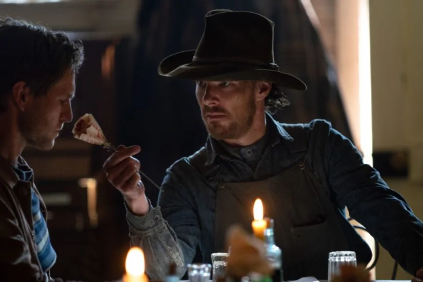
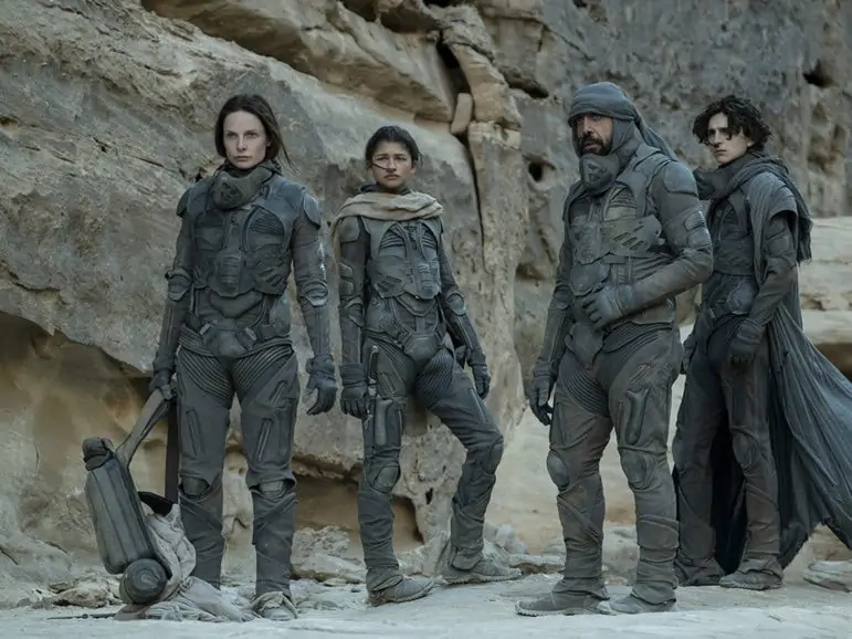
We’ll return to Laustsen’s two different versions in a moment, but this also brings us to another question you may have about our potential due diligence in listing only four nominees. “That’s not even accurate,” you’re thinking. “Maybe I should just quit reading and go listen to a podcast.”
That may depend on the podcast, but we mention four, because the fifth nominee, for each of those awards, was different: The BAFTAs chose Linus Sandgren ASC FSF for the “finale – for now” James Bond installment No Time to Die, the ASC picked Haris Zambarloukos BSC GSC for Kenneth Branagh’s filmic memoir, Belfast, and the Oscars, true to the song America, chose longtime Spielberg collaborator Janusz Kaminski for his work reworking West Side Story.
Of course, any of those “fifth nominees” is capable of winning, especially if the “recurrent four” keep dividing votes between them. This “is-we-or-is-we-ain’t?” award season (in terms of whether to hold a live event, a very limited one, or just stream the darn thing once again) is likely to come up with more surprises as it unfolds.
As for discussions with nominees, our next chat with the ubiquitous and hardworking Mr. Fraser is likely to be for his upcoming The Batman, though we will be sure to extend kudos about his work on the sands of Arrakis. Readers of this column may remember, we talked with Mr Laustsen last month, about things noir-ish, del Toro-esque, and carnival-like. And yet, presto! We caught up with him again, specifically on the subject of the B&W rendering of Nightmare Alley.
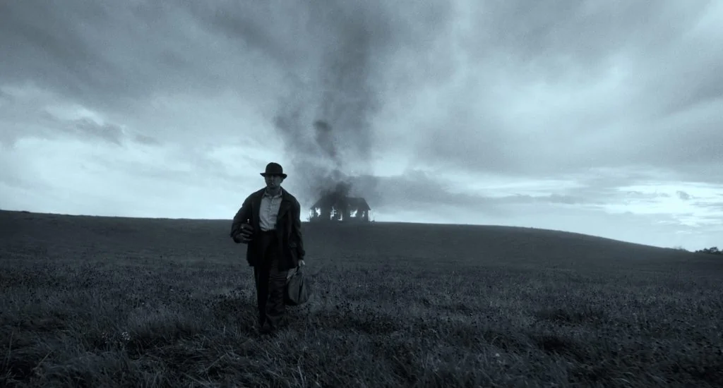
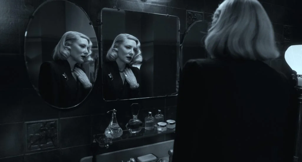
Laustsen recounted that he wasn’t able to get back to supervise the change to black-and-white, and when shooting, wasn’t absolutely sure it was going to happen – it was something “Guillermo and I talked about now and then,” though he also noted that it was “everybody’s dream” to shoot a film that way, and even when they lit, they were thinking it could also “be fantastic in black-and-white,” but ultimately it felt more like “kind of a dream.”
Del Toro, however, decided to make the dream come true, and when “they decided to do the black-and-white version, we did a couple of tests, and decided to go back to the RAW files… and we could play around. (There was) a much bigger working space there.”
Laustsen, however, was not able to play in that particular sandbox, since he was in Europe, and “Guillermo was in Los Angeles with Company 3.” Complicating things “the COVID situation was really brutal then. I think a lot of cinematographers have done post remotely, now, because you weren’t allowed to fly.”
And while his preference for black-and-white would ultimately be “to shoot in black-and-white – shoot it monochromatic with a monochromatic camera, where you can work with the magenta and cyan,” he ultimately thinks “ (they) did a really nice job there – I was trying to hang on their shoulders.”
Though his own shoulders were no slouch either, in helping the film get rewarded with nominations for so many of its visual components.
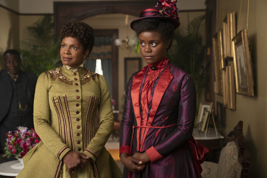
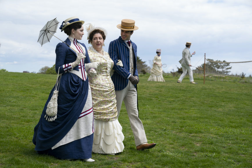
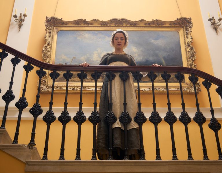
Working to recreate an age that we only contemporaneously see in black-and-white photography was Manuel Billeter, one of two DPs for HBO’s current drama The Gilded Age, wherein series creator Julian Fellowes takes both the upstairs and downstairs intrigue from his earlier Downton Abbey, and steps both across the pond, and a little bit back in time, to late 19th-century New York. Its era of railroads, bankers, and robber barons, from whence views of who should have, and who should have not, still affect American economic discourse to this very day.
Or as Billeter discovered when he was prepping the show and “reading reports from the time – the way they were talking about conditions in New York,” he realised chronicles of the disparities of wealth in 1882, “could be written in 2020… (There was) this notion of, this need to feel powerful, or in control – to feel wanted. The only thing that doesn’t change in New York,” he added, “is change – basically everything changes all the time.”
One of the many things that had changed is that “the practical light that was true in the 1880s obviously isn’t true for the present.” In that sense, both rich and poor alike used oil lamps, and the show wanted to “motivate the light as coming from an oil light, and gas lamp. We tried to use practical lights, and light with candle and oil.”
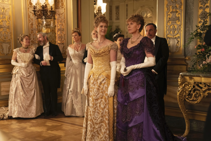
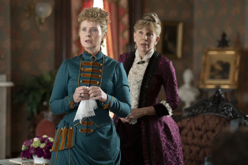
However, in the hundred-plus years since the days of Tammany Hall’s zenith, “LED fixtures have become the size of an oil lamp – and you can dial in colour temperatures, the right intensity. You can (also) hide it behind small objects, and it still feels authentic, because you can add a little flicker to it as well, to mimic the unsteady candle flame or gas flame.”
As for capturing that Carnegie-and-Vanderbilt era lighting, he used a “camera that was already in place” – since he was splitting series lensing duties with Vanja Cernjul ASC – namely a Panasonic VariCam Pure.
They then used two different sets of lenses. The first were Cooke Anamorphics for the lavish house occupied by the “old money” Brook / Van Rijn (i.e. “Van Ryan”)’ clan, as represented by Christina Baranski and Cynthia Nixon’s characters, where “the compositions were more static, and there wasn’t a lot of camera movement in it.” The anamorphic glass, he felt “subconsciously throws you back to older movies, or a time in the ‘50s or ‘60s, when anamorphic glass was new,” and seemed to better “reflect the stiffness (and) the conservative structures,” the latter referring even more to the societal ones, than the architectural.
Across the street from them are the even “lavisher,” and more upstart “new money” family, the Russells, represented by Carrie Coon’s relentlessly-planning Bertha, and her husband, George, who has grown rich with new technology. Which is to say, railroads.
For the Russell house, part of the “new New York,” and “part of society that wants to make it – that wants to break into the old power,” they used Cooke S7s. “On those scenes, it’s a bit sharper. It gives a more defined image if you want. The optical differences were used to subconsciously guide, emotionally guide audiences between these two different worlds
“Also in the Russell house, there’s a lot more movement. It’s still portrait-based, but it’s much more dynamic, changing all the time… a lot of shots we did on a dolly with the Libra Head.”
There’ve also been at least two major pandemics since that particular Gilded Age, and regarding the one we’re still not quite out of yet, Billeter notes the production was “one of the first shows in New York to start back up, after the forced pause. It was a new world, a new set of rules that applied all of a sudden,” which called for a lot of masks, a lot of testing, and isolated meal breaks replacing the face-to-face schmoozing and brainstorming of weeks earlier. But he allows, “in the spirit of getting it done, and working, in a way it was a small price to pay. But in this business,” he allows, perhaps contrasting showbiz with those earlier aristocrats, “we are quite adaptable. Always the best laid plans…”
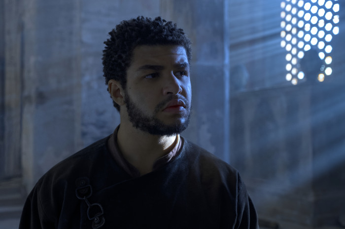
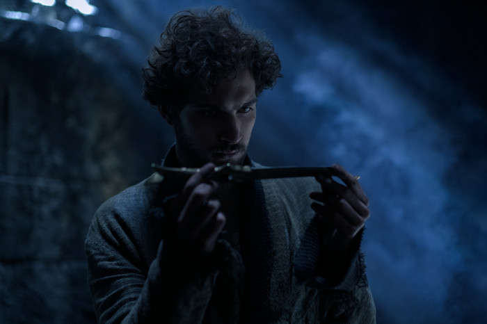
Similarly, whether those are best-laid plans of mice and men, or trollocs and wanderers, cinematographer David Moxness ASC CSC found he had to be equally adaptable when shooting the first season of Amazon’s new fantasy series The Wheel of Time.
Production, he notes, “started in 2019, and got to March ‘20 and shut down. We (eventually) went back with COVID protocols in place. It was a definite learning curve for everybody… Distancing, testing, for five days a week. But I really give great credit to our production team for managing all that. Everyone got on board, everyone was responsible for it. I really don’t feel we were losing a lot of time associated with the protocols (and) I think that any positive cases that showed up likely came from the community. But our testing really notified us of those positive cases right away, and we were able to isolate those people.”
The communities in question were those surrounding locations and soundstages in the Czech Republic and a series of often-stunning locations in Croatia. Moxness shot half the first season’s episodes, sharing duties with David Luther.
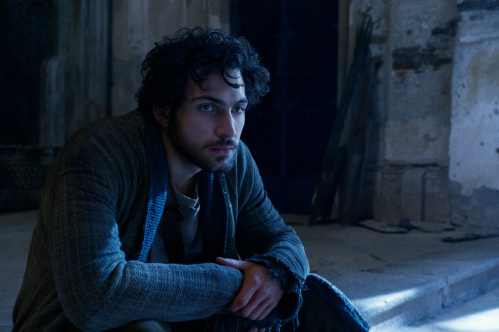
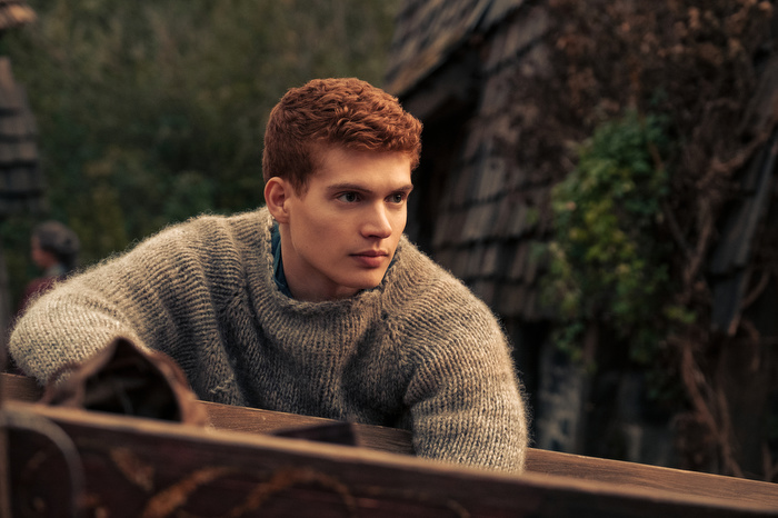
He also used a Sony Venice, “the first time I had done a full project with (one),” describing it as “a really great choice for this kind of show,” where much of the action is driven by star and co-producer Rosamund Pike, playing Gandalf-like wisdom figure Moiraine Damodred. She leads a group of young survivors from a recently slaughtered village, to sanctuary, as one among their number may be a reincarnated ancient power who could inadvertently – or perhaps “advertently” – destroy the world during this latest gyration of time’s wheel.
Moxness used Cooke S4 Primes “for their warmth,” a choice he’s gone back to “a fair bit over the years.” And there was a lot of warmth, both literally, and in terms of colour tones, to use. “We had the sun, the moon, campfire or flaming torch – all good choices” for natural light, showing how far we’ve come since Stanley Kubrick’s candlelit lighting breakthroughs in Barry Lyndon.
“An interesting thing with the Venice,” he adds, is that in “a number of scenes and environments we could have the flames do a lot of the (work) for us.” Showrunner Rafe Judkins wanted the visuals to “be grounded in reality; for me that also lent itself to the lighting of these environments, a light source through the window, or the moon. That was always my starting base – what was a natural feeling for this environment?”
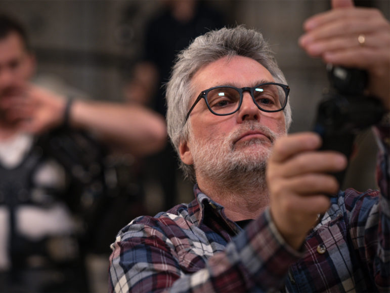
This also meant augmenting those natural feelings – and beams of light – with SkyPanels, “a lot of inflatable balloon lights,” and even HMIs, “trying to get them as far away as possible, so they’d filter in quite naturally.” They even worked with gels, in this era of dialed-in colour, while being mindful not to force a particular lamp in one direction or another. “For me, the right tool for the job is ‘what’s the quality of light?’”
With Amazon having put season 2 into production already – and much literary material left for numerous seasons after that – it’s an investigation Moxness will be able to keep making for a while.
Meanwhile, the hybrid award season kicks off. We’ll be braving at least some of it and reporting back here.
Take care during this next one-month slice of the wheel of time. @TricksterInk / AcrossthePondBC@gmail.com


