Secrets of the Master (Part 2 of 2)
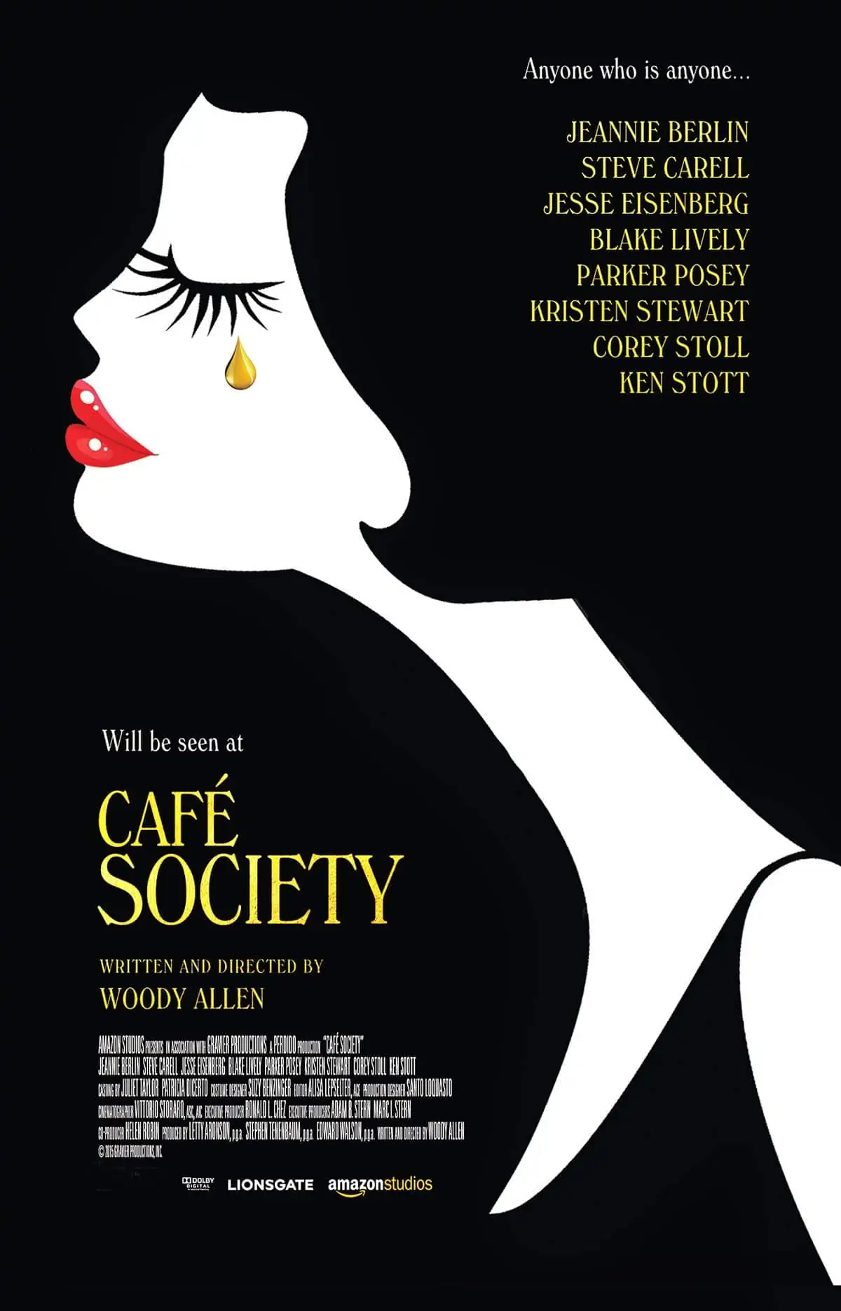
Vittorio Storaro AIC ASC / Café Society
Secrets of the Master (Part 2 of 2)
Vittorio Storaro AIC ASC / Café Society
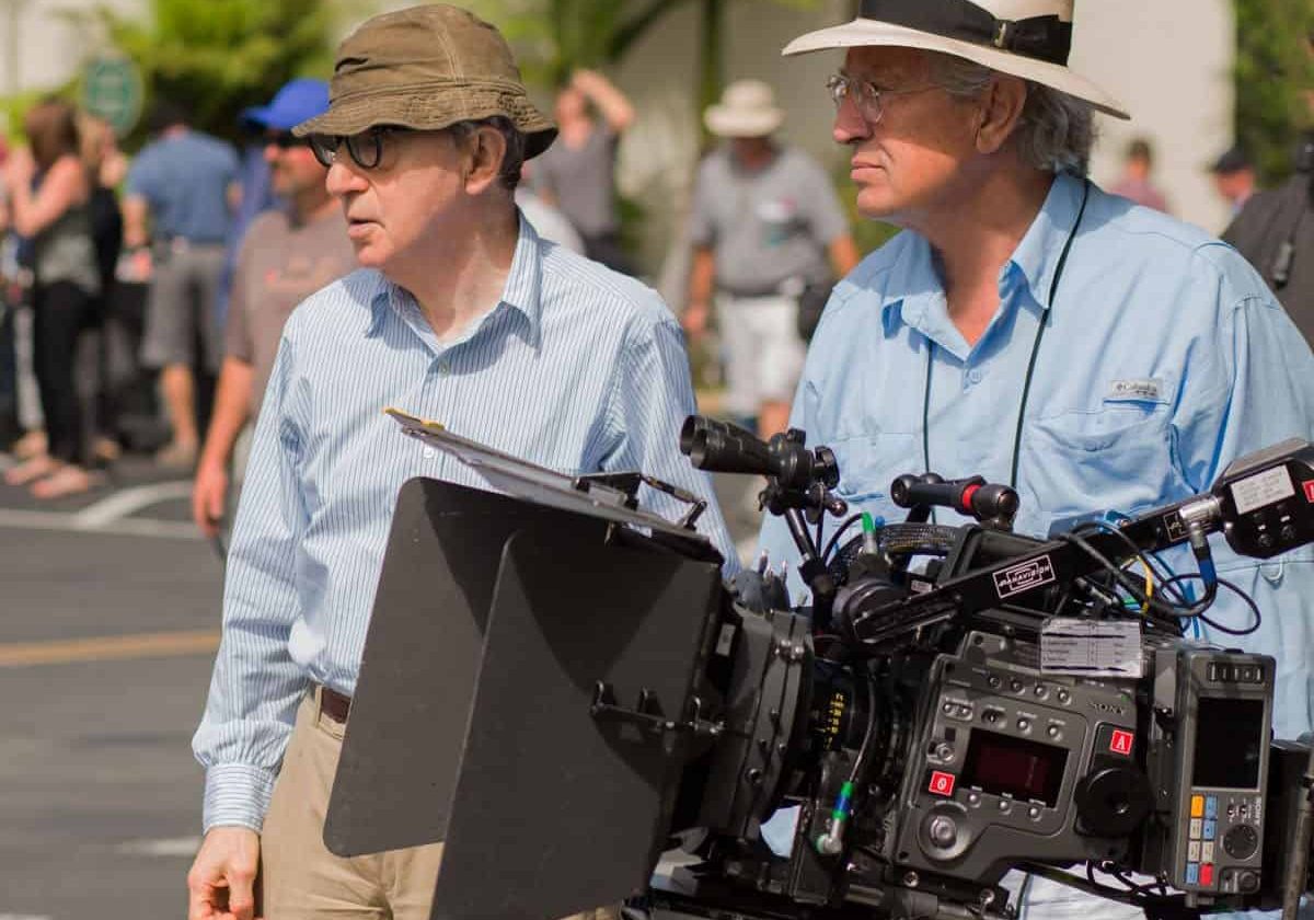
Triple Oscar-winning cinematographer, Vittorio Storaro AIC ASC, continues to share his experiences of shooting Woody Allen’s romantic comedy Café Society digitally, and offers more sage advice for up-and-coming cinematographers.
G) Digital Imaging Technician (DIT)
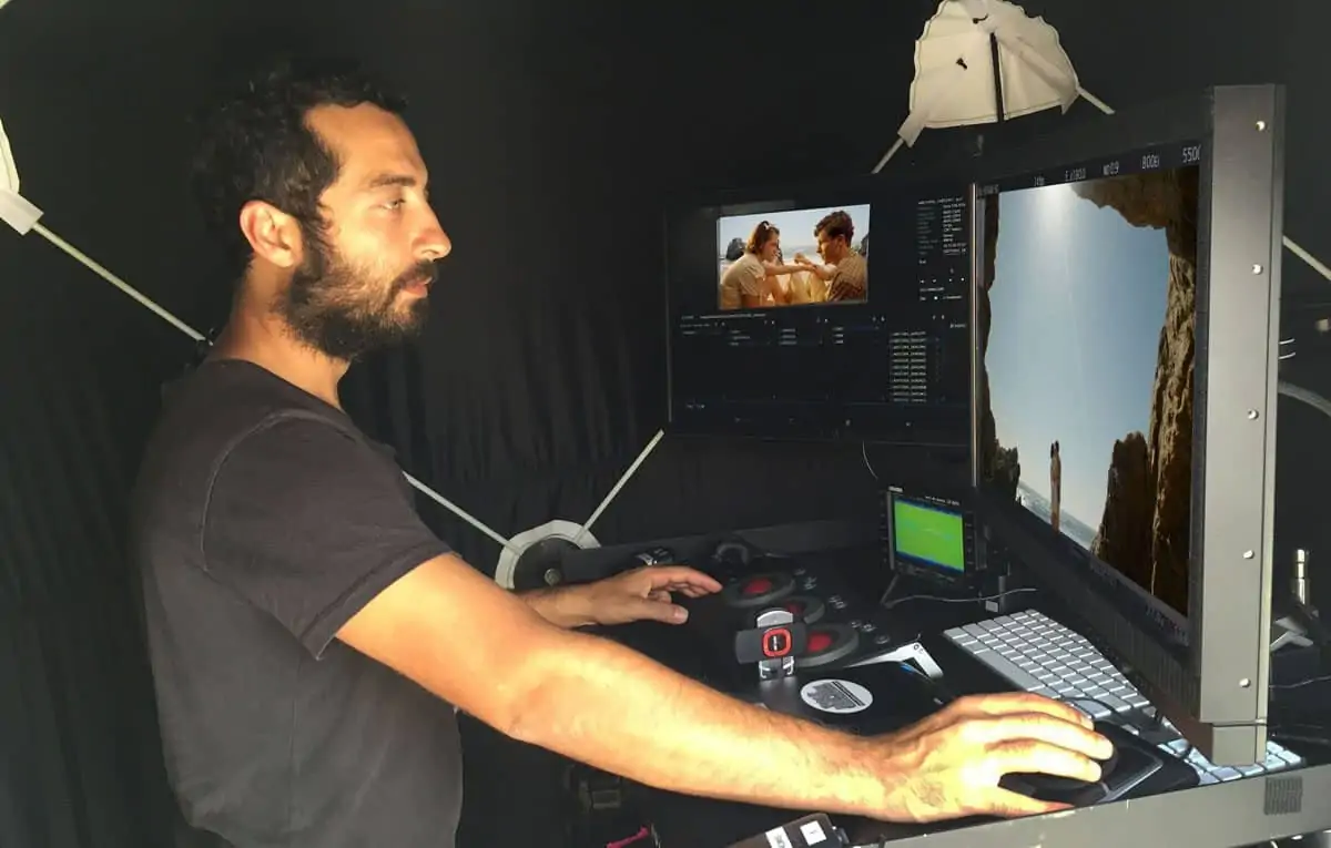
In digital cinematography the DIT is a very important figure. For Café Society, I knew that Simone d'Arcangelo, a former student of mine at The Academy Of Image Art in l'Aquila, had dedicated himself to this technology and had become very experienced in digital workflow, and I asked him to join me on this production.
But, we should be very mindful to find the balance between technology, technique and the creative needs of the cinematography. As Albert Einstein used to say, “Imagination is more important than knowledge.”
Looking back, I remember Technicolor's "Colour Consultant", who attended on-set during films made from the 1950s to 1970s. Here was a figure that influenced key creative decisions on a production including, in their opinion, how colour and lights should be best used to capture the images on film – which were normally made by the costume designers, art directors and cinematographers. Spreading fear that colours would not be captured well in shadow areas, they determined that many movies should be filmed with a generic, uniform light.
The "dramaturgy" – the practice of dramatic composition, using light and shadow – was cancelled-out of movies shot in colour. They used to say what colour was good for a Western, a comedy and musical films, and that B&W was good for a dramatic story.
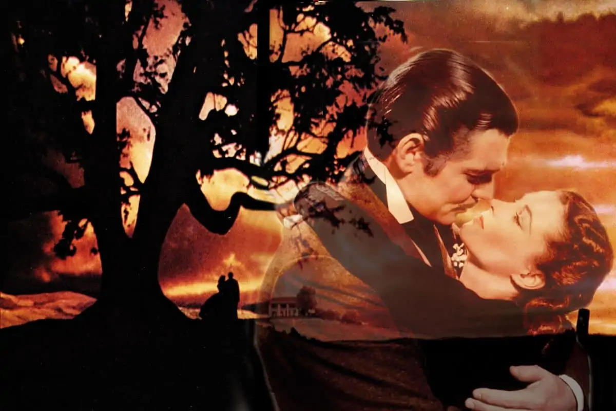
But thankfully, despite the colour consultant, the cinematographers of movies such as The Red Shoes (1948, Jack Cardiff), Moulin Rouge (1952, Oswald Morris), Senso (1954, Aldo Graziati/Robert Krasker), and especially Gone With The Wind (1939, Ernest Haller/Lee Garmes) were able, with the technology available at the time, to use colours in dramatic ways – using filmstocks with an exposure rating of around just 25ASA.
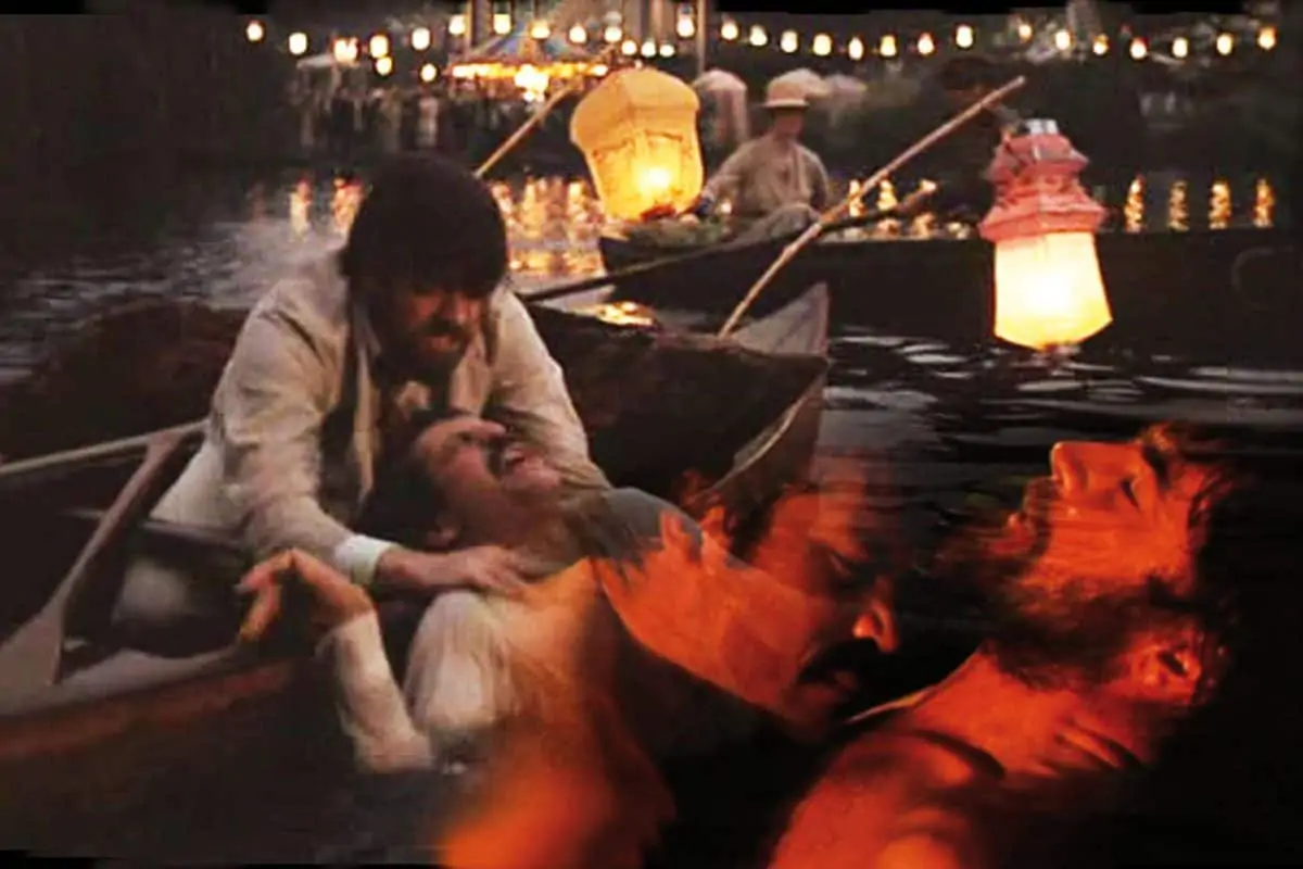
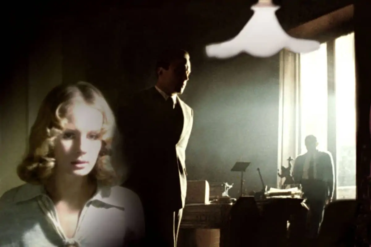
When my generation of cinematographers came into filmmaking, that theory was modified. We proved that Technicolor could record many more tonalities of colour, even in shadow. Some examples are: Women In Love (1969, Billy Williams), The Conformist (1970, Vittorio Storaro), McCabe & Mrs Miller (1971, Vilmos Zsigmond), The French Connection (1971, Owen Roizman), The Godfather (1972, Gordon Willis), Cries And Whispers (1972, Sven Nykvist), to name just a few.
That was the time of the mystery of the revelation of the image. Today we have a perfect image on a well-calibrated monitor.
H) Video control on-set
Since 1980, with Warren Beatty’s film Reds, when the first video assist technologies started being used on the film set, the cameraman and the cinematographer suddenly appeared to have lost their value in knowing how the filmed image would appear on-screen during dailies.
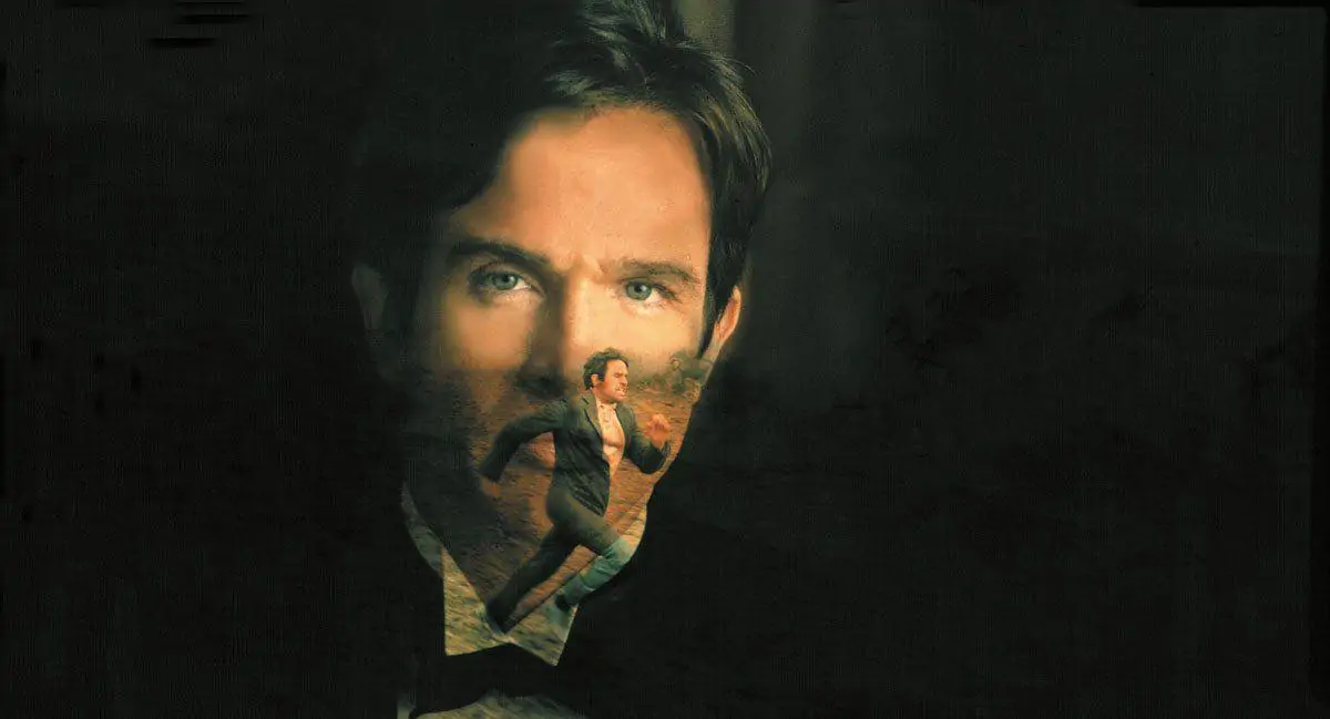
Today we live in a period of even more heightened awareness, when everyone can see the image on-set, and cinematographers have lost the mystery of the revelation of the image. Today, it is more incumbent than ever on us to really need to know the meaning of the various visual arts that go into the creation of the cinematographic image – symbolism, physiology, the dramaturgy of light and colours – so that we have solid reasoning behind our cinematographic choices.
We need to know the value and the impact that visual energy has on human perception. Video assist keeps us in agreement with the director, because we can see, and we can change together, any image. Jean Cocteau used to say: "Cinema is a dream in which we all dream together.”
I) Image composition
For me, the composition of the image in the 2:1 aspect ratio is essential. In epic pictures, such as Apocalypse Now (1979) and Little Buddha (1993), I did everything I could to preserve the original composition of the film in all forms of distribution.
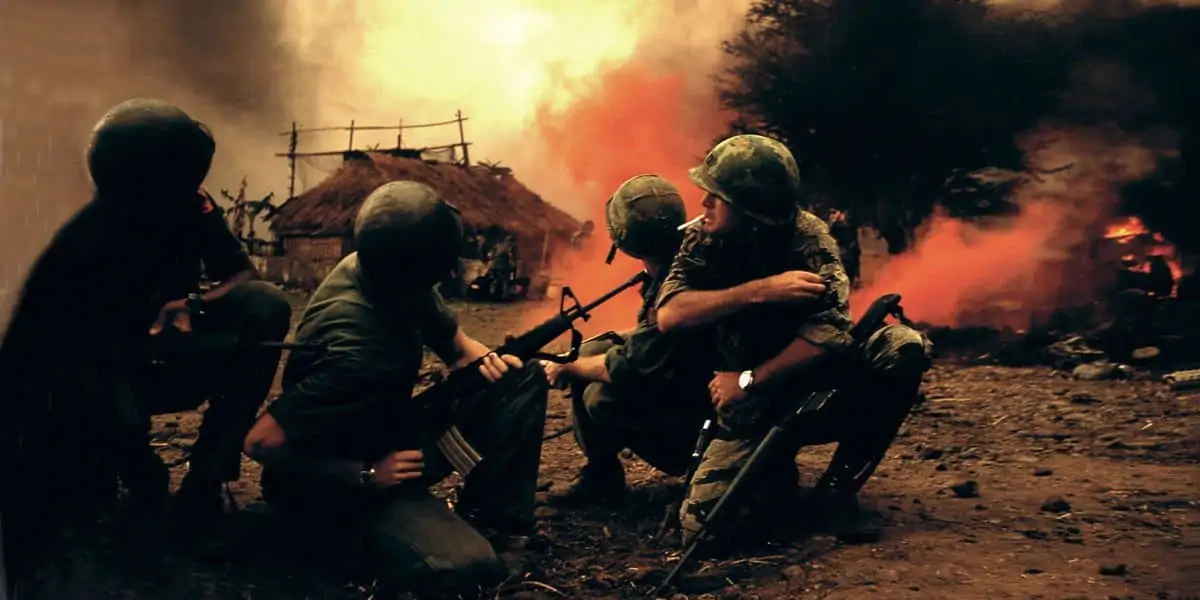
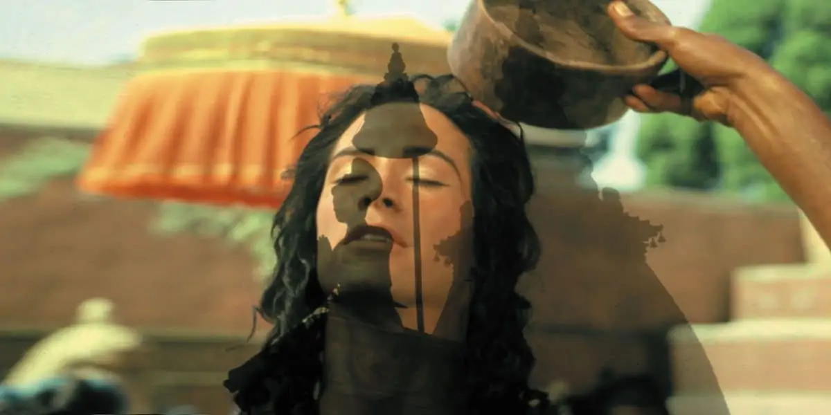
The audience needs to be respected. I believe it is very important for audiences to see films exactly the way they were composed by the director and cinematographer. However, the many different aspect ratios used throughout of the history cinema – original 1:1.33, panoramic 1:1.66 in France, 1:1.85 in Europe/USA, Cinemascope 1:2.35, 70mm 1:2.21 – were drastically mutilated when they were transferred from film to video, in order to have a full screen 1:1.35.
It's a terrible situation to record images in "full aperture" for someone later to determine the composition of the final image. Cinema is an expression of images, completed by music and words. In modifying the composition of the image, the film itself is changed from its original vision.
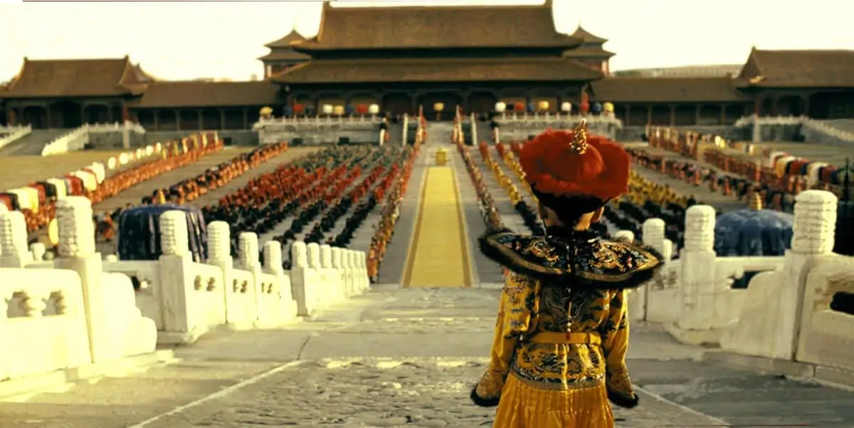
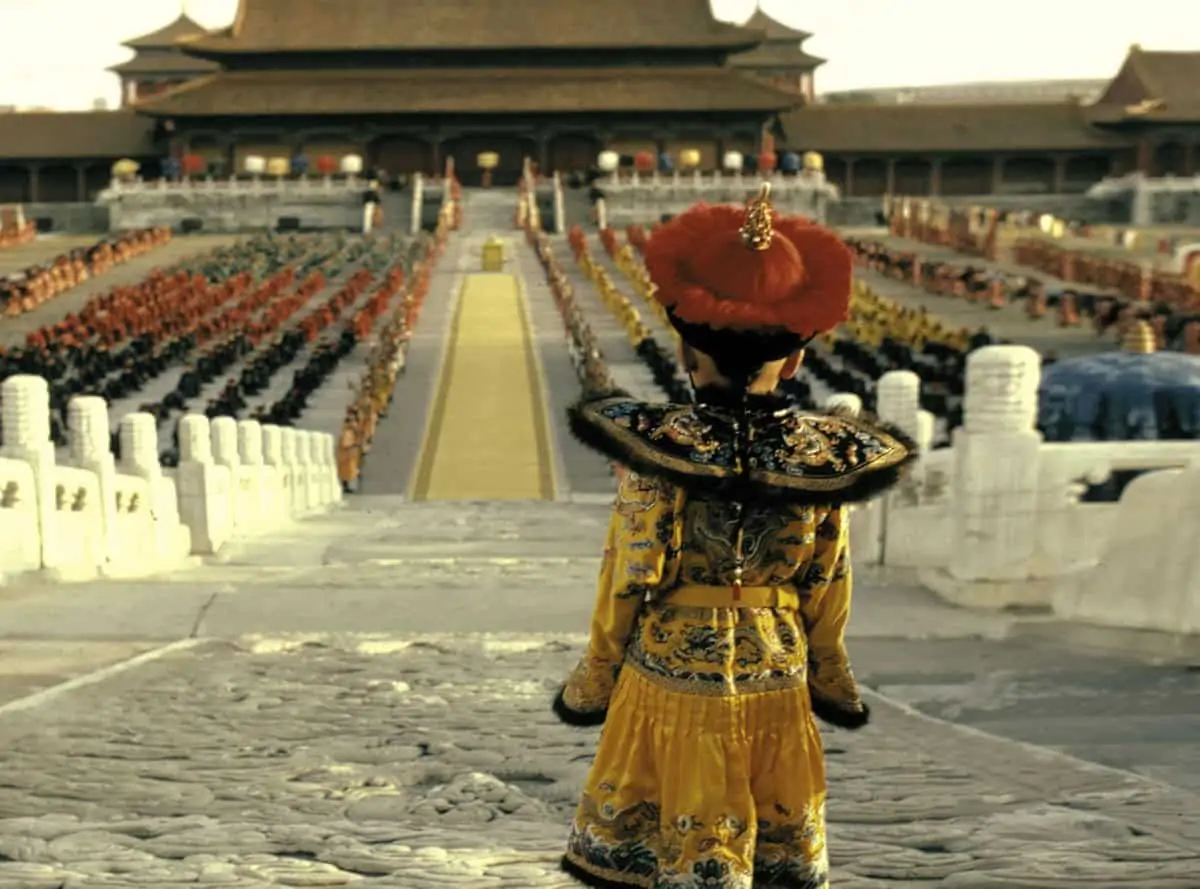
Taking the example of the best symbol of The Renaissance, Leonardo da Vinci's fresco The Last Supper, with its 2:1 aspect ratio, I invented, with my son Fabrizio, the Univisium System – a universal film format that could unify all future theatrical and television movies into one aspect ratio of 2.00:1.
As humans, we consider "reality" to be what our eyes see around 180° degrees of space. When we select part of this reality, in a specific size and shape, we are creating "visual art". "Art" in Latin means "ability". In agreement with directors, we need to compose images to suit the style of the film. "Composition" and "rhythm" are two of the most important words in the camera operator's vocabulary.
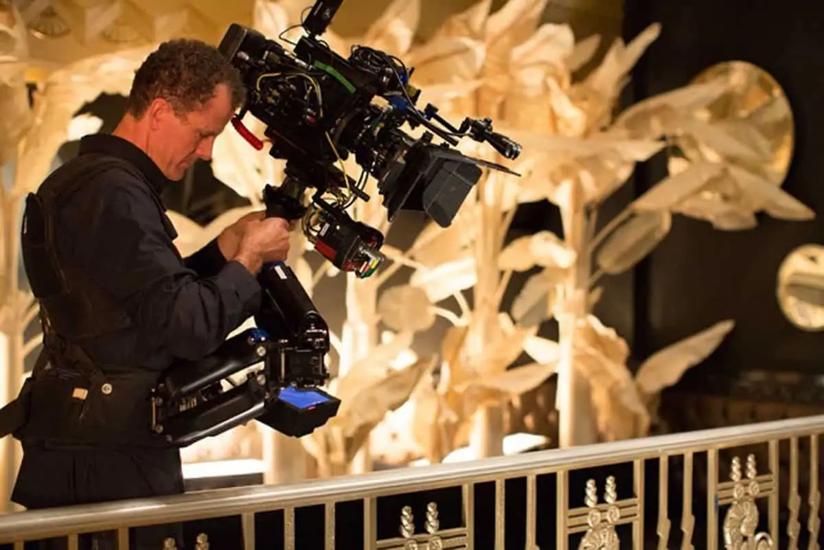
Working closely with camera and Steadicam/operator Will Arnot, we together dedicated specific attention to the correct composition and rhythm in every image in Café Society, to make sure they were in sympathy with both the narration and structure of the overall story.
J) Dailies
Shooting in New York, every Saturday I reviewed dailies in my hotel apartment with Anthony Raffaele, the colourist at Technicolor New York, Will and Simone. These sessions allowed us all to confirm or modify any creative and technical choices we had made. Those meetings also gave us a continual survey of the visual journey of the production so far, and to make decisions about the next stages of the production.
K) Digital Intermediate grading & 4K 16-bit colours
With the digital intermediate (DI) colour grade, we are able to finalise all of the visual aspects of a movie. That horrible statement that you sometimes hear on-set, "don’t worry about it now, we will fix it in post", should not be part of a cinematographer's vocabulary. In the DI, we should just refine the quality of the images that we crafted and recorded on-set.
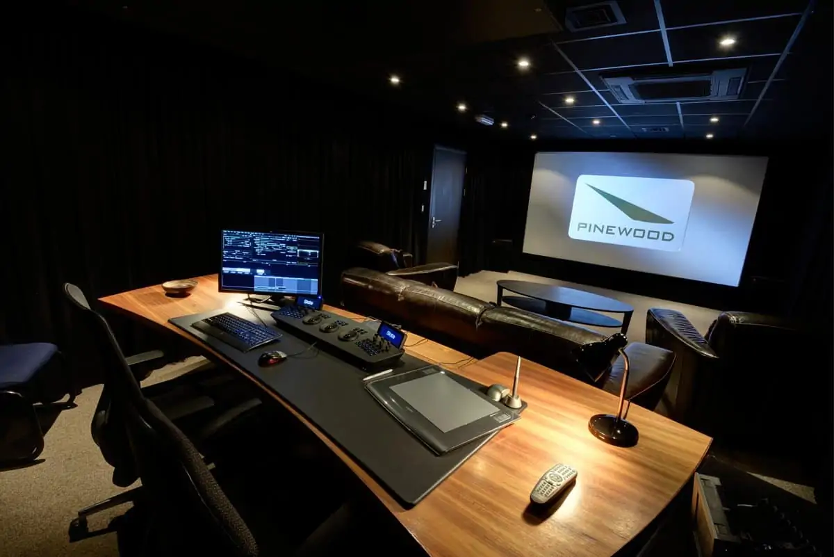
So, the first thing that I asked of Technicolor New York, was to have DI colourist Anthony Raffaele with me throughout the entire production. I believe that is very important to carry with us all the knowledge that we learn during the entire filming process into the final colour grading sessions.
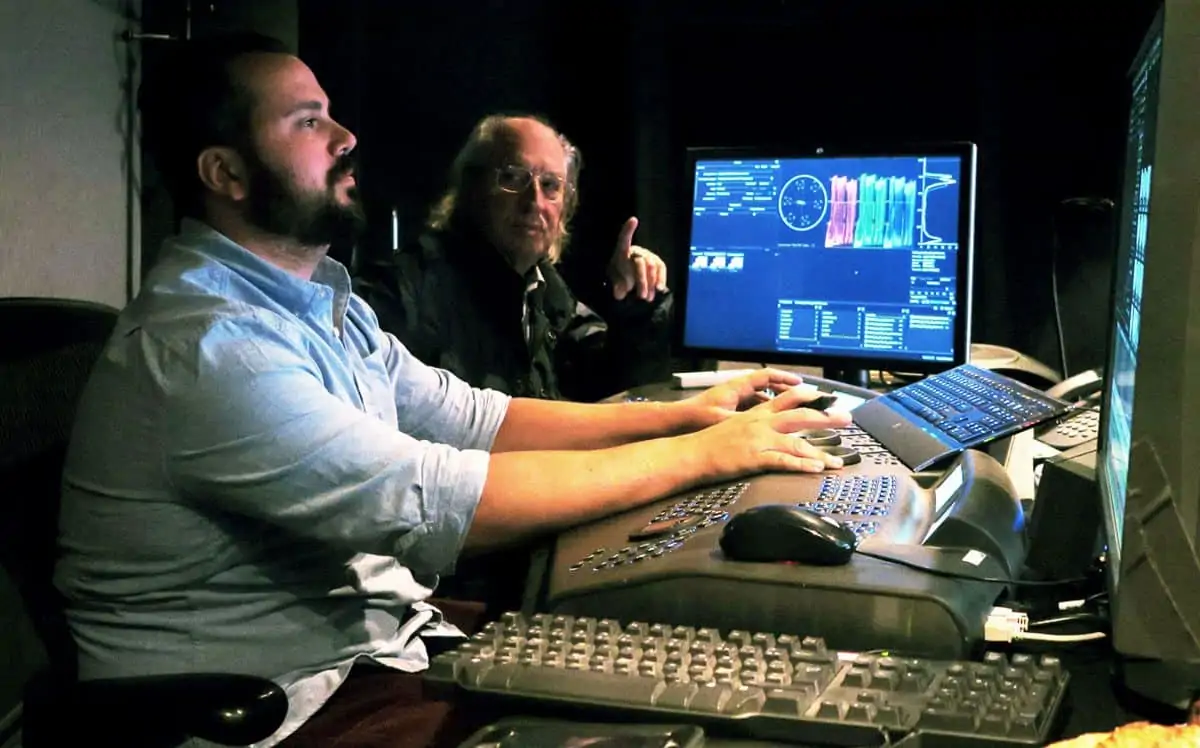
Using the Baselight colour grading console, and with his sensitivity and technical knowledge, Anthony was able to interpret my complete vision for the movie, and do it all at the original recording quality of 4K 16-bit, with 2:1 composition, in realtime, during the DI colour correction. This has been my dream for several years.
L) Worldwide distribution
As I have already noted, when you create digital images at the very highest level of quality, it is very important to maintain this quality throughout the worldwide distribution of the movie. Unfortunately, the main distribution standard today is still the 2K, 12-bit linear DCP. Very few cinemas are equipped to screen movies at 4K and even fewer have the capacity to support 16-bit colour.
If we record/screen at 4K, with the Univisium 2:1 format, we have a frame size of 4096 x 2048, totalling 8,388,608 million pixels. To record/screen at 2K, with the Univisium 2:1 format, we get 2048 x1024, just 2,097,152 millions pixels. Essentially we have lost 6,291,456 million of pixel information. Also, 16-bit linear colours represent 281 billions of colour shade. But 12-bit linear colours, represent 68 million of colours shade. Between the two, 213 billions of colours shade have gone missing.
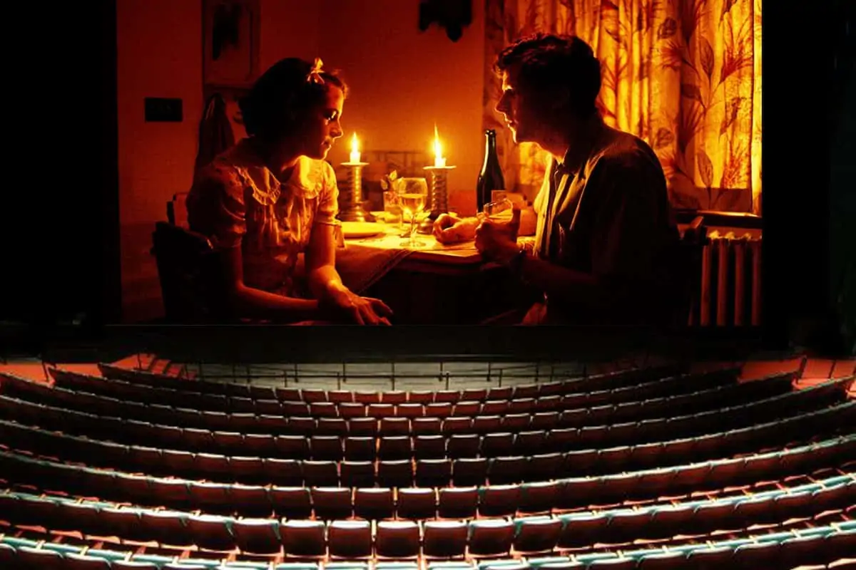
To my knowledge, the Arcadia cinema in Melzo, near Milan, Italy, screened Café Society at 4K, 16-bit. Audiences there were able to fully-appreciate the original visual intention of Woody Allen's film.
M) Preservation
The final consideration of a motion picture's journey is long-term preservation.
Almost everybody in the industry thinks that digital systems will preserve films forever. Wrong. To capture and finish in the digital format does not guarantee permanence of the media afterwards. No digital system devised so far supports assured preservation for the future. Digital images are impermanent.
According to Kodak’s specifications colour film, kept under strict temperature and humidity control, has almost 100 years of life. Digital media does not have more than five years before it needs to be re-transferred or migrated to a new new digital platform to be preserved.
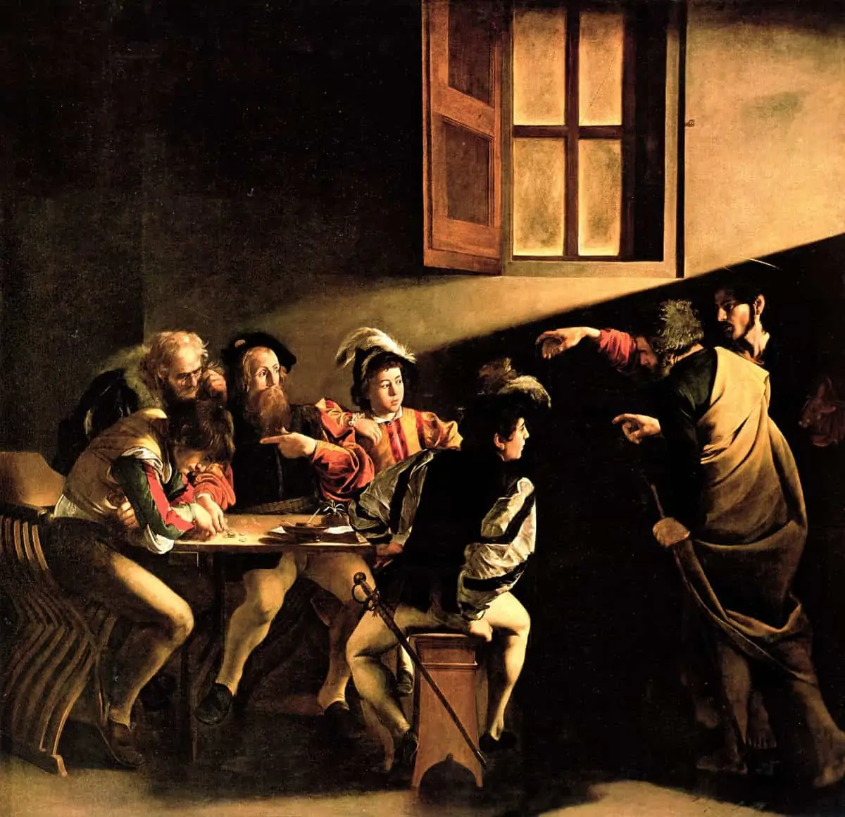
After 417 years, we can still appreciate the paintings of Caravaggio, such as The Calling Of Saint Matthew, which was completed in 1600 in Rome. But I have no idea how many years we will still be able to see the film Café Society made in 2015.
At present, the best analogue system for long-term preservation of colour motion picture film is the Silver Separation Master, devised by Technicolor, but it is very rarely used. To my knowledge, the Digital Optical Tape System (DOTS), a Kodak technology developed by Rom Hummel with Group47 in Los Angeles, could be the final answer for both analogue and digital movies. The DOTS technology, can withstand extreme temperature and exposure to electrical or magnetic fields, and offers the capability to preserve and read image files for perhaps 500 years into the future. It has already generated much interest from the US Library Of Congress and the US National Archive.
I believe that everybody should be free to do in cinema what they think is appropriate for their creative personality. But, the romantic and nostalgic energy being spent by filmmakers and cinematographers, in trying to maintain past analogue systems, to keep alive what, any how, is going to disappear, would be much better invested if we all work together, using our combined energies, in trying to reach the best possible image quality at every stage of pre-production, production, post production and particularly preservation for the future. It is our creativity, our history, and our film industry that are at stake. We all need, for the love of the art of cinematography, to take a stand on these fundamental matters.
