Game, Set & Mismatch
Linus Sandgren FSF / Battle of the Sexes
Game, Set & Mismatch
Linus Sandgren FSF / Battle of the Sexes
BY: Ron Prince
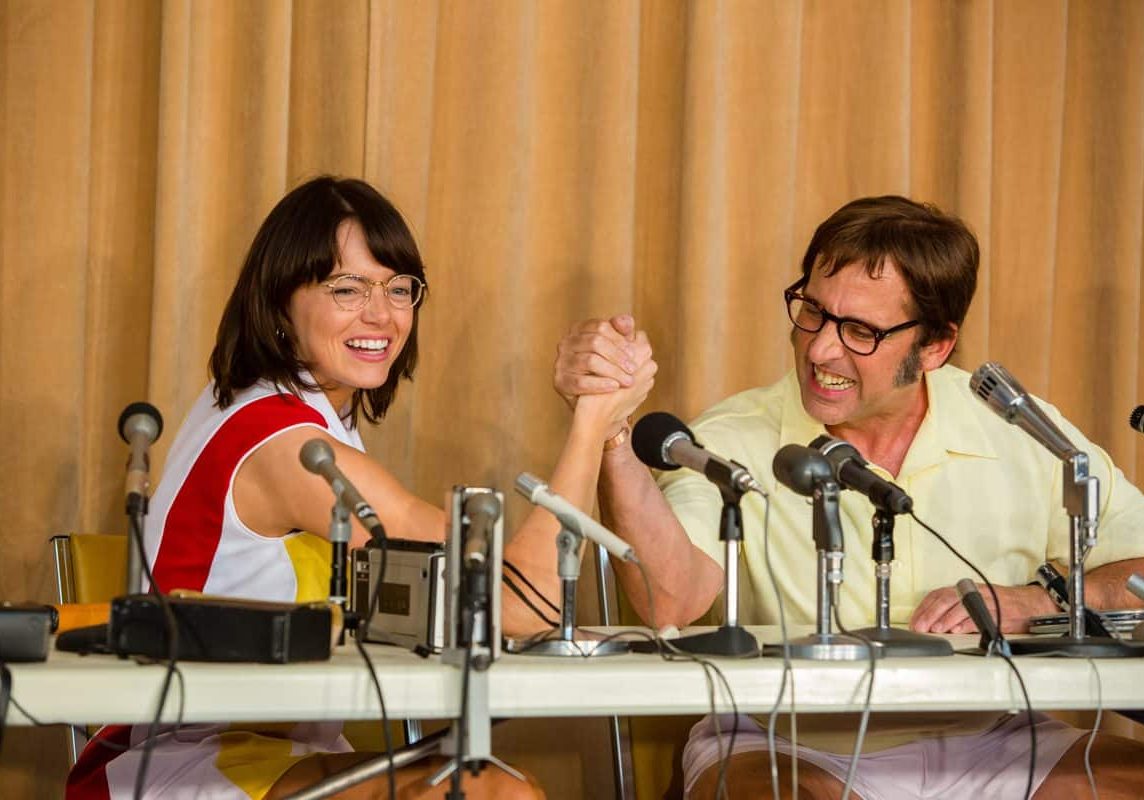
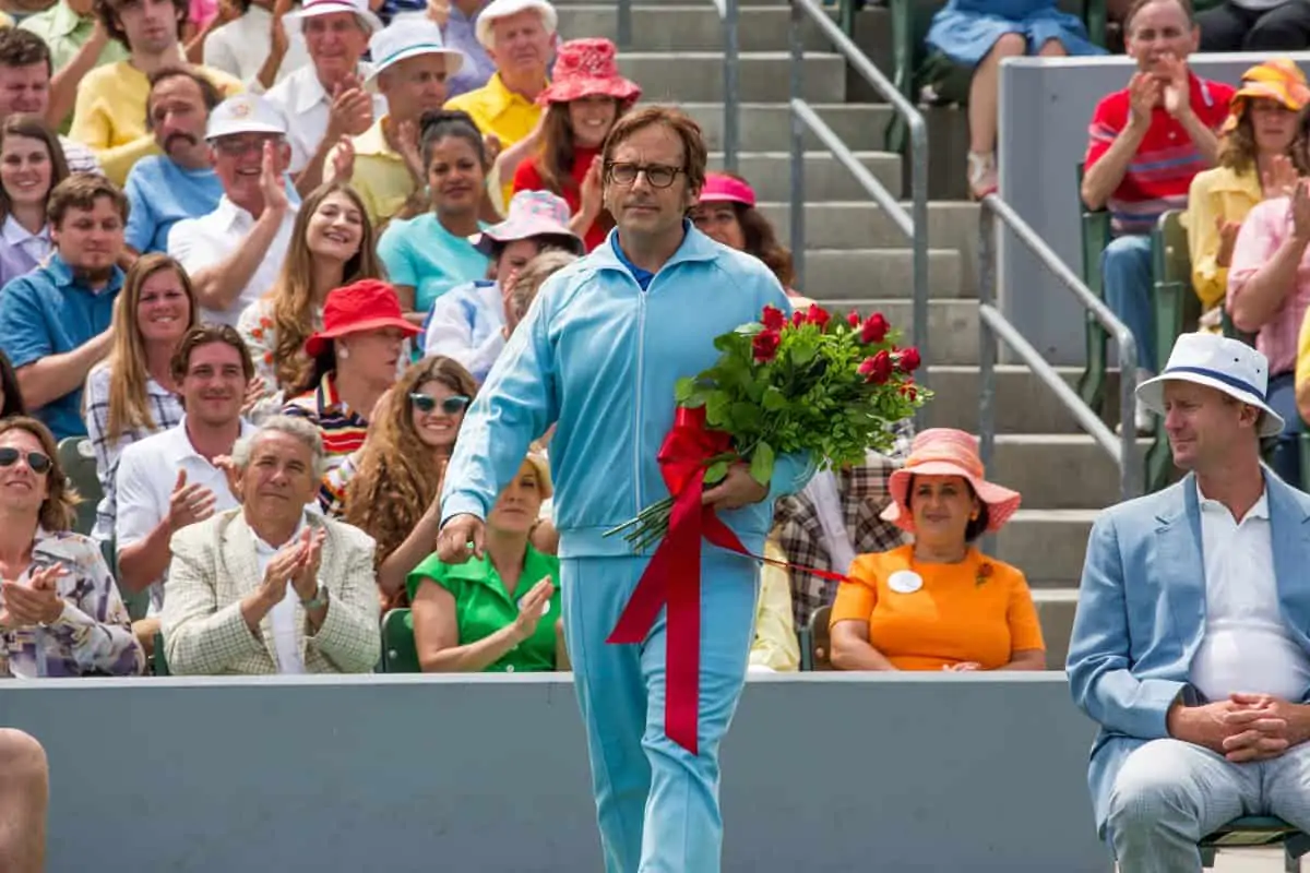
Battle Of The Sexes , directed by Jonathan Dayton and Valerie Faris and written by Simon Beaufoy, is based on the infamous 1973 tennis match between World No.1 Billie Jean King and former-champion, gambling addict and self-proclaimed male-chauvinist Bobby Riggs.
Having boasted about his masculine supremacy both on and off court, Riggs was humiliatingly trounced in straight sets at the Astrodome, in Houston, Texas, and isolated himself in his hotel room for several hours after his defeat. In the movie, King is played by the Oscar-winning actress Emma Stone, with Steve Carell as Riggs.
Principal photography on 35mm film, under the supervision of Oscar-winning cinematographer Linus Sandgren FSF, took place over 35 days in Los Angeles, from April to mid-May 2016, with a budget of more than $25 million. Although Sandgren had previously worked with Dayton and Faris on many advertising projects, Battle Of The Sexes was his first feature with the husband and wife directing duo.
“My experience on commercials with Jon and Val has always been great, and I had always admired the way their approach to longform stories and character development, such as in Little Miss Sunshine (2006, DP Tim Suhrstedt),” he says. “Having read the script for Battle Of The Sexes, it was clear that this movie worked on many different levels. Firstly, it examines the public and private faces of the characters, their outward fame, as well as their inner loneliness and solitude. For example, Bobby and Billie Jean’s marriages are both in trouble – Bobby’s wife has had enough of him, because he can’t kick his gambling habits, and Billie Jean falls in love with her female hairdresser, Marilyn Barnett, much to the pain of her husband.
“But, along with these immediate conflicts, it is also a vehicle for wider debates about prejudice, sexual politics, equality and diversity, which still rumble on today – nearly 45 years later. Overall, it speaks to a broader audience than just tennis fans.”
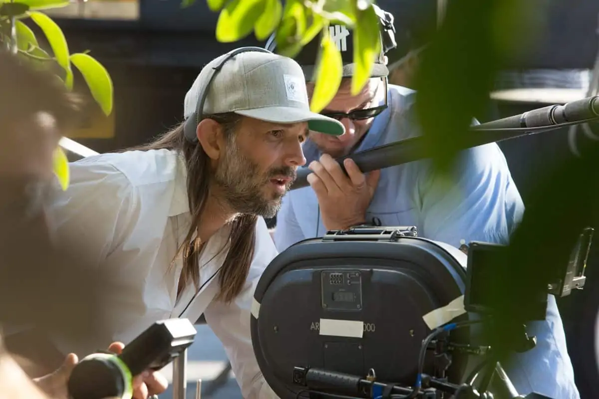
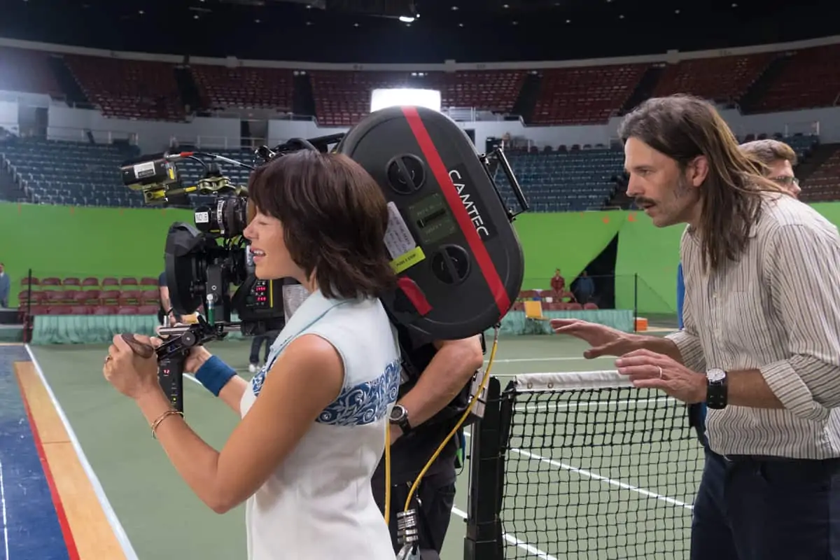
In visualising the ’70s style of the movie, Sandgren and his directors eschewed the obvious recourse of taking a nostalgic look at the era from a modern perspective. As Sandgren explains: “Basically, Jon and Val wanted to make this film as if it had been made in the 1970s – at real locations and in a contemporary manner. They also wanted it to be more like dramatic thrillers from that time – with neo-noir lighting, evolving layers of visuals and sound to create a sense of people talking across each other, and to have solid, 1970s-style camera moves on the dolly. Steadicam was way too modern.”
In this respect, classics such as The French Connection (1971, DP Owen Roizman ASC), Klute (1971, DP Gordon Willis ASC) and Nashville (1975, DP Paul Lohmann) proved inspirational. Sandgren says he worked particularly closely with production designer Judy Becker and costume designer Mary Zophres to develop the overall look of the production.
In keeping with the ’70s atmosphere, Sandgren shot the movie on film – Kodak Vision 3 5219 500T 35mm – over-exposing the negative on-set by a third and then push processing at the lab (Fotokem), which had the effect of increasing the overall contrast, colour saturation and grain in the final image.
“When you push process film at the lab, because of the over-development, you get whiter whites and blacker blacks, resulting in greater contrast in the image, as well as a greater richness of colour and stronger grain texture – all natively baked-in on the film negative, which Jon, Val and myself felt was most appropriate for this production. With the grain, the colour, the costume and make-up you feel you’re really in the 1970s, and have a connection to the characters.”
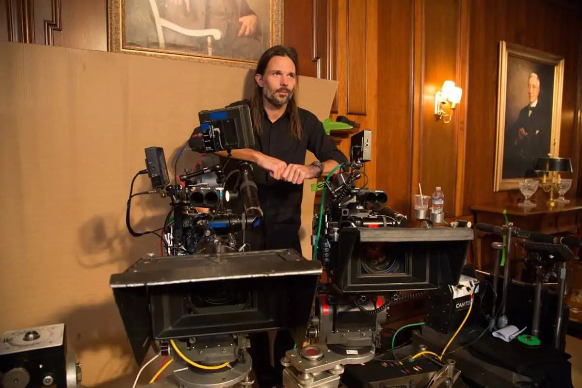
"it is a vehicle for wider debates about prejudice, sexual politics, equality and diversity, which still rumble on today – nearly 45 years later. Overall, it speaks to a broader audience than just tennis fans."
- Linus Sandgren FSF
Shooting widescreen 2.40:1, Sandgen’s choice of vintage lenses served for more than general aesthetic purposes, extending into support for the emotional storytelling.
“From the outset we created visual rules for the framing: the less the character allowed us into their life, the further away we were; for more intimate scenes, when the characters allowed us inside, we would either zoom in or go hand-held and close with primes. Although we considered and tested 16mm Anamorphic, the advantage of shooting 3-perf 35mm in 2.40:1, is that it allowed us to use a much larger selection of beautiful old spherical zoom lenses for our desired storytelling effect.”
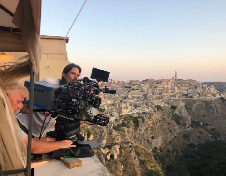
Camtec in LA provided a wide selection of vintage zoom and prime lenses, several of these having to be specially refurbished for the shoot, plus ARRI LT and ST 35mm cameras, that saw Sandgren shooting A-camera and Ari Robbins on B-camera.
“The furthest emotional and physical distance between the characters and the audience is when we are watching them playing tennis on TV, which involved a longer lens from far away – such as the old Angénieux 20:1, 25-500mm, zoom T5,” says Sandgren. “At other times, we might want to show or empathise with a character’s inner-conflict, loneliness or solitude, but out of respect for their sensitivity, stand back and power-zoom in, such as during a break in-between games of the match. For the scene in which Bobby tries to coax his wife back, we used an old Canon K35 25-120mm zoom. It has a Macro function, which allowed us to focus really close up on Bobby’s eyes.
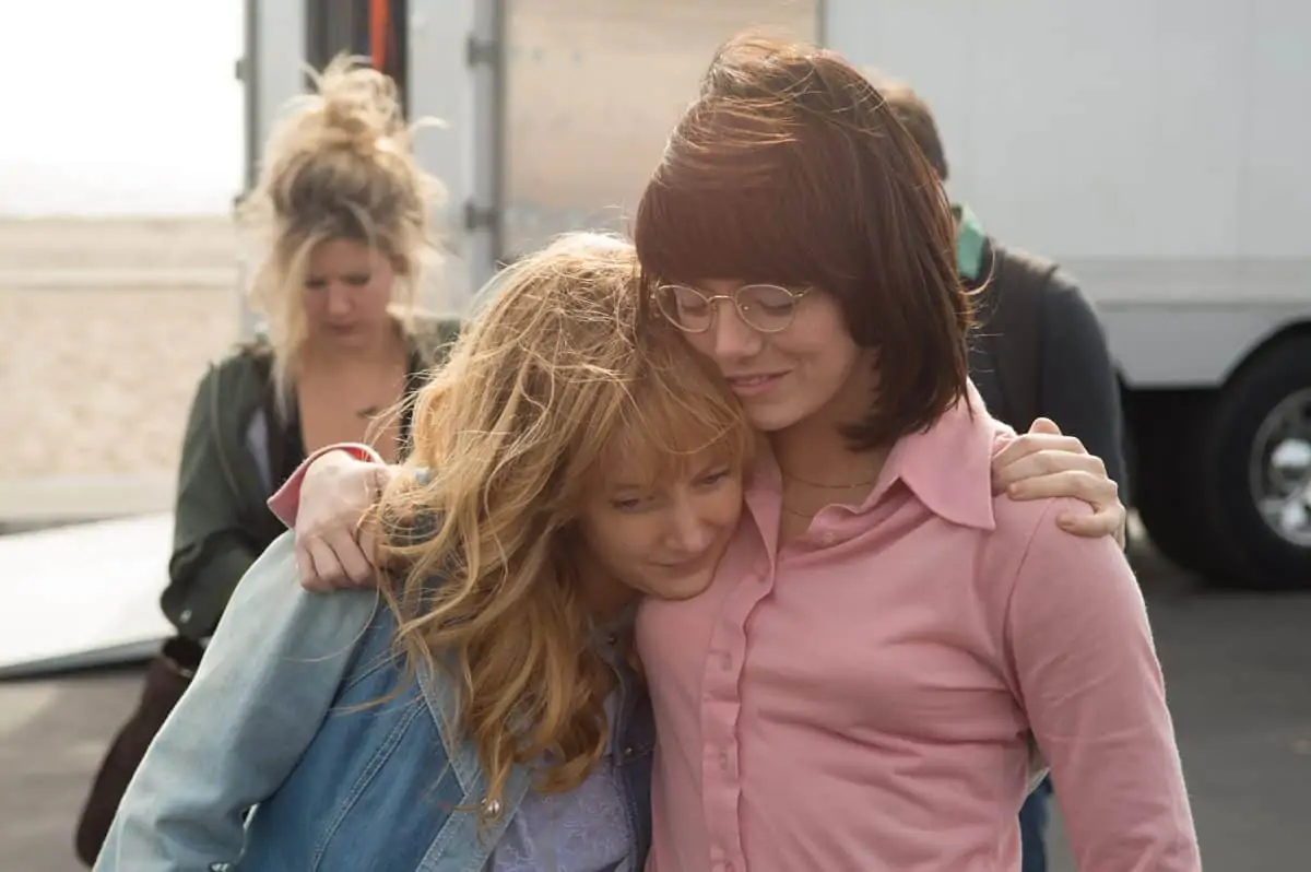
“To enhance the eroticism when Marilyn cuts Billie Jean’s hair, we played it in close-ups, again with the K35s, leveraging the natural warmth and distortion of the glass to create a hazy dreamlike quality. We shot the love scene between Marilyn and Billie Jean in close-ups too, but used the Kowa Cine Prominar spherical primes, which are slightly colder lenses but with warmer flares. This scene is all the more intimate in that Billie Jean wears glasses in every other shot in the film, but she takes them off at this moment and the image becomes really close and personal.”
To visually underscore the battles between the sexes, Sandgren and the directors also worked out a visual metaphor that runs throughout the movie. This sees the women, such as Billie Jean, move forwards (i.e. standing on the left of frame looking right), whilst the men stand on the right look back (looking left).
Sandgren notes. “As the movie progresses the women gradually move from left to right, and the men go in the opposite direction. It’s a subtle, subliminal expression of the women being the more progressive in this particular slice of history.”
