HDR in Practice
Post-it Notes / Kevin Shaw
HDR in Practice
Post-it Notes / Kevin Shaw
Colourist Kevin Shaw says there are many misguided beliefs about HDR, plus the current mixed offering to consumers further complicates progress in creating a better viewing experience.
Whilst anyone who sees well-mastered images on a 4,000-nit monitor instantly appreciates the beauty, depth and realism of the experience, most people have a far lesser introduction to High Dynamic Range. To be clear we are talking HDR monitors, not the multi-exposure capture process that is now known as HDR imaging (HDRi) or photo HDR. Many content makers are still focused on their standard dynamic range market and consequently limit the benefits of HDR because of poor workflow, because of concerns over creative intent or, maybe, because whilst many consumer televisions now claim HDR, only a couple manage 1,000-nits and none go above that yet.
The technical details of HDR are widely available. For example: my paper ‘An Introduction to HDR’, (http://www.finalcolor.com/hdr/) and this Apple developer movie (https://developer.apple.com/videos/play/fall2017/502/). So, I am focusing this article on the creative impact.
Cinematographers often say that they always capture high dynamic range since original camera negative can capture about 14 stops, and the better digital cameras today usually manage at least 12 stops.
HDR monitors display about 10 stops at 1,000-nits (the level adopted by the UHD Alliance), which makes colour grading HDR very different to what we are used to. The good news for colourists is that while SDR grading usually starts with primary controls to manage the 10+ stops captured into the six stops represented by 100 nits, well-shot material needs very little adjustment when shown in HDR.

The emphasis is on ‘well-shot’, since any form of clipping spoils the amazing realism of HDR, and there is very little headroom when the display and the camera have about the same range. So, cinematographers have considerably less latitude with exposure in HDR, and colourists find it much harder to manage problem shots.
Although the initial primary set-up is easier than for SDR grades, the colourist now has several new factors to consider. To use an HDR analogy, our most basic rules have gone out the window, yet remain in full view.
I tell new colourists that the only things in life that are certain are death, taxes and unexposed blacks. Unexposed blacks have full range RGB code values of 0,0,0 and that was always a good starting point for a grade. Raising true black above that in our traditional SDR display gamma formats just makes the image milky, since it reduces an already limited dynamic range.
In most HDR grading we use the Perceptual Quantization curve (PQ or BT.2084), which is scene-referred rather than display-referred. The creative application is that I can choose to raise black levels by 10% or more and still have more contrast than before, simply by raising the white point further. The blacks still look relatively black, but now when we cut from a sunlit exterior to a dark cave the black levels can drop. This causes the eye of the viewer to dynamically range, something it does all the time in real life, but has never had to do while watching TV. The effect is something that feels more real and more emotional. Many people comment that HDR has more depth than stereoscopic 3D.

"HDR does visibly have better colour and indeed colours we have never managed to display before. The trick is in the brightness. In SDR displays brightest white is achieved when RGB are all at maximum, and when the RGB channels are equal there is no saturation. In BT.709 the colourist must choose between brightest white, or less bright to show some saturation."
- Kevin Shaw
The whites are even more complicated. We must now distinguish between reflective white and illuminant white. In standard dynamic range TV and cinema (SDR) these two white levels are so close that we often treat them the same. There is a benefit in this approach, since it makes bright lights, including skies, spectral highlights and interior windows less distracting. When grading with PQ, the reflected white surfaces, let’s call them paper white, are usually within a stop of where they were in SDR. However, those glints on chrome, backlights in hair or spectral highlights in running water, can now be 500 nits or more above the white of paper. This also adds to the realism of an image, but like the floating black level, there is no longer a fixed or standard level to put them. They exist for effect, and that will always be a subjective choice made in the grade. Keeping paper white to a similar level as SDR retains the artistic intent, using pixel values above that for light sources and their reflections (yes lens flares now look amazing!) adds realism, contrast, depth and emotional impact that has never been possible before.
Blacks and whites make up the high dynamic range, but our rendition of colour is also dramatically changed. Forget the marketing speak about BT.2020. On paper BT.2020 is about twice the chromaticity gamut of BT.709 and it sounds very exciting. But the truth is that the UHD Alliance has specified 90% of P3 as the standard for consumer UHD Premium televisions. Even if you are really choosy and find a television with close to P3 gamut, the increased number of colours in the P3 chromaticity triangle is about as noticeable as 3840 pixels (sold as 4K) compared to 1920 HD pixels. BT.2020 is nothing more than a wrapper, a good marketing story and a way to protect for future compatibility.
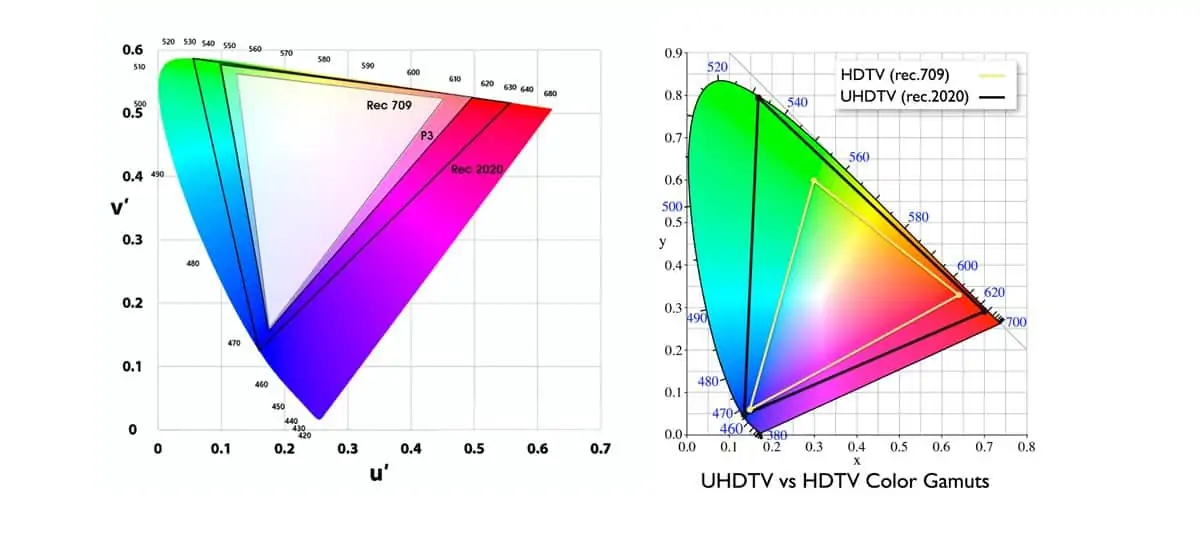
However, HDR does visibly have better colour and indeed colours we have never managed to display before. The trick is in the brightness. In SDR displays brightest white is achieved when red, green and blue are all at maximum and when the RGB channels are equal there is no saturation. So, in BT.709 the colourist must choose between brightest white, or less bright to show some saturation. Examples would be car tail lights, stained glass windows, fireworks and so on. These objects in life are bright and saturated, which is not possible in SDR. In a HDR grade we very rarely use maximum white, since we are happy with paper white around 200 nits. That means we can now, for the first time have fully saturated colours much brighter than reflected white. Early HDR animation experimented with these new colours, but the real prizes are the coloured light sources, including candles, lens flares, fire and explosions, that can now look stunningly better.
These are just a few of the observations I have made grading high dynamic range projects. We are all learning, and it is very exciting, discovering new ways to exploit the technology. The future is bright!
Kevin Shaw CSI has over 30 years of experience as a colourist, and works all over the world grading feature films, commercials and TV shows. He has been teaching colourists for over two decades, created the da Vinci Academy in 1998, co-founded the International Colorist Academy in 2009 and co-founded Colorist Society International in 2016.
