Secret weapon
Far from staying in the shadows of its successful predecessors, the ITV remake of The Ipcress File pays homage to its past while bringing modern techniques to the Cold War spy story. Cinematographer Tim Maurice-Jones BSC reveals how he brought the Sixties to the screen with vintage lighting choices and lenses.
Literary adaptations are notoriously difficult, and Len Deighton’s 1962 spy thriller The IPCRESS File comes with the additional pressure of having already been filmed very successfully. Even so, director James Watkins and cinematographer Tim Maurice-Jones BSC quickly discovered that the photographic style of the best mid-century spy thrillers refers back even further than Deighton’s novel – further, even, than the Cold War itself.
Having collaborated with Watkins on The Woman in Black and The Take, Maurice-Jones had some caution over becoming involved in “a much-loved classic – it can be a bit of a poisoned chalice as people are so in love with the original. But the script, by John Hodge, was very good, and more faithful to the book.” The 1965 screen adaptation was, as Maurice-Jones says, famous for its use of Dutch angles – “but to recreate them,” he confirms, “we needed to firstly understand them.”
Maurice-Jones quickly began to suspect that cinematographer Otto Heller BSC had been influenced by the seminal work of BSC founder member Robert Krasker BSC ASC, who won the 1951 Academy Award for best cinematography for the noir The Third Man. “Robert probably took his inspiration from German expressionist films of the 1920s, but as much as I loved the angles of the original, I thought they might distract from the more complex story we were telling, so I decided not to go as extreme. But after the first week’s shooting, we felt we needed to go back to the more extreme look!
“We liked that in The Third Man normal life was level, and the spy world was angled. There is a great composition in The Third Man where two people are speaking but facing away from each other. The exact composition turns up in The Treasure of the Sierra Madre and The Godfather. I used the same composition in The Ipcress File on several occasions.”
In the spotlight
Given that basis for composition, Maurice-Jones aimed for lighting which “paid homage to the original style of the movie, with the hard ‘60s light. But shooting hard light is a lot more difficult to do. You have to relight for every position; you can’t be too high; you can’t be too low. If you look at The Third Man, the nose shadow just joins the cheek shadow. It’s inches left and right to get the right position. The actors have to understand hitting marks is important because you look amazing when you hit the right light.”
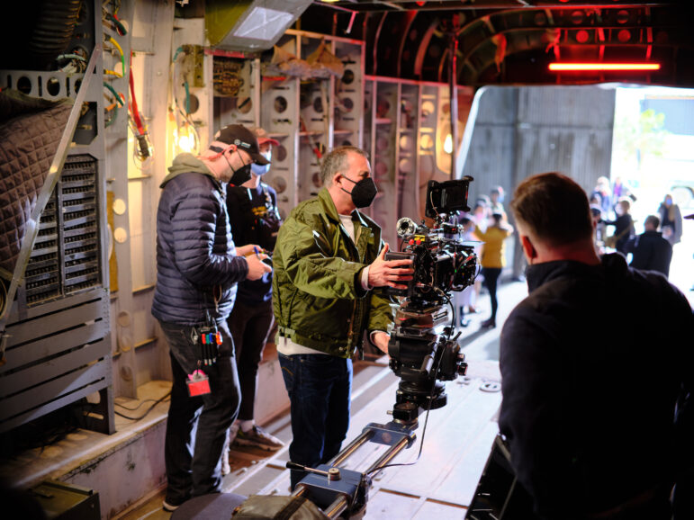
To create that light, Maurice-Jones chose period tools, accepting that “the lights that were around in the 1960s were very limited. I mainly used Fresnel lights without diffusion. I had some fluorescent tubes on the ceilings and the walls; I had some LED lights just to pop some light into a corner. And I used very little smoke, they didn’t use smoke. It was very hard and clean.”
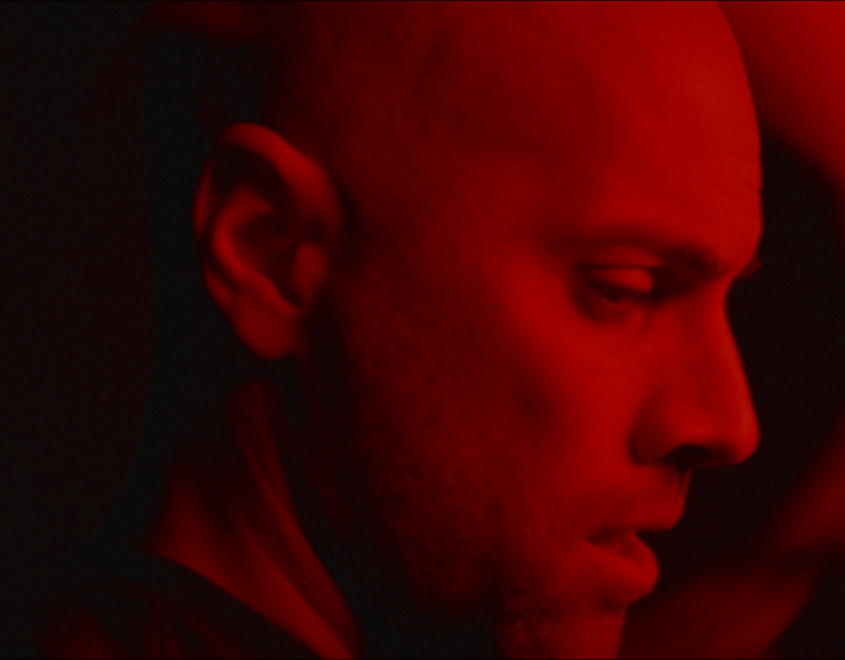
Shadow control was naturally paramount, and Maurice-Jones had a firm plan: “I’m looking for both eyes lit, but after that, a very strong, deep shadow on the shadow side. I want a hard black shadow on the guys. We did camera tests and Joe Cole said ‘Wow, I’ve never been lit like this before.’”
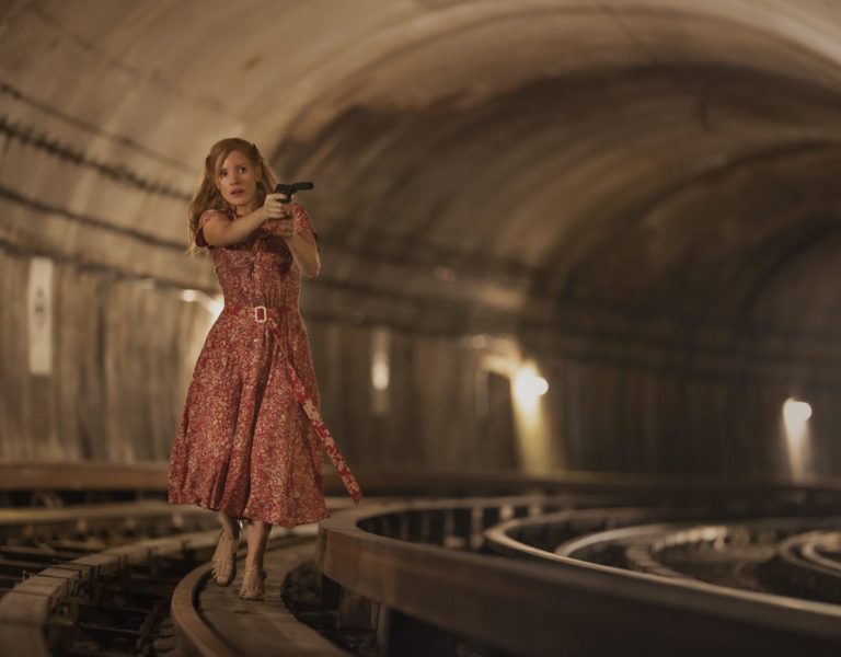
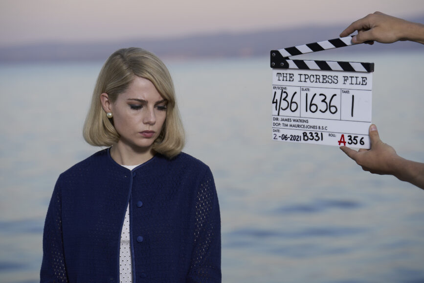
The carefully controlled reserve of Lucy Boynton’s character, Jean, required a different approach. “I wanted her to look like an ice queen,” Maurice-Jones says, “perfect-looking, so I always had the light directly over the lens if I could, lighting her with no shadows. If you look at fifties and sixties movies the female leads are often lit that way. It sounds harsh, but that’s how women were photographed.”
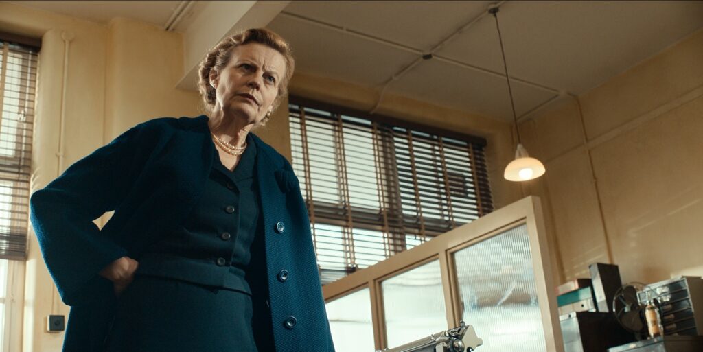
Other characters, meanwhile, required other approaches. “Anastasia Hille was playing Alice, a 60-something, chain-smoking, hard-bitten assistant, so I lit her like one of the guys, really hard. She has an amazing face and I lit her for character.”
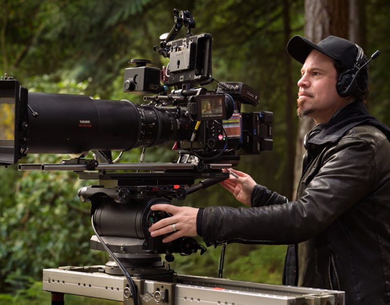
Maurice-Jones used the ARRI Alexa LF Mini in its 4K windowed mode (with the camera package for the UK shoot, supplied by Pixipixel) – “so I could use the vintage Zeiss Super Speed lenses, which don’t cover full frame.” These lenses, he goes on, are not quite period accurate, dating from “the early seventies, but they still had a good look for the sixties. I couldn’t use the 18mm as it couldn’t cover, but I also had a set of Canon Sumire primes. They’re slightly softer, they’re warm, a little more romantic than a Super Speed. I also had some vintage Zeiss T* lenses, which are older than the Super Speeds, to fill in the gaps at 40mm, 100mm, 135mm, and 180mm. Any time I shot mid or closeups of Lucy, I’d use a Canon lens as they’re a little softer and a little more flattering. I used the others for everything else.”
As prep was finalised, the story’s most iconic piece of costume demanded special attention. “Joe was wearing glasses for the whole movie, big thick black glasses. When I did the lighting test, they were shiny, and every single light reflected in the frame of the glasses, so we had the frames remade in matte black.” With reflections still in mind, Maurice-Jones mentions the flat glass lenses often used in costume spectacles. “I don’t like the flat lenses, so we had proper lenses. I had to get the light just high enough not to reflect, but an inch higher and the big thick shadow of the glasses went over his eye!”
Capital of culture
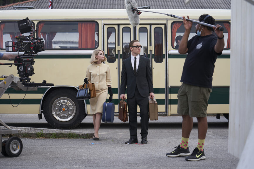
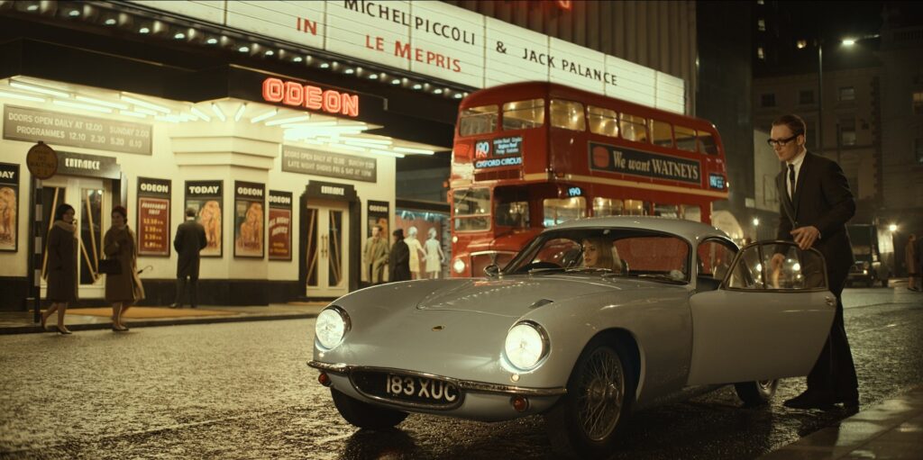
Principal photography ran from February to June 2021, beginning in Liverpool. With the city standing in for London, the crew created “two sorts of England. One had a red London bus, the Odeon cinema in the background – it’s bright, swinging, Carnaby-Street London. Then there’s the other type of London which was cold and dirty.” Operating personally, Maurice-Jones shot closeups and mid shots, while Malcolm Mclean captured unusual angles and wides with a second camera.
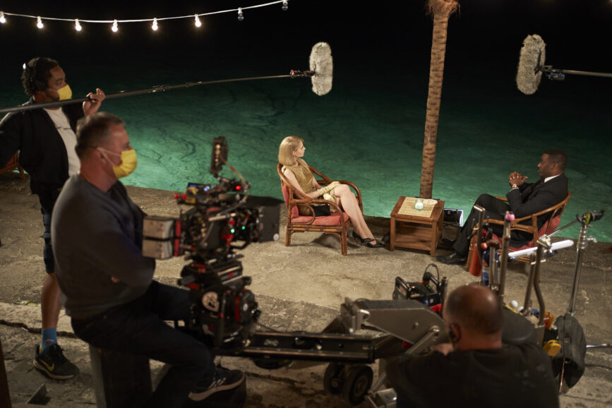
With UK work complete, the production moved to Zagreb and Split in Croatia, doubling for Finland, East Germany, the Pacific, and Berlin. “Berlin at that time had no colour,” Maurice-Jones states. “It was faded grandeur, very limited colour palette, grey and brown.” One memorable setup demanded quick thinking after a change in the weather. “There was a scene between Dalby [Tom Hollander] and Stok [David Dencik] which we were shooting in a Roman ruin. We’d designed a five-minute tracking shot on Steadicam, and I spent all day lighting it with ten huge balloon lights designed to look like soft moonlight through the whole of the ruins.
“On this night the wind got stronger and stronger, so strong the Steadicam guy couldn’t operate. Now it’s one in the morning and it’s going to be bright at four thirty. What are we going to do? I found the biggest space in the ruins, and then took the biggest light I had and put it as far away as I could, put a blue gel on it and shot as if it was single source moonlight. We ran the scene five times, changing camera positions each time. It ended up being one of my favourite scenes.”
Long takes, Maurice-Jones says, were common in period camerawork, “so we wanted to shoot a lot of scenes in one take. There’s a scene with Joe [Cole] and David [Dencik] when they come out of the funeral, another five-minute Steadicam scene-in-a-take. There’s a great scene where Joan is at the drinks party, gets a phone call and she walks all the way up to the camera and picks up the phone. He catches up with her, we track back – it’s all choreographed into to one scene. We’d spend quite a lot of time choreographing.”
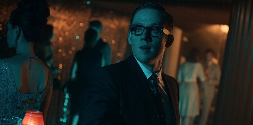
Maurice-Jones’ approach to monitoring was straightforward: “set the monitor to Rec. 709, add a tiny bit of contrast, and reduce the saturation a bit. I’d look at the monitor a bit, but I’d use my eyes and look at the scene. On something like this which is such a simple lighting style you really don’t need a LUT.” This approach also simplified grading. “It was mostly playing with the contrast levels. I wanted the contrast to be quite strong, but not fake strong. So, there was very little to do in terms of deciding what colour we wanted it to be.”
One frustration Maurice-Jones cautiously raises is that “you spend so much time trying to make it beautiful, and then it goes out on TV and it’s not what I set in the grade. This is a problem a lot of DPs have; what you did in the grade is not what you see on TV. This was brighter and less contrasty. The other thing that’s a frustration is that half the people watching it have their TV set to sport mode or whatever. But I miss the days of the Sony Trinitron. If you graded something, that’s what you saw.”
The result is a story that avoids, just as Maurice-Jones hoped, much comparison with the 1965 film. “That’s all about Michael Caine’s character, but the original Deighton book had many characters; it was multifaceted.” Even so, the leads were clearly defined. “I wanted Joe and Lucy to look amazing. Joe always has these amazing suits on, and he has a hard light that brings out the texture in the fabric and the clothes. Lucy has a great outfit every day. Let’s make it look like a Vogue fashion shoot from the ‘60s. Why not!”

