
Bruno Chrome
Peter Doyle / Inside llewyn Davis
Bruno Chrome
Peter Doyle / Inside llewyn Davis
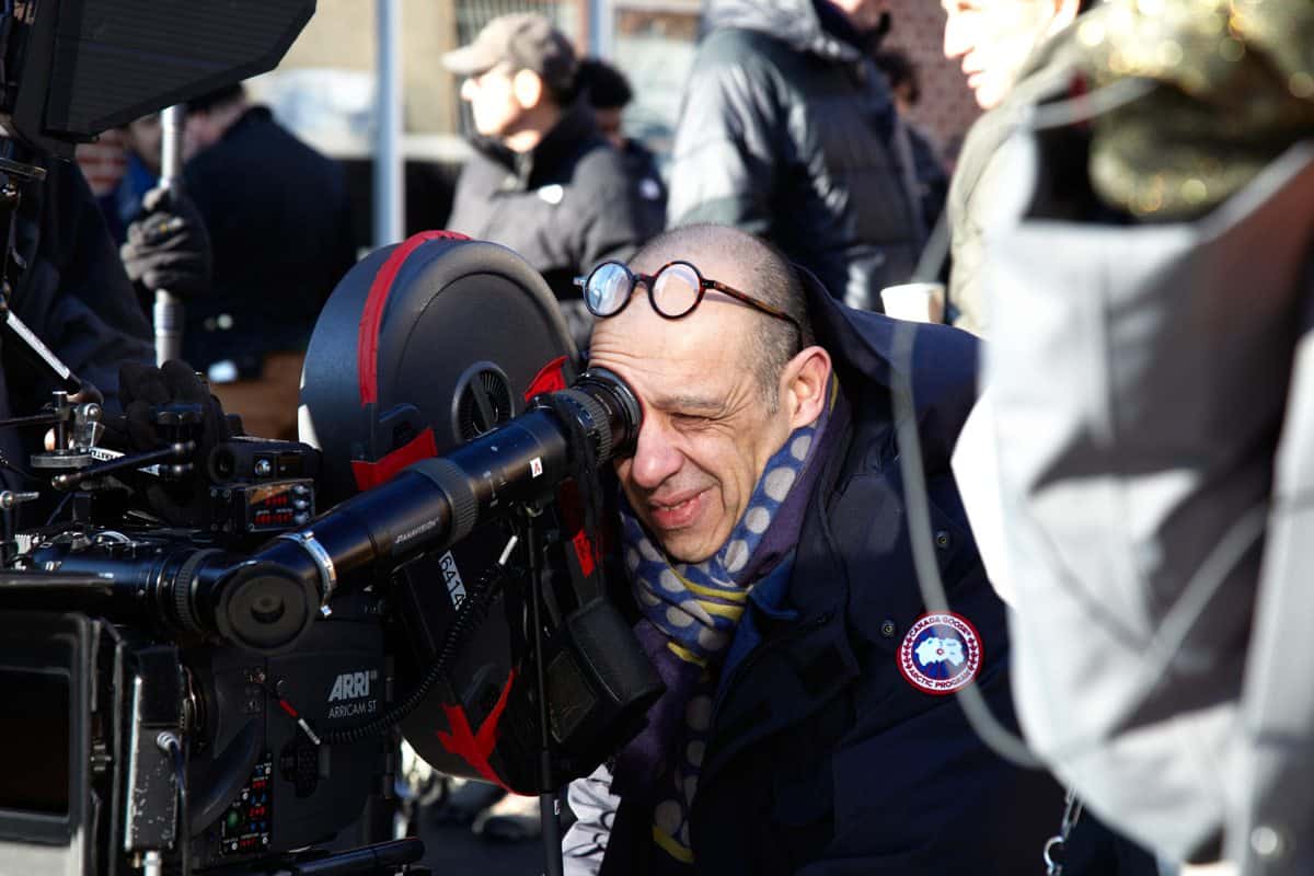
With a career spanning over twenty years, Peter Doyle is one of the film industry’s most distinguished supervising digital colourist. Now supervising colourist at Technicolor, he is renowned for his remarkable handling of digital colour-grading and pioneering approach to colour design as an integral part of the each production’s unique creative recipe.
Doyle’s work for the two largest tent-pole franchises in movie history – The Lord Of The Rings trilogy and Harry Potter – won him universal acclaim. Recent work includes Alexander Sokurov’s Faust and Tim Burton’s Dark Shadows, as well as Peter Jackson’s The Hobbit. Over the last nine years, Doyle has focused exclusively on digital grading for feature films. He has developed a pipeline that centralises colour-management of a film from daily rushes, including colour control of VFX plates, through to final release printing, DCI and video deliverables. He continues to work with cinematographers developing sets of tools, technologies and processes that bring each distinct creative vision to life.
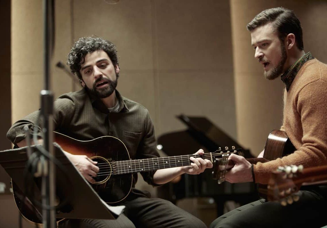
Picture this: Greenwich Village, New York, 1961, winter – back when it was just The Village, home to budding cultural icons and a nonconformist way of life, but before it blossomed as the nucleus of the folk music scene of the 1960s.
This is the setting of Joel and Ethan Coen’s latest comedy drama, Inside Llewyn Davis, detailing a week in the life of an aspiring folk musician as he faces both the bleak New York winter and seemingly insurmountable obstacles to success.
Doyle worked closely with DP Bruno Delbonnel AFC ASC to enhance the particular quality of light and evokes the feeling of a cold, bitter New York City in February on the big screen. The Coens were inspired by the early album covers including The Freewheelin’ Bob Dylan from 1963 and Another Side Of Bob Dylan from 1964.
“Bruno did some more research and found the colour outtakes of the album covers and several other reference points that really brought to life the unique light that New York City had during that period,” says Doyle.
Collectively the pair gravitated towards the style and tone of NYC street colour photographers of the 1960s, specifically Saul Leiter. “I was familiar with Leiter’s work, having bought several of his prints a few years ago,” he says. “I took that look and feel and began building a colour process that would emulate the hue response of those photographs.”
Delbonnel worked with the production design team and shot a series of colour swatches of the proposed sets in natural light, according to the time of day that the script called for. These swatches were then run through the colour process Doyle designed and developed.
“I named the process Bruno Chrome. It seemed apt at the time and it became our colour bible for all departments. Everyone was able to see exactly how the set would read on the film, and Bruno was able to rate his negative, a major consideration given the restrictions and difficulty of shooting on location in New York,” explains Doyle.
Inside Llewyn Davis was shot on 35mm film, an aesthetic choice influenced by the time period, New York location and the actual story.
“We wanted the audience to feel the era of the film and we wanted to do this without using the clichés of sepia or scratches. So celluloid was the obvious choice,” he remarks.
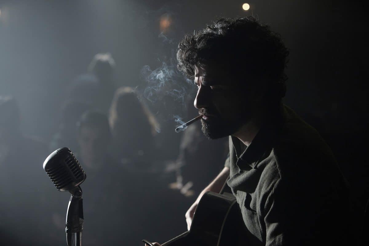
The film is almost like a memory, in perfect recollection. For the DI, Doyle and Delbonnel focussed on capturing the spirit of the period as opposed to merely reproducing it. Delbonnel used modern film stock to capture that essence and Doyle applied subtle manipulation during post production to fully bring that look and feel through.
“We used 3D look-up tables and colour matrices which equated to a lot of forced colour,” says Doyle. “We didn’t use the blue layer of the film stock at all. It was a variation of the old Technicolor two-strip concept where you built the blue by remapping the red and the green. It worked really well with the art direction and the costumes.”
All grading was performed on Baselight systems with all rushes scanned at 2K on a Spirit telecine using the custom-developed look-up tables to check the colour. According to Doyle the looks that were applied to the rushes were near final because the process was treated as if it were actually a DI.
“Bruno is meticulous about his work, his exposures are impeccable and, as a result, this approach is ideal. When he shoots multiple takes, the lighting is pretty much locked. This means that once you set a look for the first take, you can apply it across all the others and they cut together well.”
“We used 3D look-up tables and colour matrices which equated to a lot of forced colour. We didn’t use the blue layer of the film stock at all. It was a variation of the old Technicolor two-strip concept where you built the blue by remapping the red and the green.”
- Peter Doyle
For colourists there are advantages to applying a near-final look to rushes. Doyle explains that it allows the editorial team to work with images in a form that is incredibly close to how they will appear in cinemas and that can subtly impact their creative decisions.
Doyle’s approach also turns grading into an evolutionary process. “As the editorial team completed sections of the film, they passed them back to me. I reviewed the shots in context and tweaked them if necessary.”
Doyle previously worked with Delbonnel on Harry Potter And The Half-Blood Prince (2009) and Tim Burton’s Dark Shadows (2012) and it this relationship and matching of aesthetic sensibilities come through in the feel of Inside Llewyn Davis.
“This really worked because we have a good working relationship and are familiar with each other’s style,” says Doyle. “It made the grading and collaboration much smoother and we got to the point not where we were asking how do we want the film to look, but rather how can we make it better?”