Bomb Gone
Jess Hall BSC / 30 Minutes or Less
Bomb Gone
Jess Hall BSC / 30 Minutes or Less
BY: Ron Prince
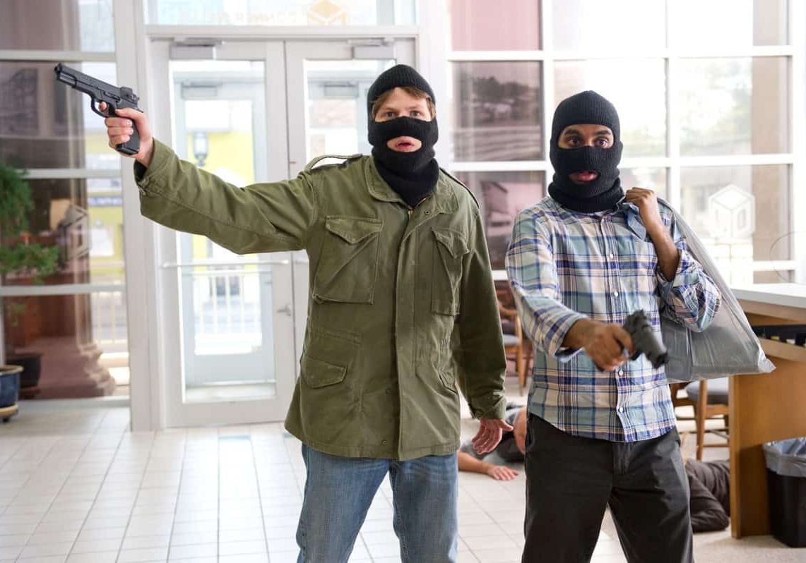
Two fledgling criminals kidnap a pizza delivery guy, strap a bomb to his chest, and inform him that he has mere hours to rob a bank, or else. As the clock ticks, Nick (Jesse Eisenberg), with the help of his ex-best friend, Chet (Aziz Ansari), deal with the police, hired assassins (Danny McBride and Nick Swardson), flamethrowers, and their own tumultuous relationship.
That’s the premise behind 30 Minutes Or Less, the double-buddy-movie-comedy, directed by Ruben Fleischer (Zombieland). Produced by Columbia Pictures, and funded by Medienboard Berlin-Brandenburg, it is loosely based on the Collar Bomb Case, an unusual and disturbing bank robbery which occurred in Erie, Pennsylvania, in 2003, when Brian Wells, a pizza deliveryman, was killed as a bomb detonated when police apprehended him outside of the bank.
The film is the latest outing by cinematographer Jess Hall BSC, whose previous cinema credits include Hot Fuzz, Son Of Rambow, Creation and The Switch. Filming on 35mm took place in Grand Rapids, Michigan from July to September 2010, with the bank robbery shot at a vacant bank in the town of Ludington. The film's screenplay was by Matthew Sullivan and Michael Diliberti, with Ben Stiller among the producers.
“In terms of comedies I am generally drawn to stories that have a darker subtext. I grew up watching Monty Python, Rising Damp and The Marx Brothers – very specific types of comedy that have shaped my preference for both an ironic tone and a certain type of physical comedy. I liked the way the 30 Minutes Or Less script combined comedic elements with action and was based around a definitive, concise timeline that gave the narrative pace and drive. Zombieland impressed me and this was a great opportunity to work with Ruben and Jesse Eisenberg who had combined so well on it. I was also intrigued to explore the visual landscape of the Midwest, which I had recently been exposed to in the writings of Jeffrey Eugenides and his fantastic book Middlesex. Eugenidies wrote the initial story for The Switch entitled The Baster, which was what had initially drawn me to that project.”
Hall says the subject of lighting for comedy was a major part of his initial discussions with Fleischer. “I don’t do conventional, flat-lit comedy lighting, and neither does Ruben. He wanted to bring a certain cinematic value to 30 Minutes Or Less, with a subtle naturalistic look, and this drew us together.”
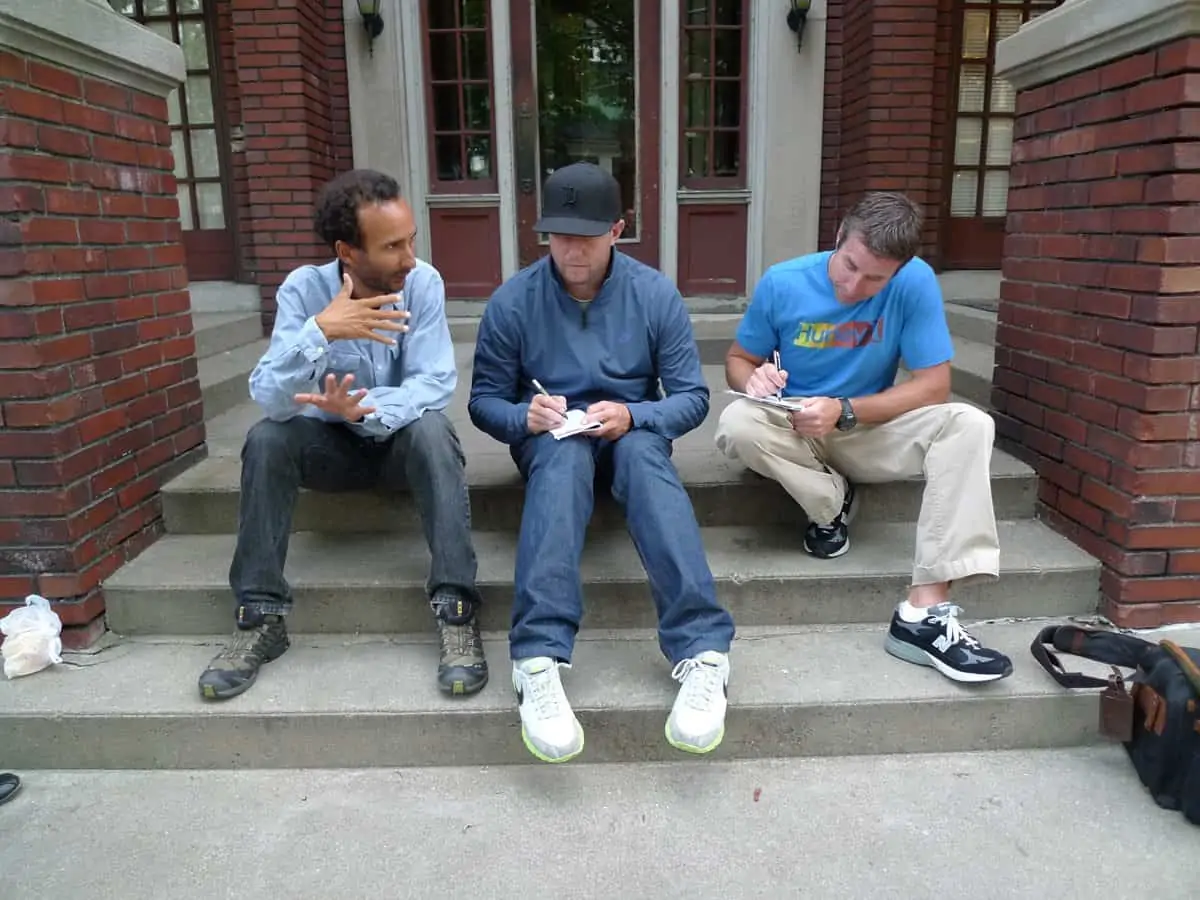
Early in discussions Fleisher declared that he was a fan of Hot Fuzz and Son Of Rambow – both action comedies - and that he wanted to draw on elements of both, admits Hall. “He wanted a natural look with a unity of style – to create a distinct sense of place, capturing the texture of location. We concluded the best approach was to use a subtlety in the visual style that would complement the extreme characters in the story and ground the film in a sense of reality. In this way we could help the audience to engage in this somewhat bizarre world.”
Hall says that the Cohen Brothers’ Fargo, lit by Roger Deakins BSC ASC, was a key creative reference. “Roger is a master at finding the appropriate style for the story. Ruben brought up Fargo as a reference and I liked the way the photography was so restrained. You are both immersed in a specific place and culture whilst at the same time observing it. This gives room for strong performances and extreme events to play out within the frame in a way that is quite disconcerting. The framing style and composition of the film utilises slightly longer focal lengths than usual for a Cohen Brothers film and this was not something that we used in our film. However, the overall naturalistic palette and realism in the depiction of the Minnesota and North Dakota landscapes and interiors was an inspiration”
Also informing the creative approach, Hall says were the photographs of Jeff Brouws, particularly his book Approaching Nowhere. “It’s a fantastic book of photographs that visually explore a discarded landscape in areas where traditional industry has collapsed,” he says.
Hall had just over six weeks prep time on the film, including scouting locations at Grand Rapids, which he says was full of surprises.
“Traditionally a furniture manufacturing town, it’s a diverse place with a lot to offer in terms of locations. There is quite a lot of history there with traditional homes, including a beautiful restored Frank Lloyd Wright house, giving way to generic modern suburbs. There is also a more dilapidated side, large railroad and industrial yards and disused factories.”
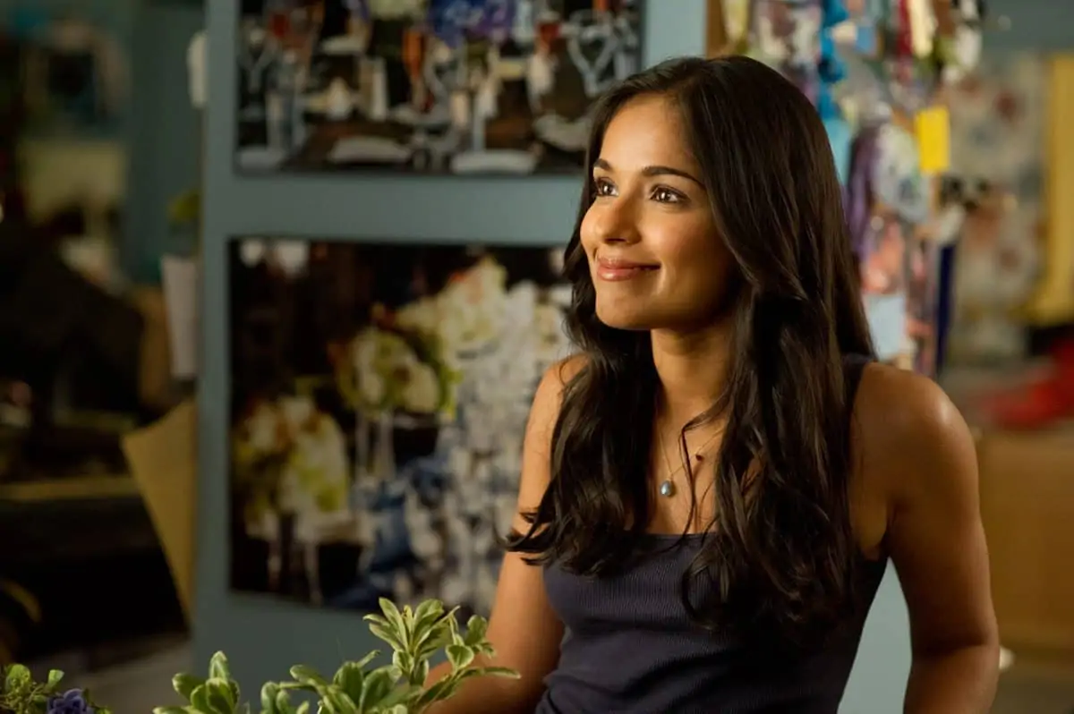
Much in evidence is also what Brouws refers to as “the franchised landscape” – a convergence of corporate logos, shopping malls, tarmac and cars. “Your first instinct might be exclude these from the frame, however there is a bleak beauty and desolation to these landscapes that somehow reflects the material world that drives our characters.”
The other, not quite so pleasant, surprise was the weather, and it’s effect of the lighting conditions – a prime concern in terms of continuity, as the majority of the story takes place over the course of 24 hours.
“We are talking about a huge land mass – the American Midwest - and the weather patterns for Grand Rapids move across the plains and cross lake Michigan which behaves much like an ocean and causes weather and light to change continually. The sun constantly chases along the sides of the clouds as high meets low pressure,” he explains. “Also, we were going to be shooting in the summer, when the sun is high and once the story gets moving we are on a specific timeline that goes from morning to night with some scenes talking place at dusk.”
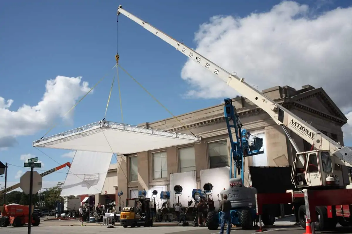
To control the fugitive light on exteriors Hall opted for textiles on large screens, ably wrangled by grip Richard Guinness. Gaffer John Nadau came in below and created modelling with bounced sources.
“We were constantly shooting with two cameras often at right angles and although the diffusion overhead took the curse off the sun it creates quite a flat top light on faces that is not my preference. I think one of the most important responsibilities of a cinematographer is to light the faces of the actors well and appropriately for the scene. Simply flattening the light is not enough, Jesse and Aziz needed a specific type of light and contrast to look their best.”
This system he says not only helped him keep a consistency, even when the light changed, and to a certain extend combat the time of day, but aided the actors too.
“Some of the main cast are stand-up comics, there was quite a lot of improvisation going on and sometimes the takes were very long. Ruben was clear that he didn’t want to wait for light, neither did the 37-day schedule permit it, and scenes could not always be scheduled for the appropriate time of day. It was important that if one of the actors was on a roll we could continue shooting despite the changing light and that the shot would be good.”
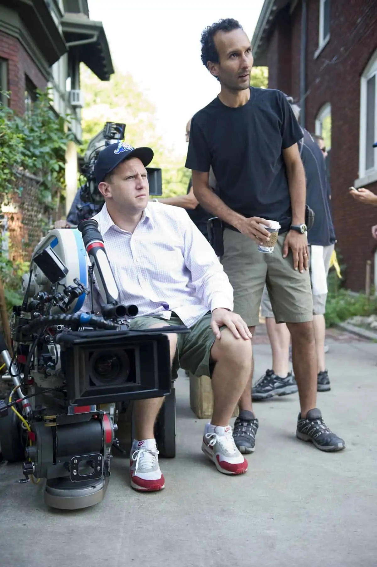
"['the franchised landscape'] Your first instinct might be exclude these from the frame, however there is a bleak beauty and desolation to these landscapes that somehow reflects the material world that drives our characters."
- Jess Hall BSC
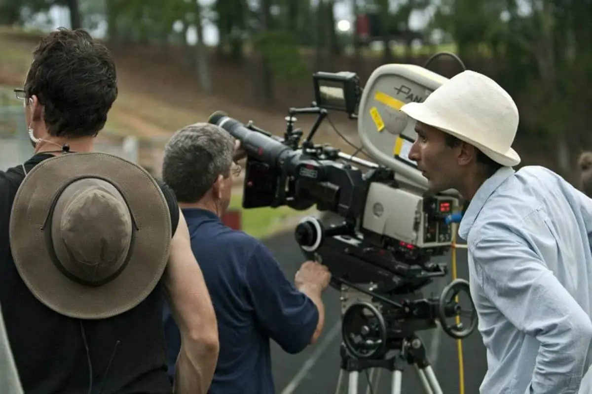
Hall says the landscape and tone of the film had much to do with the decision to shoot 2.40:1, with A and B cameras, using wider lenses when possible. The dual Millennium XLs and a selection Primo lenses including primes and Panavision in Los Angeles provided zooms. A camera was operated by Neil Norton, with Paul Verrier on B-camera.
“It’s a cliché and I often believe rules should be broken, however comedy frequently works best with wider lenses. The key lens for us was the 27mm, we would often use that lens both for wide shots and medium two-shots and then move to the 40mm for the close up. There is something about the way that perspective works on the 27mm lens that always draws me to it, especially when there is action involved. Objects move faster towards the lens but without a sense of distortion. The wide aspect ratio also meant I could capture the sense of space and location – to give a certain sense of the epic. An important part of this comedy is that these characters start to believe they are in a story bigger than their circumstances and 2.40:1 helped to express that. Ruben coined this a ‘double-buddy-movie’ and the two shot was the key. We discovered it was just funnier to see both characters in the frame, to see them interacting with each other without a cut. Composing a two shot in 2.40:1 just works better especially in car interiors, of which there are many”
The early debate as to whether to shoot on film or digital was decided after Hall undertook side-by-side tests during pre-production of a night scene at the film’s finale in a scrapyard, involving an escalating outbreak of fires. “It’s quite a long night exterior scene that takes place over a large area with a significant amount of fire involved. I was concerned how the digital formats would hold up in relation to the fire at a wide aperture,” he says. “The test revealed that 35mm proved vastly superior in holding the level of detail in the flames. I still wanted to light to T4.5 to get really good detail in the flames, and that was a lot of light given the size of the location. But on the digital formats we tested I needed at least double the light. ”
Hall selected Kodak Vision 3 5207 and 5219 film stocks, “I have used these a lot, know where I am with them, and how to explore their subtleties.”
To keep the look naturalistic, Hall chose to use mainly bounce lighting where possible. His lighting package, provided locally by Lowing Lighting, with some additional fixtures from Quixote in LA, included a pair of 18K ARRI Max HMIs, and a pair of 1.8K ARRI MAX. For large night exteriors 36 light Dino’s were combined with 12k tungsten pars and 20k Fresnel’s. For specific scenes he used Mac 2000 moving lights, litegear LED ribbon lights and LED Nila lights.
In terms of lighting, Hall had to contend with the additional dynamic of balancing the very different skin tones of Ansari and Eisenberg, who appeared in many scenes together. “Aziz has very dark skin, whilst Jesse’s is quite pale. I knew film would give me the latitude to capture this difference, but needed to work on the lighting, especially when they were in driving sequences.
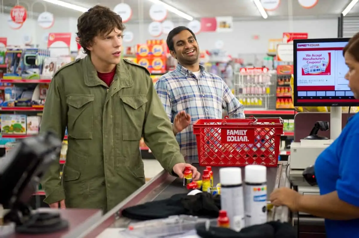
For car shots involving the two actors, Hall used Nila LEDs. “It is a really useful source, due to the lenses on the bulbs its quite directional and runs on very small batteries,” he explains. “I could mount them in series on the bonnet of the car and lift Aziz’s exposure by ½ to 2/3 of a stop without effecting Jesse’s.”
In terms of camera movement, Hall says the opening scenes of the film, during which the characters are established, were shot more conventionally, with a combination of classical tracking shots and a static camera before gradually shifting to handheld as the action becomes progressively more wild and frenzied.
Recalling the evolution of the camera movements, and use of color, he describes a 360-degree tracking shot around McBride as he converses with his girlfriend (played by Bianca Kajlich) in a strip club.
“As she mesmerizes him with an erotic dance, the cameras circling of them becomes a metaphor for his entrapment in her seductive web,” he explains. “Reuben and I are both fans of the classic 360-shot – as perfected by Martin Scorsese and Michael Ballhaus ASC, and who also choose just the right moment to execute it for dramatic effect.
“As the shot evolves they conspire and develop some sinister plans. This was one of the scenes in which I took the opportunity to do slightly more dramatic lighting and use color to create a sense of discord. The key light was a Jem ball that bathed them in a golden hue. An LED light was fixed just above the lens to give a glint in their eyes. In the background I used primary red and blue gels, and a combination of a pale gold and a pale blue that were exact complimentary colors. These blended with the cool white of the LEDs and created a rich palette that was in contrast to the majority of the film where I controlled the color temperature very carefully. Space was tight so we shot it on a 21mm lens and used tracking boards. It was a struggle to keep the lighting fixtures out of shot. Then we shot it again on a 40mm and were ready to wrap at mid-day, it was the prefect way to cover the scene.”
