RIDING THE WAVE
Find out how Channel 4’s Big Mood depicts the flip from “up to down” experienced by its bipolar main character through the lens of cinematographer Daniel Stafford-Clark.
Big Mood is my favourite kind of comedy; one with dark edges that doesn’t pull its punches. It follows the friendship of two women living in Dalston East London, Maggie (Nicola Coughlan) and Eddie (Lydia West), as they navigate their early 30s and diverging life priorities. Maggie is bipolar and by the end of the first episode we realise that her irrepressible energy as she drags Eddie into a series of wild adventures is, in fact, a severe manic phase, as she crashes into a depression that threatens to derail the friendship.
I was very lucky to have an unusually long prep period for a Band 2 show. This meant that I could help guide the first location scouts, which is rare in television for a DP. Also, it meant I had lots of prep chat with the director Rebecca Asher and the writer Camilla Whitehill, imperative to finding a visual language that was authentic in its depiction of a mood disorder, expressionistic when it needed to be, but ultimately focused on the two lead characters and their relationship.
At the very heart of our visual approach was a sliding scale of “mood” that we would discuss in relation to every individual scene. We used this as a basis to make key decisions which included a LUT with a sliding scale cleverly created by colourist Toby Tomkins from Harbor Picture Company that ranged from a punchy, sharp, saturated ‘up’ tone to a desaturated, cold and lower-contrast ‘down’.
I opted to shoot with Zeiss Super Speeds on a Sony Venice in 4K mode, after testing a range of options. They are perhaps my first love when it comes to lenses, as they were some of the earliest cinema lenses I had access to when I started out. When wide open they degrade and soften right off across the image, but they quickly resolve when stopped down, becoming very sharp at deeper stops. This was an exciting creative tool with which to approach the “moods”.
They were supplemented by a set of Kowas, very much at the funky end of the anamorphic spectrum, used to simulate a very strong point-of-view of Maggie’s increasingly delusional visions, brought on by lithium poisoning from her medication, as the series draws to a close.
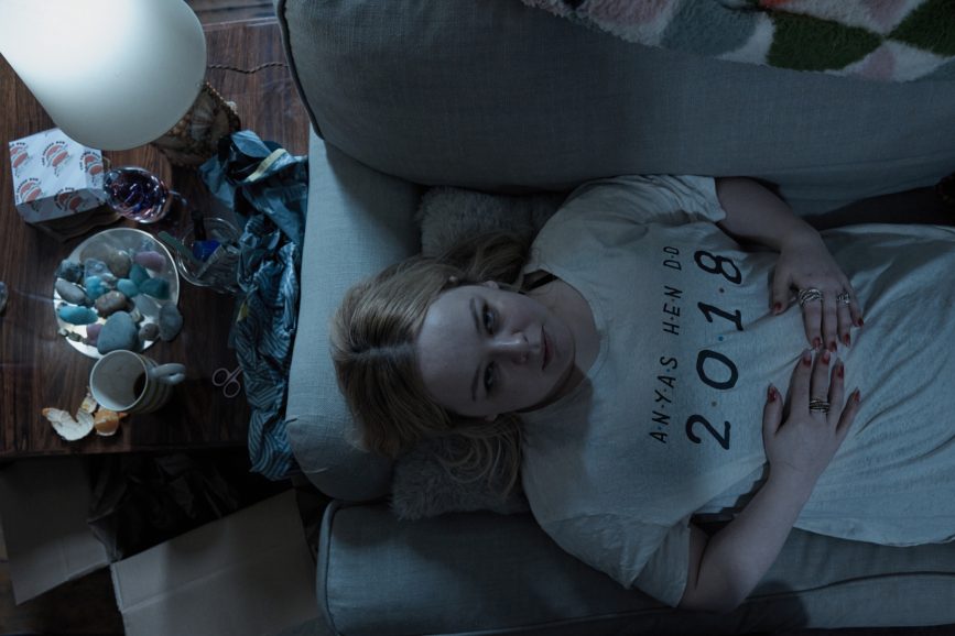
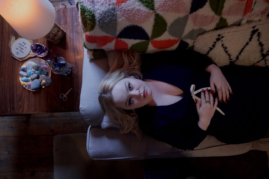
Pretty much every creative decision had the mood dichotomy behind it, and nowhere was this more the case than the end sequence of episode one. We see Maggie return to her flat after her adventure with Eddie where her amusing escapades have been pushed right to the edge. Still there is a lightness in her step as she enters her apartment and flops face up onto the sofa. It feels warm and inviting. Then, in a jump-cut, the flat is a grim total mess, and Maggie hasn’t moved (we assume for days). This plays out in an overhead shot and then a wide reveal. Then we cut out to credits.
This sequence was present in the script when I first read it and jumped out as an exciting challenge. As we approached the shoot, the creative team were all onboard with giving this moment as full an impact as possible, so it would be a thorough departmental collaboration.
I wanted the flat to have a mix of practical lighting, ranging from classic warm tones to cooler kitchen fixtures, and a few funkier colours such as green that hinted at a manic personality. All of the practicals had NYX bulbs, which allowed our gaffer Gordon Goodwin total RGB control from a gaffer control kit.
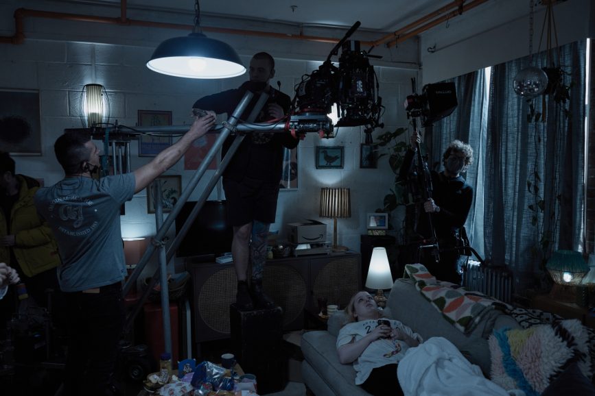
For the final sequence of episode one, Gordon and I deliberately dialled in a more saturated, mixed tone across the practicals, heightening the mood. Then for the jump we dialled in a cold, neutral tone that exactly matched across all of the practicals with colour temperature that matched the ambient light from the windows, to give the effect of a totally grey palette. Art department, led by designer Candida Otton and costume, led by Gabriella Yiaxis, brilliantly supplemented this in the tones of the clothing and the layers of mise en scène so that when we cut to ‘down’ we could see a total change from cosy to chaotic.
Timing was crucial. We had to move fast, as is always the case on a television schedule, but particularly so as it was midwinter and we were up against it with daylight needed for our un-tented first floor windows: Shoot the wide shot first, mark up our exact position and grab a still from the monitor in the ‘up’ look. Then move to a top shot, achieved by under slinging the camera on a prebuilt dolly/twin tube rig. Lock it off, shoot the ‘up’ version of Maggie on the sofa, then switch everything (lighting, costume, props). Use mix and overlay to place Nicola Coughlan in exactly the same spot, and shoot the ‘down’ shot. Then move back to the wide and again use mix and overlay to find the precisely same composition for the ‘down’. Finally the LUT gave us the final push into this murky world, as we went with the strongest “down” look on our sliding scale we would in the whole show.
We knew we’d captured this flip from “up to down” as we were shooting it. It gave the crew a buzz and was a real indication that we were on the right track with the bolder decisions we were making.
