DESCENT INTO DARKNESS
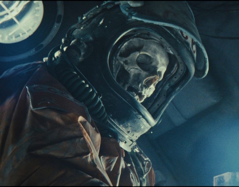
In Nightmare Alley, a clear filmmaking ambition combines emotional visual storytelling, tension-building camera movement, and classic Hollywood lighting to chart the rise and fall of a charming and ambitious carny turned con man. Dan Laustsen ASC DFF, director Guillermo del Toro and their key collaborators share how they created a powerful nightmarish vision.
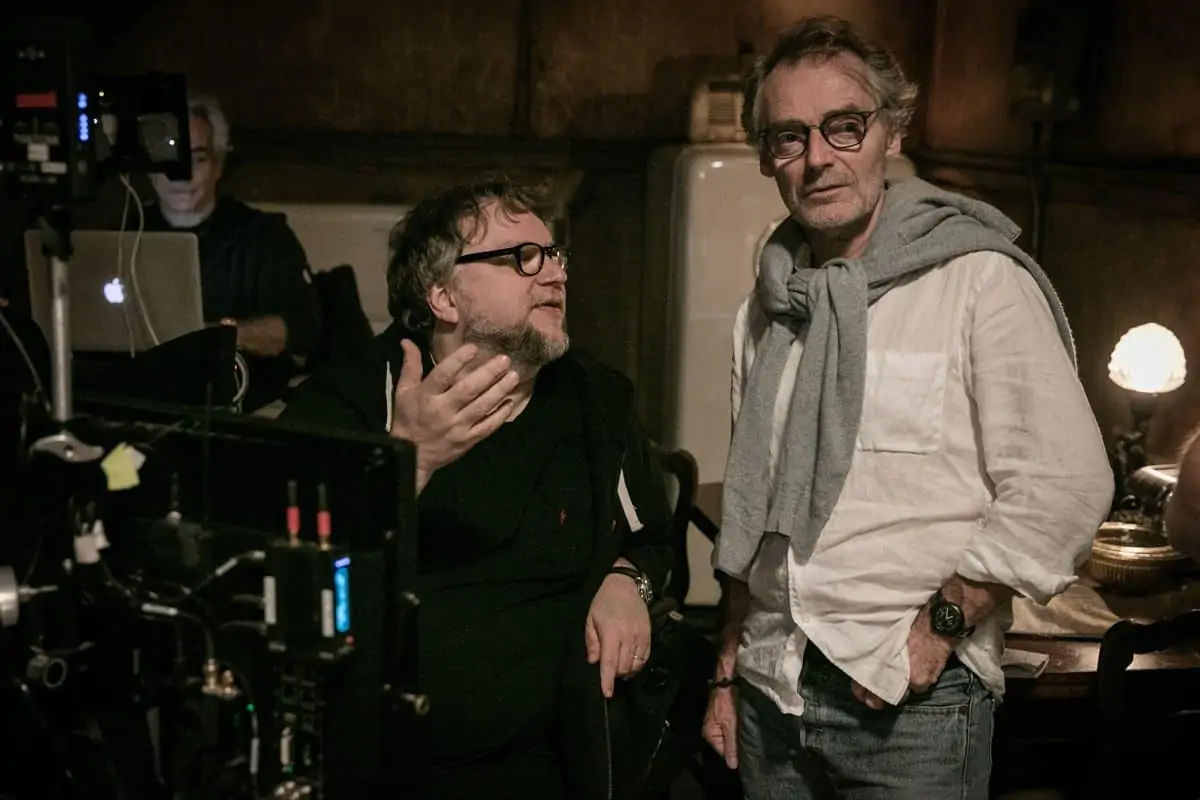
“Of course, the story is always incredibly important, but for me the appeal of working on a movie is also down to the director,” says Dan Laustsen ASC DFF. “When Guillermo (del Toro) came to me with the concept of Nightmare Alley, I was completely open to his reimagining of the story because he’s such a phenomenal talent with incredible ideas that it makes working with him an exhilarating experience.”
Based on William Lindsay Gresham’s 1946 novel, Nightmare Alley is Laustsen and del Toro’s fourth collaboration in a two-decade production partnership. The film chronicles the rise and fall of Stanton Carlisle (Bradley Cooper), a down-on-his-luck mentalist working at a carnival who transforms into a dazzling showman and master manipulator who believes he can outwit fate.
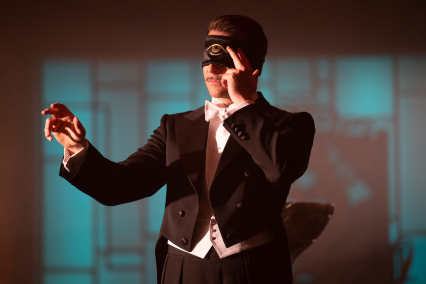
Drawn to the macabre and human world of carnival sideshows at the centre of the story, del Toro was confident Laustsen’s creative prowess would help him reenvisage the cautionary tale about destiny and humanity, expanding his filmmaking in new directions. “This is the first of my movies that, although it has a magical atmosphere, is not mannered or stylised. It’s set in a reality that is identifiable and immediate,” says del Toro.
Del Toro first presented the idea of reimagining the dark tale to Laustsen when they were filming the Oscar-winning The Shape of Water (2017), for which Laustsen received an Academy Award nomination.
“I wanted to render a classic story in a very alive and contemporary way. I wanted people to feel they are watching a story pertinent to our world.”
– Guillermo del Toro
Once on board, Laustsen was told not to read the book or see the 1947 film noir adaptation (directed by Edmund Goulding and lensed by Lee Garmes ASC) before beginning the Nightmare Alley reimagining. “I agreed with Guillermo that this needed to be treated as its own production, so I only read the screenplay which he co-wrote with Kim Morgan. I wasn’t making the book; I was making Guillermo’s movie. There are so many elements to discover in Guillermo’s interpretation as he’s always bursting with ideas.”
Exploring the boundaries between illusion and reality, hopelessness and power, and triumph and tragedy was at the fore as they began building a meticulously detailed cinematic world. Del Toro endeavoured to put a contemporary visual spin on the haunting 1947 film, wanting his reimagining to look more modern and in line with a 21st century thriller.
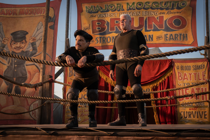
Always united in their filmmaking vision and cinematic tastes – believing camera movement, colour, and light to be amongst the most powerful tools in storytelling – Laustsen and del Toro’s ambitions for the film were shared from the outset. While they set out to once again create an all-encompassing cinematic mood that would wash over the audience, del Toro wanted to avoid played-out noir motifs such as a desaturated look, instead diving into lush colours. Creating a sense of scope through wide one shots was also key for the director, as was using camera movement to build the tension and create a feeling of impending doom.
Del Toro wanted to keep the story speeding forwards, as Stanton’s life descends into darkness. “I wanted to render a classic story in a very alive and contemporary way,” he says. “I wanted people to feel they are watching a story pertinent to our world.”
The director also wanted his adaptation to bring the women’s stories to the fore as Stanton becomes entangled with each one: “Thematically, I’m very interested in exploring the genre from a different point of view. Instead of a femme fatale, I have three very strong female figures and an homme fatale.”
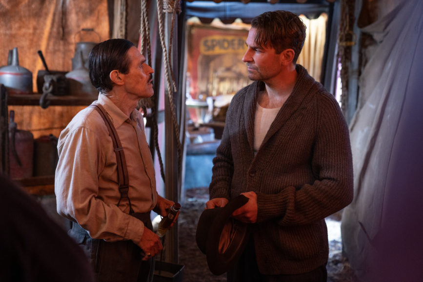
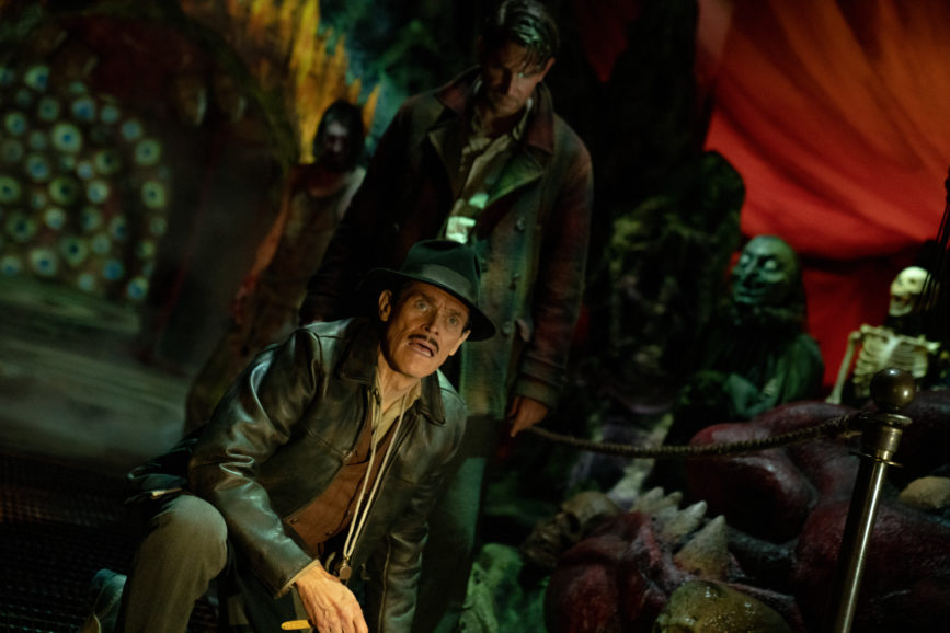
During his productions’ very early stages, del Toro creates mood boards and determines colour palettes for the sets, so the crew is in unison regarding the overriding visual concept. Rather than creating storyboards, they work to del Toro’s loose shot list and book of drawings. “Everything goes through Guillermo, and we work to his guidelines, so everybody flows in the same direction,” says Laustsen. “It’s a long prep period, especially for this film due to the pandemic. It gave us a luxurious 16 weeks to prepare and meant we could spend a lot of time pre-lighting.”
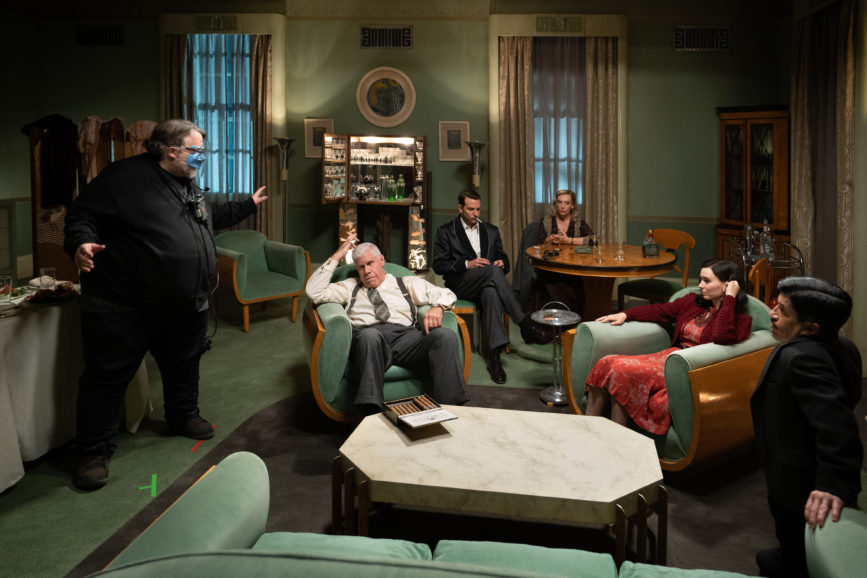
Unlike The Shape of Water, which was captured in a more coordinated way and on a shot-by-shot basis, a less structured approach was adopted for Nightmare Alley as the takes are longer and “the camera almost floats through the scenes.” The success of capturing shots in this way is largely determined by del Toro’s blocking, says Laustsen, and him “guiding the shots during the shoot as he already knows where he wants to cut”.
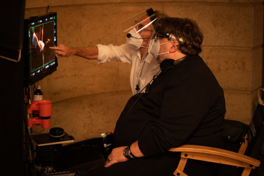
Determining the narrative priorities was followed by an exploration of format options including shooting tests in 4:3. But although the initial instinct was to adopt the Academy ratio, it failed to align with the feeling the filmmakers wanted to create of the “actors being inside a box.” Laustsen, del Toro, and production designer Tamara Deverell talked about how to use low angles, wide angles, and play with how much of the ceiling is in shot to help convey this feeling. “We wanted to go a little Orson Welles, and even on the close-ups of Bradley, we adopt a wide-angle approach,” says Laustsen.
A unified tale of two worlds
Returning to work with some of his key visual collaborators, including Laustsen, production designer Tamara Deverell and costume designer Luis Sequeira, del Toro was confident Nightmare Alley would have the same element of wonder the team is renowned for producing while also looking different to his previous films.
The first half of the film, which immerses the audience in the mesmerising and quirky carnival community, del Toro visualised as being “hard-edged and hard-working, sometimes spooky, but never quirky or fantastical”.
“Guillermo always wanted a strong visual contrast from the first to the second half,” says del Toro’s frequent collaborator, producer J. Miles Dale. “We go from a place that’s gritty but full of life, to one that’s polished yet completely alienating.”
But although the film is divided into contrasting halves – the inner circle of a 1940s traveling carnival and the halls of wealth and power – they still needed to seamlessly unite through their visual language to feel part of one thrilling ride. “We aimed to use softer light in the carnival sequences but for their still to be darkness in all shots and deep shadows in the faces, for example,” explains Laustsen.
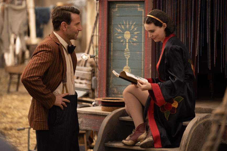
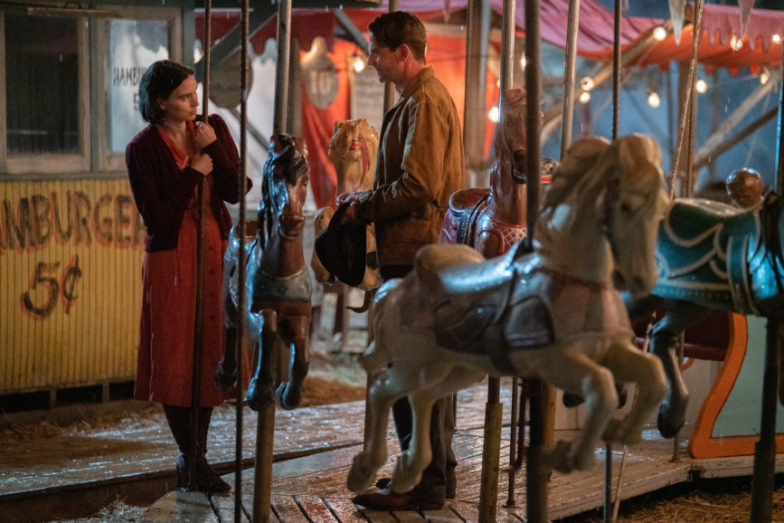
Knowing a soundstage would not convey the eerie beauty needed for the first part of the story, the crew built their own carnival on location. Months of scouting were required to find a space with a large enough footprint that could also accommodate the multiple cherry pickers and 170ft cranes needed to illuminate the area. The search concluded with the discovery of the empty Markham Fairground just outside Toronto, which was deserted due to the pandemic.
Following months of intensive research, scouring collections of carny memorabilia to create detailed designs for every aspect of the carnival, Deverell erected a magical collection of vintage amusement rides, sideshow stages, and tents. Deverell’s team produced four iterations of the main carnival, and a final even more macabre version for the film’s shocking final scene.
For mood, palette, and texture inspiration, del Toro directed the team towards the work of three American realist painters – Edward Hopper, Andrew Wyeth, George Bellows – as well as Danish painter Vilhelm Hammershøi, known for his stark, shadowy interiors.
Often communicating in images rather than words, Deverell and del Toro exchanged photos throughout the creative process. “Guillermo would bring me an image and I’d respond with a render, and he’d respond back after drawing over it,” says Deverell. Guillermo also referenced a number of films including The Postman Always Rings Twice, which was influential for Zeena’s farmhouse scenes.
The ambitious shoot began in early 2020 but in March that year, amid mounting concerns surrounding the pandemic, del Toro, producer Dale, and producer Cooper halted production. “All the sets, set decor, props, and lights remained in that dark studio for almost six months, until we resumed in mid-September,” says Dale. “The carnival, which had already been mostly built, spent the spring and summer ageing authentically in the sun and the rain. We picked up exactly where we left off.”
During the hiatus, del Toro saw the story with renewed clarity, reflected on what had been shot, and carried out some extensive, early editing to refine material. “The project actually became much more deeply ingrained in us, and we were able to analyse the characters and begin the editing process,” he says.
A sleeker aesthetic
As Nightmare Alley enters its second act, Stanton and his love interest and fellow carny Molly (Rooney Mara) leave the unique carnival sphere for the bright lights of Buffalo where they strike it rich as a double act, becoming even more ambitious in their plots to manipulate. In line with the story’s change in direction, the visual language also transforms, adopting a sleek Art Deco aesthetic.
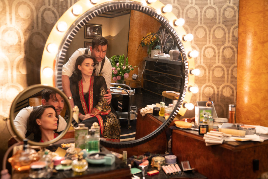
In one scene, Stanton and Molly perform on stage in a lavish spherical room in the fictional Copacabana. This required the club to be created inside Toronto’s historic and Art Deco Carlu Round Room, erected in 1930. To allow the camera to capture the room’s ravishing domed ceiling in 360 degrees, Deverell crafted a heightened floor to bring the actors closer to it and decorated the room in line with del Toro’s specific colour palette.
To give the crew more control over how many of the scenes were lit and captured, they used soundstages, except for the carnival scene. These included the scenes taking place in Stanton and Molly’s hotel suite and in psychoanalyst Dr. Lilith Ritter’s (Cate Blanchett) office where Stanton hatches his most elaborate illusion and begins to unravel.
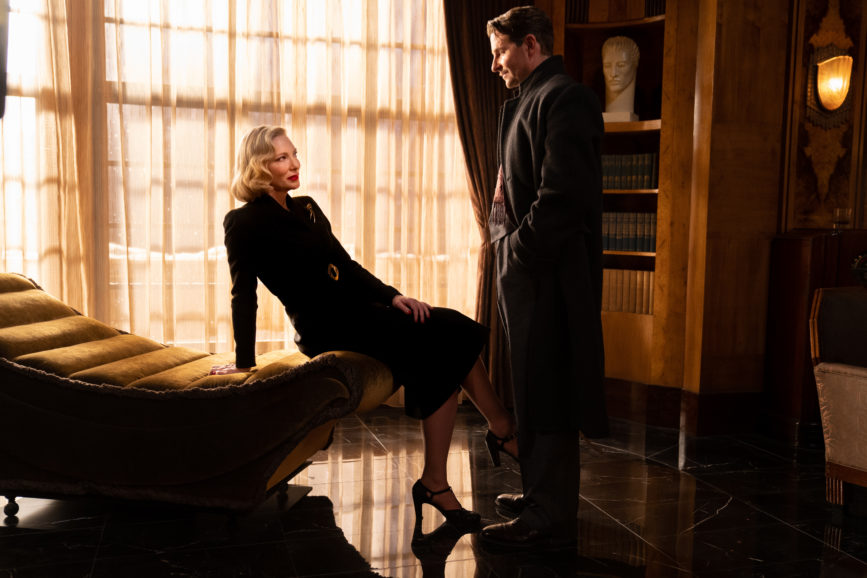
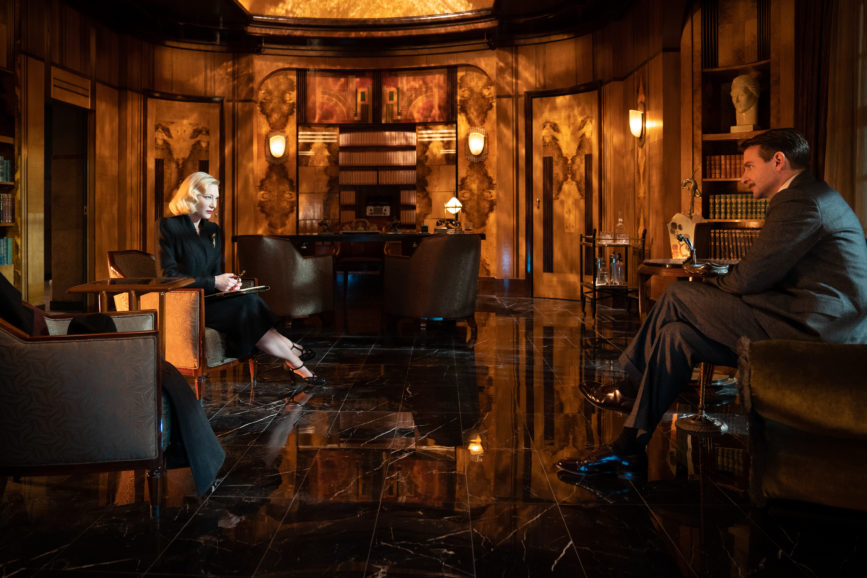
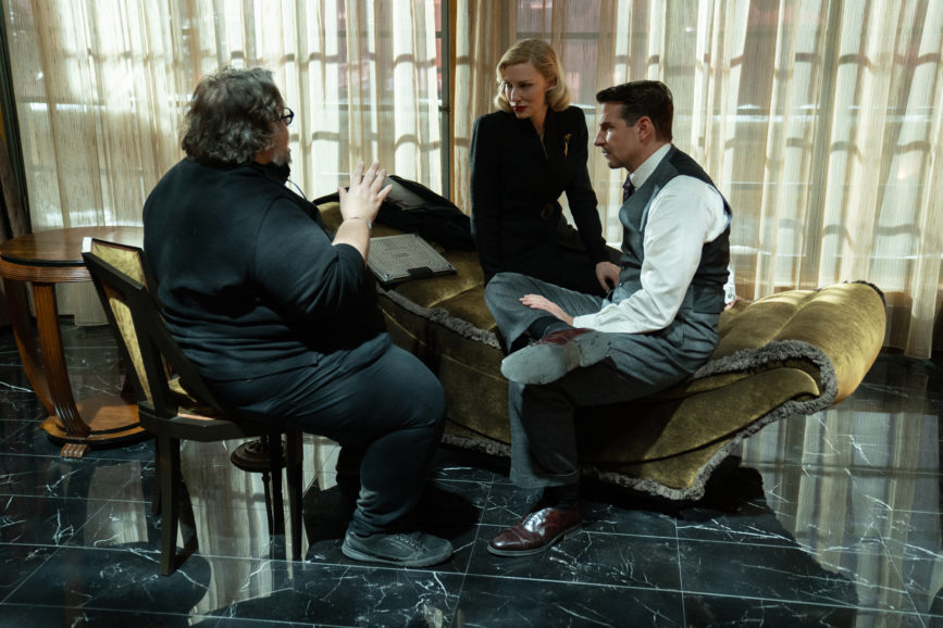
When designing Ritter’s office, Deverell looked for inspiration from the luxe elegance of the Weil-Worgelt study – a famous Art Deco room designed in the 1920s. “We mostly see Lilith in her office, so it had to feel like the setting of a very powerful woman, a woman smarter, more beautiful, and more ruthless even than Stanton,” says Deverell.
There was also much discussion about how wide walls should be and how much space was needed behind the camera. “Guillermo and I frequently talked about corridors and how narrow we should go. He always wanted some kind of background and liked to work with hidden layers to create that feeling that the actors are in the box,” says Laustsen.
“For example, the wall in Lilith’s office, was short in the beginning and then we made it longer. The skylight – which was great to allow more light into the space – needed to be removed a couple of times. In the bungalow where savvy mentalist Zeena (Toni Collette) lives, I was lighting from the side or the ground rather than above – as I did for most of the film – and didn’t need to remove the low ceiling. I really like the effect that creates in the shot, boxing the characters in.”
Close encounters
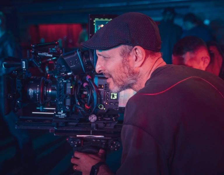
Knowing close-ups would play a starring role, Laustsen decided to shoot large format with ARRI’s 65mm digital camera, the Alexa 65, and Signature Primes, supplied by ARRI Rental. He found the combination to be “super-sharp, especially when we were shooting near the actors so frequently” and was impressed by the camera’s ability to enhance atmosphere, even in the darkest of conditions. While most of the film was shot with the Alexa 65, the Alexa LF was used for the Steadicam sequences.
“The Alexa 65 is a middle format camera with big sensors which I like because the depth of field is fantastic for skin tones and for the face – it jumps out a little more,” he says. “I’m typically a cinematographer who likes things pretty dark. But on this film, Guillermo kept saying, ‘let’s make it darker!’ The Alexa 65 was able to handle all of this very low light fantastically.”
“The Signature Primes’ close focus is so impressive, so when you’re in a medium or a wide shot tracking into a close-up of Bradley, for instance, you can do that easily without having to put diopters in because the lens is so sharp,” he says.
In addition to adopting a classical wide-angle approach to show off the sets in all their glory, wide-angle close-ups of the actors were frequently used, keeping the camera constantly moving. And while combining a diffusion filter with Master Primes had been successful for The Shape of Water, tests proved it would be unsuitable for Nightmare Alley.
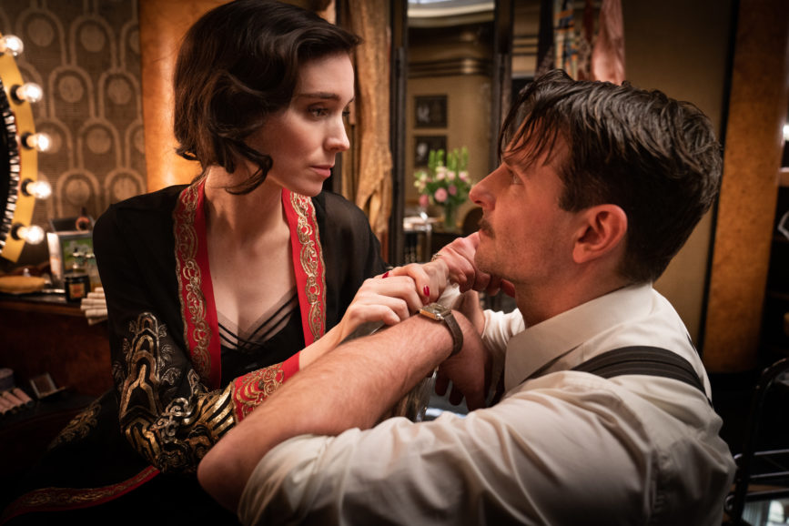
“We also tried shooting with a nylon stocking behind the lens, as we did in the old days, but it didn’t work on this occasion,” says Laustsen. “Instead, we shot with a 1/4 or 1/8 Tiffen Black Pro-Mist filter inside the camera, so the shots of the actors weren’t too sharp.”
1st AC Doug Lavendar carried out in-depth testing of the filters. While determining the thickness needed, he kept in mind that Laustsen never uses a filter in front of the camera, wanting a lens flare rather than a filter flare. “Working with the Pro-Mist filter inside the camera means it’s not touching the black at all. The black is still pitch black, but you see the highlights on the actors and the practicals still glow,” says Laustsen. “That slight diffusion is great when you’re working with large-format lenses, shallow depth of field, and the camera’s always moving, close to the actors.”
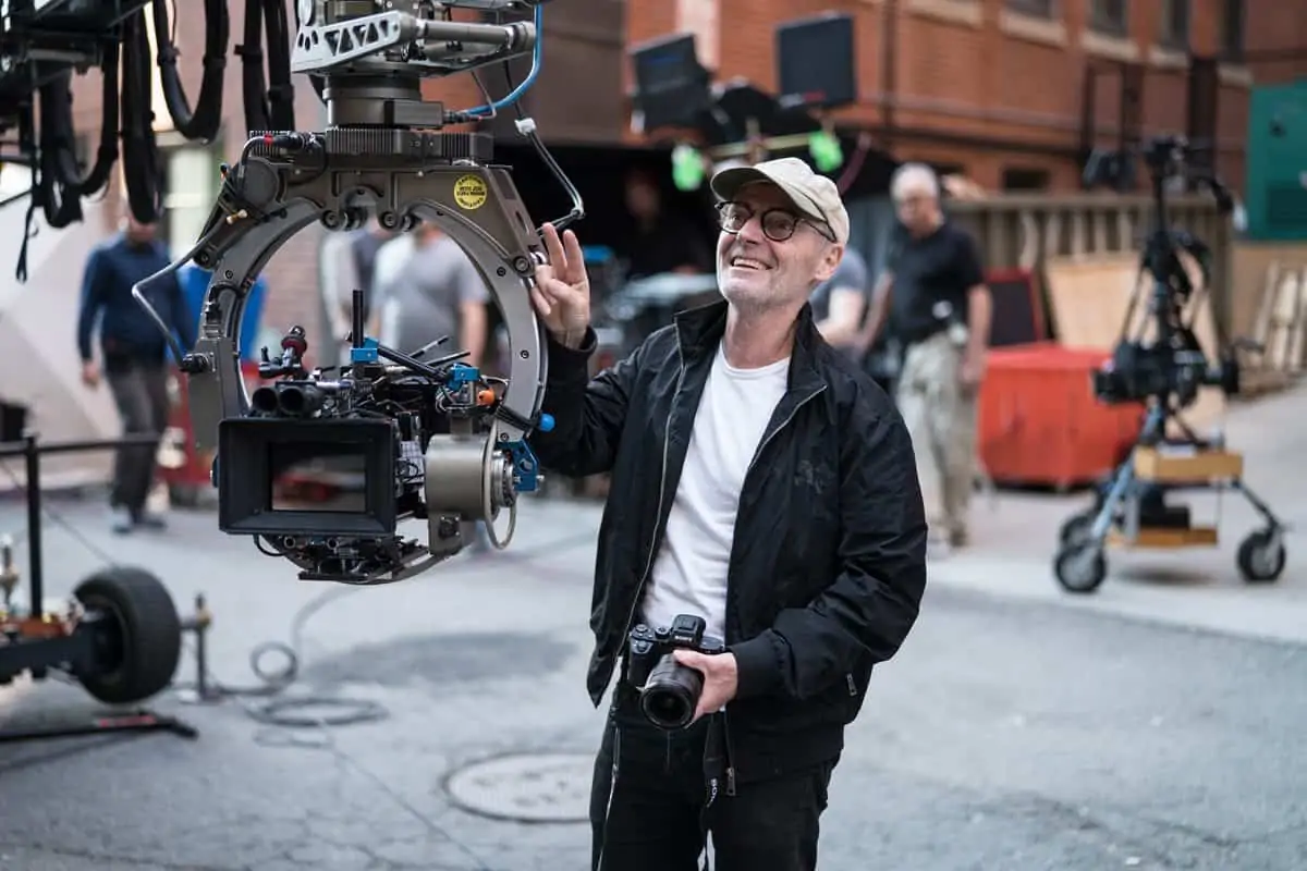
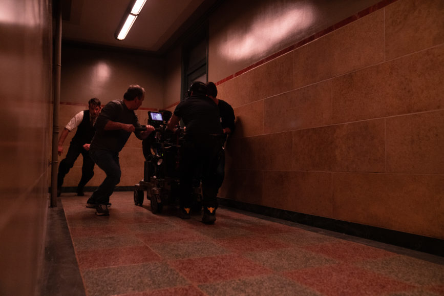
Laustsen also teamed up again with A camera operator Gilles Corbeil, having enjoyed collaborating with him multiple times, beginning with del Toro’s Mimic (1997). They chose which tools to use to achieve the creeping motion that flows through the film, using the expertise of key grip Robert Johnson (The Shape of Water) and direction from del Toro to ensure the results aligned with how he designed the shots and envisaged the edit. Most of the film was shot on a dolly or a jib arm, with a Technocrane always on standby.
“We didn’t move the camera just for the sake of moving it though. It’s not a pull down or boom up. It’s a dramatic creeping movement coming around the axis. I don’t think there was one shot where an operator was looking into the camera,” adds Laustsen. “It’s then a question of where you need to be, and which walls need to be removed. The problem is when it takes so long to block a sequence you don’t always have much time to light it because everyone is waiting for the camera movement to be fixed.”
Once del Toro explained the desired movement – using a remote head on an AeroCrane, mounted on a dolly on a dance floor, for example – grips Ron Rensetti Jr, Mark Berdock, and camera operator Corbeil plotted it out. “We needed to communicate on the fly in quiet, tight sets and the camera always moves and sees everything, so I would end up in another room. This is something I would normally avoid as you want to see the dolly or crane to get the context of what “arming right” means,” says Corbeil.
“1st AC Doug Lavender was a big help as he was always the closest person to the actors and would provide intel. A radio is sometimes useless on a quiet set, and hand signals don’t go through walls. If we ran out of room, in Lilith’s office, for example, we slowly arm up to finish a push in.”
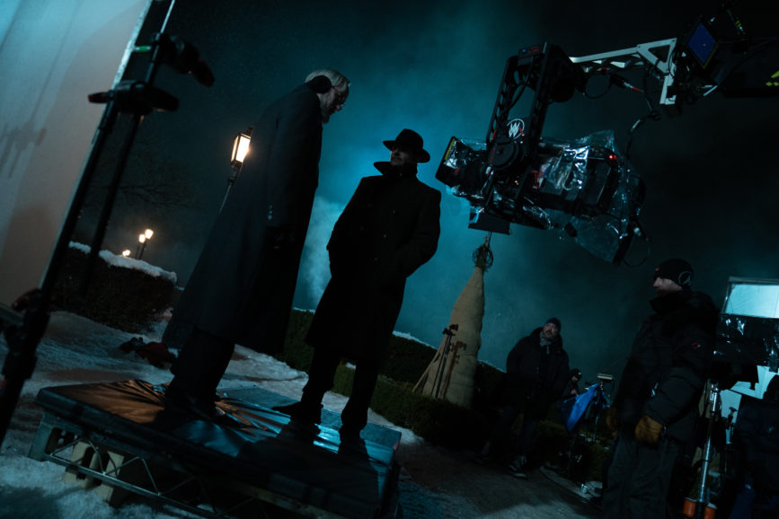
On larger sets, a 45’ Scorpio telescoping crane and Matrix head made it possible to migrate through a crowd at the carnival, sometimes paired with Corbeil on Steadicam when the crane might risk bumping into the extras or cast. As some scenes were captured in the rain, head tech John Harper designed a rain cover for the Matrix head.
Pace and timing a given move to arrive where and when appropriate was often the challenge. “The last shot of the movie was a two-minute 20” push in, but not rehearsed,” says Corbeil. “You don’t want to arrive at the end of a slider early, you always save a bit. A 600lb object is going to fight quick impulses, and the move can’t draw attention to itself. You’re hired to do what the director expects and need to be consistent from take to take.”
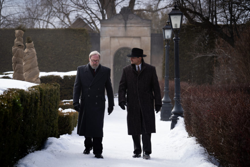
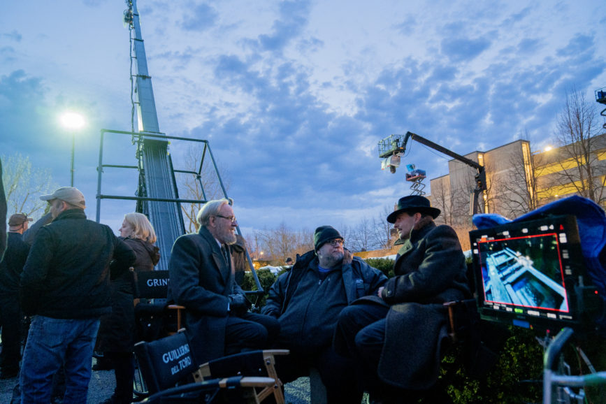
The scenes shot in Ezra Grindle’s formal garden, featuring four-foot hedges framing four-foot-wide paths, all covered with snow dress, also presented an impediment to the 45-foot crane and 100 people moving without leaving impacts on the snow.
Complete control
Lighting shifts with the story, changing from more naturalistic and warmer in the first half before becoming increasingly bright and harsh. Informed by del Toro’s mood board, Laustsen and gaffer Michael Hall discussed light placement to align with the stages of the narrative. Preferring to work with “big hits” outside windows, the cinematographer often adopted a single source approach.
“Dan expressed that he likes to have complete control over all the lighting on set, right down to the practicals,” says Hall who felt “privileged” to work with Laustsen as he is a fan of his visual style after having researched many of his previous projects.
Lighting console operator Desireé Lidon worked alongside Laustsen and Hall on set to make quick, subtle, and sometimes complicated lighting changes as needed and without any delay in shooting, with everything running through her main board but controlled through her laptop on set.
“Guillermo and I have pretty precise ideas about what atmosphere we want to create on set which my fantastic team helps achieve,” says Laustsen. “We both love steel blue, and use it in all our movies, so we knew the night light would be steel blue but at the carnival the key lights should be much warmer.”
The intricate carnival was a huge space to illuminate and required many cranes, some 300 feet high, plenty of backlight. Hall and rigging gaffer Pierre Berube had to work out how to run an enormous amount of cable.
The main lighting set-up used in the carnival, especially at night, comprised of large construction cranes with Dwight Crane Raptor lights. Custom Pyrex glass filters of steel blue were made for the Raptors as changing gel would have been time consuming and costly in terms of shooting time. “These were used in every compass point to minimise any movements of lighting cranes and to allow for shooting scenes in sequence which Guillermo likes to do,” says Hall. “We used practical bulb stringers – comprising more than 2,000 clear 50-watt bulbs – to give us that warm base.”
For the daytime carnival scenes, ARRI M90s with 1/2 CTS were selected to add some warmth. Hall chose M90s instead of Arrimaxs for their size as “they are still punchy and small enough to fit in the tight spaces between the carnival tents and structures.” Floor lighting consisted of a variety of SkyPanels, Astera tubes, 20K tungsten fresnels, and ARRI T12s.
Pre-lighting every set was of utmost importance and in some cases, on the larger sets like the carnival, the crew would pre-light at the weekend to maximise the shooting day which had been limited by COVID restrictions.
The sheer size of the location where the carnival scenes were filmed made it a considerable undertaking for the lighting crew. “In the huge open field, we were open to the elements an oncoming winter could throw at us – torrential downpours, windstorms that damaged tents and buildings, and snow,” says Hall. “Wind proved challenging in terms of keeping continuity with the atmosphere and from a safety standpoint, keeping our lighting cranes in the air, all while practicing COVID-safe protocols.”
While the overriding ambition was to create a contemporary film, the rain-soaked feel in some scenes is a nod to the old-school noir aesthetic. “We wanted it to feel like a third dimension brought into the screen,” Laustsen says. Heavy rain towers, spinners, and fans had to be erected, producing sodden, chilly conditions for the cast and crew. “Working with rain towers can be rough work for the actors, but their performances are informed by these authentic elements,” he adds.
When shooting scenes requiring torrential rain and lightning effects, the crew and cast’s safety was paramount, so GFCI breakers were installed for protection. “A large part of the carnival was controlled by DMX running under gangways and through buried conduit throughout the carnival,” says Hall. “We had to ensure that remained intact and functional amidst all the set changes and repurposing of set pieces during the shoot. I was proud of the riggers and shooting crew for being on top of everything in a location that size.”
Embracing the dark side
In the film’s second half, Laustsen and del Toro wanted to portray characters such as Lilith as powerful and strong, achieving this through very precise and classical Hollywood lighting, creating a noir feeling in her office environment which presented different technical complexities. For Laustsen, this more direct and typically 1930s style of lighting made the actors’ faces pop but still “had a feeling of contrast between the steel blue outside and warmer interior lighting”.
“Those scenes are so dramatic and shot pretty wide and we wanted to use fixtures that were very specific as we were lighting in a more classical way. The camera is moving, actors are moving, and we needed to track them, especially Cate, with a handheld light because if you didn’t hit her precisely, the shot didn’t work,” he says.
“This can be difficult because actors are used to being able to walk around the set. But on this occasion, we didn’t want to do that or to light from the sides with soft light. We needed the actors to hit the light exactly, which Cate and Bradley did brilliantly. We wanted to move those scenes away from being realistic and more towards artificial and powerful. But I don’t think about the light as artificial in those scenes; I just think wow, Cate looks fantastic.”
To achieve this desired effect, Blanchett was lit using a custom light – a long square box that could be focused just on her face that frames of gel could be inserted into, and cutters could shape.
As a homage to classic film noir lighting, old school and modern lighting were used. Hall and Laustsen selected LED ribbon and Titan tubes to accent the coves and mouldings and a large quantity of SkyPanels to backlight a translight outside the window. “From above, we pushed 1K fresnels through cookies to create a dappled effect behind her desk,” says Hall. “The fireplace played a big part in many of the scenes there. We used a combination of practical fire provided by SPFX and interactive fire created by running two tungsten space lights through the dimmer board to create a flicker.”
Whereas the carnival scenes’ key light positioned close to the actors was warmer, but still had a steel blue element, the key light in the later Buffalo sequences was more neutral and the shadows became deeper, coming from the opposite side. “We rarely front lit or used fill light because we weren’t afraid of the shadows,” says Laustsen. “But as a cinematographer, you must protect your exposure, so I was shooting on the same T stops – 2.8 and 4 – for the whole movie.”
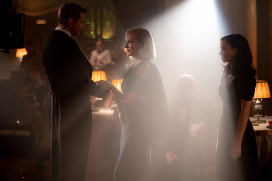
One of Hall’s favourite spaces to illuminate was the Copacabana which “had to look decadent and complement the amazing work of the set decorators, wardrobe, hair and makeup department, and script.” A combination of modern and traditional lighting tools was once again used including many Titan tubes, RGBA diffuse flex ribbon, ARRI tungsten lighting fromT12s to 300s, and 2K Molelipsos on-camera followspots. “With the help of the atmosphere, we achieved those amazing beams of light commonly found in clubs of that era,” says Hall.
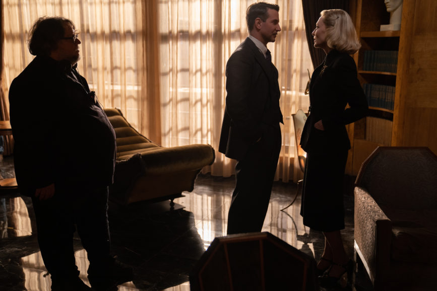
Not afraid to embrace the darkness, del Toro and Laustsen also experimented with the use of shadow and silhouette, often hiding parts of characters until they needed to be revealed. “For instance, in the scene where the fire is blazing behind Stanton and he’s standing in silhouette, you really get the feeling that he is alone in the world. You don’t see his face at all, it’s pitch black, but you know he’s in trouble,” says Laustsen. “Again, we used a super-low camera angle and pushed in on a wide angle, so you just see a man who is in trouble, silhouetted against a beautiful ceiling.”
Creative consistency
Determined to maintain a consistent look the whole way through the production process, Laustsen “did not want to make a new movie” when it came to the grade with Stefan Sonnenfeld at Company 3. “Production designer Tamara had spent time painting everything exactly the right colour and costume designer Luis had created the wardrobe to fit in with those early mood boards, so this meant the dailies and the final movie needed to be close,” says the cinematographer.
As a period piece that is impeccably lensed and lit, Sonnenfeld considers Nightmare Alley one of the most beautiful films he has worked on. “Working with collaborators like Dan and Guillermo, who were both so receptive to input to bring this film to life, was an epic experience for me.”
As Laustsen “shoots so beautifully and meticulously”, Sonnenfeld found the experience to be seamless. “The key challenge was to strike the balance between the beauty of Dan’s lighting while being conscious of emotion within the story to enhance the experience for the audience,” he says.
Achieving heightened reality on occasions was achieved in the grade. “We tried to embellish what Dan did with the lighting but at the same time, in particular scenes, we didn’t want to be too purposeful,” says Sonnenfeld. “For example, during the carnival, we had to try to ensure it wasn’t too beautiful as it might take you out of what Guillermo was trying to convey within that scene. It was a delicate balance of keeping things real and very close to what Dan was able to create and bringing the cinematic feel for the right moments.
While it released in lush colour that bursts from the screen, noir creation Nightmare Alley also enjoyed a special black-and-white re-release in select cinemas. Having decided to shoot in colour, the team still talked about what it might look like in black-and-white from the beginning and how the direct single source lighting approach could lend itself to a black-and-white version and help achieve more contrast. “During the DI for the black-and-white release, we spent a lot of time going back to the RAW files, starting from scratch and being very precise,” says Laustsen.
Grading the black-and-white version involved a different dynamic and sensibility. “The film has such beautiful costume and set design and that doesn’t play into the grading process as much in black-and-white,” says Sonnenfeld. “We spent a lot of time with Guillermo experimenting with different lookup tables with the intention of conveying different emotions for different scenes, ensuring we could bring the costumes and set to life.”
While most of the film was created in camera, another collaboration was key to ensuring VFX enhancements were incorporated correctly in certain sequences. Visual effects supervisor Dennis Berardi and the team from Mr. X in Toronto supported the vision and helped determine when visual effects would be necessary.
A dark and dramatic scene where a character is hit by a car required a green screen technique and rotoscoping as it was too cold to shoot on location and there was not enough space for the team to rig wires to the car. “Mr. X did a fantastic job, and the results are seamless,” says Laustsen. “They try to make the process as easy as possible for the cinematographer, so you don’t even have to think about it. It’s the same across the board – Guillermo and I have precise ideas about what atmosphere we want to create in the production which our fantastic crew and collaborators help achieve. That’s the beauty of movie making – everyone pulling together.
“And as Guillermo says, ‘When you work with excellent people, why do you need a rehearsal? Let’s just shoot it because we know with our team, it’s going to be perfect.’”


