DECADES OF DECAY
What does it take to create the futuristic, apocalyptic world of one of the most talked about shows on the planet?
British Cinematographer caught up with Stephen James (VFX supervisor, DNEG) and Nick Marshall (DFX supervisor, DNEG) to find out the behind-the-scenes effort that went into constructing the Cordyceps-ridden landscape of HBO’s The Last of Us.
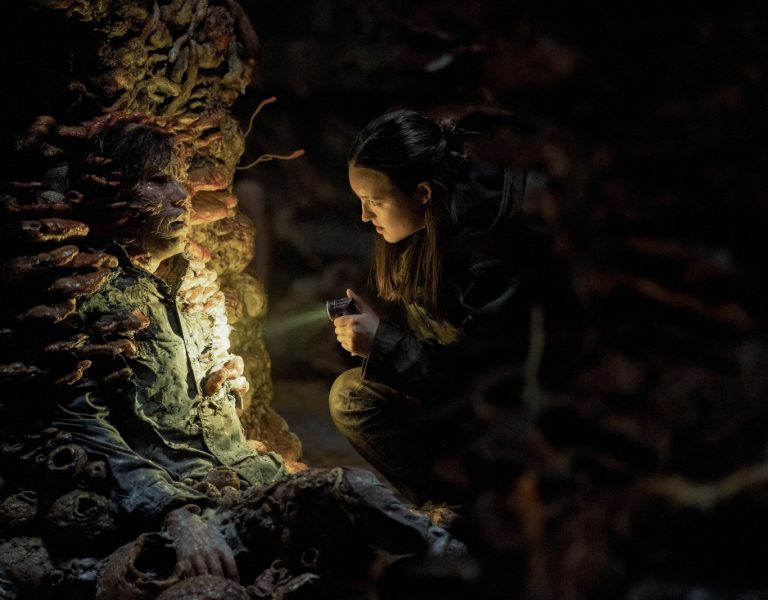
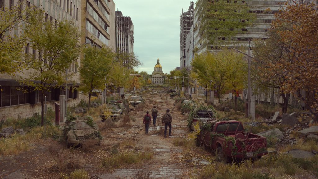
The immersive VFX has been a heavily-lauded feature of the Pedro Pascal starring series. The vibrant colours of the deadly fungus contrasting with the depleted USA, full with quarantine zones and destroyed buildings, has resulted in a unique visual style.
James and Marshall delved deep into how they achieved the style, the effects of COVID-19 when portraying a global pandemic, the pressures of adapting a beloved video game, and the inspirations of The Last of Us.
How did you collaborate with the cinematographers on this project?
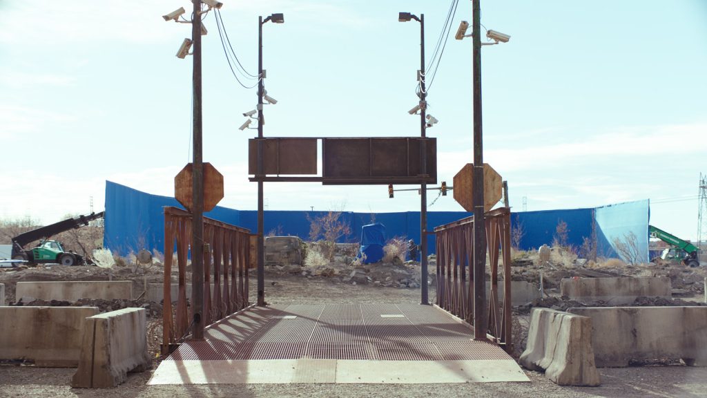
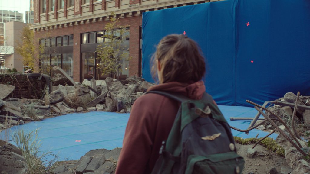
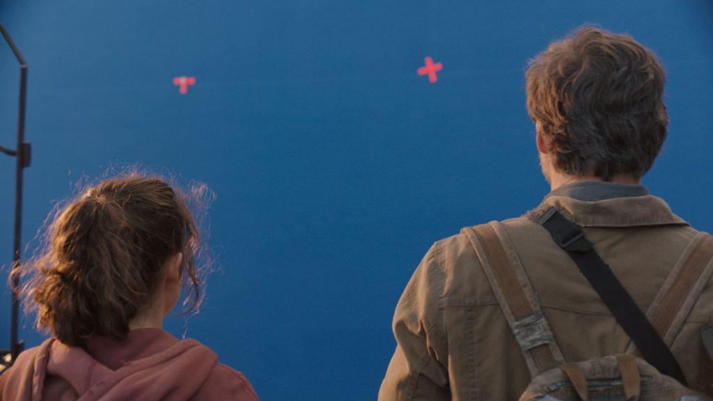
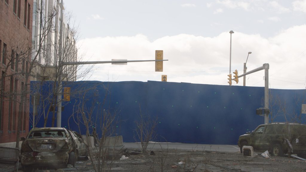
NM: Our collaboration with the cinematographers mostly came through Production VFX Supervisor, Alex Wang. During our time on set it was clear that Alex maintained a very close relationship with the cinematographers, and had an open dialogue that allowed him to advise on key VFX elements to consider when shooting. This ultimately meant that we were able to get really great shots that were conducive to the visual effects process. This included shooting clean plates, framing for elements that didn’t exist on set, and creatively lighting the shots in ways that would complement the VFX work and lead us to beautiful final images. There was some breathtaking work captured in camera on this show so we knew we couldn’t let our work detract from that.
Were there any particular pieces of instruction from the DP (or otherwise) that stood out to you when achieving the VFX style?
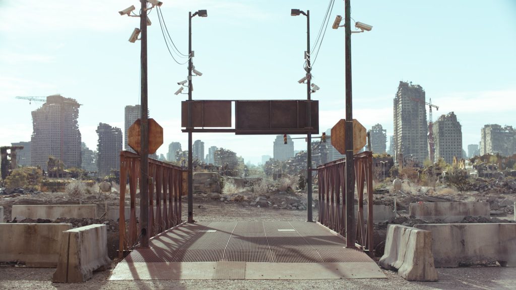
SJ: It can be a common mistake in visual effects work to try to make every shot the prettiest, most perfect shot possible. On set and in reality you don’t get to pick the sky, you just turn up and hope it’s what you need on the day. Alex Wang made sure that we worked in a way that blended our work into the on set photography. There were certainly times we were able to go big, so to speak, but with all of our work we relied on a considerable amount of the show’s photography to use as a guide.
NM: Our main goal with all of the work that we delivered was to honour the photography, which differed greatly as a result of the production spanning many months, in different locations, with very dramatic changes of season. We looked for any cues that we could find that would allow us to carefully match the specific details of the lighting that was captured during principal photography. The world is revealed to the audience in line with how Ellie is discovering it, and the cinematographers really embraced this. It was not uncommon to see the DP crouched in the set – despite the dirt and freezing temperatures – finding the best framing to craft the right mood. I was fortunate enough to be able to take careful notes during scenes that seemed like they would prove challenging for VFX, including sketching out the specific light setups in a small sketchbook and then referencing this months later when we began our work. In some cases, we tried to assist by doing early previsualisation that could be discussed with the DP and iterated on before going to shoot, so everyone had a rough idea of how the final shot would look prior to shooting anything.
How enjoyable was it to create the depleted world of the future with VFX?
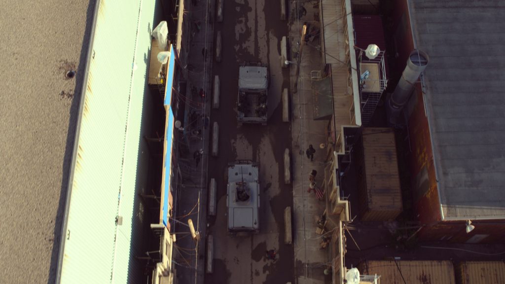
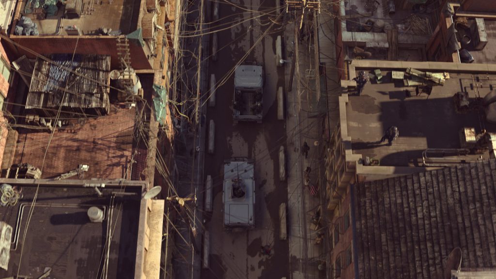
SJ: Beyond all of the technical challenges that come with destroying buildings, weathering the world, and adding layers of overgrowth, I encouraged the team to always consider how it all came to be. The Last of Us game series is known for its environmental storytelling. Everywhere you look there are hints to what happened during the outbreak, and what happened since then. The hope is that those details come through and make an impact on the audience as a whole.
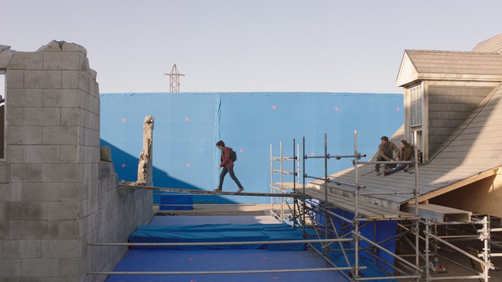
NM: It was an absolute pleasure to get to work on a show like this. The games are well known for having a sense of beauty to the way that nature reclaims the planet after the Cordyceps outbreak, so there was an excitement and buzz around getting to create these bleak and challenging worlds in a way that would ultimately be hauntingly picturesque. We researched extensively to understand how buildings would age in real life and paid close attention to the kinds of details that had been added to the practical sets so that our work would disappear and leave audiences unsure of how much was practical and where the handoff to digitally created worlds was taking place. Craig Mazin said it best as we were finishing up the project – the biggest victory and biggest curse for VFX is that if we do our job well, nobody knows we did anything at all – but we relished the challenge of striving to hit a level that would stand the test of time as well as the game has.
How did the video game source material guide the visual style? Was there anything you could directly lift from the game into the series?
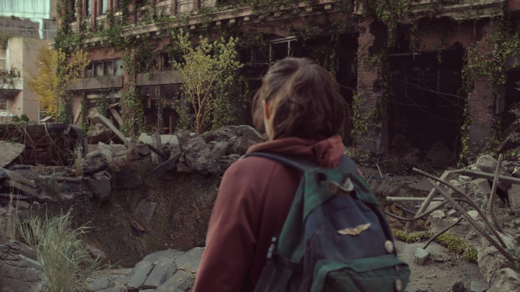
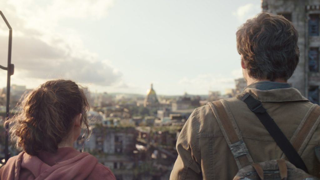
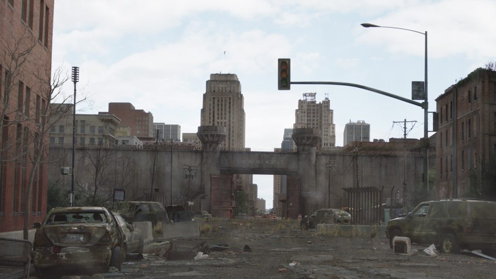
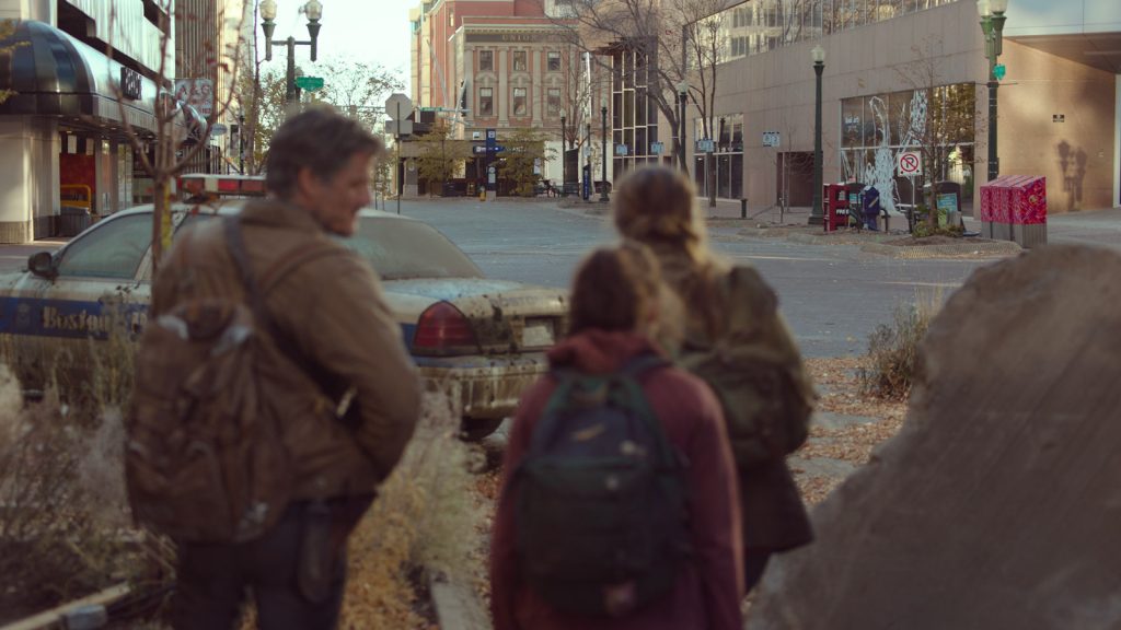
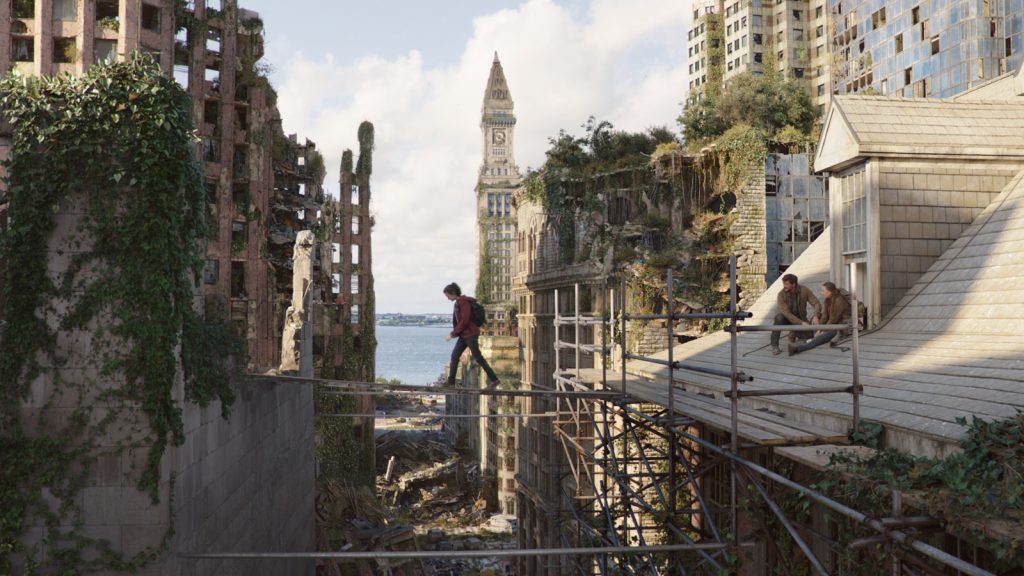
NM: Craig and Neil had very specific ideas for many of the sequences, including allowing viewers to see some new and different areas of the world that weren’t explored in the games. We also had to ensure that we didn’t fight against the practical locations that were used, so we adapted our environments accordingly. However, some moments – such as the view to the Statehouse from the roof of the Bostonian Museum – were almost direct matches to the game and we were all really excited to recreate those for the show.
Were there any other visual inspirations for the project (outside of the game)?
NM: For the most part we always had a live action plate to work to, but occasionally we did have the need to break away from anything practical and embrace fully CG shots for moments that could only be achieved with visual effects.
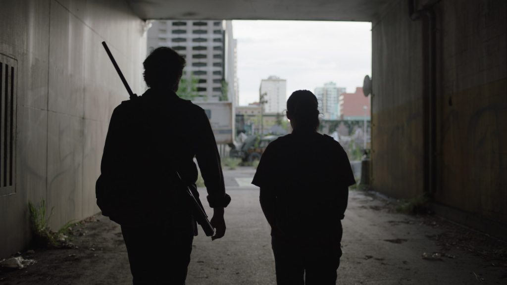
One good example is the escape from the Boston QZ that closes out the pilot episode. This night scene was a huge challenge because it takes place in the midst of a storm, with no signs of human activity in the city and none of the characters are carrying a light, so there is almost no justification for anything but complete darkness! To overcome this we had to think like cinematographers and creatively stage the lighting. I’d been inspired by Roger Deakins’ approach to wide angle night shots on True Grit, so I gathered digital IES profiles of the ARRI HMIs that he is reported to have used, allowing us to mimic their exact response in our computer generated scenes. We carefully positioned banks of these lights in areas that would conveniently hide the sources but would carve some really nice contrast and help to highlight the protagonists, constantly layering light shapes over dark to make it read well. Conrad Hall’s work on Road To Perdition was actually a closer match to our lighting conditions and gave us some great reference for how light behaves as it bounces around in the fine mist from the rain, and how to artfully silhouette the characters, so we referred extensively to this too. Then we added lightning flashes that illuminated a few key frames to create more drama.
Finally, it was critical that our visuals tied in seamlessly to what had already been shot so masterfully by Ksenia Sereda on the practical shoot in Calgary. This was one of only a few occasions where we had to look outside of our existing show photography for cinematic reference – having such gorgeous shots already captured for the show meant we really didn’t need to look elsewhere for inspiration, we were surrounded by it!
Were you excited to work on an apocalypse piece that is more unique in its colour palette and visual style? i.e. The vibrant colours of the fungus and outer world, compared to perhaps the stereotypical washed out colour palettes we associate with the genre.
SJ: Yes, but it also created particular challenges. They shot the show over an entire year in order to get a realistic passage of time through the seasons. That meant that we had to create a wide variety of CG vegetation and overgrowth, including dead and flowering varieties, in order to shift our palette in a realistic way to align with each episode.
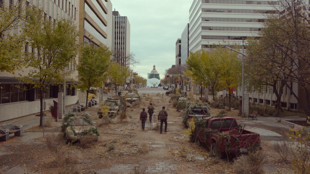
NM: Yes! We’ve all seen the desaturated and desolate environments that have been created in other films and TV shows, and they can offer their own appeal in their limited palette barren wastelands, but we knew from the get-go that we wanted something different here. We were fastidious about injecting a varied and vibrant colour palette into our work, and spent considerable time mimicking every hue that is found in lush and fertile locations. We studied how light would pass through translucent leaves, giving occasional strong pops of colour, and we made sure that our weathering retained all the colour range of real mould, lichen, rust, algae and moss. We used carefully composed saturated colour to draw attention to some of the destruction where it became of narrative importance to do so.
How difficult/interesting is it to incorporate VFX into a story that jumps through different time periods? Is there a pride in making sure everything is period-accurate in earlier scenes pre-breakout, and also making sure the timeline of decay matches up after the breakout?
NM: It was great fun to theorise how the weathering and ageing would occur in this world. There were other VFX vendors who had work to do to manage specific progression of decay, and this was executed masterfully. Our task was to design a lot of unique areas that help to drive the progress of our characters and force them in certain directions without seeming contrived, much as the games had to.
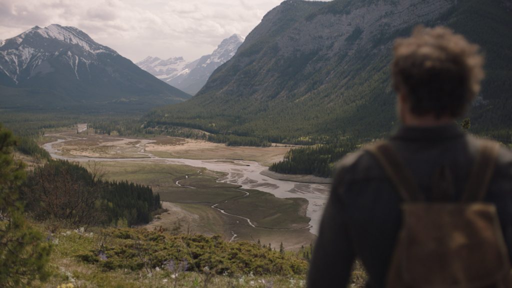
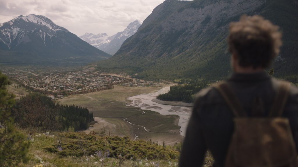
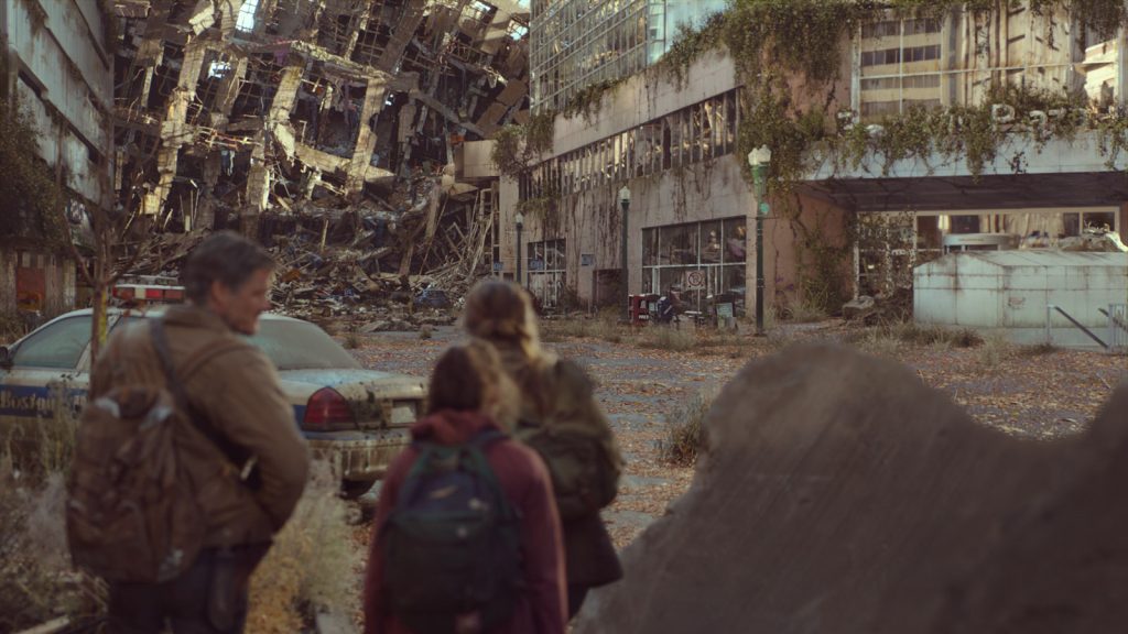
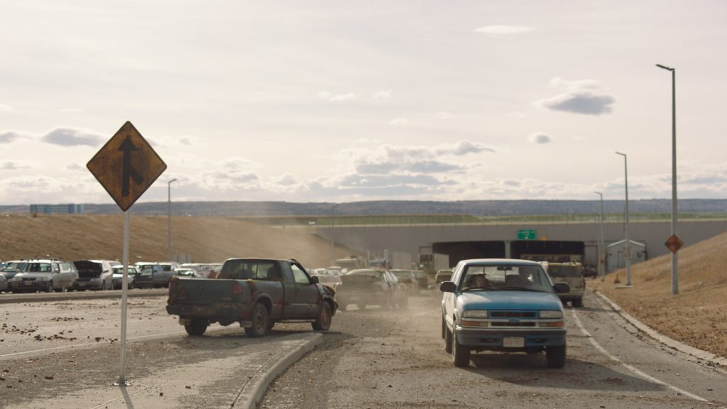
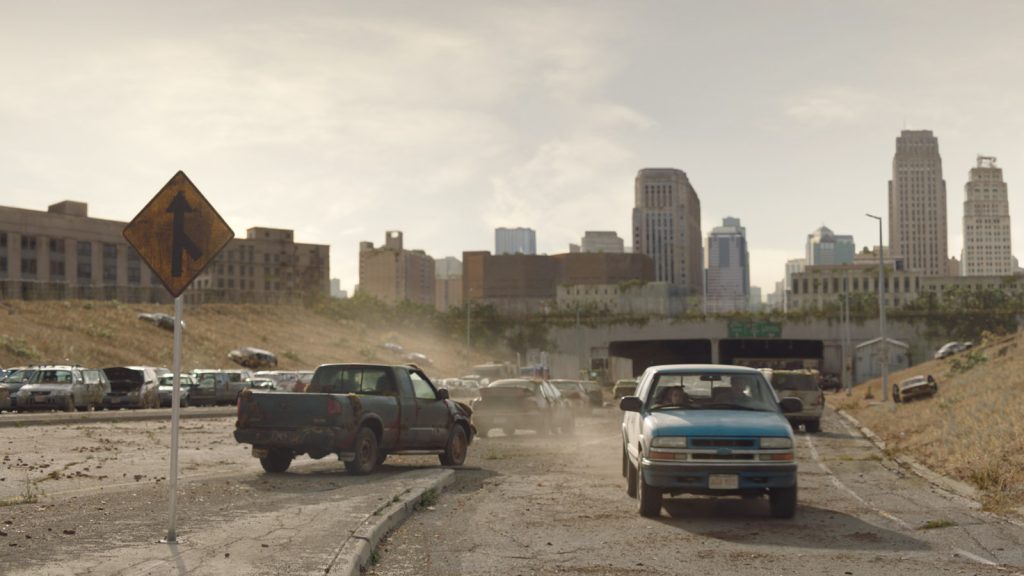
We worked on small vignettes and created little stories for ourselves about how the bombing of Boston occurred and what kind of destruction that would leave, as well as how the sunlight and moisture would then allow vegetation to grow at different rates. Vehicles abandoned along roads was a common thing for us to contribute to a shot, so all the vehicles that we built had to remain period accurate. We also altered the Boston and Austin skylines to remove buildings that would have been erected in the years since the outbreak would have halted all construction.
How did the context of a global pandemic (if at all) affect your own vision and ideas of what a highly infectious disease spread could look like visually?
NM: I think that reality has taught us in the past few years just how much nature can thrive when human impact is suddenly diminished. There has been some incredible imagery that shows fauna and flora recovering with surprising speed, so our vision of a beautiful desolation was perhaps not so far from reality after all!
SJ: The pandemic absolutely changed the way that Craig Mazin and Neil Druckmann adapted the game into a TV series. Every member of the audience is now an armchair epidemiologist so certain changes such as the way the fungus spreads were altered to make them more realistic and believable.
Did you feel pressure when bringing something to life that has had such a passionate following in the gaming sphere?
SJ: Our team loved the games and I knew that what we were contributing would be well received. I try not to let too much pressure get to me, or to the team. We’re one part of a massive project and all we can do is our best. And after working on the show for a while, I knew it was in very good hands with Craig Mazin.
NM: Absolutely! Gamers are a discerning bunch, and this particular franchise has some of the most ardent fanbase. Gamers are very visually astute, they know what to look for, it’s not quite the same as the average layman. Our visuals had to live up to those high expectations, and beyond that we are fans too so we wanted to do justice to Naughty Dog’s work!
How did your approach differ from other DNEG projects you’ve worked on?
SJ: I worked on this shortly after completing Dune. All that development of sand and I couldn’t use any of it in The Last of Us!
NM: The technical approach we took was not entirely new – the majority of our tools and pipeline were tried and true methods. What was unique was how much the production team trusted VFX to be part of the storytelling and we took that responsibility very seriously. We would frequently find that we’d hit a challenge and someone on the team would take it upon themselves to really go above and beyond to creatively solve the problem. Even under time pressures when we were in the thick of post production, there was always a desire to extend ourselves to make sure we never settled for “good enough”.
What was the most difficult VFX sequence in this project?
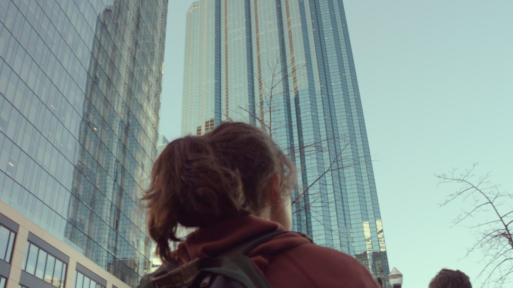
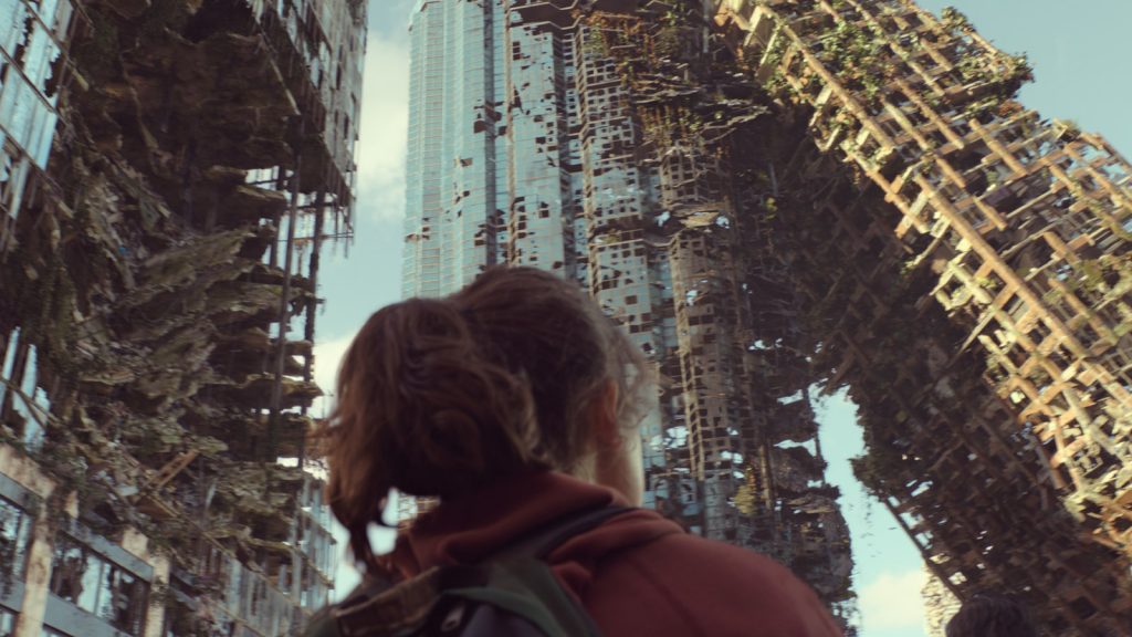
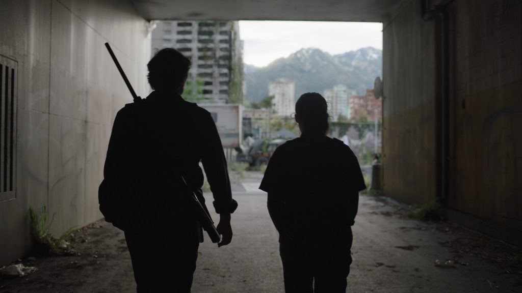
NM: I would probably pick the sweeping establisher of the leaning tower shot after the trio emerge from the hair salon. This shot was exceptionally technically challenging just due to the amount of data that we had to manage in such a large and detailed environment. The rendering alone took over a week for the longer panning shot across the destroyed skyline, so we had to carefully stage our iterations and plan all the handoffs between departments very carefully, with the help of our fantastic department supervision team. Delivering a short sequence like this requires the talents of many people – from asset generation, camera animation, set dressing, destruction simulation, matte painting, compositing, and even our animation team were involved to create a flock of birds, which were used to help justify Ellie’s gaze following something through the long, slow panning moves across the skyline. What is really remarkable about this project in the end was the volume of equally complex sequences, it’s hard to choose just one as the most challenging.
What is your favourite piece of VFX in this project?
NM: My answer to this probably changes every week. I am proud of some of the really subtle and invisible work that we contributed, but also love the reactions to the more epic work. Our teams in India worked on a high volume of very subtle fine integration work, and when you have such an emotionally charged show it’s so important that the audience never notices a VFX shot that will pull them out of the moment. Seeing our work completely disappear during Episode 3 was just as rewarding as the bigger moments that telegraph themselves. I think audiences would be shocked at just how many shots had some level of VFX and I’m really pleased with the consistency.
Is there anything you learnt from this project that you’ll take onto every project going forward?
NM: It wasn’t a surprise to me, but this show reaffirmed for me the importance of design and subtlety. If we had not put any thought into why the world came to look this way, we would have fallen into generic post-apocalyptic tropes and not created something iconic. We would routinely take shots that were relatively progressed and just take a step back, reassess the content with a fresh eye, and sometimes make the difficult decision to radically rethink certain aspects if we felt that there was room for improvement. It also taught me that the internet audience will review every pixel of our work in excruciating detail, so we really have to work with that level of scrutiny in mind!

