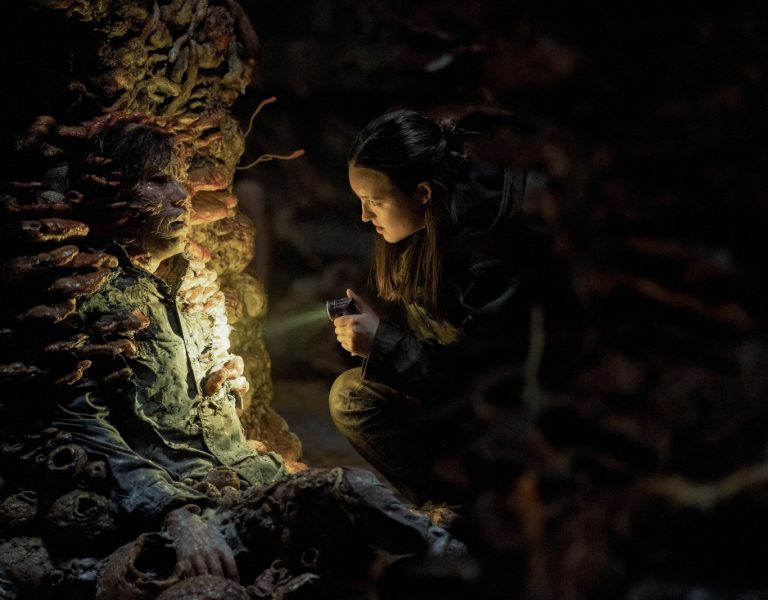
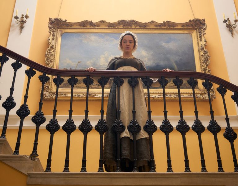
The supernatural drama of Archive 81 translated by DP Bobby Bukowski ASC and Picture Shop colourist Freddy Bokkenheuser.
Urban thriller Archive 81 seemed to come out of nowhere when it catapulted to the top of Netflix’s TV rankings shortly after release. The supernatural tale, based on a podcast series of the same name, follows an archivist who takes a $100,000 job restoring damaged videotapes for a mysterious corporation and gets pulled into the vortex of a mystery involving a missing woman and a demonic cult.
The show’s developers have genre pedigree. Showrunner and executive producer Rebecca Sonnenshine was a producer of The Vampire Diaries, while fellow EPs Paul Harris Boardman scripted Deliver Us From Evil and James Wan co-created the Saw and Insidious franchises.
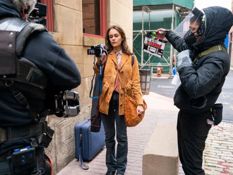
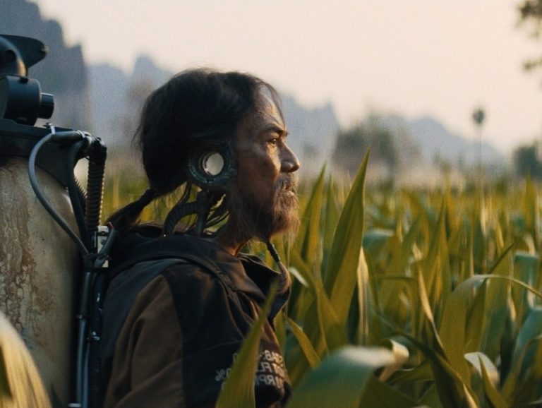
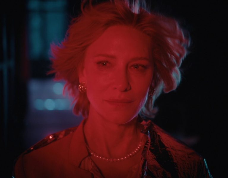
When archivist, Dan (played by Mamoudou Athie), begins reviewing ‘found footage’ salvaged and replayed from various media including Hi8, Betacam and 16mm, he unearths the story of a missing and presumed dead documentary filmmaker Melody (Dina Shihabi).
The narrative timeline of Archive 81 shifts between the present day and the early 1990s. Sonnenshine and cinematographer Bobby Bukowski (99 Homes, Land) worked with Colourist Freddy Bokkenheuser at Picture Shop to create a consistent look for the show across the multiple formats and time periods.
“Rebecca likes things very unadorned and when there was any suggestion of things getting more overt, she would pull it back to simplicity,” explains Bukowski, who shared cinematography duties on Archive 81 with Nathaniel Goodman and Julie Kirkwood. “Although this story is ostensibly in the horror genre, she wanted to root it visually in the emotional lives of the two main characters.”
Part of the exploration of the look harkened back to 1970s cinema, such as Taxi Driver and All the President’s Men, “trying to make the lighting not too Hollywood and motivating light from natural sources.”
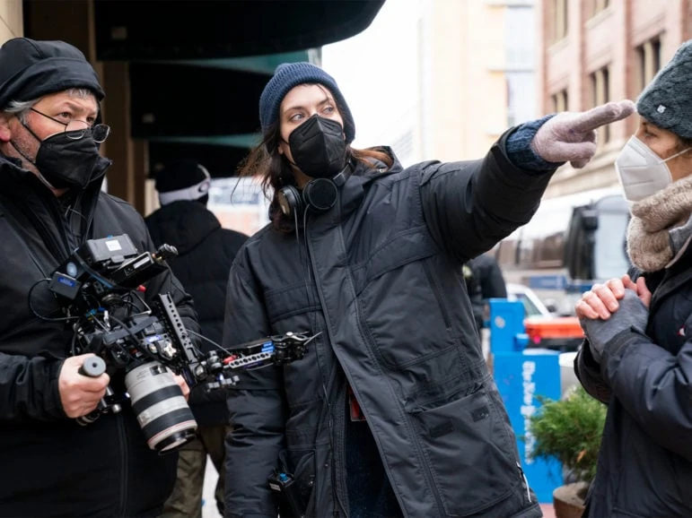
Bokkenheuser picks up, “We knew we needed to work in DolbyVision HDR but at the same at the same time we didn’t want the show to feel shiny and new. A perception of HDR is that enhances the brightness and pops the colours – which it can – but it also gives you incredible latitude in the shadows and that’s what we wanted to lean into for this story.
“We wanted a filmic look and talked a lot about stock,” says Bokkenheuser, who worked closely with Post Producer Mandi Price throughout the series. “It was the look of that early 1970s film stock that we wanted to capture without going to the extremes of super warm or cold.”
When Bokkenheuser ran Fujifilm emulation in tests, Bukowski was able to call out the exact film stock with just one look at the LUT.
“I’m a huge fan of analogue film and Fuji in particular,” the DP explains. “I like the rendition of secondary colour as opposed to Kodak’s more primary range of tonality. I’ve shot so much with Fuji 500 ASA stock from the 90s that when Freddy showed it to me, I knew it was what I wanted for the 1990s look in Archive 81.”
Two worlds and more
Present-day scenes were higher contrast, lower saturation, and cooler while the 1994 scenes had more saturation, a little less contrast, and were warmer. This made the two time periods separate and visually distinct. The current day sequences are also largely set in a concrete bunker, helping to differentiate the two main storylines.
“We developed a show LUT that had many of the characteristics of the ‘70s stock we wanted to achieve,” Bokkenheuser says. “Then in the DI and grade we pushed the universes a little further apart. Even though set design and lighting did a great job, we needed to press ‘CAPS LOCK’ a little bit to make it clearer that we’re in two distinct time periods.
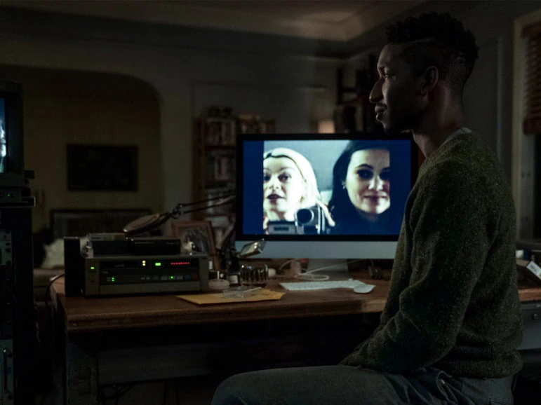
“I applied a little halation on the ‘90s too. It’s one of those things that some people may see and some won’t, but I hope everyone feels that something is different about each universe.”
Another strand of the story occurs in 1924. “I wanted it to feel like a piece of fine china, something really old that you have to be careful with, so it doesn’t break.”
There are also sequences that take place in a separate reality called the Otherworld. The look design here was iterated over several weeks in prep.
Bukowski says, “Rebecca didn’t want to signal anything too broad from camera movement or colour. Just the idea of these two people (Dan and Melody) meeting across timelines was enough for an audience to know that something strange was going on. We didn’t need to underline the strangeness.”
Bokkenheuser gradually dialled up the halation. “It’s one of those looks that doesn’t strike you as weird at first,” he says, “but when you run a sequence you just feel in your bones that something unsettling is happening visually.”
When Dan finally enters the Otherworld, Bukowski wanted to take red away from the colour spectrum and lean into the green. “I’d send Freddy test footage and he would adjust it remotely and send it back. It was a great working relationship really considering I’m sending him a lot of footage and asking for fixes on a TV schedule when time is often against you.”
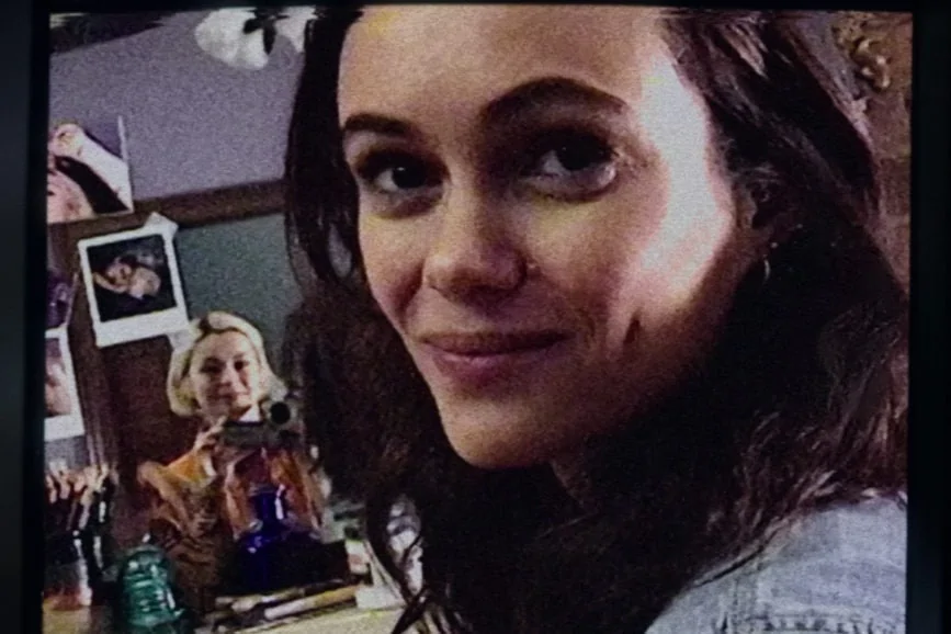
The old footage that the archivist finds on Hi-8 and VHS is what binds the two worlds, and the two protagonists, together.
“Rebecca and I did a ton of research to create realistic looks,” says Bokkenheuser. “I really had to stretch my muscles on it. The formats that we had to recreate, they had to look absolutely right.”
Principal photography was captured on Alexa Mini LF, but most of the Hi8 footage was shot on Hi8 by Shihabi, just as it appears in the story.
“We had to retrofit some older cameras so we could get video and audio out so the director could monitor the feed on set,” Bukowski says.
“The Hi8 actually looked pretty good in the right lighting,” adds Bokkenheuser. “I had to dirty it up in a lot of places. We made a fire-damaged look and came up with the term ‘smoke-bubbles’ for the burn hotspots we added to the footage.”
Other formats were shot with the Mini and treated in post. Footage in Episode 2 was designed to replicate the PXL2000 point-and-shoot camera launched by Fisher Price in 1987 that recorded to cassette tape. The low resolution, black-and-white look for this was found after rigorous tests.
A sequence in Episode 7 from the 1920s was scripted as if shot on a hand-cranked 16mm camera then later reviewed by Dan as an 8mm copy.
Other short clips, often serving as episode intros, required the team to mimic a 1980’s “Lifestyle of the Rich-and-Famous” look, a 1990’s public TV broadcast, and an early 2000’s television commercial look, among others.
Bokkenheuser and Senior Finishing Editor Mark Dennison created a static reel and used overlays throughout the series.
“We touched every era and every format which, for me, was a creative dream,” Bokkenheuser says.
Handcrafted look
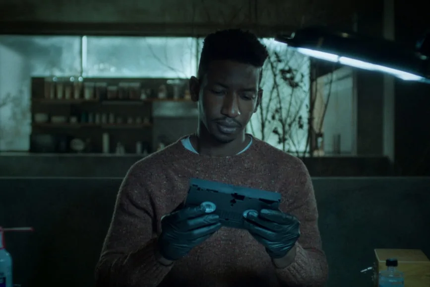
Bokkenheuser had started out in the industry in Denmark in the mid-90’s working with film negative and making tape to tape VHS copies. This unique background proved to be a perfect match for Archive 81. “I went from dubbing tapes to tape-to-tape grades and then to using digital linear finishing systems like Avid Symphony. You had to learn a lot of tricks to make it work and at that time in Denmark you had to do a lot of the work, including VFX, inhouse.”
Working at Picture Shop with all the firepower of Resolve at his fingertips, Bokkenheuser still called on his memory banks to create looks for the dated media. “I didn’t use a lot of plug-ins, it was more hand crafted,” he says. “I used tools from far back in my mind,” he says.
“Freddy was indispensable in helping create the disparate looks,” says Bukowski. “He and our VFX team worked assiduously to render those looks authentically. He is an enthusiastic partner who is indefatigable in plumbing the work for every single opportunity to use the grading process to support the narrative.”
Archive 81 is streaming on Netflix.

