Cutting Edge
Steve Yedlin ASC / Knives Out
Cutting Edge
Steve Yedlin ASC / Knives Out
BY: Robert Allen
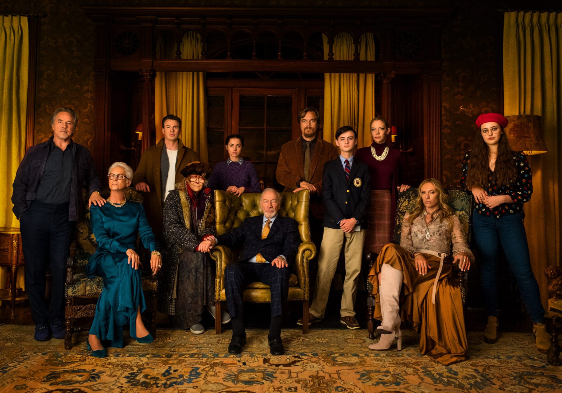
In director Rian Johnson's highly-acclaimed, Agatha Christie-inspired, murder mystery, Knives Out, a family clashes, a patriarch dies, and a master detective leads an investigation that threatens the family's dark secrets.
The movie represents Johnson's fifth collaboration with cinematographer Steve Yedlin ASC following Brick (2005), The Brothers Bloom (2008), Looper (2012) and Star Wars: The Last Jedi (2017).
"Rian first told me about the Knives Out concept over ten years ago, but wrote the script much nearer to the time of production," says Yedlin. Neither the director nor the DP had done a 'Whodunnit?' before, and Yedlin says he was excited to imagine Johnson's take on the genre.
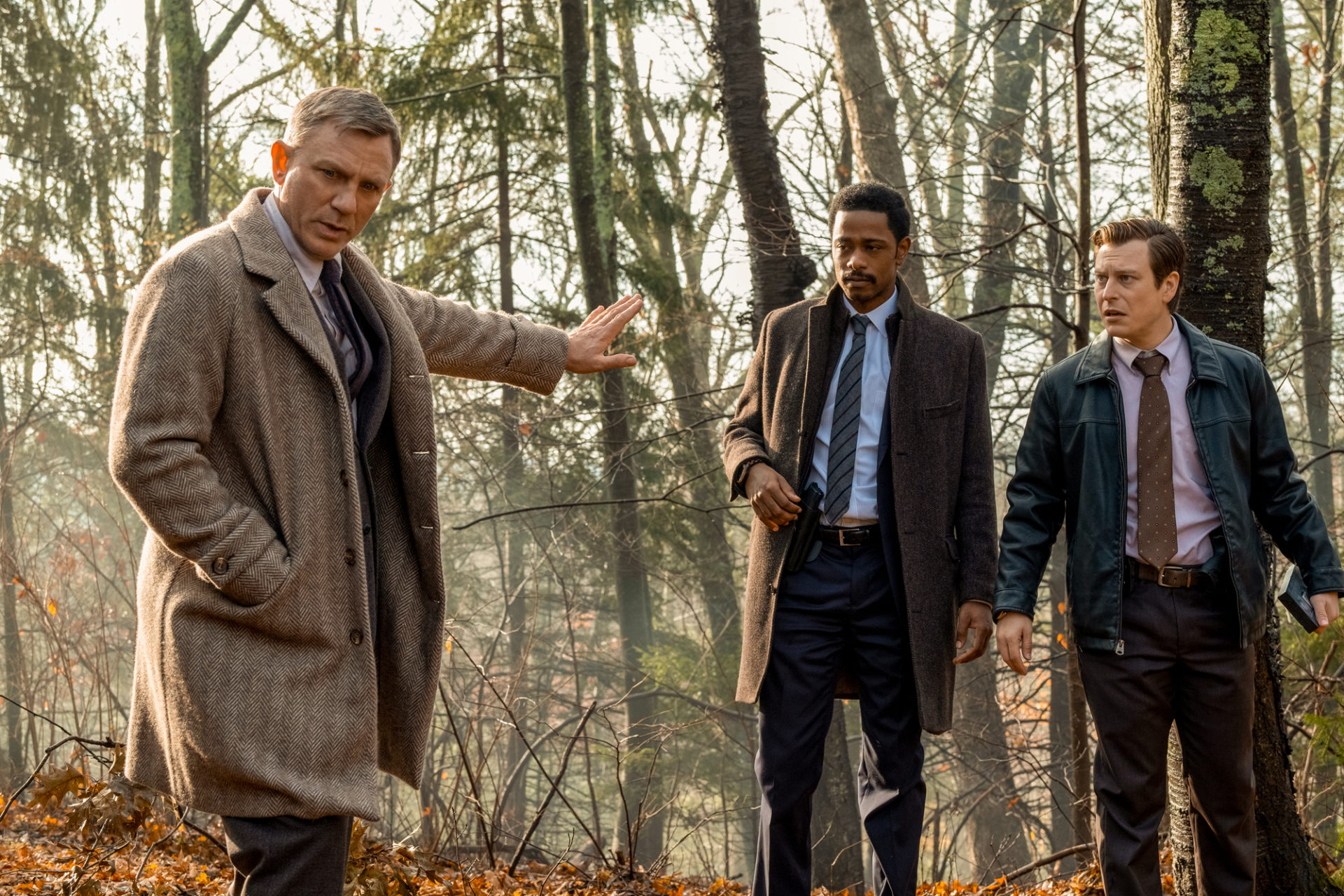
"Rian has the formidable creative capacity to take a familiar genre and elevate it in a unique way. For Knives Out, he refined his long-time approach to lighting that he calls 'theatrical realism', which might sound paradoxical or out-of-context, but the idea is for each scene's look to be organically motivated yet heightened. And in this case, the story is a balance between a fun/comedic 'Whodunnit?' and a dark drama of toxic privilege, that's mirrored in the photographic balance between lustrous exuberance and noir-ish chiaroscuro."
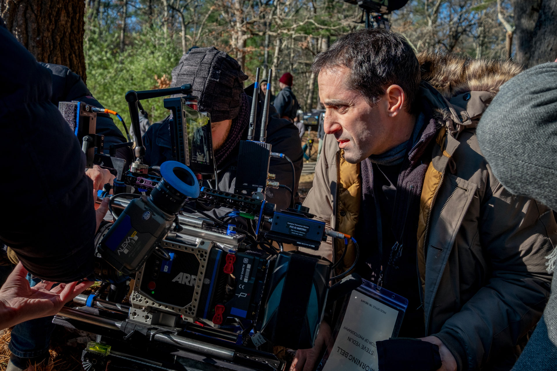
Principal photography began on October 30, 2018, in and around private mansions in the suburbs of Boston, Massachusetts, before wrapping some 38 shooting days later on December 20th. A variety of sets matching the mansion interiors were constructed and shot on stages nearby.
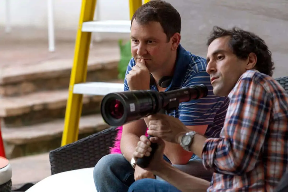
"Rian has a really particular style, honed over the years, and a strong sense of what he wants in relation to the storytelling. We tend to use wide-ish lenses so that we can feel the space around the characters, and we do a lot of pushes-in - sometimes fast, sometimes slow - in a well-tuned dance with the actors. For Knives Out, we designed compound moves that combined dollies, pans and zooms, to follow or heighten evolving action in a thoughtful, Altman-esque sort of way. Some moves helped to grow a sense of tension, some delivered a big reveal."
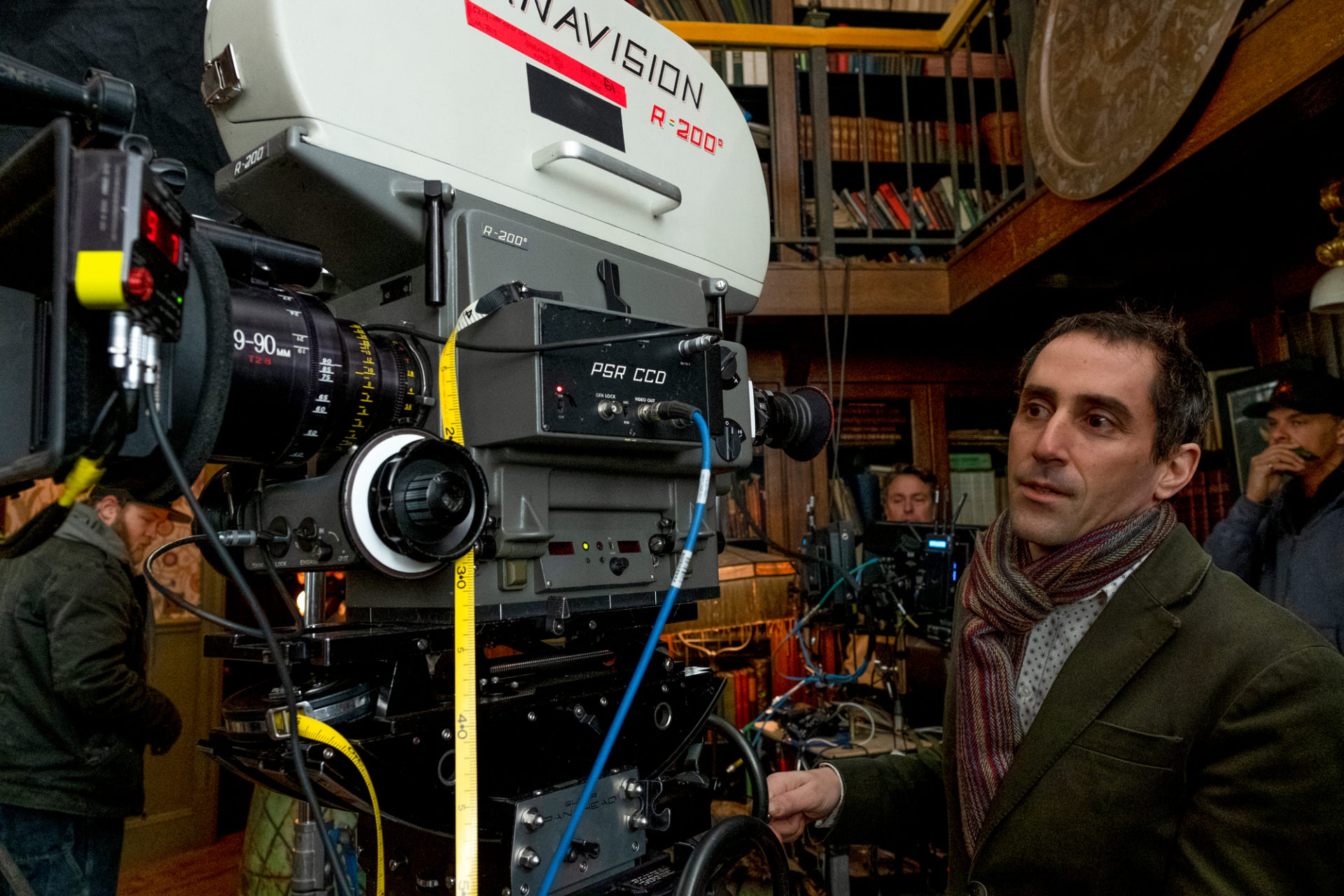
Yedlin framed Knives Out in 1.85:1 aspect ratio, using Alexa Mini's fitted with Zeiss Master Prime glass, noting, "you can open those lenses wide and the image doesn't fall apart." He also used Panavision PCZ Primo 19-90 and PZW 15-40 Primo zooms, as zooming was an essential part of Johnson's visual design. Cameras and lenses were supplied by Panavision Hollywood.
"With Rian's approach, it's nothing but a joy. We found some really cool shots, and did fun stuff, like breaking the convention of the tighter camera having closer eyelines and the wider having the looser ones."
- Steve Yedlin ASC
The production was mainly a two-camera shoot. "On some projects, the interaction between A- and B-cameras can be a frustration," he says. "But, with Rian's approach, it's nothing but a joy. We found some really cool shots, and did fun stuff, like breaking the convention of the tighter camera having closer eyelines and the wider having the looser ones."
The A-camera operator was Yedlin's regular, Dale Myrand, with Boston local Terence Hayes on B-camera, who also proved helpful in assembling the local crew. The gaffer was Joshua Davis. The second unit DP was Ashley Connor, about whom Yedlin remarks, "Although it was my first time working with her, she fitted right into Rian's family of collaborators and delivered beautiful work, especially some evocative shots in and around the mansion."
Speaking of which, Yedlin remarks, "When I first saw the old, dark mansion during an early scout, I was struck by the beautiful, natural light coming through the windows, and knew that by subtly augmenting that window light during production we could capture that steely, but magical feel."
When it came to illuminating those scenes, Yedlin combined ARRI SkyPanels with a range of custom-built RGBWW fixtures in various shapes and sizes - 4'x2' (the type most often used), 4'x4', and 18"x12" rectangles; as well as 14" scoops - covered with Depron foam sheets to provide diffusion. He was able to match the various fixtures to the natural, and ever-changing, window light by measuring the window light's chromaticity with a spectrometer and employing self-developed software that could calculate the requisite RGBWW blends to match the target color with the custom fixtures.
He says, "Even if the light outside changed, we could always match our fill light to it, giving a gentle look in which the wrapped light matched the environment, instead of looking like artificial augmentation."
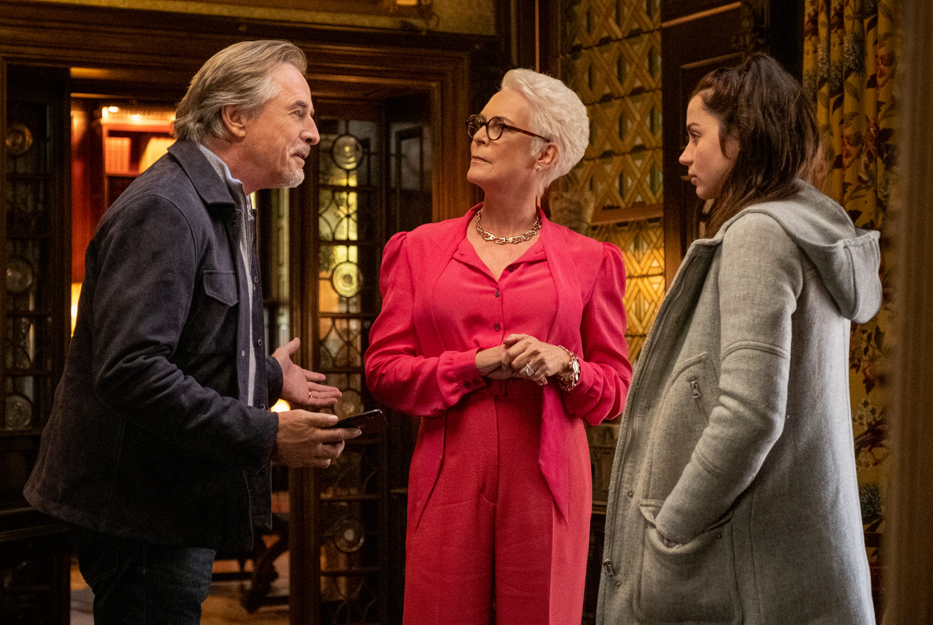
Yedlin reveals he never has a DIT involved with image evaluation, and never does any grading on-set either. "Essentially, I use a single show-LUT - based on years of development from data sets on contact printed negative. It has a long shoulder and toe, and delivers colour crossover and more nuanced colour rendition than some popular contemporary looks. It also has more complex saturation in neutral tones, especially on faces, than you get from some off-the-shelf alternatives. I light with my meter, lock-down the look on-set, and try to keep to simple adjustments in the final grade."
Whilst Yedlin's LUT provided a colour rendition that is reminiscent of a photochemical system, he also collaborated with FotoKem who applied his self-designed algorithms for evoking film's recognisable grain, halation and gate-weave - all based on his own empirical data collection and computational development. The final grade was done with colourist Aidan Stanford, whose eye for subtlety Yedlin attributes to his roots as a film colour timer.
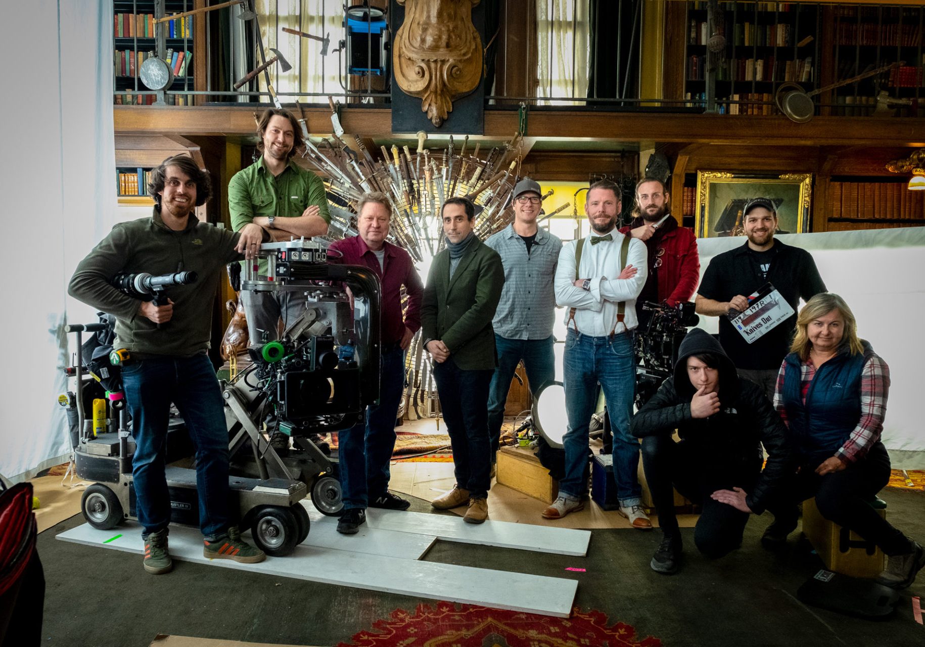
Yedlin has tried to stay ahead of the technology curve since the early days of digital acquisition's push into cinema. "I've gotten super-deep into studying colour science and I develop my own image-processing algorithms for both colour and spatial rendition," he says.
"I'm inspired by, but not a slave to, how photochemical systems have traditionally rendered tones and colours. Things like grain, gate weave and halation can also help to make the image look more artful and less clinical. And for Knives Out, we were able to tailor these algorithms to taste. I am very excited for people to see the movie, and enjoy its amazing twists and turns."

