EN VOGUE
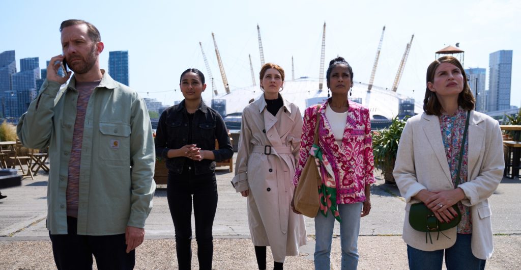
The Netflix series Geek Girl, centred on an awkward teen model, uniquely benefits from cinematographer Tim Palmer BSC’s fashion industry knowledge and experience.
Not many people know this, but before I entered the camera department, I was a fully-fledged fashion photographer in the late 1980s. I used to shoot everything on medium format, which gave me a deep familiarity with that large format, glossy, sharp, and crisp aesthetic. This experience placed me in an excellent position to lens Geek Girl, a 10-part television series based on Holly Smale’s 2013 young adult novel, which follows the journey of an awkward teenager who unexpectedly becomes a model.
The call came from Zoë Rocha, a producer I worked with in 2021 on a dramatisation of the Flowers in the Attic series for A&E Network. That was a completely different type of show—a period drama with lots of subterfuge and evil machinations, shot in Romania. Geek Girl was a new kind of challenge and an opportunity to revisit my roots in fashion photography.
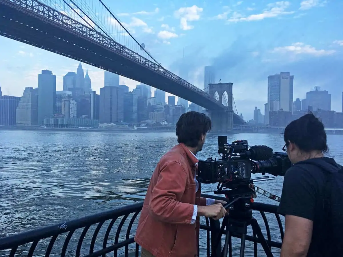
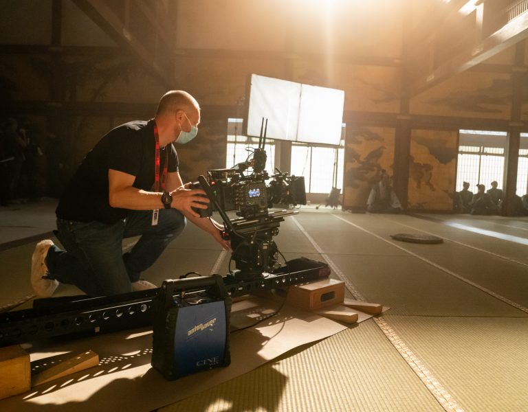
We shot it on an Alexa LF, provided by Pixipixel along with our lighting kit. While I could have chosen the Alexa 35, I preferred the full-frame look. The high fashion content of the show demanded a visual style reminiscent of fashion photography, and the Alexa LF felt like a perfect fit.
I’ve always been a fan of Cooke lenses and use them whenever possible. I’ve relied on Cooke S4s throughout my career, and their large-format equivalent, the S6s, were my go-to for this project. There was no deliberation because the Cooke look is unbeatable—great on skin tones, beautiful on faces, and offering a nice fall-off. They’re incredibly sharp, yet they render skin tones naturally, with full detail but without harsh edges. It’s a very natural look, without needing diffusion on the lens.
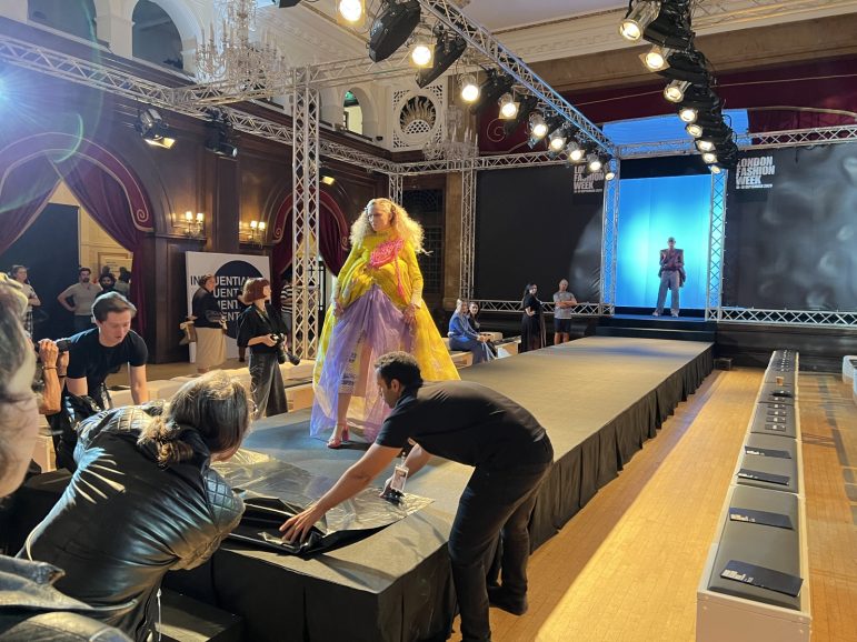
The biggest challenges in filming Geek Girl were the fashion shows—massive set-piece sequences with distinct looks and styles for each. We built one fashion catwalk runway environment at Porchester Hall in Bayswater, transforming the big ballroom there. Another catwalk was built from scratch at Twickenham Studios, and the third one was set up in Canada. Each had a unique aesthetic. The Porchester Hall catwalk was more traditional, with par cans and spotlighting in the rigging to create sharp light on the models as they walked the runway, reminiscent of a rock concert.
The Twickenham catwalk had a completely different design brief. We worked with Anna Valley, LED specialists, to build an LED wall that spanned the entire back of the catwalk and an LED ceiling running its length. The interactive lighting graphic pattern they designed changed throughout the show, lighting the catwalk and creating the scene’s environment. The only conventional lights I used on this set were a couple of 2Ks at the end of the catwalk to provide a strong key light for the models’ pirouettes and smiles.
For the more conventional scenes, we used Creamsource Vortex soft lights, old-fashioned par cans, and some tungsten lights. The LED screens provided by Anna Valley were crucial for the fashion show scenes. I worked with their techs to get the colour temperature right because what looked good to the eye often appeared greener on digital. We had to dial in the right amount of magenta— probably only about 10 or 20 points—but it made a significant difference in how the cameras recorded the colour space.
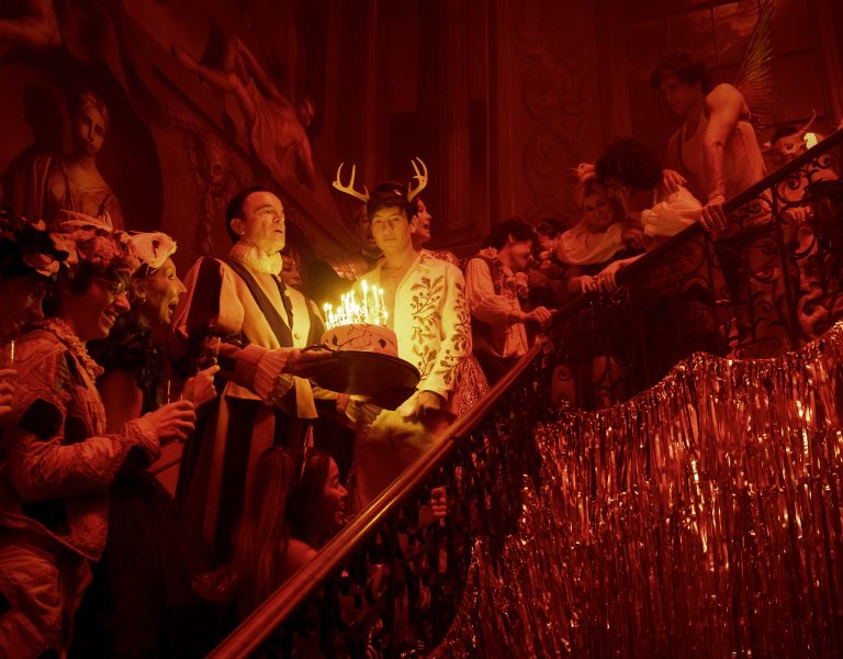
Lighting for fashion is different from traditional movie lighting. It has to be sharp, hard, and high-contrast, with strong, glamorous frontal key lighting. This goes against the grain of typical cinematography, which favours gentle backlight and soft, wraparound lighting. However, my background in fashion photography taught me how to tweak the edges to make it look good on film. I also understood the types of lenses, focal lengths, and shot sizes that work, as well as the importance of movement in the frame and the models’ body language. I took it upon myself too to coach the background extras on how to look the part of runway photographers! One of the visual signatures of the show was to incorporate film lighting into the shots as dressing and lighting. I wanted to use more vintage ‘glamorous’ looking tungsten units like Dino lights and Briese Lights. The tungsten worked well to give warmth and colour contrast and the look of the fixtures in frame made the compositions really dynamic.
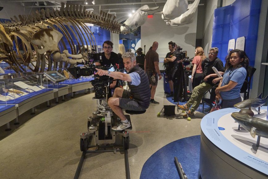
Working on Geek Girl was a learning curve. It was my first time working on a series with 10 half-hour episodes instead of the usual hour-long format. You end up packing as much into a half-hour episode as you do into a full hour, making it full-on all the time. It felt like running a half marathon—tons of scenes, lots of variety, three cameras most of the time and constant movement.
There was no time to think or discuss so preparation was everything because you have only your intuition on which to rely on set – just like live TV. When the train pulls out of the station there’s no stopping it. Despite the challenges, my background in fashion photography gave me an edge in capturing the essence of the fashion world with authenticity and depth. Geek Girl is a visually stunning series that remains true to the realities of the fashion industry, thanks to this unique perspective.
Filming Geek Girl was a wild ride, but it was one that reaffirmed my passion for blending the art of fashion photography with the storytelling of television. Each scene is infused with a genuine flair, making the series a compelling tale of self-discovery and personal growth, much like its protagonist, Harriet Manners.
–
Tim Palmer BSC is the head of the cinematography department at Boston University’s film and television school.

