GUIDING LIGHT
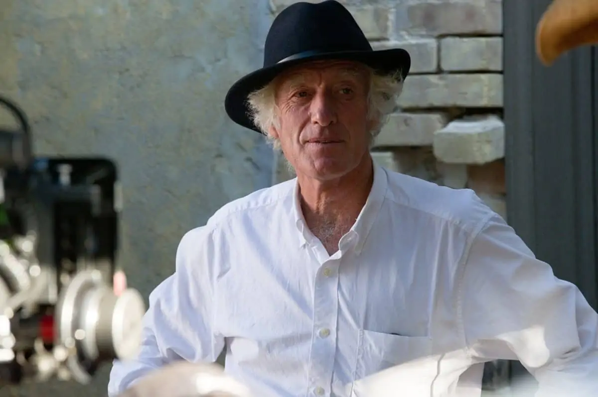
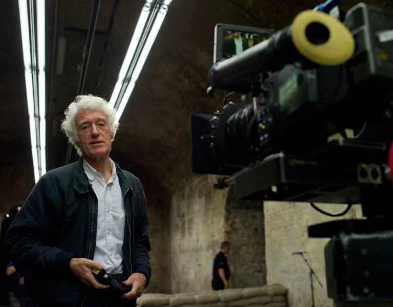
Bringing a tale of connection and community set in a fading cinema in a south coast seaside town to the screen saw director Sam Mendes once again collaborate with Sir Roger Deakins CBE BSC ASC, entrusting him to masterfully encapsulate the heart of the poignant story in cinematographic form.
“That little beam of light is escape,” says Empire of Light’s Stephen, referring to the power of movies brought to life on screen by a cinema projector’s rays. The sentiment is echoed by the film’s writer-director Sam Mendes whose belief cinema can set our imagination free to “find another part of ourselves” motivated him to share a coming-of-age story about human connection with audiences.
Penned during the pandemic, Mendes first solo screenplay, Empire of Light, is a tale of community, acceptance, and equality. Set in an English seaside town on the south coast in the early 1980s – a troubled time of recession, unemployment, and racial tension – the film centres around the employees of the aging Empire cinema; primarily lonely and unhappy cinema duty manager Hilary (Olivia Colman) and the light that enters her life with the arrival of the theatre’s newest employee, the young, charming, Stephen (Micheal Ward). As their connection grows, tensions of the time come to the fore, as Stephen – a young Black man living through a racially troubled period – becomes the target of abuse, and Hilary’s own struggles with her mental health surface.
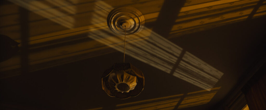
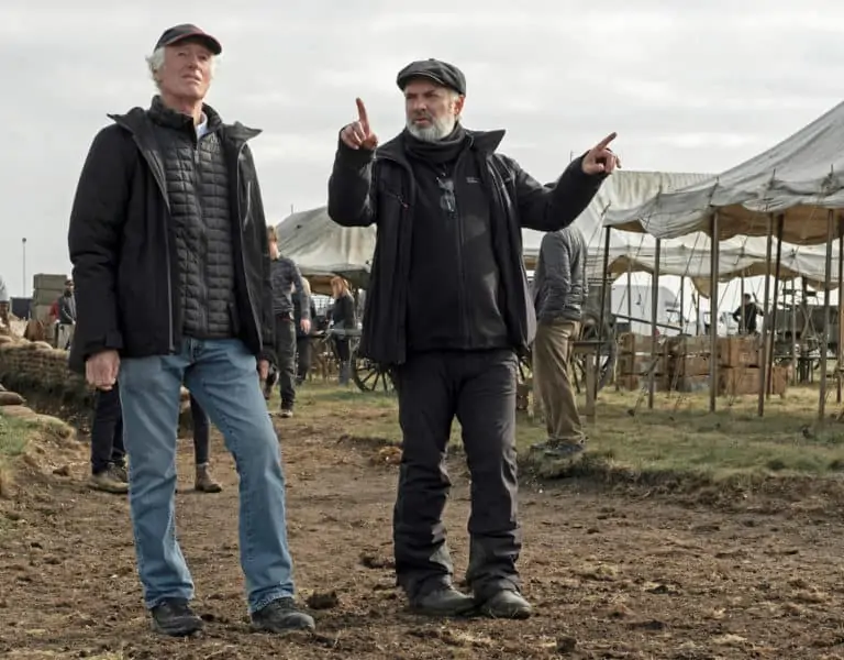
Marking Deakins and Mendes’ fifth production pairing (after teaming up on Jarhead, Skyfall, Revolutionary Road and 1917), Empire also reunites Mendes’ other repeat collaborators including production designer Mark Tildesley, gaffer John “Biggles” Higgins, producer Pippa Harris, costume designer Alexandra Byrne, and hair and make-up designer Naomi Donne.
Mendes shared details of an upcoming project when they wrapped 1917. “When, during the pandemic, the script came from Sam for a different production, Empire of Light, it was a nice surprise to discover it was a character study set in a seaside town,” says Deakins, who spent his formative years by the South Devon coast in Torquay.
“I grew up in that world and even though I moved away by the early ‘80s, when Empire is set, I still return to Torquay. Many things in Sam’s script were familiar – there were also bikers in Torquay and nearby Paignton.”
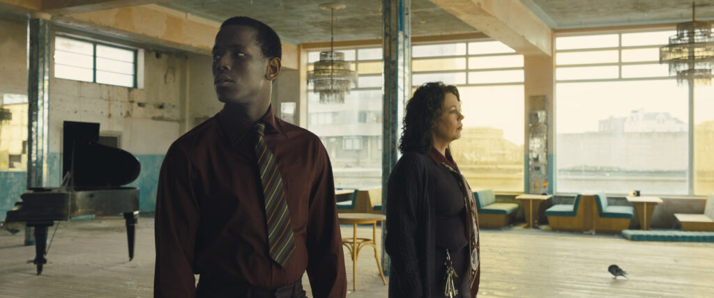
The film is a character study at its core in which the Kentish coastal town also becomes a cast member. Scene setting shots of Margate’s expansive beaches and atmospheric skies are a backdrop to the narrative. Some of this imagery echoes stills in Byways, Deakins first book of photography published last year which includes moments captured by the coast and of the rural splendour of the southwest of England.
“There’s something about that singular view of a still image I love,” says Deakins, who originally intended to be a photographer. “A lot of my time off is spent wandering around coastal towns with my camera, so Empire was attractive to me because it was an interesting script that happened to be set in a seaside town.”
Mendes sees the lockdown period Empire was born out of as a time of “intense self-examination and reflection for all of us” in which he confronted memories he had “been wrestling with since childhood. That was the spur to write – to explore those memories and to see if I could unlock anything interesting.”
The music, movies, and pop culture of the late ‘70s and early ‘80s, when Mendes was a teenager, formed who he later became as a filmmaker: “It was a period of great political upheaval in the UK, with a great deal of very incendiary racial politics – but at the same time, an amazing period for music and for culture generally – very creative, very politicised, very energised.
“Movies deal in mythic landscapes. You’re always looking for a point where the past becomes somehow bigger in scale, and greater in theme, and more fabled than the present. Looking back now, this period in England seemed to me one where the intersection of racial politics and music and movies was particularly special and unusual.”
While Mendes penned the script for a film set during a time of upheaval, the modern world was also going through a period of uncertainty and turmoil. “In the middle of lockdown there was a racial reckoning in the world. We were left alone to contemplate how our own racial politics had been formed, and whether we had fallen down in our attempts to make sure the world was evolving,” he says.
“When I wrote the movie there was also another common obsession: we were all worried whether the cinema was going to die, along with live performances. So, all those things have gone into this movie, and in that regard, it’s quite raw.”
Cinematic scope
A motivation for shooting in Margate was production designer Mark Tildeseley’s discovery of Dreamland: a former cinema and ballroom with an impressive Art Deco exterior attached to a seaside funfair. Mendes rewrote some of the screenplay in line with the new location, making use of the ballroom rather than a disused balcony and incorporating a scene set at the funfair’s roller rink.
“I think Sam had a slightly different vision for the town than some of the other locations we scouted,” says Deakins. “Margate brought a reality to this movie and feels more like a seaside town in the Northeast of England than Brighton or Worthing.”
Mendes was drawn to the Kentish coastal town “because it offered so much opportunity in the scale of the visual landscape” and a “breadth which gives it poetry and a cinematic scope.” He elaborates: “It’s where J. M. W. Turner painted most of his famous paintings – he went there because he said that the skies were the finest in Europe. It’s where T. S. Elliot wrote The Waste Land, sitting in a bus shelter just outside of the cinema looking out over the beach and the grey sea that sits beyond.”
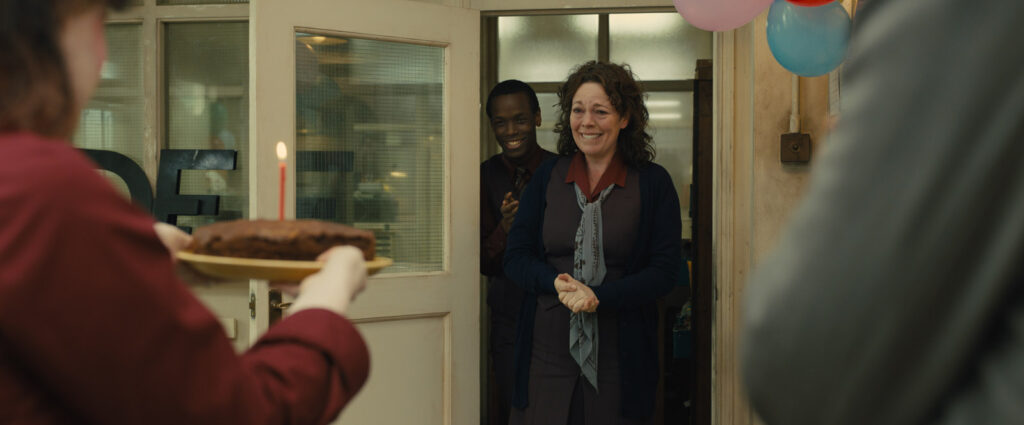
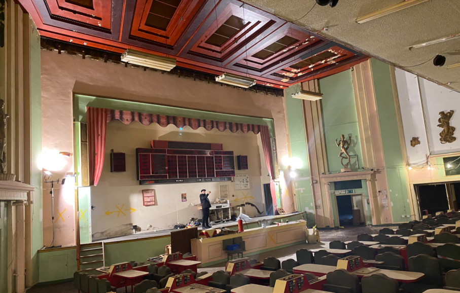
Tildesley’s team embarked on a mission to transform and refresh Dreamland, turning the theatrical auditorium, which had been converted into a pea green bingo hall, into the Empire’s cinema. He ensured everything installed in the auditorium was period appropriate, from the seats and material on the walls to the proscenium arch.
One concern was the cinema’s location beside a roundabout, and the only major road through Margate, requiring diverting traffic through a back road. “Luckily the local people were understanding. It was so important to get cooperation from the town due to the number of days we had to lock off the street, so location manager Emma Pill’s role was crucial,” says Deakins. “When we faced weather issues and needed to swap scenes or shooting days, the location team quickly reacted to that too.”
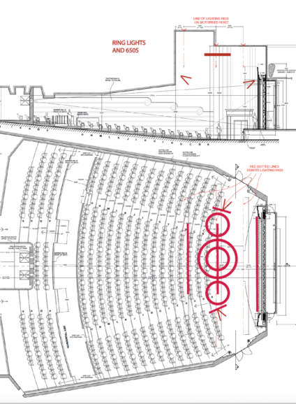
As expected when working in aging cinemas, problems such as incorporating a lighting rig in the rotten ceiling were faced, requiring many structural engineers and a purpose-built lightweight rig which could not be seen in camera.
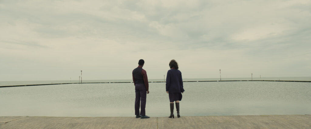
Although Dreamland offered some exterior and interior elements, there was no suitable Art Deco-style lobby overlooking the sea which, as Tildesley highlights, is “a centrepiece – it’s where all the characters meet. It had to be visually captivating.”
Deakins and Mendes considered shooting this on stage at one of the large studios, but they were unavailable, and, besides that, time would be lost in travelling. It would also prevent shooting in sequence, which Mendes wanted. Fortunately, an empty lot sat two doors away from the cinema where the lobby interior set was built with the same view out to sea as the Dreamland exterior shots.
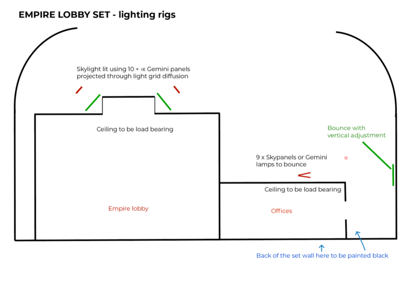
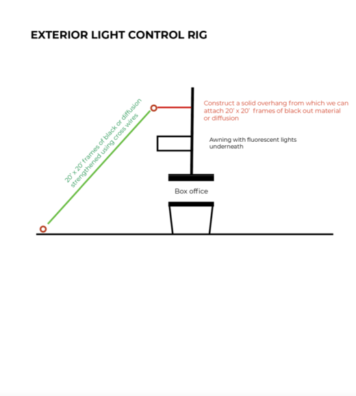
“This set looked out at the real world, so it required control of the balance between the interior and exterior, and the colour of the light,” says Deakins. “That’s one of the hardest things when shooting a scene over a whole day with changeable light and trying to make everything feel consistent.”
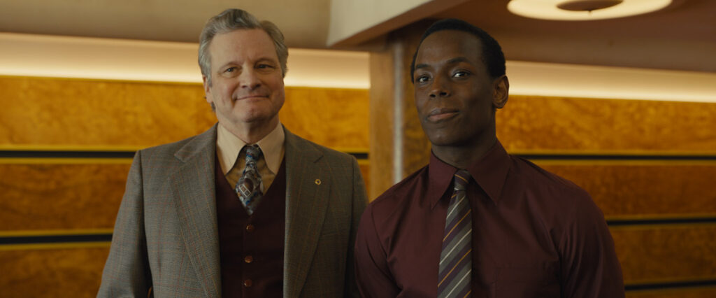
The theatre interior was also demanding to capture which, “like most theatres, was split, so they had taken the upper circle and made another cinema upstairs. Therefore, there was no projector to hit the screen from above the circle, as there normally would be,” adds Deakins.
Production designer Tildesley created a projection booth below. But the low ceiling made it almost impossible to light it, so he worked with Deakins, Higgins, and the art department to determine how to incorporate lights to create a space that looked real whilst not revealing it was a split cinema.
“As we had very little head room, we had to design a system using Astera bulbs with full colour mixing to get soft top light for ambience,” explains Higgins. “These bulbs were mounted on rings of various sizes which fitted within each other, the largest ring being 12 feet in diameter. We had more than 300 bulbs individually controlled from the grandMA lighting desk for this effect alone.”
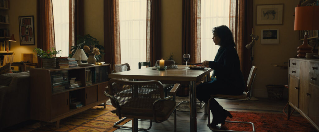
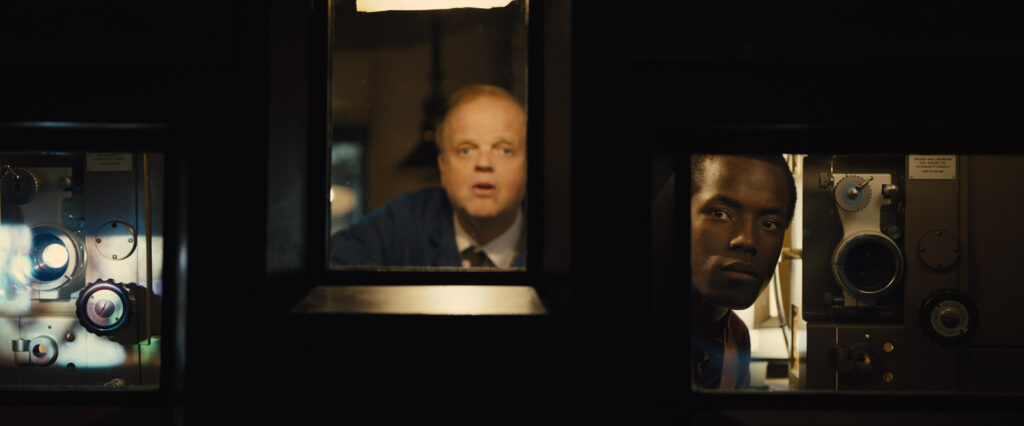
Tildesley’s team then built the projection booth interior, with moveable walls to accommodate filming, at a hangar at nearby Manston Airport, where the interiors of Hilary’s and Stephen’s apartments were also constructed. To “cheat that the projector was there” Deakins suggested blacking out the front of the set and putting in a screen in a false perspective to art director Rod McLean. “You could then produce double images; the image on the screen and the image of the projector would be reflected in the booth glass.”
Projector tests shot at a college theatre demonstrated the double refraction images to Mendes. It was also critical to use film of the correct density for the playback that retained the strength of image. “We then explored how to augment the windows of the projection booth set with the visual effects team, so it looked like you were seeing the curtains when the movie wasn’t playing, creating a subtle sense of the room beyond,” says Deakins.
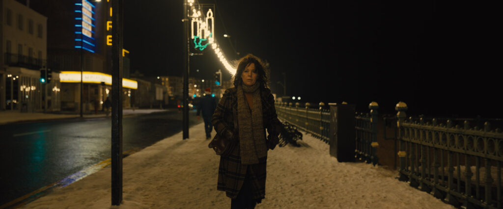
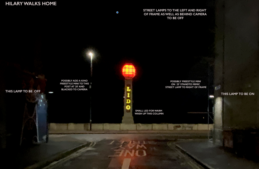
Deakins worked with Tildesley particularly closely when some restrictions faced meant the practical lighting often had to work for what was being captured. For instance, practical lights in the lobby that appear in camera, also needed to be used for illumination. As gaffer Higgins highlights, “practical lighting is no longer a background effect. It is a lighting tool and therefore a very important “fixture”. There was a huge practical installation on almost every set and on the streets for the night sequences.”
Seamless entity
1917 needed to be conceptualised during prep, with sets built based on what was being captured. While the more still, observational, and naturalistic Empire still required early discussions about what should be a set or a location, the exploration of the look was more gradual.
“As it’s a character study, the approach is often not finalised until the actors are on set” says Deakins. “You never want photography that’s too flashy. It’s all about creating a natural world. In cinematography, if something stands out, you’ve failed. You’re trying to create a seamless entity.
Although not referring to specific documentaries he shot in his early career when crafting the naturalistic film, Deakins believes cinematographers are a product of everything they have done before and that “starting off in stills and then shooting documentaries for years naturally influences the way he approaches a production.”
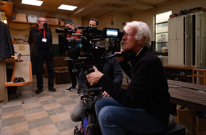
When exploring the use of colour, the work of photographers Deakins admires such as Harry Gruyaert was a reference. Mendes originally considered shooting the film in black-and-white, but Deakins did not envision it that way. “I love black-and-white – in a way, I wish everything was black-and-white – but I felt this had to be colour for some reason, and I showed Sam Harry’s photography for colour inspiration.”
Deakins knew the interior of the cinema lobby needed to be warm and agreed with Mendes that, following a cool dawn sequence as Hilary enters the space, when the lights come on, the lobby should become warmer and more inviting. Even more vibrant colours later feature in a pivotal sequence when a Chariots of Fire premiere takes place in the cinema.
Hillary’s apartment set switched between colder and warmer looks depending on the scene. Meticulously analysing each element that would appear on screen to ensure it aligned with the story, Deakins looked at various swatches of material to guarantee the curtains in the apartment were captured as desired. This included a scene Deakins wanted largely in silhouette and a night sequence in which he wanted the blue flashing light of the police car outside to subtly appear on the curtain, so the audience feel the exterior, “rather than it being a solid curtain with just a slit of light.”
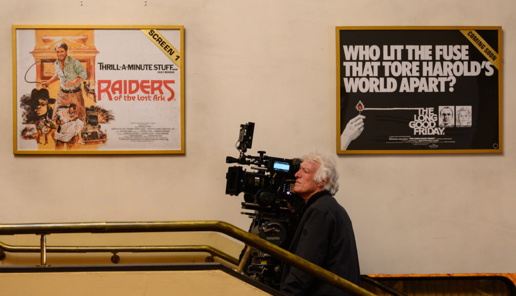
As Mendes wanted to shoot in sequence as much as possible, the design team needed to prepare everything for Hilary’s flat set up front and redress the set as it occurs in script order. “The set develops in the same way the story does; we project Hilary’s struggles into the set and show a progression as she deteriorates and recovers,” says Tildesley.
The bathroom cabinet in Hilary’s apartment was also designed with attention to detail to signify her deteriorating mental state, as demonstrated in a shot which sees the bevel of the mirror split across her face as the cabinet door closes. Motivations for light sources were also discussed in depth for a night-time scene when Hilary has a breakdown in her flat and is taken away by a social worker.
“We figured that was one time it would be best to use a really bald, hard light, so the scene is basically lit by a practical light without a shade on it,” says Deakins. “The bare bulb makes the scene naturalistic, but its light is also slightly harrowing. And the way Olivia leans into it, and the light becomes lower and more bleached out on her face, worked well. This also required discussions about how the makeup would change.”
Nothing happens without light
For gaffer Higgins, who believes in collaborative filmmaking where everyone is respected for their contribution, “the combination of Sam Mendes, Roger Deakins and so many other talented film makers on set” meant he knew as a team they would “produce something very beautiful.” From the first script reading “it felt like beautiful old-fashioned film making, a world away from many contemporary heavily CGI dependent films.”
“As Toby Jones’ character, projectionist Norman, says in the film, “nothing happens without light”, so I wanted to make my contribution to the telling of this poignant love story and celebration of film and cinema,” he says,
Having worked together since their first film 1984 (in 1984), Higgins has come to know what Deakins looks for in a new film. “Roger is extraordinarily talented, and it’s been a real honour to work with him over the decades. I’ve always been delighted and excited to get the call from him to do each of the films we’ve made since those early days,” he says.
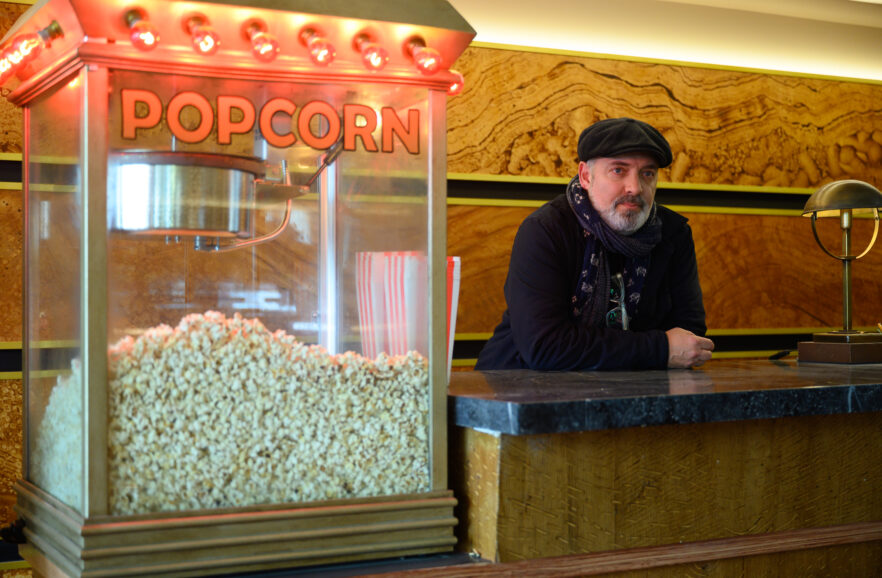
“We’ve both developed in our craft over these many years and have always been able to bring that experience as well as openness to new technologies and approaches into our joint working. Empire of Light was the culmination of all those years of experience, and in conjunction with so many talented others on set, we’ve created some very beautiful looking films I’m really proud of.”
To ensure the light enabled the creative ambitions to be realised, Deakins and Higgins overcame a variety of technical challenges. “If you’re balancing to natural daylight, and using conventional sources like halogen tungsten bulbs, when you dim them, they change colour and become warmer,” explains Deakins. “So, when the daylight’s fading, you bring down your lights to balance with the exterior, and they get warmer and the daylight is bluer, which is no good.”
This dictated that all lighting was LED, marking the first time Deakins worked purely with LED fixtures. As the daylight changed, LED allowed light levels to be increased or decreased overall, or one area of the set could be brought up and another down to add light and shade to a shot. “While there were advantages to using LED, it is still quite expensive,” says Deakins. “Also, if the audience ever detected LEDs were used to light a shot, they would feel it’s not quite 1981 which would be a shame.”
Hurdles were also faced due to the number of productions being shot in the UK at the time, meaning large quantities of LED were not available. “We had to mix and match and sometimes we couldn’t afford the number of lights we wanted which required smart scheduling from Biggles,” says Deakins. “Behind the scenes there was a lot of juggling of lamps, and it would have been easier if we’d had a few more and left them up, but, because of budget restraints, they all needed to be replaced and reset.”
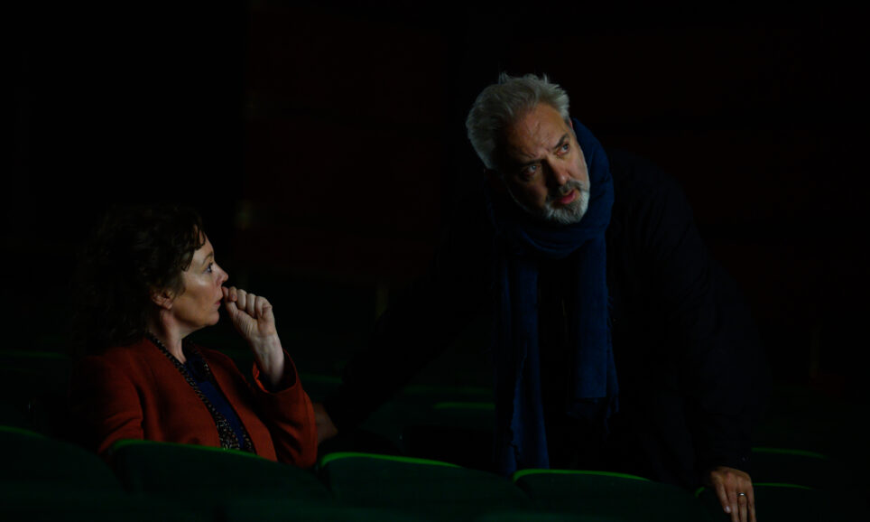
Higgins commends the “marvellous technical support” from Panalux during this time. The newest fixture incorporated into the lighting line-up was the Fiilex Q5 which offered full colour management and could be used as a Fresnel or by fixing an Octa Dome diffusion they could be converted to a soft-light. “We would have liked some of the larger Fiilex units, but they were not available in Europe in time for our schedule,” adds Higgins.
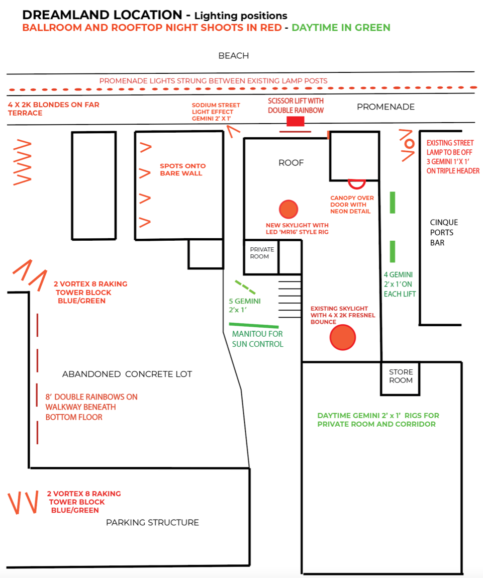
To illuminate exterior night-time scenes, Deakins suggested introducing LED festoon lights along the seafront. “Torquay and Brighton still have them, as did many other seaside towns, especially in the ‘80s,” he says. “We needed to convince production that festoons would make a big difference to the feel of the setting. There were then shipping problems due to shooting around the time of the pandemic.”
“We managed to source around 6,000 LED bulbs for the seafront festoon installation which we tested on camera and found to have the same characteristics as a 60-watt tungsten bulb, so we went from 60 watts to seven watts,” explains Higgins. “This enabled us to use power supplied to each lamp post by Margate council who were very helpful.”
The pressure was on the first night the festoon lights were captured on camera as they were turned on half an hour before the shoot, leaving little time to balance and dim down some to create the desired feel. “The people living in the town loved the festoons and wanted to keep them, but after the first storm, some bulbs had water in them, and sparked,” says Deakins. “It was lucky they stayed on when we needed them for the shoot.”
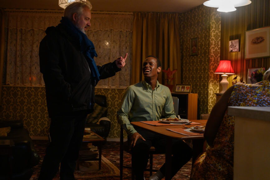
Liking to work with natural light as much as possible, Deakins would have preferred some of the interior apartments were real locations rather than sets but finance dictated some production decisions. “I’d have liked a real night exterior and day exterior for some of them, but the film is more of a character study than about the view out of the window,” he says. “And as we were shooting in February, March, and April of this year, the daylight was restricted. If we’d shot at real locations, we’d have been boxed into a certain amount of shooting and be at the whims of the weather.”
Inconsistencies due to the weather and changes in natural light for certain scenes shot on location such as when Hilary and Stephen visit the beach were among the sequences modified during the grade with Company 3 colourist James Slattery.
“James is an incredible dailies timer who has now moved into DI. He has an excellent eye and knew the footage so well, seeing the film all the way through from the shooting tests to the final grade,” says Deakins. “It made such a difference having somebody who had gone through all the dailies because I would go in every so often and sit with him and tweaks things, so he knew what I was looking for.”
Some scenes in the cinema lobby also required adjustment in the grade. “It didn’t matter how much I could balance the light interior exterior, there were still some days when the sun was out, and it was a matter of selecting the exterior and giving it a little bit of detail in the grade,” says Deakins.
“That’s the great thing about the Mini LF; you have so much latitude, meaning we could pick those highlights, bring them down and bring some information into them. But I never wanted to make it look absolutely crystal clear because that doesn’t feel real. For instance, if you stand in a dark space and look at the curtains, they’re blown out. I wanted that reality, but I also wanted to feel something.”
The world beyond
The staff locker room was the setting for multiple scenes, some of which were captured through a glass window Tildesley designed into the set, tying in with the observational feel of the film. “That was a difficult set to shoot because it was part of the composite set of the lobby,” says Deakins. “I wanted to light the locker room through the windows, but due to space restriction there was only five feet outside them.”
Therefore, locker room scenes were shot with overhead fluorescents as there “wasn’t really any other option, especially when shooting eight or nine people around a table in different positions.” Deakins knew it would not be possible to light each shot separately, so he needed a light that worked for everything. “I didn’t change it, other than balancing a little bit. But that’s probably what it would have looked like – it’s a workspace and not meant to look pretty.”
In contrast, more expansive shots of the surrounding areas were also essential “to open up the idea of the space of the world beyond. We shot more footage of the ocean, capturing the width of it and the scale of the human being against that environment but not all of it is in the film,” adds Deakins.
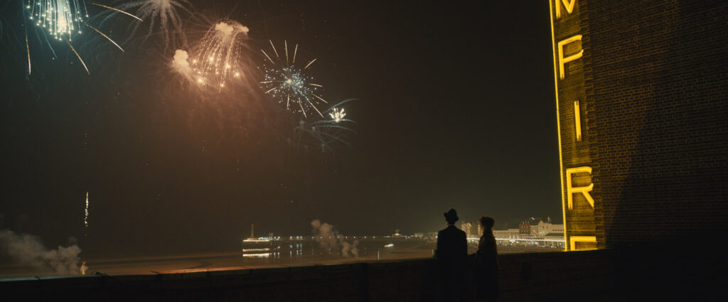
Striking silhouettes were incorporated when appropriate such as in a difficult to illuminate night-time sequence which sees Hilary and Stephen in silhouette on the cinema roof, dwarfed by exploding New Year’s Eve fireworks. The obvious way to light it would have been to have work lights up there as sources for the actors, but Deakins thought that was “too much and too bitty.” He wanted the “feel of what was surrounding the roof, not what was on the roof.”
Therefore, he asked Tildesley to introduce a skylight in the lobby set which would also feature on the roof. “We didn’t want a Disney-like twee thing; it had to fit in with the palette,” he says. “Mark designed a wonderful skylight, but then it needed depth as it was sitting on a roof, so we figured out a way to light it.”
The solution was a small ring of LED spotlights, shooting down, and painting the floor of the skylight white so it looked like light was emitting from it. “This created a lovely light coming up, illuminating the characters’ faces,” says Deakins. “I then asked Sam if we could stage it so Hilary and Stephen stand at an angle to the skylight and a three-quarter front side light hits them. When the fireworks are set off, you want the fireworks to be the centre of the attraction and the light from the neon Empire sign on the outside of the building to be another focal point.”
For this scene, individual dimming control was used on each swag of festoon and the dimmers were concealed inside the lamp posts, which meant Higgins’ and Deakins’ radio control would not work, so they manually controlled these levels. Deakins and Tildesley discussed the colour of the new exterior neon ‘Empire’ sign in depth and the cinematographer boosted the yellow appearing on the characters’ faces.
Special effects supervisor Richard Cheal then introduced atmosphere to the scene as Deakins “wanted a very light haze, so you could silhouette the characters against the fireworks and whatever ambient light there was,” he says. “The festoon lights also created a little bit of bloom in the atmosphere to add to the silhouette.”
Another poignant sequence, reinforcing the power of cinema, sees Hilary – a cinema attendant who has never watched a movie in her place of work – sat in the theatre, her face illuminated by the screen as she is captivated by cinematic classic Being There.
Deakins admits he finds it difficult to shoot such scenes as “you usually have to use separate lights for the character, but I didn’t want to do that, so we made sure we used a strong enough projector to bounce light onto Olivia. I brought a fake screen slightly further forward from where it would have been, so the beam you see behind is actually the beam that’s lighting her – it’s all synchronised. You can achieve this with fancy systems and larger projectors, but I wanted something simple and just to bounce light off a white screen.”
In contrast to capturing mesmerising moviegoing moments, a different approach was adopted when lensing scenes depicting the political upheaval and racial politics at the time. One such sequence sees the cinema staff initially intrigued upon noticing a sea of motorbikes and a crowd marching past the theatre. This soon turns to turns to fear when rioters storm the building and violence ensues.
“We spent a long time discussing whether we should suddenly go into handheld, but it just didn’t feel right. It felt like a self-conscious visual way of adding something to the scene, so I argued against it. By not using handheld, I think it stays within the language of the film. We shot Jarhead totally handheld, but I don’t think that documentary realism would work here,” says Deakins.
“This scene also incorporates the brightness of the light outside, so when the rioters first appear at the door they are in partial silhouette, making it hard to distinguish who they are. The drama and the feeling of realism is very much created through the light.”
Creating naturalism
Mendes and Deakins spent a number of days talking through the visual approach this film. “It could have been all handheld, like a docudrama, which we did discuss,” says Deakins. “And I don’t know if it was a reaction to 1917, a film where the camera doesn’t stop moving, but it struck both of us that what felt right for this film was more stylised, more quiet – much more static to allow people the space in a frame.”
The director and Deakins – a career-long user of ARRI cameras – were so impressed by the visual results and flexibility of the Alexa Mini LF that ARRI developed for them to shoot 1917 that they wanted to capture Empire of Light with the same large-format system.
Although Empire is much stiller and “light years away” from 1917, valuable lessons learnt when shooting the World War I epic and their previous productions could be applied to their latest film. “The variety is one of the main things that’s been so fun about working with Sam. The first film we made together, Jarhead, was all handheld which I never expected I would do with him on our first movie, and then Revolutionary Road was very controlled but with quite a lot of camera movement,” says Deakins.
“Skyfall was totally different again – at times with long held shots and at others with many cuts and a lot of action. And then there’s the one-shot approach to 1917. In Empire you’re creating a naturalistic environment, with the camera always motivated by the actors and the shot construction taking place on the day of the shoot in conjunction with the performances. In contrast to working with the actors on the day, for 1917 everything had to be conceived before shooting began, before even set design and location scouting took place. Although the camera was motivated by the actions of the characters, it could also become more observational, and the action seen from a distance. That was key to making 1917 work, otherwise you would have been tight on the character’s back or front for the entire film, which wouldn’t be sustainable.”
On this occasion, the camera crew did not include a Steadicam operator as it was not possible to dictate the days they would be required. Instead, Deakins searched for a gimbal system they could have access to throughout the shoot and revisited testing carried out for 1917 with the ARRI Maxima stabilised gimbal head.
“We didn’t end up using it for 1917 but it felt like a good choice for Empire because we could have it all the time and, if necessary, use it without a technician, although we brought one in to cover ourselves most days,” says Deakins. “We used it a lot. We would figure out the scene and then see if the Maxima could save us time as we wouldn’t have to lay a track, if we were running on a pavement, for example. Or we could lay a track and use the Maxima as well.”
The Mini LF was paired with ARRI Signature Primes which were also used for 1917 and chosen once again because they are fast, clean, sharp, and lightweight. While Deakins used one lens for 1917 to align with shooting a film from one perspective, on this occasion he worked with a wider range of lenses – primarily between 32mm, 35mm, 40mm, and 47mm but occasional a lot wider or longer.
“I almost always work with primes, and we never even carried a zoom for Empire,” he says. “I don’t like messing around with lenses, I want things to be what I see. Although the eyes may not be as good as they were when I was 19, I still see very sharp images, and I just want that to be what I’m capturing.”
Lensing the calibre of performances on show in Empire of Light – from a stellar cast including rising star Micheal Ward through to the Academy Award-winning Olivia Colman – was a high point of Deakins’ filmmaking experience.
“The cast in Empire were exceptional, and it was a real pleasure to capture their performances. That’s what I’ve always loved about what I do, and certainly what I love about operating the camera, whether it’s shooting music videos for BB King, or capturing great actors like John Hurt and Richard Burton in 1984 – one of the early films I shot that featured Richard Burton’s last performance. I just love looking through the lens and seeing that frame and that performance.
“It’s not quite the same as when I started – I’d be the first to see the performance we were capturing because I’d be behind the camera, there wouldn’t be a monitor, and the director would probably be standing next to me.”
Friendship in the frame
While some see Empire of Light as an ode to cinema, Deakins views it as being as much about the power of friendship. “Yes, it highlights that movies can take you outside of yourself and expand your view of the world. That’s what everybody loves about movies,” he says. “However, I think Empire of Light shows us how much Hillary gets from her human relationships. It’s just about friendship; life is about friendship. And movies can show you something beyond yourself that gives you a little bit of escape and stimulates you. Being There – the film that moves Hilary – is, again, very much about the small and special parts of humanity.”
Mendes agrees that the film is about a group who “find friendship and come together in this extraordinary building. At its core, the film deals with the families we create around us that help get us through life – and how people are drawn together to take care of each other, choosing kindness, compassion, and empathy.”
With friendship also at the fore of his production experience once again, Deakins enjoyed the solidarity that resulted from working with the crew. The filmmaking family built throughout a production and the collaborators who become comrades over multiple projects is one of the great joys of his role which Deakins treasures.
“Biggles, key grip Gary Hymns, focus puller Andy Harris – who has been with me for 30 odd years, since Fargo and I could hardly do a film without – they’re all an integral part of a production,” says Deakins. “The visual effects team were too on Empire because while this is not a superhero movie, there are a lot of subtle visual effects tweaks. It was also incredibly important they didn’t stand out. If you’re adding a big monster in a scene, you’ve already suspended belief. But if you’re adding visual effects to a small seaside town you don’t want it to show.”
