FILM AND THEATRE UNITE
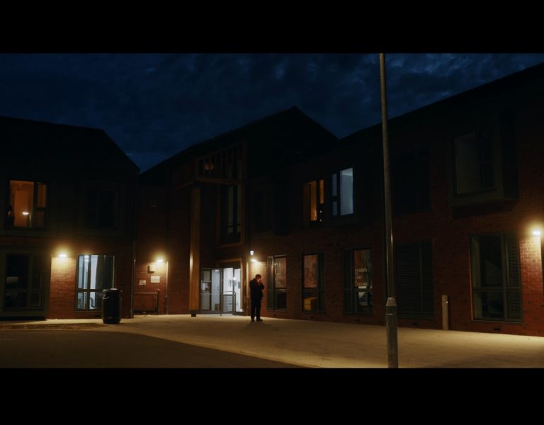
January 2021. Britain is locked down, divided, and facing some difficult truths. Old friends Michael (Neil Maskell, Peaky Blinders) and Delroy (Giles Terera, Hamilton) are dealing with issues much closer to home.
Tensions are running high, and racism isn’t far below the surface in this funny, political, and explosive drama that merges theatre techniques with those of film.
The project’s origin is a pair of critically acclaimed stage plays written by Clint Dyer and Roy Williams and performed at the National Theatre in 2020. ‘Death of England’ starring Rafe Spall and ‘Death of England: Delroy’ starring Michael Balogun (after Terera withdrew due to a last-minute health issue) were essentially monologues, staged in the round.
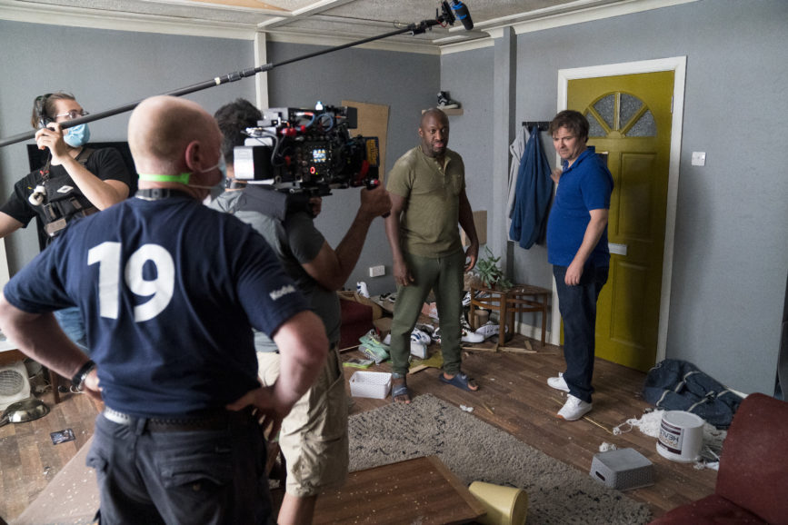
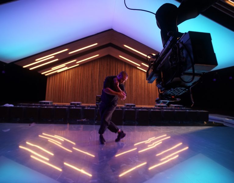
The writers scripted a standalone piece for the screen as a two-hander featuring the main characters, with Dyer directing the NT production for Sky Arts. This followed on from the success of the NT’s first original film Romeo & Juliet. Death of England: Face to Face was filmed on the NT’s Lyttelton stage over 15 days and combines filmmaking with theatre in its blocking, lighting, camera work and breaking the fourth wall. To that end, it required the extensive pre-production participation of director of photography Sashi Kissoon (Venice at Dawn, Genius by Stephen Hawking).
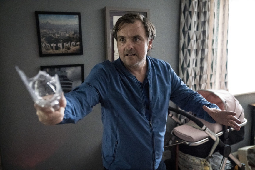
“It’s the greatest creative experience of my career, not only in terms of how I shot it but being invited into script breakdowns to help shape the film and being in the two weeks of rehearsals,” says Kissoon, who had worked with Dyer on short film Swept Under Rug and commercials previously. “The collaboration was very open. It’s very rare that a DP is encouraged to talk in depth about story.”
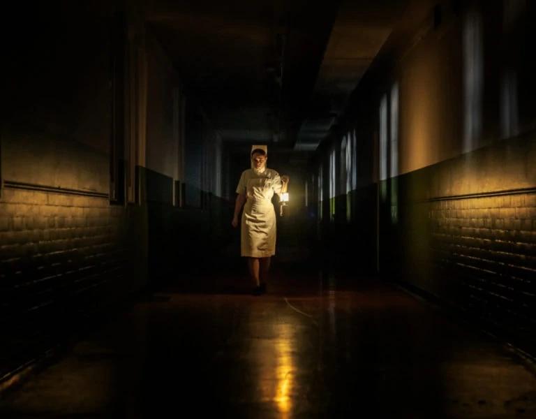
He explains, “I met with Clint and production designer Samantha Harley 2-3 times a week over a month and workshopped the script. One early idea was how to illustrate the internal memory of the characters. We called this the ‘brain space’ and it’s the key idea of setting these scenes in a black space.”
When Michael visits the corner shop in his brain space Kissoon pitched the idea of using forced perspective, to shrink the set down to make the shop keeper and shop feel small.
Subscribe to our mailing list to continue reading
Another idea was to use two different aspect ratios throughout. Although they ended up staying mostly 2.39, when the film cuts to flashbacks – flickers of just a few seconds – these are shot 16:9 to help differentiate them.
Kissoon suggested using composite shots of actors within the same frame. The idea was to present characters looking back at themselves in self-reflection. He says, “These are moments when in hindsight we question why we do the things we do. I did some tests and showed how it could be done without any expensive VFX.”
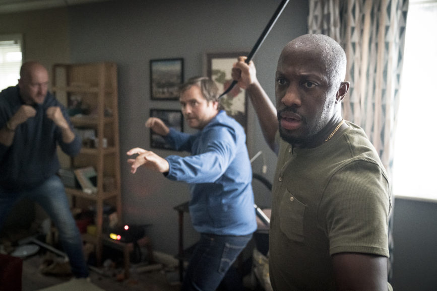
If that was something not possible in live theatre, then the production also planned an elaborate shot (not used in the end) during the climactic fight scene in which, while the camera spun 360 around the room, the damaged walls of the flat would be lifted clear by the stage crew to reveal as good-as-new walls.
“In the film world, that might have taken weeks to arrange but the theatre crew were so used to doing things like rapid major set changes, it proved no problem.”
It also made sense, partly for budget, to use the theatre’s own lighting kit and therefore to employ the theatre lighting crew who knew exactly how to use it.
“With my gaffer and best boy, we did a film school lighting class, and we had a crew from the NT who knew theatre lighting inside and out and helped build little rigs above the set to give us more control.”
Kissoon acquired on Sony Venice principally because of its ISO 2500. “The big aesthetic for the brain space was that the shadows would fall off the blacks. I didn’t want to see any detail, so we wanted to raise our stop high enough to have everything else fall off to shadow.
“The other benefit of the Venice is its versatility. So, when we’re shooting the present-day scenes, we use spherical Zeiss Supreme Radiances in full frame mode and for flashbacks its Lomography’s specialist Petzval 58mm lens with the Venice switched to 4K anamorphic mode.”
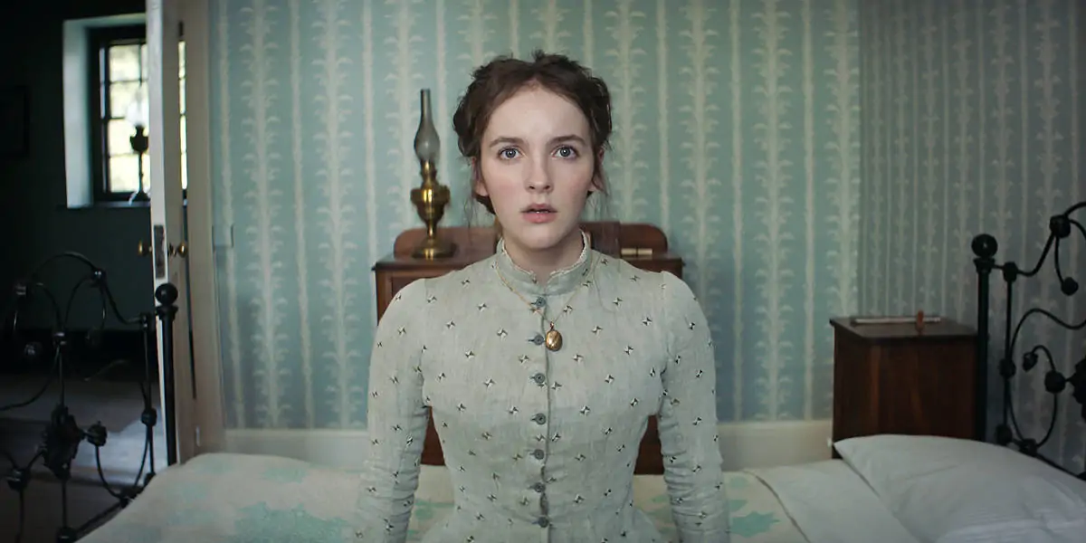
Kissoon liked the warping effects at the edge of the frame from the Petzval while keeping the centre framed for portraiture. “I wanted the audience to know exactly what they were seeing straight away in those few seconds.”
He also deployed the lightweight RED Komodo armed with a 20mm standard speed Zeiss for a few shots. These included one where Delroy gets pulled into a fridge as the actor talks to camera.
“I built a rig that enabled Giles to grab the camera off me and take control of it. Another instance is a POV of a man being beaten up by Michael and then a handheld shot of Delroy taking in a lift.”
The look of the feature is crisp, modern, and warm-toned in places and conceived in conversation with Dyer and Harley to challenge the conventional look of ‘poverty porn’.
“When a story is set in a council flat you tend to get the same handheld 16mm desaturated look which we felt does such a disservice to people who live there. Just because someone may not have as much money as anyone else, it doesn’t mean they are any less happy.
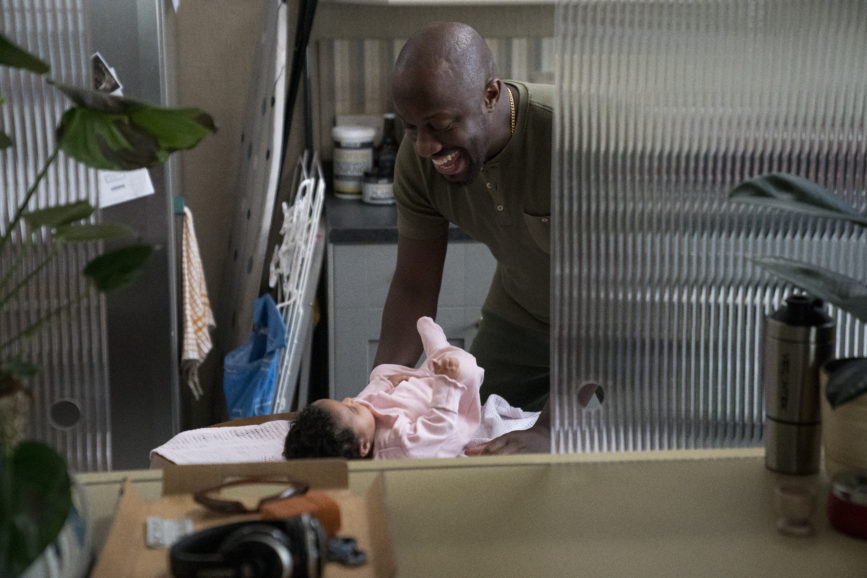
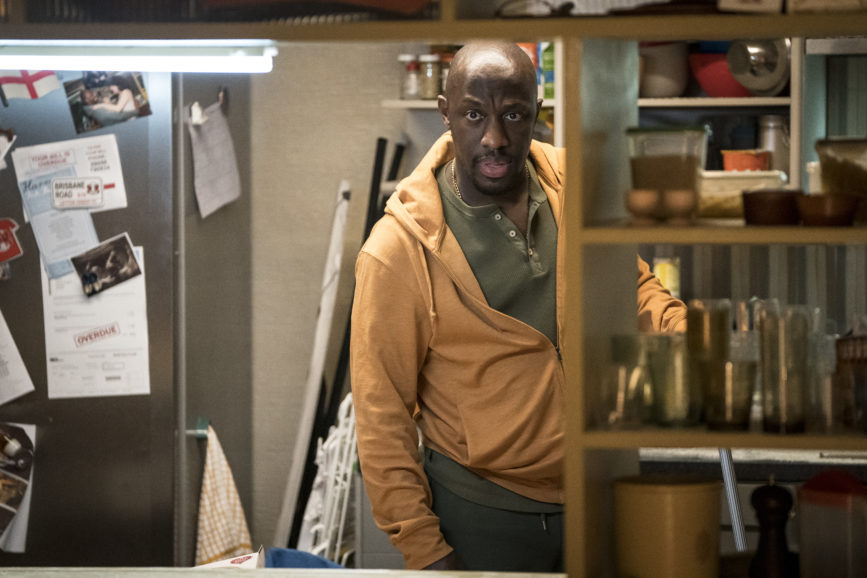
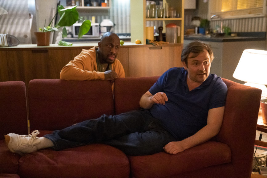
“The idea for the design of the ex-council flat is that Delroy owns it and is doing it up. We learn he once had a decent job. The living room has a warmer feel, but the kitchen retains the old fluorescent tube because he hasn’t got around to redecorating that area yet.
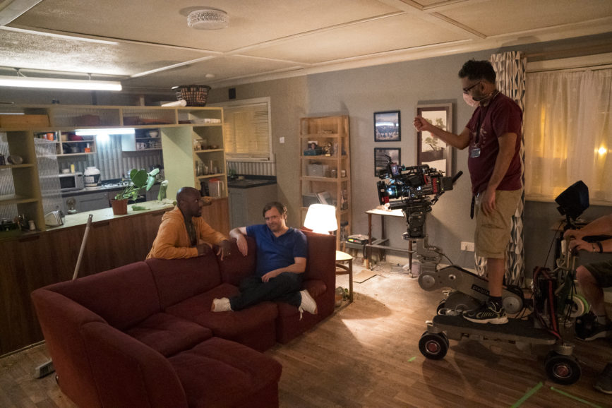
“Using Venice in 6K full frame mode you just get this extra richness to the image which is the inverse of the gritty kitchen sink style. That’s also why everything in the flat, apart from the fight, is on a dolly. We wanted this elegant motion to show a different side to life in these buildings.”
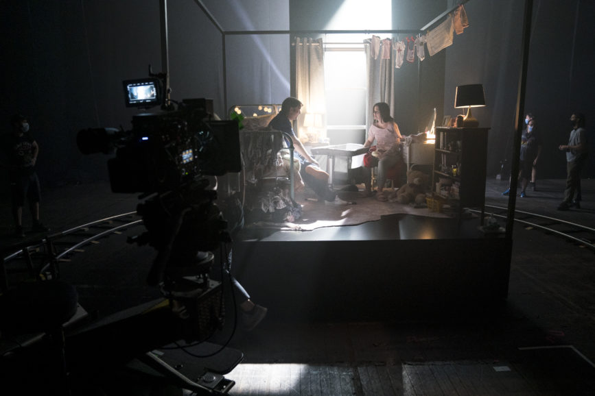
The full frame enabled Kissoon to use a shallower depth of field to keep as much separation of the two characters from their background as possible.
“Again, it’s the idea that where you live doesn’t define who you are. So many people judge others because they live in this neighbourhood or that type of house. Then when we flip into anamorphic, I want the audience to subconsciously feel they’re in a different world. The old anamorphic lenses warp the image to give it that extra feeling being unnatural.”
Aside from the NT team, Kissoon commends grip Tony Sankey, focus puller Chris Steel, and colourist Asa Shoul. “It was a team effort and collaborative process not possible without any of them.”
