A LOVE LETTER TO LITERATURE
The creative forces of Robert Yeoman ASC and Wes Anderson are victorious once again in The French Dispatch. The cinematographer and director – along with other collaborators such as production designer Adam Stockhausen and stop-motion DP Tristan Oliver BSC – reveal how they brought the collection of stories from the final issue of a magazine to life on screen.
“Every movie with Wes is an exciting challenge and that’s what we all enjoy – entering his world and seeing what we can contribute to help tell the story. When people are taken out of their comfort zones, they often produce better results,” says cinematographer Robert Yeoman ASC about his latest collaboration with director Wes Anderson and his carefully selected team.
Yeoman’s rewarding creative relationship with Anderson began on the director’s first film Bottle Rocket back in 1996. “As a filmmaker, he’s grown in his understanding of how to create films ever since,” he says. “When he started working on animated productions, they presented him with a different way of approaching filmmaking. He’s gone on to apply many of the techniques he learned to live action.”
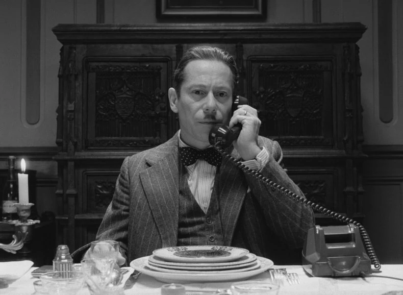
Like his previous work, Anderson’s latest captivating creation, The French Dispatch, features a remarkable ensemble cast – including regulars such as Frances McDormand, Bill Murray, and Owen Wilson along with new additions to the star-studded line-up such as Timothée Chalamet, Benicio del Toro and Elisabeth Moss. The dialogue is superbly constructed, and the scenes are meticulously crafted with each exquisitely detailed shot standing alone as a masterpiece. His tenth film – comprising a collection of four stories from the final issue of an American magazine, published in a fictional 20th century French city – is a love letter to journalism, French cinema, and France – a place cherished by the director.
“I remember reading an interview with Tom Stoppard in which someone asked him where one of his plays came from and he said that it’s always two different beginnings of an idea for something that he puts together and that becomes the next play. That’s exactly what happens to me every single time,” says Anderson. “So, this movie is actually three things: a collection of short stories, something I’ve always wanted to do; a movie inspired by The New Yorker and the kind of writer they’re famous for publishing; and I’ve spent a lot of time in France over the years and I’ve always wanted to do a French movie, and a movie that was related to French cinema.”
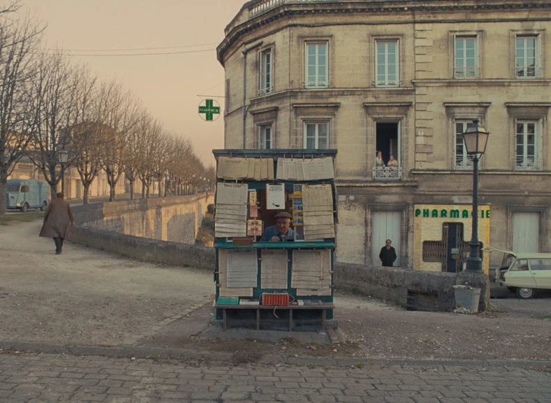
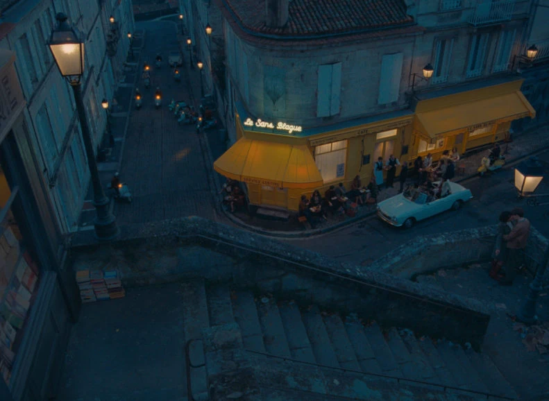
In The French Dispatch, the relationship with the written word exists on many levels. Anderson continues: “There’s what you’re seeing on the screen, there are the subtitles, there’s the texture of the magazine, and there’s the value of the relationship to writers and to a kind of writing that people feel is being lost now. The hero of each story is a writer.”
In the same way each issue of a magazine is the product of a collaborative process, The French Dispatch is the result of a magnificent union of passionate and talented craftsmen and women joining forces to produce beautifully detailed scenes and a rich tapestry of enchanting stories like those gracing the pages of print publications. To aid the flow of ideas and creativity, Anderson assembled a library of references at the hotel where his production team was staying, allowing them to explore a wide assortment of references.
“Wes likes to hire a small boutique hotel for the actors, himself, and crew members such as production designer Adam Stockhausen, costume designer Milena Canonero, editor Andrew Weisblum, and me,” says Yeoman. “We’re all in our own little world and have dinner together every night which really creates a family atmosphere and a strong bond. Not many movies work in that way.”
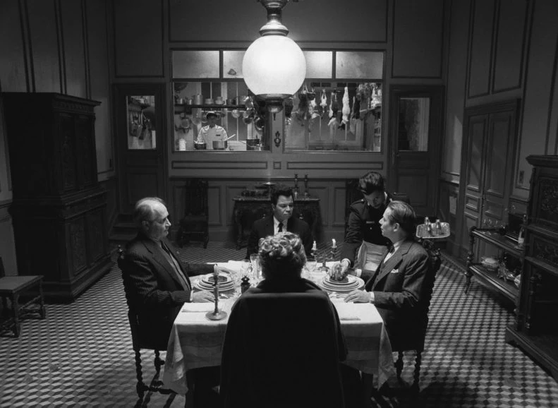
Yeoman, like many members of the team, found the library of books and films incredibly valuable. “Wes is a fan of the French New Wave movement, so many of our references were films such as Jean Luc Godard’s Vivre Sa Vie (1962) and Diabolique (1955) which influenced the way we lit a scene and our decision to use the 1.37:1 frame commonly adopted by French New Wave productions. We also revisited the work of French photographers such as Henri Cartier-Bresson, one of my favourite photographers, and Jacques Henri Lartigue, who is a source of creative inspiration for Wes.”
This French New Wave influence also impacted the filmmakers’ decision to shoot some scenes in black-and-white, which Yeoman lit with harder light than the colour sequences. Having never shot a feature in black-and-white, Yeoman was eager to delve into the creative opportunities it offered. “On The Grand Budapest Hotel (2014) we also started mixing different formats within a film, so we would shoot anamorphic, spherical, at different aspect ratios. We had a lot of fun doing this and I welcomed the chance to do that again on The French Dispatch.”
Whilst experimenting with formats, the stories always remained the focus, from “The Concrete Masterpiece” – a tale centred around a criminally insane painter and his prison guard and muse – through to “Revisions to a Manifesto” – an account of the motivations behind and events surrounding a youth revolt. “Each of the four stories was so unique and Wes wanted each one to have a very specific look, so they would appear to have been written by different writers,” says Yeoman. “To ensure the visuals reflected that, we varied the use of colour, lighting, and framing throughout.”
Grounded by reference
Prep for Anderson’s films involves visiting real locations with a film camera to capture the settings in existing light. To help evolve ideas and allow Yeoman and Anderson to experiment with concepts, the producers, 1st ADs, and other crew members often pose for the photographs.
“The visual base of the film, the costumes, the sets, everything – they’re all informed by research,” says Anderson. “Even though it’s a kind of confection and it’s sort of invented stuff with a fantasy element to it, it is basically all grounded by reference.”
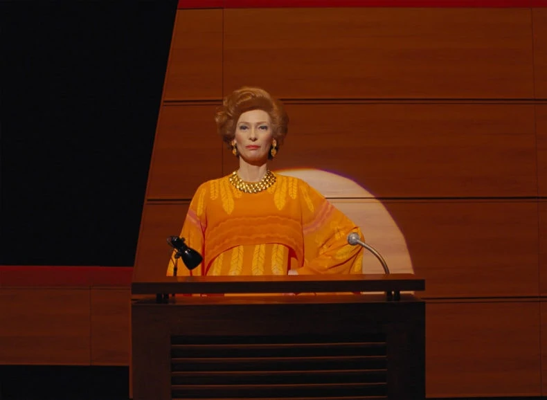
Having storyboarded many of his earlier films, Anderson made the move into using animatics – animated storyboards – when he shot his first animated film Fantastic Mr. Fox (2009). These now form a key part of the creative process, offering the team a visual and creative method of organising and previsualising the scenes whilst thinking about the camera movement and minute levels of detail needed.
“They have become our bible,” says Yeoman. “The only problem is the characters in animatics can move much faster than people in real life, so something in a cartoon might take six seconds when it takes 12 seconds in real life. This means certain things need to be altered slightly.”
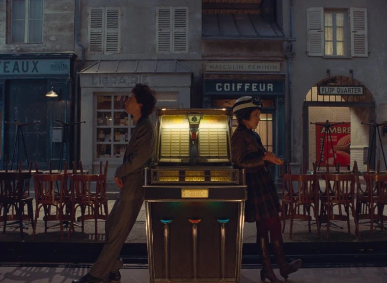
To be representative of France throughout the ages, The French Dispatch, is set in the fictional city of Ennui-sur-Blasé. Rather than shooting at multiple locations, Anderson and his team found the perfect setting in Angoulême in southwest France. This served as a base for operations, with much of the film being shot in an abandoned felt factory. For production designer Adam Stockhausen, Angoulême offered the “right kind of age and architecture” for the stories being told. “But more specifically, it had twists and turns, stairways, little viaduct crossovers, and unique vertical stacking of interesting spaces. That made for beautiful frames, and it also suggested certain areas of Paris, Lyon, and other French cities,” says Stockhausen.
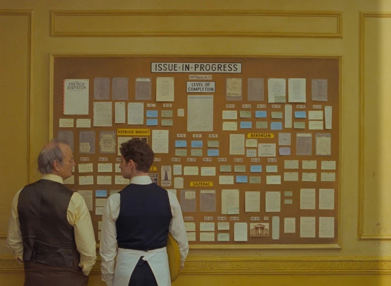
“Wes has a great history of finding alternate studio spaces in these towns where we’ve worked. The felt factory was a pretty amazing space right outside of town. We had all our workshops and storage there. It became an actual film studio, totally from scratch, without even having electricity when we walked in the door.”
Yeoman and the crew could shoot on location while the next set was being built in the factory. He found to be an efficient way to work. “Our pre-light crew could also be in there lighting the set while we were shooting elsewhere,” he says. “Working in a small, picturesque town such as Angoulême gave us the opportunity to do things that would have cost more and likely been more restricted in a major city. The people living in Angoulême were all very welcoming and excited to have us there.”
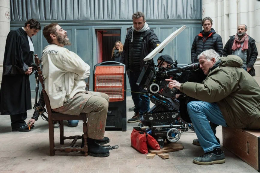
Like many of Anderson’s films, The French Dispatch consisted of a combination of built sets and real locations the art department would modify. “For example, the big battle scenes in “Revisions to a Manifesto” took place across the road from our hotel. For the prison scenes in the “The Concrete Masterpiece” story we converted an old warehouse which required a lot of construction to create areas such as the cells and the gallery housing Moses Rosenthal’s works of art.”
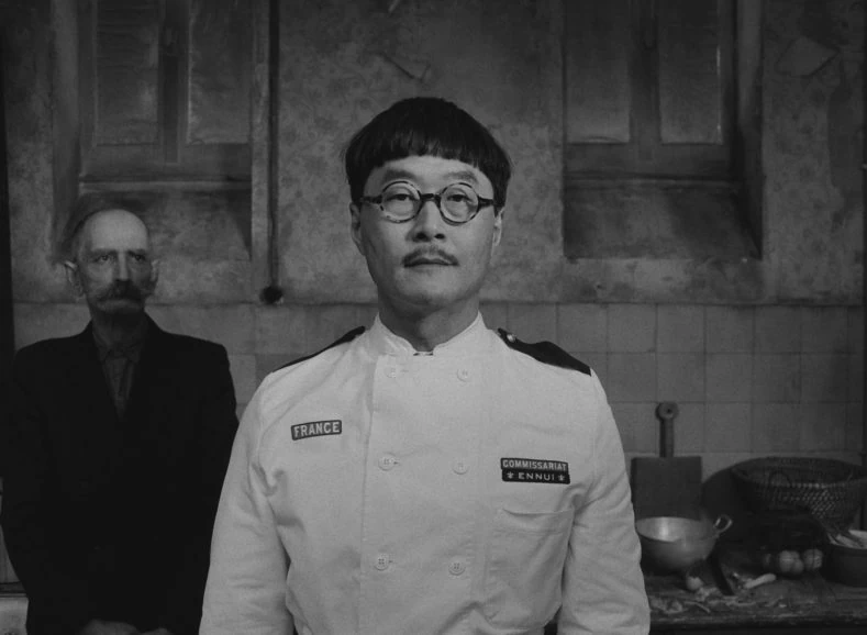
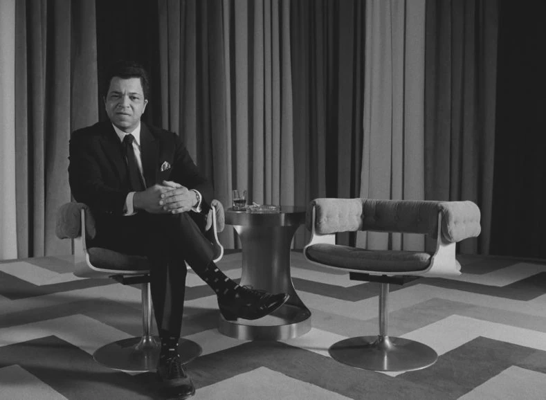
Stockhausen’s production design flair was once again integral in producing the distinct style and unique worlds for which Anderson’s films are renowned. His models sparked early conversations with Yeoman and Anderson regarding colour and lighting and in turn translated into the creation of around 130 sets: more one-off set-ups than any of Anderson’s films.
Following the animatic process, the team compiled a list of the physical requirements for each piece of the story. “When Wes locked in and said, ‘Okay, this is the place for this or that scene,’ then everything started to click together,” says Stockhausen. “And then, even though every shot meant a different set for huge chunks of the film, it was all within the context of this one place which became a palette for the story.”
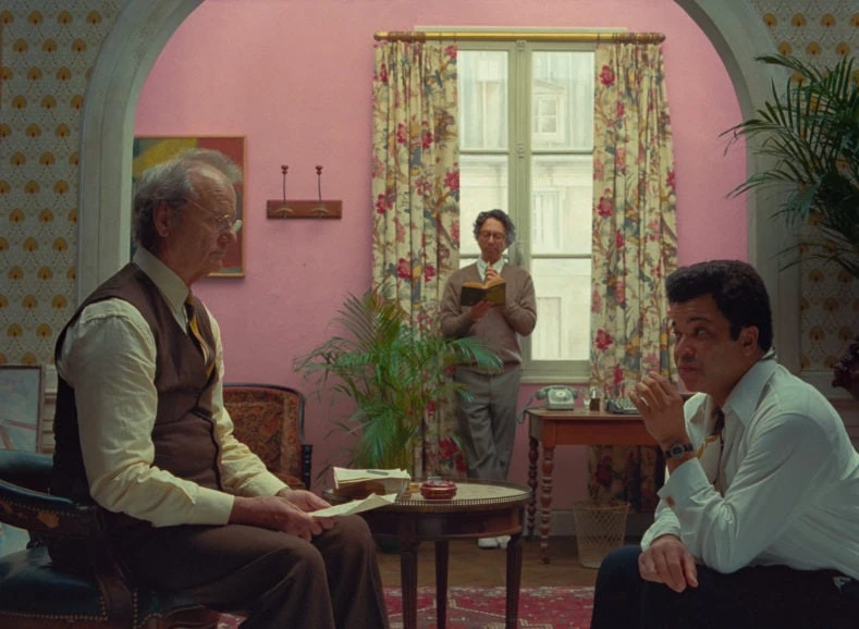
Test shoots also took place involving costume designer Canonero, during which items of clothing were filmed against elements of the set to see which tones best served the world being created. “When shooting black-and-white tests, it was interesting for me to discover that a light yellow or light blue shirt would still come across as white,” says Yeoman. “This vital period of testing also informed the wardrobe department, so they knew if any alterations were needed.”
Signature style
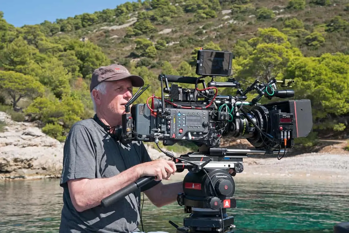
Yeoman began shooting with ARRI cameras on The Grand Budapest Hotel. Having been so impressed by the performance of the Arriflex cameras on that occasion when filming in the winter in Gorlitz, Germany, he maintained close relationships with the ARRI team and continues to work with their cameras. On this occasion, he chose the Arricam ST, supplied by RVZ Rental in Paris.
ARRI Master Anamorphics were selected by Yeoman for the anamorphic sequences because “many other anamorphic lenses are sharp in the centre, but the focus falls off at the edges”. “Wes likes to have everybody in focus, maintaining that sharpness even if somebody is at the edge of the frame, which the ARRI lenses allowed us to do,” he says. “For the spherical scene, we used the Cooke S4s which I loved shooting Grand Budapest with, especially when capturing faces. We tended towards wider lenses – 18, 21 and 25mm.”
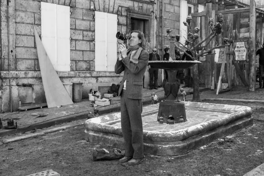
Although the 1.37:1 aspect ratio reminiscent of French New Wave films was the definitive frame of The French Dispatch, a switch to anamorphic would occasionally be made, either as a storytelling tool or for the practical reason of fitting everything in the frame. “Wes likes to include many people in the frame, which is easier to do in 2.39:1, so on The French Dispatch we used the edges of the frame much more,” says Yeoman. “In a three shot, sometimes one person would be closer to the camera with the others further back to add dimension. I would then use more light to hold focus on everyone in the shot. Working in that format, it can be a challenge to get all the people in, but we had a lot of fun with it on Grand Budapest and I’ve loved it ever since.”
Except for his animated films, all Anderson’s previous work has been shot on film. Once again, shooting on 35mm film offered a “unique feeling and texture” that Yeoman and Anderson felt complemented the stories being told in The French Dispatch. “Although I still also shoot digitally, I was brought up on film and feel the method of shooting it is different – there is more focus on what’s happening on set from the crew and a greater respect for the process. I just love the final look and always will,” says Yeoman. “It requires more careful lighting when working with a slower film stock, particularly for interiors, as Wes likes to vary a lot of depth of field, but the final result is worth it.”
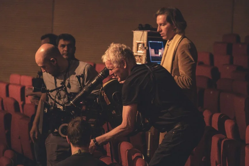
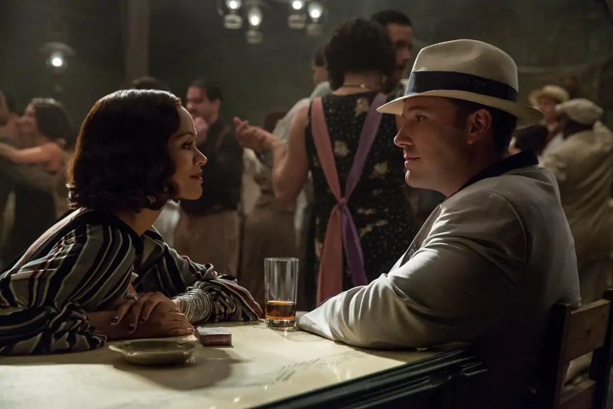
Despite originally intending to shoot most of The French Dispatch in colour, after viewing the black-and-white test shots in the edit room, Anderson and Yeoman were drawn to the “striking look, grain, and contrast” of the Kodak Double-X 5222 stock, inspiring them to shoot more of the film in monochrome. Colour, or lack of it, was also used as a narrative device. “Quite often, we used colour for emphasis,” says Yeoman. “For instance, when Rosenthaler [Benicio Del Toro] reveals his paintings for the first time, we switched to both colour film and an anamorphic lens to give the shot a much stronger impact.”
Anderson elaborates on the freeing process of creative experimentation and exploration: “At a certain point, I just decided I’m going to do whatever I want, and that if I wanted to do a sequence that’s black-and-white widescreen handheld, then that’s what we were going to do. Can we do this part as just a cartoon? Yeah, we can, so I think we will. When I first started making movies, it was always: ‘Can we do this?’ I feel like I don’t even bother to say that anymore. But of course, it all has to gel and come together, and that’s why it’s important to have such a great team.”
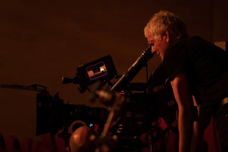
Following positive experiences shooting Moonrise Kingdom (2012) and Grand Budapest on one film stock, Anderson wanted to avoid mixing colour film stocks on his latest creation, working with the Kodak Vision3 5213 stock, processed at Hiventy in Paris. Working in close alliance with Anderson, Gareth Spensley at Company 3 in London helped ensure the vision for different looks for each of the stories was realised in the grade, both in the black-and-white and colour sequences.
“Wes has a very clear idea when it comes to colour and he likes to push the envelope,” says Yeoman. This in turn affects the cinematographer’s approach to lighting. “I generally try to be as realistic as I can with lighting and sometimes people have said the movies look unlit. On this production, I took a different approach which was more theatrical. For example, for the scenes in “Revisions to a Manifesto” when Timothée Chalemet’s character Zeffirelli is riding a motorcycle, we experimented with more colourful lighting and canted angles to make it dreamlike. We did the same in the youth revolt scene by adding gels to the lights.”
Paris-based gaffer Gregory Fromentin and Yeoman selected a heavily LED rig, relying on ARRI SkyPanels more than the cinematographer had done in the past. “The beauty of working with them is you can change the colour and intensity and they don’t get as hot as tungsten,” says Yeoman. “We had total control, so when we were shooting in the evening, we could decrease their intensity and add some blue to make it feel like dusk. It was also cost-effective as we could move quickly, avoiding the director and cast waiting on set while we were lighting.”
Visual continuity
Techniques which had been explored in Anderson’s entirely animated productions were also utilised for select scenes in The French Dispatch. Having collaborated on previous animated films such as Fantastic Mr. Fox and Isle of Dogs (2018), Tristan Oliver BSC headed up the team responsible for sequences in this vein in the latest production.
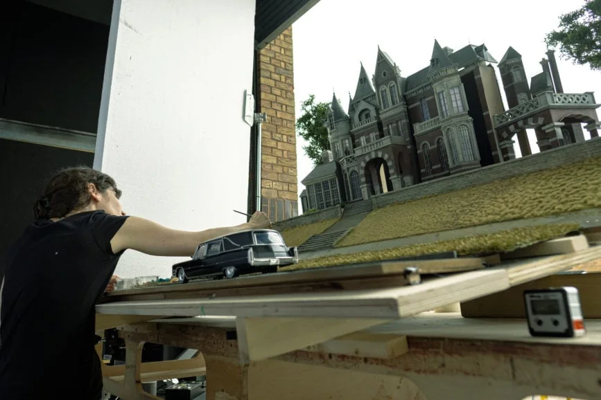
“Wes has increasingly started to insert model work and animation into his live action movies,” says Oliver. “On this occasion, the model work we captured was used for beautiful scene markers which were created in super miniature, some of which had some animation dropped into them. We also created set extensions using old school models rather than CG, did some live action pickups on black-and-white 35mm, and some animatronics with huge moving models.”
The main requirement was for those components to fit seamlessly into the live action footage to ensure a continuity of look. “We’ve done a lot of work with Wes, so we weren’t about to start throwing in hard key lights or anything that wasn’t in line with his style. We’ve already developed a dialogue with him, the people who build the sets, and the live action camera crew on previous productions,” says Oliver. “One of the most interesting aspects of our work on this film is the variety of media we were using – we were shooting 35mm black-and-white film, digital stills, 4K on digital stills cameras for some of the smaller moving sequences. Eventually it all had to look like 35mm.”
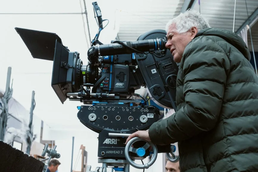
The sequences on film were captured using the Arriflex 435, the stills cameras for the animation and the tableau were Canon 1Dx MKIIs, and the Nikon Z6 was used for the 4K live action capture. Lenses selected to shoot the stills were Zeiss Distagon and Nikon AI, with Cooke S4s on the Arriflex 435 for capturing footage.
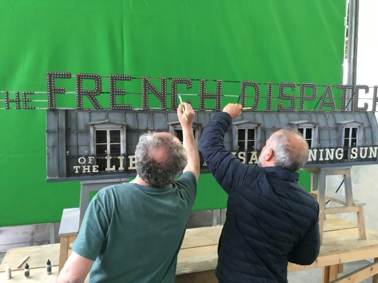
Oliver and his team – which included a motion control operator, camera assistant, gaffer, spark, two model makers based in Germany, and set dressers – also worked on more conventional animation sequences which were dropped into the live action. “Some were more stylised and complex while other examples were more simplistic, such as shooting the newspaper sign on top of the building as a model which was then dropped in as an element over the live action footage.”
The four-week shoot saw Oliver’s team film for three days at Studio Babelsberg in Berlin before capturing the majority at Arch Film Studio in Hackney, London. As Isle of Dogs puppet maker Andy Gent has studio space there, he could provide a team to service the sets that had been made in Germany and shipped to the UK.
The process differed in some ways to previous productions Oliver had worked on with Anderson due to the set extensions needing to be shot in daylight. “We would normally have a controlled studio for that, but Wes wanted them to match the look of what they had shot in France,” explains Oliver. “He’s a fan of extremely flat light and likes a cloudy day more than most. We were shooting in August when it was very sunny, so we were in the car park of the studio putting up huge silks to try to hold that light back and make it look super-flat. That’s an unusual thing to do because the light is constantly changing, so shooting any kind of animation in those conditions can be tricky.”
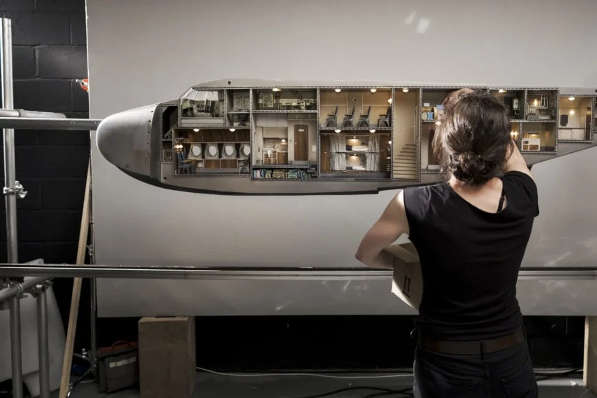
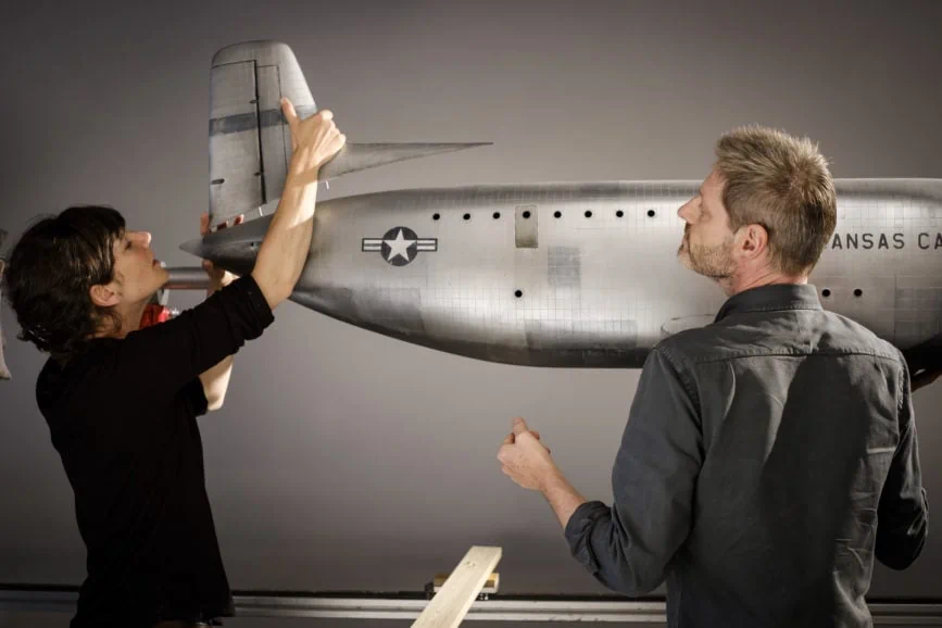
“But above all, when helping craft any Anderson production, the process is incredibly fun,” says Oliver. “Especially the huge metallic aeroplane in The French Dispatch. The side could be removed to reveal the interior. That was an absolutely stunning piece of work to shoot. The model was about five feet long with working propellers and you could see every compartment in the interior along with tiny models of the cast. I’m lucky enough to work in a world where people create fantastic things like that for me to shoot. I’m rarely in the middle of a field in a rainstorm, praying for the sun. I normally get something amazing to point the camera at, so I’m privileged in that respect.”
At the centre of the story
Whether stop-motion or live action, the need for precision is essential for the successful world building in an Anderson creation – with camera movement always motivated by the story, whether using a push in for emphasis or a walk and talk scene in which characters reveal important narrative details. The way the camera was used in The French Dispatch needed to reflect the director’s carefully crafted dialogue. For example, achieving the signature whip pans used to great effect in many of Anderson’s productions, demands carefully considered blocking as well as skilful use of the dolly. “Wes is so precise in his filmmaking which means dollies are essential – we only had one Steadicam shot in the whole film,” says Yeoman.
That requirement for accuracy led key grip Sanjay Sami to devise a system called the Mangalore to help accomplish complex and accurate moves. “That ingenious system allowed us to work with a dolly on top of a track that could move in and out one way and then slide off a track to move sideways,” explains Yeoman. “The scene with Roebuck Wright [Jeffrey Wright] walking through the police station, going from room to room and ending up in Albert the Abacus’s [Willem Dafoe] cell was all achieved with a very long dolly track and the Mangalore, carrying out the very precise in and out moves. 1st AC Vincent Scotet was also an integral part of that team. I tend to shoot at f4 or f5.6 which can make it tricky to hold people in focus at different distances, but he did it so beautifully.”
The stunning symmetry that makes every frame gallery-worthy and has become a treasured feature of many of Anderson’s filmic worlds was once again embraced by the crew. “When we get to a location, the first thing we do is find the centre of the room as that’s the point we anticipate Wes will want to start to achieve that signature look,” says Yeoman.
Ambitious ideas transformed into magnificent cinematic moments throughout the filming of The French Dispatch. “One of my favourite shots – and I have many – was when we introduced Le Sans Blague and Wes had the idea of the whole wall of the set opening up while the story played out. Adam Stockhausen pulled it off in style,” says Yeoman. “I love those shots with such theatricality, similar to Francis Ford Coppola’s 1981 movie One from the Heart, a film I often refer to in terms of stylistic approach.”
Another equally bold scene required a Towercam to begin filming in a library before moving down through the floor onto the level below. This demanded extensive planning and modification, including cutting a hole in the floor and ceiling for the Towercam to move through. Detailed preparation also helped realise a stunning and impactful frozen-in-time effect. To create the story’s still-life passages, the actors were asked to freeze in place in front of a beautifully painted wall and objects were hung from the ceiling as if suspended in time. “It was difficult to pull off, but it was all one shot. We just tracked across, room to room, which was all built on stage at the felt factory,” says Yeoman “The painted background looked incredibly realistic on the black-and-white film.”
One obstacle the cinematographer navigated when shooting this scene was the positioning of the cast as some were very close to camera and others further away. “Wes wanted to hold them all in focus, so we had to light that area to an 11 stop, put white sheets on the ceiling and bounce nine 18Ks off it. We then hung a silk over the set to produce a soft, even light,” he says.
“Often throughout my career, Wes has described something to me and how he wants to shoot it and I’ll think to myself, ‘Oh my, that’s impossible’. But then, we somehow work out a solution to achieve it. I don’t think I’ve ever had to say, ‘Sorry, we can’t do that’. We always find a way and I’m lucky to have been surrounded by excellent people who have helped me make important decisions. Working with Wes and the team is always like embarking on a life-changing adventure.”
