Robert Elswit ASC on Ripley
Jun 20, 2024
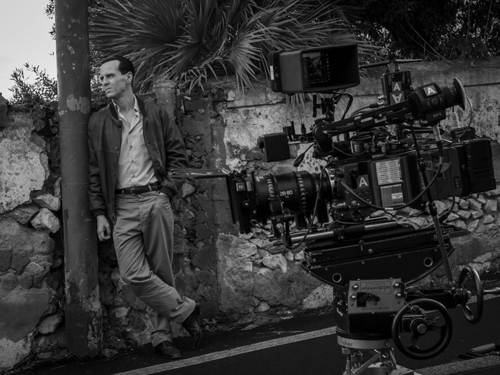
Based on Patricia Highsmith’s bestselling Tom Ripley novels, Netflix’s eight-episode limited series Ripley stars Andrew Scott as the eponymous antihero, a grifter scraping by in early 1960s New York. When Tom is hired by a wealthy man to travel to Italy and convince his vagabond son, Dickie (Johnny Flynn), to return home, he takes his first step into a complex life of deceit, fraud and murder.
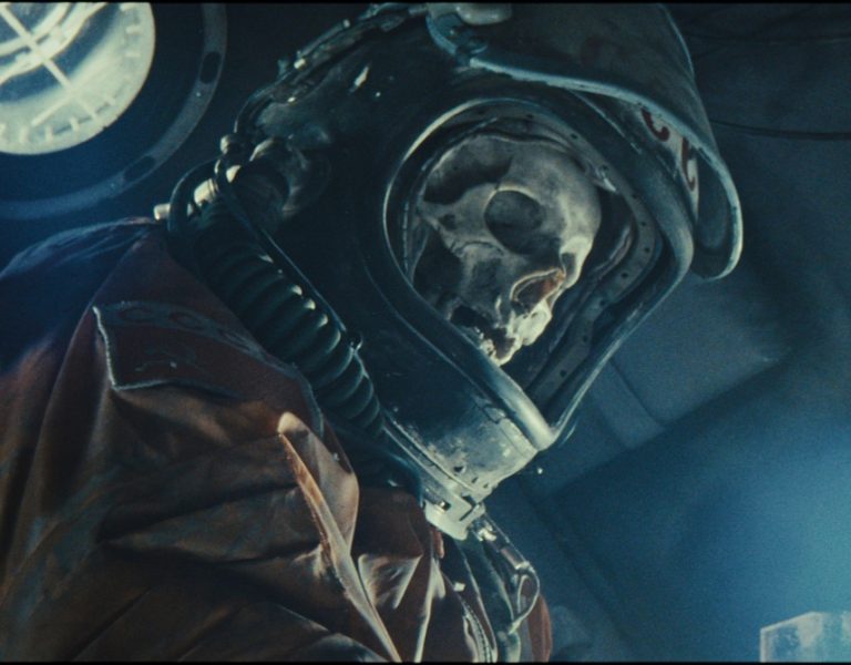
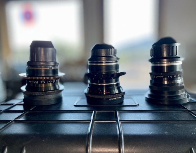
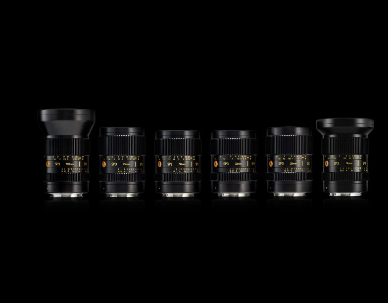
The series was written and directed by Steven Zaillian, who partnered with cinematographer Robert Elswit ASC for all eight episodes. Elswit’s primary lenses for the production were Panavision VA primes, supplemented with select Primo 70 and Ultra Speed focal lengths as well as Primo 70 and prototype VA zooms. Here, in his own words, the cinematographer details the creative collaborations that brought Ripley to the screen.
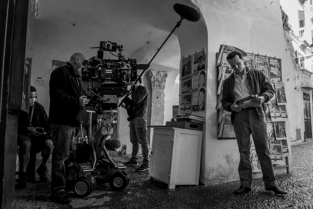
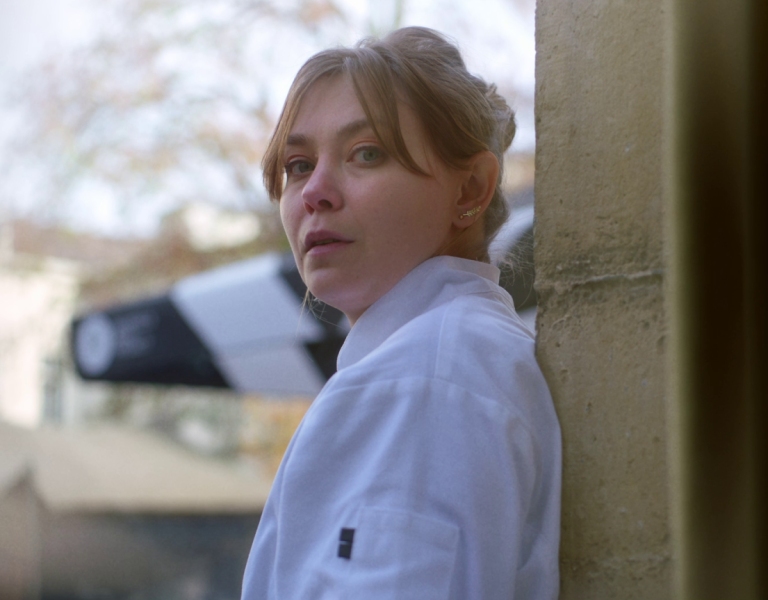
I’d worked with Steve Zaillian a few years earlier on the pilot of his series The Night Of. I knew from that experience that Steve had very strong ideas about the pictorial style and lighting design of his shows. Very much like a cinematographer, Steve believes that the lighting of a movie, the way rooms and characters are lit, creates a direct connection to the emotions of an audience. When he told me that he definitely wanted to shoot Ripley in black-and-white, I knew he had very different ideas about the nature of Ripley’s character and Highsmith’s story.
He and our production designer, David Gropman, spent months scouting locations throughout Italy, and they created a vast collection of black-and-white images — not only location photos but also the work of Italian photojournalists from the ’50s and ’60s. The pictures became a great reference tool for thinking about working in monochrome.
In Steve’s script, Ripley’s actual talent initially seems to be that of a con man, a cold, calculating sociopath who’s able to manipulate and see through people, always hiding his emotions and playing a role. But when Ripley arrives in Europe and is exposed to Italian life and culture — the language, food, architecture and especially the music and art — it changes him in unexpected ways. Ripley’s discovery of the work of the 17th-century Italian painter Caravaggio makes a particularly strong emotional impact on him.
Caravaggio appears nowhere in Highsmith’s novel. The inclusion of his art and then the painter as an actual character in Ripley is a complete Steve invention. The emotional impact of the painter’s work on Ripley is reinforced as he learns of the many parallels between their two lives. It causes Ripley to seek out Caravaggio’s paintings wherever he is in Italy and becomes one of the central themes in the story.
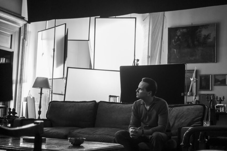
The specific nature of Caravaggio’s style of painting, chiaroscuro, refers to the use of strong contrasts between light and dark to direct the eye and affect the overall composition of his paintings. This style gives an underlying sense of drama and tension to Caravaggio’s work, and it’s that style of lighting design that lends itself particularly well to black and white. We see examples of it in the great German expressionist films of the silent era and later in American film noir movies of the ’30s and ’40s. It seemed the perfect approach to creating the black-and-white world of Ripley. The pictorial style throughout the show, with regard to the sets, locations, costumes and lighting design, was always to create and even exaggerate strong contrasts between light and shadow.
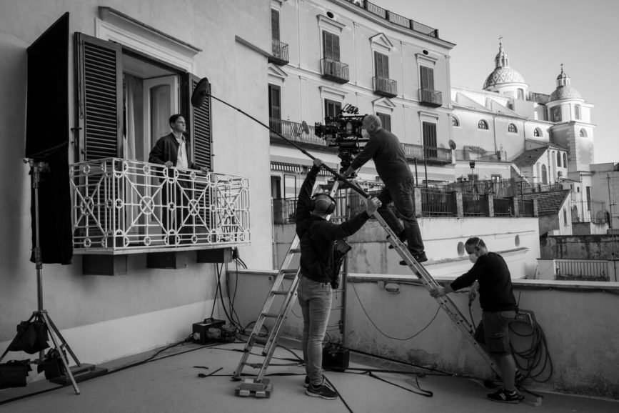
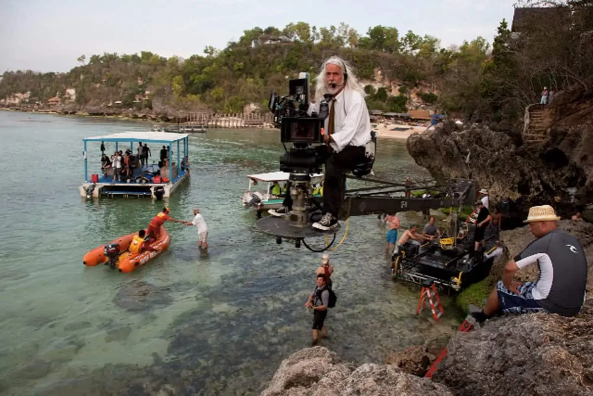
We shot the entire show with Panavision’s VA primes. My longtime assistant Erik Brown put a wonderful set together with Dan Sasaki’s help. We also took along large-format zooms, including the 28-80mm, 70-185mm and 200-400mm. We used the zooms mostly for the water work in the killing of Dickie sequence, which we did off of cranes.
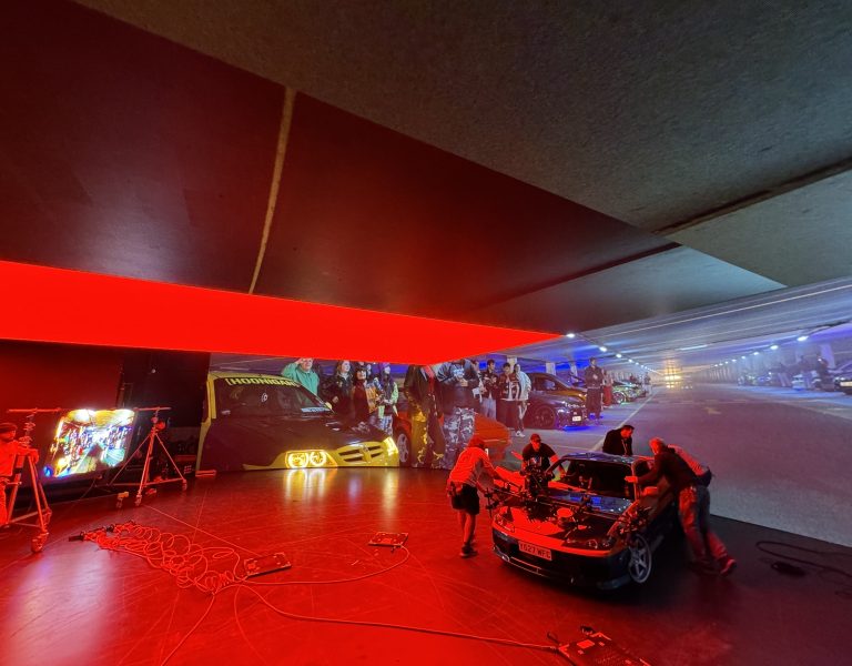
Throughout the show, Steven wanted to avoid any sunlit travelogue quality to the visuals on any of the exteriors on Ripley. Because of the length of time needed to shoot the boat sequence, in order to control the light we shot almost all of it in a swimming pool south of Rome. We surrounded the pool on three sides with greenscreens and covered the opening at the top with a charcoal scrim to diffuse the sun. The amazing Chris Centrella was the key grip on the show, and the great Francesco Zaccaria our gaffer; together, they handled this and all the many complicated sequences beautifully.
Along with David Gropman’s wonderful sets, I have to mention the extraordinary work of our two costume designers, Gianni Casalnuovo and Maurizio Millenotti. They built every piece of clothing the principals wore. Their coats, shirts, sweaters and suits are character studies in themselves. There are many shots that really came together because of the tonal values and textures of the clothes the characters wore. And there wasn’t a stick of furniture or stitch of clothing or a prop of any kind that Steven didn’t carefully consider. There were a lot of props — it took two full days to get through the great prop master David Gulick’s show and tell.
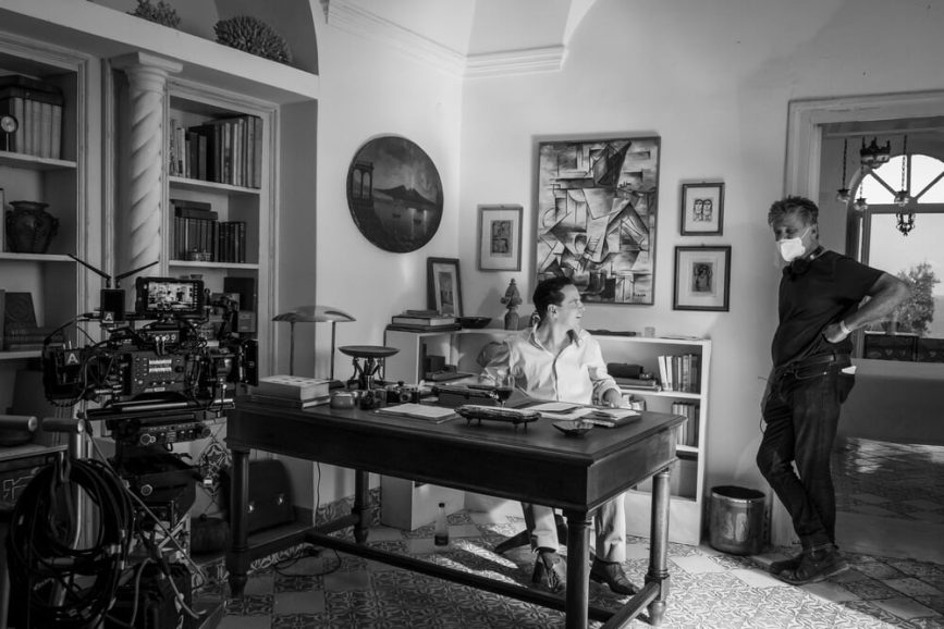
Many of us spent over a year working in Italy and the U.S. on this show, but for Steve Zaillian, Ripleyhas been a five-year-long labor of love. It’s been wonderful to see it so well received.
For episode 4, Steve recreated an experience that he had on one of his earlier visits to Rome. He has Tom visiting the church where three Caravaggio paintings of St. Matthew hang in one of the small chapels. The walls of the chapel are very dark, but there are spotlights that will illuminate the paintings if you drop a coin in a box. It’s a recreation of the setup that actually exists in San Luigi dei Francesi, where the paintings really hang. Steve tells the story of dropping a euro in the box, the lights come on, and as he looks up at the paintings, a priest who was standing behind him says, ‘It’s the light, it’s always the light.’ It’s a quiet moment in the show as Tom listens to the priest. It works as a wonderful metaphor for the visual design of Ripley.
–
This article was shared with permission from Panavision.

