Every time I start teaching a new class at ArtCenter College of Design, within the first few minutes I say to my students, “Every element of every frame informs the audience.”
I’ve always believed that there are elements of every picture we see that register in the conscious part of our brain immediately. These parts of the conscious recognition can include elements of composition, colour, lighting, or movement. They also illustrate that what the image is showing can have strong effects on our emotional conscious brain. I’m sure we are all aware of those effects on us.
But what about the things that we are not consciously aware of? Some of those elements can be even more powerful than what we can immediately recognise as having an ‘out loud’ effect on us.
For instance, when I was a student, I learned about Alexey Brodovitch. Although not a household name in the arts, Brodovitch was extremely important in not only developing new ideas in graphic arts but also in teaching these concepts to so many of the giants in photography and graphic design in Mid-Century graphics. There were names like Diane Arbus, Richard Avedon, Irving Penn, Hiro, Robert Frank, Joel Meyerowitz, Lisette Model, and many more famous artists and photographers.
In 1934, the Editor-in-Chief of Harper’s Bazaar magazine, Carmel Snow, saw Brodovitch’s work for the first time and said, “I saw a fresh, new conception of layout technique that struck me like a revelation: pages that “bled” beautifully cropped photographs, typography, and design that were bold and arresting. Within ten minutes I had asked Brodovitch to have cocktails with me, and that evening I signed him to a provisional contract as art director.” He remained at Harper’s for 24 years and had an outsized effect on modern graphic design and photography.
Brodovitch created a seemingly unconscious method to direct the eyes of viewers of his compositions to enter a design, travel across and around pages, and then directed them to turn to the next page. A remarkable concept that can work within any graphic art, even for motion pictures. Think of this as elements of composition. For instance, think about how important an element of composition that crosses the frame line can be. That can be something that can move a viewer to enter a frame or leave a frame, depending on the position. When creating a composition, I consider what is in the frame, what is left out of the frame and what crosses the frame lines.
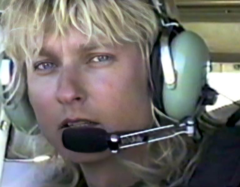
Let’s move forward in time to the early 1990s when I did my first work with Hi-Definition. I was asked by Panavision, Sony, and NHK to do a little experiment with a camera they had designed. They wanted to prove that movies could be made with these cameras. It wasn’t even digital at that time. And we had a three-inch cable connecting us to a bread truck with 4” quad video recording that was analogue. On the last day of the production Sony brought out their first 1” digital recorder and for the first time we were un-tethered.
What I noticed most was that there was a quality to the 30 frames-per-second that did not look like film. But it was hard to put our finger on the problem. We wanted to see 24 FPS video, but we were told by Sony that would be impossible. And if they could do that it would take over ten years to develop. Both the Media Lab at M.I.T. and the Polaroid company took up the challenge and within a year they had put together a 24 FPS progressively scanned camera from off-the-shelf parts that did look more like film. It didn’t have that “live TV” look some call the “soap opera effect” that most video suffered from.
At that point I started to think about why the quality is so different with different frame rates. When digital visual effects were just starting to be used in commercials, we were asked to shoot 30 FPS film to allow them to use 30 FPS digital effects. And much to our surprise that quality looked very much like live television, just like 30 FPS high-def video.
And after hearing about a system for monitoring brain activity through MRI scanning, I thought about being able to see what part of the brain gets lit up by different types of image capture and exhibition. I went to Kodak and the Academy Scientific and Technical Committee; I even went to James Cameron before he started Avatar, and none of them were interested in paying for testing of this nature. But they all thought it was a good idea.
I put that idea aside because of the lack of interest until my friends at Baylor University decided it was time to find out. The Department of Film and Digital Media along with the Neuroscience department at the university put together some preliminary experiments. We tested over 283 students about perception and memory until the pandemic hit and we had to stop.
At that point our research team moved into a different idea about increasing the quality of colour reproduction for digital displays. As I mentioned before in this column, this work has been very successful, and we now have a company that has multiple patents for the method of adding additional colours to digital displays. I’ve called it “The colours between the colours.”
There are so many new and exciting developments to talk about in the realm of the un-conscious and telling stories with our ability of reaching deep into our audiences’ sub-conscious. There is the field of study called psychocinematics which brings together film theorists, philosophers, psychologists, and neuroscientists to consider the viability of a scientific approach to our movie experience. This is a study that has been taken up at many universities around the world. Arthur P. Shimamura from Oxford wrote a compendium of empirical work by many of the top scholars in this nascent academic field. But these aren’t cinematic artists and ultimately it is us who will learn to explore and use these important tools.