Father figures
Bruiser, Miles Warren’s striking feature debut, grapples with toxic masculinity and paternal conflict, as witnessed by a 14-year-old boy. Behind the lens on the coming-of-age drama was cinematographer Justin Derry, who reveals how he developed the film’s rich visual texture.
When 14-year-old Darious (Jalyn Hall) is beaten up after school, he runs into the woods where he meets the mysterious Porter (Moonlight’s Trevante Rhodes). This chance encounter turns Darious’ otherwise peaceful family dynamic on its head: Porter, who offers to teach Darious how to defend himself, turns out to be the teenager’s biological father. As he returns to the fold, tensions blaze between Darious’ old and new father figures as a violent legacy emerges.
Bruiser expands on Miles Warren’s short film of the same name, which was selected for Sundance and SXSW. New York-based DP Justin Derry brought his expertise to both the short and the feature, which premiered at TIFF 2022. In this fascinating Q&A, he shares his memories from shooting and his journey to becoming a cinematographer.
Hi, Justin! Could you tell us about your journey to becoming a cinematographer?
Of course, I think my love for cinema began as a young kid. I watched movies every Friday evening with my family and quickly became obsessed with horror films. At a very early age, I saw Halloween and The Shining. These two films were super influential, and though they gave me nightmares, I would watch them repeatedly because I loved getting lost in a world that would both amaze and frighten me. As a teenager, I became very invested in skateboarding, and in high school, we would often sneak onto the train and travel to New York, where we would skate around Chinatown and film on our little 3-chip mini DV camera.
When I decided to go to college, I didn’t even realize filmmaking was a career path until I saw it listed as a major on one of the enrolment forms. This seemed like an obvious choice, so I went to film school and took an Intro to Cinematography class freshman year, where I became enamoured with the craft and realized there was nothing else I would rather do with my life and career.
After college, I moved to Brooklyn and started working as a lighting technician and gaffer in the independent film scene around 2011. I worked on dozens of films, including Alex Ross Perry’s Listen Up Philip (2014). I was also the gaffer on many commercials and music videos. One of my last projects as a gaffer was for a hero of mine, the music video for David Bowie’s “Valentine’s Day”.
I always knew cinematography was what I wanted to strive for, so after 3-4 years working as a gaffer and lighting technician, I started turning down feature films in the lighting department so I could pursue shooting short films and music videos. Luckily, I quickly found success as a commercial DP, which made it financially possible to stop working as a gaffer altogether. I shot over 100 commercials over the next 4-5 years, and this was a wonderful way for me to hone my craft and experiment with different tools and techniques.
Eventually, I realized that I needed to make another career shift to get back to my true passion of working on feature films. To do this, I knew I would have to start shooting more short films and turning down commercial work when Narrative opportunities came along. This is what led to me shooting Miles’ first short film, Huntress, which we shot in 2017 on 16mm in Upstate New York at his parent’s house.
How did you come to work on both the short film and the feature?
Bruiser is the third film I have shot for Miles. We originally met in early 2017 when he approached me to shoot his film, Huntress. When he first called me for that film, I knew that we shared many similar tastes in film. We both loved Paul Thomas Anderson; we also loved Paris, Texas, Biutiful, Dogtooth, and Carol. I remember I put a little lookbook together for the film, and I think that was exactly what Miles was looking for. So it just felt like a great connection and collaboration.
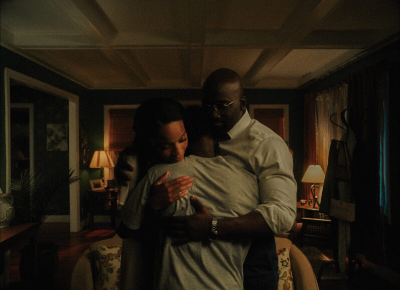
When Miles reached out about Bruiser, the short film, I was immediately on board. I really wanted to tell a film about violence and masculinity in father figures. I thought it was a common relationship between father and son and a very interesting subject to explore. I remember Miles and I both really wanted to shoot the film on 35mm 4-Perf because our goal was to trap our characters within a visually confined and restrictive composition – we wanted our characters to occupy the same frame as little as possible. 35mm for us was ideal because we both love working on film and love that there is often magic and beauty that results from trusting your eye and embracing a messy realism that exists in the world. I find that with digital, it is easy to over-scrutinise and polish the image. Kodak and Metropolis Post in NYC also really went out of their way to help us make it happen.
What cinematographic elements from the short did you want to continue for the feature, and was there anything you dramatically changed?
Unfortunately, it was not possible to shoot the feature film on 35mm film because our schedule was too tight. So we decided to fully embrace digital and find our own aesthetic that would resemble the texture and painterly quality of the film. So early in prep, I did a bunch of camera tests and got the idea from Drew Daniels’ work on Waves to shoot the entire film at 3200ASA on the Alexa Mini. During testing, I found that 3200ASA added this beautiful softness that took the edge off the image. It felt like the pixels danced and moved a bit, and there was no longer a biting sharpness. I worked with DIT Chase Abrams to really meticulously gauge exposure on set because we knew it was risky shooting at such a high exposure index. We found that over-exposing by half a stop protected the digital negative just enough so that we didn’t lose our actors’ faces in dark scenes, and we had flexibility in the colour to shape the image how we wanted. I also used a ¼ Black Pearlescent filter on the entire film because I love the way that filter affects highlights without having an impact on the rest of the image. I feel this is the best filtration for creating a sort of halation in the highlights reminiscent of film stock. We married these exposure and filtration choices with Panavision Ultraspeed lenses which are some of my favourite spherical lenses ever made. I love that they have a softness and bloomy look to them without losing contrast. They also are very fast and allowed me to isolate our characters.
Tell us about your ongoing collaboration with director Miles Warren and what made it so successful. What was his vision for the feature and how did you help him realise that?
As I mentioned, Miles and I just love movies and have very similar tastes in film. We both love the same things as storytellers, so a lot of our inspiration comes from the same place. I love working with a director who believes the image is an extremely important piece to the emotional response we have as audience members. Filmmaking is one of the most collaborative mediums, and it is so powerful because of the culmination of choices, disciplines, and craftsmanship that alchemise into a story. That includes cinematography, production design, costume design, sound mix, and score, and all elements work harmoniously to create a great film. Miles understands that and is always excited to push the visual language and move outside of our comfort zone.
What kind of creative references and inspirations did you discuss?
Miles loves to reference new media outlets, memes, and viral videos. The initial inspiration for Bruiser was based on viral fight videos that Miles had found, and wanted to explore why society is drawn to videos of violence. When watching those videos, you realise that there is sadness and messiness that happens when two people fight in real life. It is often embarrassing, and you are probably witnessing one of the worst days of a person’s life. There is something very upsetting but also unhinging about that. For Bruiser, we wanted to lean into that uncomfortable space and show the honest brutality that occurs when someone lets their anger and violent nature consume them.
Visually, we referenced photography, films, and art. Gordon Parks was a huge inspiration for some of the imagery. There is a messy reality to his photography, but also, I think, an inarguable beauty. We also watch films like Ali: Fear Eats The Soul, Cold War, George Washington, and The Place Beyond The Pines. Lastly, I referenced the painter Alex Merritt because I think he is one of the more emotive contemporary painters. His artwork shows anger and frustration that explodes from within, while his subjects often also seem sad and lost.
How did you decide on the 4:3 aspect ratio?
From the beginning, Miles knew that he wanted this film to be 4:3. He referenced films like Come and See, Cold War, and Ali: Fear Eats The Soul because the characters of those films feel imprisoned within the composition. We wanted to isolate our subjects and try to force them into a frame that gave them very little room to breathe.
What did the pre-production and testing process entail and how long was it?
With every film, I usually like to start with creating a lookbook and shot list with the director. So early in prep, Miles and I went to Alabama with our producer Aaron Ryder and our co-producer Albert Tholen. We used this time to get to know the environment and to feel how the texture of the place would affect and have an imprint on the film. Then we started putting together images and references that I could organize into a collage to share with other departments, so our vision was communicated clearly. We spent about two weeks going through the film scene by scene and creating our shot list. I remember reading an interview with Gordon Willis where he spoke about going through the script with a director and deciding how they imagine each beat and what the goals of a scene are. He also puts great importance on how you choose to transition from scene to scene. So I’ve always sort of adopted that way of working. I like to meticulously break down the script with the director and really understand every choice we’re making along the way.
When did principal photography begin and end?
We started shooting in February of 2022 and finished principal photography in March 2022. We shot the film in 20 days. It was a very demanding schedule, especially because we knew we’d be working with a 15-year-old for 95% of the movie, which limits the amount of hours you can spend with them on set. Luckily our entire cast and crew were fantastic to work with and very professional, so we were often able to finish each set up with very minimal takes. Our 1st AD, Josh Montes, did an incredible job of steering the ship.
Can you briefly run me through the key filming locations? Which location was the most challenging to shoot in?
We had a few challenging locations in this film. Probably the most complicated to shoot was our houseboat location. This set was a real houseboat that the Art Department acquired during prep. They gutted, painted, and aged the entire boat, transforming it into the crash pad of one of our main characters Porter. April Lasky, our production designer, had an amazing vision for the film, and working with her and her team was one of the best collaborative experiences I could have asked for. What made shooting at this location so difficult was that it was very small, and the art department had to build a floating dock to fix the boat due to the water depth constantly changing. The shore was very muddy and slippery, so we constantly had to put planks of plywood down to load our people and equipment in and out. It was also very difficult to get power to the boat and to operate on the dock with the camera. We had a complicated Steadicam shot planned that followed Porter from inside of the boat, out onto the dock, and tracked with him all the way up onto the shore, and then it wrapped around him as he teaches Darious how to throw a punch. Our Steadicam operator, Kyle Derry, had to navigate a very unstable dock while we had spotters guide him on and off the boat and onto the shore.
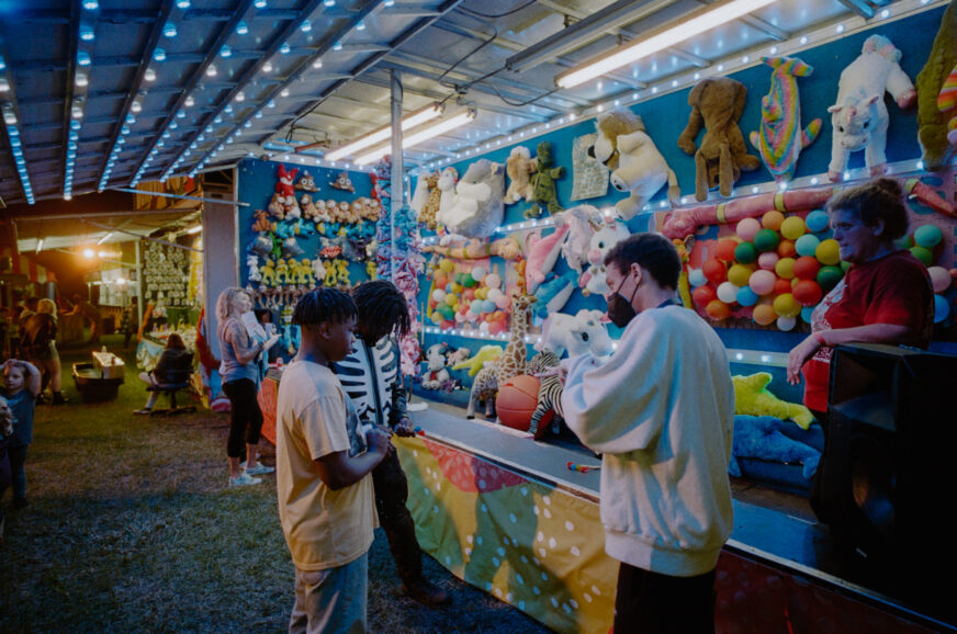
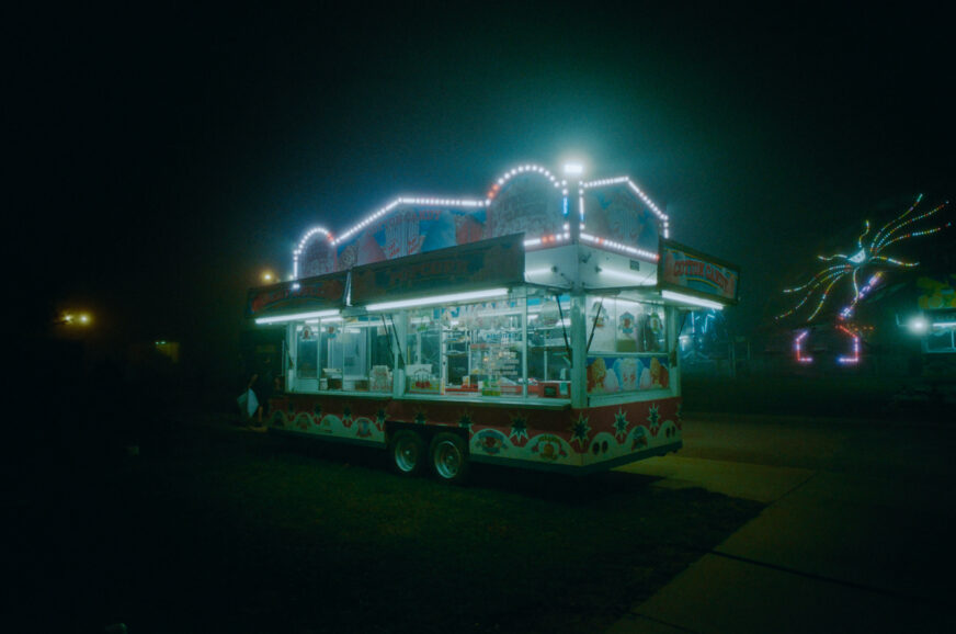
One of our other trickiest sets was the county fair. This was designed and built by the Art Department team in an empty field. April Lasky designed some 3D diagrams with all of the rides and booth layouts, as well as trucks, parking lot vehicles, and food trucks. During our prep, we would discuss the layout of everything to make sure it worked for our camera positions and movement. I also wanted to make sure I could hide lights where necessary. So the 3D Diagram was a huge resource in planning these scenes. To light this set, I had the grips build me a 12×12 softbox that I wanted to mimic fluorescent fixtures near the food trucks. Our fluoro look for the entire film was 10,000 Kelvin and Full Plus Green. We also bounced tungsten lights into muslin for colour contrast and fill motivated by the string lights the art department hung on some of our backgrounds. We had a few 5Kw tungsten Fresnels that we would hide behind the booths as backlights or side lights for the rides. I also had an 80ft construction lift that our key grip, Danny Brazen rigged two 12-Light Maxi-Brutes. Most of the tungsten units were gelled to look like sodium vapour – I believe our cocktail was Full CTS and ½ Plus Green.
Tell me about your camera package…
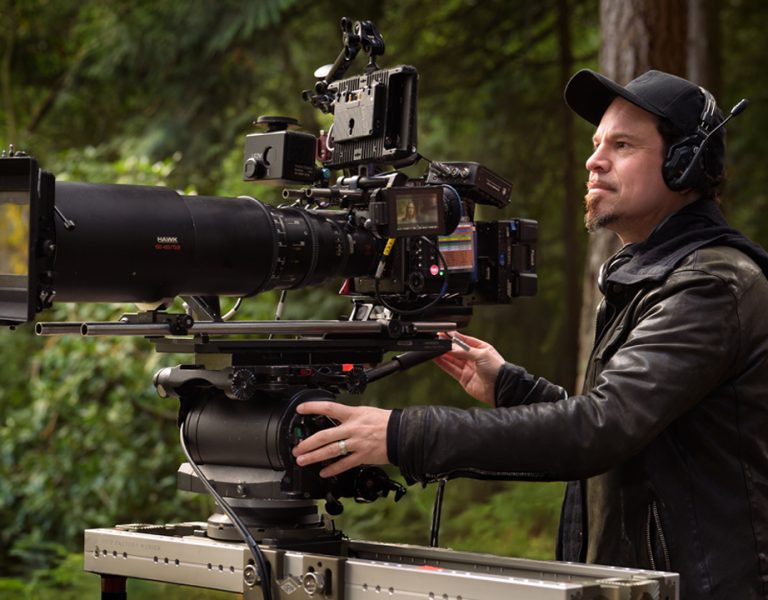
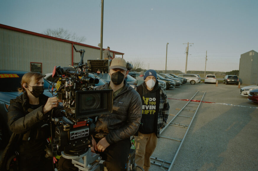
Panavision provided the camera package for BRUISER. I have worked with Marni Zimmerman out of Panavision New York for years, and she helped us with the short film. So when the feature came along, she was obviously my first call. Marni connected us with Steve Krul, who works at Panavision New Orleans, and he helped us figure out what camera and lens package was best. After some tests, I chose to shoot on the ARRI Alexa Mini with Panavision Ultra Speed and Super Speed prime lenses. We also asked Panavision if they could Detune their Primo 24-275mm 11:1 Zoom to match the Ultraspeeds, so they worked with their incredibly talented lens technicians to make it happen. I love working with Panavision because they always ensure I have what I need and care about their relationships with filmmakers. It is always a pleasure.
How did you shoot the Ferris wheel scene?
I love this scene. Honestly, it gives me chills when I watch it. It’s such an important moment for these two characters and shows that they are intrinsically connected. We always knew we wanted to have the camera with the actors in order to feel close and intimate with the characters. Our key grip rigged the camera to the front of the ferris wheel bench seat and counterbalanced the back end to keep it level. Miles and I were excited about using a 14mm lens for this scene to feel very close and intimate while making the world around the characters feel enveloping and intense. The Ferris Wheel itself had some wonderful practical lights built into it that changed colours, so we chose to accentuate that effect by rigging several Astera Titan tubes around the actors with chase sequences and different colour patterns. For most of the fair scenes, I also had an 80ft lift with two 12-Light Maxi Brute bulbed w/ VNSP and gelled with our sodium vapour cocktail. For this scene, we panned one of those Maxis to backlight the ferris wheel, and for the second unit, we focused on some of the other rides in our background.
Tell me about your collaboration with gaffer Brent Bailey. What was your general approach/philosophy when it came to lighting Bruiser?
This was my first time working with Brent, and we had a great experience with the film. During prep, I usually start by giving a broad list of the lighting units I like to work with and think are appropriate. Then during our location scouting, I worked with Brent to refine that list. He had a lot of great new LED units that he owned and liked working with, so he recommended we augment my list with a lot of those fixtures. One of my favourites was the Creamsource Vortex 4 and 8. Those lights were incredible. They had great colour controls and effects, and they were so punchy, which I always find difficult with LED lights. You often sacrifice output for controllability, and these lights had both. Brent and his team were great at working on the fly and allowed me to really improvise when necessary.
The lighting was beautiful – I especially liked how you lit Darious’ house. What equipment did you use and what was your approach to lighting the location?
Thank you! The house proved more difficult than I honestly expected. Because we were shooting 4:3 and often on very wide lenses, it was difficult to hide lighting equipment in the ceiling or on the floor. This wasn’t so difficult for our day scene because I could primarily light from outside. I love using mixed colour temperatures for day interiors, so most of our day scenes were lit with M90 HMI bounced into 12×12 bleached muslin as our soft cool sky ambiance, and then I would contrast that with warm, direct sun shafts created by our Maxi Brutes outfitted with VNSP Bulbs. I would choose varying levels of CTO or CTB on those units to control how much colour contrast was in the scene to differentiate different times of day within the film.
The night scenes were much more difficult. I often used several 650w Tweenies outside of the windows to illuminate the sheers with double full CTB and ½ Plus Green Gel. I had the art department provide some fake tree branches with leaves for us, and the grips would rig these in front of our small lights to create patterns on the windows. The west-facing side of the house I lit with mercury vapour cocktail and the east-facing side of the house I lit with sodium vapour to create a tonal transition between different rooms in the location. I imagined one of the streets outside the house was lit with warm street lamps, and the busier street was lit with mercury vapour. Most of the interiors were motivated by practical lamps with warm shades. So I rigged Litemat4 and 2L with egg crates into the ceiling or on c-stands and placed them near most of our practical lights to push extra light onto our actors’ faces. Sometimes I would use a “Ghost Light,” which is basically a Litemat4 pointed straight down with ultra bounce fabric on the back and light grid cloth on the front. This created a very soft key light that falls off quickly. We could rig this to a single rolling stand and wheel it around the set.
In the kitchen, there was this really strange fluorescent arrangement in the ceiling that had wooden beams separating them in an asymmetrical pattern, so I asked the Art Department if they could rearrange the panels to be symmetrical, and then we rigged Astera Titan Tubes above the plastic diffuser panels to push a fluorescent blue from above. To maintain a consistent look in the film, I chose the same fluoro colour as at the fair – 10,000 Kelvin and Full Plus Green.
How did you shoot the motorbike scenes?
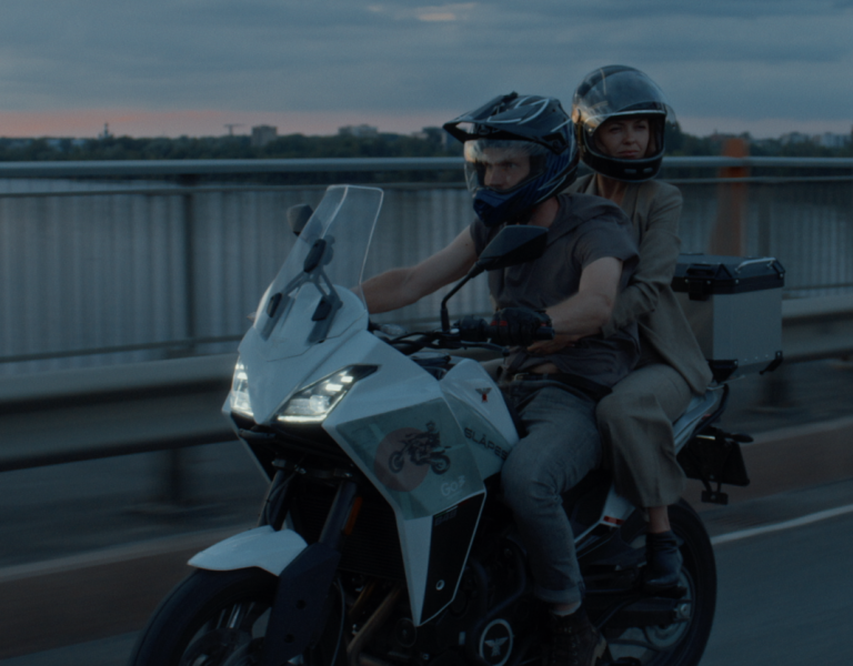
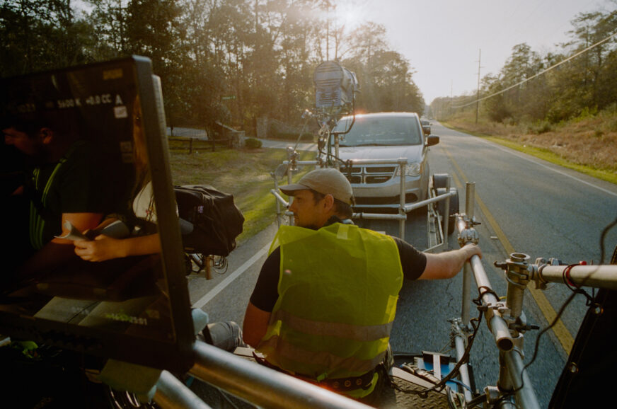
Wong Kar-Wai is always a huge inspiration, and our motorcycle shots with Porter and Darious were obviously inspired by Fallen Angels. Most of our driving scenes were shot on Process Trailer. We often used Astera LED Tubes with chase sequences to mimic passing street lights overhead, and then we would have Creamsource Vortex8 with a Chimera as a soft ambient base. For the motorcycle scenes, we wanted to create the effect that the streetlights were blurring because this was a moment of escape for the characters. We shot the scene with a 356-degree shutter and at six frames per second.
For the second to last scene of the movie, we shot in a massive open field along the side of a road. Miles had told me since the beginning of prep that he had always imagined this scene as a giant pool of light engulfed by darkness. He also referenced a shot from Kendrick Lamar’s “Element” music video where a man sits on the ground looking up toward the camera, beaten and bloody – almost in a trance, lit by the reflective warm street light above. He wanted the actors to walk in and out of darkness, so the audience lost track of where the two people were. We wanted something grounded but impressionistic at the same time. To achieve this, we worked with April Lasky (production designer) and Kyra Boselli (art director) to install an old wooden sodium vapour street light on the side of the road. We wanted a solo street lamp in the middle of nowhere, so the Art Department worked with the city to cement a post into the ground and then sourced a sodium vapour light that gaffer, Brent Bailey, wired up and ran power to. This motivated our light source but did not create the effect that Miles was after, where the actors could move in and out of darkness through the pool of light. To achieve this, I worked with the Grip and Electric team to rig a 12×12 softbox on an 80ft construction crane. I wanted the light to be soft but punchy, so it would fall off quickly. We skirted the box with black fabric, and I filled the box with 12x 1000w Parcans with medium flood bulbs. I first imagined half soft frost could be the right combination of bloomy soft but with a hard edge; however, when we built that, the individual lights created separate pools on the ground, so I realised it was not diffused enough. We added an additional ¼ grid cloth to the half soft frost, which diffused the 12x Parcans just enough. The gaffer used his colour meter to gel the Parcans to match the practical sodium vapour street lamp installed by our Art team. This created the impressionistic pool of light that set the stage for our actors in one of the film’s final scenes.
Who did the grade and what was their brief?
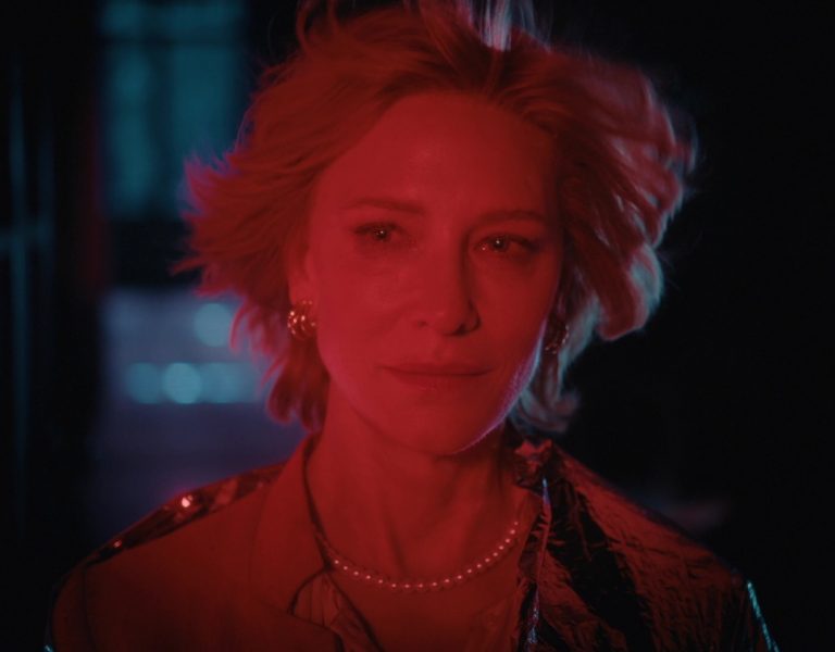
Sean Dunckley at Assembly was our colourist on the film. This was my first time working with Sean, and he was gracious enough to start building our look before we came in for our supervised session. He made a few different looks originally based on some of the references and notes we sent over. This proved to be super helpful to our process and allowed us to decide on a rough direction before we arrived at the session. We were most interested in creating a naturalistic but filmic look with texture. I told Sean I loved film halation and had seen Steve Yedlin ASC’s test, where he designed a post-effect to match film halation. I wondered if this would be possible for our film. Sean was excited by the idea and began experimenting on his own time. He ended up developing this very believable and beautiful reddish halation around the edges of our highlights. With digital, you often soften the highlights and try to pull the information down, but because we loved this halation effect so much, we would push highlights stronger in some scenes and let things feel slightly blown out. This is something I always love about images shot on film. I love seeing highlights as they get close to their breaking point, and I never felt like I could do that with digital.
What was your proudest moment from the entire production process?
Honestly, my proudest moment was probably after the premiere at TIFF this year. Hearing the audience respond to the film and feel as much for the characters as we do was such a great feeling. I just want to make films that move people and have an emotional impact. I think we make films for the audience and to make people feel something. Seeing people laugh, cry, and cheer was really powerful.
Are there any key crew members not yet mentioned that you’d like to mention in the article?
Oh man, my entire camera department was absolute legends. My 1st AC, Rob Agulo, has worked with me for eight years now and has always been down to clown. My brother, Kyle Derry, was our A-camera operator and Steadicam operator for the run-of-show. He put up with having me talking in his ear day in and day out over a headset and was a huge support whenever I felt like I was stuck in the weeds. My DIT Chase Abrams was honestly my eyes. He designed a board with hot-keys mapped to printer light incremental adjustments so I could live grade the dailies super quickly, and he always made sure I had a good exposure and calibrated monitor close. Also, just a super warm presence on set. My 2nd AC and B-camera operator on multi-camera days, Laura Nolan, was always excited to be there and worked harder than anyone else on the set. I can’t thank my crew enough; they are such incredible human beings and make it a joy to come to set each day.

