HAUNTING ABSTRACTION
When approaching Shakespeare’s Macbeth from a cinematic perspective, Bruno Delbonnel ASC AFC and director Joel Coen enjoyed a fruitful creative collaboration as they explored a theatrical form of abstraction driven by rhythm, simplicity, and powerful performances.
For a production rooted in the power of storytelling through the written word, it is fitting that poetry was at the centre of early discussions between cinematographer Bruno Delbonnel ASC AFC (Amélie, Harry Potter and the Half-Blood Prince, Inside Llewyn Davis) and director Joel Coen when they were deciding how best to bring Shakespeare’s famous play Macbeth to the big screen.
Two years prior to shooting The Tragedy of Macbeth, whilst exploring the visual direction the movie might follow, the filmmakers compared the project to a haiku, a Japanese short-form poem. “In three lines, a haiku describes the whole world. That’s exactly how we wanted the set and the lighting to be. The complexity is in the language of Shakespeare, it’s not in the image,” says Delbonnel.
“Despite the source material, this process did not feel like we were adapting a play. For me, it was still all about the script which we were using to make a movie. Although we followed the plot of Shakespeare’s play, Joel reorganised certain elements slightly so it would work as a film.”
The catalyst behind the on-screen adaptation was a discussion between Coen and his wife Frances McDormand, who plays Lady Macbeth and co-produced the film. “Frances asked me if I wanted to direct a stage production of Macbeth she was doing,” says Coen. “I said I wouldn’t know what to do on stage, but if she wanted to think about it as a movie then that would be interesting to explore.”
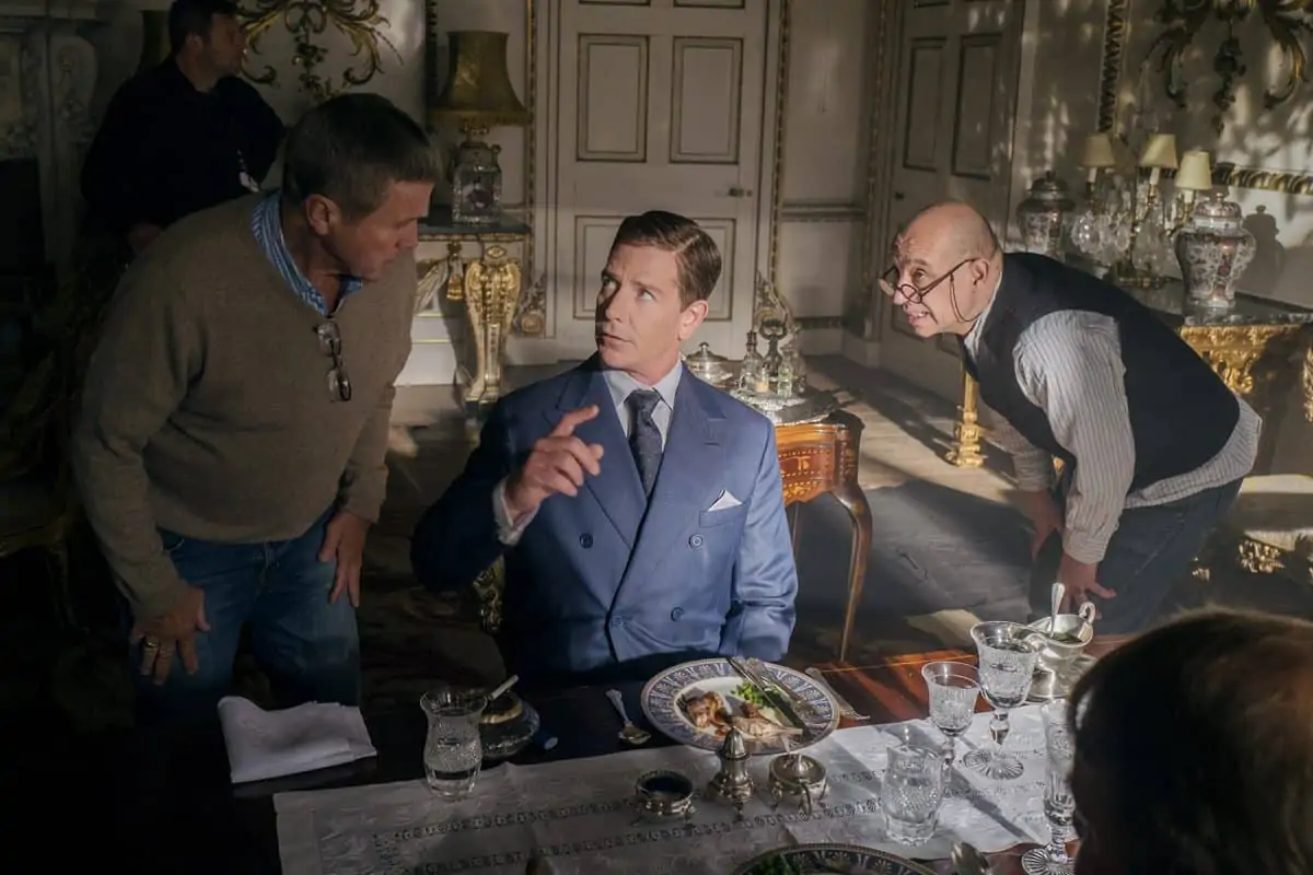
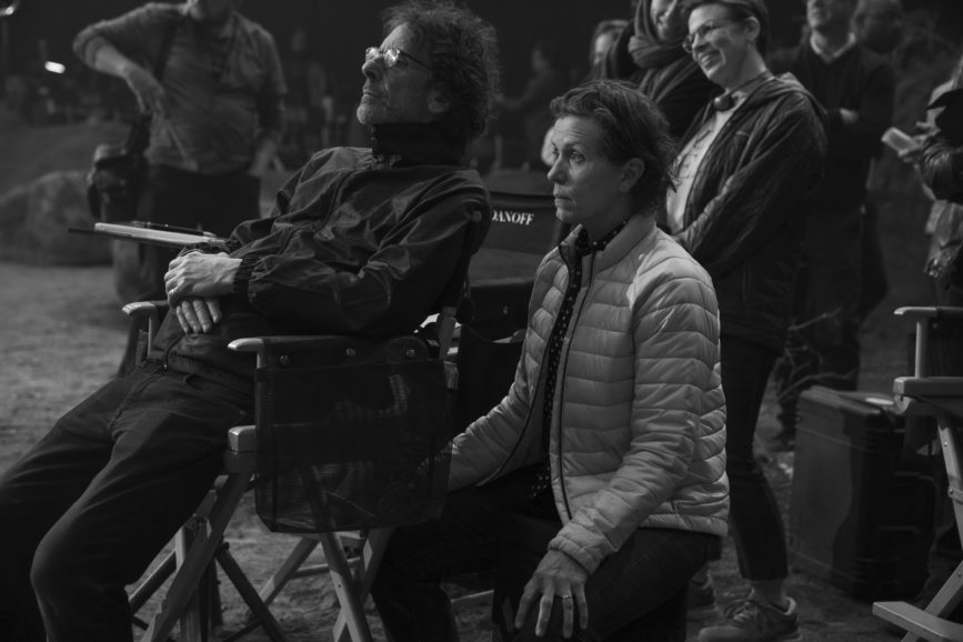
The haunting black-and-white creation that these discussions spawned is Coen’s solo directorial debut, following the 18 movies he made alongside his brother, Ethan. “Since Ethan was not working with us on this production, I became Joel’s sparring partner,” says Delbonnel “We shared ideas, problems, and concepts – it was a very intense but fruitful collaboration in which we were always questioning what we were doing to try to find the best solution.”
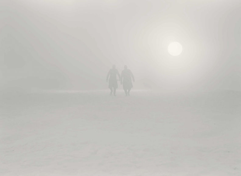
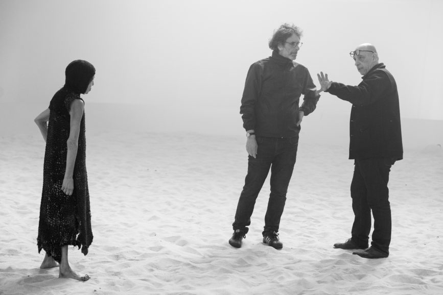
Early priorities outlined by Coen included not wanting to make a period movie or shoot in Scotland or on location. He also wanted the production to be totally abstract. “Instead of realism, we were going towards theatricality and the kind of abstraction that theatre has which sometimes movies do not,” says Coen. “We wanted to strip it back to the essence of the play. Frances was also playing Lady Macbeth, and Denzel [Washington] would play Macbeth – both are in their mid-60s, so this was about the dynamic of that couple in this story at that age, which isn’t in the play. It brings about other ways of thinking about the story and the relationship, but in the context of an older couple.”
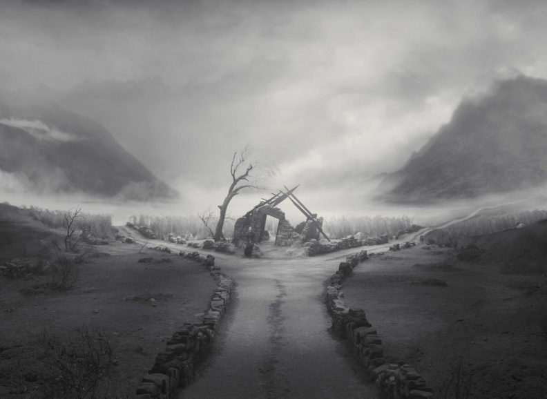
As concepts developed further, it became more apparent that it would be impossible to shoot the movie on location because “nothing existed” in Coen’s vision of the haunting world of The Tragedy of Macbeth. The film was therefore captured at Warner Bros Studios in Los Angeles, with the largest landscape – referred to by the crew as The Crossroad – shot in the vast 35,000 square foot Stage 16.
Edward Gordon Craig described it as being more dreamlike – the production should not be in a conscious place, it should be in a subconscious, less realistic place, which is an interesting way to approach the text.
Joel Coen on designer Gordon Craig
Kathryn Hunter – the brilliant actress who plays the witches – showed Coen a book about the designer Edward Gordon Craig who designed sets at the turn of the century, including many for Shakespearen plays. “That opened a window in terms of his opinions about it being a mistake to run towards realism when working with Shakespeare’s plays,” says Coen. “He described it as being more dreamlike – the production should not be in a conscious place, it should be in a subconscious, less realistic place, which is an interesting way to approach the text.”
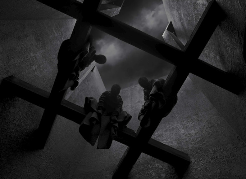
The abstraction that would be brought to the sets then became a core focus. “The castle was a vision of lines and shapes, for instance. We used all the possibilities stages offer to build a world, which is the beauty of working on this kind of project,” says Delbonnel. The cinematographer is familiar with building worlds on stage, having shot many sequences for productions such as Dark Shadows, Darkest Hour, and Miss Peregrine’s Home for Peculiar Children in this way.
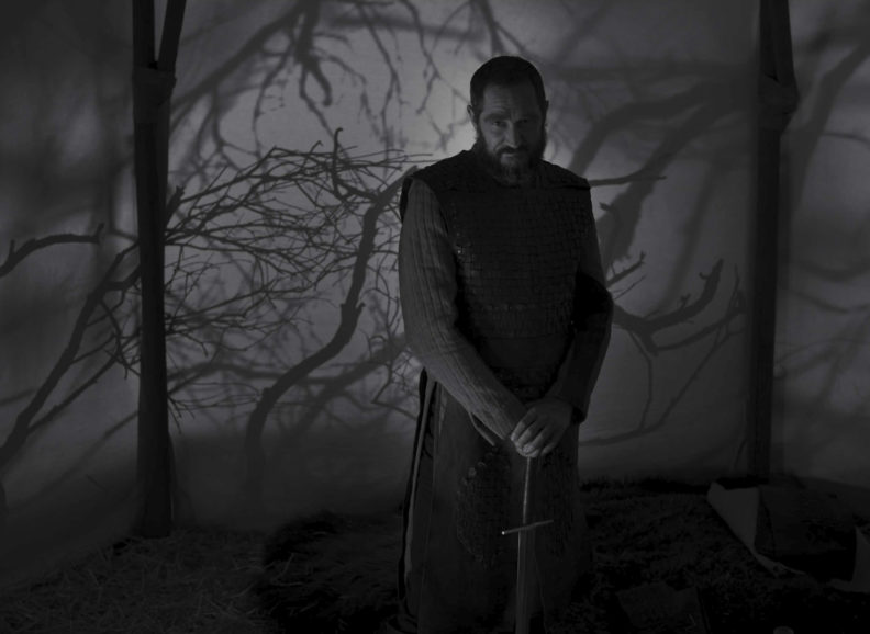
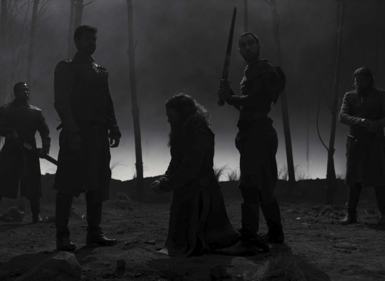
Believing Shakespeare’s plays to have contemporary relevance, the director-cinematographer duo revisited the work of other filmmakers who share their love of Macbeth and who have adapted it for the big screen, from Roman Polanski’s and Orson Welles’ takes on the classic tale and Justin Kurzel’s 2015 version of Macbeth through to Akira Kurosawa’s Throne of Blood which transfers the plot of the play from Medieval Scotland to Japan.
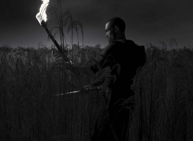
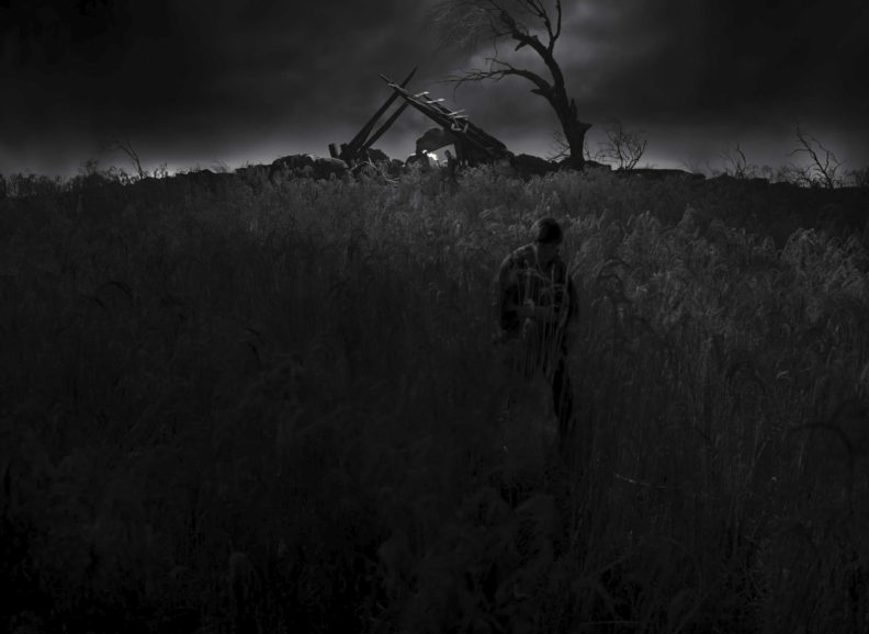
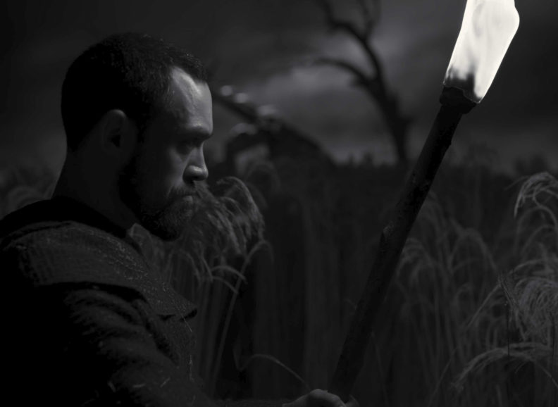
Their research period then examined how directors have solved technical and narrative problems when working on films with similar parameters to The Tragedy of Macbeth – being entirely built on stage. They analysed a night scene in F.W. Murnau’s Sunrise which is shot on stage and sees the protagonist walking through a swamp. “Since we wanted to shoot on stage and incorporate abstract landscapes, such as in the scene when Banquo is murdered, we looked at how Murnau made a limited space look bigger than it actually was by designing a journey through the swamp. Our question was the same when Ross tries to find Fleance hiding in the reeds. The reeds part of our set was only 50 by 60 feet long.”
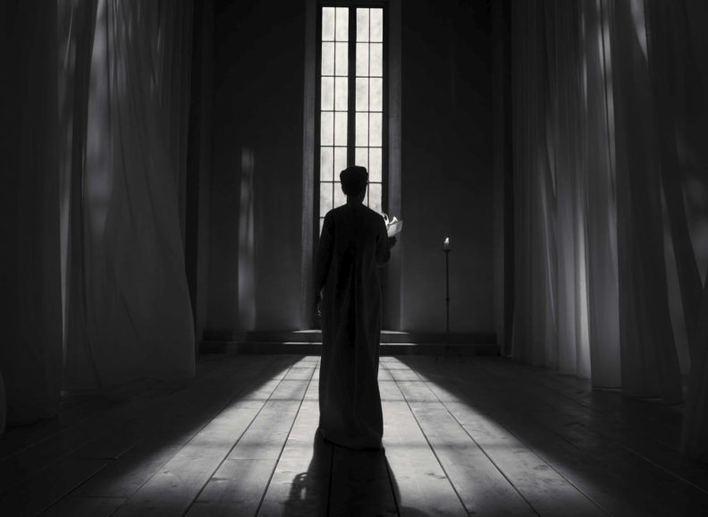
Like his previous productions, Coen shot listed extensively, choreographing scenes prior to rehearsal. Adjustments were occasionally needed, and scenes were reshaped during rehearsal as discoveries were made through the actors’ performances. “Sometimes Joel would invite me to rehearsals to show me something that Frances or Denzel were doing which would change the shot list. It was fantastic to have that input, and it meant the film was ever evolving, based on a very solid shot list,” says Delbonnel.
“When you start rehearsing with actors, things emerge from the blocking in terms of how the actor has to do it, and then we improvise, if you can call it that. You’re then deciding how you’re shooting, maintaining your own concept, but in the context of what the actors have to do, and vice versa,” says Coen. “We had a three-week rehearsal period, which is unusual in movies and is closer to what happens in theatre. It’s like the sense of the production you would instil in a company that’s about to perform a play – that’s an affinity the film had with theatrical productions.”
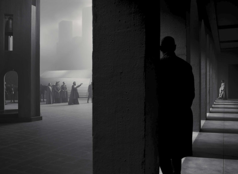
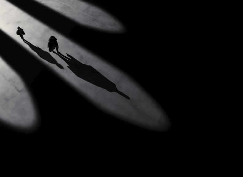
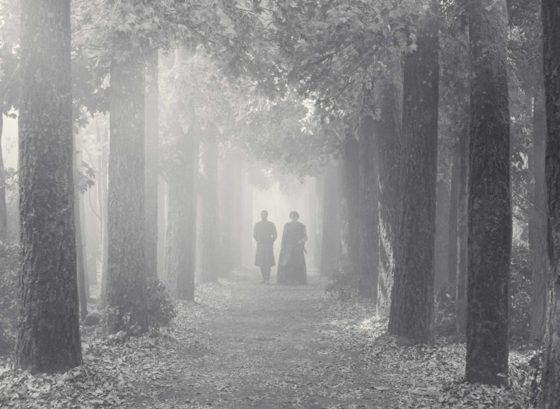
Still photography discovered during a period of intensive research aligned with Coen’s desire to avoid a period feel and instead adopt a crisp and modern approach which incorporated hard shadows. During this process, Delbonnel found a photograph of a colonnade featuring shadows created by the arches. The film’s feeling of abstraction was then developed around this powerful image.
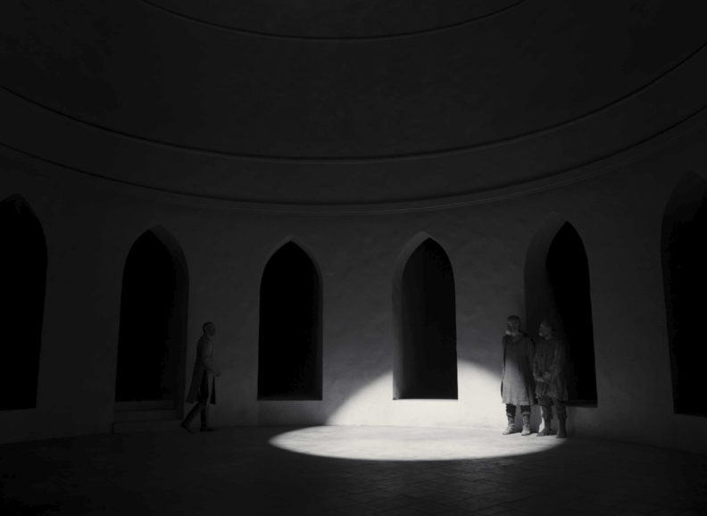
This process saw Coen and Delbonnel decide to lose all ornamentation, so a column was simply a column rather than a Corinthian column, and an arch was just an arch rather than a gothic arch. Production designer Stefan Dechant helped to further develop this concept of abstraction. “We worked as a trio with Stefan and whenever a shape became too complicated, we brought it back to simplicity,” says Delbonnel. “He offered so many beautiful ideas during the two-hour meetings we had almost every day.”
Supporting Shakespeare’s language
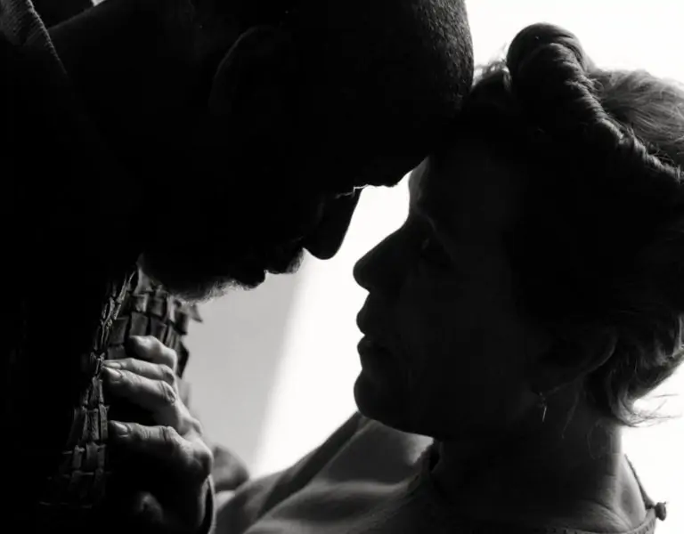
Shooting black-and-white was one of the earliest creative decisions the filmmakers made, feeling it immediately places the audience in a world of abstraction and helps develop a concept based on simplicity. “Skin colour is not as prominent when shooting black-and-white, and it meant we could make the background and set more neutral, so nothing from the set catches your eye in the frame,” says Delbonnel. “A wall is no longer stone-coloured; it’s just an element separating two spaces. It’s more about contrast than a colour palette and that intensity supports Shakespeare’s language.”
Based on their experiences shooting The Ballad of Buster Scruggs (2018) digitally, it was evident to Delbonnel and Coen that repeating this for The Tragedy of Macbeth would be logical. “I wanted to push towards a very crisp image and the length of some monologues leant themselves to shooting digital,” says Delbonnel. “As a director, it was useful for Joel to keep moving with Denzel or Frances when they were doing several takes, without needing to reload – something he enjoyed when shooting Buster Scruggs.”
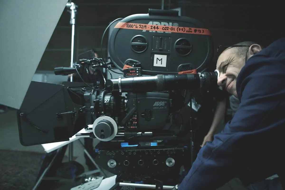
Delbonnel chose to work with the ARRI Alexa LF, supplied by Otto Nemenz in Los Angeles. “Shooting with the Alexa LF in Academy format is just the best thing you can dream of because you’re using the best part of the sensor and everything is perfectly in line,” he says.
The decision to capture The Tragedy of Macbeth with a colour sensor rather than a black-and-white sensor stemmed from an interesting discovery made during testing with colourist Peter Doyle, the cinematographer’s collaborator for the past 15 years. “Peter suggested we convert everything to black-and-white and switch off the blue layer of the RGB curve. The RGB then behave like contrast filters, which had a fascinating effect on the skin tones, and the modelling of the light becomes more nuanced and delicate,” says Delbonnel.
“That’s why I shot everything at 3200 K, but all the moving lights were 6000 K. This meant the light was saturated with blue which helped us when playing with the blue layer. Shooting with a colour sensor allowed us that freedom in post.”
Avoiding the blue channel prevented the noise of the blue sensor. Doyle also modified Delbonnel’s classic show LUT to work in black-and-white. “We had a policy that no one should see the colour image,” says Doyle. “We used Baselight for dailies and final grade and all departments were issued with a LUT that assumed the CDLs from our dailies colourist, Mel Kangleon which reproduced the image Joel and Bruno saw on set. This meant the first day of the final grade was exactly how everyone knew the film, and the process of DI was to build and refine on the work already performed, not restart.”
First, using Baselight, Doyle removed all LUTs from the pipeline, producing an incredibly pure image as the grey was absolutely accurate, without the slightest colour deviation that LUTs will always create. “We then implemented new colour space Oklab, a variation of the classic LAB typically used to convert to black-and-white,” says Doyle. “This allowed us to control and modulate colour contrast Bruno had built into the lighting design with greater finesse. We could also grade with a skin tone control and add a luminance to Denzel and Frances’ skin tones. It became a slider that swung between the glowing, ghost-like skin tone of infrared to the very modelled, coarse, hard effect of tintype photography.”
Doyle also helped develop a look based on the platinum photographic prints Delbonnel adores which are created using a monochrome printing process involving platinum. “A platinum print has a lot of grey in it, so we looked at how to create that effect in a moving image projected on screen,” says Delbonnel. “We extended the whole thing, so there was a long curve in the grayscale.”
The more I think about light, especially after this production, the more I see it as a musical score. It’s all about rhythm. Light can be fast or slow – it could be like a Charlie Parker bebop or a Mahler symphony.
Bruno Delbonnel ASC AFC
As there are no achromatic displays devices, at least in the motion picture industry, this allowed Doyle to control how the black-and-white was presented. “To achieve a platinum print look, we introduced the most subtle colour contrast between the blacks and whites, magenta blacks, and warm highlight with neutral grey,” he says.
Doyle modulated the white point across scenes, typically warm for day, and cool for night. It is the same concept as printing onto Seagull or Foma photographic paper. “This was extremely subtle and almost impossible to detect, but the desired effect was to give the black-and-white projection a luminosity and a presence platinum print has. We wanted to embrace the digital process, and not produce a retro-looking film, with grain, flares, or flat black-and-white.”
Delbonnel and Doyle are no strangers to experimentation, having developed pioneering solutions for previous productions including the software they created with Josh Pines for Dark Shadows which produced highly saturated colour. “I usually talk to Peter as early as possible to explain what I’m looking to achieve,” says Delbonnel. “He will then either speak to the colour scientists at FilmLight and they will develop software with us or he’s able to achieve it working with Baselight.”
Doyle adapted the simple LUT Delbonnel has used on previous productions. DIT Josh Gollish then kept check throughout filming to ensure the look did not stray from the intended vision. “The LUT is underexposed, so what I see on the monitor is darker than what I see on camera and what my light meter is reading,” explains Delbonnel. “This produces a very thick neg, like when I shot on film and always overexposed to create that effect.”
Finding the melody of the movie
A long-time user of Cooke lenses, Delbonnel selected the S7 primes, shooting primarily with the 40mm and 50mm. “On regular 35, I use the 27mm S4 lens, which is fantastic, so we found the equivalent for the large format Alexa LF in the S7,” he says. “They were perfect for this because they are sharp but the fall off is beautiful and I like the depth of field they offer.”
Delbonnel’s preference is to shoot with prime lenses, but when the crew returned from a four-month enforced pandemic break, new protocols meant he had to adapt his shooting process. “When production resumed, we needed to use zoom lenses because it was too dangerous to keep changing lenses. This meant I also worked with the Fujinon Premista series zoom lenses for some sequences as they were a great match for the S7s.”
Advantages shooting a film offers over a play is the ability to capture close-ups, change perspective, and extend or shorten sequences in the edit. “In theatre, you’re looking from one point of view at a stage and there’s a central design metaphor that governs the entire production,” says Coen. “But movies are about what you’re looking at, from what angle, and how long you are looking at it – elements the director, cinematographer, and other members of the team govern.”
While little camera movement is used throughout largely static The Tragedy of Macbeth, when the camera does move it is motivated by the story and powerful performances. This was accomplished with the help of talented 1st AC Andy Harris, who has worked on many of the Coens’ previous productions, and “fantastic collaborator” key grip Ray Garcia.
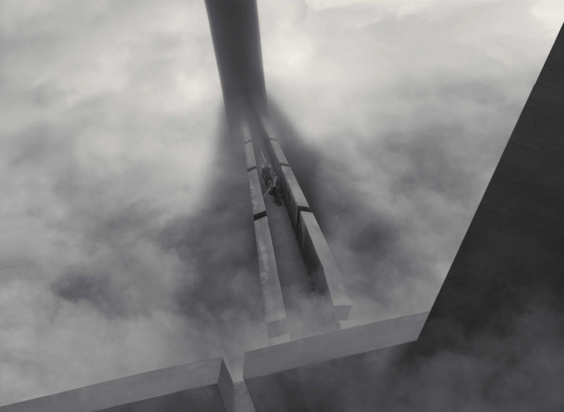
For example, in the dagger scene, when Denzel is delivering an important speech as he walks down the steps, the camera moves with him, and the approach becomes less static. “But after Macbeth has murdered the groom and is talking to Lady Macbeth, it’s all about their conversation and the proximity to the characters,” says Delbonnel. “Joel didn’t want to lose Macbeth’s face in this scene – he wanted the camera to be as close as possible as he stared down at Lady Macbeth. It was directing in its purest and most powerful form from Joel, executed brilliantly by the crew.”
Composition of shots is simplistic, symmetrical, and bold. In the famous dagger scene, for example, the camera is placed in the middle of the corridor. But while Delbonnel says many people have commented on the Dutch camera angles used, it is in fact the lighting that creates this effect. “The camera is very square on and perpendicular, but the lighting is uneven, creating a feeling resembling German Expressionism. When we found a frame, I would destroy the image and composition with light, introducing a big shaft of light cutting across the frame diagonally.”
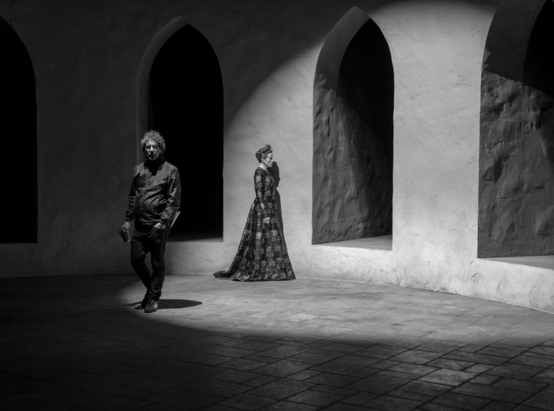
To produce this stylised and harsh effect, Delbonnel worked with gaffer Michael Bauman to first produce a fill light that is added to with the “hardest and sharpest” light possible. The light found to produce the most powerful and suitable effect was ETC’s SolaFrame. “I’m interested in moving lights, and I’d work with moving rock ‘n’ roll style fixtures like this before. They were perfect for the look we wanted because they are so sharp and punchy,” he says. “I then designed gobos to produce the sharp shadows. So, in the dagger scene, the shadow on the floor is not the actual shadow of the arches, it’s a projected image through the gobos.”
Due to the shapes that could be created when working with the SolaFrames and the effects produced by bouncing them off walls to light actors, Delbonnel lit most of the film with the fixtures. Additional innovations included LED lights developed by Mike Bauman for LiteGear: LiteMat and LiteTile in sofboxes and 20K conventional movie lights.
“The more I think about light, especially after this production, the more I see it as a musical score. It’s all about rhythm. Light can be fast or slow – it could be like a Charlie Parker bebop or a Mahler symphony,” says Delbonnel.
The cinematographer tries to find something to motivate what he is shooting and often this comes down to rhythm and music. “At the beginning of The Tragedy of Macbeth, it is very grey and more of a sweet melody as information is slowly delivered,” he says. “But then after the first witch appears on the beach, it becomes darker and darker and in the rhythm Joel wanted, which is based on Shakespearean language and very melodic.”
At that point, Delbonnel’s lighting also became melodic as he conceptualised in terms of rhythm rather than mood. “If you take the colonnade scene, it’s a rhythm inside a rhythm, inside a rhythm. The shadow of the column is a rhythm, Denzel walking down the corridor is a rhythm, as are Shakespeare’s lines on top of that. It’s about balancing everything and playing with those elements to create a pace. I’m always trying to find the melody of the movie, based on the script and the director’s vision.”
