IMPERFECT WORLD
Setting the tone from the very first scene, giving the actors freedom of movement and expression, and embracing imperfection were paramount for director Olivia Wilde and cinematographer Matthew Libatique ASC when building a believable distorted utopian vision for Don’t Worry Darling.
Gender politics, sinister secrets, and paranoia collide in dystopian psychological thriller Don’t Worry Darling, directed by Olivia Wilde – following her directorial debut Booksmart (2019) – and deftly lensed by Matthew Libatique ASC (Black Swan, A Star is Born, Mother!). Based on a story by Carey Van Dyke, Shane Van Dyke, and Katie Silberman, the screenplay – also penned by Silberman – is a tale of utopian suburbia in which housewife Alice (Florence Pugh) is part of an experimental idealised living project with her husband Jack (Harry Styles).
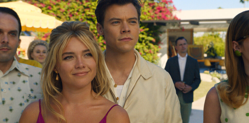
Jack and the other husbands residing in the candy-coloured 1950s-style housing development in the desert work for the Victory Project, a mysterious corporation led by Frank (Chris Pine) with ambitions to change the world. When Alice questions the intentions of the company she discovers life in the vibrant, shiny, hyperreal world is not as it seems.
Libatique first worked with Wilde when he shot Cowboys and Aliens (2011), in which Wilde played Ella Swenson, before collaborating on short Wake Up – a run and gun four-day shoot in New York, directed by Wilde. Libatique looks back fondly on the production as “the most fun four days. Olivia had these incredible ideas and assembled this really collaborative team including talented actor, Margaret Qualley.”
When Wilde initially approached Libatique to team up again on Don’t Worry Darling, he was unavailable but then the pandemic shut the world down. A few weeks after work recommenced for Libatique, Wilde contacted him with an update on the plans for the production which was coming back to life after the hiatus and due to start shooting in November 2020.
Libatique “jumped at the chance as Olivia was trying to create the same vibe we had on the short film. She surrounds herself with people who are in tune with her and loves to socially interact rather than schedule rigid meetings.”
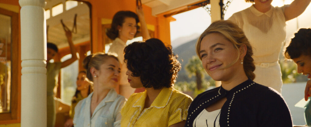
Much of the design was already in place when Libatique joined the project. Meetings with production designer Katie Byron and costume designer Arianne Phillips demonstrated the style and palette were already strong and the cinematographer was determined to honour the colours they had chosen.
As playing with colour temperatures “can be dangerous” and risk changing the production design and costume team’s plans, a LUT was created with Company 3 colourist Alex Bickel. “One of the first things I did was organise a simple test with Arianne. The clothes were not completely made or fitted yet, but I asked which materials and colours she would work with and took stills of the fabric in neutral daylight. After taking a colour temperature reading to see how the colour was meant to render, I shot at a couple of different colour temperatures and sent that footage to Alex to make a LUT that looked like that reference.
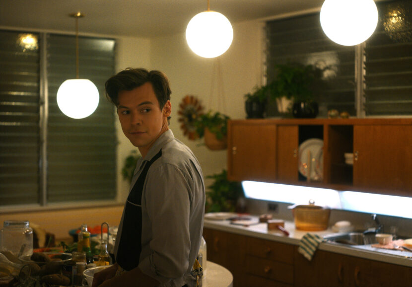
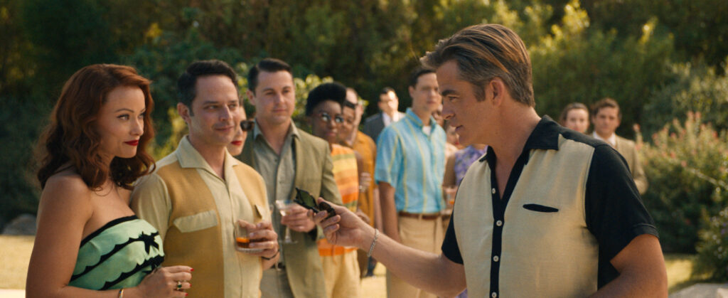
“We were working with this world of colour, but it wasn’t as simple as saturating it. When creating the LUT we wanted to accentuate the world while honouring the colour space and not affecting the skin tone. That took a bit of work in testing but once we landed on it, we used that LUT for the whole film.”
DIT Michael Kowalczyk was integral as the bridge between post-production and the shoot while monitoring the LUT. Guidance during the development of the LUT was also provided by photographer Erwin Olaf’s “tremendous body of work that shows the colour and vividness of the wardrobe and background, while looking honest and achieving a neutral skin tone rather than overly saturated.”
To share her visual ambitions with Libatique, Wilde presented a vast wall of references, explaining the significance of each image. From these references – “it might be a photograph of hair blowing in the wind or a flare coming off glass” – it was apparent the world he would help build would be “shiny, idyllic, and based around modern architecture, palm trees and that low-hanging sun of Palm Springs.”
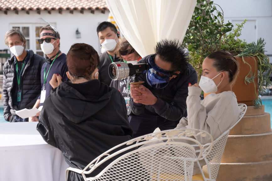
Wilde’s ability to allow each collaborator to clearly imagine what she envisions was advantageous. It was important for the first scene to set the mood and tone for that world using handheld camera, proximity to the actors and the freedom they had to move.
Libatique also tried to keep lighting as broad and naturalistic as possible, “to have the cameras find the light rather than lighting the frame. Often, because we had so many cast members, it was about giving the camera as much freedom as possible, at the risk of not having the perfect light here or there. Again, it was about embracing imperfection.”
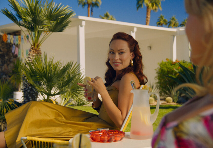
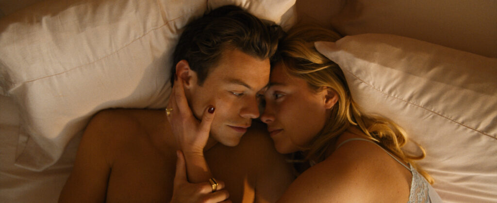
And in the same way Libatique aimed to offset the perfection of the world, Wilde “tried to turn it on its head, making it more provocative and introducing a sexier element to an otherwise perfect picture.”
Black-and-white photos of The Rat Pack – Dean Martin, Jerry Lewis, and Sammy Davis Jr. in Vegas, “arms around each other, drink in hand, cigarette hanging” – aligned with how Wilde wanted the characters in the film to live. And Libatique thought “that sounded fun. Olivia had the ability to make me, and all the other collaborators, want to be part of creating that world.”
Photographer and filmmaker Alex Prager – a friend of Libatique who has also been an influence on Wilde since she started working with the cinematographer – was once again a source of visual inspiration, along with photographers such as Tania Klein and Slim Aarons, who is renowned for his images of socialites and celebrities.
“Slim Aarons’ work was important to revisit, not only for his photography of Palm Springs but because he always hung out with the most fabulous people. That was the world we were creating – fabulous people doing fabulous things,” says Libatique. “Everyone in our world has their cake and eats it – they’re living the party lifestyle but also have wives and kids, so the world was drawn almost too perfectly.
As Slim Aarons’ work “presented these fancy people in a candid way,” Libatique connected that aesthetic and philosophy to the world being created for Don’t Worry Darling in which “you question whether these people are normal and then as the narrative unfolds, you begin to see cracks.”
Outside of still photographs, film references included the work of director Adrian Lyne such as Indecent Proposal (1993) and Fatal Attraction (1987), among other ‘80s and ‘90s psychological thrillers.
A hint of imperfection
To realise their creative ambitions and produce an aesthetic with a hint of imperfection, Libatique selected an S-tuned version of Tribe7’s Blackwing lenses, with the camera package supplied by Camtec in North Hollywood and customised to suit by friend and Camtec president, Kavon Elhami.
“It was about taking this perfect world and spinning it just a bit, so it’s not completely level or symmetrical which the lenses helped me achieve. I wanted to embrace the way the Blackwings receive light and sometimes create a wash,” he says. “I knew what was in front of the camera would be absolutely gorgeous and I wanted to be able to pan the camera and have an accident happen all of a sudden which those lenses are amazing at allowing.”
Not wanting to shoot anamorphic, Libatique asked Wilde how close she wanted the camera to be to Alice during the moments when she is by herself. “We also needed to look at how to isolate her within a scene with a lot of people while keeping it subjective,” he says. “So, we were working with many different proximities to her. I didn’t want to ask Florence [Alice] to back up a bit because we were using an anamorphic lens where the minimum focus would be a problem. Therefore, we opted for a crop on a spherical.”
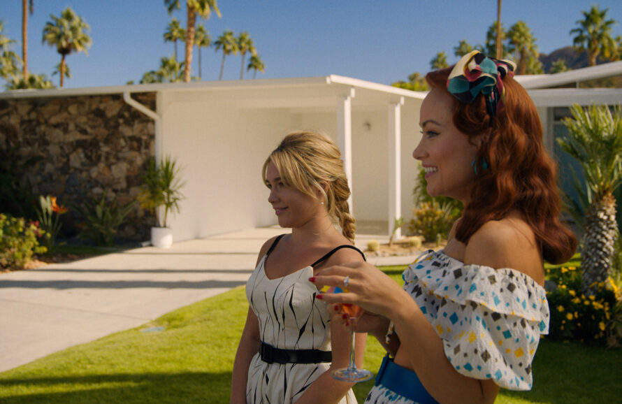
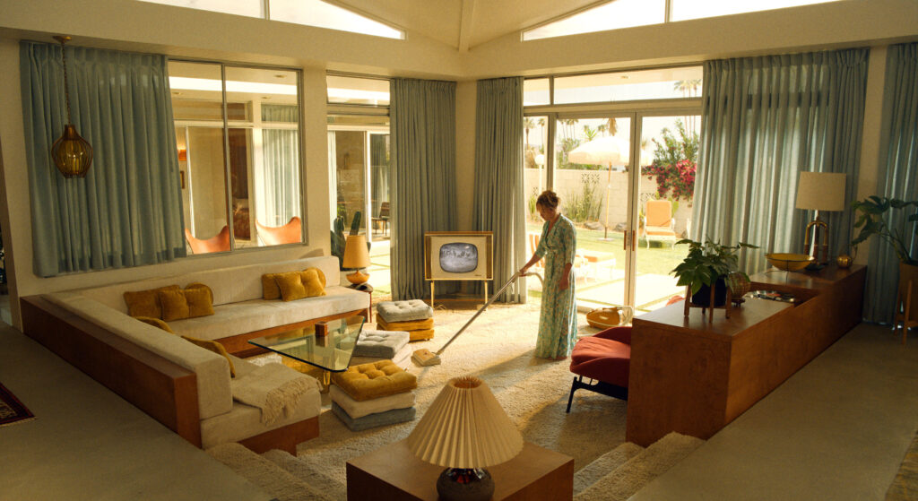
Libatique matched the Blackwings with the ARRI Alexa Mini LF in part to help overcome the challenge of marrying the set of Jack and Alice’s house to the house exterior. “Rosco shot an image in Palm Springs to create a soft drop for our stage work, so we worked with a shallower depth of field and chose the Mini LF because the sensor was so large that we could accentuate the fall off at 25, 29, and at 35 versus just using a longer focal length. We also realised every angle of the house featured glass, so the backing needed to be as big as the house and wrap around it.”
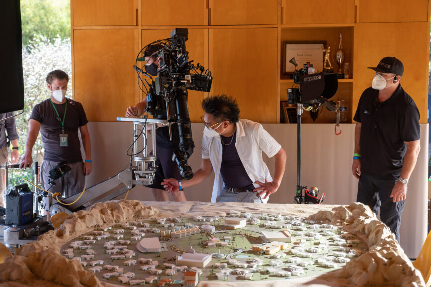
To prepare to shoot in the interior space of Jack and Alice’s house, Libatique and Byron ensured each scene was architecturally successful. Working in SketchUp 3D design software, they placed the camera in different positions to see if any overhang could be seen when working with the backing.
When Libatique joined the production, the integral location for The Victory Project headquarters was yet to be found, meaning framing and aspect ratio were still to be decided. When location manager Chris Baugh and Byron found Volcano House in the Mojave Desert – “this crazy volcano with a white domed structure on top” – it was apparent shooting 2.40 would best capture the cosmic structure and vast desert landscape surrounding it.
Bursting with sun-drenched views and palm tree clusters, the idyllic Californian city of Palm Springs was an apt filming location for the tale of class politics and misogyny that unfolds in a utopian community. Sequences in Frank’s house were captured at the iconic Kaufman Desert House, renowned for its contemporary structure. While Slim Aarons had photographed at the location in 1970 (Poolside Gossip), Don’t Worry Darling was the first motion picture to be captured there.
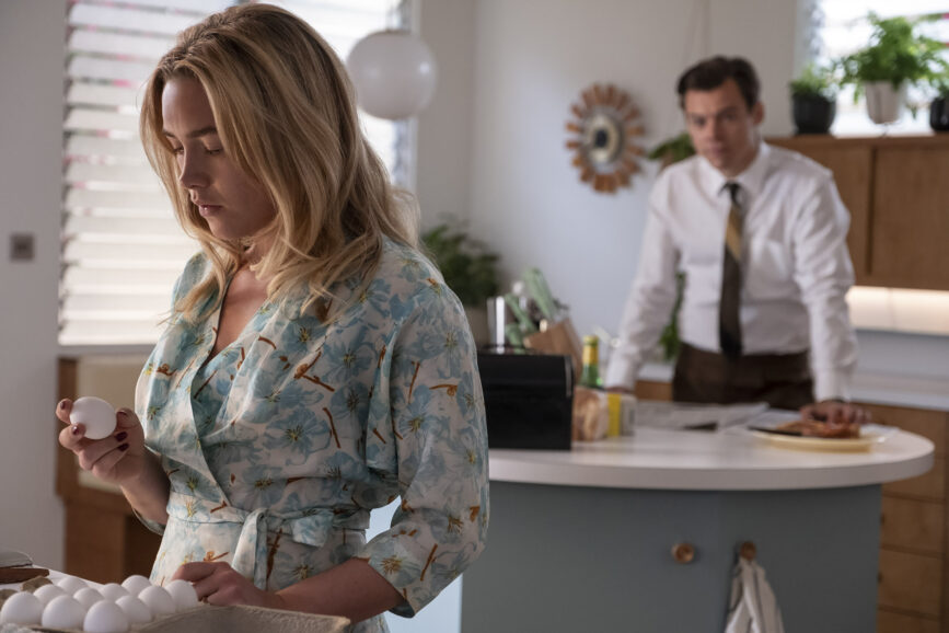
Scenes taking place in Jack and Alice’s house – which make up a large portion of the film – were shot on stage at LA North Studios in Santa Clarita. Libatique found the house “so gorgeous, and the design so spectacular that it was easy to frame.”
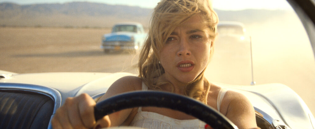
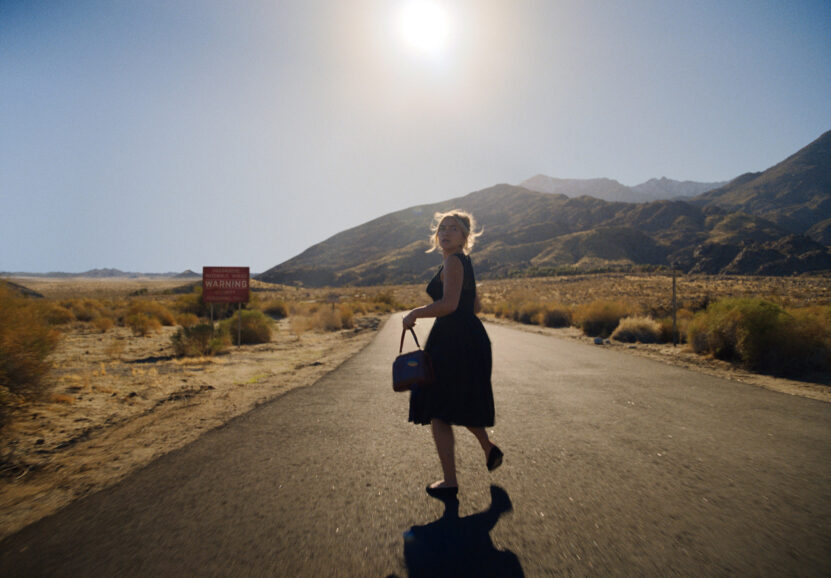
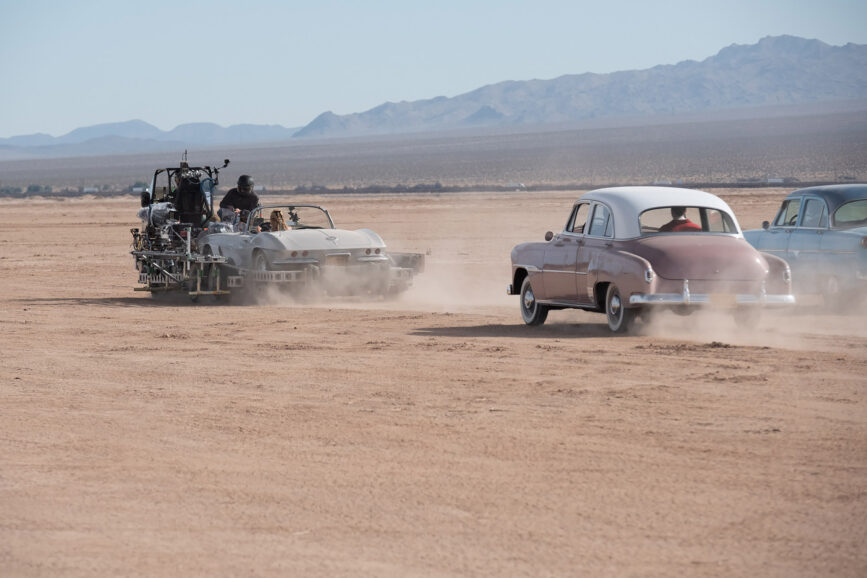
The estate where Jack and Alice live was captured at Canyon View Estates, offering the perfect combintation of picture-perfect villas and vibrant colours which Libatique refers to as “a copy and paste neighbourhood with houses duplicated over and over again”. Adjacent to Volcano House lay Troy Dry Lake, a barren lakebed that plays a starring role in the film’s pivotal high-octane car chase.
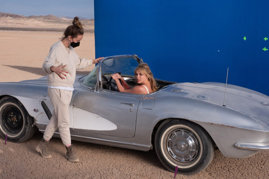
“Olivia wanted a ‘badass action sequence’, so we set out to deliver that. But this sequence was a slight source of anxiety because we didn’t really have the resources,” says Libatique. “It was a ‘borrowing from Peter to pay Paul’ type of attitude, to allow us to use gear such as a Biscuit rig to put a car on to make Florence look like she’s driving. We maximised the equipment we could secure and then used it shot after shot.”
Libatique is particularly proud of the action sequence because there was no second unit director shooting the cars, meaning they relied heavily on “talented stunt coordinator Tracy Keehn-Dashnaw and special effects supervisor Jeremy Hays to make it all happen after storyboarding it extensively. It was so fun to be in an armoured car and chase stunt driver Kyle Padelford around in the beautiful Corvette and then have two cars smash into it.”
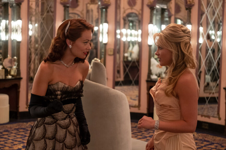
Inside the scene
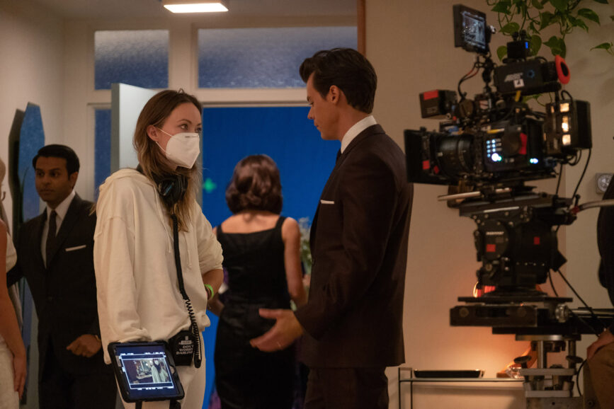
Camera operation was in the masterful hands of Scott Sakamoto, while Chris Herr took on B camera duties, both aiming to keep the camera mobile while working in synch with focus puller Matt Stenerson. “We used the second camera a lot for leapfrogging. Often Chris would have the Ronin on an antigravity rig, and the gimbal would float through the space while Scott was on the wheels,” says Libatique. “Due to numerous COVID shutdowns my fantastic dolly grip John Mang and Scott needed to work on another production towards the end of the shoot, so I operated on some scenes, with Chris still on B camera, so there was continuity.”
As Wilde had a specific vision for the atmosphere she wanted to create, it was important for the crew to make it feel like a single-camera shoot when possible. “Olivia didn’t want to put up a B camera just so we could get a piece of coverage if it wasn’t an impactful shot,” adds Libatique. “She’d rather just go with a single camera.”
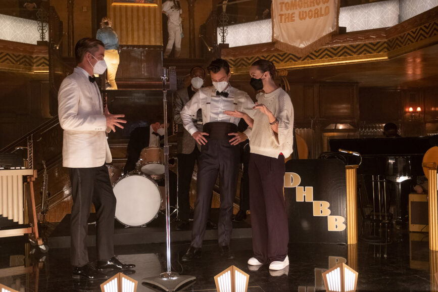
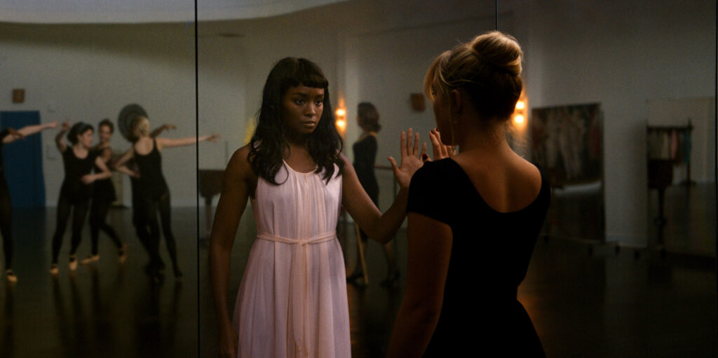
Wilde also devised a dynamic approach to present a powerful scene featuring dancers with an energy and freneticism aligning with the psychological thriller genre. “Olivia said she would love the dancers to hold the camera, so we hung a bungee cord from the top of the stage with a Ronin attached to it,” says Libatique. “The dancers then got kind of carried away and when they grabbed the camera and threw it to somebody else sometimes it came back so fast, we’d have to duck out of the way! That was just day one and it really set the tone – we knew it was going to be a fun experience.”
In contrast to the vivid colours of the film’s supposedly perfect world, black-and-white hallucinatory visions were interspersed. But it wasn’t easy to say goodbye to the vibrant hues in these scenes, which were captured in colour rather than using a black-and-white camera. “We fell in love with the colour version, but Olivia had always imagined them in black-and-white,” says Libatique. “It works well in monochrome because these projections give you clues that Alice is trapped in this machine.”
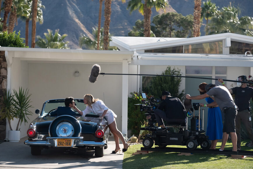
Keeping the light broad made it possible to quickly move from angle to angle if a choregraphed shot was needed. And as Olivia is also an actor [Wilde plays Frank’s wife Bunny in the film], she wanted the cast to be able to warm up from the beginning of a scene to the end. “So, there are some long takes with a fair amount of camera movement, such as the fight sequence between Jack and Alice, with coverage starting in the kitchen and going through the dining room and into the living room,” says Libatique. “We didn’t want to cut up their performances – it was important to allow the rhythm to build.”
Wilde’s experience in front of the camera also allowed her to anticipate when an actor needed more space, so Libatique followed her lead when deciding where a single should be. “It’s not a rigid rule with Olivia, it’s a feeling,” he says. “She makes decisions by being inside the scene, being on the field and playing the game with the other performers.”
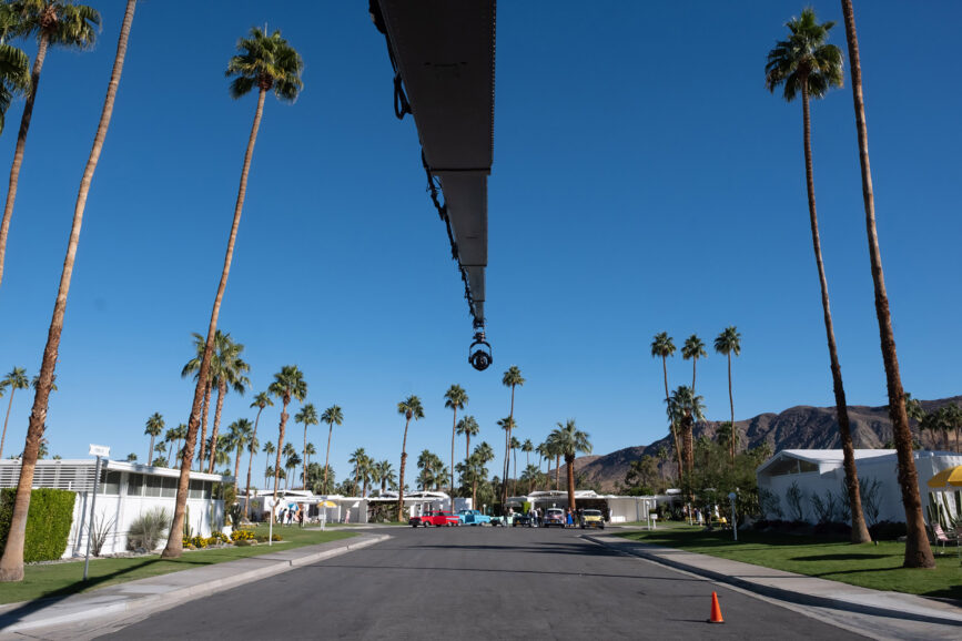
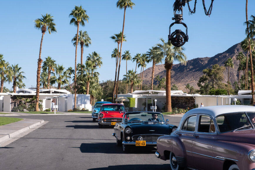
Cacophony of colour
Libatique drew upon a flashing technique he used when shooting Straight Outta Compton (2015). “We referred to it as ‘The Ring of Fire’ and it was a giant ring light pointed back at the lens which would flash, creating flares on cue, determined by a lighting programmer.”
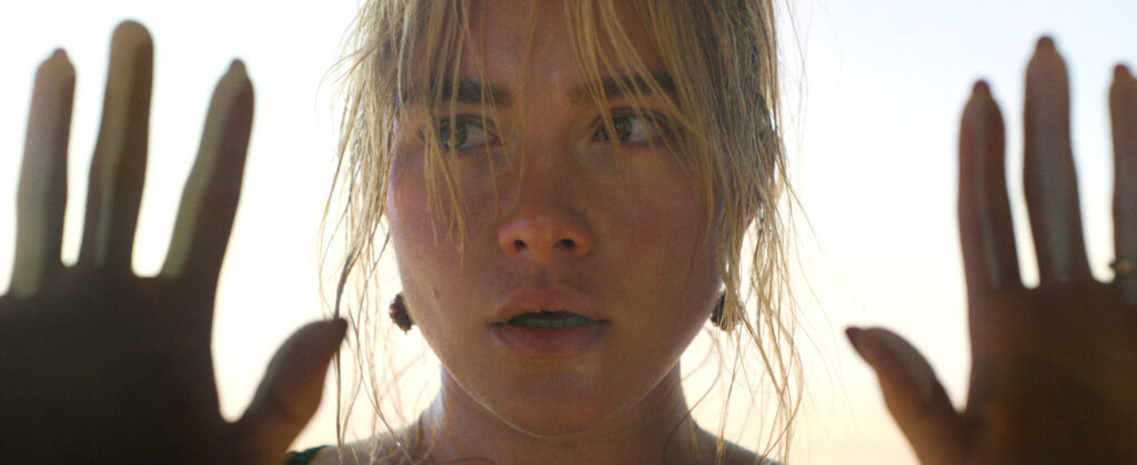
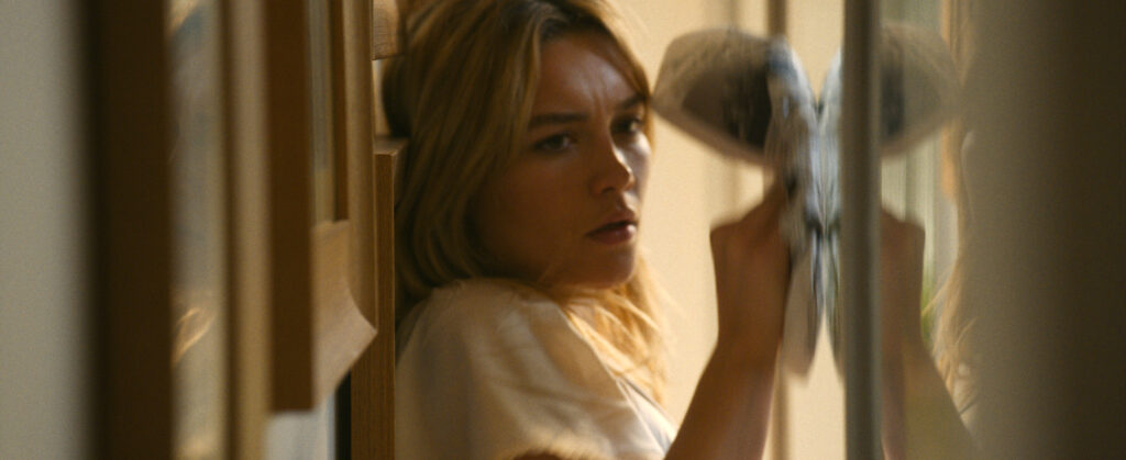
This eventually led to Camtec developing a filter tray that uses over 100 single LEDs that can flash the file by illuminating a diffusion filter of your choice. Using the technique as a motif, Libatique had fun exploring the creative results in his previous few films, working with it at low percentages if he shot scenes with smoke, for example. On this occasion, he used it regularly – and on a cue – “when Alice makes the transition from the idyllic world into this unknown place just to give it a little more grit”. It was also used when Alice leaves Victory and places her hands on the glass at the headquarters as a flash of red appears over the frame.
Libatique often works with a programmer – this time collaborating with Gideon Markham – because he likes to “give the camera movement. I’m always in contact with the programmer so I can do light cues over the course of a shot.”
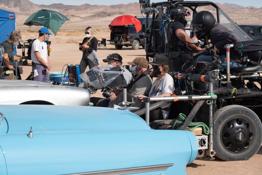
Multiple crew members united with Libatique to use lighting to believably blend Jack and Alice’s house – which was shot on stage – with the exterior locations. “If it was morning, the sun would come up from the back of the house and set on the front of the house, on the stage set as it was in the real location. It wasn’t just me keeping track of it, it was gaffer Jeff Ferrero, key grip Tana Dubbe too.”
Ferrero and Libatique worked with a mixture of old and new fixtures. ARRI SkyPanel S360s created ambience and colour contrast in the headquarters. “We would set our S360s at say 6000K to be the sky ambience, and 3200K would be the sun, trying to create an illusion of reality. That mix went a long way in creating the naturalism, reality, as well as the messiness,” says Libatique.
“If you transition from a lit window to a shadow space in a house, it gets a little cooler, depending on the time of day, so we would try to force that into our lighting scheme for Jack and Alice’s house. I would also work a lot to fudge colour temperature – it’s one of the benefits of shooting digital. What would happen if I set the camera here and then put that LED light here and this light here? The next thing you know, it’s a cacophony of colour.
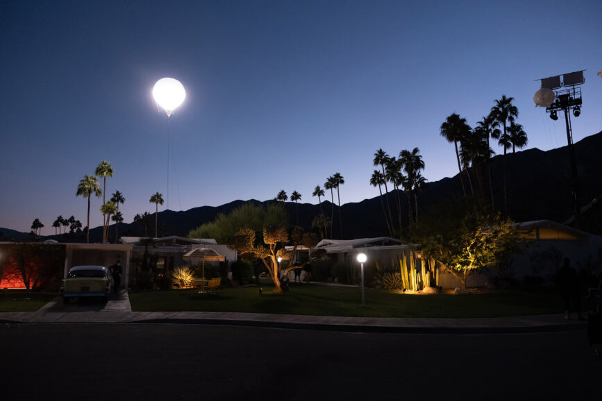
“We also used old school ARRI 24K fresnels as there’s nothing that’s going to replace them on stage for the sun. We had six 20Ks in different positions on tracks so we could move them into position to accommodate a shot starting in the bedroom and going through to the kitchen.”
Discussions about the cinematographic approach predominantly focused on how to portray the world in a believable way. “Beyond that, anything we did with proximity or lens choice related to Alice’s subjectivity and dissension into madness,” says Libatique. “Olivia and screenwriter Katie [Silberman] obsessed over that – the notion of whether this woman is going mad as well as the concept of being gaslit by men. Alice’s isolation was also important, and we explored the idea the walls were closing in on her when we literally made the walls close in on her in the scene.
“Olivia always knows what the scene’s about, and every choice was made to tell the story. We knew the contrast in design between the real world and this beautiful fictitious idyllic world was going to be pronounced, so it was all about using visual techniques to put Alice under the microscope.”
