Wired and wonderful
Jess Hall BSC / Ghost In The Shell
Wired and wonderful
Jess Hall BSC / Ghost In The Shell
BY: Ron Prince
2029: Niihama Prefecture. The Major, a cyborg counter-cyberterrorist policewoman, and her special-ops task force are charged with thwarting the activities of a nefarious cyber-criminal gang. This is an age when computer technology and prosthetics have advanced to the point that biological brains and cybernetic components are freely interchangeable, enabling a person to become a cyborg. Can The Major foil the cyber villains before they hack her and trouble really escalates?
Paramount Pictures/Dreamworks’ $120m production of Ghost In The Shell, directed by Rupert Sanders, is based on the Japanese manga comic and anime film of the same name by Masamune Shirow. Written by Jamie Moss, William Wheeler and Ehren Kruger, it stars Scarlett Johansson as The Major, along with Michael Pitt, Pilou Asbæk, Chin Han and Juliette Binoche.
Releasing in 2D, 3D and IMAX 3D and Dolby Vision HDR, the creative and technical task of converting the script into images, while paying homage to the original manga and anime versions, fell to cinematographer Jess Hall BSC, Sanders’ collaborator on several short films and multiple commercials.
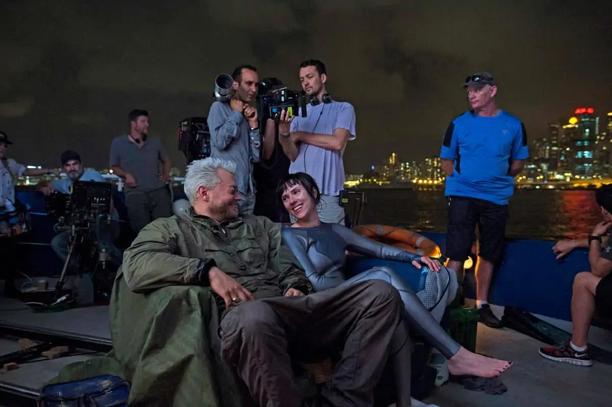
After an intensive 12-week prep, principal photography on the production was undertaken at Peter Jackson’s Stone Street Studios, in Wellington, New Zealand, between February and June 2016, where large, futuristic sets of the fictional Niihama Prefecture were built on the backlot and sound stages. Shooting also took place for ten days in the Jordan area of Hong Kong, around Pak Hoi Street and Woosung Street.
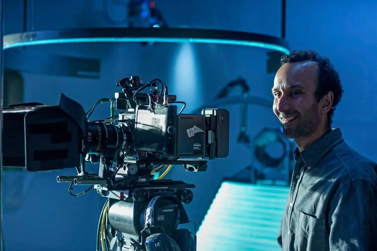
Ron Prince caught up with the cinematographer – whose credits include Edgar Wright’s crime comedy Hot Fuzz and Wally Pfister ASC’s dystopian sci-fi thriller Transcendence – at his home in Santa Monica.
What was your initial reaction to the script?
JH: I was blown away when Rupert first presented me with the script as I’ve been a massive fan of manga comics, anime and Studio Ghibli productions for many years. Growing up I had a collection of anime films on VHS, including multiple versions of Akira (1988, dir. Katsuhiro Otomo, DP Katsuji Misawa), and was familiar with Ghost In The Shell. Whilst it’s an intriguing story, featuring a cyborg with a human brain and nervous system, it is also existentialist in the way it questions mind and matter and the nature of self-identity. There was some trepidation on my part about how to bring such a complex narrative to the screen, but it was an exciting challenge nonetheless.
Tell us about your early conversations with Rupert about your approach to the production?
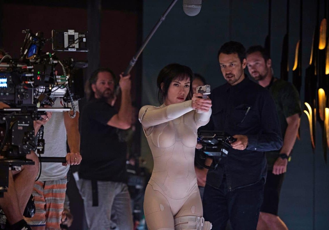
JH: Ghost In The Shell is a large and important intellectual property – so there was a lot to respect in terms of the legacy, a lot to understand about the roots of the entire genre of anime and manga. Whilst we wanted to honour the anime style we realised it would not necessarily translate directly or easily into live action. As we delved into the material we became aware of the incredible depth and attention to detail in every frame. It soon became apparent that we had to approach Ghost In The Shell more like a substantial conceptual design project, and there would need to be a lot of interaction between departments to produce the final look. Rupert challenged me. He wanted a high level of ingenuity and creativity to be applied to the photographic approach. He wanted to push the boundaries of the technology that was available to create powerful resonant images.
What references did you consider?
JH: Luckily, during prep, there was a full season of Studio Ghibli and anime movies at my local Aero art house cinema in Santa Monica, and these films provided a great insight into the anime vocabulary. The painterly quality, subtle palettes of pastels and accent colours, inspired me. I also drew from volumes one and two of the Ghost In The Shell mangas, which employ a generally bold, graphic and wide-angle compositional style. In some respects I wanted to emulate this. Rupert had also assembled a fantastic collection of ‘artworks as reference, portraying a sharp insight into technology in both form and content, showing its strengths, imperfections and glitches’ – all highly relevant to our narrative.
To intone a Japanese visual aesthetic, I also considered the minimalism and symmetry of traditional Japanese art, such as the work of the great ukiyo-e artist Utagawa Hiroshiga, for its often tense, bold, voyeuristic gaze, the compressed perspectives, the tonal palette, as well as details such as repetitive lines and form. Japanese photographer Ikkō Narahara was also important. His framing and composition is very strong, culturally specific in a sense and at times quite surreal.
Of course, we looked at touchstone sci-fi classics, such as Ridley Scott’s Blade Runner (1982, DP Jordan Cronenweth ASC) and Alien (1979, DP Derek Vanlint)
From these we absorbed a certain amount of influence in terms of the design quality, the great set-lighting, prosthetics and in-camera effects. But we were in a different world really, and Ghost was unique in my mind. We wanted our sets to be naturalistic but futuristic, to do as much as possible in-camera, whilst knowing the final image would often blend CG imagery, background plates and sets with live action.
As I was exploring colour in detail I was drawn to the work of cinematographer Vittorio Storaro AIC ASC, and Keislowski’s Three Colours trilogy. Artists like James Turell, who worked with light architecturally, and colour theorist Joseph Albers, also informed my approach.
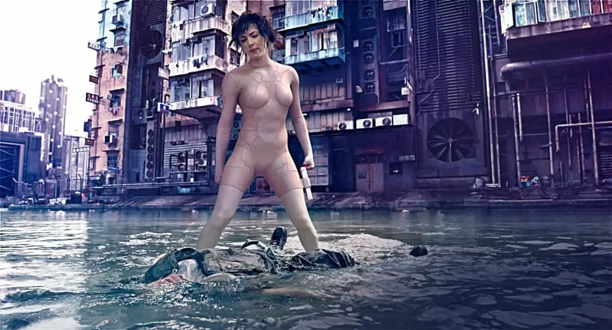
It was important to have the spirit of Hong Kong as the Niihama Prefecture in the movie too. Hong Kong has always been a gatepost between East and West, an intersection between old and new, where tradition meets modernism. In one moment you can go from high-rise, high-tech, steel and glass architecture to bustling street markets that could be from 200 years ago. Furthermore, Hong Kong is an island with a microclimate. There’s often an atmospheric haze over the city, that catches the ambient light in a very particular way. It creates a specific hue at night as a result of the multitude of neon and LED lights that are trapped in the water particles.
How did you decide on the aspect ratio for the production?
JH: For me, The Ghost In The Shell was always about 1.85:1. The main reason is that Hong Kong is a vertical city and I knew we were going to extend the horizon even further using a combination of CG, miniatures and plates to make our city more futuristic. Anime has been traditionally composed in 1.85:1 and the format lent itself to my aspirations for composition and blocking.
Explain your camera choice?
JH: The visual journey of Ghost In The Shell started with the early development of the ARRI Alexa 65. I shot tests with the camera whilst it was in its final stages of development. Then Rupert and I used it on a Halo commercial together, with an eye to possibly using it on Ghost. I knew that it had the resolution to handle the various deliverables that would be required and perhaps more significantly the ability to reproduce the subtlety of colour. I’ve always liked the Alexa colour space and this camera allowed me to underexpose further whilst retaining integrity in the low end of the curve. Perhaps most importantly the Alexa 65’s medium format sensor brings the background forwards, to give a slightly flattened perspective in the spatial relationships between objects in frame. Thus I could employ a wider field-of-view with less distortion of the image, which was perfect for the anime aesthetic I was pursuing.
We shot some tests in 1.85: on the Alexa 65, and they were very impactful when projected. However, I had to rethink my lens choices and how to use them in conjunction with the on-set lighting in order to echo quality of the anime.
The anime of Ghost In The Shell was created using a mixture of cell and computer animation and I was interested in using a camera of inherently high-quality but then degrading the image using lenses, lighting techniques and the correct amount of atmosphere. I wanted to extend the parameters of digital colour cinematography by defining a refined and highly-controlled colour palette. I did not want a brittle image or primary colours but a sumptuous painterly quality.
What research did you do as regards the lighting requirement?
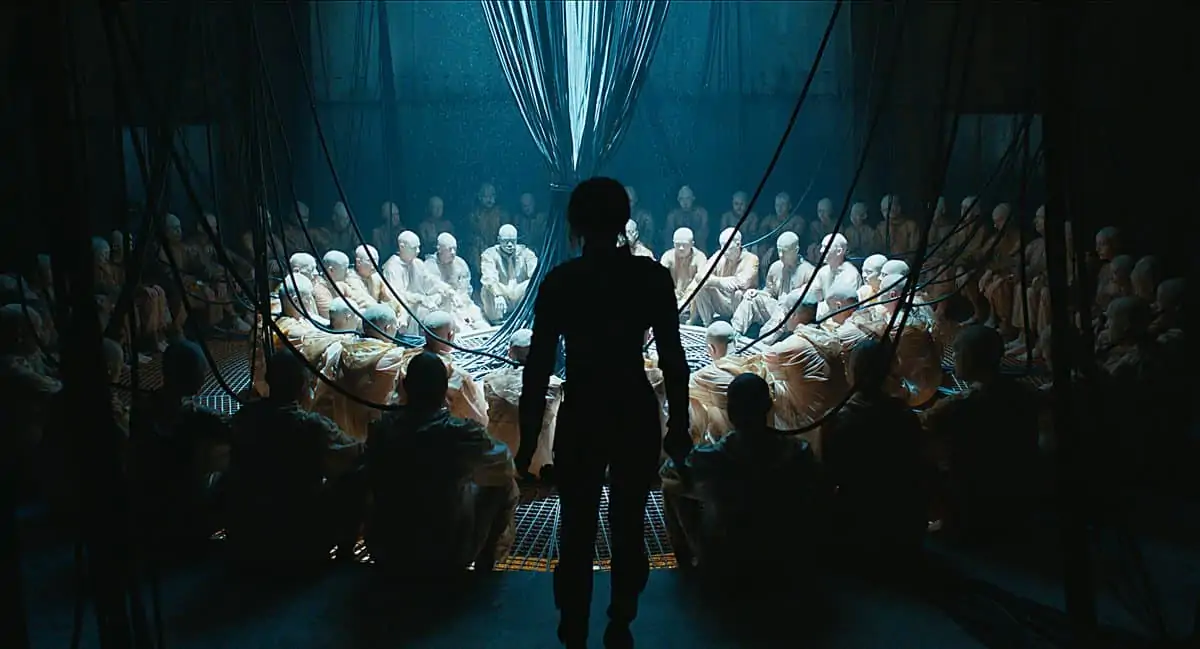
JH: The colour palette of anime films such as Ghost In The Shell and Innocence are unique. The quality of the light is elegant, considered and highly-refined. As the film’s architecture in based on Hong Kong, I took around 2,000 photographs of the city during an early scout of its architecture, signage and its unique properties, including the quality of atmospheric haze at night. I started to analyse and cross-reference these with the original anime. The result was that I came up with a palette of 28 colours, my colour story for the film – a complex mix of subtle secondary colours, cyans, greys, violets, ambers, cool white light, as well as accent colours. The big creative challenge was how do you reproduce a palette of that complexity and then control it?
I started experimenting with LED lighting in all its different guises, but initially most of the fixtures appeared a bit too crude in terms of their colour rendition, I could not get where I wanted to in terms of subtlety. From my tests I found that Digital Sputnik lights, with their six-channel colour mixing, were the most sympathetic to what I wanted to achieve. In addition they maintained colour consistency throughout the range of dimming, critical as I was using many interacting lighting effects.
I also wanted to use a lot of practical lighting and I knew there was going to be a lot of in-built lighting in the sets so I approached Mike Bauman at Lite Gear, to see how they might develop their four-channel RGBW fixtures. Ultimately we added Tungsten-white and amber to a prototype light and manufactured six-channel LED lighting strips. This developed into a unified strip and manufactured it into a product called the Cine 6. They also adapted their LiteMats to suit my purposes, as well as creating many custom fixtures, which we built into sets, props and costumes.
At this point I knew that I could mix the complexity of colour I desired, but I also wanted my colour palette to be universal, to be available on every lighting fixture I was going to use. Along with the Digital Sputnik and Lite Gear fixtures, I knew I would require RGB fresnels so I selected ARRI L5, L7 and L10s. ARRI SkyPanels were deployed in soft boxes along with Creamsource Sky lights. I used a spectrometer to analyse the RGB values of each of my 28 colours. This base was fed into other units as in order to replicate the palette. Ultimately each colour on each unit was subject to the interpretation of the camera, so mixing by eye to the monitors in P3 colour space with a LUT was the only way to guarantee total accuracy. It was quite a long and involved process, but we got there in the end.
How about the lenses?
JH: I was looking for particular qualities in the lenses. I knew I needed to shoot in low-level available light in Hong Kong for the location work, so I wanted the lenses to be as fast as possible. but without veiling flares. I was also looking for slight halations in the highlights and a fall-off in focus to edge of frame. As I pay great attention to faces, and would be photographing Scarlett, the quality of the skin and rendition of skin tones were particularly important. I was also looking for contrast. With all of this, the lenses had to have absolute colour consistency across the range of focal lengths so they could accurately render the subtlety of my colour palette.
I started testing lenses, but none of them quite suited the image characteristics I wanted. So I approached Dan Sasaki at Panavision in LA, and explained what I was looking for. He was very excited by my vision for the film and custom-built a set of lenses for the project. This included 40, 50 and 75mm and 100mm high-speed lenses as well as a 135mm macro. The lenses were somewhat based on Panavision Sphero 65’s series but had some original characteristics. I also asked Dan to build a 29mm wide-angle that was especially distinctive, the only one of its type in the world and it became our signature lens.
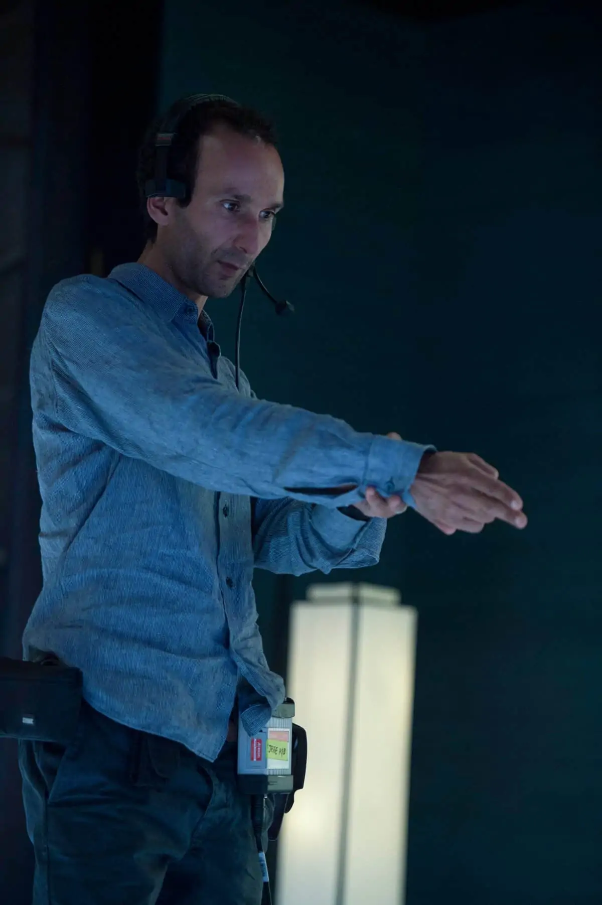
"Whilst we wanted to honour the anime style we realised it would not necessarily translate directly or easily into live action. It soon became apparent that we had to approach it more like a substantial conceptual design project, and there would need to be a lot of interaction between departments to produce the final look."
- Jess Hall BSC
Tell us about the resources in Wellington?
JH: One of the huge advantages of shooting in Wellington is that the resources are all very close at hand. Park Road Post, where I viewed tests and dailies, and WETA workshop, who made the prosthetics and props, are just a five-minute drive from Stone Street Studios. This meant I could pre-light a set or shoot a test and then quickly view the latest advances in the props and prosthetics or watch projected dailies efficiently. Each of these facilities has amazing, experienced people.
Who were your crew?
JH: Apart from Pete McCaffrey, who operated A-camera and who hails from Australia, I had a mostly local crew in New Zealand. David Elmes from Sydney was the A-camera first AC with Jake Iesu as his first AC. My B-camera operator and second unit DP was Patrick Loungeway. David Brown was the gaffer. They were all great collaborators. On the workflow side, my DIT was Mike Urban, supported by Stephanie Ng as the lead onset data wrangler, who both did a great job in collaboration with the team at Park Road Post.
Can you give us some details about the workflow?
JH: At one point we had five Alexa 65s on first and second unit, shooting 5K ARRIRAW and generating a massive amount of data. By capturing in 5-perf 65 mode 1.78:1 on the A65 we economised somewhat on the data. Thanks to a fibre-optic link between the studios and Park Road Post, the workflow was fast, and I could view projected dailies of the day’s takes every evening.
Did you create any LUTs or do any on-set grading?
JH: Yes, but not much. During pre-production I designed one LUT with Yvan Lucas, senior colourist at The Shed in LA. I used that LUT for just about every shot during production and I made only a very few minor colour changes on-set.
Early in pre-production I proposed a workflow entirely in P3 colour space. This began with on-set monitors, was translated through dailies and into the DI. P3 has a wider colour gamut and was therefore better able to capture my complex colour palette than Rec 709. By working in P3 throughout we maintained absolute colour consistency throughout the process. It also meant that VFX knew exactly what I was intending in my lighting design. They could track my colours and the position of fixtures through the metadata that was output from my lighting console and there was no colour shifting as we operated in a single colour space.
What was your strategy behind the camera moves?
JH: Whilst it has plenty of action, Ghost In the Shell is an existential story. The idea behind the camera essentially originates from The Major’s character. Neither machine or human she exists in what I termed “a third space”. I wanted to create an uneasy, exploratory but not self-conscious, way of moving the camera that expressed something of her subjectivity. We used a variety of means with this purpose in mind: Steadicam, Technocrane, Mövi rig, descender rigs. Often we used a stabilised head on a dolly without tracks enabling us to create non-linear moves with stability.
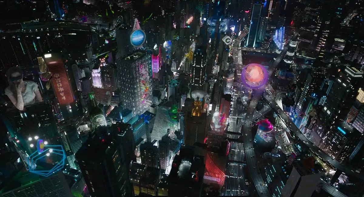
There are also four signature shots in the production when the image travels dynamically between different parts of the city. The first of these is where we establish the cityscape, moving through its canyons and multi-layered freeways, past Solograms (3D holograms) and resting in a close-up of The Major. I termed these shots our Ghostcam. These shots integrate live-action photography, aerial plates, CG-elements comprising of photogrammetry techniques and LIDAR scans of the actual Hong Kong locations. I worked closely with Guillaume Rocheron, VFX supervisor, and his previs team to create these Ghostcam sequences.
Did you work from storyboards?
JH: Yes. Almost the entire film was storyboarded. Rupert placed me in charge of that early in pre-production. I worked with three or four artists in various time zones, and would review their work with Rupert at the end of each day. During this process we really defined the structure and pace of the film.
You also used a photogrammetry rig to create the moving holograms. Tell us about that?
JH: Among the visual motifs in the cityscapes are what we called “Solograms” – live-action holograms of things like kendo fighters or a geisha pouring – suspended in the air. We wanted to create these in-camera, rather than in CG. I’ve always taken an interest in multi-camera array systems and began looking at what was being done on the conceptual edge of array-rigs at MIT and Stanford. They were interesting but too low-resolution for our purposes. In collaboration with Dayton Taylor at Digital Air we decided to build a universal capture or motion photogrammetry rig. This was essentially a dome, fitted with 80 video cameras recording simultaneously and in sync. The process created an asset that could be rendered from any point of view and, unlike conventional 3D scans, it captures the original motion of the performance photographically. The resulting scans could then be relit and rendered sequentially in post production to reproduce the original performance in harmony with the CG-constructed backplate and camera moves, before being composited into the full scene. I believe this was the first rig of its kind and it was exciting to be part of this process.
Give us some details about the final DI?
JH: I’m really enjoying the DI process with Mike Hatzer at Technicolor in LA. Mike comes from a photochemical background, so he favours a points system. The process is very precise and consistent, and lent itself very well to this project.
How do you feel about the final result?
JH: Rupert is an incredible partner and gave me so much trust and freedom to create, whilst also providing valuable guidance and insight. We had the support of Oshii who directed Ghost In The Shell the anime. The entire team visited us in Hong Kong at the end of our shoot, and were gracious and complimentary about the work we were doing. I hope the fans enjoy the film as much as I enjoyed making it.
