Cinematographer Sam Care shares the production story of Marcella series 3
Jan 25, 2021
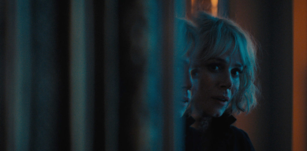
As the popular ITV drama series Marcella returns to our screens, cinematographer Sam Care reveals how he teamed up with director Gilles Bannier to push boundaries and create a stylised look while staying true to some of the series’ classic recurring themes.
Initial impressions…
I had really enjoyed the first two seasons of the show and the depth of Anna Friel’s lead character (Detective Sergeant Marcella Backland). When director Gilles Bannier first contacted me about shooting season 3, I was excited as he described it as a re-boot season, with a largely new set of characters and setting. The story is now set in Belfast where Marcella Backland has taken on the identity of Keira Devlin and is working undercover to infiltrate a wealthy organised crime family (The Maguires). This season has an amazing ensemble cast of Amanda Burton, Martin McCann, Hugo Speer, Aaron McCusker and Michael Colgan joining regulars Anna Friel and Ray Panthaki. We had the scope to come up with a new visual style for the show this season, while staying true to some classic recurring Marcella themes, like her fugue states which evolve in the new series into more of a split personality disorder between her undercover and real personas.
Collaborating with director Giles Bannier…
This was my fourth collaboration with Gilles Bannier, a French director who is now based in the UK. I had previously worked with him on two seasons of The Tunnel for Sky Atlantic and In the Dark for BBC. We certainly had developed a shorthand and knew each other’s visual taste. On Marcella we decided to challenge this and push ourselves out of that comfort zone as much as possible. Our previous cinematography was very natural both in terms of camera and the lighting, which was always motivated by reality. On this show we decided to create a more stylised look and not worry about realism to the same degree. Marcella is a heightened show that should really get inside the lead characters head and the visual possibilities for this are very exciting.
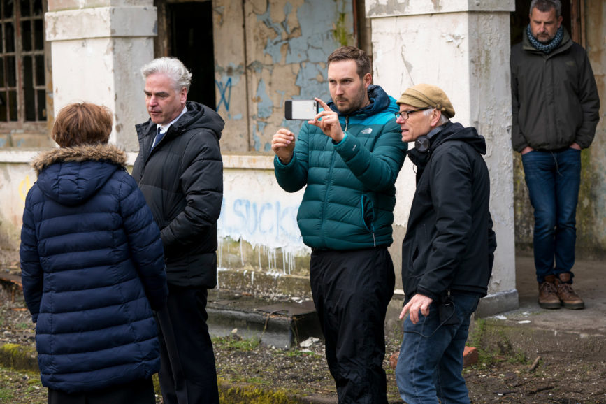
The core team…
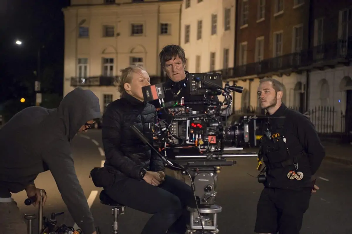
We assembled a fantastic local camera, grip, and lighting crew. A-cam camera operator Angus Mitchell whose handheld skills had attracted Gilles and I to working with him. A-cam focus puller Paul Christie kept things sharp perfectly, even in some tricky improvised handheld moments with no marks. A-cam loader Erin O’Rawe was a fantastic organiser and positive influence on set and to the whole crew. Our key grip was Nick Chester, a New Zealander now based in Belfast. He came up with some great bespoke rigs for us including a descender rig and ronin hand off shot at the end of episode 1. He also created some great car rigs to utilise the Sony Venice’s Rialto’s extension system, which allows the removal of the front image block of the Sony Venice for mounting into a much smaller housing.
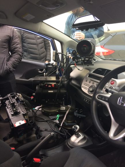
Our lighting team was headed up by gaffer Seamus Lynch who I enjoyed working with immensely. His experience was invaluable and his understanding of lighting and enthusiasm for discussing it were fantastic. He had a great team around him too, including Best Boy Ger O’Hagen, Stuart Flynn and Gino Lynch.
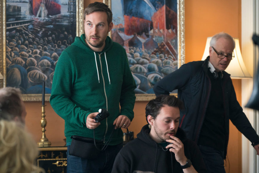
References, inspiration, and research…
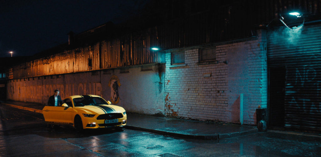
We looked at some classic references such as The Godfather shot by Gordon Willis ASC and The Yards shot by Harris Savides ASC for their golden colour temperature (which we used Antique Suede filters to replicate), use of top lighting and their photographic sense of darkness. Before this I was afraid of dark costumes against dark walls, but I embraced it completely on this one! Animal Kingdom shot by Adam Arkapaw ACS was also a reference for the use of cyan and metal halide colour temperatures, which we used in the Belfast estates extensively. We borrowed elements from many references, but the thing that tied them all together was a sense of mystery, timelessness, and tragedy.
Creative discussions and bringing the vision to life…
All our previous shows had been framed for 16:9, shot on the Arri Alexa with Arri/Zeiss Masterprime spherical lenses. So, for this one Gilles and I decided to embrace something new to go for a widescreen aspect ratio of 2.00:1 and shoot with anamorphic lenses. I had previously tested shooting on Alexa with anamorphic lenses and cropping into 16:9 or 2.00:1 ratios. I felt it hadn’t been worth it in terms of capturing the lenses specific characteristics or a good enough resolution. This is because the most interesting parts of anamorphic lenses tend to be in the corners and edges and by throwing away so much resolution (in the 16:9 crop) you end up with quite a forced look. However, with the influx of Large Format cameras on the market I decided to revisit this. I tested the Red Monstro, Alexa LF and Sony Venice. All the cameras produced impressive results and had their own strengths and weaknesses in terms of image quality and camera builds. But in the end, we settled on shooting with the Sony Venice camera in 4K anamorphic mode to make extensive use of its native 2500 ISO setting. I was also impressed with its reproduction of colour and it’s flexibility in the grade too. After testing a variety of anamorphic glass, we chose the Russian Elite S7 anamorphic lenses from One Stop Films in London.
Colour choice…
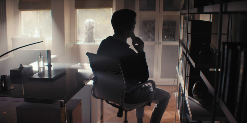
We had two distinctive worlds we were portraying onscreen. The Maguires’, mostly set at the wealthy organised crime family’s mansion and the world of the Belfast estates, which they control. We decided to give the Maguire’s family story and locations a golden look of wealth and affluence and shot these scenes with Antique Suede filters on the camera and warm gels on the lights.
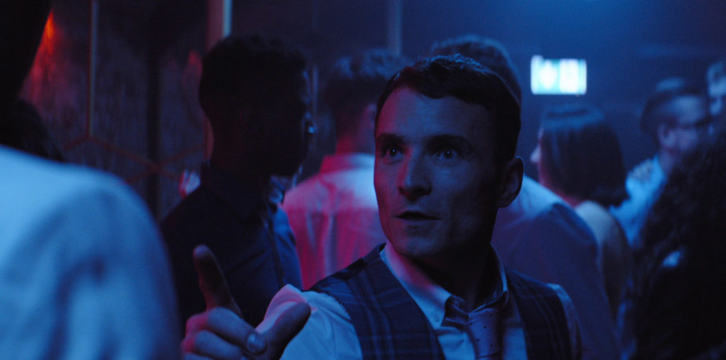
For the other world of the Belfast estates, we went for a colder look by setting the camera’s white balance to 4000 kelvin in daylight scenes. For night scenes we used a combination of actual metal halide fixtures for street lighting and HMI sources gelled with White Flame Green and 1/2 CTO.
Using framing and composition to tell the story…
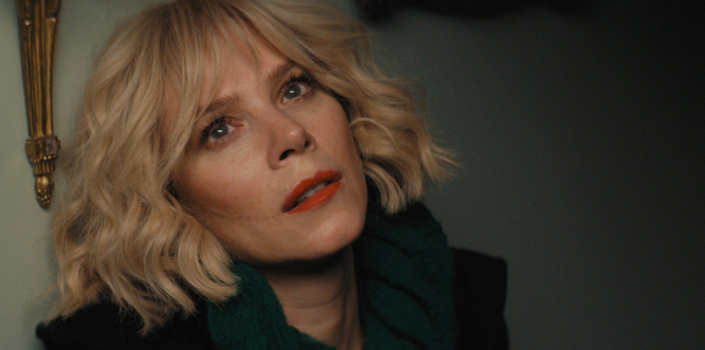
Gilles and I love discussing the camera aesthetic for projects. On this we got excited by the idea of using negative space and short sided eye lines to show Marcella’s sense of isolation and disconnect with people around her. We also pay particular attention to the use of eye lines. When to use over the shoulder, clean or direct POV shots. It’s Marcella’s story so subjectively we wanted to feel closer to her than anyone in scenes with a large family gathering. We were very inspired by the use of eyelines in The Silence of the Lambs shot by Takashi “Tak” Fujimoto, ASC. They use direct POV shots a lot for the lead character and have the actor look directly into the lens. When shooting reverses, they used tight eyelines on the edge of the mattebox, which creates a lot of tension and makes the audience feel closer to Jodie Foster’s character Clarice Starling. It’s a great example of the camera creating cinematic subjectivity.
The camera package…
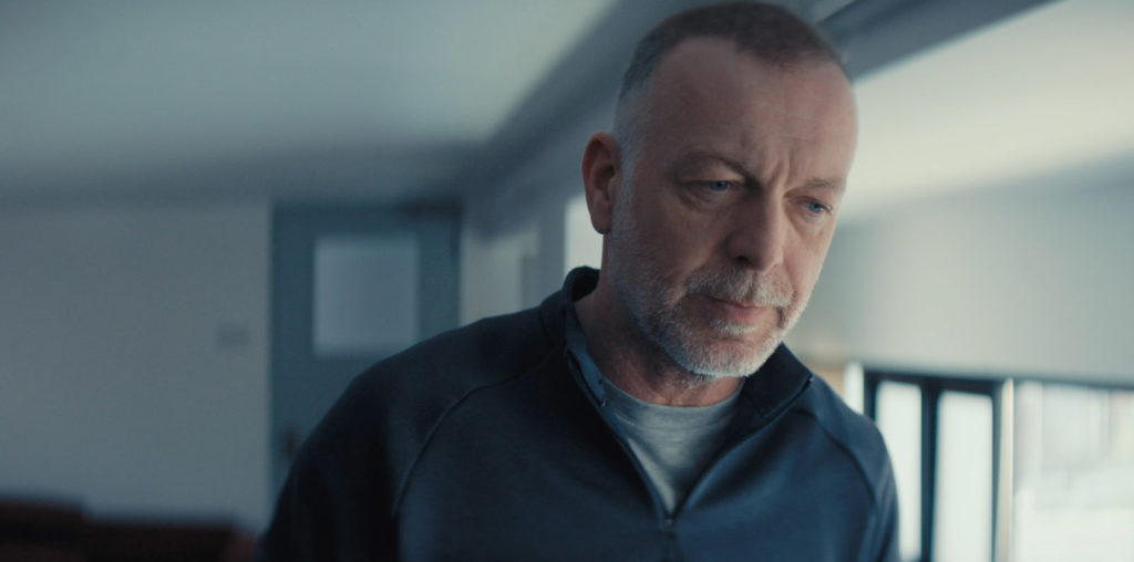
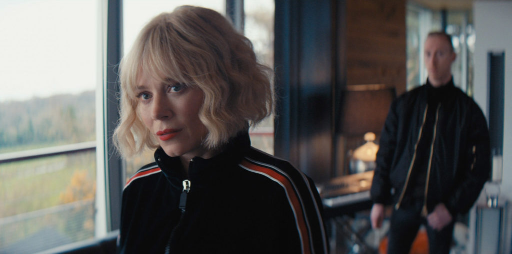
Sony Venice camera in 4K anamorphic mode with Elite S7 anamorphic lenses from One Stop Films in London. We supplemented these with a Cooke 35-140mm T3.1 zoom lens. The main camera package was supplied locally by Acorn rental in Belfast. We chose the Elite lenses as they had wonderful creamy softness in combination with the Sony sensor and they had an interesting oval focus drop off around the edges which we felt matched Marcella’s precarious mental state visually. The camera’s native 2500 iso mode helped me achieve a stop of T4 on the Elite lenses at night and low light scenarios in particular. For scenes where Marcella was in a heightened state, we shot at T2.8 to accentuate the lens’ focus drop off and get inside her mind. It was very much a combination of those lenses and that sensor that created the look for this season. When shooting digitally we no longer have older celluloid tools such as lab techniques and film stock choices, I tend to really spend time and effort searching for unique combinations of sensors, lenses and filters which will give me a specific look.
Telling the story through camera movement…
For the Maguires’ story we decided to shoot primarily with the camera on a dolly and head to represent their stability and control over the world. We used slow tension building tracking shots at times while also embracing the camera’s stillness to create the tension at other moments.
For the other world of the Belfast estates we shot primarily handheld to represent a sense of raw instability and the lack of control it’s characters have over their future. As the series progresses and the dynamics start to shift, we begin to merge these two visual styles together more and more. On previous shows we had used Steadicam extensively but on this one we didn’t use any. In fact, we only used a gimbal for one day in combination with a descender rig and ronin hand off shot at the end of episode 1. I like to create rules for the visual style in prep and give ourselves limitations to the type of kit we use, so the options are not endless.
Camera tricks and techniques…
One of the most interesting elements of Marcella’s character in previous seasons were the dissociative fugues she experiences and the way they were visualised. In season 3, these fugues have evolved into more of a split personality disorder, as Marcella loses touch with the reality of her undercover identity and her real self. In moments where this emerged, we wanted to use a new visual technique to represent this on screen. So, I developed some bespoke diopters for this look. I cut holes and shapes in old diopters of different intensities, as well as placing optical glass shapes over diopters to cancel out their magnification. Then we shot and focused through these sections of the diopters so the surrounding glass knocked the edges of the frame massively out of focus and introduced some double imaging to represent her split personality. We also shot Marcella into mirrors with a fractured double image effect to continue this visual theme.
Lighting approach…
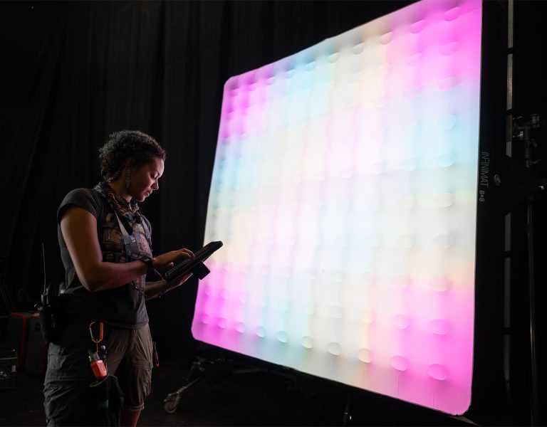
I used LED fixtures extensively on the job, more than on any previous job. They just give you so much quick control to colour temp and dimming especially for fast paced tv schedules. The workhorses for interior scenes were ARRI SkyPanel S360-C’s, S60-C’s, Asteras LED tubes and LED ribbon (95cri +) inside practical lamps shades using small battery powered wireless lumen radio drivers. To control all these LED fixtures, we used a portable wireless DMX solution controlled via an iPad interface through the app Luminair 3. The speed and portability of this system gave me instant studio-like control. Gino Lynch who oversaw it, and always lived by the monitor next to me so we could make quick adjustments to the fixtures while setting up and rehearsing the shots.
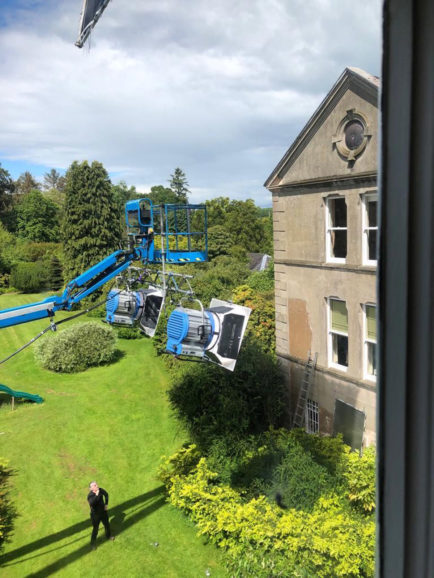
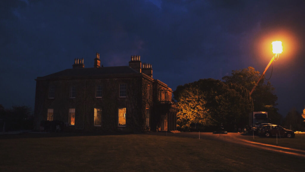
For nighttime scenes at the Maguires’, Gilles was keen not to use any moonlight motivation. So, we decided to continue the warm golden look of the location at night by using doubled layers of full CTO gel on our fixtures to create a sickly warm night time look. For our night exteriors Seamus and I used full Wendy lights with double full CTO on them. We had one in each main direction around the front of the house and used one at a time depending on the camera’s direction, as either a back light or side light. We also used 5K and 10K tungsten fresnels dotted around the gardens to create pools of light in the background of shots. I shot most scenes at T4 so we needed quite a bit of light to achieve this stop at night. I was happy with the results and the decision to use a warm colour temperature even for a rural night exterior seemed strangely more motivated in the finished scenes than I feel cooler moonlight would have been. A great example of Gilles pushing us to be bold and leave a convention behind to great success.
DI, workflow, and the final grade…
Marcella 3’s postproduction was completed at Belfast’s Yellowmoon Post and graded by their colourist Scott Ferguson. I was shooting another project during the grade period, but they kindly arranged for me to be able to fly over and grade during my weekends off. I found the Sony Venice’s colour capability and flexibility in the grade to be quite incredible as well as its dual native ISO options which allowed me to shoot at 2500 ISO and helped me to light for my preferred stop of T4 on these beautiful pieces of Russian glass.
Colourist Scott Ferguson adds: “We were fortunate on Marcella to have the time at the beginning of the process to shoot some tests and to work on a show LUT for our dailies. I always find this hugely beneficial as getting the dailies to look at least in the ballpark of what you hope to achieve in final can smooth out the final grading process and sign off, as you’re presenting a final look that is familiar but also much more nuanced and polished.
“Sam told me early on that he planned a shoot anamorphic on the Sony Venice and wanted a look that would harmonise with that. So, we tried to come up with a softer contrast film look to complement the pristine digital aesthetic the Sony Venice produces. It became clear to us very quickly when working with the Sony Venice (a first for me) that we could do whatever we wanted; I didn’t have to push and pull the image to get beautiful results. So we got to work trying to dirty up our digital image, keeping the shadows thick and cool, and highlights warm with a nice roll off.
“Our main location was oppressively, almost sickly, warm while everywhere else stayed cooler, all the while maintaining consistent skin tones. This was a big departure from the look on previous seasons, a risk for sure, but the producers and directors were behind us. New season, new city, new look and I couldn’t be happier with what we were able to accomplish. This was made possible by the images our fantastic DPs Sam and Dirk (our second block DP) were able to capture but also thanks to the latitude that we were granted by the Sony Venice.”
Overcoming obstacles…
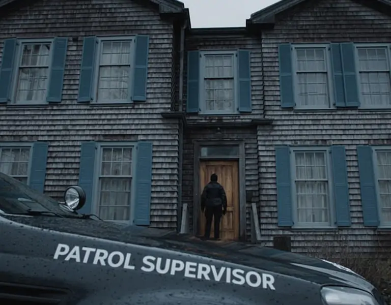
Our main location was the Maguires’ mansion, which had some huge lighting challenges. A south facing mansion with dozens of windows always poses a challenge for a cinematographer in terms of lighting control. Planning was everything to achieve a look of consistent light over lengthy daylight scenes. The solution was careful scheduling around the light direction as well as using a combination of large 20 x 20 eyebrows on machines over windows to control the sunlight. then either lighting directly with 18K HMI fixtures or bounced M90 HMIs on low stands into frames just above windows for a softer lighting effect.
Production highlight…
My proudest moment was after we had achieved a difficult oner for the end of episode 1. It included a 360-camera pan, a descender rig and gimbal hand off and lighting a huge staircase, hallway, corridor and living room without any lights on the floor at a stop of T4! With some careful, tricky lighting rigging, lots of planning and rehearsal we managed to do it in three takes at the end of an exhausting day and week! Kudos to my crew for being so good and for our grip Nick Chester for suggesting how we could achieve the shot with the descender rig.
Lessons learnt…
I learnt to not just do what is conventionally done, but to challenge yourself and your tastes as a filmmaker to see what happens. The boldest decisions that Gilles encouraged me to take on the show were the most successful in the end. It’s all about working with directors whom you trust and who push you to be bold and take risks.
Sam Care is represented by Casarotto Ramsay & Associates. The first two episodes of the new series of Marcella will air on ITV, Tuesday 26th January at 9pm and 10:05pm. All eight episodes of the series will then then be available to view on the ITV Hub.


