Lensing a legend
TV pioneer Noele Gordon returns to the spotlight in Nolly, one of streaming service ITVX’s flagship series. Cinematographer Sam Care tells us how he crafted a range of period settings for the show – with the help of hundreds of tungsten lamps!
ITV’s new mini-series, Nolly, centres around the life and work of Noele Gordon, star of TV soap Crossroads, and spans her whole life, from her early TV days in 1930s, her fame in the 1970s and her later years in the 1980s. The show is a love letter to TV production of the era and explores the on and off-screen life of this amazing woman, why she was fired from the show and how she went on to reinvent herself after Crossroads in her latter years. Produced by the team who made award-winning mini-series It’s a Sin – producer Nicola Schindler at Quay Street Productions, writer Russell T. Davies and director Peter Hoar – and starring Helena Bonham Carter, Mark Gatiss, Con O’Neill and Augustus Prew, it was fair to say that I was immediately excited by the project.
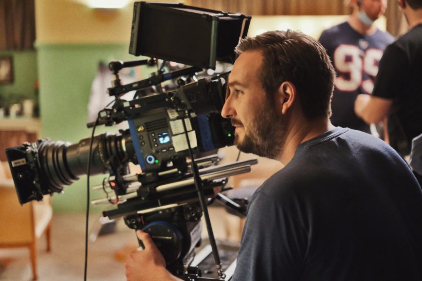
Our gaffer Steed Barrett shared my enthusiasm. “I have to admit that my eyes lit up when I saw the recipe for Nolly,” he says. “A writer that needs no introduction in Russell T. Davies, an amazing director who I’ve been lucky to work with on past productions in Peter Hoar, our DOP Sam Care, with whom we got fantastic results on our last collaboration together (Sherwood), and to top it off, acting royalty Helena Bonham Carter, in a period drama which heavily features lighting rigs. What more can a gaffer ask for?”
Developing the look
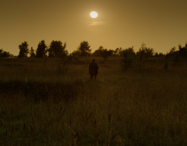
From the start Peter and I saw a mixed media approach for the look of the show. The story spans a long time and explores Noele’s on and off-screen persona so we thought a variety of shooting formats would help to tell this story. In the end we settled on a mixture of three, with different aspect ratios. The main format was Sony Venice with vintage anamorphic lenses framed for 2.00:1 aspect ratio, authentic Ikegami HK 323 1980s broadcast cameras in 1.33:1 ratio (from Golden Age TV) for the in-camera footage from the show, and S16mm Kodak Vision 3 500T 7219 on an ARRI 416 camera in a 1.66:1 ratio for specific scenes which took place in the 1930s-1950s and were key moments which defined Noele’s life and character.
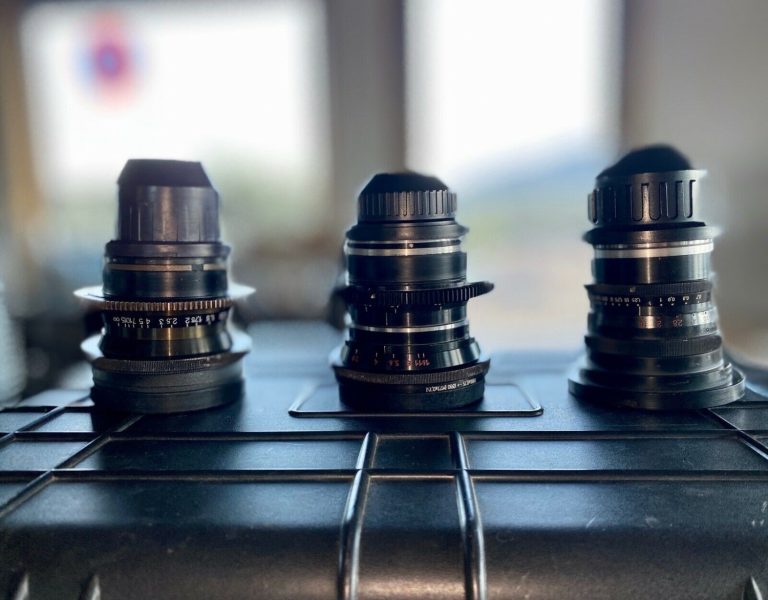
Once we had decided to shoot Scope as our main look I set out to find the right set of anamorphic lenses for the show. I started testing out some modern sets of anamorphics and using heavy diffusion to help create the period look but it soon became apparent that the show needed a set with vintage in-built diffusion. I asked Jonathan Iles at One Stop Films, the London-based rental house who are vintage anamorphic experts, who serviced the show, to come in and test all their anamorphic sets. We tested around 10 sets including Todd AOs, Cineovisions, Elites, Kowas and Lomos, but in the end fell in love with the Meru anamorphics. They are designed by Stephen Gelb, owner of Lensworks Rentals in LA, and combine vintage anamorphic fronts rehoused with Leitz primes by True Lens Services, a winning combination with very few sets in the world. We had a set of 35, 40, 50, 75, 90 and 135mm. The Meru lenses have a wonderful, creamy softness to the overall image and skin tones. This really helped for our period look and for Helena’s close-ups. I used a ⅛ Black Pro Mist filter in front of the lens to give the highlights a slight blooming halation so we could enjoy all the light sources in shot in the TV studio and theatre locations.
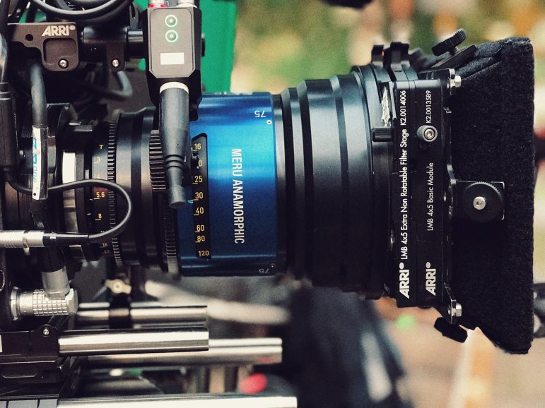
I shot the Meru lenses at T4 throughout for optimum results, however the 35mm benefited from the extra edge sharpness at T5.6. So, I tended to light sets to T4 at 1250 ISO on the Sony Venice, then switched to 2500 ISO when I used the 35mm to get the extra stop. The Venice’s dual native ISO and 2500 ISO capability was really handy considering the light levels needed for these lenses in some of the larger locations and night-time set ups. I also chose the Sony Venice because of its wonderful representation of colour and grading flexibility.
Collaboration is key
This was my second project that year shooting in Manchester so I was lucky enough to keep continuity with two of my key collaborators, our gaffer Steed and A-cam/Steadicam operator Dan Nightingale ACO GBCT. In addition, Dan had worked with Peter on It’s a Sin, so the three of us were very familiar with each other which makes everything easier. Dan brought so much to this project. Peter wanted some challenging Steadicam oners which Dan executed wonderfully along with some great perfectly timed whip pans – as I would come to find out, these were his speciality. Steed and I had developed a great working relationship on Sherwood, and decided to embrace tungsten light more than ever on Nolly to stay true to the look of the period.
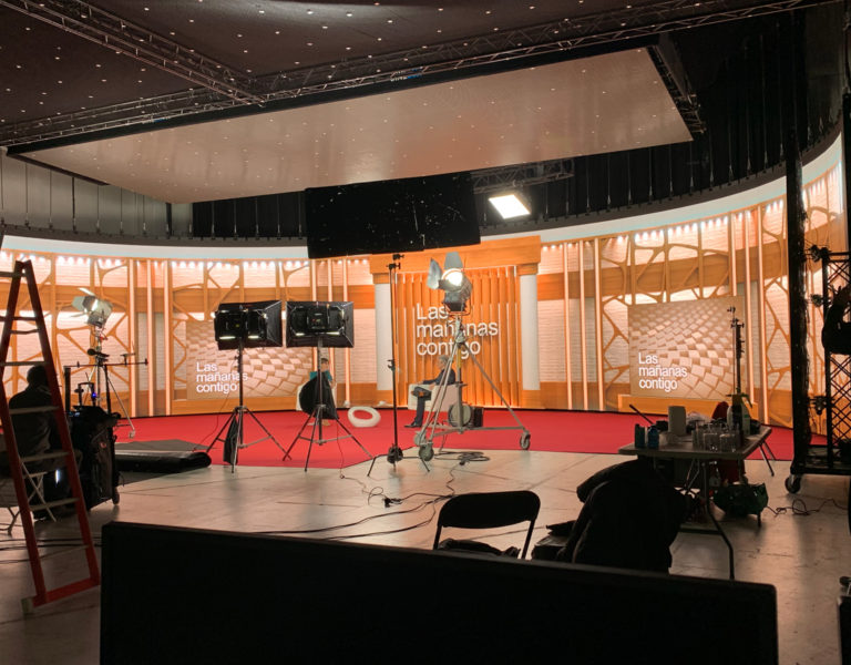
We decided to build the main Crossroads sets in Space Studios in Manchester. The challenge was that we had many long Steadicam shots moving through the whole studio, ending in a close up of Helena. So, I knew from the get-go I needed to have a full studio rigged with period-correct lighting which could be seen in a wide from the edge of the studio but was also soft and flattering enough to light Helena and the other cast up-close. Steed and I visited Panalux to go through all their old lighting sources to find the right period correct ones. With the help of John Lawton at Panalux Manchester, we emptied the London, Manchester, Glasgow and Perivale branches of literally hundreds of tungsten lamps, a lot of which were still in their original paintwork. Considering our budget John really helped us achieve what we aimed to do.
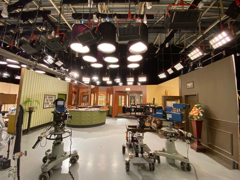
In the end we picked a mixture of 2K Zap light and 2K Bambinos. I went for more Zaps than Fresnels, especially from the front and sides of sets, to keep the light softer and used Bambinos for backlight. In total we had over 200 period correct tungsten sources rigged overhead throughout the studios over eight sets. This was a challenge for Steed, best boy Ross Chapman and rigging gaffer Bill Tracy to power all these heads at once by calculating and balancing the loads between house power and an Aggreko generator (we had almost three quarters of a megawatt rigged!). Bill and Ross had worked in the same era as the show was set and Bill had actually worked in the same studio Crossroads was filmed in. This experience, along with extensive research, was key to orchestrating all the plans such as rigging all the heads on drop arms to look like monopoles whilst hiding any modern rigging and distribution from sight to appear period correct. We managed to shoot all the scenes on the sets without the need for any visual effects to remove unwanted modern rigging.
Steed adds, “Crossroads was shot in a studio with a gantry and almost all lamps were hung on monopoles. Between the art department and my contacts we managed to source only 15 original pieces that weren’t fixed in a studio. Unfortunately 14 of which where decommissioned as they were no longer safe for use, so back to the drawing board.
“Due to there being several sets within the Crossroads studio we needed a way to hang over 200 period fixtures in shot. I went out on a limb and we managed to get hold of enough double hi lifts which aren’t designed to be used upside down and so had to be all slightly modified and individually tightened with Allen keys and extra safety chains used. It was a time-consuming and labour-intensive process but it was necessary as they were all in shot.”
Driving force
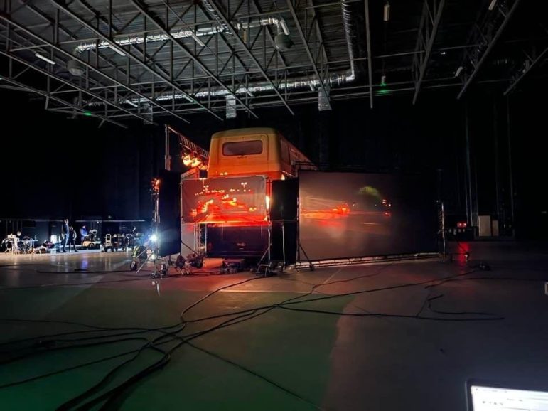
Another challenging sequence was a five-minute period night-time sequence on a moving bus with lots of characters and dialogue. We considered doing this at night on location but it soon became obvious this was going to compromise the scene, not to mention the performances, too much. I called Lester Dunton and asked him about the possibility of doing the sequence in a studio with rear projection to give the illusion of motion. He suggested using 4K video rear projection outside the on-screen windows combined with large LED panels and a lighting video projector to supplement interactive lighting from the same location plates off screen. We also had the ability to grade the projections live and keep all the different projection techniques on different channels to have optimum control. One key element to help sell the effect was the idea that the windows were steamed up to never see too clearly out of them. We also had some tungsten lights rigged on a chase to create the illusion of passing streetlights. Inside the bus we used Astera Titan and Helios tubes rigged inside to provide fill light for the actors. The sequence starts and ends on location so matching the lighting between them was a big consideration and a challenge but I was very happy with the results.
Steed remembers the Venice restaurant interior set proving tricky. After seeing reference shots from the City of Canals, it was apparent that the Mediterranean sun beat down on the almost terracotta-coloured buildings and bounced a distinctive, warm light into the restaurant. “We, however, were shooting this scene on the 12th floor of a period, listed building (with very restricted power) in the centre of Liverpool, not to mention the room had very large south-facing windows,” he recalls.
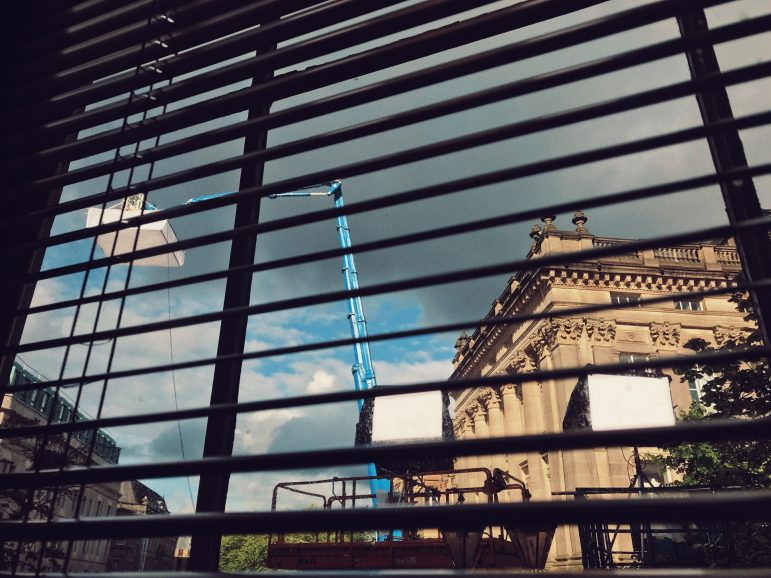
His first instinct was to use a half Dino for each window, but there was no way to physically achieve the height, leaving our team back at square one. “We weren’t allowed to fix any of the period woodwork and the window frames were only a few inches deep, which really limited our options.”
But with a bit of brainstorming, plus some help from Panalux and the art department, they found a new angle. Steed says, “We decided to flat black all the windows with Corex, meaning any changes in the ambient outside wouldn’t affect us. We then got as many Fomex Flexible LED panels as we could fit within the window frames and due to the lightweight nature, we taped them directly to the Corex. The Fomex heads are bi-colour so we had loads of control to add that warmth that this location needed and they are surprisingly punchy. The art department then dressed in the rig with some thin blinds which helped soften the light to look more natural and also opened up options for Steadicam to look anywhere.”
Playing with colour
Colour was an important storytelling tool for us on Nolly. The colour concept was to have a slightly pastel art direction palette for the sets and location and for Nolly’s costumes to have more saturation at the height of her fame, so they jumped out the screen and drew the audience’s eye to her as the centre of attention and the star of the show. As her power and influence in this world diminished over time, we started to reduce the saturation of her costume to communicate this change to her character. We continued this process in the grade with senior colourist Paul Ensby at Picture Shop, who contributed so much to the project and was a joy to work with. I enjoy his visual taste and the subtlety he brought to colouring the show.
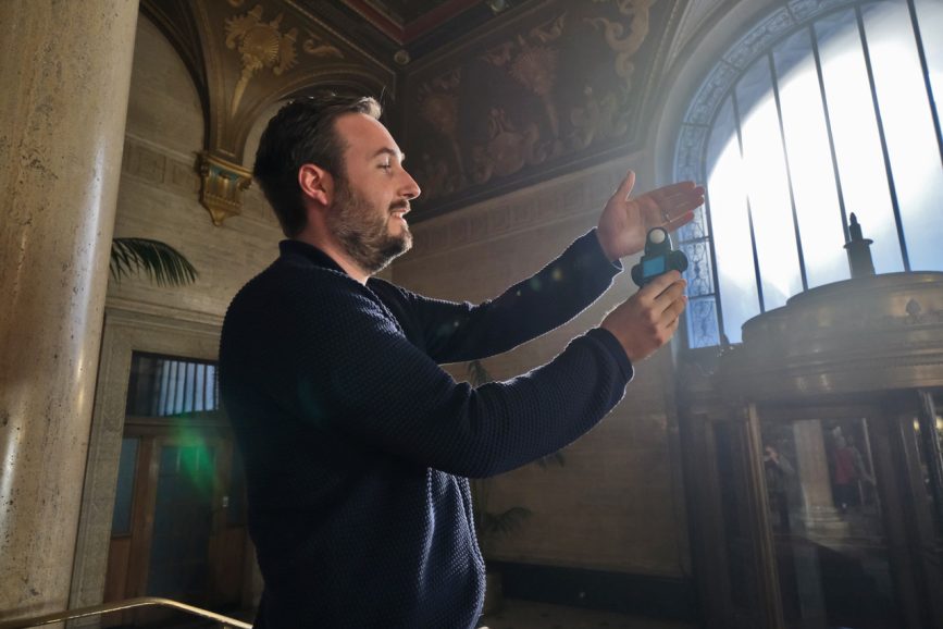
Nolly was a true joy to work on, from Russell’s incredible script to Peter’s inspirational direction, Helena’s wonderful performance, to working with an all-round passionate and talented cast and crew. Every day was a wonderful joy and challenge to overcome together and we had so much fun doing it!


