Overview: Charity is a black comedy that explores the lengths to which it’s possible to go in order to achieve the goals we set for ourselves, despite the circumstances we encounter along the way.
What were your initial discussions about the visual approach for the film? What look and mood were you trying to achieve?
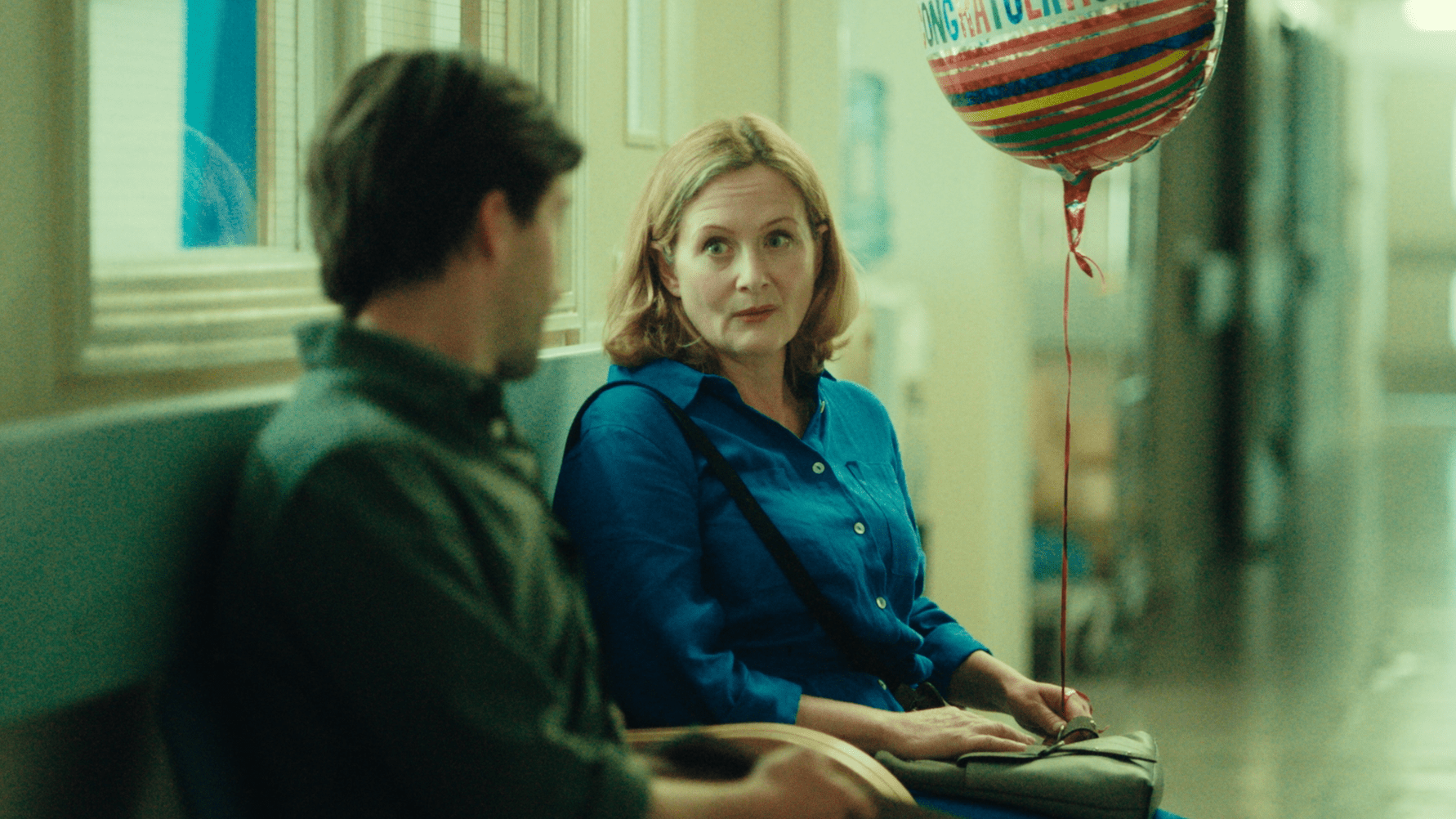
Key to the nuance of the story was the performance of Matt Jessup who played Alex, our lead. We really wanted to feel a proximity to him and create a naturalistic look that supported the honesty and truth he brought to the character. This meant developing an aesthetic that was based around lighting each environment in a way that was unobtrusive to our actors, but still giving the spaces character, In order to reflect each stage of Alex’s journey through the film.
I wanted the look of each space to mirror the sense of desperation that is increasingly prevalent in Alex as the film progresses whilst still keeping the feeling naturalistic to match the realist tone of the script.
What were your creative references and inspirations? Which films, still photography or paintings were you influenced by?
When preparing for a film I try to steer away from directly referencing other films as I often find it limiting and restrictive, instead I try to look more towards art and photography that shares some form of mood or tone that I can relate to my understanding if the script. In the instance of Charity I found inspiration in the work of photographer Rob Bremner. The way in which he captures a sense of closeness and honesty in his portraits brings a real sense of intimacy between you the viewer and the subject. This is something that I tried to build on as a starting point for my own approach to the photography of Charity.
What filming locations were used? Were any sets constructed? Did any of the locations present any challenges?
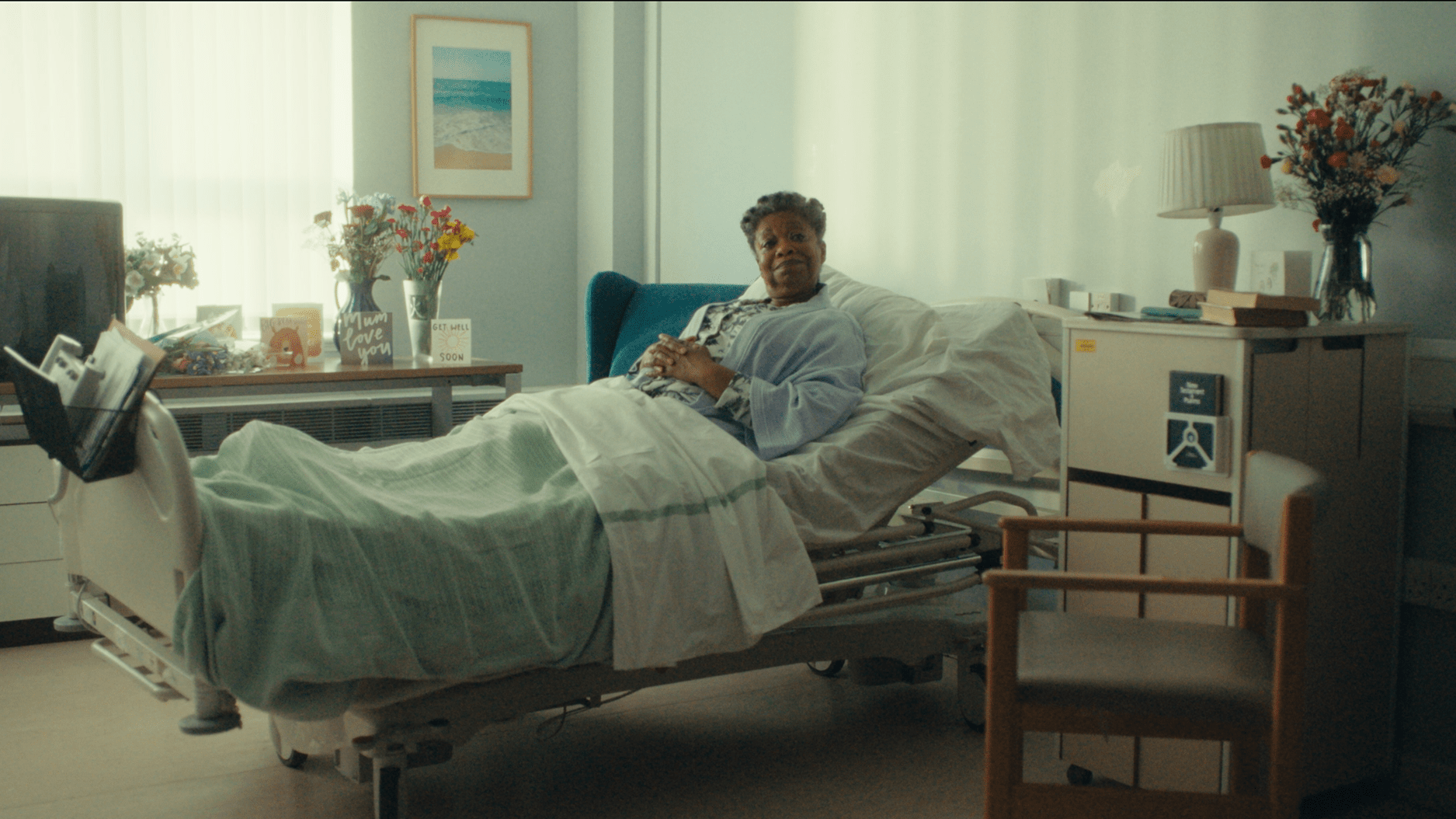
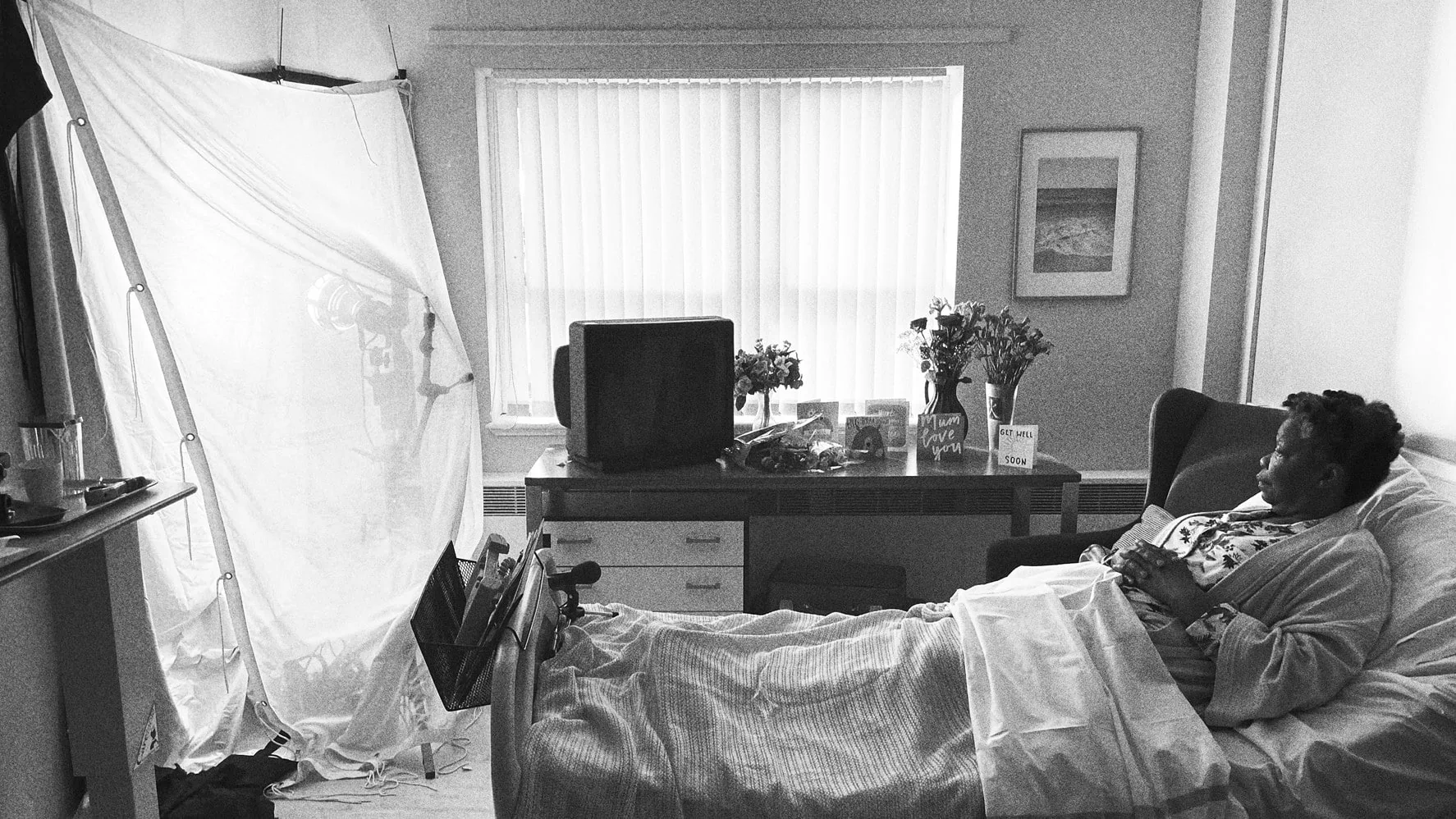
We shot entirely on location and had a real mix of spaces to deal with, from tiny public bathrooms, cars on low loaders to a whole wing in a decommissioned hospital. Finding a convincing location to act as hospital, without constructing a set, in the middle of a pandemic was obviously a challenge. I must thank the people of the Hemel Hempstead General Hospital who not only provided us with a fantastic location to shoot half the film in, but also expertly stitched up my hand after I managed to lodge the blade of my Leatherman into it, whilst derigging on the final day of shooting!
Can you explain your choice of camera and lenses and what made them suitable for this production and the look you were trying to achieve?
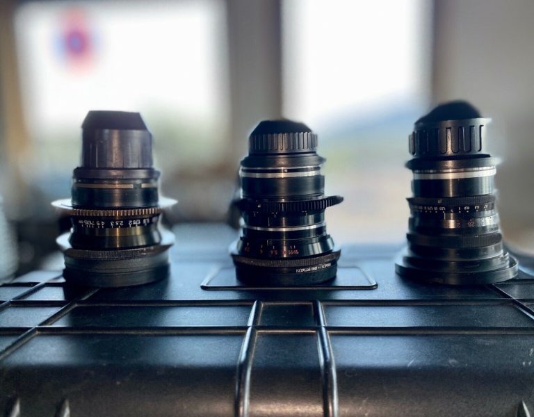
We shot this film on an Arri Alexa Mini with a cobbled together set of Master Primes and Angenieux zooms thanks to the much appreciated combined efforts of Lee Mackay and George Rumsey at Panavision and Claire Parsons at Arri. Our intention with the lensing of the film was to create a real sense proximity between the camera and our actors so I wanted to shoot on clean sharp glass that would allow us real access into the characters without bringing elements into the image that might act as a barrier to them. We also used the speed of the Master Primes to shoot with a quite shallow depth of field to really bring out our characters in the frame. I feel this combination of Master Primes paired with a bit of careful filtration supplied by Eren at Tiffen, provides a marriage made in heaven!
What was your approach to lighting the film? Which was the most difficult scene to light?
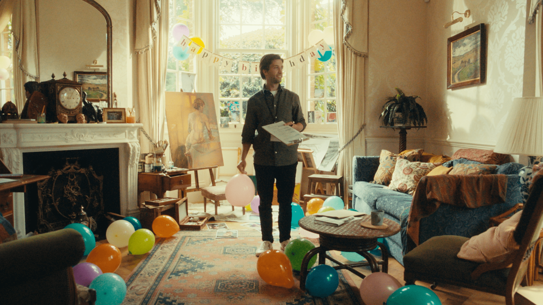
We tried to keep the approach to lighting quite naturalistic, embracing the intricacies of the spaces we were shooting in whilst also maintaining continuity as we were often shooting scenes over several days. The trickiest of these was in the house location which had giant floor to ceiling windows facing South and West. On the first day it was almost entirely overcast and on the second the weather couldn’t make up its mind whether it wanted to rain or be bright sunshine. Classic British summers! But with the help of James Rosen and the rest of the team at Panalux gaffer Harrison Newman and myself were able to put together a comprehensive lighting package that allowed us to cover all bases and maintain control and continuity in a whole range of situations. We employed a variety of large HMI fixtures and smaller LED units alongside a range of practicals including fitting 50+ fluorescent tubes in the hospital so I could have the perfect amount of dirty green spike.
What role did camera movement, composition and framing and colour play in the visual storytelling?
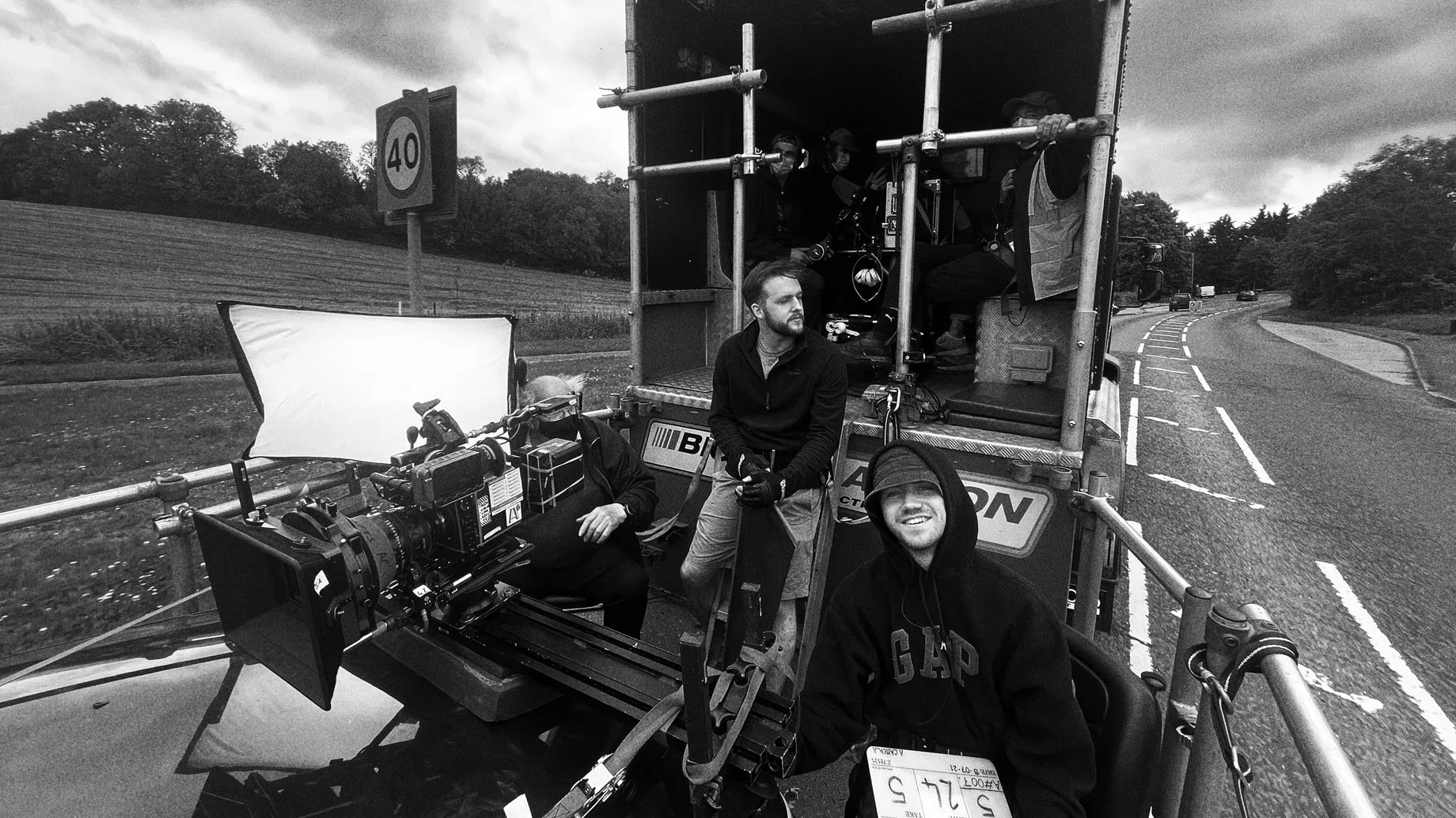
Our intention with the camera was to make it barely felt. So for the most part we employed a dolly and this paired with some excellent Steadicam work from Luke Oliver and Marcus Albertsen, really helped to tie the camera movement to the characters. This allowed them to be the driving force of the action, with the camera giving them the space for their performance without its own sense of agency becoming felt.
What were you trying to achieve in the grade?
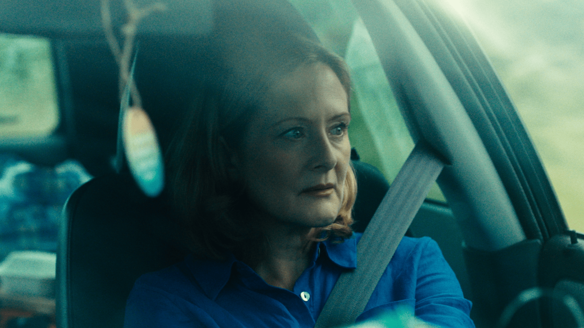
In the grade our main aim was to mirror the journey that Alex our main character embarks on. Our fantastic colourist Vanessa worked to refine the films palette, taking it from a warmer starting point to a greener, uglier world as Alex’s desperation increases.
Which elements of the film were most challenging to shoot and how did you overcome those obstacles?
Achieving the right tone with the photography of the film was one of the biggest challenges. The narrative balances a fine line between dark comedy and drama and the nuance with which we had to handle the script was significant in making sure we sat on the right side of that line. Judging comedy is always tricky and what looks funny on one lens, can become serious on the next lens up. So making sure we were able to capture the humour in the moments that called for it was challenging, but ultimately something I think we succeeded in accomplishing.
What was your proudest moment throughout the production process or which scene/shot are you most proud of?
I’m so grateful for the way that both my camera and lighting teams led by Focus Puller Connor Maloney Hill and Gaffer Harisson Newman worked tirelessly to enable us to achieve all that we did. We had our backs against the wall in dealing with a tough schedule, tricky locations and a demanding script and without their fantastic attitudes and professionalism we would’ve really struggled! My collaboration with production designer Grace Shepherd was also incredibly rewarding. Her ingenuity and keen attention to detail really brought the locations to life and into line with the tone we were trying to achieve and brought substance to my photography.
What lessons did you learn from this production you will take with you onto future productions?
I learnt so many things from this production, but the one that’ll stick with me the most is that at the end of the final day of shooting, it’s best to be exceedingly careful when handling knives. And that its absolutely vital to have a calm first aid trained AD, who’s not squeamish when it comes to blood, to look after you (thank you Jez Marshall)! Also, that shooting at a hospital, whilst it comes with its challenges, also definitely has its perks!

