
Local Colour
Post It Notes / Dad's Army
Local Colour
Post It Notes / Dad's Army
How Molinare’s post team worked with director Oliver Parker and cinematographer Chris Ross BSC to create and finesse the look of Dad's Army.
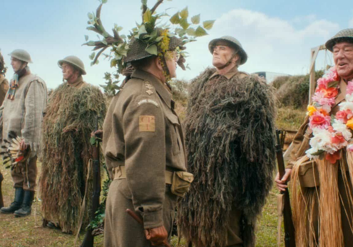
February 5th 2016 saw the hotly-anticipated release of Dad's Army – a reinterpretation of the classic BBC comedy series, with an A-list cast including Toby Jones, Bill Nighy, Tom Courtenay and Michael Gambon. The film also introduces Catherine Zeta-Jones as a glamorous journalist who is sent to report on the hapless platoon.
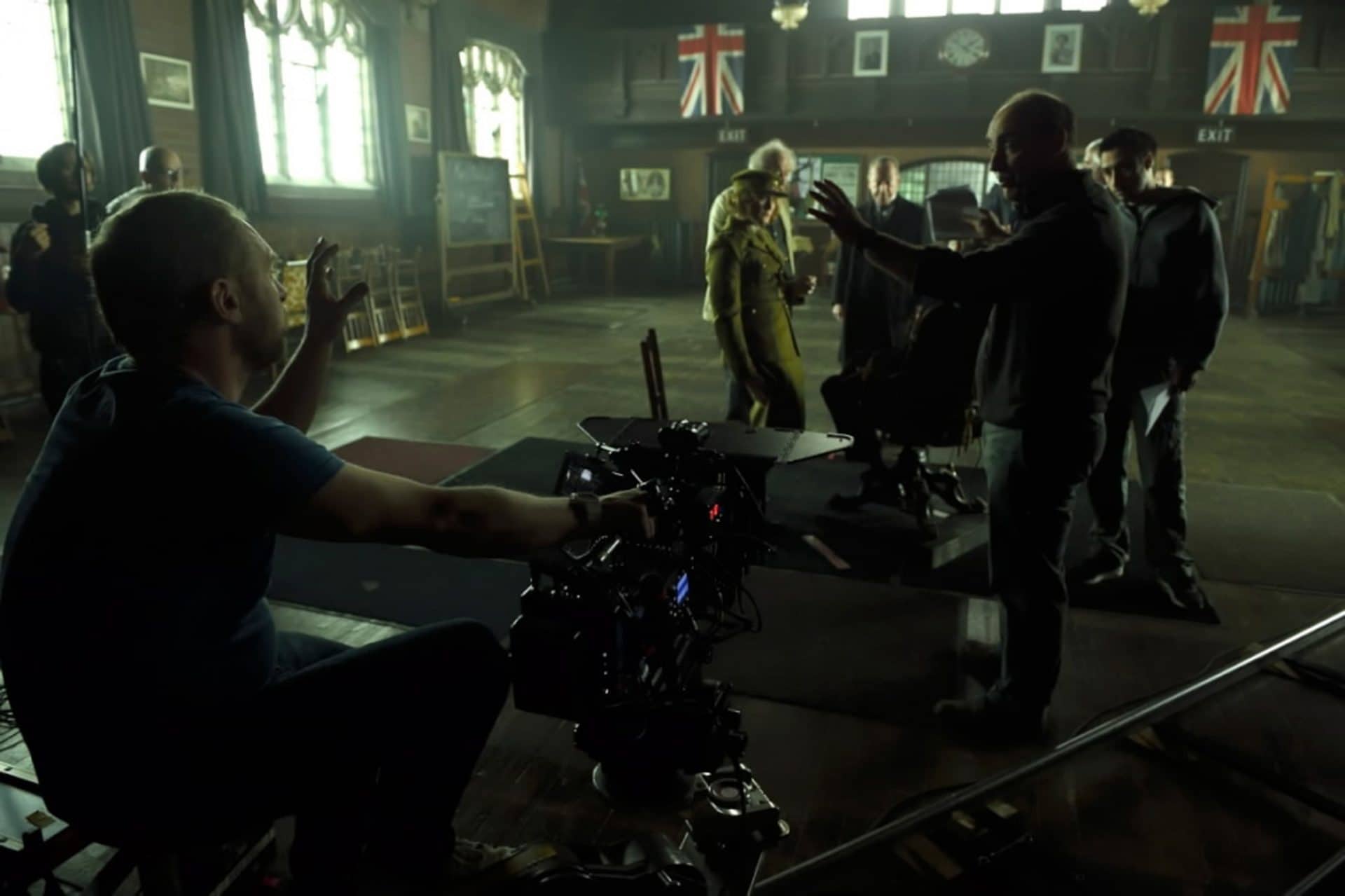
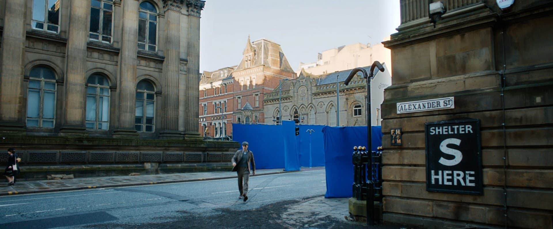
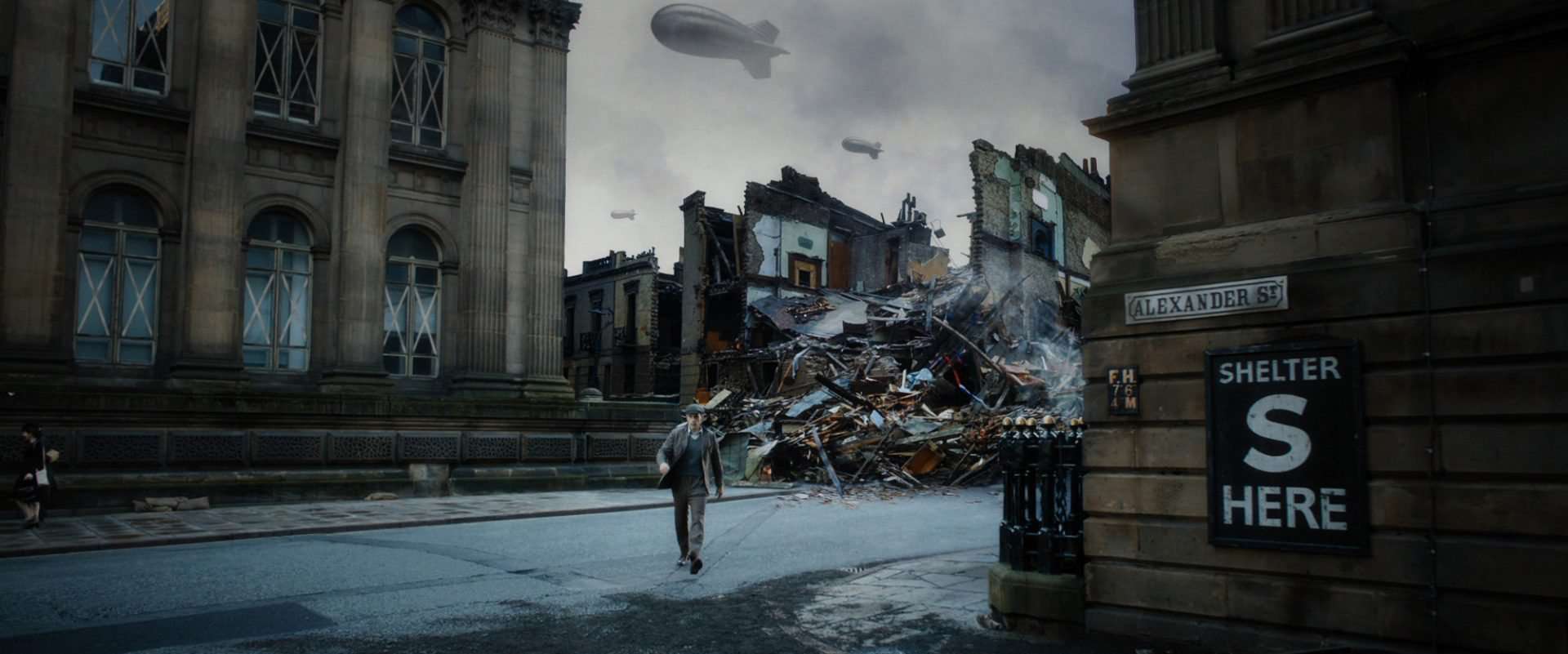
Soho post facility, Molinare, was commissioned to provide full post-production and visual effects on the film back in the summer of 2014. The DI team worked closely with DP Chris Ross BSC and director Oliver Parker to set the look of the film, with the production wanting to move the imagery away from its sitcom roots and into a more cinematic place.
The colour-timing of the film began long before the shoot, with a series of tests to compare and contrast different lens and camera combinations. Molinare's senior colourist, Gareth Spensley, applied a gentle grade to the material, which helped Ross to make the decision to use older Cooke lenses with stockings on the rear elements. This method worked particularly well for Catherine Zeta-Jones on-camera – the diffused image suited her character and seemed to land her squarely back in the period, conveying the soft-edged glamour they were after.
As Ross explains, "the colour palette for the majority of the film is a mixture of warm, earthy tones with sprinklings of delicately saturated primary colours. We wanted the atmosphere of the film to dance the line between affectionate nostalgia, 1940's glamour and classic espionage thriller, slipping effortlessly between these scene-to-scene."
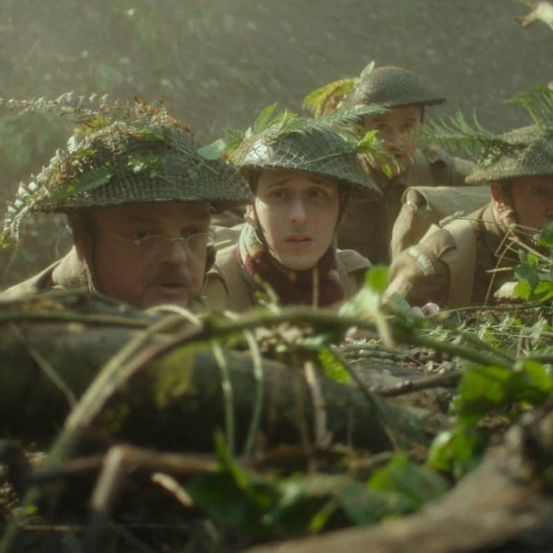
The shoot itself impacted dramatically on the eventual DI process. With the movie being set in spring 1944, director Oliver Parker had hoped to shoot the film in a glorious bucolic summer. However, the eventual shoot turned out to be 35 days in East Yorkshire, ending in December, so the crew were at the mercy of the elements. It was then the DI team's task to convincingly join the dots. Rather than go for something desaturated and sepia, Parker, Ross and Spensley were looking at richer and warmer tones to reflect the affection that surrounds the much-loved characters.
Spensley acknowledges that the biggest challenge of the grade was battling the weather conditions during the shoot, needing to replace the skies in about 40% of the exterior scenes.
"Shot in winter, many of the seasonal clues were unavoidable, but we aimed for a bright sunny feel whenever we were outside,” he says. “The techniques varied between accentuating backlight, adding sun splashes to walls and sky replacements carried out within the Baselight grading system itself, as part of our extensive VFX workflow."
Spensley also used selective grading shapes to pull the audience's attention to the characters and accentuate each moment from the actors’ comedy performances.
"We shifted the tonal range to underscore the narrative; cooling the imagery around the Nazi plotting scenes whilst subtly building the warmth through the more light-hearted romantic scenes,” he adds.
Ross’s method of netting the back of the Cooke lenses whilst shooting heavily influenced what direction the grade was taken in. Spensley used a cross colour curve to saturate the skin tones with a peachy warmth and draw separation in the shadows between the blues and greens. This worked particularly well in providing separation in large group shots of the main cast in their Home Guard uniforms. Some of the vista shots of the sea and cliffs needed more intensive work to produce idyllic landscape shots. On a few occasions the horizon line between the sea and sky had been lost in fog, so the horizon line was inserted from elsewhere.
Whilst the grade was in its early stages, senior online editor, Justin Eely, was called upon to remove modern day artefacts, such as satellite dishes and yellow lines on roads that had been spotted on the big screen. Spensley then used the Baselight's extensive compositing capabilities to perform several other visual polishes in the grade. For a couple of the night sequences, he added moons to the skies to give a visible source to lighting. For the white cliff scenes he also did a 'Photoshop-style' clean-up of the cliff top locations to make them look more like the white cliffs of the Sussex Coast – copying and pasting elements of the cliffs to hide the green vegetation visible on the Yorkshire cliffs used for filming. Doing this in the grade can often be a quicker and more flexible approach when working directly with the director and DP.
Eely also designed and created the opening titles for the film. Wanting to provoke a nostalgic reaction from the audiences, he and Parker made the conscious decision to use the same typeface as the original BBC television series. They also created the end credit sequence, which ran alongside "out takes" from the production. All work was carried out at 2K using Avid DS, Nuke and Mocha.
Molinare's VFX department completed over 100 shots for the film, and was heavily involved from early-on in the pre-production process. For each of the key scenes, on-set supervision was provided and reference images and camera data were captured. Initially, much of the work was planned as practical effects with VFX clean-up and augmentation. As the scope and scale of the film evolved, it was realised that some of the key scenes would require complex 3D additions. Primarily this was the 'floating tanks' scene for the army base, and a dedicated team focussed on the building and rigging of the tanks, trucks and buildings and camouflage nets. The cliff top scene involved compositing Corporal Jones on a small fibreglass section of cliff into plates of the Flamborough cliffs, which we further enhanced by bringing the troupe on the cliff top close to the edge.
“The Molinare team thoroughly enjoyed working on Dad's Army, collaborating with the production in a common desire to treat the characters with a nostalgic respect, whilst taking the story forward to a much grander, more cinematic look,” says Spensley.
And, director Oliver Parker was thrilled with the results: "Although this was a relatively small budget, I was delighted by the commitment shown by Molinare. Whether it was Justin in the online or Gareth's great attention to detail and continual inventiveness in the DI, they became strong creative partners in the process."