Painting a picture
Nine-year-old Tessa is faced with a tough choice to make about her mother, Luna, in The Ornament, lensed by Michael Wylam.
The Ornament is a heart-wrenching short based on a true story about childhood abuse and trauma hidden behind the façade of wealth and success. Cinematographer Michael Wylam was tasked with bringing a cinematic touch to the film’s visual storytelling while honouring its real-life origins, and his work earned him a Silver Prize at the 2023 Australian Cinematographers Society Awards and a nomination for best cinematography at the Leo Awards.
Here, Michael takes us behind the scenes on the shoot in Canada, which included eight-hour days, lots of day-for-night, and the challenge of capturing the complex mother-daughter dynamics between Tessa (Remy Marthaller) and Luna (Nathalie Boltt).
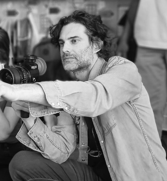
British Cinematographer (BC): What appealed to you about the story?
Michael Wylam (MW): I knew translating a script about abuse and childhood trauma into a visual grammar that explored the psychology of the insidious subject matter would require a sensitive and considered approach and would be an interesting challenge. These are important issues that need to be discussed and brought out of the shadows, and unfortunately Tessa’s story does not stand in isolation while uncovering hidden abuse in often-overlooked parts of society.
I was impressed with the script and how brave our director was in sharing this personal story. There’s a veneer of what the mother, Luna, wants to project to the world that is incongruous with the reality hidden behind closed doors, so this in itself was a powerful premise to consider.
BC: What did your initial discussions about the look and mood for the short with director Jinjara Mitchell involve?
MW: I spent a great deal of time just getting to know her story and from there it was about offering up a visual psychology that would help tell that story in the most appropriate way. We watched archival footage of news interviews from her childhood to get a sense of the tone and the period. Jinjara was quite specific on certain aspects of the film playing out as they actually happened and honouring that while evolving those experiences into a more cinematic realm was both a delicate balance and a rewarding experience.
Exploring how much the camerawork and lighting could be in conflict was a starting point I wanted to present, reflecting Luna’s impact on Tessa and how her mother’s moods and needs colour Tessa’s outlook and emotional state. Would Tessa feel sensory overload at times, and could that bring opportunities with a more impressionistic approach to lighting in moments perhaps? How stable and safe does her world feel, waiting for the inevitability of her mother’s abuse. How could the camerawork draw the audience into that idea? These were initial broad strokes that evolved as we dived into pre-production.
BC: How long did you have for prep and what did this involve?
MW: We had a good few months of soft prep but the prep really started once locations were locked, which happened only a matter of weeks prior to principal photography. We looked at a number of locations for both the school and house as it was important that they were a character themselves and created the feeling of a privileged life. Once the locations were locked I requested a scout with just me, Jinjara and producer Jordan Connor so we could start talking about a potential blocking in the spaces.
Here, we workshopped the blocking for most of the scenes and as this evolved I used a director’s viewfinder app to communicate ideas and explore frames which then created the basis of the storyboard. Scenes we didn’t get round to I later drew by hand. This was a crucial step on this film to allow our first-time director to focus on performances and also so we could communicate the boards to the crew, so everyone was on the same page while getting though our very short eight-hour shooting days. Once I’d drawn up these storyboards and they had been signed off on by our director and producer, I could then start creating lighting diagrams so that after a subsequent tech scout with gaffer James McMurchie and key grip Chris Rogers, we could start discussing pre-rigging the house and work out our lighting and grip packages.
Researching and thinking about trauma’s impacts on youth, particularly the cruelty of abuse in the home by a caregiver and how that may impact a developing brain, was particularly important for me, to understand the real-life emotional and developmental consequences in the context of the story. I wanted to explore, for example, the idea that there was a sense of dissociation to cope with the environment Tessa is in and exploring our visual storytelling with these mental states in mind was important to emotionally map the film.
BC: Did you have any creative references to create the look of the short?
MW: The story is set in the late 1990s to the early 2000s at Christmas in North America so I endeavoured to create a look in keeping with this time period. I watched a number of films but very much wanted to create our own world that was punctuated with slow lingering frames that slowly draw the audience in. We did look at references such as the film Mommie Dearest (1981) for tone but beyond that we were really wanting to create our own world.
There was a great deal of music that inspired me on this short and one that I went back to frequently was an album called Winter Songs by Ola Gjeilo. To me, this album conjures up a beautifully nostalgic and traditional feeling of Christmas while also feeling incredibly haunting, there’s this duality in it which I really responded to. When I shared this music with our director she liked it so much she wanted to use it as a reference for the score of the film, which I was delighted about.
BC: What camera and lens did you choose and what made them ideal for this shoot?
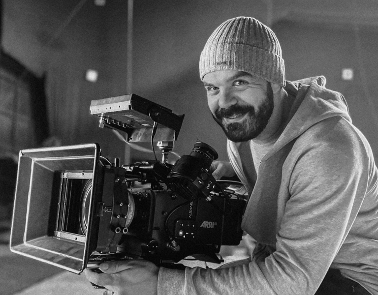
MW: With our camera package supplied by Keslow Camera I knew we would be incredibly well supported and I felt the Zeiss Super Speeds paired with the ARRI Alexa Mini would be the right canvas and palette for this project. We wanted a softer, more filmic look that took us to a time gone by, albeit not specific to movies shot on those lenses at that time necessarily. There is an imperfection to these lenses which I’m happy to embrace, particularly where their character creates a story-appropriate, painterly quality.
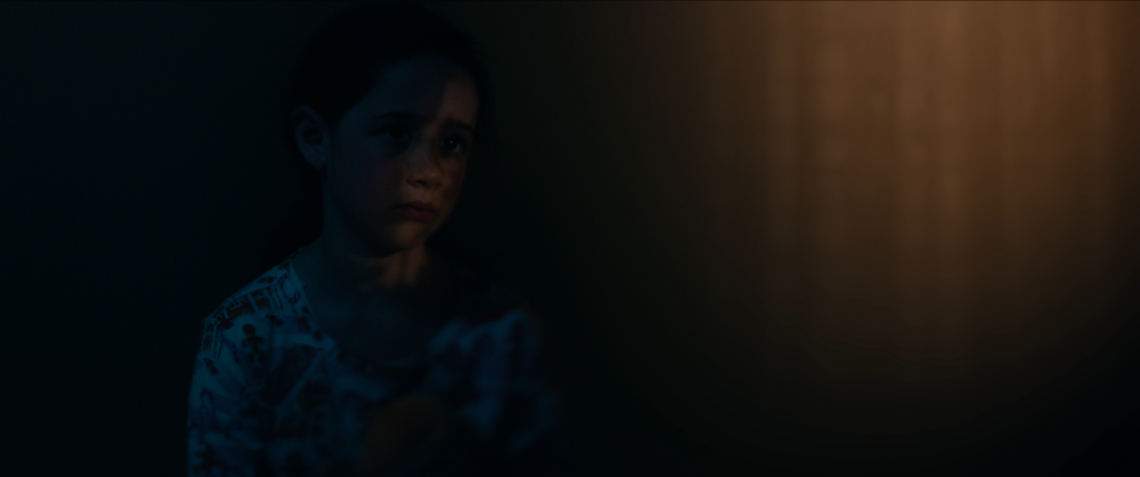
There is a scene where Tessa is dissociating after an episode of her mother’s rage and I wanted to punctuate and subtly distort this moment with a feeling visually that her world and innocence had shifted slightly, leaving her disjointed and alone in the negative space of the frame. Knowing that there was no depth to play with (as Tessa was leaning against a wall) I dug into Keslow’s extensive speciality equipment and, after testing, settled on a Clairmont rehoused Canon 35mm tilt and shift lens for a shot in this scene which cut really well with our lens package.
BC: Can you run us through the locations? Were any especially challenging or inspiring? How did you overcome these challenges?
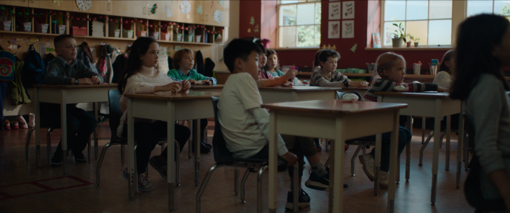
MW: The film has two locations – the school and the grand home. Scouting a great many schools became a necessity, as it appeared that many of them had become visibly modernised and sadly lost much of their character. Settling on the same school that was used in the classic movie The Neverending Story (1984) was a nostalgic moment and it was nice to pay homage to the film in one of the shots. I love the red paint of a specific classroom too. I knew wardrobe were to be dressing Luna and Tessa in red for the interview scene, so it felt as if her mother’s presence was even at the school subconsciously – as is experienced by trauma sufferers who might carry their trauma through life outside of the abusive environment. There’s no escape.
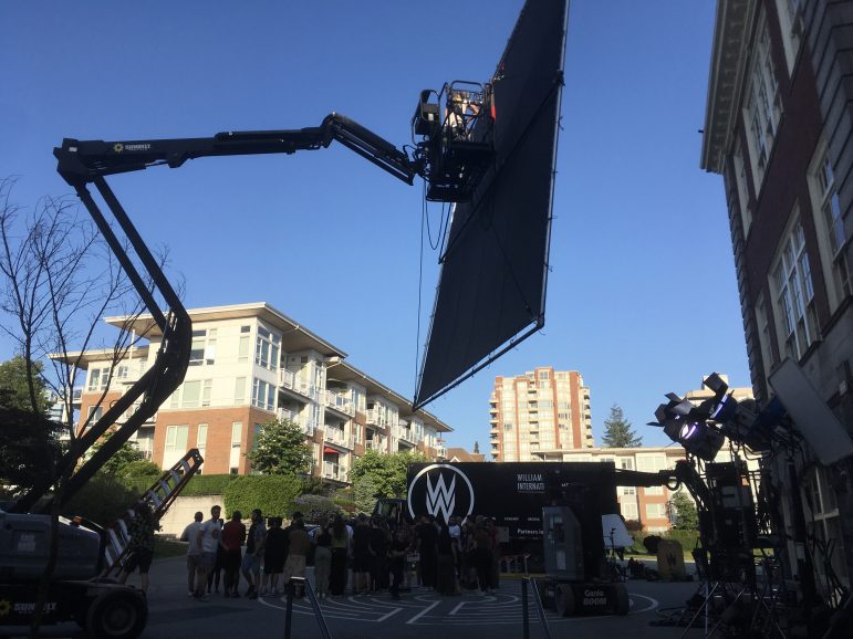
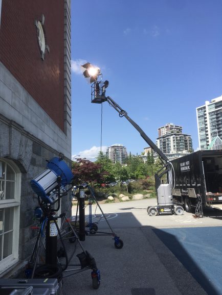
One of the technical challenges of the school was that this classroom was situated on the second floor of the building so we utilised 45’ condors to facilitate our M90s and 20×20 bounce to create our different looks and so this gave me control throughout the shoot day. The hallway that had the best architecture was on the third floor and shooting here required a decent amount of grip work to shape it and control the ambience. There were a number of very large sky lights in the roof which had to be covered with duvetyn from the outside and some 60×60’ large window panels in the hallway were south facing and required duvetyn to control the direct sunlight and create the mood necessary for the story. There were also a number of very green trees immediately outside the hallway windows (while shooting our summer days to look like winter) so we hung full grid cloth on the exterior and blew out the visible window with an M90. From there we were able to shape the hallway with negative fill and employed SkyPanel S30 and S60 units through silks, brushing light through doorways from adjacent classroom doors on our wide hallway shot as we observe Tessa and her nanny, Angela, walking to head home. A moodier scene, perhaps foreshadowing a darker tale for Tessa’s home life than that which is suggested in the classroom scene.
While scouting I noticed some schools had this opal-like diffusion and CTO squares on the windows and this inspiration I brought to our classroom scenes. I liked the textural quality these small varying squares gave the quality of the light and so we put in squares directly on window panes with opal and varying CTS strengths in places to create a sense of patches of warmth and diffusion that was carried through via our M90s with CTS 4×4 frames, emulating a fading direct late-afternoon winter light seeping through the classroom windows. It also gave me the opportunity to obscure elements showing outside the window that I wanted to hide such as modern buildings.
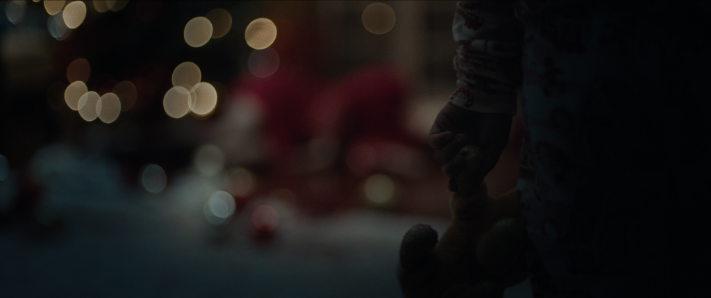
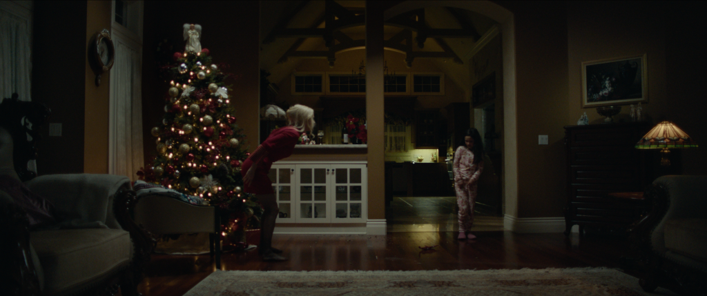
Night shoots were off the table due to restrictions with our actors and permits. The workaround was shooting day for night and tenting our night scenes while scheduling our days appropriately to sell the character of light playing outside of windows on our day scenes, so that I had control with our lights and could sculpt and shape appropriately. Much of the script is set at night so negotiating a day for tenting meant key grip Chris Rogers and his team were able to create 15’ of space outside of the very large windows in each room we were shooting in. This enabled us to light greens outside windows and use our tungsten Christmas lights to create a bokeh street-light effect in the distance, speckled here and there and allowed me to create a believability in the world beyond. This was integral to building a sense that there is life outside that is unaware of the hidden abuse within the closed doors of high society.
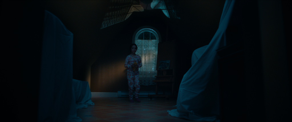
Another inspiration was finding the attic in the house location. I loved the character of this room and its potential for a powerful way to help tell the story visually, I pitched the blocking in the space and discussed the opportunity it opened here for a poignant moment in the film. Our director loved it and adapted the script to accommodate this location after the scout. I really wanted to find these moments for “breath” so that we could experience the world emotionally with Tessa. The challenge here was that we were on the fourth floor of the location with no access to lifts on this day due to budget restrictions. Luckily this is the one shot we were able to shoot into natural darkness and were able to push the schedule on this day to allow the wide shot, picking up our coverage the next morning.
BC: How did you aim to convey the strained relationship between Tessa and Luna in your camerawork? How did you use framing, composition and camera movement in this regard?
MW: The film is very much told from the child’s perspective and thinking about how that could be represented photographically was key while punctuating certain moments to explore the complex power dynamic between Tessa and her mother. The structure of the shots needed to incorporate breath in places and I knew employing slow, lingering camera moves that had stability at key moments might create a certain tension so that when we arrive at the climactic moment in the film where Luna launches into a ferocious rage we could go handheld and more kinetic, which would help propel the audience from this feeling of treading on eggshells into an unhinged and unstable environment with Tessa. Going handheld here at Tessa’s height with the camera being reactive heightened the dramatic effect to feel the encroaching danger and violence of the scene.
The underlying sense of unease was something that was crucial to get across even when it wasn’t actively being portrayed in performances and this was a consideration during blocking and working out how that would impact the compositional language of the frame. Tessa is framed next to doorways as often as possible – it’s as if she needs an escape just in case things become volatile. Shooting 2.39:1 spherical also allowed for the ability to play with negative space and opened up framing opportunities to accentuate certain emotions that felt at odds, empty or lonely while utilising symmetrical compositions in juxtaposition which were intended to give a sense of things being more balanced and in control. I felt this was an interesting way of expressing the feeling of living with a emotionally abusive parent photographically – it’s the inconsistency that is confusing and damaging to the child.
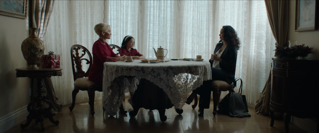
As is the way with people like Luna, their mood dictates the atmosphere of the space they are in for anyone else present and I wanted the camerawork to be subservient to that sense in moments. I wanted to give Luna, sitting at the head of the table, a domineering feeling at the dinner scene for example – favouring fairly wide lenses throughout with the exception of employing the longest lens in our lens package – an 85mm – to slightly compress Luna with Tessa across the large space of the dining table giving the mother a sense of looming presence over her daughter. This was the only time I used the 85mm in the film and we suggest the power play just subtly in these opening scenes. This then contrasts with the intimate storyteller role Luna takes next in the scene, riddling a fantasy of what she wants the world to think is their Christmas. Here she plays the role of a “storyteller” describing what Tessa will tell the school about her Christmas Day and we go wide and close for a sense of intimacy as we buy into the story with Tessa to a degree as we are drawn into her charm. Employing a subtle visual grammar without being hyperbolic was crucial in helping the audience feel these moments with Tessa as her story unfolds.
BC: Were there any challenges having a young (albeit very talented!) actor as the lead?
MW: Remy Marthaller was a delight to work with and her performance was so strong that the eight-hour day restriction (as per ACTRA guidelines working with young actors) was something we gladly worked around. We lost a third of our shooting hours on each of the four shoot days as a result and she was in every scene so it required strategising, shooting fast and closely liaising with my grip/lighting team. I created detailed lighting plans for each scene so that as much pre-rigging could be done prior to each shooting day as possible. Also while we were shooting one scene I was always lighting another in advance.
We were also unable to shoot into the night, not just because of the ACTRA guidelines but also because of permits. So, I knew selling day for night for many of the scenes in this film would be the biggest challenge photographically. They worked out splendidly however, in large part due to the incredible work key grip Chris Rogers did with the tenting, allowing me to create a believability in the night scenes. All this necessitated meticulous planning to make sure we made our ambitious days.
Another challenge here was not exposing our young actress to the profanity and violence in the performance on the day so a stunt double was used for these moments and we had to think carefully about blocking and coverage for this. Keeping the coverage to a minimum and being selective really helped ground us in the scene and keep performances fresh.
BC: What was your approach to lighting this film?
MW: As a general rule I wanted to keep all the warmth of lights in the film either in the background or playing outside windows as a reference for the absence of the mother’s maternal warmth being out of reach to Tessa. But the light on our actors was always neutral or cool with the exception of safe spaces for the young girl – the optimism of the school classroom before Christmas break and in the attic where she goes to hide from her abusive mother. In the attic, Tessa is dissociating after her mothers abusive outburst and is bathed in a cool ambience but the warm light pushed through lace curtains delicately brushes her face for the first time. I wanted to underscore the fragility of this moment here, while the fragmented light on the wall in the negative space next to her suggests a chicken coop and as though she is trapped. The opening scene of the film at the school is the only other time the light is warm as this symbolises the hope and optimism of the Christmas break – perhaps Tessa feels that this year things will be different with her mother.
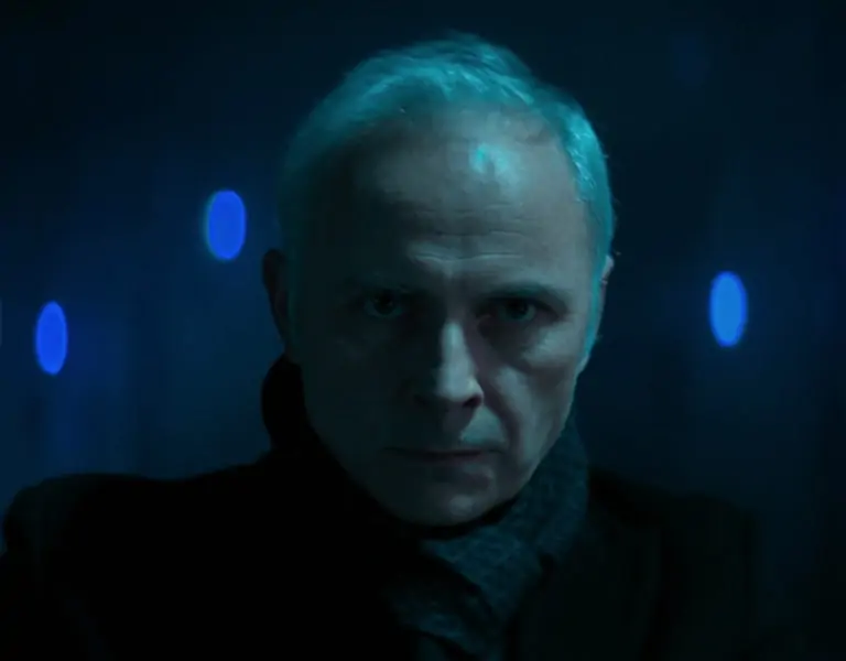
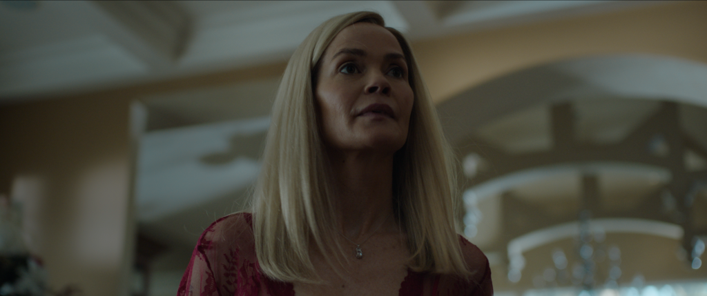
Luna is often in toppy light so we get a subconscious sense that something is off before Luna’s character is revealed to the audience. This plays the strongest in the climactic scene where she falls in and out of darkness as she snakes around the living room in a rage. Here, I rigged a number of Astera Titan tubes in a circular fashion for ambience in the ceiling playing very subtle cyan and peppered the set with accents and splashes that felt motivated. A row of Skypanel S60s dimmed down playing cyan on turtles provided our exterior light and LiteMat S2s, skirted and diffused, rigged in the ceiling ”set the stage” as our top lights in three specific areas knowing that as Luna moved in and out of darkness it would sell her character well. There is a reference of warmth in the background in the adjoining kitchen where I’d hidden a number of units but particularly the 800w tungsten dimmed down bounced off the tall ceiling to accentuate the looming shadows of the archways and to give reference to the neutral cool light on the faces in the living room. In the background here I utilised fluorescent lights under the kitchen cupboards with white flame green gel throughout to give a sense of sickly energy to the scene and drab reality. While we didn’t have access to the fixtures used widely in that period of early 2000s by cinematographers such as Darius Khondji ASC AFC, who embraced fluorescents with a green spike in them for films such as Seven and The Beach, I aimed to provide a similar effect here in homage to the era. Much of the feeling of the light was about paying homage to the period of the film.
BC: How did you light the scene where Luna is being interviewed and what was the motivation for this choice?
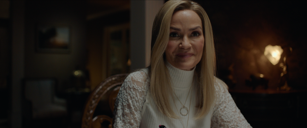
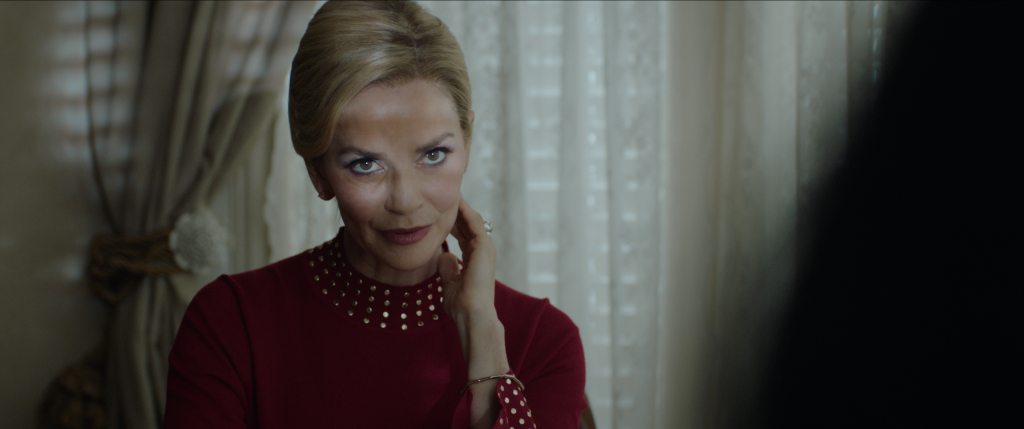
MW: Here I felt it was important to emphasise the larger-than-life feeling that Luna creates in the company of those who she is trying to charm. The life she works hard to project to the outside world I felt could be exemplified by the use of a fairly hard, direct light on her only. This almost film noir feeling of her being lit solely in the spotlight through blinds felt a little glamorous. Everyone else is lit softly and understated but she is the star of her show. I quietly advised Nathalie Boltt (playing Luna) what I was trying to express here with the light and put forward that if she felt motivated to move around a little in her performance that it would work my end, as the fragmented light was speaking volumes across her face and her performance was fantastic. She feels powerful, in control, glamorous and a little sinister.
Going a little more impressionistic here (with the motivation for the light being afternoon winter sun pouring through layers of outside trees, through blinds and lace curtains) this was achieved via a number of bounced M40s into a layer of 251 diffusion wrapped around the outside of the windows before our lace curtains and a direct M90 in the distance on a small hill in the garden for Luna’s key. I selectively had blinds closed and opened to allow direct light and removed and added diffusion on certain windows for shape. Shape was further achieved with negative fill on the interior with an eye light as required for our tighter shots.
BC: Take us through your collaboration with the colourist and how you achieved your desired look.
MW: Working with Jimmy Hsu at Company 3 is always a pleasure – we have a great shorthand and share similar sensibilities photographically. We aren’t fond of overly worked images which is great as I like to shoot as much in camera as possible on the day so that the subtleties of colour contrast are available to push during the grade, giving us the room to work in shades of subtlety. There were four distinct looks – the school just before Christmas where the light is imbued with warmth and hope, the house where the colour and joy has been taken out but peppered with splashes of coloured light, fantasy scenes which felt light and airy and the return to the school – accentuating Tessa’s mental state as hope lost, dreary and overcast.
I think Jimmy and I had the most fun playing with the fantasy scenes. I’d used a heavy Tiffen Glimmerglass on these scenes only and utilised more fill light, opened up the stop to feel a little more intimate which reduced the contrast inherently on the lenses and I went held held for a sense of freedom and playfulness in Tessa’s fantasy world. We pushed the blooming of the highlights a little further here and balanced our contrast which worked really well in combination with the filter and looked incredibly organic.
We used the same ARRI 6310 Pastel LUT that I used to monitor on the shoot days (and used by editor/post supervisor Kyle Sanborn so that the look was carried throughout post) as a starting point in the grade. I really liked the muted pastel colour palette in the way that it helped sell the period and how the colour had been drained out of Tessa’s home environment and Jimmy did a fantastic job at developing that sense beyond that starting point with a high level of sophistication.
We conversely played with pushing the splashes of cyan and warmth a little further in saturation in certain moments too. The cyan night look isn’t usually a go-to look for me but it felt really interesting using Cyan 15 and 30 gels on lamps on the shoot day. It almost had a Crayola crayon colour feel – this story is told from a child’s perspective so it made sense to have a sprinkle of childhood colour against the harsh reality of an abusive home life. We were then able to push and pull that accordingly during the grade where it complemented or worked in juxtaposition to the neutral icy/cool light playing on faces in the house and the warmth in the backgrounds at night representing distant affection.
The best compliment was once Jimmy and I had finished and the director dropped in for final looks to watch the film in the theatre. After viewing, she politely asked if it had been graded. We were delighted, knowing we had stayed true to the original intent of the photography while creating nuance appropriately with a delicate hand and knowing that if we aren’t drawing attention to the grade, as is often the way with the photography, then we’ve done a great job.
BC: Are there any scenes or shots you are most proud of shooting and why?
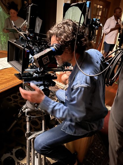
MW: I am very enthusiastic about seeing a block and rehearsal before a take but stepping out of my comfort zone for the climactic scene and offering up to shoot the rehearsal to keep the performances fresh was an approach that I think paid off in this instance. I cleared it with 1st AC Will Edmunds, knowing he was under pressure here but in no doubt as to his ability to pull it off without a hitch. Seeing the performance for the first time and reacting while I was operating helped create an incredibly kinetic feeling. These moments felt very authentic, particularly where the mother gets more and more drunkenly irate as the audience is pulled “into the ring” as it were, almost documentary-like as Luna circles around Tessa in a predatory fashion. I loved the energy and freedom of this moment: Nat had offered up a different take on the blocking and it was a wonderfully collaborative dance between us.
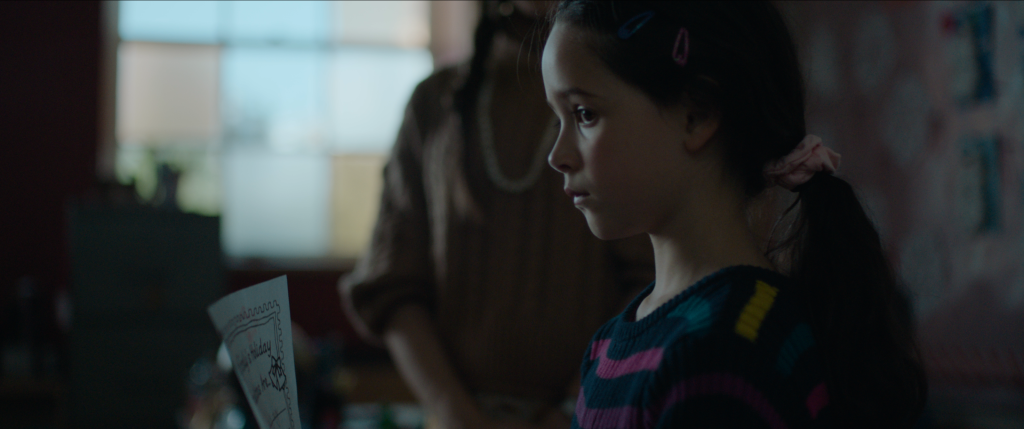
I loved the idea of bookending the film as it offered a powerful way for Tessa’s story to come full circle and this was something I put forward in the early stages of pre-production and was embraced, discarding the original opening scene in the script. Finding our characters story with a slow push in on the dolly and settling finally on Tessa for the opening of the film was a bold statement with no coverage. There is a hope and optimism in the warm, direct light here, with complimentary soft light wrapping around faces which is in contrast to the final scene of the film where we return to the school after the Christmas break. Here, the glow of Christmas promise has now faded, Tessa has had the the colour of her world leeched out of it and the classroom now has a subdued, cold wintery bleak look. She is reading the “script” that her mother wants to present to the world, a story at odds with reality.
We start on a profile of Tessa and dolly around her ninety degrees in a circular fashion as she’s delivering her presentation to the class. Her whole world has turned in a sense since she was last in the classroom and she puts on a brave face and sells the lie. This feeling that her world has shifted while we slowly track around Tessa into her eyeline while she says the words her mother told her to felt really powerful and you could feel the presence and impact of the mother in this shot, almost as if still circling her daughter. Creating the storyboards and then watching those ideas come to life through the viewfinder on the day, as envisioned months prior, is an incredibly rewarding experience.
BC: Are there any lessons that you learned from this shoot that you’ll bring onto your next productions?
MW: This shoot was a good reminder of the importance of having a strong crew behind you. All crew in my departments were highly experienced local union crew and as this was a very challenging shoot it was so important that we worked cohesively together. They had my back throughout, worked at an incredible pace and we made each one of our very ambitious days – I’m very grateful to them.
