BLEAK BEAUTY
Linus Sandgren ASC FSF was perfectly aligned with writer-director Emerald Fennell’s visual ambitions when lensing a twisted tale that is shocking yet beautiful.
Following writer-director Emerald Fennell’s 2020 bold debut feature and breakout success Promising Young Woman (Cin: Benjamin Kračun BSC), for which she won an Oscar for Best Original Screenplay, the filmmaker’s next production was certain to be equally as daring and distinctive. Packing a punch through its storytelling and visuals and full of twists and turns, Saltburn ventures into new narrative territory spanning class privilege, seduction, and aspiration.
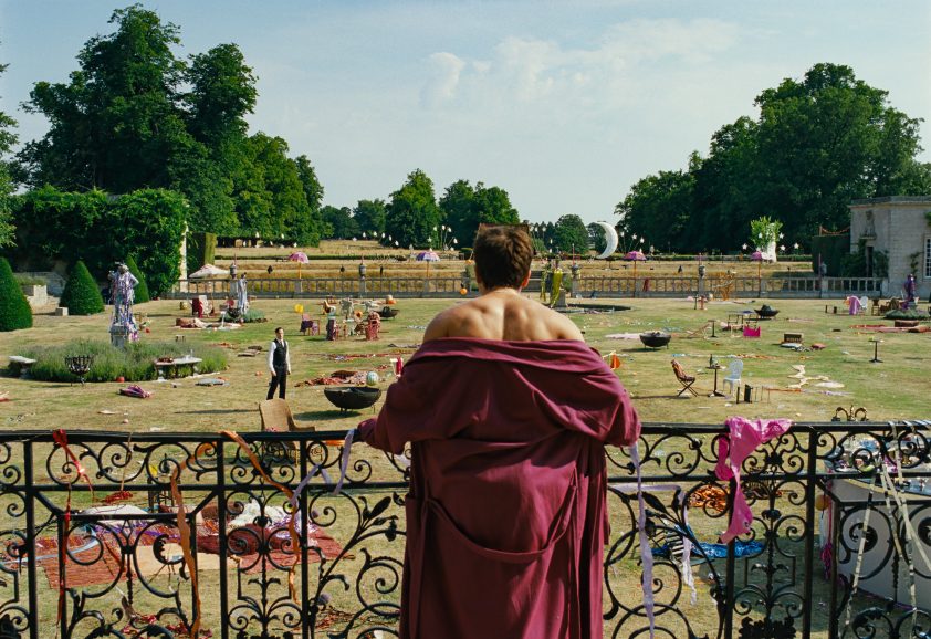
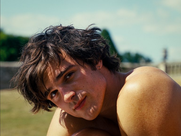
In the tale of excess and obsession we meet student Oliver Quick (Barry Keoghan) who is struggling to fit in at Oxford University before he meets alluring classmate Felix Catton (Jacob Elordi). As Oliver’s infatuation for his new friend grows, Felix welcomes him into the fold of his eccentric aristocratic family for a summer of decadence and debauchery at their sprawling Saltburn estate.
Linus Sandgren ASC FSF was approached with the script for Saltburn by Margot Robbie who starred in 2022’s Babylon which the DP lensed. She was co-producing Saltburn through LuckyChap Entertainment, the production company she founded with her husband producer, Tom Ackerley, Josey McNamara, and Sophia Kerr. Having been wowed by Promising Young Woman (also produced by LuckyChap), specifically the script, Sandgren was excited to discover Fennell wanted to talk to him about her upcoming project. “I was impressed by how brave she had been in the making of Promising Young Woman – she made bold choices like how long she let a killing go on in a single shot,” he says. “She’s so confident in how she tells the story.”
Sandgren’s first meeting with Fennell further clarified “what an intelligent and visionary director she is.” The initial discussion with a director is one of the most crucial parts of Sandgren’s process, often equally as important as an outstanding script. “How the director presents the project gives you a sense of how much they care about the story and helps you connect with their vision,” he says. “Emerald is a very inviting person who loves collaboration. She’d already done so much homework and everything was visually explained in the script. There’s a strong reason behind why she wrote the story that’s clear all the way through working with her.”
Fennell’s ambition for a smaller, more intimate shoot, and capturing Saltburn on film was also a great draw for the cinematographer: “I love working with Margot too – she’s a really smart producer who picks her projects carefully and LuckyChap have a great focus on equality when they hire people.”
Speaking to British Cinematographer at the BFI London Film Festival opening gala screening of Saltburn, Fennell shared her inspirations for the film and how Sandgren helped realise her vision: “Linus is the absolute best and most extraordinarily talented person. Everything he does is not only beautiful but is motivated by characters. We discussed the emotional place the story was coming from, talked in a metaphorical way, and referred to it as a vampire movie. We were looking at Caravaggio, Merchant-Ivory period classics, Peter Greenaway movies.”
The director wanted to tell a story about “our cultural obsession with the things we can’t have, about the overwhelming pull of our all-encompassing lust for those things and the utter dismay we feel towards that obsession… I also wanted to write about first love, about that kind of summer you only ever have once, that summer you can never get over and also never get back.”
Attention to detail
As well as the film’s wider visual scope, Fennell focused on rich details such as props, set decoration and costumes that would ensure everything was authentic to the 2000s era in which Saltburn is set. “This included stupid tattoos some people had back then and details that allow the audience to enjoy the film in a comical way,” says Sandgren. “The story is also so dark – there’s a fine line Emerald loves to walk between comedy and the darkness of a thriller.”
Upon first reading, the cinematographer interpreted the story as a “psycho thriller, Hannibal Lecter-style tale that is much more about obsession than killing. It’s also sexual which played into the visual cues when thinking about lighting and aesthetics.” The gothic tone was at the forefront from preproduction when Fennell told Sandgren, “Oliver loves Felix so much he needs to suck the blood out of him like a vampire.”
The sexually charged nature of the obsession in the narrative was communicated in Fennell’s direction of certain scenes influenced by multiple Hitchcock classics and gothic vampire tales such as Nosferatu. As the narrative saw gothic horror, romance and opulence collide, films portraying holiday romances like Call Me By Your Name were a motivation when conveying the summery feeling of the posh British Saltburn estate. Other wide ranging cinematic references included Joseph Losey’s 1971 country-house drama The Go-Between; Yorgos Lanthimos’ tale of familial isolation Dogtooth; the ITV television production of Brideshead Revisited; and even 1999 teen romantic comedy Cruel Intentions.

During their creative exploration the filmmakers decided a stylised rather than naturalistic approach was appropriate. Earlier sequences at university differed in tone to those at the Saltburn mansion when the story becomes more vampire inspired. “We adopted an old school approach like Hitchcock in terms of the voyeuristic suspense central to the story,” says Sandgren. “When I asked Emerald how to describe the feeling of certain scenes, she replied with words like, ‘intimacy, wet, sweat and armpits’ – summing up what she aimed to achieve in the sexual but comically dark thriller about friendship, infeasible desires and hatred at the same time.”
Framing the story within a 1.33 aspect ratio was partly influenced by the aristocratic family who live at Saltburn, and paintings of ancestors on their walls. “These were painterly compositions of families, single portraits, and some of children who had died and had even been painted as if they were dead and grey,” says Sandgren, who, like Fennell, felt the story suited a square frame more than CinemaScope. “Through this aspect ratio, we wanted to signify how the family had almost been stuck in time for hundreds of years by portraying them in the same way they always had, through a more painterly composition.”
Street photography and Polaroids offering inspiration during the project’s early stages also informed the decision to adopt a square frame. The filmmakers wanted close-ups to capture a face alone in the frame, communicating isolation and claustrophobia and tying into Fennell’s desire for some shots to feel like the audience are peering into a dolls house, observing the characters in a voyeuristic way.

“It’s a beautiful aspect ratio to create a summer feeling as the characters lie in the grass and also intimacy in close-ups. There’s no space for anything else in the frame, so it’s more in tune with the character’s emotion,” says Sandgren. “It creates claustrophobia too, like you’re in a box similar to classic horror films from the silent era which also inspired the lighting.”
Oxford University is a key location for the first part of the film, shot at a college at the university featuring muntin bars – metal strips separating panes of glass – which tied into the concept of university being an isolating experience for Oliver and scenes seeing him staring out of his prison-like dorm window.
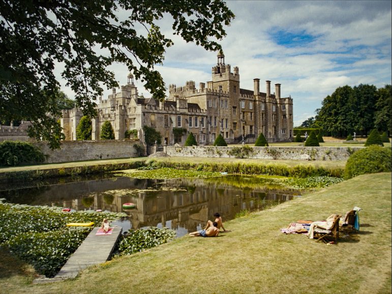
“For the Saltburn mansion, Emerald found the perfect 18th century country house estate in Oxfordshire. It’s never been filmed, and we had complete access to it which was incredible,” says Sandgren. “The cast and crew became like a big family – it was a very intimate beautiful shoot.”
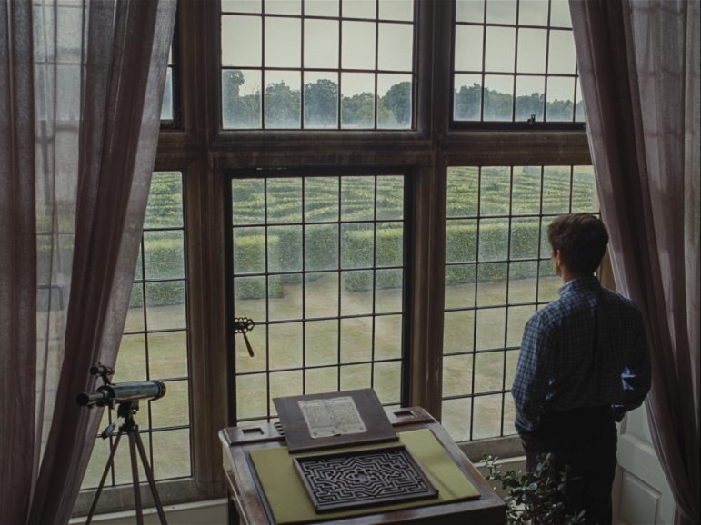
To ensure locations were in line with Fennell’s vision, production designer Suzie Davies (Mr. Turner, Peterloo) collected a plethora of references. “She was very much into filthying things up,” says Sandgren. “Her creativity blew my mind, suggesting incredible wallpapers and colours as well as props that made Emerald laugh and tied in with her desire for the film not to feel like a normal costume drama but to include all the dirty and trashy details, from pistachios through to chewing gum.”
Speaking to us on the Saltburn red carpet at London Film Festival, Davies revisited her collaboration with Fennell and Sandgren in choosing the palette, tone, and framing: “It was great to be involved in making those important decisions. Cinematographers can make or break designers and probably the other way as well but I’m so thankful Linus made our design look so beautiful. We were like magpies looking for shiny things because this family is filthy rich, but amongst the paintings of Henry VIII you also have slightly tacky, funny, and unusual modern art and inflatables in the pool. It was a real mash up of fine art and tack.
“Emerald wanted the film to start off as an oil painting and then begin to melt, distort, and become darker as the story goes on. I wish we had Smell-O-Vision as you wanted to smell the oil and sweat and feel all those other senses. It was all about distorting things and using reflections and shiny surfaces.”
Dramatic illumination
Lensing a film about obsession and excess led Sandgren to seek dramatic lighting inspiration from paintings by artists such as Italian Baroque painter Artemisia Gentileschi, an early follower of Caravaggio whom she worked with in the early 17th century. “In the Baroque era, when they painted events, it was always dramatic,” says Sandgren. “If someone’s head is chopped off, that is the actual image painted. Whereas in the Renaissance period, they more often captured the aftermath and grieving.”
He describes Saltburn’s lighting style as “adopting classic Caravaggio contrasts” and being divided into chapters where day exteriors should convey “sexiness and sunbathing” and the more melancholic exteriors, when the theme of death becomes more prominent, were usually captured in rainy and cloudy environments, with fog incorporated if needed. “Exterior night scenes were often suspenseful and voyeuristic and where vampire influences in our mood boards really came into play in the shot and lighting design,” he adds.
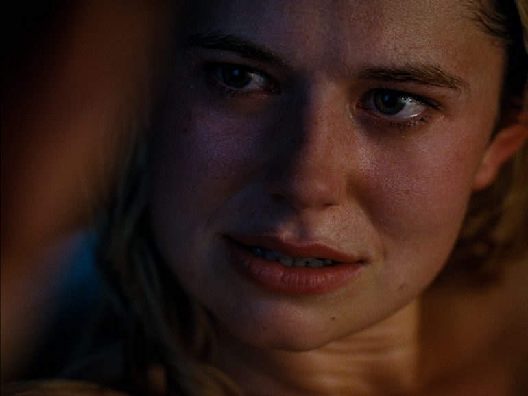
Lighting looks were created for characters and the filmmakers enjoyed “happy accidents” along the way such as an obsession-infused scene where Oliver spies on Felix in the bathtub. “We wanted to light Felix so he was glowing, shiny and sweaty, so we used a Par Can to create hard light on him. It was beautiful to let that light from Felix illuminate Oliver’s face too, forming a connection between them.”
Sandgren worked with many British crew he had teamed up with on previous productions including chief lighting technician David Sinfield. As Sinfield was only available for part of the shoot his brother gaffer Ian Sinfield (best boy on No Time to Die) captained the electric department for the majority. “Ian and David have a similar style of organising their work and the same warm, collaborative manner. Our main aim was to light in a way that distinguished different scenes in an expressive way, suggesting the vampire theme from the start without revealing the story,” says Sandgren.
”One challenge was designing the lighting style at the grand manor in a way that helped us move around the house without moving too many lights around. The house needed to feel like it kept old secrets, and could bind scenes together. Rather than bright, interior days would be dark and moody, as if the light was hardly let in to reveal the truth, metaphorically. This required big lights outside big windows in front of many facades.
“Long Steadicam shots through the building required us to light the house from outside and even though the owners of the building were very accommodating they were concerned about us driving too much equipment around on their lawn. So, what we needed – which wasn’t really budgeted for – were more cherry pickers than normal so lights could be prepared on all sides of the house, and we could go from a day scene to a night scene in different rooms.”

Three 28 metre cherry pickers with an 18K Arrimax in each were positioned outside the largest rooms. On the back of the house were two 21 metre cherry pickers with M90s and by the side of the bedrooms and bathroom were smaller spider lifts with M90s, serving as sun and moon light. All interior night scenes were shot day for night and required windows to be gelled with ND 2.4 and 9Ks shone through to create moonlight. All lighting equipment was supplied by Universal Productions.
“Green Voltage emission-free silent generators were also very helpful and more environmentally friendly than other options,” adds Sandgren. “They’re an electric rather than petrol generator and provide a lot of power.”
The wild nighttime party scene at the estate demanded the most cabling and effort from the electric department. Moonlight was required in all directions as the crew needed to shoot at all angles so cherry pickers with moonlight were set up in four positions. “We also had to hide tungsten Maxi Brutes within the set to augment a fire effect and light a discotheque scene so we could move freely across the party.”
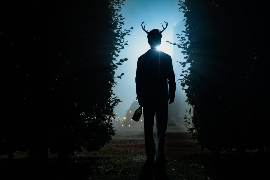
Aiming for gothic aesthetics, the filmmakers often designed shots in a minimalistic but theatrical way, with dramatic backlights through fog and no fill. ”In the nighttime maze scene we positioned cherry pickers around the sets and used Creamsource Vortex 8 units to backlight the heavy mist in a monochromatic vampiresque style. The atmos and fog in the film was mastered by SFX supervisor Rupert Morency and was a huge part of the lighting.”
Similar sensibilities
Early scenes when Oliver is at university were lit more naturally and fixture choice was based on what would have featured at the time. “The nightlight is a crappy fluorescent tube to show the contrast of that type of ugly lighting in this grand location with historically beautiful architecture,” says Sandgren.
These sequences also aimed to highlight Oliver’s alienation from his peers at university and shots of him playing pool frame him alone in wide compositions. But after painting a “dreadfully sad” picture of Oliver’s time at university, the connection between him and Felix becomes more erotic.
“I loved Suzie Davies’ design of the dorms. Felix’s had a red carpet that intensified the sensual feeling of their friendship. The endless piles of trash made the room disgusting at the same time, while Oliver’s dorm is sparser and more boring,” says Sandgren. “Oliver has an obvious attraction and we wanted Felix to be naked and sweaty in the scene where he’s lying on his dorm room floor smoking. There are also visual foreboding cues as you see the shadows created on him by the bars across the windows like a prison and Oliver’s shadow creeping in on him.”

Colour aided communication, with red having a particular significance in creating a sensual feeling, an ominous sense of what is to come, and aligning with a character’s increasingly devilish nature. Not only is it the chosen hue for Felix’s dorm carpet, when a significant character dies, Fennell wanted the scene to be draped in the colour using red curtains.
The director and DP’s shared passion for celluloid created a visual cohesion from the start. Sandgren – a long-time advocate for shooting on film – finds colours are richer and the texture and grain help convey emotion. “You don’t need to add contrast because it’s inherent in the negative, and it especially suited this film’s subtle colours and cooler tones for scenes taking place outside,” he says. “Saltburn is almost an impression of reality, but it isn’t reality, so it helps to shoot on film, because digital can feel more real, so you’d need to work against that with lighting, filtering, or adding grain in post.
“I love the process of shooting on film as you think you know how it’s going to look and when it comes back something has been added you couldn’t predict, and it’s even better than expected. Somehow even a grey day when captured on film will be beautiful and with richer colours. On this occasion we had much less fill than I normally would, it was more contrasty.”
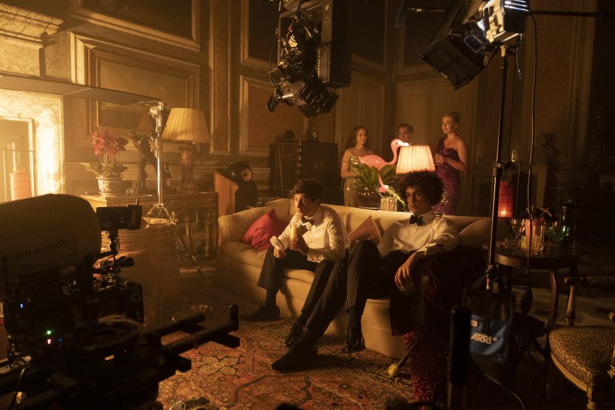
Shot on 4-perf 35mm film, Saltburn was developed and scanned 4K by Cinelab Film and Digital. Most of the film was shot on Kodak Vision3 500T/5219 for night exteriors and day interiors because it aligned with Sandgren’s desire to often light from outside and not use much light. Kodak Vision3 250D/5207 was also used for some day interiors and Vision3 50D for sunbathing shots as it is colour balanced for sunny days and brightly lit scenes.
Having worked with Company 3’s Matt Wallach on dailies for many years, the colourist then began to handle the DI and dailies for Sandgren’s productions No Time to Die, Don’t Look Up and Babylon. “But as this production was in the UK and we couldn’t bring Matt over from the US, he was involved in the DI, and helped dial in the dailies. Company 3 colourist Doychin Margoevski – who worked on The Nutcracker and the Four Realms – was dailies colourist,” says Sandgren. “As this film needed to be so dark and moody, Doychin’s great sense of darkness without being afraid to be bold was perfect. I want the dailies to have the final look. We then save time in the DI, just levelling scenes to each other and focusing on perfecting things.”
Mood of the story
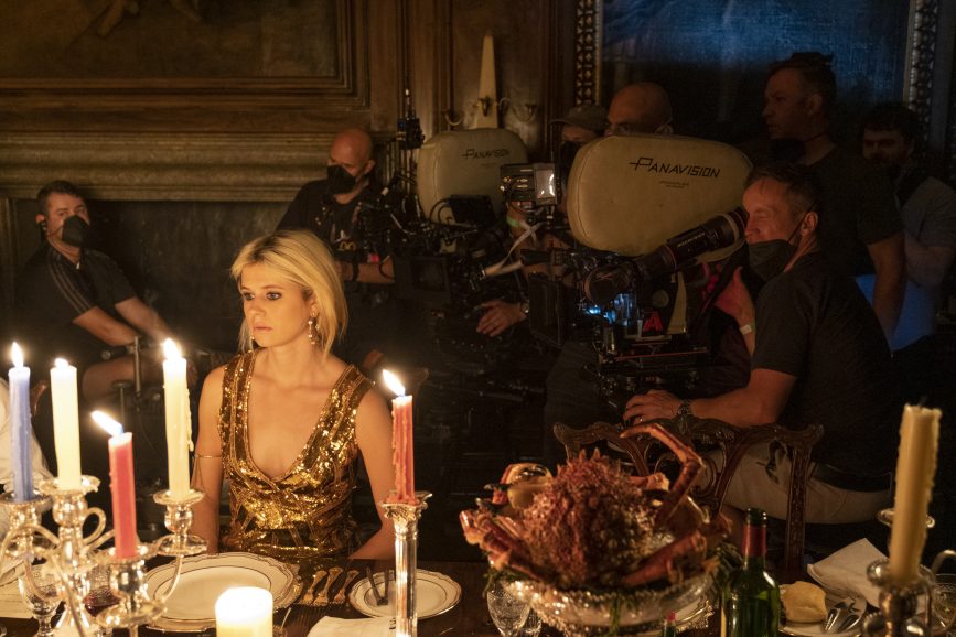
To capture the sumptuous tale, Sandgren picked the Panavision Panaflex Millennium XL2 paired with Panavision Primos, a lens he had enjoyed using on 2018’s The Nutcracker and the Four Realms, finding it offers “something special and rich with more contrast and depth.” Not wanting a lens that was too clean, he found the lens flare that forms in the shape of a red ring suited the film’s visual tone.
Reuniting with Sandgren to help capture the story was A camera and Steadicam operator Ossie McLean ACO SOC who he last collaborated with in London in 2021 on No Time to Die. As McLean was unavailable at the beginning of the shoot Jason Ewart ACO stepped behind the camera for some sequences. Also teaming up with the DP was 1st AC Jorge Sánchez, marking their tenth production pairing. “Our whole camera crew was excellent. I brought in splinter DP Jack Mealing – who used to be my assistant and now shoots many commercials and short films and is moving more into features – for sequences such as the wild party scene,” says Sandgren.
Camera movement was intuitive and driven by suspense. While some Steadicam was used for important suspenseful tracks and other livelier oners such as the walk through when Felix introduces the house to Oliver – most of the film was shot on dolly. “We often looked at how to shoot in the simplest way to tell the story in the best way,” adds Sandgren. “Emerald pays a lot of attention to that so many compositions were both beautiful and explained the story effectively.”
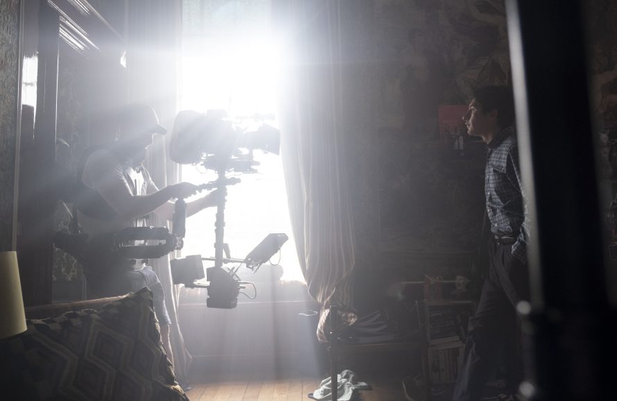
Key grip David Appleby’s ingenuity (No Time to Die, Indiana Jones and the Dial of Destiny) helped realise ambitious scenes including one set in a chapel. Sandgren and Fennell wanted the ornate ceiling to be seen before the camera tilts 180 degrees down to a top shot of a coffin and tracks with it. “Setting up a crane on that balcony seemed impossible, especially with a precious organ blocking most of it,” says the DP. “But Dave precisely fitted a narrow crane on tracks between a doorway, reaching over organs and banisters to be able to capture the shot just as we wished.”
Shooting the beautiful Saltburn estate from the air was a joy for Pete Ayriss, chief pilot at aerial film specialists The Helicopter Girls. While shooting establishing shots using the Freefly Alta X drone carrying an ARRI 235 payload on the DJI Ronin gimbal he discovered the lines that supported Fennell’s vision. Understanding the mood of the scene and story of the shot is important for Ayriss, informing how he paces a sequence and, along with camera operator Phil Arntz, knows the beats to hit. “The more we understand, the better we can offer our interpretation of the director and cinematographer’s vision,” says Ayriss. “Emerald’s directing style reminded me of Steven Spielberg, who I’ve been fortunate to work with, because she leads with the conviction and courage to enable the people around her who are experts in their fields.”
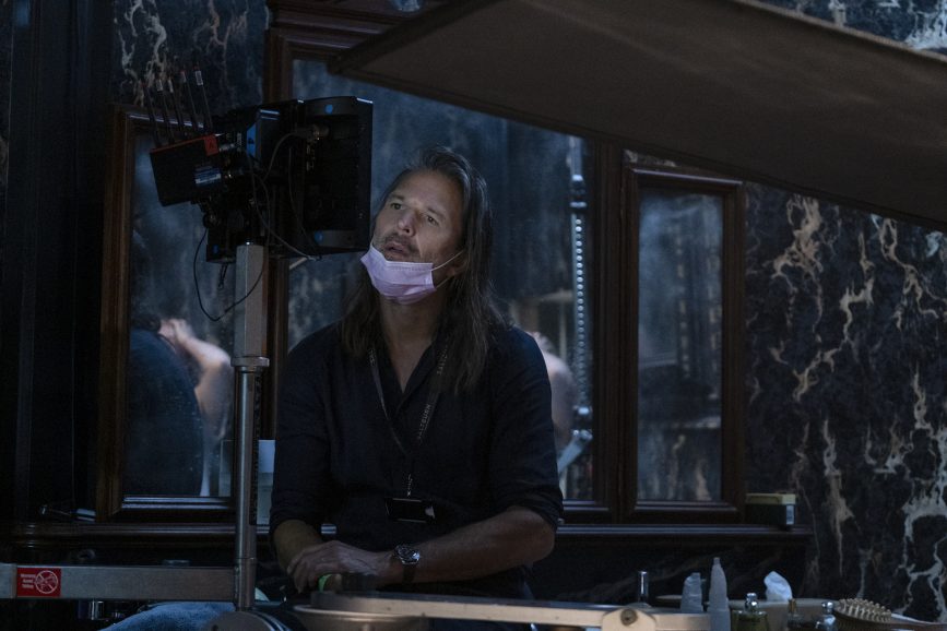
Sandgren wanted to carry the look throughout the production by also shooting drone sequences on film, requiring a merging of new and old technologies. “One of the main challenges is carrying a 400-foot roll of film because a 200-foot roll, while smaller and lighter, is not practical as with only two minutes of record time we’d have to reload after each take,” says Ayriss, who has flown film previously on The Northman, No Time to Die and Star Wars. “We’ve designed bespoke mounts which get all the accessories in the right place on the gimbal, so it balances, and we get unrestricted movement in all directions. I love shooting film and the rush I get when we turn over and the monitor flickers.”
In one sequence captured from above characters run through the maze in the Saltburn garden. As the maze did not exist at the location, Ayriss shot plates from 600ft descending on a central marker while the cast followed paths on the ground which would become their routes through the maze in the final VFX shot. “The altitude, lens and light were key as well as a precise descent through the drone’s own airflow,” he says. “It was a challenge mainly because we were working with limited time and light, along with the fact we were shooting film which forces a longer than normal pause while the mag is reloaded.”
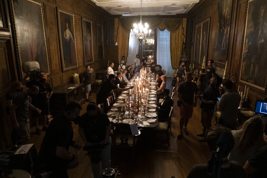
Disturbingly beautiful
Efficient shooting was achieved by working with wider blocking and only incorporating close-ups when they were most powerful. Scene blocking was approached similarly to painting compositions and even when shocking events took place, they were filmed with beauty in mind. “Emerald and I have a similar attraction to images which helped when blocking and figuring out a scene and how to light it to make it not only sensual or a thriller, but viewed in as beautiful a way as possible,” says Sandgren.
“If a disturbing scene has a seductive dramatic light, it makes it kind of awkward. We tried to step back and see it like a painting you could observe from a distance. As we wanted to make some scenes disgusting and attractive at the same time many things Emerald highlighted as important were contradictions – beauty and ugliness, empathy for the devil.”
But while shock value was at the centre of certain scenes of a more graphic nature, some sequences, such as the discovery of one character’s body, was treated with more sensitivity and captured at a skewed angle and with most of the character out of frame. “It all depends on the intentions of the scene – some were provocative whereas others didn’t require this treatment and needed the character to be treated with respect, almost in a moment of grieving so it is more heartbreaking for the audience,” says Sandgren. “You need to be artful as well to walk the line of some scenes not just being gross, because there are things people may have a hard time to watch.”
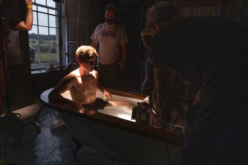
How much is seen and how creepy it is was a recurring conversation between the filmmakers. In a scene where Felix is standing on a bridge throwing stones into the water, rather than cutting to a close-up of Oliver watching him from a distance Fennell wanted him to be seen far away observing. “It’s spookier to see this character watching them from a distance,” says Sandgren who was also impressed by Fennell’s sense of timing, and the flow of lines. “When she cut aligned with a rhythm of filmmaking I enjoy most. It all felt very tight, and she has a great musical sense for what’s going on in a film.”
From Gus Van Sant and Damien Chazelle through to Cary Joji Fukunaga and Emerald Fennell, Sandgren cherishes the new perspectives shared by each director with whom he collaborates because they present different solutions and techniques he may not have considered. “I learnt a lot from Emerald and how brave her visual storytelling is. Sometimes I might suggest shooting another angle so they could cut to something else in the edit. She’d stick to her guns and how she envisaged the story being told and she was right to do so.”
