How Light Iron’s Ethan Schwartz shaped the look of What We Do In the Shadows
Aug 27, 2024
How would you describe the overall look of the show, and has this changed from when season one first aired in 2019?
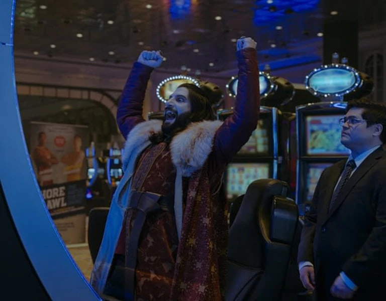
“I first joined the colourist team in Season 1 as an additional colourist and became the main colourist from Season 2 onwards. What’s great is that I’ve been able to work alongside several talented DPs and have played a significant role in honing the visual identity of the show. The show’s consistent visual style blends bright comedy and dark world elements with a frantic documentary-style of filmmaking.
One of our early discussions with cinematographer DJ Stipsen and showrunner Paul Simms about how the show would look leaned heavily on the importance of reflecting a rich, visually engaging and distinctive world for the vampires. To achieve this in Baselight, I use specific colourways for distinct environments that remain consistent throughout the series. Much of the action takes place at the vampires’ house, and a new introduction in Season 2 was to add desaturated hues of blue for the uplights and green for the downlights in the building’s interior that are still used today. For any exterior moonlit shot or interior scene where moonlight is visible through the windows, we use a prominent desaturated pale lavender light throughout the series.”
Season 5, specifically the episode ‘Pride Parade,’ has been nominated for an Emmy this year. In your opinion, what is it about this episode that resonated with voters?
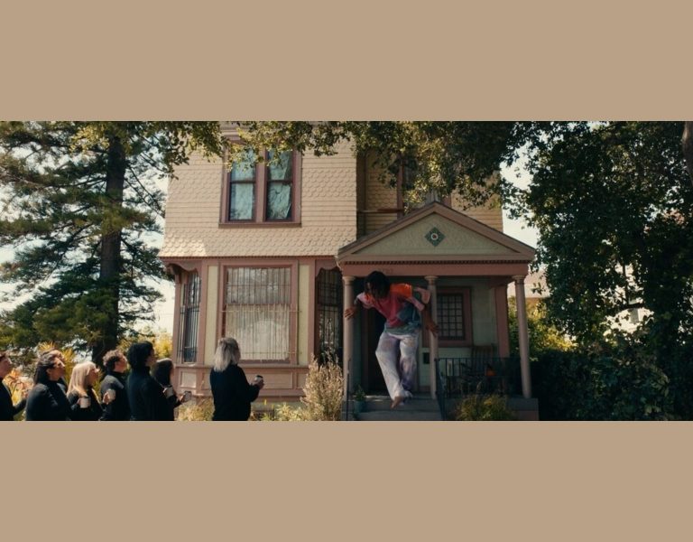
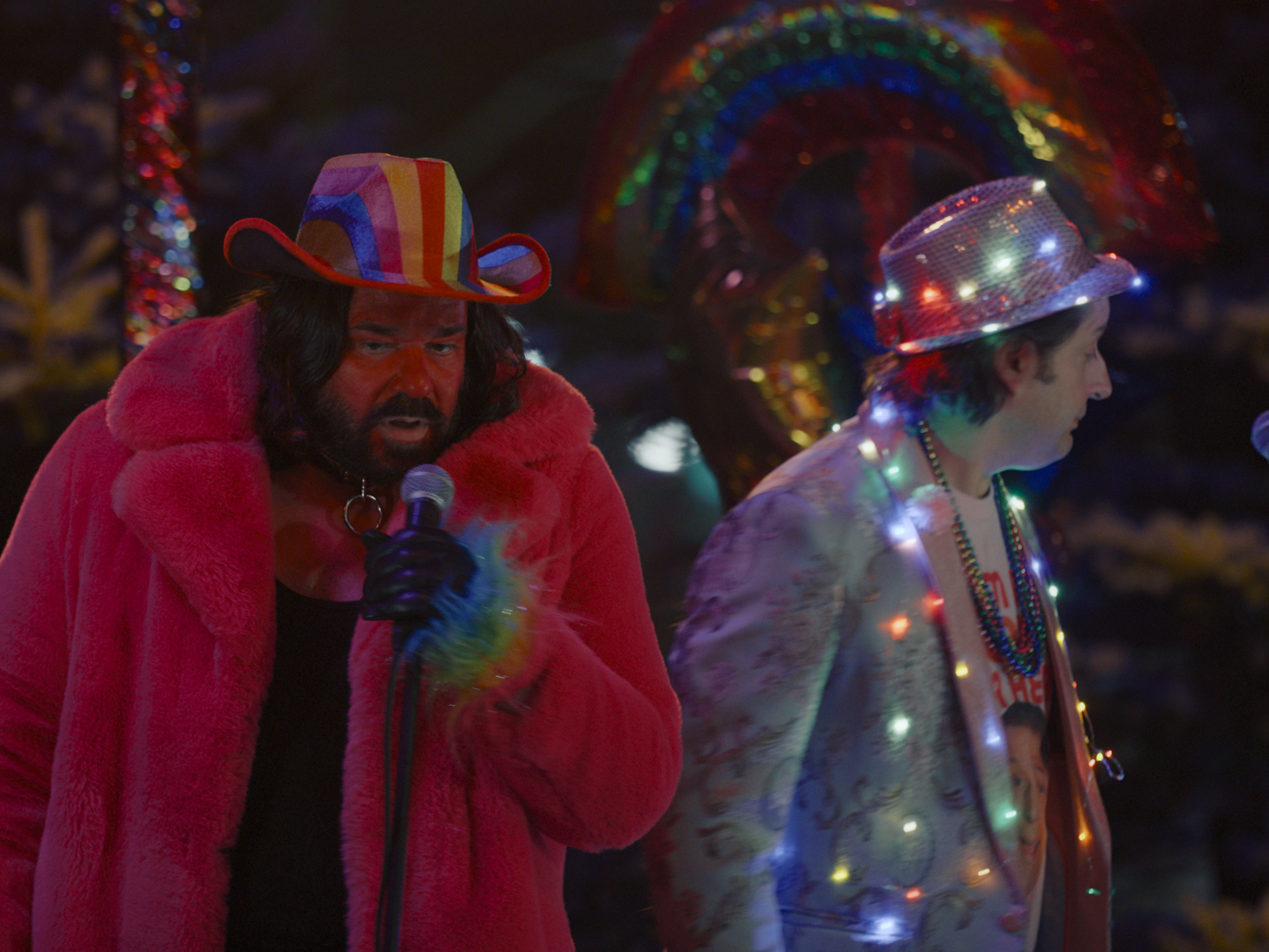
“The show intricately weaves dark world tropes with comedic moments, which is very entertaining. It has its own unique, frantic style that is even more pronounced in the ‘Pride Parade’ episode. The episode follows multiple character arcs as they do things for the first time, each requiring specific colour ways to reflect their new environment. For example, the scene where Nandor is on a determined mission to fly into space, or Lazlo invents sunscreen to walk in the sunlight.
I think this episode stood out to Emmy voters because of the narrative depth to each individual storyline coupled with the technical precision of the stylised visuals. The colour grading had to adapt to a range of scenes, from bright day exteriors to nuanced night shots. Managing the colour palette for different storylines, like the vibrancy of the pride parade and subtle pale moonlight effects, was crucial. The episode’s fast-paced camerawork and multiple arcs added to the challenge, but also created a unique visual experience.”
What are some of the more challenging aspects of grading a show that mixes dark visuals with comedic moments?
“My work on the show is often about achieving the correct balance of dark and bright elements to give the series its unique atmosphere. The show is supposed to be dark, it’s shot at nighttime, but it’s also extremely comedic, so we still need to be able to read the actors’ faces and see their expressions. Often that involves brightening the characters’ faces, especially around the eyes, but being careful not to lose that dark element.
As the viewer, we need to feel that the characters are vampires in an old, creaky house that is candlelit. However, because of the frantic back-and-forth documentary-style filming, the whole room needs to be light enough to see the characters’ interactions as they pan around. It also needs to feel ‘realistic’ within the context of it being a documentary, so it can’t be too stylised. There are many factors to consider, and getting the black level exactly right allows the show to tread that fine line of documentary, comedy and moodiness.”
What are some examples of challenges you faced that showcase how colour grading demands can vary from episode to episode?
“Despite having a distinct visual identity from location to location, every episode is unique and presents its own challenge. In ‘Pride Parade,’ one of the main characters, Nandor, flies into outer space. The sequence required different colour treatments for each stage of his transition from the ground through the stratosphere and into outer space. To add to the complexity, GoPros were used to capture the actor from two different angles, so the transitioning colours needed to match precisely when alternating between the two as he rises. The grade had to maintain the show’s established dark palette but also transition the colours to emulate the vastness of space.
Another episode in Season 5, ‘Local News,’ was supposed to feel like the documentary crew had discovered old broadcast tapes that were being played on a VHS player rather than a sequence that had been inserted in post-production. By using Base Grade and a Colour Crosstalk to skew the red, green and blue channels, I could make this part of the sequence feel different to the normal show. The newsroom needed a saturated, almost broken blue and red for the graphics and clothing to add a degraded quality that would further sell the archival footage feel.”
What techniques helped to highlight or accentuate the different themes in ‘Pride Parade’?
“I did a lot of Hue Shifting to enhance and desaturate specific colours. I desaturated the blues and reds due to how electric it feels on digital cameras. Beyond this, I created a lot of windowing and shaping to help maintain continuity. Places like the eyes and face are crucial areas to maintain brightness, so I needed to mask those areas to handle the frequent camera movement. Additional feathering to the masks ensured the integration of lighting remained smooth and consistent, and helped to retain a natural look despite the fast-paced, documentary-style camerawork.”

