Helena González takes us through her rigorous testing process and shares how she and director Simon London were immediately on the same page when it came to crafting the 1960s drama’s mood and atmosphere.
Trapped in a 1960s facility evaluating children for potential citizenship, two girls are faced with the question of human value in This is Ours. Finch is thrilled to be doing well in the tests when her roommate Bren begins to rebel, refusing to take part any more. This destabilises the foundations of Finch’s success and the girls are set against one another. However, by the time Finch is selected and Bren tagged for removal, a bond has developed that outweighs any victorious feelings for Finch and their separation leaves her devastated as she anxiously enters her new life as a citizen.
British Cinematographer: What were your initial discussions about the visual approach for the film? What look and mood were you trying to achieve?
Helena González: When Simon London (director) and I began talking about the film very early in pre-production, we were immediately on the same page about the atmosphere and the mood of the film. We wanted to go for a communist-era Soviet look with Nordic light, feeling raw and cold. We imagined the world having these angular and oppressive shapes contrasting the vulnerability of the children, but also rich in textured, imperfect, naturalistic lighting to keep it feeling very grounded. Despite the world in which the girls live being brutally rigid and structured, what was most important for us to convey was the emotional journey of the main character. We wanted the audience to feel close to Finch and her experience.
BC: What were your creative references and inspirations? Which films, still photography or paintings were you influenced by?
HG: In our early conversations, it became clear that in order to achieve the mood we wanted, the ideal format would be 16mm; either shooting film or replicating the look digitally. One of our main visual references was Winter Brothers, directed by Hlynur Pálmason, which was captured on 16mm film. Tonally, we had some of Yorgos Lanthimos’ films in mind with regard to how he creates these absurd, dystopian worlds. Prep also involved plenty of conversations with Yujia Huang (production designer) who did an amazing job designing the palette of the film. She brought lots of paintings and period photographs to the table which were key to designing the look of This is Ours. We agreed on quite a desaturated palette; full of greys, blues, greens and earthy tones allowing the character’s skin tones to pop. As well as the base palette we decided to introduce the Olympic primary colours when the girls are undergoing their ‘tests’; using one of these colours (red, yellow and blue) to define each test we see in the film.
Two other films that we had in mind were Happening and Playground. We were really intrigued by how they connected the audience to the character’s experience through their use of focus, depth of field and composition.

BC: What filming locations were used? Were any sets constructed? Did any of the locations present any challenges?
HG: For the majority of the production we shot in Dean Valley Studios in High Wycombe. This was a warehouse space that had been converted into studios, but still retained this cold and industrial look which was ideal for our film.
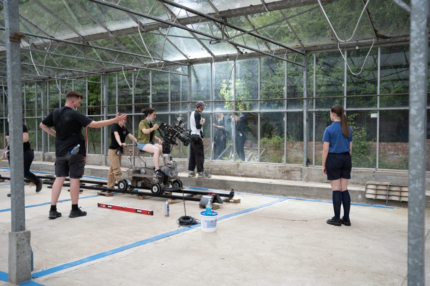
The warehouse had exteriors also which we needed, as well as two smaller rooms which we dressed as the bedroom and washroom. There was also a large open conservatory which we used as a courtyard set for the film. With windows on all sides, we didn’t really have the equipment to control the natural light, so this was a challenging set.
Fortunately it was cloudy the entire time we shot that scene, which made things easier but also suited better for the mood of the film. The interior of the warehouse had great texture in the walls and concrete floors which was very close to what we had envisioned in prep. The challenges were that it was such a vast space to light and there were skylight windows which we couldn’t access to cover. To combat this we pushed a lot of light from HMI units through the side windows to bring as much contrast and shape to the space as possible.
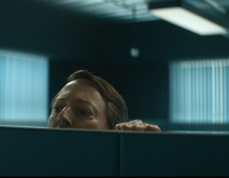
We also had an office set which we shot at NFTS. The production design team dressed an existing room and did an amazing job transforming the space and making it fit the world we created in the warehouse.
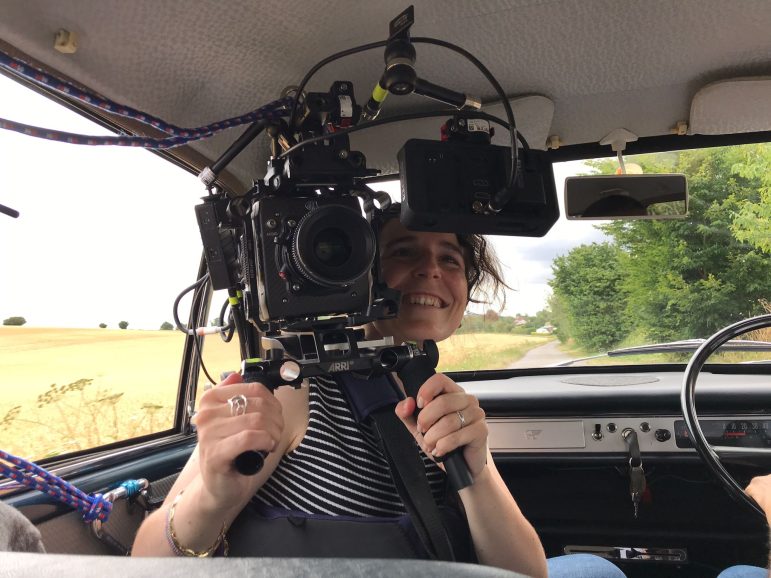
Finally we had a moving car scene, including a drone shot. We found an ideal stretch of road very close to Dean Valley Studios where we shot this sequence. We also got lucky with the weather on this day as it was bright but with still some cloud so that we could hold exposure outside of the car for this sequence.

BC: Can you explain your choice of camera and lenses? What made them suitable for this production and the look you were trying to achieve?
HG: As I mentioned, Simon and I were really on the same page with shooting the film on 16mm film. We really liked how it renders colour and gives these richer skin tones, texture and grain as well as the proximity in the relationship with the camera and the characters. But equally, we had the challenge of shooting with child actors which meant we had limited hours on set with them. Ultimately we felt that shooting on film with limited stock would hamper our choices and amount of takes. We decided to prioritise performance over everything else and so I suggested to Simon we do some tests in Super 16mm mode on the Alexa Mini.
I had been interested at the prospect of shooting 16mm digitally for a while, having known my mentor Neus Ollé AEC BSC shot La hija de un ladrón on the Alexa in this format and I really liked the results. Esther Woodbridge (colourist) and I took the tests and we both played with them to get a look most akin to 16mm film as possible. I was very pleased with the results, I shared them with Simon and we decided it was the best way forward.
As we were shooting digitally, I wanted to use vintage glass to bring us as close to the look of 16mm film as possible. I tested the 8-64mm, 7-63mm and 11-165m Canon zooms as well as the Zeiss Standard T2.1 primes. We even tested Cooke S4s to see how Super 35mm lenses would resolve in the format, which ended being too clean for us.
We ended up shooting on the 7-63mm and 11-165mms as they allowed us to do these slow and drawn-out zooms due to their extensive range. These two lenses also had more texture and aberration on the edges than the 8-64mm which was preferable to what we were going for.
After testing the zooms I saw some tests of the Zeiss Ultra 16 Primes and I fell in love with them. ARRI Rental were instrumental in helping us to get a set. We really loved using the 9mm, 8mm and especially the 6mm to get these unsettling wide shots, highlighting the absurdity of the dystopian society they were living in. The combination of the Ultra 16 Primes for the widest shots and the Canon zooms for our mids and closes worked really well to balance the absurd with the intimate and authentic.

BC: What was your approach to lighting the film? Which was the most difficult scene to light?
HG: My intention with the lighting was always to build a lot of contrast into the scenes with this cold, white light which would come through the windows in our interiors or from a cloudy sky in our exteriors. We didn’t want to use practicals as we imagined the world in which they live to be austere and conservative in their use of electricity. So it was a challenge to base all of our light off of window sources while also retain a naturalistic motivation.
Something that caught my attention was how the snow shaped the light in Winter Brothers. I really enjoyed the quality of light this gave and although there was no snow in our world I lit with a lot of bounced sources to emulate a similar quality. We used several HMI units provided by Panalux bounced into 12×12 Ultra or Poly Boards outside our windows. Keeping most of the sets clear of lights on the floor really helped give freedom to the actors in their performance, although it did mean at times I needed to use a lot of light.
The most light we ever had on a particular scene was around 18k-20kW, when we had a 9kW, 6kW and a couple 2.5kWs working at the same time. Another challenge of this setup was controlling the sun as it came in and out during the day. When the sun came direct we would diffuse it or put up blackouts to block it out. Our bounced HMIs as a key, served more to create shape and texture on the skin while we controlled the amount of ambient we were getting from the sun throughout the day. Luckily we had a big team of sparks led by my gaffer, Mark Lane who I couldn’t have done the film without.
There is one scene in the film where the girls are laying in bed in the early morning. For Mark and I this was definitely the most challenging scene. As we were unable to shoot at night we had to build a tent outside of the bedroom window. Using LED panels we created this soft blue-ish light as though it was coming from the dawn sky. This was tricky as we were using net curtains to conceal the exterior but they would burn out quickly with the sources we were using from outside. In the end I feel we managed to create the right light for this intimate moment that the girls share in this scene.
BC: What were you trying to achieve in the grade?
HG: Following the tests I did in Super 16mm mode on the Alexa, Esther Woodbridge and I worked to create a show LUT that we would use on set. We were trying to build a look with enough contrast and to create a cold environment around the girls, leaning towards cyan but still with skin tones that felt rich and vulnerable. The final look of the film has ended up being quite close to the LUT that we created initially. That’s why I really enjoy the process of testing in pre-production, as in this case I learned the limitations of S16mm mode on the Alexa. For example, Esther and I discovered that at higher ISOs the noise that the sensor introduced became unpleasant, so we decided instead to shoot at 400 ISO or less whenever possible, and then add film grain in the grade. In addition to the grain we added more halation in the highlights which helped make the glass feel even older.
BC: What were the most challenging parts of the film to shoot and how did you overcome those obstacles?
HG: There were some technical and safety related challenges to certain setups in the film. Thankfully we prepped meticulously so that we could get the results we wanted with the correct equipment and in the precious little time we had with the actors.
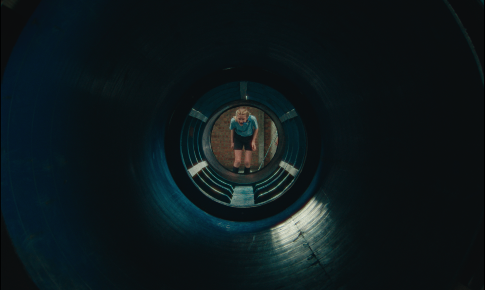
I remember early on when scheduling there was one particular day which felt like it was going to be tight to get all the coverage we wanted. The scene in question was the ‘pipe test’ which involved the kids having to crawl through a pipe holding on to a cable with their teeth. The scene was complex for many reasons but it was all about capturing this silent interaction between two characters to understand the dynamic.
Some of the setups were complex moves on the dolly which was fun to orchestrate even if it was challenging. Simon, Yujia, the production team and I worked very closely with Sam Roffey (1st AD) who did am amazing job. He not only helped us achieve everything we wanted to on set but also fostered a lovely working atmosphere on set. A key part of this was giving Olivia Booth-Ford (Finch) and Alice Miles (Bren) the space they needed to perform, which Sam managed brilliantly.
BC: What was your proudest moment from the production process? Is there a specific scene or shot that you’re especially proud of?
HG: My favourite scene in the film takes place in the middle of the story when tensions come to a head and the girls fight in their room. I suggested to Simon that we set the scene at sunset, with a very low direct sun coming through the windows, to contrast the coldness in the rest of the film. I wanted the light to feel as though it was putting the girls on edge and pushing them to express their feelings, which is something these kids have never done at this point. I am really proud of how that scene has ended up and I think the visuals really complement the experience the girls are going through at that point of the story.
One of the reasons I’m proud of it is that the lighting is very simple. We lit it with a 5kW Fresnel direct through the window as well as some 600w Tungsten heads bouncing into Dedolight Lightstream reflectors (generously provided by Cirrolite) which helped create texture on the walls behind the girls.
BC: What lessons did you learn from this production that you’ll take with you onto future productions?
HG: First of all, testing is crucial. It allows you to save time and money on set, as well as being able to establish the technical rules of the world. Having these rules in place then gives you the space to improvise and be more creative on set, which I find very liberating.
I also learnt how important it is to give respect and space to the actors. It doesn’t matter if the cinematography isn’t perfect, the performances are what move the audience. It’s important as a cinematographer to give them space and time to make their job easier. This film taught me how to think in lighting how to create a look that works for the film but also facilitates their job. The film will always benefit from it.
I also learnt a lot about lighting, especially working in a big space with big sources and how to control the natural light and use it to your advantage as well.

BC: What would be your dream project as a cinematographer?
HG: To be honest, the projects that I am most excited about are ones that allow me to meet amazing collaborators and learn from them. I also love to travel and discover different places and how the light behaves around the world, so I’d be excited to be able to discover new places. But the most important thing for me are stories that are so powerful that they push the audience to think beyond the film itself. I’m most interested in stories that follow character’s emotional journeys. I think those are the ones that allow me to learn something and present challenges; not only in cinematography but in life. Those are the ones that make me grow as a person.
