HEIST HOMAGE
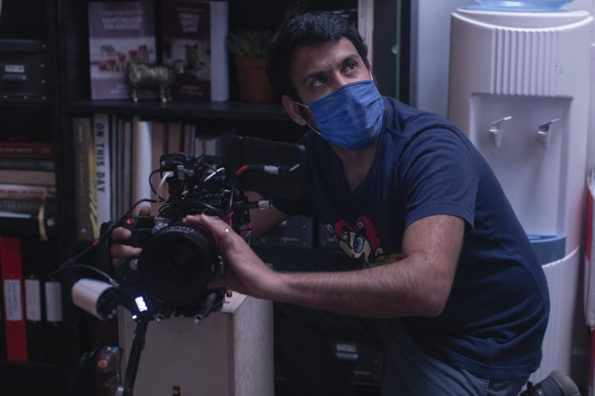
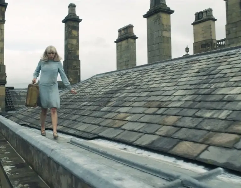
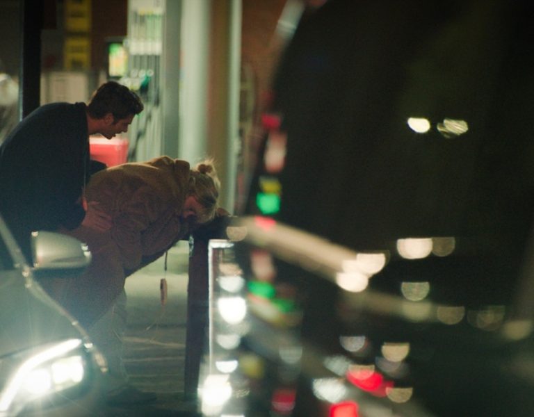
We caught up with cinematographer Haider Zafar about his work on Marcus Flemmings’ Blonde. Purple. The director of photography filled us in on how he lensed the surreal homage to the ’90s heist movie.
What initially appealed to you about the film?
Having collaborated with director Marcus Flemmings for 15 years on a multitude of shorts and three previous features, I am always excited to read his latest screenplays. It was no different with Blonde. Purple – I was enticed by how the narrative was to be confined by a single location yet feel expansive with a dual timeline of how our protagonist reaches their plight.
It was also Marcus’ most commercially driven screenplay with nods to his directorial influencers.
How did you collaborate with the director?
We always start it off with a casual dinner to discuss ideas and visual references, whilst being mindful of any limitations or constraints due to budget or resources available. Both of us being keen movie goers, a lot of our sensibilities would align in how we would tell the story visually. Although Marcus had created storyboards, we would often explore setups on the day depending on location and what was possible with our lighting and production design arsenal.
Who were the other key members of the team you worked closely with?
Gaffer and cinematographer James Westlake has been a gem of a collaborator since 2018 and someone I hugely admire. Despite Blonde. Purple being set in a real world environment, we were fully supported by Marcus to push the lighting in terms of colour and tone, especially for the flashbacks and then we adopted a more honest lighting approach for the present.
Another major collaboration was with production designer, Catherine Zafar (not a coincidence) who created, amongst all locations, a wonderfully rich bank office environment to allow us to film in 360 degrees – as we would be spending 70% of the film in that space. I had to help source props for the art department and also ensure constant creative communication in what would work for the camera technically and aesthetically and above all, Marcus’ vision.
Offering creative ideas and solutions by all members of the team on low budget movies is an absolute key process in making the best possible film.
What creative references and inspirations did you consider?
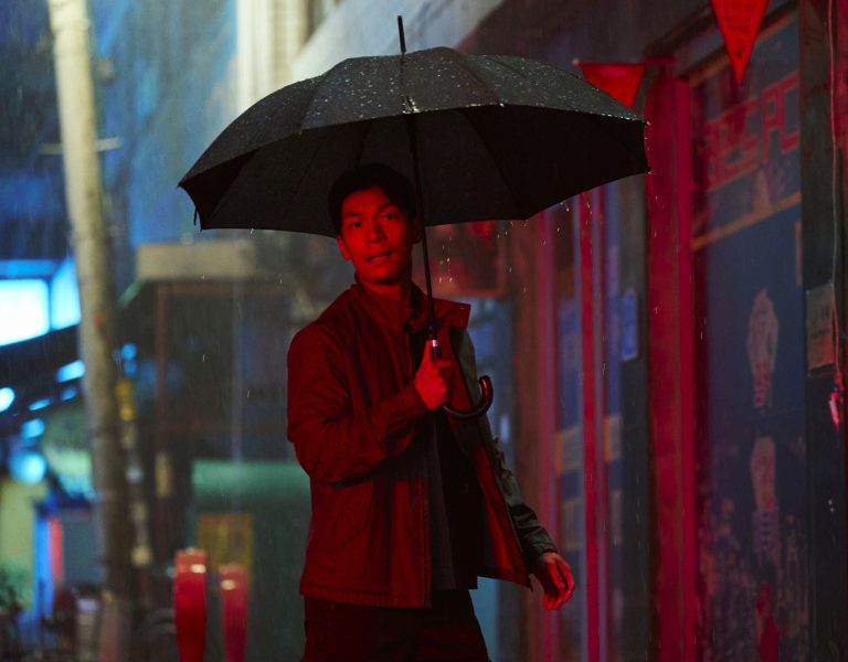
For Marcus, the ’90s and early 2000s heist movies were very strong references for the style and tone of the film, Soderbergh’s Out of Sight being something we rewatched. Visually, the works of Nicolas Winding Refn and his use of colour with fellow DP collaborators Newton Thomas Sigel ASC, Larry Smith BSC and Natasha Braier ASC and then the more classical though heightened style of Quentin Tarantino’s collaboration with Robert Richardson ASC all played inspiration to the look and feel of the film.
How did you use framing and composition creatively throughout the visual storytelling?
Although cinematography encompasses more than lighting and composition, collaboration with Marcus starts with a frame in mind – sometimes his and sometimes mine but always definitely what the location dictates. What I love about Marcus’ vision is the knowing of what shots he would want in the edit and never doing unnecessary ‘coverage’ that could lead to sloppy visuals.
We shoot single camera on everything and that means a more controlled focus on the framing, composition, and lighting of a shot.
For me, there’s a rustic quality to the film that is brought out further with the costumes and production design. It’s truly a collaboration from all departments.
The film frequently jumps between timelines. How did you approach this visually?
Filmmakers often set rules for themselves and then throw them out when something isn’t ‘feeling’ right. It was no different here!
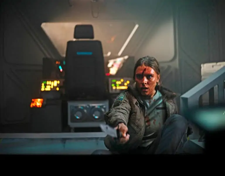
Marcus and I discussed a handheld approach for being trapped in the bank office. I coined the term “let’s Revenant Cam it” and then we had a very controlled tripod and dolly approach for the flashback scenes.
The film begins handheld and as the two leads, played by Julian Moore-Cook and Ellie Bindman, begin to form a bond, the camera calms down. It ramps back to handheld for the frenzy of the final act. This was a process that only came to us once on set and in a real environment. I often find filmmaking being instinctive than knowing everything prior.
Out of the few, but impressively stylised sets, what was your favourite setting to film and why?
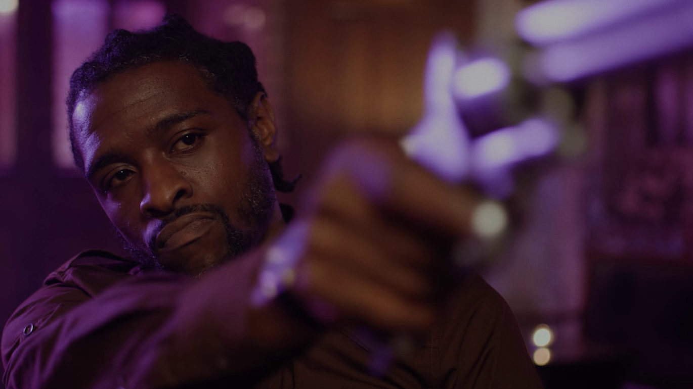
Selfishly, I have to say the bank office, only because I was able to help Marcus and the production designer visualise and space plan the environment using my background in 3D visualisation. Filming in one location and making it constantly feel fresh and new is a challenge in itself. Practical lighting and a couple of key soft lights was all we used to light the office space.
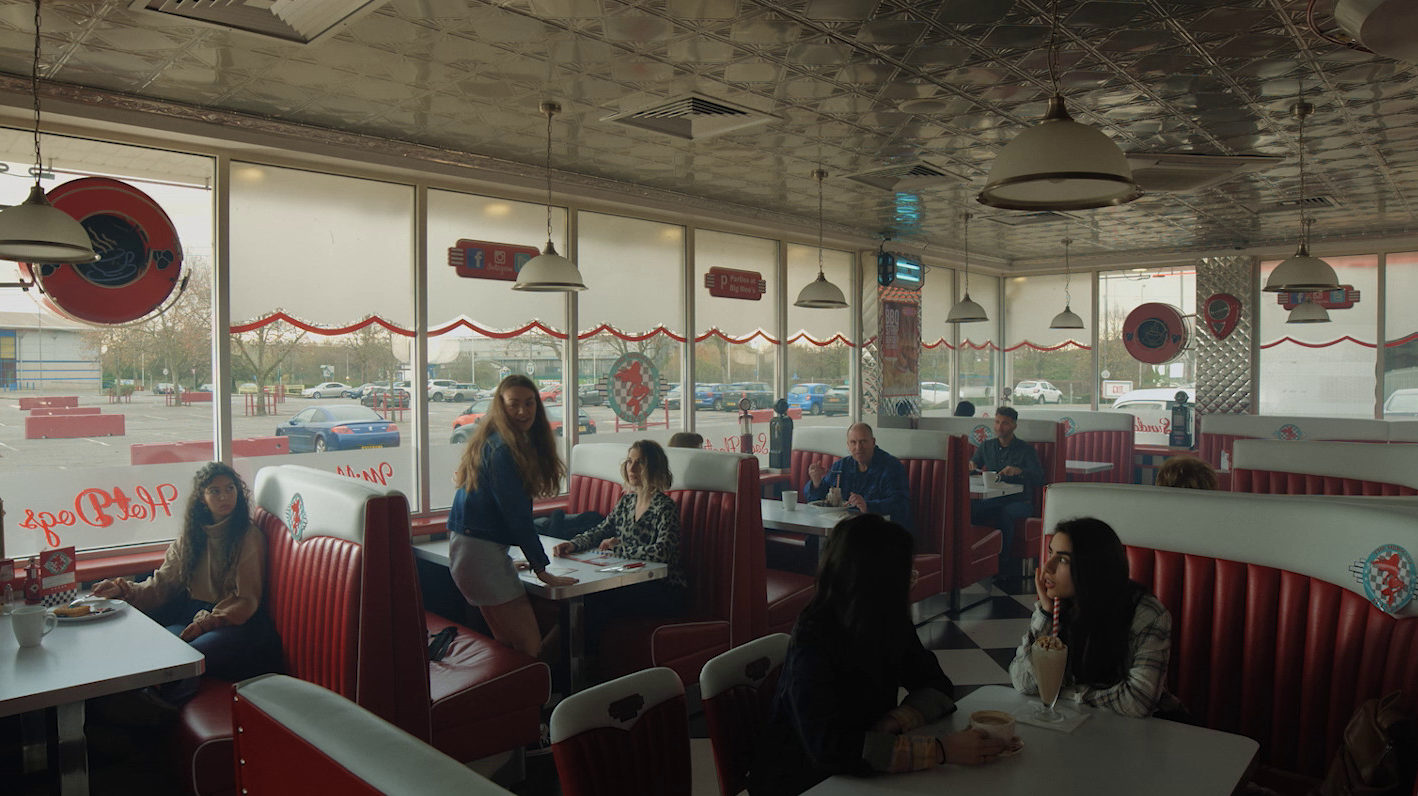
I’m also a sucker for American diners, and turning an East London burger joint into Mermaid Diner by the production designer was also a fantastic location to shoot.
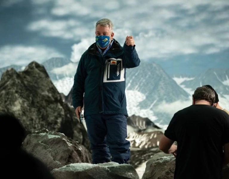
Through the use of some VFX wizardry we were able to make the likes of Hatfield in Hertfordshire become an American cityscape. For the flashbacks, the use of longer lenses, 50mm 85mm and 135mm, is a little more prevalent, and for the present timeline interior we opted for a lot of the 14mm wider angle.
What camera package did you use to suit the production?
South London based Nodachi Films had recently acquired the Kinefinity MAVO LF and kindly provided the camera package at a reduced rate and I subsequently brought my set of Samyang Xeen Cinema Lenses, loving the colour rendition and clarity.
Gaffer James Westlake brought his ever growing collection of Aputure lighting with only one other externally sourced M18 HMI lamp from Shoot Blue for a night woodland exterior.
How did you manage claustrophobic locations and lighting situations?
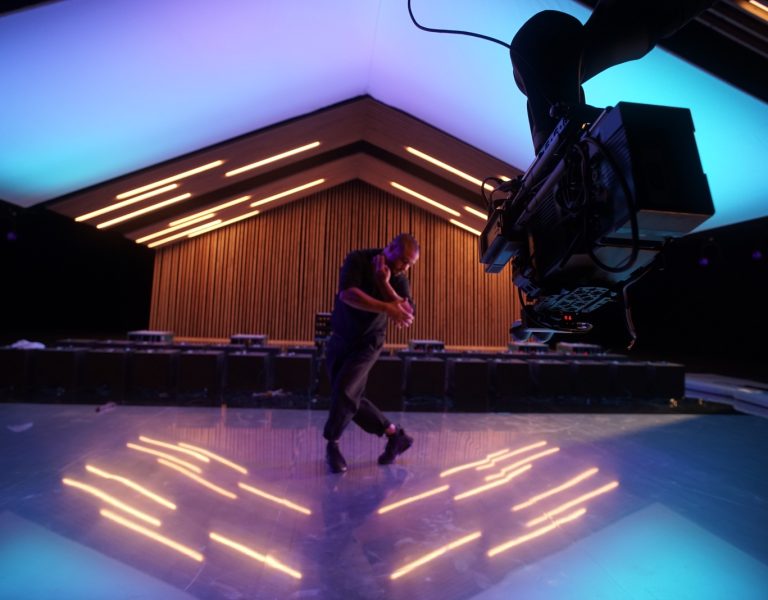
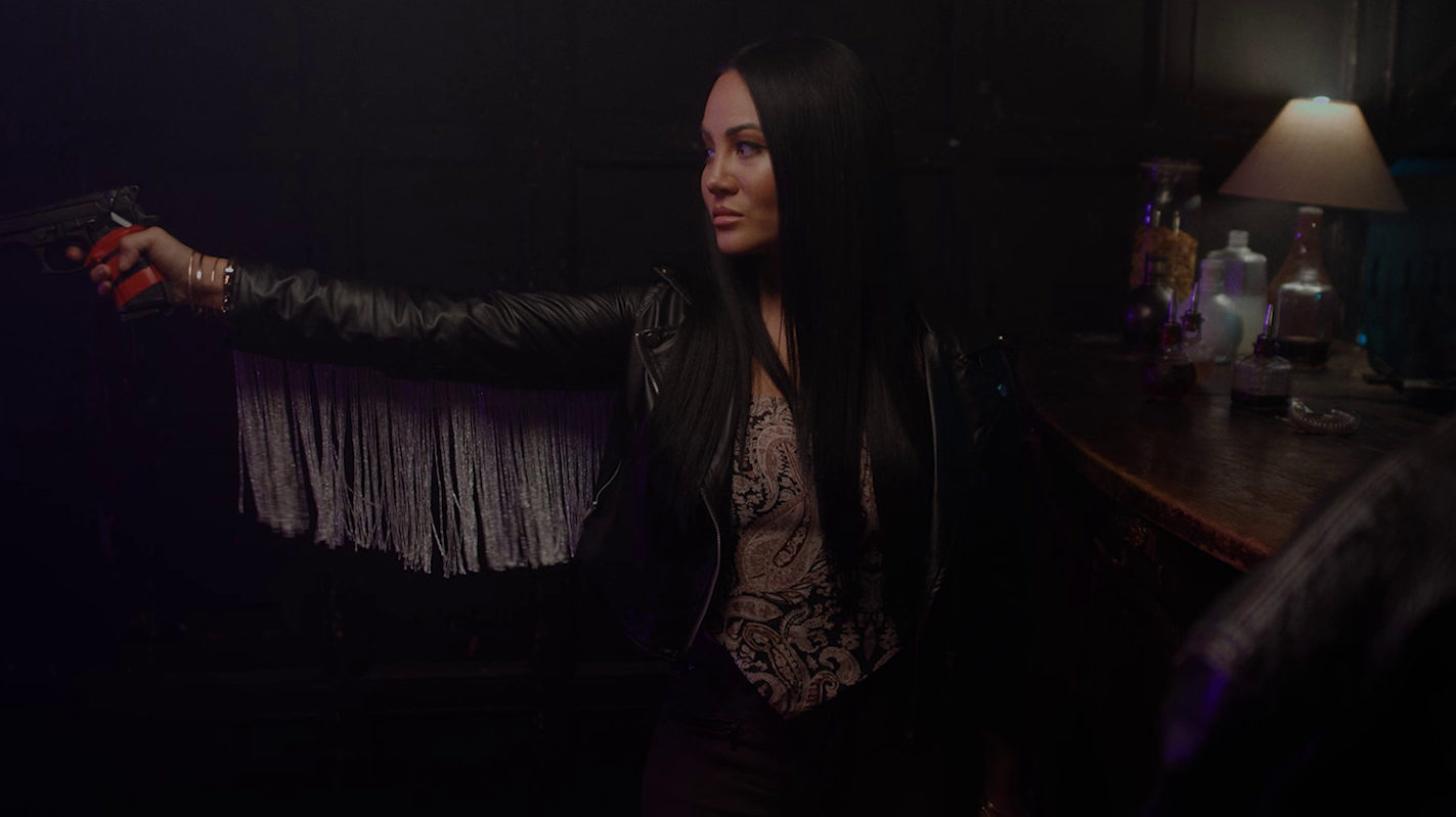
With the use of wide lenses and a large format camera sensor we were able to tackle physically tight locations and still find depth. The lighting was all practical bulbs on dimmers controlled via an iPad by the gaffer who would often start a flashing disco.
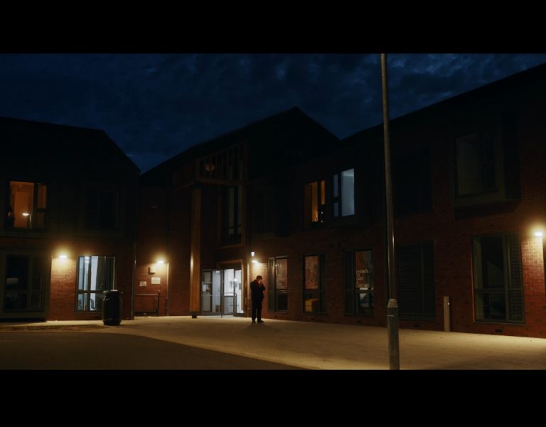
The exteriors varied natural light and some use of our own fill and bounce, and the night exteriors would use location lights and film lights for diffused fill and any additional colours we wanted to use.
What was the biggest challenge the production presented and how did you overcome it?
Whilst most of the shoot went fairly smoothly, COVID obviously slowed us down with social distancing, and being masked up in warm spaces made it tricky to work for long stretches productively.
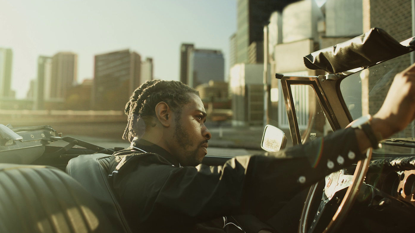
One particular incident that wasn’t ‘fun’ at the time was when filming in a street in Hatfield and a local resident came out of their home stating they weren’t happy we were filming outside their property. We said that we are on public land and filming towards an actor in a car, but they were adamant our camera was facing their house! Eventually they calmed down and said it was okay, but by then we had decided to move along. We ended up finding a much better location for the scene and God even brought out the sun for a beautiful backlight!
What was your proudest moment throughout the production process?
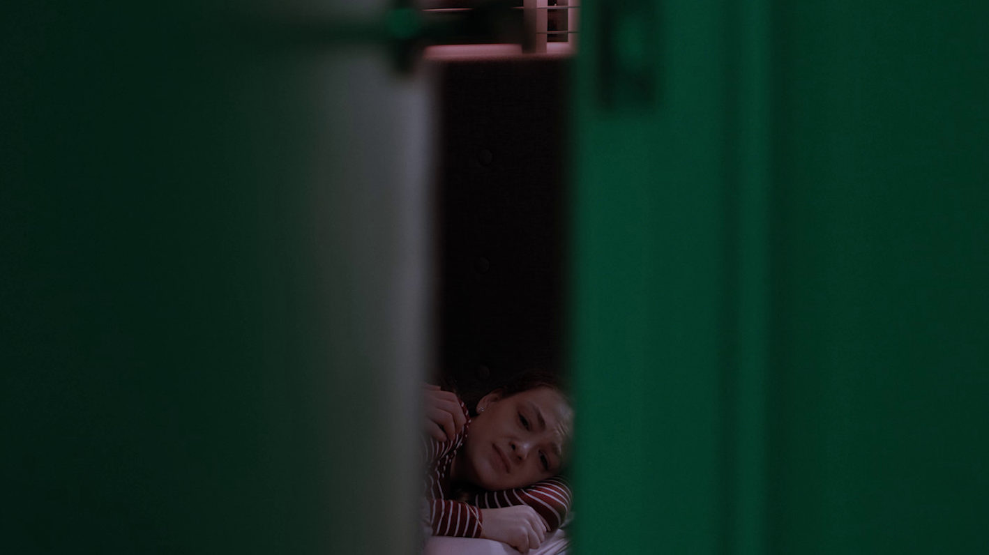
Being shot in and around London, but made to feel like a nondescript US State was a huge result on the sub £100K budget.
Making an indie feature is tough, making an indie feature visually consistent in a multitude of locations is even tougher.
Having completed a two-hour feature in 15 days, whilst battling a 2020 pandemic in winter and coming out with a piece of filmmaking to be proud of was in itself the proudest moment, with the exception of seeing it on the big screen at the cast and crew screening.
What lessons did you learn you will take with you onto future productions?
Being open to trying unconventional or obscure framing, more use of colour and ultimately my new found love for the large format sensor.
