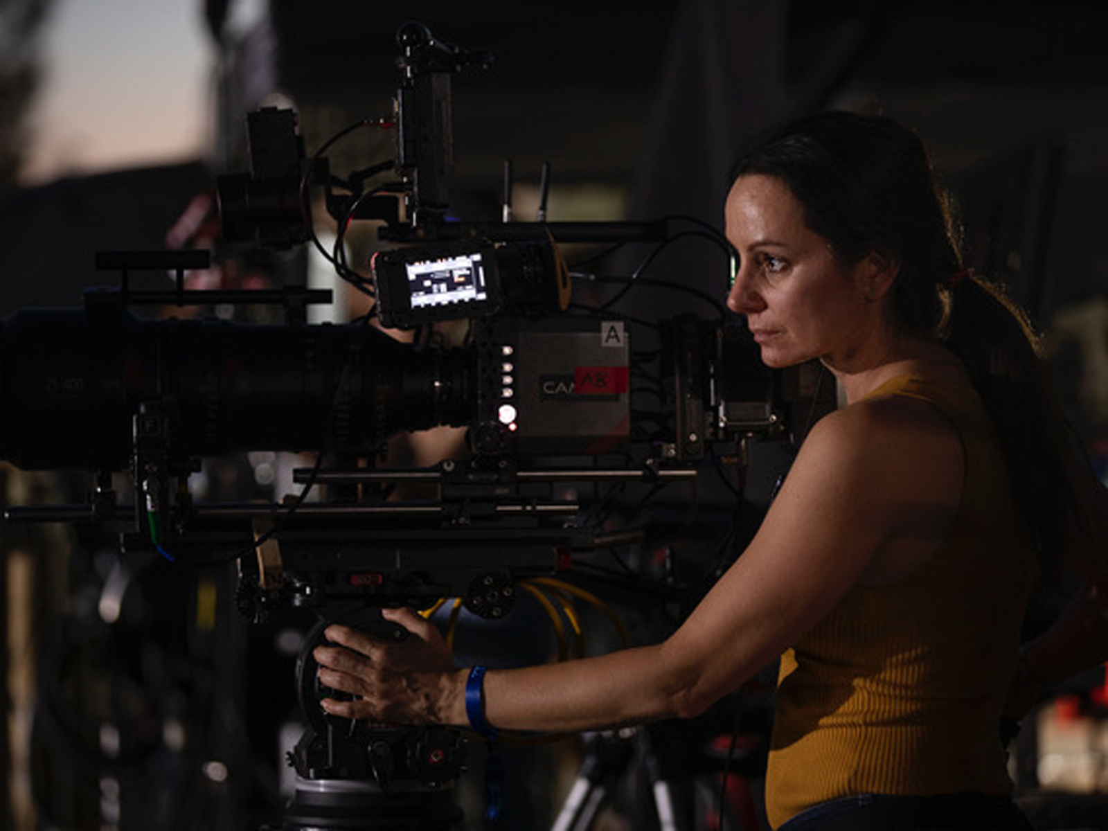
Natasha Braier is an Argentinian cinematographer known for her visually striking and innovative work. Her collaborations with directors such as Lynne Ramsay, Nicolas Winding Refn, and David Michod have earned her critical acclaim.
Braier’s distinctive visual style, marked by bold use of colour and light, has made her a sought-after talent in the industry. Her work showcases her ability to capture emotions and enhance storytelling through her unique lens.
Braier’s notable works include The Neon Demon (2016), Honey Boy (2019) and The Rover (2014).
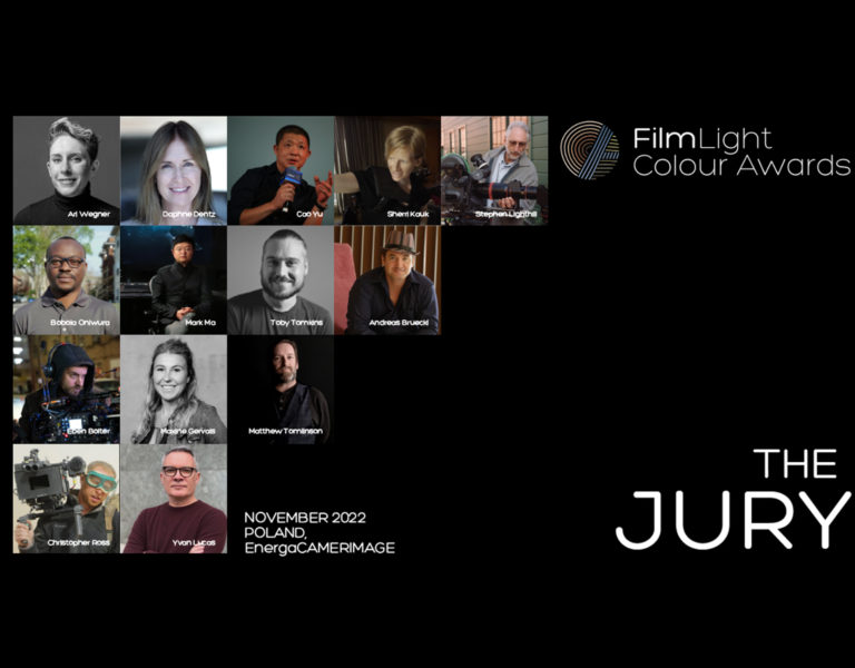
You are a judge for the 2023 FilmLight Colour Awards. Why do you think it’s important to recognise colourists in a platform like this?
I think in today’s digital age the colourist has become a crucial part of the process of creating and finalising the look and they are a very close ally of the cinematographer. Even if a cinematographer has made decisions on camera – decisions which, on film, would have been irreversible – the range of possibilities in colour correction today is huge. A colourist can help a cinematographer achieve what they want to achieve, or they can completely destroy their work.
It is important to reward the good work and to create a culture that understands and appreciates how we work together in collaboration, and how colour correction is successful when it is enhancing the cinematographer’s original vision.
What are you looking for in entries this year?
I’m looking for fine, elegant work that is humble – not something that is trying to create a “look” and call attention to itself.
I’m looking to see how the grade has helped to refine the cinematographer’s work, how it has aligned with and is at the service of that vision.
As a judge, do you place more emphasis on technical mastery or the emotional impact of the colour grading?
I think both things are equally important. Technical mastery means nothing if there is no emotion, or the wrong emotion. On the other hand, of course, technique is the medium that the colourist uses to fine tune and achieve the desired emotion.
Judging is now complete. How did it go and, without giving anything away, was there anything that stood out to you or captured your attention?
It’s been extremely challenging. The material is very good and overall I’ve been very impressed by the entries.
The supporting material is key to determining the work of the colourist and being able to accurately analyse how much of the look was achieved in dailies and how much was added in color correction. We had a jury meeting recently and we all agreed that we’d like to see more supporting material in future years.
You’ve worked with director Nicolas Winding Refn who is known for his intense use of colour in films. How did you approach colour on The Neon Demon?
Nicolas loves colour and contrast. He is colour blind to some colours, so he needs the other colours to pop in order for him to see them. I love how from that limitation, a very unique and brave aesthetic was born. Actually, a lot of great painters had visual limitations – Van Gogh, Degas and Monet all had eyesight problems.
I personally have astigmatism, which slightly distorts and reduces the sharpness and contrast. I believe this is one of the reasons why my lighting is quite contrasty, and why I choose softer lenses that see the world more like I do. El Greco also had huge astigmatism, and it’s said that this is the reason why his paintings are distorted.
Nic and I didn’t know each other before Neon Demon, but we were definitely a perfect match. I’ve always been very experimental and have worked with experimental directors, but Nic just pushed me to the next level and gave me so much freedom to play with colour. He is not afraid of failure, he detests to be in ‘safe ground’, so there was no fear and total permission to try things even if it may fail. This was extremely liberating and turned out to allow an explosion of colour creativity, which I think was only possible in the safe container he created where the process was priority over the result.
Can you tell us about your relationship with colour and how this has changed over the years?
It definitely changed with Neon Demon. Before that, all my films had been shot on film and my colour palettes were always very designed and controlled, working in collaboration with the art department and costume department and using filtration and lab techniques, but they were never so colourful, I guess mostly because the nature of the stories I was telling didn’t need that.
My film, The Milk of Sorrow, which was shot in Peru, was probably the most colourful. But our job in that one had been to ‘curate’ the abundance of colours in Lima and reduce the palette to a specific combination of colours. Neon Demon was the first project where we wanted a lot of colour, but that colour wasn’t necessarily in the locations or the wardrobe – I had to create it with the lights. This opened a new door of lighting with coloured light and there has been no way back from there.
Can you recall a scene or a movie where the colour grading played an expected but pivotal role in the story?
I actually make all my colour decisions in camera. My dailies are 95% exactly what you are going to see in the final piece. I don’t like to leave decisions for later. I work closely on the creation of the LUTs prior to the projects and I monitor on set with that. For me, the colouring process is just one last polishing pass where we improve what we already have and help some continuity issues or modelling where I couldn’t do it on set. So, for me, there is never a pivotal role in the grading.
Do you have pre-production discussions with your colourist and, if so, do they influence your lighting on-set in production at all?
Absolutely. We design the LUTs together and do tests before we start production.
What are you working on now/next?
Due to the strikes, the project I was working on was put on hold, so I’m working on commercials and music videos.
