Please share an outline of the production?
Where We Came From is a short film directed by Nick Virk and produced by Shiva Raichandani, starring Emmy Award-winning Archie Panjabi. The story follows Satinder Aujla, the UK Conservative government’s newly appointed foreign secretary, as she leads a high-profile press junket. As she defends fascist policies under the guise of British values, her internalised racism becomes apparent, revealing the extent to which she has sacrificed her heritage in pursuit of power.
The film had its world premiere at Tasveer Film Festival 2024, followed by its UK premiere at Manchester Film Festival 2025.
Why was it so important to tell this story? How different was the production from previous projects?
This story felt urgent because it examines the insidious nature of internalised racism and how power can erode one’s cultural identity. In a time when nationalism and political rhetoric are increasingly divisive, Where We Came From challenges audiences to question who gets to define ‘British values’ and at what cost. By centring the experience of a British South Asian woman negotiating newly found power, the film forces us to confront uncomfortable truths about assimilation, privilege, and the compromises made to belong.
From a production standpoint, this project was radically different from conventional narratives. With every frame centering on the protagonist, it demanded precision in cinematography, framing, and performance, something which I had not done before, unlike traditional multi-character films. It was a rewarding creative challenge.
How did the director articulate what they were looking for?
Nick had a clear vision for Where We Came From from our very first meeting. I was drawn to the concept when they presented their storyboard and idea for the film. They provided a detailed blueprint of the film from start to finish, ensuring that every creative choice served the story’s psychological depth. What distinguishes Where We Came From is its bold, singular visual approach. Archie Panjabi remains the sole presence on screen, ensuring the audience is entirely immersed in her perspective. Nick wanted the film to function as an extension of Satinder’s psyche, as we capture every subtle shift in her expression and posture of her navigating the press junket, how she perceives her surroundings, allowing the audience to experience her in real time. This approach allowed the film to feel both intimate and unnervingly claustrophobic.
How did you decide upon the visual language?
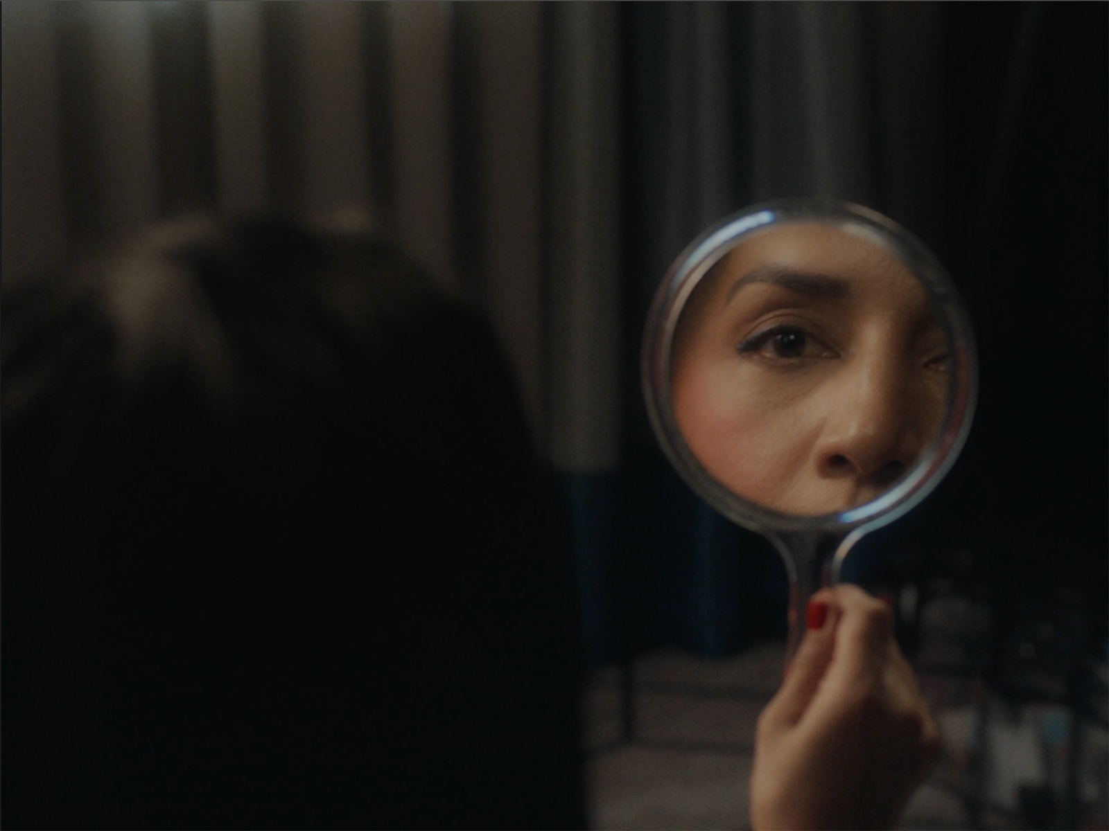
We chose the 4:3 aspect ratio to create a very intentional portrait framing throughout the narrative. This tight composition keeps the focus on Satinder, never allowing another character to enter the frame. It enhances the sense of confinement and control and the character’s own narcissism and inability to empathise. On rare occasions, when Satinder is alone, we use wider shots to highlight her isolation and loneliness, further underlining her emotional disconnect.
Colour plays a pivotal role in reflecting the themes of the film. The use of red, blue, and white as accents subtly reference the Union Jack. These colours, particularly in Satinder’s makeup and the ornate hotel suite, create a sharp contrast with the natural browns of the wooden furnishings, leather seats, and Satinder’s skin tone. This visual dichotomy underscores the tension between her heritage and desire to assimilate.
In moments where Satinder is stationary, like during interviews, the camera slowly closes in on her. This push-in reflects her vulnerability under the weight of public scrutiny, symbolising the mounting pressure she faces as her actions and decisions come under intense examination.
What creative references provided inspiration (films, photography, art)?
We drew inspiration from the gritty texture of Spencer, alongside the structured framings seen in Severance. Spencer examines with emphasised beauty the psychological fragmentation of a singular character. The symmetry and warmth of Claire Mathon’s frames contrast with the story’s dark themes and suggest that the beauty is hiding something more sinister. Whereas Severance uses cool blues and monotone palettes to suggest a sense of order and austerity. Combining these references, we lit the set to be a wash of blue that pointed towards Satinder’s conservatism, and then lit her with warmth to accentuate her natural beauty. The warmth of her skin against the coolness of the blue point to her identity crisis – so while each frame is aesthetically-pleasing there is a suggestion of an underlying conflict.
Nick was also interested in Tudor portraiture. In the film, Satinder references herself to a queen with a fleet of ships. Elizabeth I and her contemporaries were often painted with flattering skin, almost blurred to show perfection, whereas the backgrounds, the clothes they are wearing and the props they hold are shown in extraordinary detail. The ostentatious display of wealth and royalty gave character to the sitter, rather than anything innate in their features. The eye is drawn to them, because of the pomp that frames them.
How did you go about devising the shot list?
Nick crafted the shot list with reference images of what they had in mind. We discussed the intention of each scene, making sure that the camera movements, framing, and angles would convey the message visually. It was important to understand when we would be close up to Satinder and when we would be at a wide. In the wides, we wanted the audience to concentrate on what she was saying and how this would impact society at large. In the close-ups, we hope to get the audience to consider what she may be thinking or feeling about her policies as a South Asian British woman who would be impacted by those very same policies in the past and very possibly in the future. We made those decisions very consciously ahead of the shoot due to limited time on set.
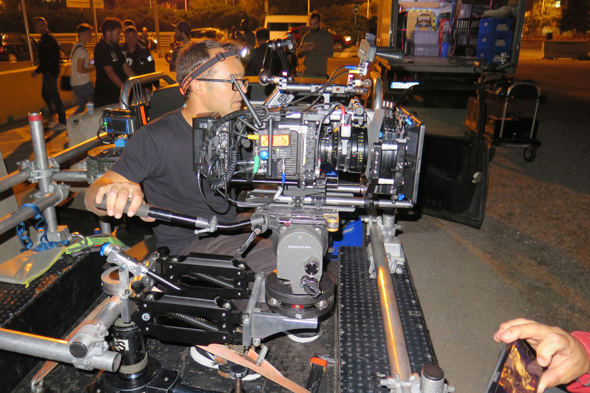
What cameras and lenses did you use and why? Who supplied them?
We used an ARRI Alexa Mini paired with Leica Summicron-C lenses, supplied by PixiPixel UK. It was also the same lens used in Spencer, which became one of our inspirations for incorporating it into our film. The Leica Summicron-C lenses were a deliberate choice. Known for their incredible sharpness, natural contrast, and true-to-life colour rendition, they offered a level of clarity and maintaining a clean, modern aesthetic while still retaining some texture. Their T2.0 aperture also gave us a controlled depth of field, enough to isolate Satinder without losing the sense of her environment. This setup gave us the ability to craft an image that feels immediate and raw.
How did you go about devising the lighting schemes and what fixtures did you use and why?
Given that the film is set in an interview context, we intentionally kept some of the lighting fixtures visible to maintain the realism of the hotel room interview setting. For the key lighting, we used a combination of LiteMat 4 and LiteMat 2 Spectrum panels, selected for their versatility in creating both soft and directional light. My gaffer Ryan Delahunty and I found it a convenient setup to sculpt the lighting and shadows, shifting them to reflect Satinder’s emotional state as she transitions between her public persona during the interview and her more vulnerable moments off the record. The goal was to establish a gritty, sharp, and intimate atmosphere that mirrored Satinder’s internal conflict. We wanted the lighting to feel raw and unrelenting, much like the character’s journey.
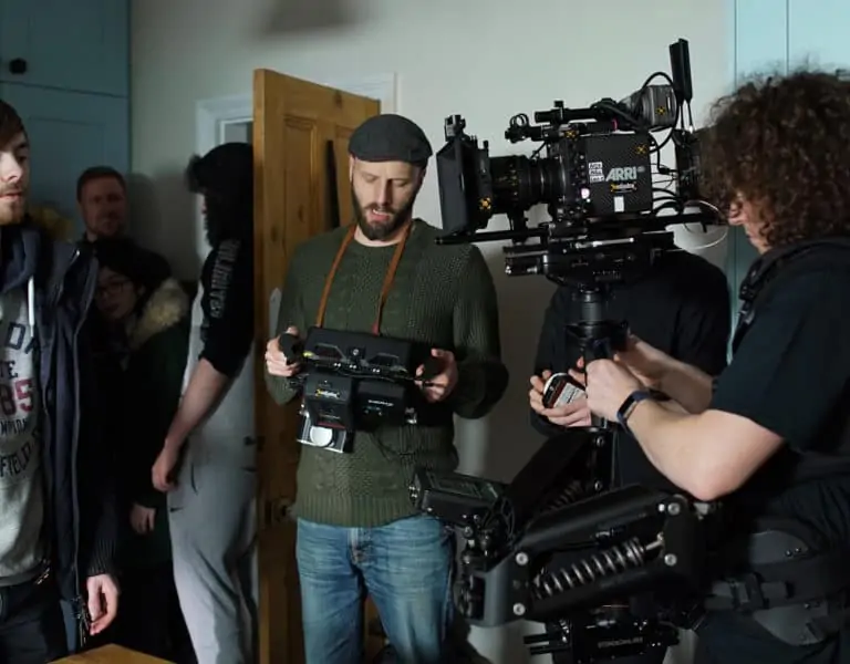
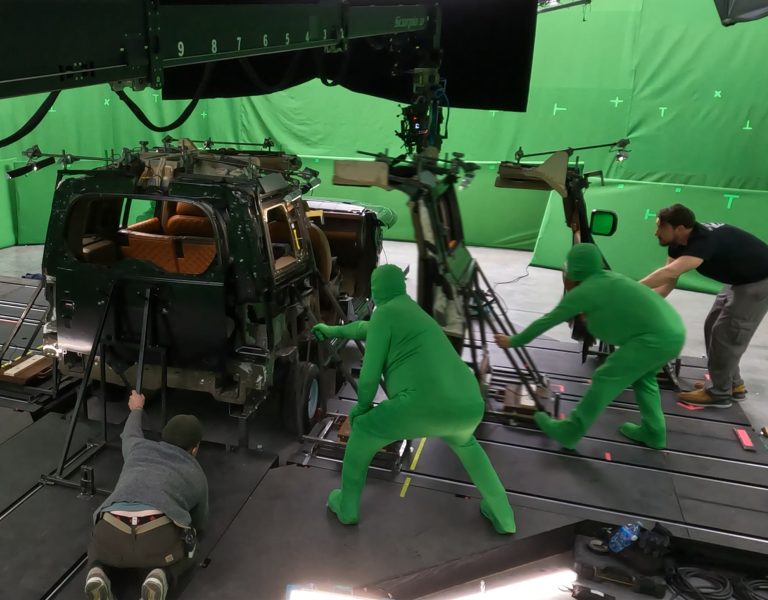
Did you have to create any custom camera and lighting rigs?
We did not create any custom rig or camera for this project.
What challenges did you encounter when shooting the project and how did you overcome those?
This turned out to be one of the quickest pre-productions I’ve ever experienced, and believe me, it was a real challenge! I got a call from my producer, Shiva, telling me we were shooting the following week due to Archie’s availability and I had just returned to London from travelling. No pressure, right? We had only five days to pull everything together, from finalising the shot list and lighting plan to scouting locations and getting the gear ready. But I’m so grateful to have worked with Nick, who had such a clear vision and precise shots in mind. Their clarity helped anchor the process and kept us focused through the chaos.
We also had a car scene where we wanted to focus closely on Archie’s eyes. However, due to the limited space inside the car and the necessity of a static shot, we had to rig a short stick on the floor to position the camera. Even then, we encountered issues with the close focus distance, which wasn’t quite working. To resolve this, we tested multiple diopters on the lens to determine which would give us the sharpest focus.
How did you decide upon the colour palette and LUTs?
We once again drew some inspiration from the Union Jack colours when developing the film’s colour palette. The result was a curated mix of blues, reds, beiges, and earthy tones. The blues and reds were made to almost feel artificial to the natural browns of Satinder’s skin tone. This palette was designed not only to subtly reference British identity, but also to visually underscore the internal and external conflicts within the character of Satinder.
Was there much in way of changes in the DI and which colourist were you working with?
I always aim to achieve as much as possible on screen during the shoot, using production design, costume, lighting and colour temperature to ensure the director’s vision is realised in-camera, not fixed in post.
For the grade, I had the privilege of working with the talented Alex O’Brien from Okay Studio, with whom I’ve collaborated on several of my previous films and music videos. Alex has an incredible eye for colour, and we’re always perfectly in sync when it comes to choosing what serves the story best. While we captured the core look on set, we took the opportunity in post-production to refine the colours and textures, particularly enhancing the reds and blues to subtly reference the Union Jack.
Is there particular shot or sequence you are most proud of and why?
There’s one particular shot in Satinder’s bedroom that was done in a single take, and it goes from a medium shot to an intense close-up of Archie. It perfectly captures the simmering rage and her lack of self-awareness beneath the surface. I absolutely love the mood we created for that moment; it’s raw and compelling. There’s also a shot where she’s positioned lower in the frame, which shows her vulnerability. We also kept the lighting simple and effective by relying on practical lamps, complemented by a single Litemat for additional fill.
What lessons did this production teach you?
You can pull off something incredible in less than a week! It just goes to show that when everyone’s on the same page, something special can happen, pressure and all!