From the very beginning of Changing Ends, director Dave Lambert and cinematographer Bud Gallimore were on the same page regarding the visual direction of the show.
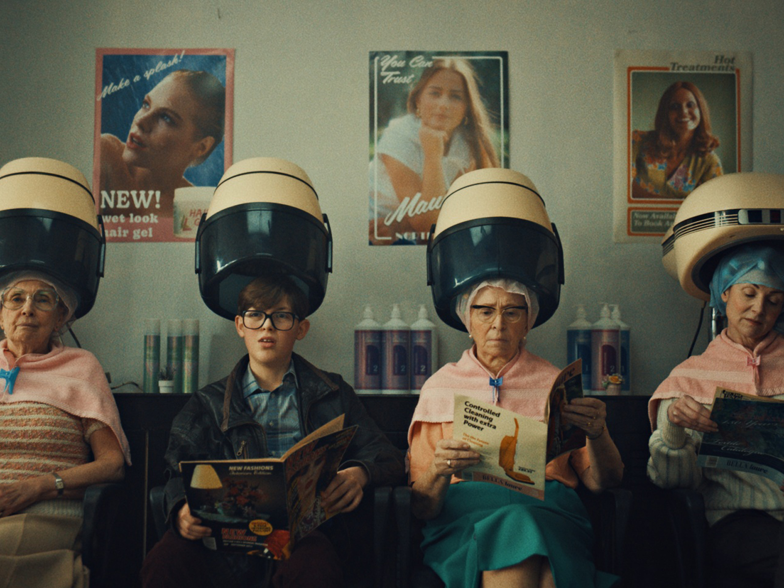
At the pre-pilot stage, they made crucial decisions about how to create a distinct visual identity for the series. They aimed to establish a “period” setting that felt both nostalgic and authentic without leaning into stereotypes or overstatement. The goal was to evoke a natural, almost retro or vintage atmosphere, reminiscent of the 1980s, while ensuring the aesthetic felt genuine and true to the story.
The aesthetic of Changing Ends was carefully crafted to evoke the warmth and texture of 1980s photography. Lambert and Gallimore drew inspiration from Alan Carr’s 35mm photographs, as well as their personal childhood memories from the same era. The goal was to create a sense of nostalgia that would resonate with viewers without making the show feel too dated. Lambert emphasised the importance of keeping the design elements authentic, noting that the 1980s were still heavily influenced by the 1970s. The result was a visual style that felt real and relatable, avoiding the clichés of neon colours and exaggerated fashion.
Gallimore and Lambert’s collaboration extended to the selection of filming locations, which played a significant role in reinforcing the period setting of the show. The location manager, Louise Manzaroli, identified a house that perfectly captured the essence of Alan Carr’s childhood home, even evoking memories for Carr himself. The surrounding neighbourhood was equally fitting, and the production team moved quickly to secure these locations. While there was some consideration given to building a set, Lambert felt that real locations, despite their challenges, provided an authenticity that could not be replicated on a soundstage.
Lighting and camera work were crucial in establishing the tone and atmosphere of the series. Cinematographer Bud Gallimore explained that the lighting was kept soft on skin tones, with colour temperature changes used to reflect the mood of different environments. For example, the warm, nurturing environment of Alan’s home was complemented by soft, warm lighting, while the school was lit in cooler tones to reflect Alan’s more challenging experiences there. Gallimore’s objective was to create visuals that felt like an 80s photo album, albeit with a slightly more cinematic quality.
The production of Changing Ends was not without its challenges. Time constraints and budget limitations were significant factors that required careful management. Lambert acknowledged that in a TV comedy, where time and money are often limited, it’s essential to prioritise certain scenes and make pragmatic decisions. Gallimore highlighted the importance of meticulous planning, noting that the fast-paced nature of the filming process required creative decisions to be made almost instantaneously.
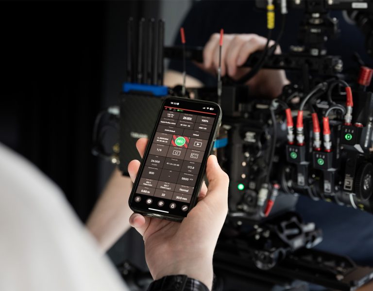
When it came to selecting the right equipment, Gallimore chose a super-clean yet warm lens set for the Arri Alexa Mini LF, which offered a stunning large format look. Although the series was delivered in 1080p, this choice allowed for higher codec recording, giving the team more flexibility in post-production to achieve the desired “vintage” look. Subtle camera movements, often achieved with sliders or a gimbal, helped maintain the fast pace of filming while ensuring the visuals remained engaging.
It was up to Splice’s Head of Picture, Adam Dolniak, to ensure that the colour grading complemented the Changing Ends’ 1980s’ style. The goal was to evoke nostalgia, with a focus on warm tones, selective saturation, and pleasing colour contrasts. Specifically, embraced shifting tones toward tobacco yellows, greens, and reds to enhance the retro feel.
Adam found that leaning into warm tones effectively complemented the work of the art department and the selected locations, Throughout the grade, neither pure white nor pure black points were used. Instead, highlight tones were made creamier, with subtle tints of yellow or green. This was further enhanced using Baselight’s Texture Highlight tool to create a gentle bloom effect.
There was a strong emphasis on accentuating natural skin tones, ensuring they appeared vibrant and authentic on screen. Baselight’s Film Grade tool was particularly useful here, offering a toggle for luminance specifically in the mid-tone range, which added depth to skin tones.Adam aimed for an authentic colour palette, avoiding highly saturated areas that could draw attention and appear artificial.
To further enhance the retro aesthetic, vintage lens characteristics were added during the grading process. This included geometric distortion and spherical chromatic aberrations applied as a vignette. These effects were dialled up in wide shots and reduced in scenes focused on characters. The subtle imperfections added character to the footage, complemented by selective sharpening and the addition of beautiful 35mm film grain scans applied throughout the series.
Looking back on the production, Lambert and Gallimore expressed satisfaction with how closely the series aligned with their original vision. Lambert noted that the visual style, refined during the production of a taster tape, remained consistent across the two series.
Watch the second series of Changing Ends now on ITVX.
