FLYING COLOURS
Colour plays a starring role in cinematic storytelling. Erik Messerschmidt ASC shares insight into how it can create emotion and inform the audience, the vital collaboration cinematographers enjoy with colourists, and his experience on the jury of this year’s FilmLight Colour Awards.
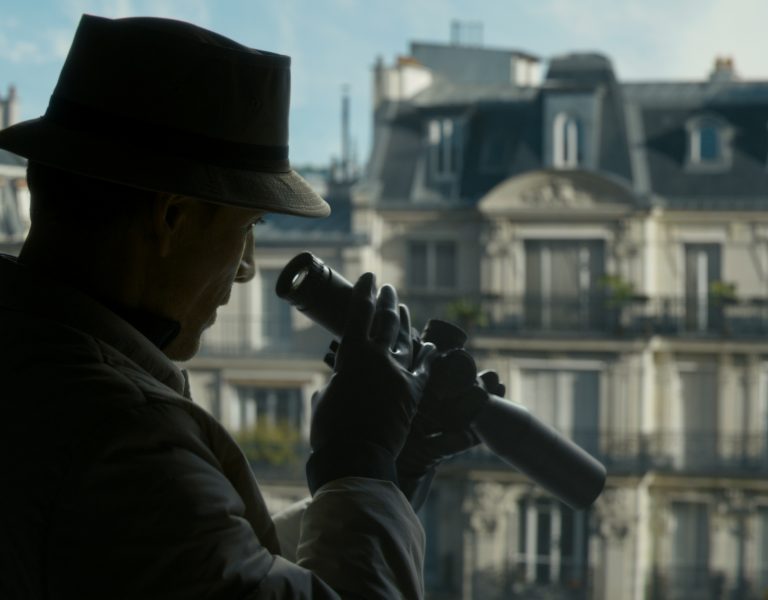
Every filmmaker’s relationship with colour is different and extremely personal. Cinematographer Erik Messerschmidt ASC (Mank, The Killer, Mindhunter, Ferrari), believes that just as colour informs us about our environment, the same principal applies to cinema. “In terms of setting the mood, tone, and conceptual context for what environment the actors are in, colour is vital,” he says. “It has always been intrinsically important to photography in general.”
Having begun his career in fine arts photography, for many years Messerschmidt worked with Gregory Crewdson, a photographer who was concerned with the colour of environments and how set dressing and art direction could tell a story and instruct the audience where to look in the frame.
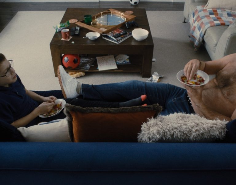
“I also like to use colour as a storytelling tool to focus the audience’s attention on what I think is important for them to understand,” he says. “One way to do that is limiting the amount of colours in a given frame. We can have a colourful image, but maybe we don’t use too many colours so we don’t overwhelm the audience, instead focusing their attention on what we want them to see.”
Colours chosen and how those selections are made helps create the desired mood. Cinematographers who were masters at this and Messerschmidt considers “creative heroes” include Gordon Willis ASC (Klute) and Robby Müller NSC BVK (Paris, Texas), both renowned for their imaginative use of coloured light or contrast.
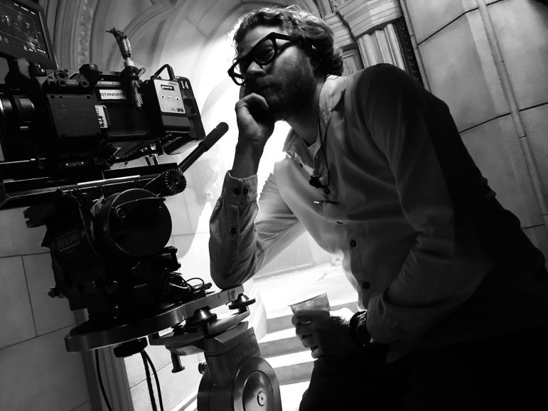
As black-and-white also has the power to take the audience on an immersive journey, what are the secrets to successful use of monochrome? In colour photography, Messerschmidt highlights, colour contrast is one of the principal ways to create depth in the frame. “But with black-and-white, you don’t have that privilege. It’s a different scenario and all about tonal contrast. Whether you’re shooting film or digital, different colours can have similar exposure values or reflectivity values but look drastically different in black-and-white. A warmer brown tone of wood trim might look three stops darker in black-and-white than if the same amount of light was on a dark green object because of the amount of infrared it reflects.”
Therefore Messerschmidt carries out extensive testing with the production designer to determine which paint tones and costume colours contrast best against each other when photographed. And when incorporating colour, cinematographers should be on the same page as collaborators such as the production designer, costume designer, and director in terms of how they, as a unit, will use it. In Messerschmidt’s experience, “aesthetic conversations about the palette should be carried out well in advance and the production designer and costume designer are well positioned to help action that decision making”.
Championing the craft of colour grading
Messerschmidt is on the jury of this year’s FilmLight Colour Awards, taking place at Camerimage Film Festival. Now in its third year, the awards continues to recognise talent and achievements in grading across features, series, commercials, and music videos.
The judging panel also features members including jury president Mandy Walker AM ASC ACS and fellow cinematographers such as Catherine Goldschmidt BSC, Robert Richardson ASC ACK, Birgit Gudjonsdottir, Yong Hou, Tim Kuhn BVK, and Michael Liu, Avik. Colourists on the jury include Kaitlyn Battistelli, Greg Fisher, Jax Harney, Tim Masick, Mahak Gupta, Elodie Ichter, and Dirk Meier, who are also joined by guest of honour director, screenwriter and producer George Miller.
Grading is an aspect of filmmaking Messerschmidt believes is important to celebrate because “it’s always valuable for the cinema public to understand the various people whose creative energies go into the films they see”. Colourists, he continues, are unsung heroes, to some degree: “Their name is often buried at the end of the credits, deep down in post-production, when in reality they are the last people to touch the film, and the production can look wildly different after it’s been across their desk.
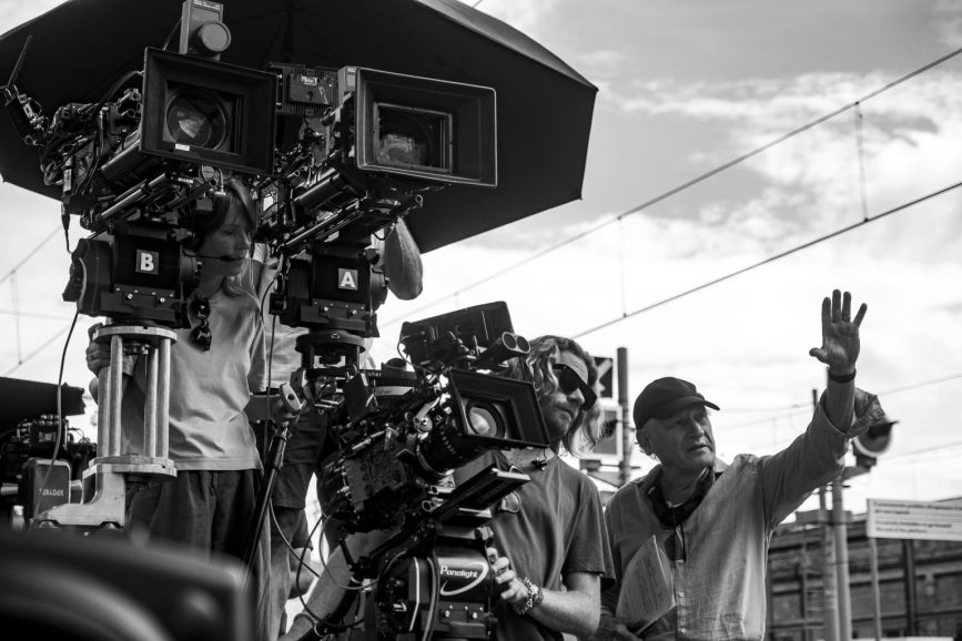
“I think the finishing part is half of the process, it always has been since the beginning of photography. We light and expose the image in terms of how it’s captured, and typically that process is only complete after the correct application of colour processing and grading. So in my mind, it’s an essential part and a necessity for the cinematographer to participate in it.”
Valuing his relationships with colourists, Messerschmidt admires them for their technical skill, and crucial creative and aesthetic input. For him, that stage of the process can often present surprises that transform a project. “If I’m disappointed with a decision I might have made, or I feel the shot isn’t impactful enough, often the colourist’s fresh set of eyes can breathe some new light and life into a shot that’s not working,” he says. “They’re your last creative partner, and in a way, have the most power over how the audience is going to experience the production.”
But Messerschmidt advises against cinematographers viewing the grade as the stage at which they apply aesthetic decisions, however tempting it might be. “Grading is extraordinary and vitally important, but my opinion is if you want the wall blue, the wall should be blue or if you want the light to be cool, the light should be cool,” he says. “It is crucial to try to build as much colour contrast and decision making into the set dressing and lighting as possible first and then season the soup with the colour grading, opposed to generating an image at that stage or it can look false and artificial.”
Feeling “honoured” to be part of the judging process, when Messerschmidt assessd this year’s Colour Awards submissions, nuance was at the forefront and “looking for colourists who clearly take the aesthetic direction the director and production designer has set and sweeten it in the appropriate way”. Rather than rewarding “the flashiest work with the most colour contrast and most aggressive grading”, he is more interested in work that is “nuanced and shows real restraint as it’s all about the application of that power”.


