Overview: 1980. A bright young photographer is pushed to the edge by his teacher’s seductive philosophies and unorthodox methods, all in the name of great art.
What were your initial discussions about the visual approach for the film? What look and mood were you trying to achieve?
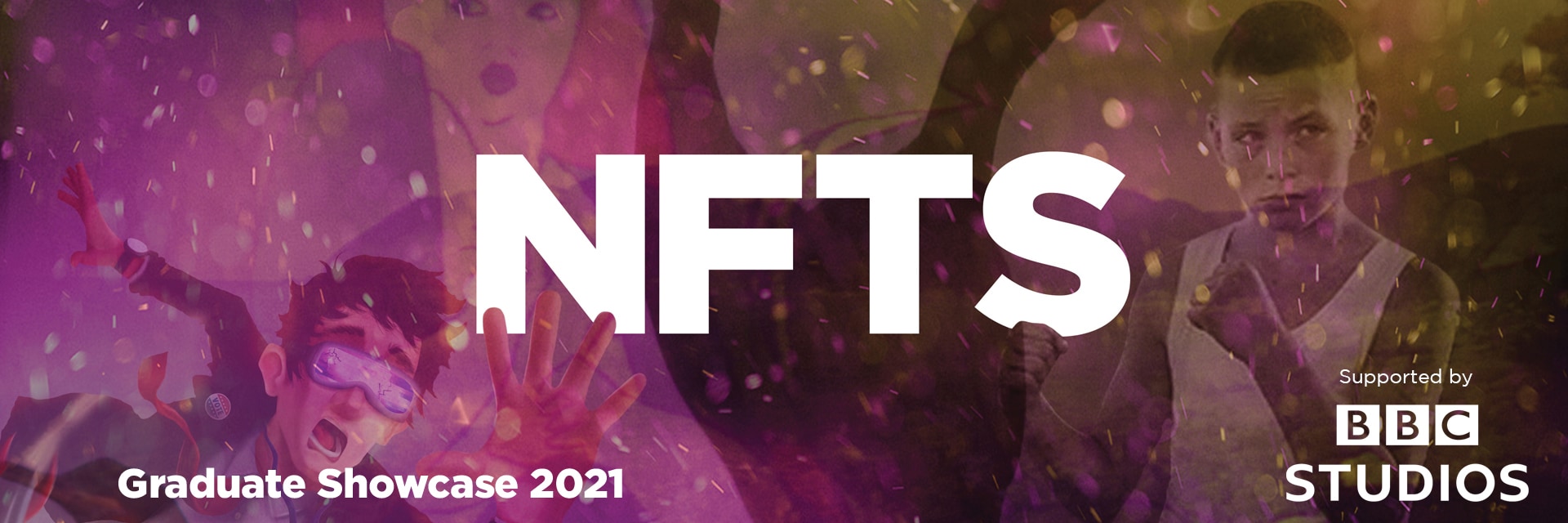
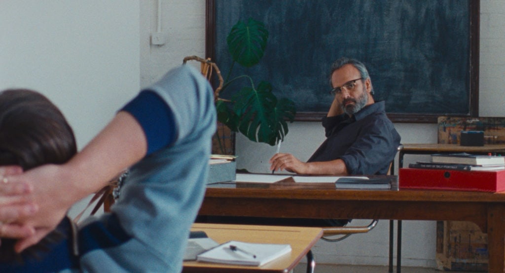
The director (writer and director Lisa Clarkson) and I discussed at length how important the viewers perspective is in our film. Set in art school in 1980, Muse follows George, a bright young photographer who is taught, seduced and pushed to the edge by his unorthodox teacher, all in the name of great art. We open on a shot of George’s eyes straight to camera, when his gaze breaks, we then cut to his POV, as he by virtue of this angle introduces us (and himself) to the rest of his classmates. With this scene we set the tone of palpable intrigue, nervous energy and excitement.
The most important job I felt I had on the film was to frame the scene in such a way that the audience learns something different about the character. As the story progresses, our visual language and perspective changes, utilising bold framing, camera movement and montage to enter or depart from George’s frame of mind. Because of the time period, the look of the film really benefited from being shot on Super 16 Kodak Vision 3 250D & 500T, and went nicely hand-in-hand with the manual processing scenes in the darkroom. It was a bit of a full circle moment.
What were your creative references and inspirations? Which films, still photography or paintings were you influenced by?
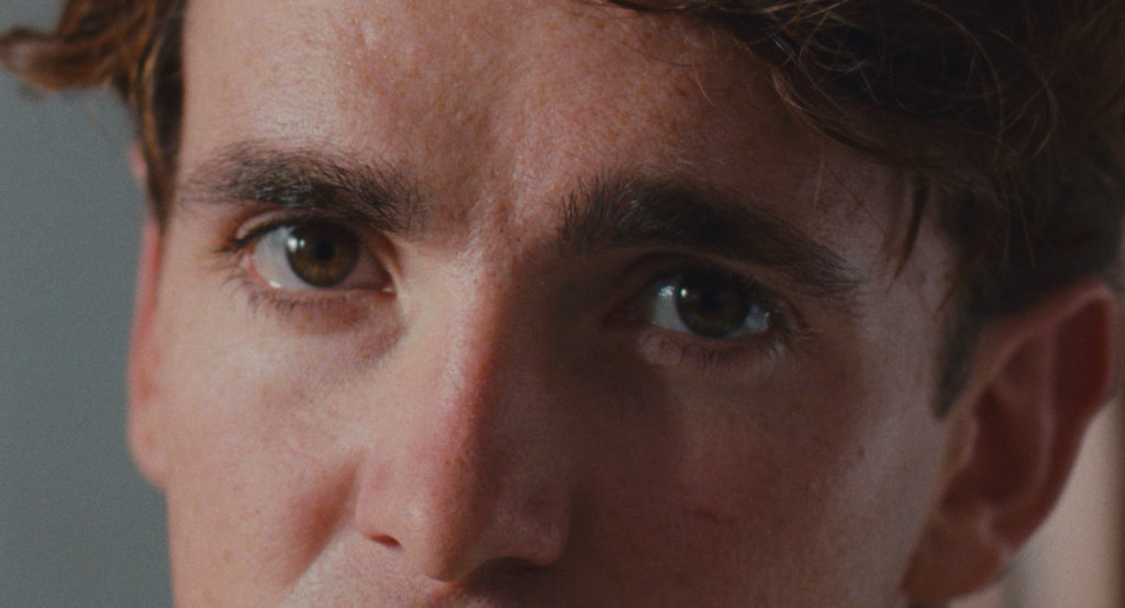
Lisa is brilliant when it comes to creative references and has a wealth of knowledge in art, fashion, music and photography as well as the written word. We spent a lot of time looking at the work of Rob Bremner, Tom Wood, John Myers and especially Tish Murtha, whose work we were permitted to use in the film thanks to her daughter. We also took inspiration from Bruce Gilden for the photograph of George’s mother. We also looked at the sometimes tumultuous relationships between artists and their muses, such as Francis Bacon and George Dyer, Warhol and Basquait and more historically, Socrates and Alcibadies. We referenced a lot of films with a heavy focus on still photography, like City of God (2002) and Blow Up (1966). We also focused on complex character relationships like Phantom Thread (2017) and A Woman Under the Influence (1974). Also, for a twist of style, Lisa’s favourite – Trainspotting (1996).
What filming locations were used? Were any sets constructed? Did any of the locations present any challenges?
We had the honour of shooting our exterior of the college and George’s bedroom at St. Peter’s College, Oxford University. One of the only benefits of COVID restrictions was that due to the lack of students, the College was able to offer itself as a location, which in normal circumstances would have been impossible. Our main classroom and darkroom were at Amersham Campus of Bucks Technical College which is an amazing location with one of the best darkrooms I have ever been in. To add depth to George’s character we wanted his home to contrast directly to his school and chose to shoot our coach, parent’s house and art gallery all around different parts of Birmingham. Additional scenes were also shot in Birmingham Museum & Art Gallery. However, because of lockdown they could only allow five of us one hour to shoot what we needed, which we adapted to with a fast-paced doc-style shooting that we just managed to pull off in time. We even managed to sneak in a bit of Bolex footage to use in a flashback, however I couldn’t see a thing and just had to point, shoot and pray that it was there!
Can you explain your choice of camera and lenses and what made them suitable for this production and the look you were trying to achieve?
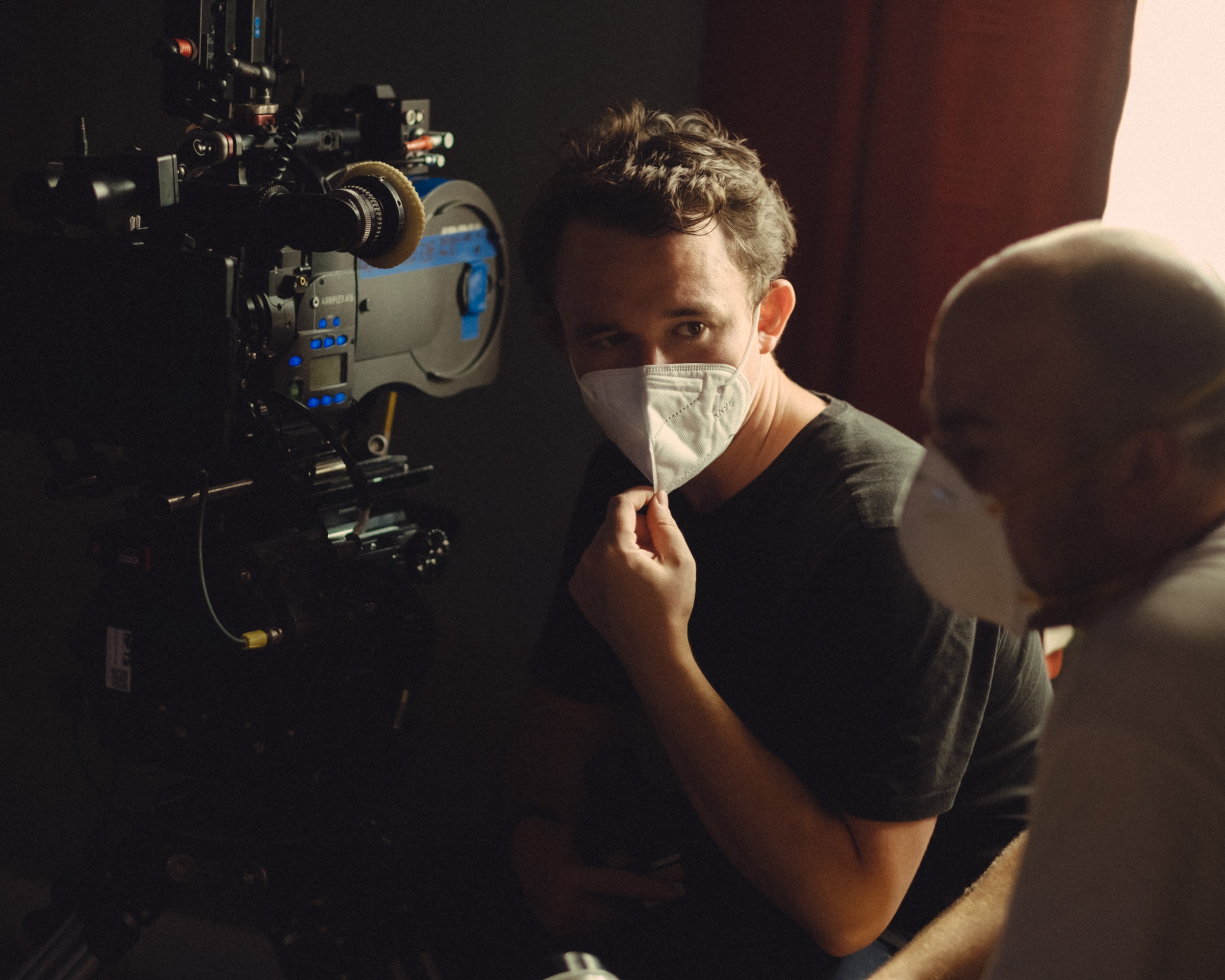
I am a massive fan of the Arriflex 416 which is my go to for work on Super 16. It has a bright viewfinder, it’s light and very ergonomic which helped me keep nimble and more importantly was designed to allow me to pair it up easily with 35mm format glass. I chose to shoot on Cooke’s S4’s and SK4’s which helped me out with the wider focal lengths for the format, thoughtfully provided by Take2 London. I was a big fan of this pairing, having only really shot on S16 with Zeiss or Canon lenses before. I chose to shoot on Super 16 Kodak Vision 3 250D & 500T as well as a sneaky bit of Bolex footage for a montage sequence. There is an intentional jump of format which works weirdly well for how disorientating we wanted the montage.
What role did camera movement, composition and framing and colour play in the visual storytelling?
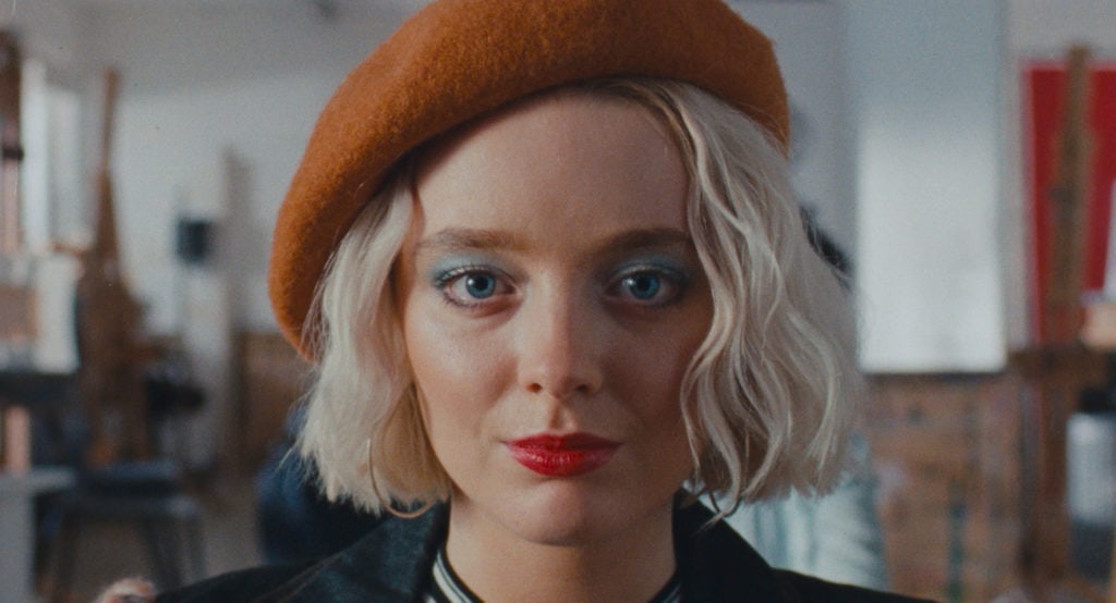
I aimed for a naturalistic, observational (but not voyeuristic) feel that would gain trust and plausibility from the audience. This in turn would then set up a contrast when we chose to put the camera in a more stylistic placement. The frequent eye lines down the barrel when the two students are exploring taking a picture of each other, when George returns home to take a picture of his mother (landscaping him against a floral wallpaper and television set) and then at the end of the film when George reveals the picture of his mother. For camera movement, I knew I had to spend four days in a classroom with very heavy dialogue scenes. It was the first time I utilised having the camera on a short slider on a PeeWee Dolly on a levelled floor instead of dragging a tripod around for four days. Having this ease of movement not only saved hours of time moving the camera but it also meant that I could add a very subtle push in or adjustment if an actor had slightly missed their mark, which is an amazing benefit when shooting on limited stock. In our research, Lisa also developed a love of how the colour red rendered on film compared to digital. Red worked thematically dealing with passion, sex and nicely linking into our darkroom. We agreed with Francis, our colourist, that is was quite muted, but deep and not overly bright. We choose to try to carry this through with Eve Finney’s (our production designer) theme and designs all the way through the grade.
-What was your approach to lighting the film? Which was the most difficult scene to light?
I always try to light each set/location using motivated sources of light whether that’s through big heads through windows or accentuating practicals. I will then use small son source, diffusion, bounce or neg on the floor which helps keep a small footprint, allowing the actors more freedom and also makes it quicker to turnaround between shots. I was lucky to have on board good friend and gaffer Cullum Ross who is very used to this way of working. We also utilise Cullum’s Gaffer’s Control Wireless DMX box which means we can adjust lights a lot quicker in the room especially if they are outside or rigged high, a real time saver. This worked really well when shooting in the darkroom that was lit totally by LED’s using ARRI SkyPanel S60c’s and Astera Titan Tubes.
Shooting LED in the darkroom meant we could film and hand-develop photographic prints using the exact wavelengths needed to give me more transmission for our stock without fogging the paper. This was a vast improvement and a lot quicker than my previous experience of 2K Tungsten heads that pretty much melt by the time you black wrap all of the spill. A big challenge we faced was finding the location of the large classroom that we would spend a significant amount of time in. The classroom worked for the story and also was only 15 minutes away from the NFTS and had an amazing darkroom on site. The only issue was that the classroom we thought was the best to shoot in had not only a shipping container blocking out the windows half way down the room, but also had tinted privacy windows that knocked out +3 stops of light.
The tint we could solve by pushing bigger heads and daylight heads through the windows. However, the shipping container gave us the biggest problem as there was no distance between it and the windows to fit anything big enough to not only compensate for the tinted windows, but to physically fit in the gap. In an ideal world we would have craned it out but cost and time meant that wasn’t an option. Cullum suggested ARRI 4k X Lights which I didn’t even know still existed. These were perfect and luckily readily available. With a heavy frame in front of each, they were slim enough to fit between to container but had a big enough flood when diffused to still give a sonness to the source. It was the perfect example of having the experience to pick the right obscure tool for the problem, kindly provided by James Rosen at Panalux.
What were you trying to achieve in the grade?
During prep I worked with our colourist Francis Qureshi to define a look and palette for the film in regards to grain structure, warmth and contrast. Out of all of the images and references I looked at, we kept returning to films that had been shot on the now depleted Fuji Stocks. However Francis thought we could experiment with a combination of LUTs that could help replicate a Fuji Print stock and get us close to a look that I was after. We were lucky to be helped by Kodak and Digital Orchard to shoot some tests that would not only help with some technical and creative challenges (such as CRT TVs and darkroom sensitivity tests), but would also give us a good chance to test our LUT which consisted of a Fuji & Kodak print stock combination. It was during this testing that Dan Redrup from Digital Orchard suggested testing the difference of a 4K scan opposed to the normal 2K scan.
This was incredibly worthwhile. Having only scanned my previous work in at 2K, I could instantly see the difference when projected. It helped maintain a crispness whilst still retaining the texture of film and gave us more to play with in the grade. Throughout shooting, Digital Orchard would upload our rushes and they were developed by Kodak at Pinewood. Our dailies colourist Nigel Tadyanehondo would apply our dailies LUT and give it a quick pass before uploading for our director to view and use in editorial without the dreaded “temp love” from a best light.
What was your proudest moment throughout the production process or which scene/shot are you most proud of?
One of my proudest achievements was shooting our nine-page long opening scene (nearly a third of the script). It involved every character and had an absolutely mad long lens panning shot that is pin sharp (thanks to focus puller Alex Finlayson!) and was all shot in one day with one camera and no overtime under COVID restrictions. It even warranted a pat on the back from veteran first AD Francesco Reidy for that day!
What lessons did you learn from this production you will take with you onto future productions?
Learning from the challenges we faced in heavy dialogue scenes with multiple characters and a strict shooting schedule, I would try and balance these issues by introducing another camera to capture reactions simultaneously.
> DISCOVER MORE ‘FICTION’ FILMS FROM THE 2021 NFTS GRADUATE SHOWCASE
> GO TO BRITISH CINEMATOGRAPHER ‘HOME’ PAGE
> BACK TO TOP