Emotional shelter
Cinematographer Tibor Dingelstad NSC shares how he crafted a visual language influenced by street photography and naturalism for British-Dutch drama Silver Haze.
Tell us about Silver Haze…
23-year-old Franky is a nurse who lives with her large family in an East London borough. Obsessed with a thirst for revenge and a need to assign guilt for a traumatic event that happened 15 years before, she is unable to build any meaningful relationship until she falls in love with one of her patients – Florence. They escape to the coast where Florence lives with her more open-minded patchwork family. There, Franky finds the emotional shelter to deal with the grudges of the past.

How did you get involved with the film and what appealed to you about the story being told?
Sacha Polak and I were shooting Hanna when she first mentioned Silver Haze. Her plan sounded still a bit vague back then; what she had to offer was an appealing synopsis, a small budget, a mix of lovely professional and non-professional actors and the desire to have a healthy amount of shooting days, even though that would mean sacrificing a larger crew and having limited resources. Later she told me she considered not writing a script at all, which seemed so out of the ordinary that I couldn’t help but laugh. As we know, scripts can sometimes be useful shooting films.
Despite a few unknowns, she did manage to convince me they were not trying to lure me into a trap but that the set-up for the film was a sincere wish of hers to gain a certain kind of creative freedom that she felt she hadn’t had in her other projects. (Side note – eventually she did write a script before we officially started pre-production.)
After meeting some of the characters that inspired her to tell the story of Silver Haze, I became more invested in her vision and appreciative about her approach. Getting to know Vicky Knight and learning about where she came from really inspired me to get involved. Also, they was another character written that is played by Esmé Creed-Miles, who we knew well and worked with before on Hanna.
The familiarity among the core team helped us more than we could imagine, especially on such a specific production.
Tell us about your initial conversations with Sacha about the look and mood for Silver Haze. What was her vision and what new perspectives did you bring?
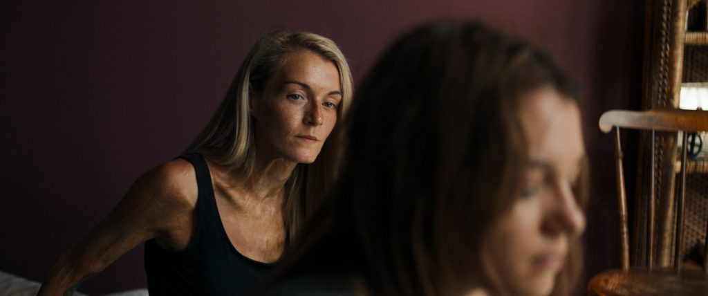
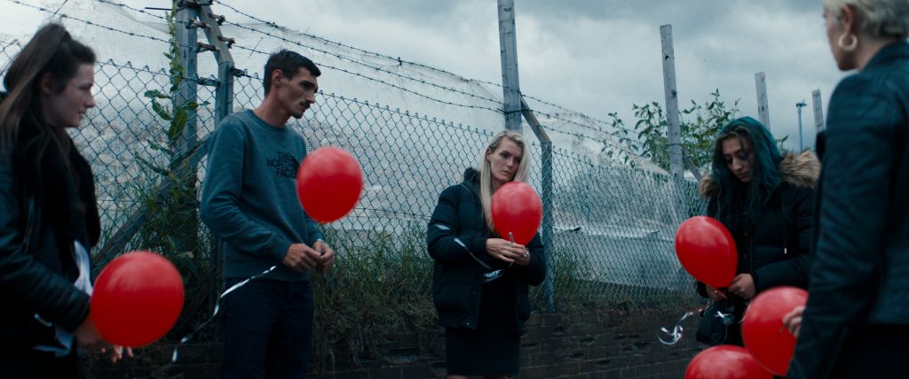
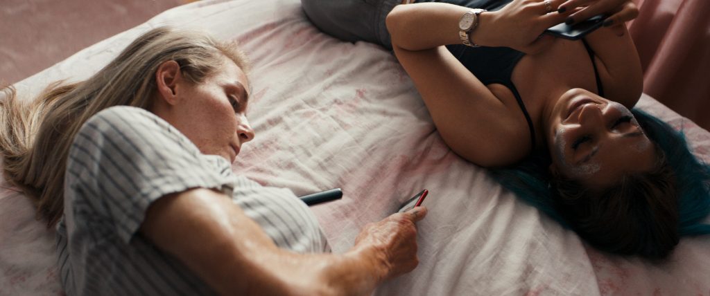
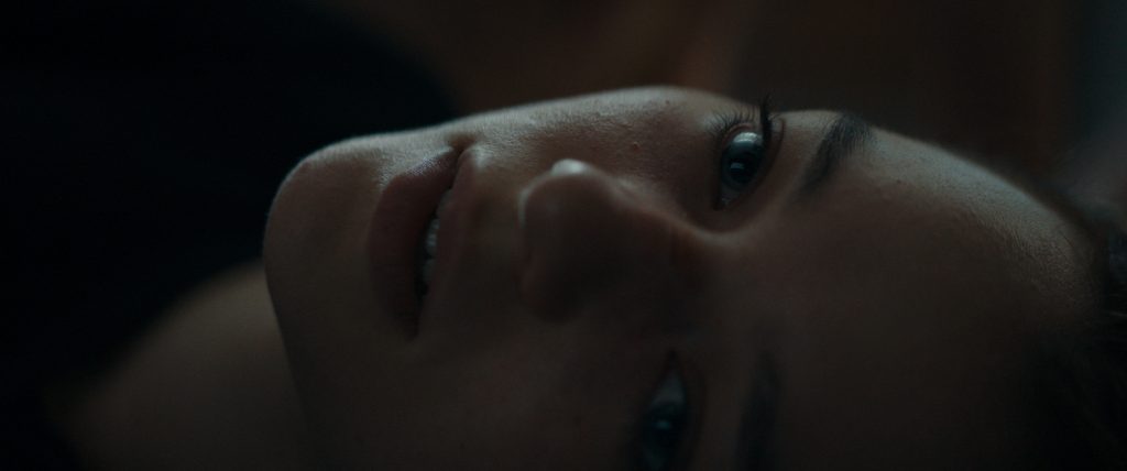
Our main characters’ lives are full of hardship and their stories exist out of a culmination of events, but it’s not all doom and gloom; there’s so much joy, humour and heart-warming love for family and friends that I don’t often see. While the story is one of difficulty, we did want to emphasise the beautiful element of their lives visually as well. We were keen on not showing too much of the ‘greyness’ of Dagenham but to show the colour and joy of our characters’ experiences.
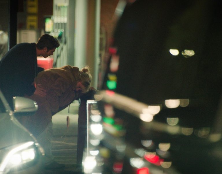
Searching for the visual tone of Silver Haze we researched some street photographers. It was inspiring to see how a few of those photographers were able to isolate and capture stunning little moments without losing track of a strong aesthetic, for instance like the work of Johan van der Keuken.
To elaborate on what kind of aesthetic we were looking for, some naturalistic photography/cinematography has a certain rawness to it that is often seen in contemporary French cinema. This specific ‘natural-style’ is so raw and real that loses a photographic aesthetic, it doesn’t look lit or composed and it certainly doesn’t have an outspoken grading. This style mainly favours what is been photographed rather than how it is photographed. Although beautiful films are made that way and it can be an effective way to tell a story, we concluded that most of our scene’s needed a more outspoken visual approach. Some vital subtleties of Silver Haze would get lost if the visual language wasn’t driven by photographic design choses. Knowing what we didn’t want was extremely helpful in deciding the final look.
Telling a story based on real lives and played out by some of the actual characters brings a whole new layer of responsibilities to a film that affects the way you shoot the story. You can imagine that it meant a lot to us when people familiar with the area complimented us on how well we managed to show the beauty of their home that is often hidden for outsiders to see.
Take us through your approach to crafting the film’s visual language.
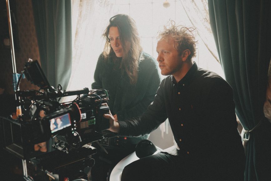
The unique approach and nature of this project made us realise that we needed a strong visual language to make the film suitable for the big screen. It became important to create some visual guidelines that helped us tell the story of Franky’s journey in the most captivating way as possible, by drawing the viewer in and absorbing them in her life.
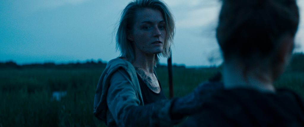
The film all takes place on location in Dagenham and Southend-on-Sea and because we couldn’t build any sets, we had to find our shooting locations as we went. Finding the often-hidden photographic qualities of those places was quite a search. We spend a lot of time walking around, taking photographs of the neighbourhood; the locals and their interiors to understand what it was we were looking for, which was an absolute joy to do. Also, by doing so we learned much more about the characters, their motivations and the environment they grew up in. Although the film had so many documentary-like elements, we knew that the mixture of non-professional and professional actors would work better if we had more control over the visual language than you’d have in a documentary. This motive became essential in most of the decisions We made from there on in.
When we started scouting it soon became clear to us that Dagenham isn’t an easy place to photograph and that we had to be creative on our choice of angles to stay true to visual language we had in mind. Luckily, we had enough time to adapt the scenes to the reality of our locations to make them all work, and I was happily surprised by the hidden gems we eventually found.

When was prep and what did it entail?
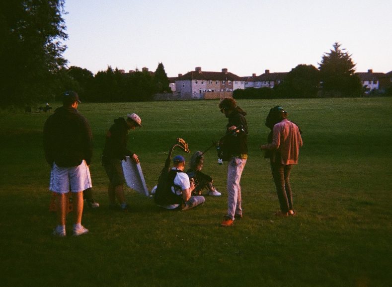
We officially prepped for about four weeks including a 10 day quarantine in our hotel. In a weird way this felt like a luxury to be able to prepare with Sacha for 10 days of seclusion. Everyone who’s ever worked with a director in a production office knows how distracting it can be to share their attention with at least eight more people at the same time. I do remember us being impatient near the end of our quarantine to finally start our groundwork.
Crewing up was a bit harder on this one than we were used to. Because of the lean budget I couldn’t work with the crew I normally work with, so I had to find a new crew that was experienced enough to deliver but flexible enough to deal with the constraints and the rough conditions. Working with non-professional actors and a small crew on a sensitive story meant it was crucial for Sacha to have a crew that brought a pleasant and warm energy to set that would help the talent to perform to the best of their ability. The process of crewing up took longer than expected but eventually we found the perfect crew for the job. It was a joy to see how all the lines between departments faded as we went along; everyone was so supportive and helpful. It’s rare to see that kind of symbiosis and I really believe the group effort can be somehow felt when watching the film.
What was your approach to camera movement in Silver Haze, especially to create tension and atmosphere?
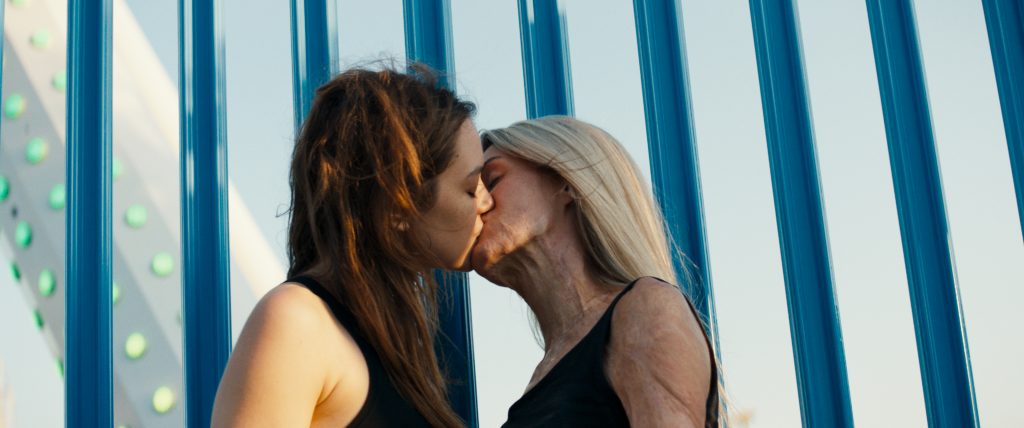
The camera motion was an essential part of the language we created. We were convinced the film would benefit from a more controlled way of shooting rather than an only handheld driven style. One of the challenges we dealt with was the absence of a grip department. At first we investigated a more static fly-on-the-wall approach, but this style was not able to capture the vibrant energy of the characters.
This led us to a livelier camera motion. We turned to the Mōvi pro which, at first, didn’t seem to be the solution we were looking for. Not only because I lacked the experience in operating it myself but mostly because the machine seemed to be a bit to slow following the high energy in improvised scenes. Sacha didn’t agree with me; she liked my operating way more than I did and she loved the way we were ‘too slow’ in improvised scenes. Sacha turned out to be right, the floating camera added tension to the scenes and worked way better than I’s anticipated. It adds a specific determination and focus to the scenes that we could not get in any other way. It puts the camera a just behind the action of the character instead of ahead, which makes the character lead the action and added extra tension to the scenes.

Can you run us through the locations? How involved were you with scouting?
Finding the right locations in Dagenham was a different process than we were used to. Unfortunately, there was no database of houses available to us which meant the scouts had to post literally hundreds of letters into mailboxes throughout the area. When a disappointing low number of replies came in, we realised that the local homeowners were suspicious of our motives and unwilling to open their homes to us. We had to change tactics to gain their trust, which meant we personally had to be more invested and present in the search.
Unfortunately on multiple occasions, homeowners agreed to have us film but then denied us access when we turned up. I guess it was the nature of what we were doing, but you can imagine how difficult that was to deal with and what kind of flexibility was needed from our side to make it all work. However, the flip side is that when we did eventually find willing landlords and locations, they were so generous and gave us more than we’d asked for. Some of them even end up in the film as day players.
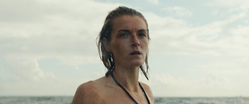
Southend-on-Sea was a very different experience as it’s a unique seaside town two hours from London with a massive fair, and a popular holiday destination. During the day the boulevard is flooded with families enjoying their beach holiday and at night the drunk teens come out to party. It is a wild place to shoot in, but the village has a lot of visual appealing features to offer, such as the fair, the English seaside architecture and the mud that arose when the tide went out, leaving an almost dystopic muddy desert filled with boats laying where once the sea was – a good example of a memorable image that became part of the story when we scouted it.
Tell us about your camera package. Which camera and lenses did you use and why?
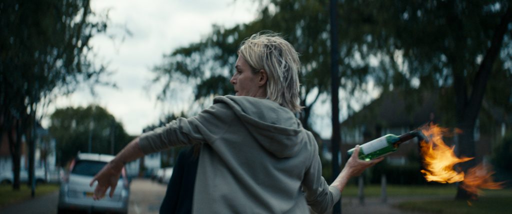
We started off on the idea to shoot on 35mm (2 perf) which, surprisingly, was even encouraged by the producers. Unfortunately, after some digging, we lost confidence that we would get the best result possible out of the performances with the shooting ratio production had offered us. Switching to the Alexa Mini was a no-brainer, as it would help us massively to work better with the non-professional actors and all the other uncontrollable elements of the shoot.
The context of the neighbourhood is of such importance to the story that shooting in 2.40:1 cinemascope made sense to us. To pick the right lenses for the job we looked for glass that would both meet our practical and our aesthetic needs. From a practical point of view we couldn’t lock off any of our locations nor could we hire tons of background artists, so it was important to be able to defocus the background to help us deal with uncontrollable elements. The speed of the lenses and how they performed wide open was crucial, we needed to get the right exposure levels in our exterior night shoots that we often couldn’t light. After some testing, the ARRI Master Anamorphics turned out to be the perfect match for us. We loved the contrast plus these lenses perform extremely well in difficult light situations. They show a beautiful and consistent amount of detail over their whole range.
It felt essential to respect the limitations of making a small film and to give ourselves boundaries. Keeping things simple meant we gave ourselves headspace to be creative and open to possibility as we went along. A lesson I will remember is that more richness can grow from simplicity than from complexity.
Once we had the basic outline for the camera equipment we needed, our 1st AC Alyssa Veen, who’s both experienced in drama and documentary filmmaking, assembled a solid camera package together with Cam-a-lot in Amsterdam, that could easily be ran by our small team.
What was your general approach to lighting? What were the key pieces of kit you used and were any special rigs created?
To keep the look of the film consistent throughout the many uncontrollable locations, we had to be precise in when to shoot where. Our gaffer Blaine Bradley and I assembled an – again – simple and efficient light kit. On location we had to be exact in which part of the locations would work for us and which didn’t but also when, in terms of the sun (the sun is not a reliable factor in the UK).
I get asked sometimes how we managed to make the film look the way it did with the little recourses we had. I guess we made our disadvantages work for us. Blaine and I mapped each of the locations to see which places worked well at what time of day or didn’t work at all. We always discussed our findings with Sacha and then we’d come up with a plan. There was a lot of give and take but Blaine consistently showed how creative we could be without the resources.
It helps of course when the director has a strong visual eye too. Sacha was of great help, in making the scenes work on all ends. We build the scenes around the natural light rather than making it look good with big rigs. It was a puzzle, but nevertheless a lot of fun. Luckily Sacha, Blaine and production designer Elena Isolini were all on the same page. We did have the luxury of being flexible in scheduling the days to make it all come together beautifully, otherwise this wouldn’t have been possible. Another advantage of being a small crew is that we had more flexibility in when we wanted to shoot where, so we could reassess location, timings and the mise-en-scène when we started rehearsals.

How much of the look was done in-camera as opposed to in the grade?
In general, I prefer to create the look as much in-camera as possible, using colours, builds, light, wardrobe, textures and a LUT. The original idea was to shoot on film so it made sense to create a look that came close to the original filmstock we were interested in. This is when our colourist Laurens Orij came in, I had worked with Laurens on a feature shot on 35mm before but never on a project shot digitally. He’s an extremely devoted and tasteful colourist so I was convinced he could be of great help, not only in post but also during the whole shoot. For simplicity we were aiming to only have one LUT that would serve the whole film.
Unfortunately, COVID regulations made it impossible to fly us to Paris to run some tests. Being forced to work remotely delayed the process and we were still going back and forth during the first two weeks of principal photography finalising the LUT. Eventually we managed to create a beautiful look that served us well.
I prefer to work on slightly unforgiving LUTs to push myself into focussing on precise lighting and exposure that I wouldn’t be able to do on a forgiving greyish LUT. In my opinion, anything that’s done in-camera makes the grading process a lot easier and will lead to a more natural and balanced look. A crucial by-product of this approach is that the producers, the editor, and financiers also get used to the look, from moment they see the first dailies till the last day of the grade. You don’t want any unexpected changes or heavy miscommunications on something as pivotal as the contrast, exposure, and the colour handling.

