ADAPT AND REACT
Jenna Cato Bass’ Flatland took DP Sarah Cunningham out of her comfort zone and into the remote, barren landscapes of South Africa. The film centres around the lives of three women as they navigate the suffocating gender and race politics of a small-town within the South African flatland.
British Cinematographer caught up with Sarah to discuss the trials and tribulations of shooting an independent film in an unfamiliar world.
What initially appealed to you about the film?
I was on a very unglamorous journey from Bristol to London the night before, and I went through the script whilst I was engaged on another project. But when I was reading through, I was just laughing out loud and totally involved in the characters. It was the comedy of it and the incredibly colourful Afrikaans language that made the characters really distinct. The dissonance between being on the very grey M4 and the outstanding beauty of the Karoo desert was so enticing.
Additionally, the passport into another world I wasn’t too familiar with. The politics of South Africa and specifically the racial and gender politics I was really unfamiliar with. There was so much subtext in the script. It was incredibly intriguing.
How did you collaborate with the director?
We were supposed to shoot a year earlier, so Jenna and I had started working online together for a long time before. We worked on a technical breakdown together, which we referred to as the French term ‘dépouillement’ – essentially meaning the dissection of a chicken. Which I really like as it’s a super visual metaphor of what you do when you approach a script! You go into it and think of all things that could occur and take them on one by one. What was really amazing about having this document was that there were no rules. It didn’t need to be neat, or what we were actually going to do. It was a splurge of ideas and allowed us to have a constantly moving, ongoing dialogue.
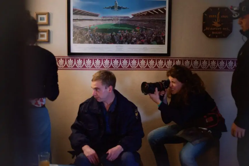
The majority of the film was shot in Beaufort West, which is part of the truck route between Cape Town and Johannesburg and is really frozen in time. The interior is a kind of late 70s vibe and hasn’t changed. Jenna had been going there for three years, so she’d show me images and I’d respond with other images. It was just a collation of all our ideas.
Holding off on me being physically present also allowed us to really think about cinematic language, which wasn’t too dictated by physical spaces. There’s always a dosing to do between reccy-ing too early on, and the danger of that which is the shoot being dictated by the space. You become too reactive. On the flipside, reccy-ing too late gives you too rigid an idea of how you’re going to do it and then the space doesn’t fit your ideas. It was a really organic way of doing it.
Did this help to achieve the authenticity of the film?
We were quite keen on being inspired in a documentary-style way from these spaces. Jenna was adamant that a lot of the secondary parts were not professional actors, they were from Beaufort West. She wanted a very authentic feel. It helped to create a nice dissonance between the written narrative and the documentary feel which created the desired uncomfortableness we wanted.
On a low budget film, it’s also incredibly important to respond and be reactive to the real spaces you are in. You can’t impose or recreate a universe from scratch. At the same time, we wanted to have a coherence. So, we wrote a little manifesto for structure and to anchor our ideas.
Who were the other key members of the team you worked closely with?
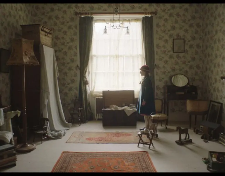
For sure, the production designer Sarah Hartinger. Many of the set, we didn’t have to do much. But, we really thought about palette together. We were always navigating the line between realism and heightened reality to achieve the kitsch element in the piece. For example: the way drapes, textiles, and windows affect the colours on set. There’s a scene in Poppy’s bedroom and the whole setting is pink. I was quite inspired by the photographs of Bieke Depoorter who has lots of shots of interiors where the walls are really textured and deep in colour, but they’ll be a veil at the window that colours the whole room and makes it quite aquatic. Particularly interiors where people are not very wealthy, but colour is used as an expression of themselves. My technical crew as well, because I was the only non-South African on the crew. So, they helped me navigate being in a new place. My grip, Nasmie Majiet, was an incredibly thoughtful and reassuring presence.
Was having a tight-nit crew helpful when shooting the close quarters in-car footage?
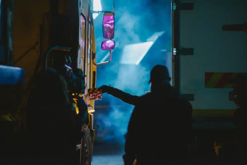
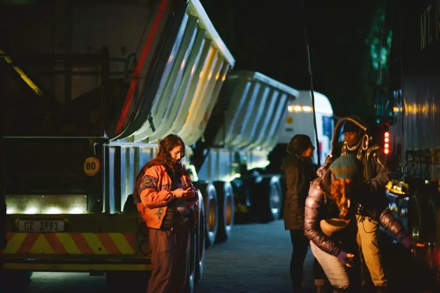
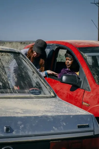
One of the biggest head-fucks was the truck. We kept circling and circling all the different obstacles and ways to do it. Nasmie is one of those people who would never poopoo something and would encourage creativity with huge technical expertise. We landed on the most simple situation, which was to have a real driver in a real truck actually on the highway.
A lot of the big trucks we were using have a curtain in them to separate the sleeping space and driving part of the cabin. We essentially reccied a truck which was super luxury, where the backspace was huge and wide. If you closed the curtain and just had the driver hidden behind the curtain off shot and just put a steering wheel in front of the actor, you could believe the truck was driven by the actor. All these conversations about high technical solutions, the simplest thing became the answer!
How did you use framing and composition creatively throughout the visual storytelling?
Within the manifesto we made it abundantly clear that all the characters are experiencing repression of feeling and desire to control. We decided with the character Beauty that the camera would not move as there was a sense of stasis and inertia in her story. Often, we would position her within the frame obscured or cut off to reflect this awkwardness. Whereas with Natalie, the camera was always moving, energetic and experiential. It was very textural and chaotic, unlike Beauty whose was arid and barren. As Beauty became more loosened up and liberated, the camera began to move with her to reflect this growing freedom.
One of the original concepts we discussed, but didn’t make the final cut, was Jenna’s idea to start the film in the ratio 1:1 which would then slowly open up to become 2:1. This was to reflect this growing freedom and show the characters becoming less isolated as their stories became intertwined. Although we didn’t use this effect in the end, you can see how at the beginning of the film we make more use of vertical space and by the end it is a lot more about lateral space. It’s important to note because it really demonstrates how there is a huge distinction between centrality and use of height at the beginning compared to the end. Although it was disappointing not to happen, you still really get those ideas within the fabric of the film.
What camera package (and lenses) did you use to suit the production?
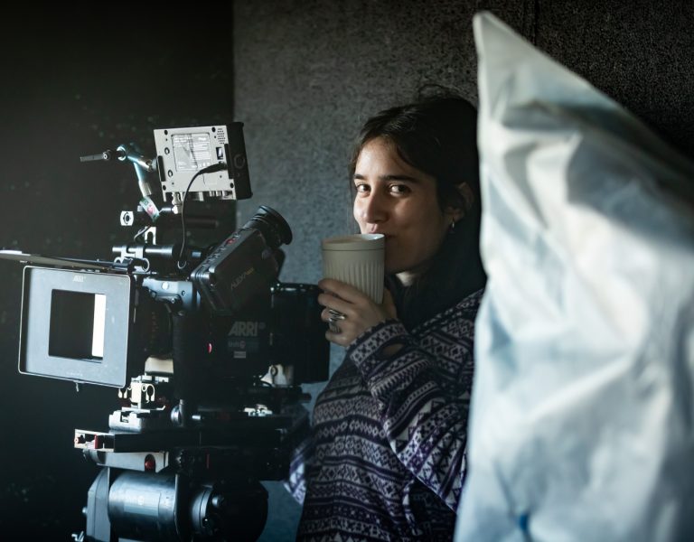
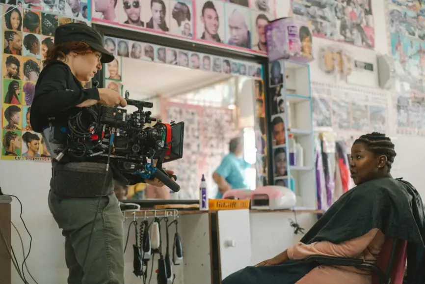
The ARRI mini – it has so much latitude and when you’re working with natural light it really is invaluable. Also, Cooke s/2 lenses as they have a strong all off at the edges and I wanted that textural aberration. I feel like every cinematographer uses these! One thing I also made sure of was to have a zoom on stand-by as we didn’t have any second unit days. If there was any moment of waiting, I would turn around and film a shot of whatever was behind me, because I knew how important it was to interweave the story with the context of the space.
How did you manage tricky weather conditions and lighting situations?
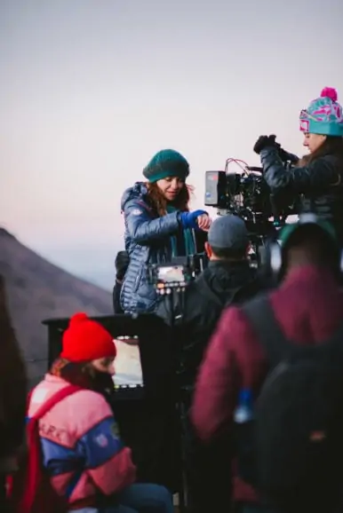
The trickiest situation were the scenes with snow falling, as the gaffer fell sick and no one knew how to use a snow machine! I’m normally adverse to strong backlit night lighting, but given my resources there was no other way to go about it. I tend to want subtle night times with low contrast so we adapted and I had to go against my usual taste. We waited for that moment for the acting and snowfall to coalesce magnificently, as often when snow is backlit it can look really fake, but in the end we got there! Going against a naturalistic lighting style and embracing a more genre-specific mood was sometimes challenging, but was a big learning curve.
What creative references and inspirations did you consider?
At the beginning of the film we were referencing naturalistic, fragile style like Andrea Arnold, but by the end it was more directed towards kitschier styles like Pulp Fiction. We were often thinking about Fargo and how it’s a thriller in a vey stark environment, stripped of glamour.
What was your proudest moment throughout the production process?
When two guys came from ARRI and didn’t see me and Jenna talk, but asked her: “How do you and Sarah communicate, you don’t have any comms or anything?” and she said: “we don’t need to!” Essentially meaning we had become telepathic at that point and it was really great to have someone else notice our chemistry!
What lessons did you learn you will take with you on to future productions?
We lost a hotel location two days before shooting. One of the owners of another location said we could use their dad’s hotel – but it was currently being used as a boarding house for Chinese aviation students. So, we reccied this place and we tried to map the thing we had originally imagined onto this new space and reality.
During all this we were thinking that someone should really make a documentary about these students who learn to fly here because the air visibility in Shanghai is so poor. Then we thought: why don’t we just change the scene to accommodate them? It doesn’t really matter that it’s never explained, but it added so much texture to the piece and I’m really proud of it. The lesson from that was just to be super adaptable and open to any situation that might come across on a day of shooting.
–
Sarah Cunningham is represented by Casarotto Ramsay & Associates


