What initially appealed to you about the film?
Terri Dwyer and Greg Barrow had sighted this project as their debut for production company, Buffalo Dragon, so it was quite exciting to get involved with them and read the script that was adapted from a novel of the same title by Samantha Lee Howe. It was apparent early on that the adaptation was well handled and we were in good shape in story terms with lots of potential to tell a compelling story that was quite different to other projects I’d been involved in. This offered the chance to shoot a small number of characters in large spaces, and I found that dynamic very appealing.
How did you collaborate with the director?
The director, Giles Alderson and I met up where possible early on, under covid restrictions, to flesh out ideas and begin to pull together images we liked and believed would do the script justice. Then we refined those refences as much as possible using a service called Shot Deck that Giles introduced me to which allows you to create mood boards easily. Once we had our visual templates down, we basically established a set of rules to stick to in terms of suitable lens choices, camera movement and colour schemes. Giles had a lot of energy from the get go and we quickly found a palette for the film that we were both excited about.
Who were the other key members of the team you worked closely with?
Anna Papa, the production designer was involved in the early discussions with Giles and we spoke a lot about the use of practical lighting for the manor house location and light fade effects for certain key sequences where there was a design and lighting crossover. We then discussed all of that with our gaffer, Tom Knowles, who did a great job of facilitating and creating something tangible out of our ambitions.
What creative references did you consider? What were your inspirations? What research was carried out?
Giles sent over several films for me to watch to give us a starting point for our discussions. The collaboration between David Fincher and Jeff Cronenweth came up a lot and so we looked at films like Gone Girl and The Girl With the Dragon Tattoo. One of the striking things, especially with Gone Girl, is the simplicity of the camera movement and Giles and I really took to that as we wanted to make sure the action on screen was always doing the heavy lifting and we didn’t want to rely on redundant camera movement if a scene wasn’t working. This led to decisions whereby we would stay on the wider end of the lens spectrum to minimise camera movement when cast would walk around the scene or make gestures during static moments. Roger Deakins work has always been a big inspiration for me, so I spent a lot of time going over his films and analysing strong character arcs, like Emily Blunt’s performance in Sicario and the way that was represented visually.
What did your initial discussions about the look and feel of the film include? How did you help ensure the director’s vision came to life?
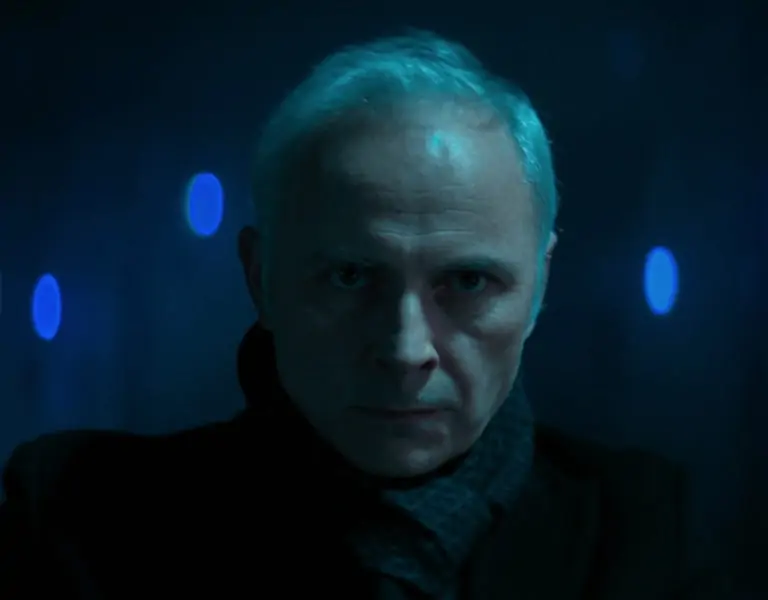
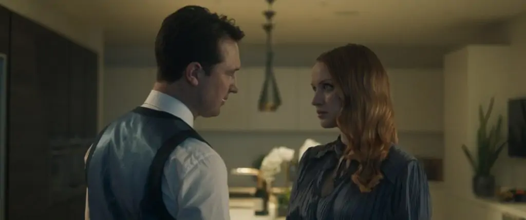
Very early on I suggested taking a mono or duo chromatic approach within each scene as I wanted the colours to represent the point of the narrative we were portraying and not just happen to be there. I’m a firm believer of keeping things simple and never over complicating anything for the sake of it and if we used a particular colour for a scene, I wanted there to be a reason why. My main mission was to deliver on what Giles was thinking but also to guide his decisions with suggestions that I felt offered a particular impact to the story. At one stage we filmed a darkroom sequence and I wanted to make sure we created the right atmosphere at the right points in that sequence, so we developed a concept of three lighting states for the darkroom, white, yellow and red, each to be used at the right moment and guided, as always, by the character decisions and never us forcing a character to do something awkward just to make a cool light effect take place. This allowed us to emphasise story beats in, I hope, a natural way.
What influenced your colour choice throughout?
I worked fairly instinctively on colour choices by recceing the locations and figuring out how far from an ordinarily natural colour palette we could go to drive the story without it becoming over stylised. This involved looking at a lot of night exterior references, which I tend to find can either look very real and tangible or extremely artificial, and we chose to go for a softer approach and to avoid hard light as much as possible with the exception of perhaps one or two scenes that required it.
How did you use framing and composition creatively throughout the visual storytelling?
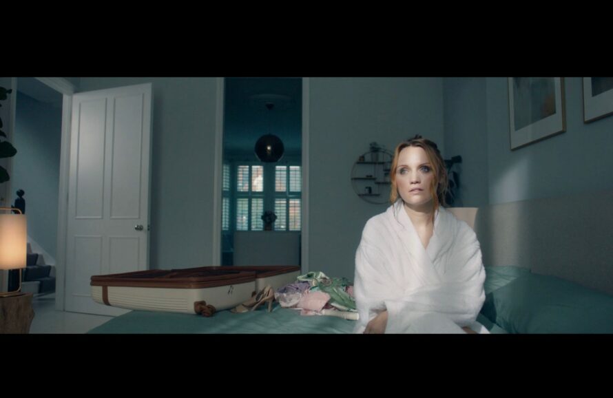
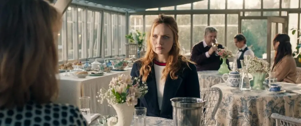
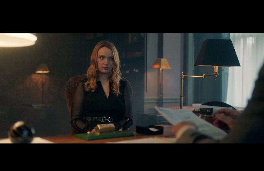
It was always crucial for us to have freedom within each scene to shoot wide and point the camera in almost any direction, this meant a lot of hard work from the art department and lots of time with the gaffer setting up each scene to get the space lit with as much attention to detail as possible without restricting our lens choices. We mostly shot with a 20mm and 28mm as the spaces we were filming in communicated so much detail. When we saw those spaces overbearing our lead character, Charlotte, we didn’t want to frame anything out or have too shallow a depth of field to obscure where she was. Ultimately it was about placing her in the world of the story and getting across the sense that she is surrounded by the weight of that world.
Which shooting locations/sets were used?
We had a manor house in Northampton, Ladyham Hall, where a lot of the story takes place, and then a series of London locations. Most of the time we were shooting on location and did very little studio work, which enabled us flexibility when shooting. The manor was great because we basically took over the whole site and picked any space we wanted to shoot in and given the period it was built in, it offered a lot of character as a baseline.
What camera package (and lenses) did you use and why was it so well suited to the production?
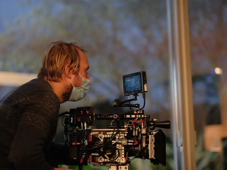
We were fortunate enough to get a really comprehensive package from Panavision thanks to Harriett Cannon who was our account manager, and shot on the Alexa Mini with Zeiss Ultra Primes. The key thing for me was having a wide range of lens choices so we could make subtle decisions when shooting. The story is very largely a two hander so I knew there would be a lot of nuance in the performances and sometimes a little twitch of the eye or flick of the finger goes a long way to communicating a feeling to the audience and if we were in a situation where we were not quite wide or tight enough to catch those subtleties, I wanted to be able to make that change without having to make a big jump in focal length.
How did you use camera movement to help tell the story?
Sparingly and only when it felt essential. If there was no reason to move the camera, we typically allowed it to remain static. Most of the movement in the film is when we are following the action and we tried as much as possible to land on a still frame once that action on screen came to a halt. There are always exceptions, but that was the general rule.
What camera tricks and effects did you use? Did you use any brand-new techniques?
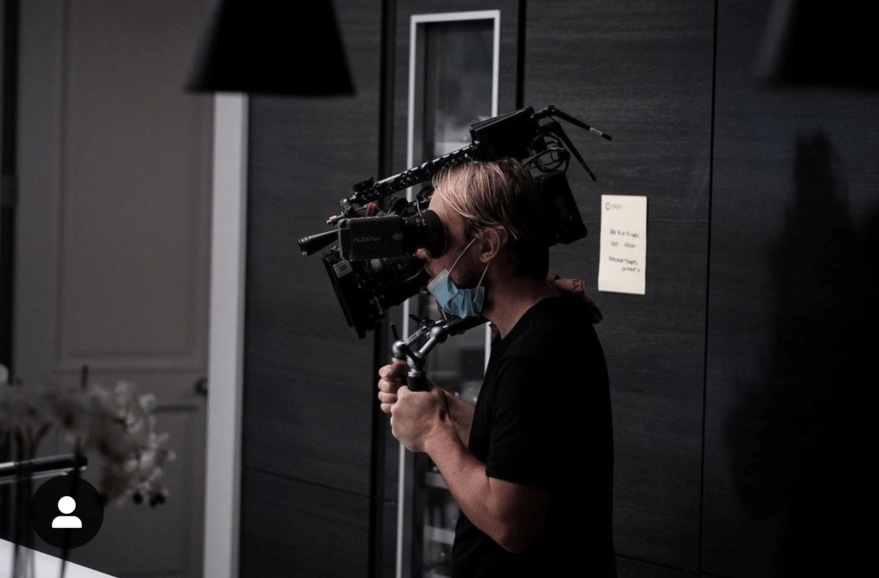
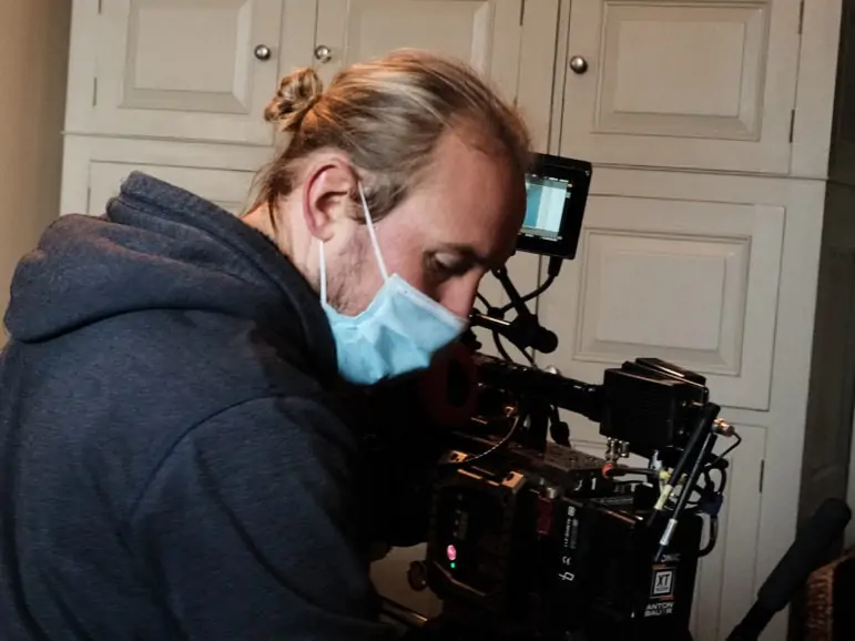
We had a fairly traditional approach to shooting so the tricks and effects were reserved for key moments. We had a sequence take place in a dug out grave and a some of the coverage required us to get the camera in the grave and have dirt thrown onto the lens through a character’s pov. We spoke a lot about using a screen and housing for the camera but in the end we realised it was easier if I just jumped in the hole, got covered in mud, and operated the camera on my shoulder with the grip holding a piece of clear protective screen over the lens. We got very muddy but it did the job.
We also had a shot where we are standing outside the house looking at Charlotte staring through the French windows and the camera then moves through the glass to arrive over her shoulder at which point we see her reflection in the glass we just passed through. We did this on the day by timing the shutting of the French windows with the point the camera spins to see the original position after I’d stepped though. The shot then had some VFX work to add the reflections we couldn’t capture in camera.
What was your approach to lighting? Which equipment did you use and why? How did you work alongside your gaffer to create the desired effect? How did you use natural light?
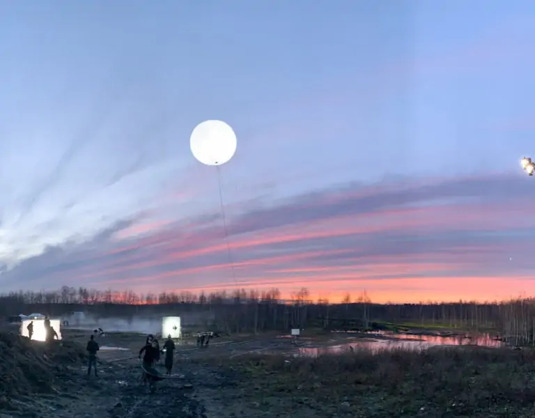
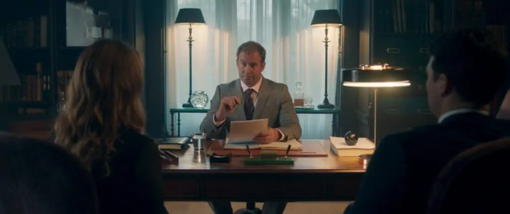
I wanted to stick to soft external sources and bring as little into the interior shooting space as possible, which was difficult because we shot in December so the schedule dictated that we shot a lot of day scenes at night. We had to therefore re-create a day feeling, whilst also conveying the mood we wanted, without being able to see the outside world or having too heavy a contrast between the windows and rest of the space. It was also important we never over-light anything so we made sure to justify all our sources with practical lamps that were on set and spent a lot of time positioning the lamps so the shadows would fall where we wanted them. The main intention was to create a rich contrast without having very definitive shadows everywhere the way you would with hard light. But we also wanted to avoid that low contrast soft light feel.
Where did you do the DI? How did you work with your colourist to ensure the correct look was achieved?
I worked with Tom Cairns at Dirty Looks who has become a brilliant collaborator and feels like a genuine extension of the process of photographing the film. I can communicate my ideas with him and trust that he gets it and polishes off the material where we left off on set and we usually discuss the creative intention quite early on in the process. Once the shoot is underway I’ll start shipping him dailies and stills to get up to speed by the time the grade happens.
What was the biggest challenge the production presented and how did you overcome it?
Our biggest challenge was having some really heavy shoot days under COVID restrictions, so at times it just felt like the schedule was unachievable, but we always maintained we had to keep the quality high and be true to the creative approach so we found logistical ways of being efficient on set. We did a lot of pre-lighting and having full reign of the manor location really helped as I could go off and light a series of sets whilst still being able to jump back to pick up coverage in other parts of the location. Most of the time we were ready to go for the next scene with just a few tweaks required.
What was your proudest moment throughout the production process?
My proudest moment was more an overarching realisation that we had such a good camera and lighting team that Giles and I were able to easily communicate what we want and the results always almost all of the time was incredibly satisfying. For the most part I think we pulled off some lovely moments where the lighting enhances the journey the characters are going on without it being too in your face. There was a point in the first week of shooting when the whole team realised we were onto something and there was evidence in the rushes of great work being done by all departments, which elevated the drive to push through what was a very tough shoot, and that was a lovely moment of coming together for the whole crew.
What lessons did you learn you will take with you onto future productions?
I definitely learnt to listen to my instincts on this more than any other production. When I felt something was wrong and I knew deep down the reason why, tackling that and taking a moment to discuss with the director the change I thought we needed to make and making time for that always put us in a better place. Similarly, if things were going really well, resisting the urge to get too excited and make a change that wasn’t necessary was important and I think the consistency of the look of the film holds up as a result of that and it will definitely be an ethos I carry forward.
