COLOUR CHAMELEON
Selected filmography
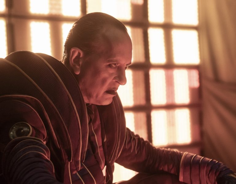
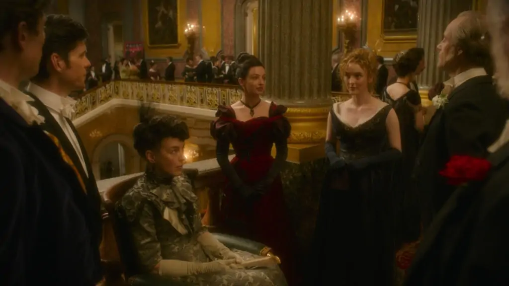
The Nevers (2021) (TV series)
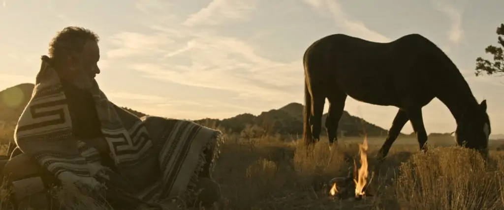
News of the World 2020
Da 5 Bloods (2020)
Raised by Wolves (2020)
Crazy Rich Asians (2018) (TV series)
Sicario: Day of the Soldado (2018)
Alien: Covenant (2017)
X-Men: Apocalypse (2016)
The Big Short (2015)
The Martian (2015)
Exodus: Gods and Kings (2014)
X-Men: Days of Future Past (2014)
Oz the Great and Powerful (2013)
Prometheus (2012)
Pirates of the Caribbean: On Stranger Tides (2011)
Quantum of Solace (2008)
The Hurt Locker (2008)
Zodiac (2007)
The Departed (2006)
The Aviator (2004)
Pirates of the Caribbean: The Curse of the Black Pearl (2003)
Confessions of a Dangerous Mind (2002)
Panic Room (2002)
What inspired you to become a colourist?
I worked at a duplication company owned by Warner Bros. and I started, like a lot of people, as a tape op. There were colourists there and that’s how I first learned the job existed. I worked on mastering some animated shows like Batman and Animaniacs in the early ’90s and after a while, I knew I wanted to colour live-action shows.
How and where did you learn the craft?
I joined the Post Group as an assistant. A lot of the top colourists of today were there at the time. I assisted for a while and learned what colour grading was all about and eventually I got work as the colourist on the show seaQuest DSV. The clients were happy with my work and soon I was also doing a lot of commercials and music videos.
Who or what are your biggest inspirations or mentors?
I assisted the colourists at the Post Group, and they helped me get a firm grasp on the job. I would always be experimenting on my time off – putting the negative of something that I liked up [on the Telecine] and trying to see if I could make it look as good as the colourists did. If I got stuck, I could ask whichever colourist was there at the time.
What would you single out as your big break?
In the early 2000s, the technology to finish feature films digitally was still being developed. The tools we had for TV work – things like windows and keys and defocus – weren’t available for features. I had been grading David Fincher’s commercials and music videos and the non-theatrical releases of his features The Game and Fight Club. He wanted to finish his next feature, Panic Room (shot by Conrad W. Hall ASC), as a DI [digital intermediate], which was a brand-new thing. But he wanted all those controls that we had for video finishing.
He encouraged me to move to Technicolor from the Post Group so I could be the colourist for that film. I was like, “Sounds great!” I’d be working with David and on the cutting edge of this new technology! Then Tom [Newton Thomas] Sigel [ASC] wanted to finish his new film, Confessions of a Dangerous Mind, as a DI, too. I’d coloured some of his TV work at the Post Group and he wanted me to do his DI. I was off and running in this brand-new field!
Some people who want to be colourists can do a good job for an individual shot but just can’t hold a look consistently throughout a whole movie – 3,000 shots or whatever it is. You can work with them for years…and then you have to kind of let it go. It’s just not the job for them.
Stephen Nakamura, Senior Colourist, Company 3
What are the key qualities of a star colourist?
Part of it is about temperament. You have to be able to work with cinematographers and directors and sometimes a whole lot of other people and always have ideas to present but also be able to quickly show people options. Of course, one absolutely essential aspect to success as a colourist is an eye for colour. You need to respond to very subtle changes in hue and contrast and have a feel for how these [attributes] affect the mood and meaning of a scene.
Some people pick that up pretty quickly. With others, it takes a long time. Some people really never get there. They’ll see things as too green or too magenta or too low contrast. Some people who want to be colourists can do a good job for an individual shot but just can’t hold a look consistently throughout a whole movie – 3,000 shots or whatever it is. You can work with them for years…and then you have to kind of let it go. It’s just not the job for them.

What are the fundamentals of a successful colourist/DP relationship?
You have to be able to share the cinematographer’s sensibility. You need to be a bit of a chameleon. Everybody has a different kind of style – a different idea about what things should look like – and as a colourist, you want to see things the cinematographer’s way to a great extent, so they don’t feel they have to micromanage every scene.
When I start on a movie or TV show, I’ll usually pre-grade some scenes. Ideally, we can then sit down in the same room and start reshaping shots together. Maybe they keep asking for me to brighten faces or they usually want to darken the background or put vignettes around the frame or desaturate particular colours. Soon, I can say, “OK, I see how this person looks at photography. I know how they respond to certain looks.” Once you work with a DP multiple times, you get a feel for how they look at things.
What role do you believe colour and the grade play in enhancing a production?
A lot depends on the production. There are films that have a very intense look built in the grade that could never be created any other way. Then there are times when it’s more about evening everything out and polishing, similar to what a timer did in the photochemical days.
Very often, there are situations where productions just can’t wait hours or days for the perfect weather, and we can go in and we can add in the equivalent of filters and grads, and we can affect the contrast and shape the light to a great extent.
On big visual effects shows, shots often come in from multiple effects companies and the work can be beautiful but until everything is seen projected in context and in the colour space that it will be seen in theatres, people can’t know exactly how it’s going to look. Maybe the sky element suggests that the tree we’re looking at would have more direct sunlight than it has so I could isolate the tree, and then use colour correcting tools to change the look of the tree, maybe add some contrast and saturation, to make it sit perfectly within the finished shot.

What innovations have you been impressed by?
I’ve worked on DaVinci colour correctors my whole career and they’re always adding new tools. Everything I’ve discovered along the way has been about giving the client something they need that I can’t quite do with the normal tools.
I coloured the Brad Bird film Tomorrowland, which was shot by Claudio Miranda [ASC]. It was the first feature to do a version in the HDR Dolby Cinema process and it was before Dolby’s technology was completely able to do everything necessary. We were working with Dolby and Blackmagic Design [makers of DaVinci Resolve] and our in-house team of colour scientists, led by John Quartel, to make it all come together.
I was recently asked to come up with a unique look for some flashbacks on a series, so I did a lot of experimentation within Resolve’s OpenFX palette using their Glow tools to come up with a look they liked. I love to experiment with every tool available when I need to do something I’ve never done before.
What advice would you give aspiring colourists?
I think it’s a really exciting time to be a colourist because just look at how much content there is out there. And a lot of it is really fantastic! You have all the cutting-edge directors and cinematographers doing TV and features. It used to just be network TV, theatrical releases, and some cable shows. Now even YouTube has a great stuff to watch. And there are so many platforms where people can experiment. It’s not like when I had to learn on my off hours when there was a bay available.
Do you think it’s still important to work as an assistant and to train at a post company or do you think the future is more about learning at home?
I think that people still do better in an environment where they can learn directly from experienced colourists and in a professional situation with clients and deadlines.
What are the biggest recent changes you have seen in the world of colour grading?
HDR is a big difference. Some cinematographers like to keep the essential feel of the P3 finish when we master for HDR and others like to really explore how the possibilities of making brighter highlights, more intense colours and the perception of darker blacks can add to their visual storytelling.
Another change that came from the pandemic, of course, is remote work. Company 3 has had the ability for a long time to do colour grading where the colourist is in one place and the clients are somewhere else but much more of that has happened over the past year by necessity and I think that’s both good and bad. It’s good because I can collaborate with cinematographers while they’re off on location shooting their next project. In fact, I’m currently working from one of our Los Angeles facilities with Dariusz, who’s shooting in Rome, and Tom Sigel, who’s in the UK. But I also think there is a lot of value in sitting in the same room with the cinematographer and watching the same images because that’s really a great way for me to get a feel for what they like and don’t like.
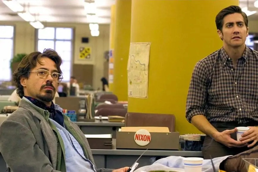
Cinematographer Newton Thomas Sigel ASC says:
“As a cinematographer, you need to have a vision of what you want to begin with and where you want to go at the end. I think that the gaffer AND the colourist are key collaborators in that. The more you work with somebody, the more you can relinquish the OCD aspect of control. Stephen Nakamura is somebody I’ve worked with for many years and we have a certain common language.
In a creative process with an artist that you respect, you expect to have opinions come back at you. I think one of the privileges of being a director of photography is that you can take the opinions you like and respectfully decline the ones that don’t work for you. When I’m working with Stephen, I know I’m going to like quite a lot of his opinions.
One of the major challenges with Da 5 Bloods was making sure that throughout the digital grade, we stayed true to the look of that reversal film that portions of the movie was shot on. We didn’t want to go to all the trouble of shooting 16 millimeter reversal and not have it end up looking the way it was supposed to look. We also had some digital shots that had to blend in with those shots. I knew that Stephen could get us most of the way there before I even started going in to Company 3 to work with him.
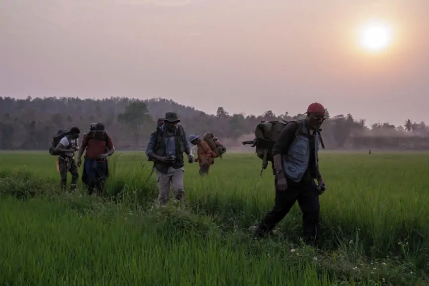
Also, we shot a lot of night exteriors in the jungle with only a moonlight source. Spike [Lee] likes to work fast so there wasn’t much time for lighting, and we didn’t have that much [lighting equipment] anyway. This was really the jungle. Since I know exactly what Stephen is capable of, I knew when we were shooting that it would all work but there’s no way we could have shot those scenes as quickly as we did if we didn’t have someone like Stephen who could finetune the look and also keep it all looking natural.”
Cinematographer Dariusz Wolksi ASC says:
“Stephen and I go way back to the first Pirates of the Caribbean, which was when digital colour grading for feature films was a cutting-edge technology. Since then, we’ve worked on so many pictures and we’ve developed an extreme shorthand. He understands my aesthetics. I’ve done movies with numerous directors and introduced them to Stephen and they’re still using Stephen.
We work with [digital imaging technician] Ryan, who creates the files on set where I can basically sketch the look and then those files go to Stephen and he does his own work based on what we gave him. He has much more control in his grading theatre, of course, but he’s already starting out with a good idea of what the director and I are looking for.
I know he works in all kinds of ways depending on the cinematographer and director. When he’s working with Ridley Scott and I, we do things that are quite edgy and visually quite strong and powerful and he’s right there with us – a part of the family.
I grew up with a very strict knowledge of what the film lab can do. But today, you can analyse and dissect every frame and put windows around everything and keys…the technology is overwhelming! And that creates a danger because you can do too much to it. Stephen knows where to use [that technology] and he knows where not to.
He has a great sense of how images should look even if a lot of it is actually a visual effect. Think of the classic thing that happens when you have a bluescreen outside the window. The VFX people might create a perfect looking view of what’s outside. But we know that the window should be blown out. In real life, you wouldn’t have a perfect exposure outside the window and if you did, it would look horrible and artificial. So, if you give Stephen those two elements, you know he’s going to just balance them perfectly.”
