

SHINING A LIGHT ON HISTORY
Cinematographer Alejo Maglio explains how lighting, lenses and the ARRI Alexa Mini helped to shape historical drama Summer War.
When Alicia Scherson invited me to shoot Summer War, one of our first conversations was not about cameras, lenses, or cinematic references. We talked about Chile in 1989 and its political context.
The film takes place during the last summer of the Chilean dictatorship. It is a very particular moment in history: the plebiscite has already taken place, the regime has lost its political legitimacy, yet it still remains in power. Everything seems to belong simultaneously to the past and the present. I wanted the cinematography to embody that same condition.
Very early in the process, an idea emerged that eventually became the guiding principle of the entire film: whenever possible, we would work only with tools that already existed in 1989. It was not driven by nostalgia or a fascination with vintage technology. It was a deliberate creative constraint. If the story belonged to that moment, I wanted as many of the material decisions as possible to belong to that same historical period.
As the preparation progressed, I realised that this principle was expanding far beyond lenses and lighting. It gradually began to shape the aspect ratio, the construction of colour, the staging, and, above all, the way we looked at the space. I try to let each film discover its own visual language; the technical decisions come afterward, as a consequence of that search.
After reading the screenplay, I began watching a vast amount of World War II archival footage. I was particularly interested in material filmed by combat cameramen on the beaches of northern France. I searched for footage shot by both the Allied forces — which is far easier to find today — and the much rarer images preserved from the German perspective.
Much of that material had been photographed on 35mm using Bell & Howell Eyemo cameras: heavy, rugged machines with very limited controls, operated by people who were just as exposed as the soldiers they were filming.
I wasn’t interested in reproducing the texture of that archive. What fascinated me was its way of looking.
Finding perspective
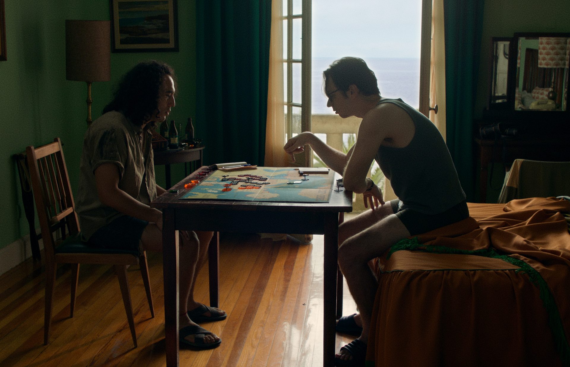
I suggested to Alicia that we think about the beach through Udo Berger’s point of view, as if he were watching an Allied landing from the German side. It wasn’t about recreating historical shots or making a cinephile reference, but about adopting a perspective. The room in the hotel’s main location became an observation post. The beach ceased to be simply a seaside resort and gradually turned into strategic territory. Everything happening beyond the window could be read as movement across a battlefield.
There is a story about Atahualpa that appears in the film itself, and that helped me understand the relationship between the characters from my very first reading of the script. While imprisoned, Atahualpa watched the Spanish play chess for days. Without anyone explaining the rules, simply by observing, he eventually defeated them. In the film, this story is told by Elsa’s husband while a mural of Atahualpa is being painted inside the hotel. I always felt it perfectly described the relationship between Udo and El Quemado: while one believes he understands the game, the other quietly learns by watching until he becomes an unexpected opponent.
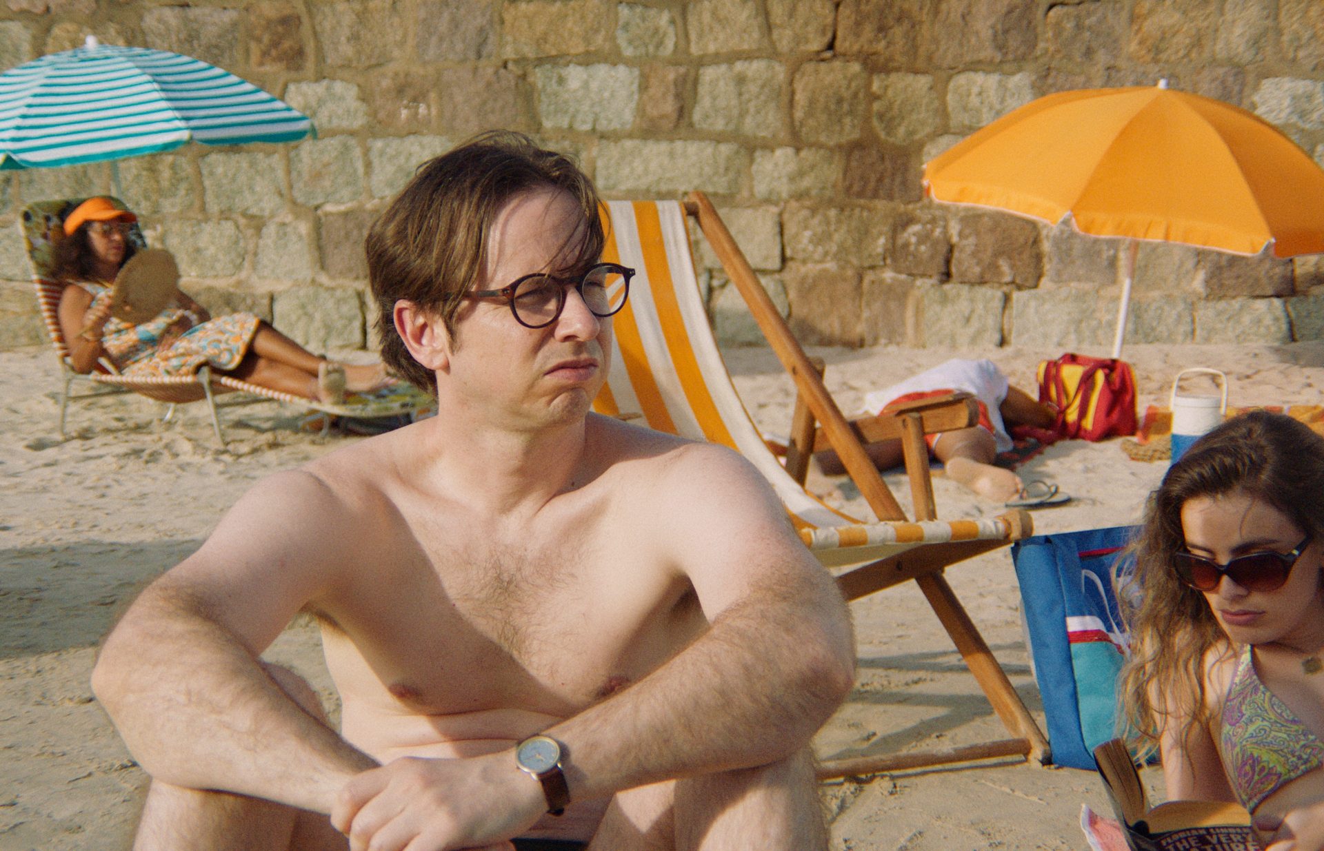
That idea ended up shaping much of the staging on the beach. Kayaks, beach chairs, and umbrellas formed the everyday landscape of a Chilean seaside resort in the late 1980s, but they gradually began to behave like elements of a battlefield. El Quemado even used those same objects every night to build the fortress where he slept. We also incorporated small Styrofoam toys shaped like dirigibles and warplanes that occasionally appeared silhouetted against the sky. We were never trying to illustrate war itself; we wanted to show how Udo gradually started reading the landscape through the logic of his board game.
Udo plays The Rise and Decline of the Third Reich, the classic Avalon Hill wargame published in 1974 that also inspired Roberto Bolaño’s novel. We built a faithful reproduction of the original board because the connection between fiction and World War II was already embedded in the literary source material.
Finding the right references
From the very beginning, Alicia had two very clear photographic references in mind: Don Terpstra and Martin Parr.
During the 1980s, Terpstra photographed the beaches of Reñaca, very close to where our story takes place. His photographs portrayed exactly the beach culture we wanted to reconstruct, but they also revealed a very particular way of recording light. The colours were never bright or idealised. Skin always seemed covered by a permanent ochre layer, while the shadows retained a cool quality subtly contaminated by earthy tones. There was something in those images that allowed the pleasure of summer holidays to coexist with the silent weight of Chile’s political reality.
Thinking about that palette, I find a parallel with Goya’s Black Paintings in the way colour seems to carry historical memory. In both cases, ochres invade the skin while cool tones never feel completely clean; they always carry traces of earth, smoke, or shadow. I like to think that our film pursued a similar contradiction: a luminous summer where history continues to permeate everything in front of the camera.
Martin Parr added another layer. The Last Resort observes holidays with a unique mixture of humour, harshness, and an extraordinary attention to the material quality of sunlit skin. Later, we also incorporated the work of Robbie McIntosh, whose photographs of Italian beaches naturally resonate with Parr’s.
These references never functioned merely as colour references. They influenced the height at which we placed the camera, the relationship between the characters and the landscape, the way light should fall on the skin, and also the construction of the physical world in front of the lens.
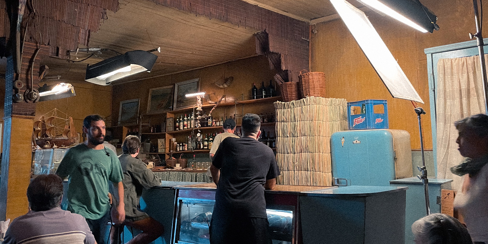
Sebastián Muñoz and the entire production design department created that world with extraordinary attention to detail: the worn architecture of the main location, the umbrellas, kayaks, beach chairs, the palette of every object, and the texture of every surface. Cinematography and production design developed the film’s visual language together long before we reached the colour grading stage.
During the grade, Thomas Woodroffe refined and consolidated that visual direction, strengthening an identity that was already present in the photographed material.
Quality lenses
Choosing the lenses always occupies a central place in the way I work. Not because I believe there is one perfect set of lenses for every film, but for exactly the opposite reason. I try to find the glass that belongs to each specific project. I rarely repeat lens sets; I prefer to begin every film by asking what kind of gaze that particular story requires.
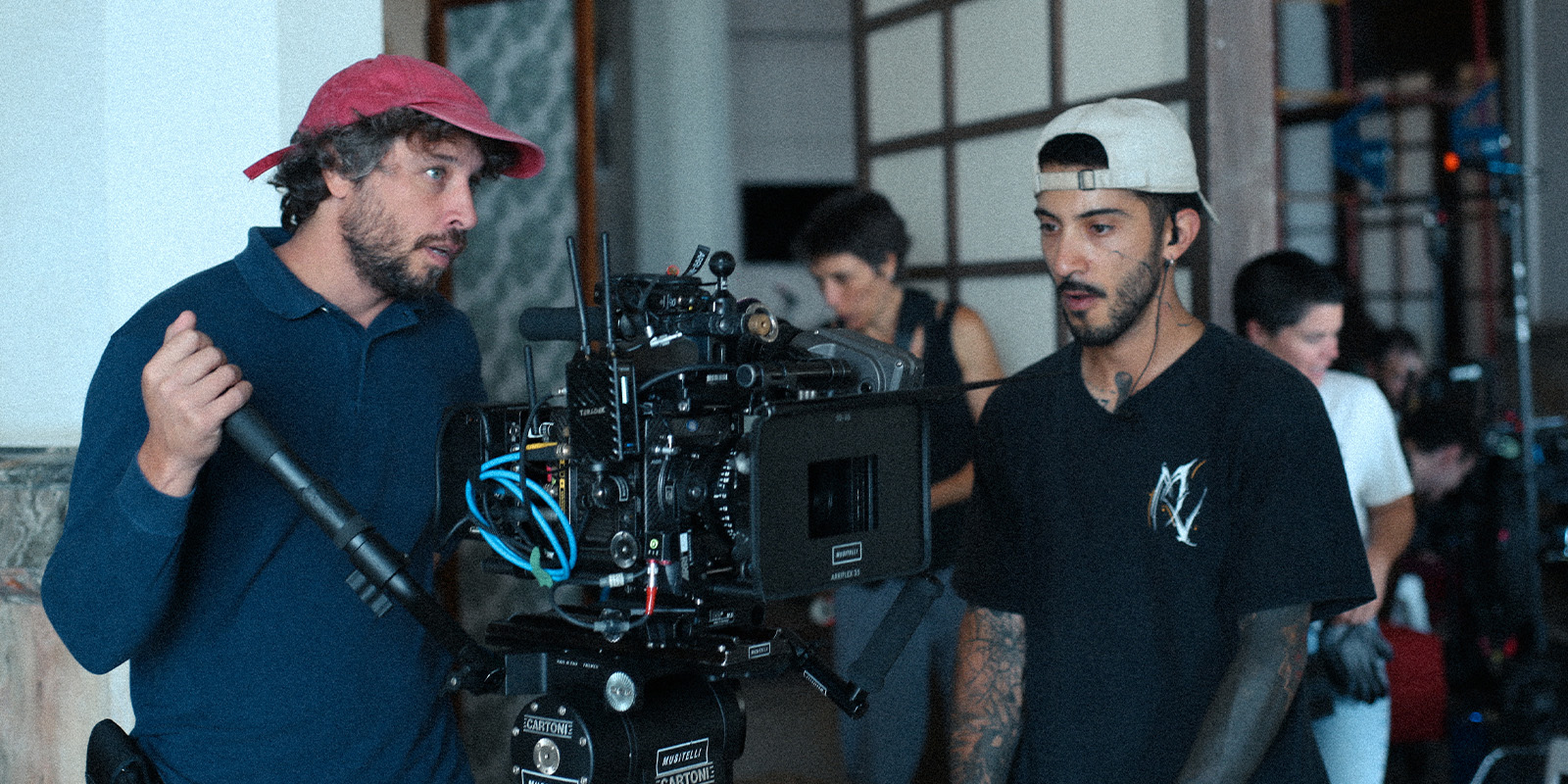
Before settling on the Nikon AI-S lenses, I tested a complete set of Lomo Super Speeds from the same period. The Lomos had many qualities, and for several days I thought they would be the final choice. But every time I returned to our visual references, I found that the Nikon AI-S lenses brought me closer to the film we were trying to make.
It wasn’t simply an optical decision. Nikon AI and AI-S lenses had been fundamental tools for photojournalism and documentary photography throughout the 1970s and 1980s. I discovered that Steve McCurry used them, as did many photographers from Chile’s Independent Photographers Association during the dictatorship. I felt those lenses had already looked at that country. They had recorded that light, those bodies, and that historical moment. I wanted the tools we were filming with to share the same material memory as the world we were reconstructing.
Visually, they also offered exactly what I was looking for: solid contrast, rich colour, restrained flares, gentle halation at wide apertures, and a less aggressive micro-contrast than many contemporary lenses. Skin acquired a very particular presence, with smooth transitions between light and shadow that naturally echoed the photographic references we had been working with.
The rehousing addressed only mechanical aspects: longer focus throws, de-clicked apertures, and the ergonomics required for working comfortably with a focus puller. What truly mattered remained the glass itself.
There was one deliberate exception: the camera. It could not share that same material memory because it inevitably belonged to another time. My search was therefore for a sensor capable of naturally dialoguing with the lenses, the lighting, and the physical world that did belong to 1989. I was never interested in making the camera imitate film. I wanted it to coexist with those older tools and record that world naturally.
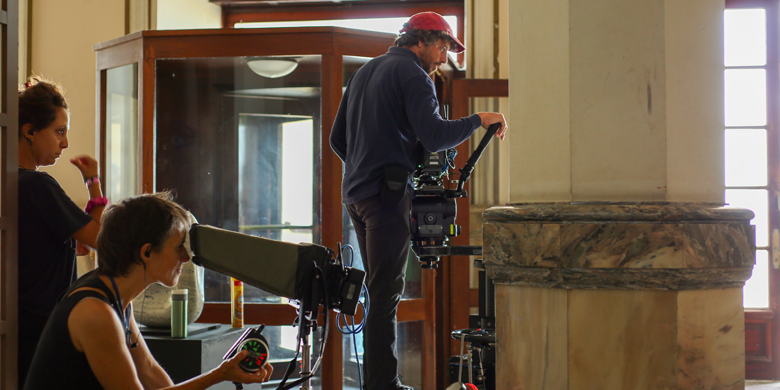
For that reason, I chose the ARRI Alexa Mini, shooting in Open Gate and composing the film in a 1.55:1 aspect ratio. Using the full sensor area allowed me to bring the cinematic frame closer to the language of still photography, which was one of the project’s primary visual inspirations. The sensor’s dynamic range also proved essential in our main location, where the ocean outside the windows needed to remain alive while the interiors retained their depth and density.
I also chose to work in a 1.55:1 aspect ratio because it brings the cinematic frame closer to the language of still photography, from which nearly all of our visual references came. It is also a format I have continued to explore since The Delinquents, and one in which I find a very natural sense of composition.
Realistic lighting
The same principle that guided the choice of lenses also guided the lighting. We worked with light sources that could realistically have existed in 1989.
Together with gaffers Florencia Martínez in Uruguay and Kike Palma in Chile, we relied primarily on tungsten units, HMIs, and traditional fluorescent tubes. I deliberately avoided giving LED fixtures a dominant role. When they appeared, they were used only for subtle fill or to support existing sources.
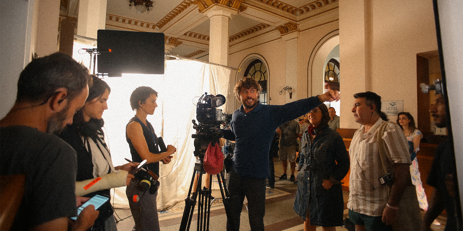
The practical lights that remained visible in the frame followed the same logic. We used incandescent bulbs controlled with dimmers for table lamps and practical fixtures. Finding them turned out to be surprisingly difficult, as they had almost disappeared from the market, replaced by LEDs.
More than the hardness or softness of the light, I was interested in the way it behaved on the skin. We used only the amount of diffusion necessary to shape the faces while preserving directional light and well-defined specular highlights. That quality of skin — so present in the photographs of Parr and McIntosh — remained a constant reference throughout the shoot.
For the beach exteriors, we added no artificial lighting. The entire lighting strategy relied on large silver and white bounce surfaces combined with extensive negative fill to restore contrast to the bodies. That work began long before shooting. During the scouting process, I carefully studied the sun’s path and the different orientations of the beach in order to determine the ideal time of day for each scene. Later, together with the assistant director, we built the shooting schedule around that logic so that every sequence could be filmed when the natural direction of the sunlight best served the staging.
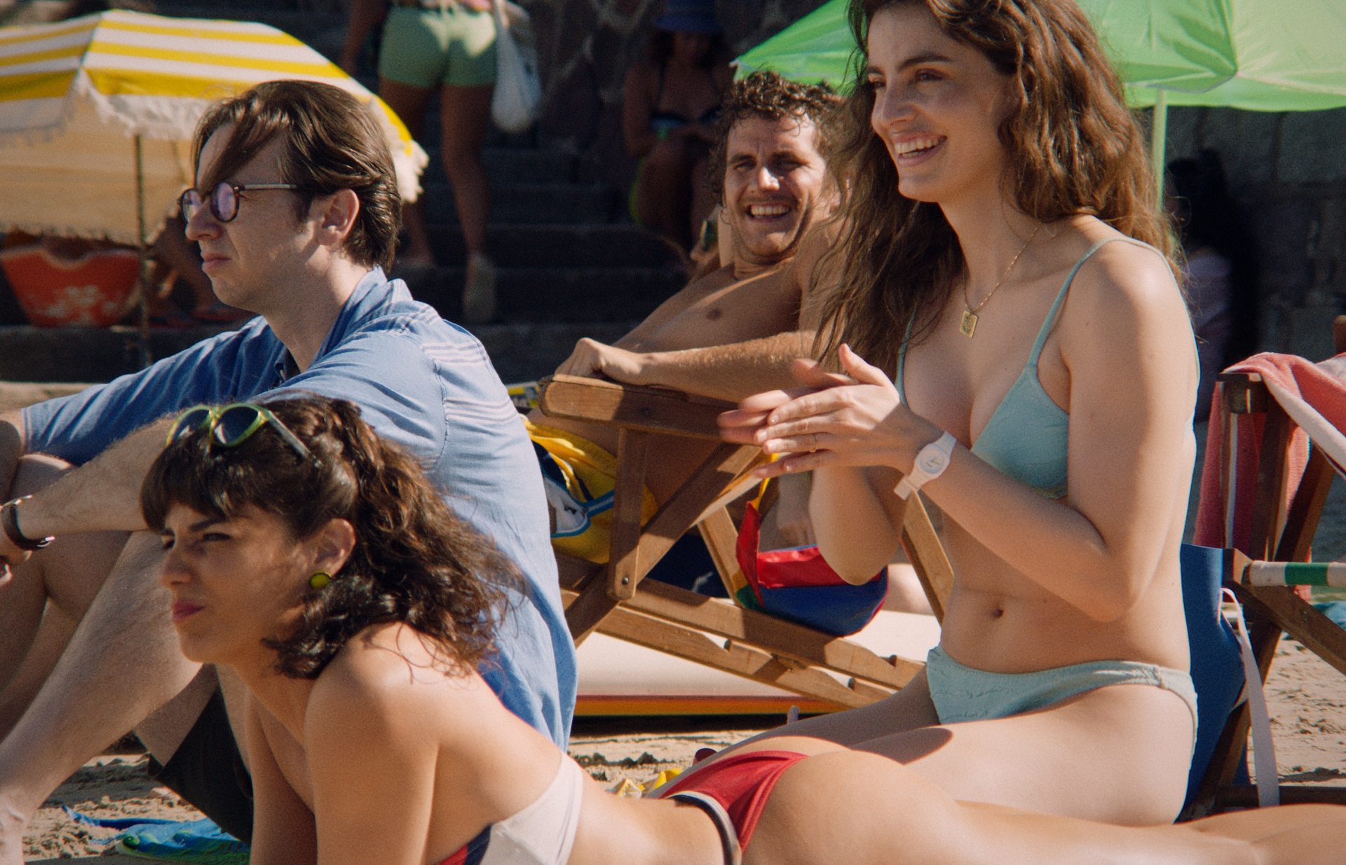
Negative fill does not add light; it removes it. By absorbing ambient bounce, it restores the sculptural quality of direct sunlight on the body. We were never trying to beautify the beach, but rather to preserve its physical sensation of heat, humidity, and summer that was so present in our photographic references.
The evolution of the lighting follows Udo’s psychological journey. At the beginning of the film, the room still belongs entirely to the outside world. The beach invades the space, and the main source of light always enters through the windows.
As Udo’s relationship with El Quemado becomes increasingly complex, that balance gradually reverses. The room stops being a place from which to observe the world and becomes a mental space instead. The lighting shifts toward interior sources: table lamps and ceiling fixtures, reinforced or recreated with small tungsten units, Dedolights, and fluorescent tubes.
At the same time, the colour temperature gradually becomes warmer, the contrast increases, and the shadows deepen. The image follows Udo’s psychological deterioration as he slowly loses the ability to distinguish between reality, the game, and the images produced by his own imagination.
Throughout the film, World War II archival footage remains a recurring presence, always accompanying the movement of the board game. But the real subject was never the war itself. What interested me was conveying the feeling of living inside a suspended historical moment.
In 1989, Chile was leaving behind a dictatorship while still living within it. That same year, the Berlin Wall fell. One era was ending, while another had not yet fully taken shape. I wanted the cinematography to breathe that contradiction — to preserve the material weight of the past while allowing the arrival of a new world, one that had not yet completely come into existence, to quietly emerge.