CAPTURING THE CLUTTER
Nanu Segal BSC explores how lensing choices and lighting transitions came into play when shooting haunting drama examining childhood trauma, Hoard – from scenes grounded in naturalism through to more absurd hoarding sequences.
When my agent sent me the script for Hoard, as soon as I read it, I knew this was a film I really wanted to be part of. I connected with the characters in a really profound way and found writer-director Luna Carmoon’s story incredibly moving. Hoard follows Maria – a teenager whose mother was a hoarder. When the story moves forward to the ‘90s we see Maria living in a foster home where a previous resident, Michael, inspires her to revisit childhood memories and repressed passions.
Collaborating with Luna was really special – she was both very specific about what she wanted while also being very open to suggestions on the different ways we could achieve the shots within our resources. It made for a very creative and joyful prep and shoot.
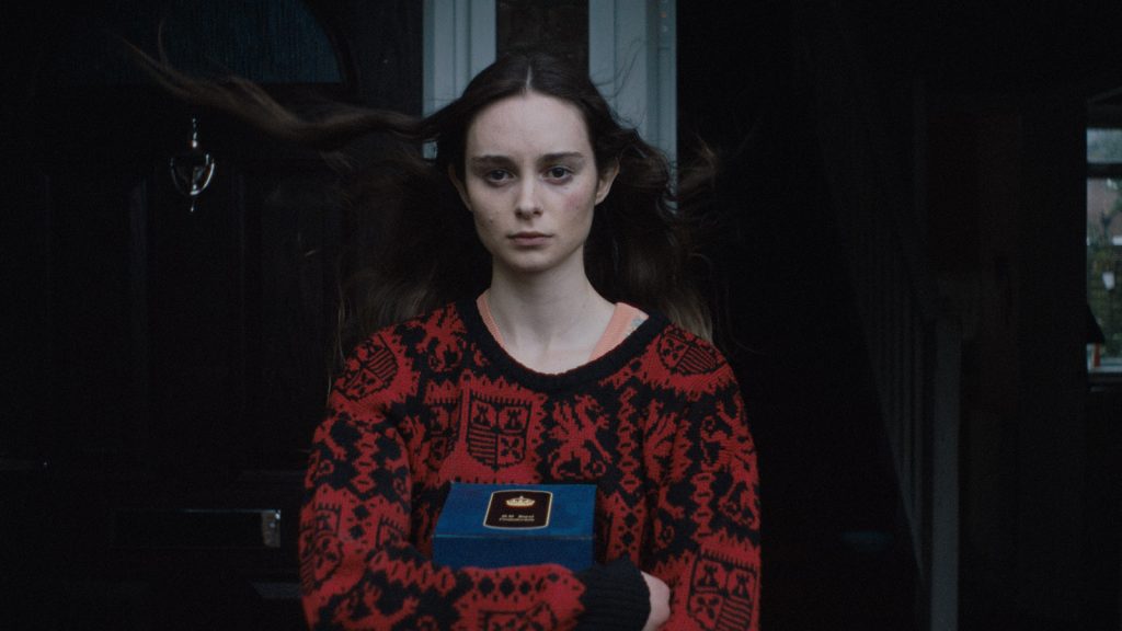
At the point I joined pre-production, Luna had already put together extensive mood boards and references for the film. Although we were shooting digitally for budget reasons, we took inspiration from British cinema of the ‘60s and ‘70s, and filmmakers such as Alan Clarke, Nic Roeg, Ken Russell, Jerzy Skolimowski, Joseph Losey, and Andrzej Żuławski.
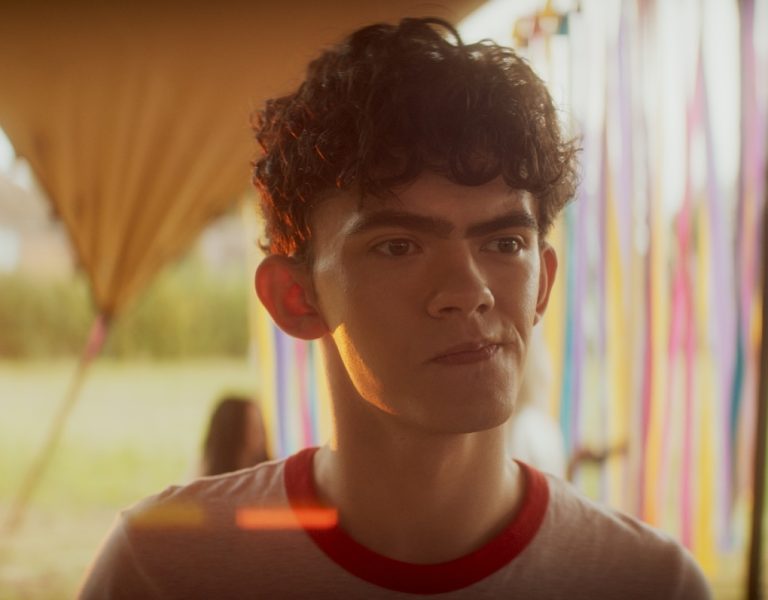
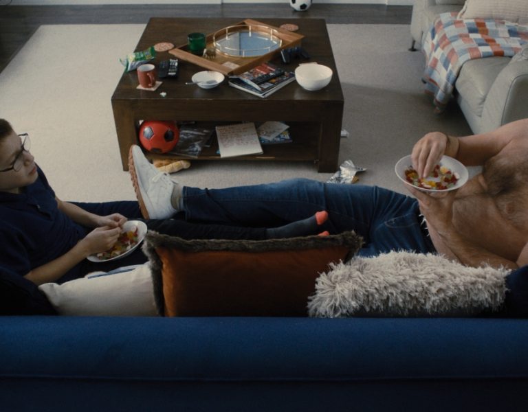
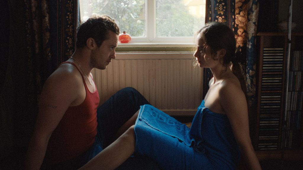
There are two main visual strands to Hoard – the first is very grounded and rooted in naturalism, while the second looks more to the Theatre of the Absurd for the hoarding scenes.
Although the film has two timelines (1984 and 1994) – which are delineated in Vanessa Taylor’s grading work – on the shoot itself, Luna and I were more focussed on creating a difference in the visual language for the naturalistic scenes and the absurd scenes. We took different approaches to the lensing, lighting, and camera movement in the absurd scenes.
Lensing the absurd
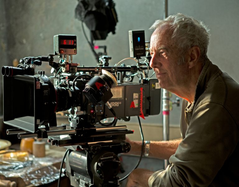
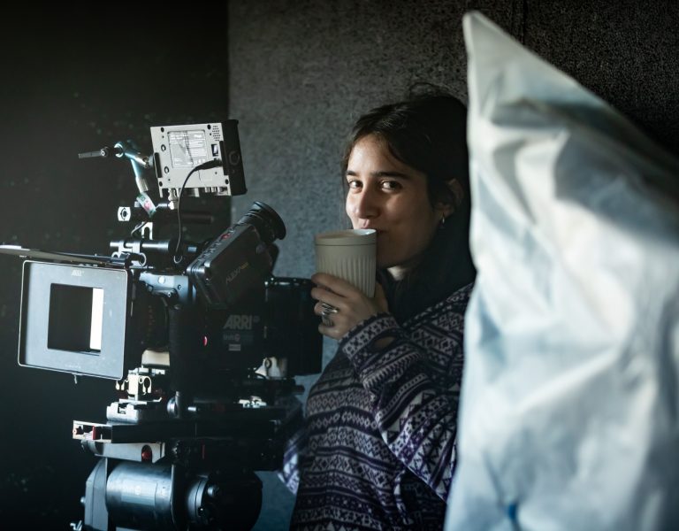
One Stop Films provided our package and were an amazing support throughout the shoot. I chose to shoot on an Alexa Mini in OG 3.2K, 16:9 and the choice was partly pragmatic – we needed a camera with a small footprint because we would be shooting in some very tight spaces. Also, the shoot was largely handheld, so the Alexa Mini was perfect for this as well as being budget friendly.
Before testing, I already knew I wanted to shoot Hoard with vintage lenses, given that Luna wanted the film to feel as un-digital as possible. Focus puller Irys Steel and I lens tested extensively to select the Cooke S2s for the bulk of the shoot, switching out to the dreamier Kowa Cine Prominars for the absurd scenes. I felt that both the Cooke S2s and Kowas helped to embed the production design, costume design, and cinematography together in a way that wouldn’t be so effective on modern lenses.
One Stop Films also provided the lenses – they have such a fantastic selection of glass, and Jonathan Iles is always on hand with his vast array of knowledge to make suggestions and advise.
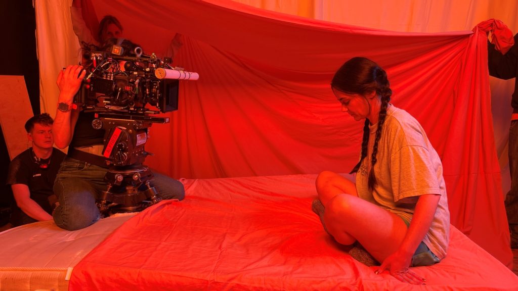
I really enjoyed shooting the absurd moments with the camera movement and lighting transitions that Luna requested. For example, shooting the mother and young Maria spinning under the bed covers, then older Maria under the spinning washing line was really fun. Luna had mapped out these moments in such a clear way and it was really exciting to be able to bring them to life.
Generally I don’t use much filtration outside of NDs and ND grads, because I like to choose a lens that has the contrast and sharpness or softness that I am looking for. That was definitely the case for Hoard.
Creative transitions
I’ve been really lucky to have worked with gaffer Vianney Kernanet several times before we collaborated again on Hoard. Our approach was largely to be source motivated with the lighting and then to allow ourselves to enjoy more extreme colour and transitions for the absurd moments.
We needed to be modest with our lighting package, so we leant on quick and flexible fixtures like SkyPanels, Asteras and NYX bulbs. Vianney had everything wirelessly connected to his iPad which made things run as smoothly as possible on the day.
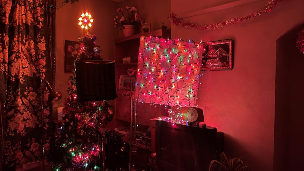
As well as using film lighting, I love lighting with practicals. One of my favourite units was made up of fairly lights strung together on a 3×3 piece of poly which came in handy for the scenes which were set during the Christmas period.
Luna had mapped out lighting transitions that spanned the two timelines and the lighting transitions were a way to connect Maria with the younger version of herself. For example, when young Maria puts her hand through the skeleton at school, the lighting cross fades from daylight to the Lucozade light of her bedroom. This moment is echoed when Maria puts her hand through the letterbox after receiving her mother’s ashes, and the light through the letterbox is augmented in intensity.
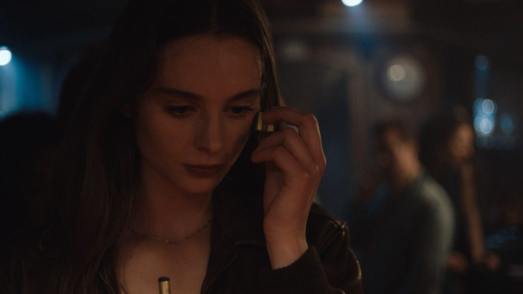
Natural light is always either the inspiration or the end goal. To this end, if the natural light was working for us and I felt like I could keep things consistent, I was always looking to use it. I feel the same way about practical lighting and looked to make the practical light the hero of the lighting set up whenever I could. For the scene were Maria plays pool in the pub, the lighting is designed in tandem with production designer Bobbie Cousins. The pool table light served both as set dressing and the key light for the scene. I love how this approach frees up the space for camera and composition as it means I’m not having to keep anything out of shot.
I always learn so much from every shoot I’m lucky enough to be part of and Hoard was no exception. It was such a privilege to help bring Luna’s vision to life. This shoot was a truly collaborative experience across all the departments and crew members and such a joy to be part of. Coming away from Hoard, I was reminded of the importance of listening to each other and listening to what the script is telling you.
