A little over a year ago, I got a message from my agent. It read simply: “Are you ready to be really excited?”
What she was about to offer was the opportunity to work on an entire season for Paramount+ with a director I have always loved working with —Börkur Sigþórsson. Sigþórsson and I had previously collaborated on the last block of Midwich Cuckoos, and ever since, we had been on the lookout for a suitable project on which to reunite.
This new series, Insomnia, was based on Sarah Pinborough’s book of the same name, and depicts the fears of its main character, Emma, of losing her mind. A couple of weeks before her fortieth birthday, Emma stops sleeping—just as her mother had right before she had suffered a violent psychotic breakdown.
Pinborough’s books are well known for their unexpected twists and playful approach to genre that mixes elements of horror, thriller, mystery, and fantasy. Striking the right balance between real and surreal was our starting point. We sought to find the right tone for something that’s very grounded in reality, but that at times, and often suddenly, incorporates elements of the supernatural. The story considers themes of mental illness and paranoia, prompting us to visualise these unsettling experiences.
Börkur and I share such a common visual sensibility and I feel I intuitively grasp his creative direction. He is brilliant at coupling emotion with image, so we can see the visual vocabulary forming as early as camera test. We had a prep of six weeks but were able to put together the whole show in this time. It was the first time I had done an entire six episode block, and the sheer amount of information was an exciting new challenge.
TV scripts are ever evolving, which means that, despite our prep, adaptability was key. To aid this, I developed mood boards that I shared with the colourist, production and costume designers. Our goal was to keep a limited and consistent colour palette through the entire show. We developed a LUT with the colourist Tim Drewett at De Lane Ley, with additional on set tweaks from my long-time collaborator DIT Joe Dibble.

Drewett described our process as follows: “The brief was to come up with a look that featured earthy tones with occasional pops of accent colours. The grade was about creating a classically filmic look, but something naturalistic in a way that would help to tell the story and not detract from it with excessive style. I was given several indepth reference mood boards with precise notes on preferred levels of highlights and tones. These really helped to visualise the colour and texture that we were looking for. Films that were referenced included ‘We Need To Talk About Kevin’ and ‘Tar’, for their naturalistic lighting techniques and cinematic style. For the shoot we created a single show LUT that was used throughout the process. The LUT incorporated most of the look. We used various tools within Baselight to achieve a nice filmic contrast with a softer highlight roll off. We skewed the colours in a way that closely matched the visual references. It gave us a nice starting point that worked well to grade with, both on set and in the final colour sessions. In the final grade we added some halation and 35mm film grain to really bring the look of the show together.”
I decided I really wanted to consider specific visual tropes. While perhaps not a revolutionary approach, this proved to be incredibly useful. We looked at imagery such as obstructed vision, repeated circular details, and extreme close-ups. Despite being broad and straightforward, these focal points offered valuable guidance for all the visual departments in navigating creative decision making.
Hands on prep started in 24-7 Drama rental house, who were extremely considerate of what we needed.
Börkur was keen to use the 2.35 format, whereas I was more inclined towards maximizing the visibility of the surrounding space, which favoured a large format camera. Ultimately, we settled on the Alexa LF paired with Zeiss Supreme primes. After shooting a lot on vintage glass, the Supremes provided a refreshing cleanness and consistency across the set. To add a touch of texture and atmosphere, we incorporated 1/8 glimmer glass into our setup.
During prep, Börkur and I discussed the visual language for each of the more surreal elements of the shoot and made sure that they could be clearly distinguished. We had to tackle flashbacks, sleepwalking scenes, awakenings, and transitions depicting insomnia from night to day. Building a rulebook for these elements was essential because it gave us a solid framework within which we could work more creatively. This meant that even if things changed in the script or on set, we had a clear plan to fall back on.
We quickly identified our approach for flashback scenes, drawing inspiration from Malick’s “The Tree Of Life”. The goal was to make these scenes distinct from the present timeline. We achieved this by adopting a child’s perspective, with lower angles and wider lenses, contrasting with the focused visuals of the present. We shot most of the scenes on a 15mm lens. Establishing this visual language within a scene was crucial. Fortunately, we planned for it, and during Emma’s first flashback moment, we executed it in-camera. A Steadicam shot follows Emma walking through a door that appears in her kitchen. At the moment the threshold is crossed, we zoom out from a 35mm to a 16mm lens and adopt a lower angle. So both the actor moves into the new space of the childhood house, while the shooting settings are changing at the same time, thereby providing a visual signifier of the flashback to the audience.
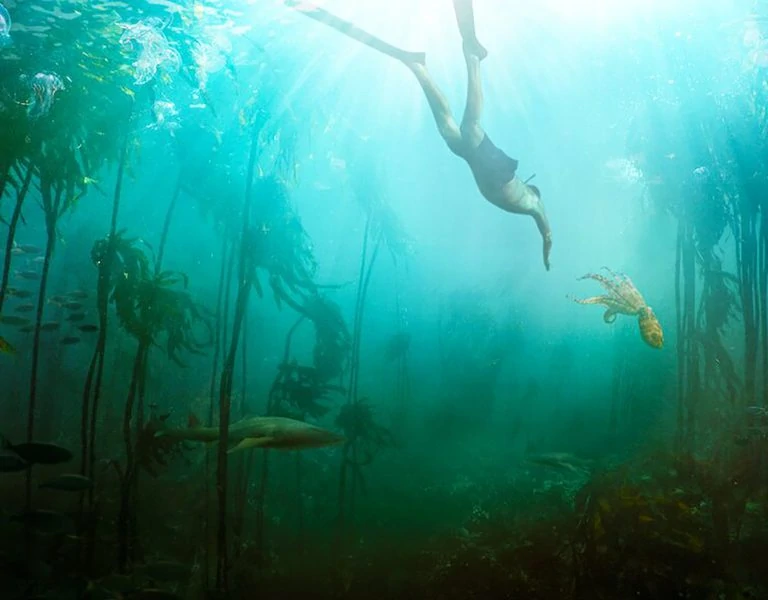
Another transition into a flashback occurs during a scene in which Emma is celebrating her birthday and taking drugs. She’s dancing around a flat, singing to herself, and then lets herself fall back onto the sofa. We cut to an underwater shot of young Emma falling into a pond. To enhance the subjectivity of this moment, we used a falling rig that allowed us to follow Emma’s face until the last moment of the cut, intensifying the audience’s sense of her experience.

Another transition was achieved purely through lighting. Emma’s character is in a jail, coming down from drugs she took the night before. She suddenly experiences an intense bad trip, recalling her memory of drowning as a child. Our idea was contrived on the day of the shoot. I spontaneously suggested to our amazing gaffer, Stuart King, to introduce water reflections inside the cell, as if literal waves of anxiety were washing over Emma. We had a small set up with a foil loose frame and an LED source dimming in and out. I believe it really enhanced Vicky Mclure’s performance in this scene, as she could react authentically to these visualized fears—as if sleepwalking and coming back to reality. We aimed to capture Emma’s state of being neither quite fully awake nor completely in a revery.
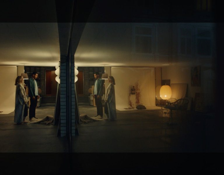
Throughout the shoot, we had constant discussions to find the most effective approach to other moments of surreality. One method involved the camera gliding through the space, embodying Emma’s spirit, while occasionally glimpsing her in reflections around the house. For the first nightmare sequence, we employed a simple yet impactful trick of filming Emma standing on a dolly. The central question we sought to answer was: What does waking up look like? We knew it couldn’t be a direct cut and yet we needed a sharp and unmistakable effect. After experimenting in a test room at 24/7 Drama, I proposed using a dioptre rig. At the moment of waking, the dioptre would swiftly drop in front of the lens, causing a split-second blurred vision—a sensation similar to a blink or the lifting of a veil. Graham Hawkins designed the rig: a 3D split dioptre holder made and attached to an Arri FF4 unit that could swing in and out around the optical centre. During filming, I operated the rig myself, ensuring the filter dropped in synchrony with the performance.
The entire shoot took just over twelve weeks, evenly split between a variety of urban locations and the main house. It was crucial for us to ensure the story was firmly rooted in London, as we were very fortunate to shoot on location and we selected places that do justice to the city’s grandeur and idiosyncrasies. These locations included Emma’s office, offering an incredible view of St. Paul’s Cathedral; hospitals overlooking overground train lines and Shoreditch cafes and restaurants.
The most challenging location for us to secure was Caroline’s house. Her character lives in a council flat. We needed a place that contrasted with Emma’s lavish home but was still suitable for shooting. Because of our schedule, we had to film most scenes there to give the appearance of night, even though they were shot during the day. With the help of our production designer, Claire Kenny, we transformed a residential house into an older space that worked really well for these scenes.
Emma’s home posed the greatest challenges in terms of maintaining coherence. We discovered an incredible space in North London, generously spread across two floors. The downstairs area had beautiful interior architecture with rooms that connected through multiple doorways, offering a range of different camera angles. Remarkably, we didn’t grow tired of the space during the six weeks we spent there.
I found the toughest aspect of this part of the shoot to be accurately estimating the grand scale of the location. It was easy to block scenes around the entrance, living room, and kitchen, but ensuring that the lighting was both interesting and at a consistent level proved to be much more difficult. I enjoyed the challenge, though. We ultimately settled on a combination of hard light sources streaming through the windows and softer, localized spotlights on the floor to maintain a depth to the exposure. A similar struggle arose when addressing interior night scenes, which were meant to be illuminated solely by moonlight, without any practical light sources. Stuart King, our gaffer, and I had previously collaborated on “Midwich Cuckoos” and dealt with a similar task, but here, it had to be executed on a larger scale across two floors. Börkur particularly enjoys working with long, developing shots, so we placed numerous local LED sources around the house to emulate soft moonlight. In postproduction, we minimized highlights as much as possible.
During the prep, Börkur expressed that he really wanted to highlight the idea of sleepless nights. As a result, we planned several scenes with night-to-day transitions captured in-camera, where Emma remains static and awake in bed. Having used a similar technique in previous projects, I was excited to explore this approach further. We had a few scenes in Emma’s house, where we shot a rising “sun” in a night for day effect. In first instance we tried a subtle introduction to the technique, where we gradually transitioned from night to day. In the later example of the technique, during the sleepover scene at Phoebe’s, we expanded on our original approach, creating an even bolder sunrise effect. We achieved this by employing a 10k tungsten light mounted to a jib arm on a dolly, gradually rising and dimming up. To enhance the ambiance, we also used skypanels to simulate the morning sky. In this scene, Emma is watching TV throughout the night, with the camera tracking around her on a 6-foot slider, while the sunbeams enter the room, and glide across her face. As often happens, we had to achieve this shot in a very short amount of time and it required a great synchronisation across crew members. Despite the challenges, I’m very pleased with what we managed to produce.
I had a wonderful time working on this film and genuinely enjoyed myself throughout the process.
When I look back at the footage, I don’t have many regrets. Even though time pressure was at times acute, I believe that, overall, we maintained a cohesive look to the visuals.
I believe my and Börkur’s success lay in being very clear about our initial intentions and sharing them across all departments. Nobody is a mind reader, so providing comprehensive references with notes proved an effective way to communicate our vision. However, once those intentions have been established, I firmly believe it’s important to allow pragmatism and happy accidents to shape the process. Being reactive rather than inflexible has always served me best. Film is a fluid artform influenced by the many voices of the crew, so it’s beneficial to let those voices be heard and allow the process to unfold organically.
